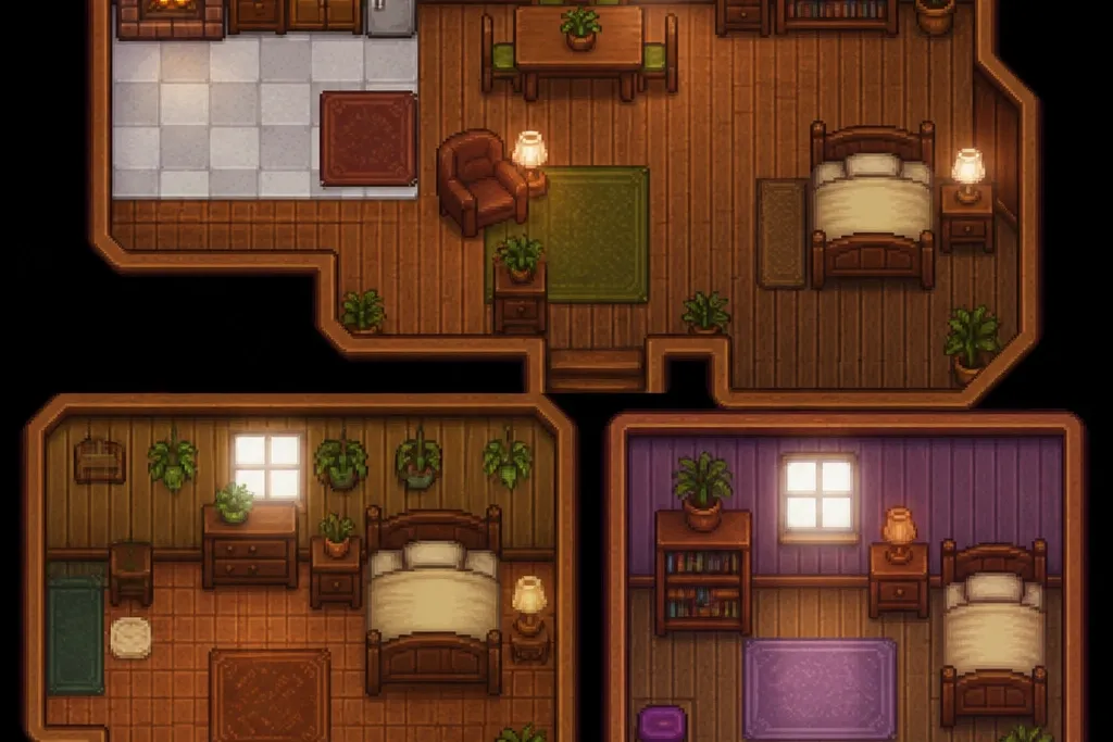
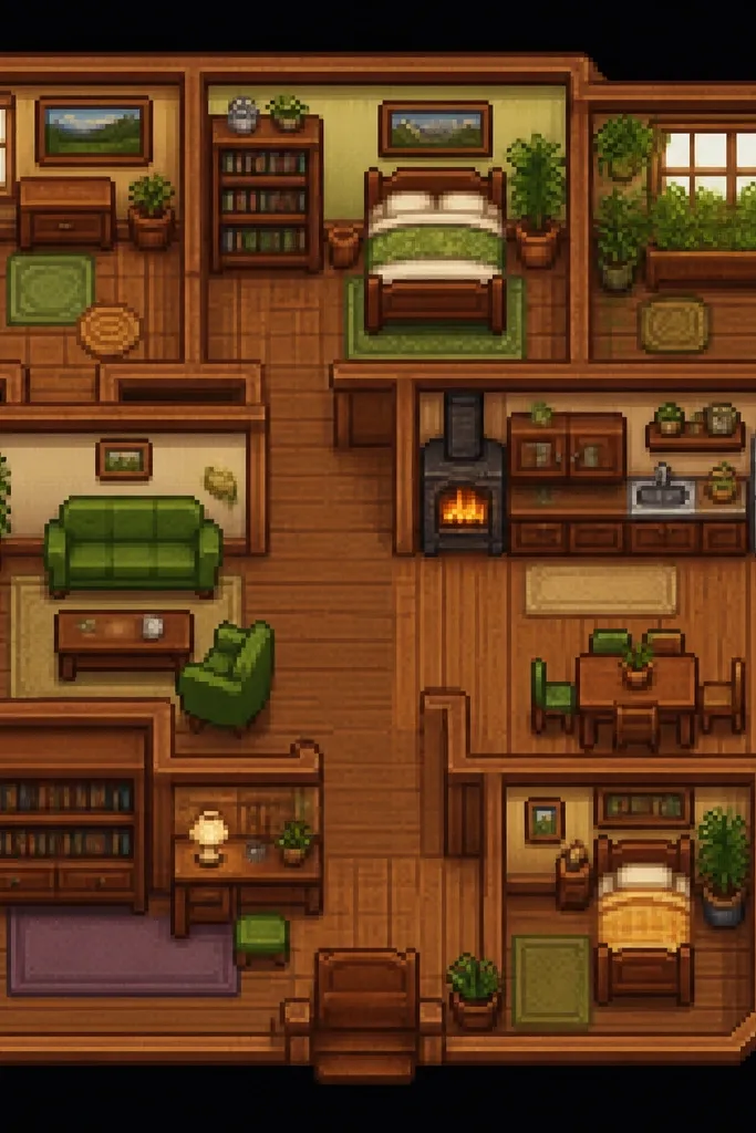
1. Cream linen runner on a scuffed farmhouse table
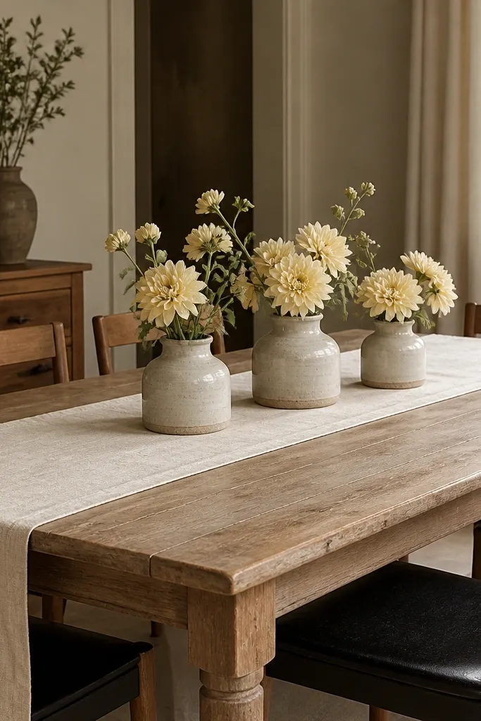
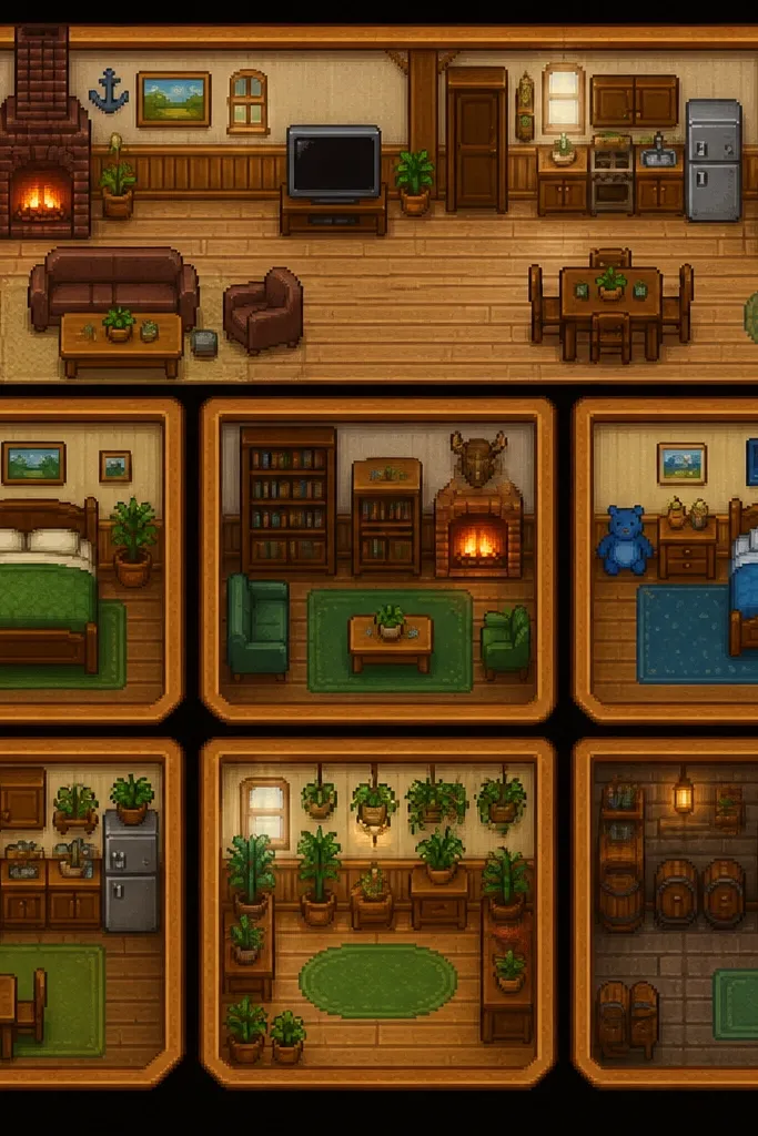
This is the simplest way I’ve made a dining table look “game correct” on a stardew valley house interior budget. Linen reads warm and lived-in, and the cream color keeps the room from feeling like it’s trying too hard. The worn table texture gives you depth without needing expensive decor. Add pale yellow flowers for that soft spring signal.
Use a runner that’s about 12-14 inches wide and centered. If your table is 36-40 inches wide, aim for the runner to leave 8-10 inches of wood showing on each side. Pick jars in off-white, speckled gray, or light clay so they match the runner instead of fighting it.
Pro tipSteam the linen before you set it down. Wrinkles look authentic, but random creases look cheap.
Watch outAvoid glossy “costume linen” that looks plastic under warm bulbs.
2. Black metal bottle rack + three glass jars
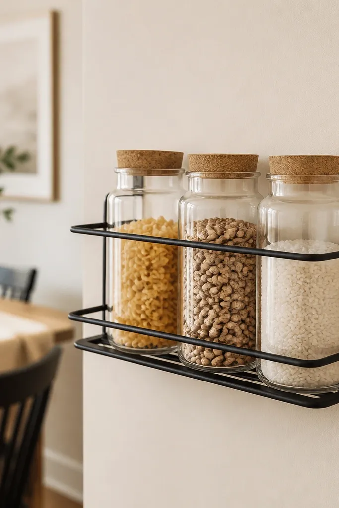
Black metal adds that dark hardware contrast the game interior vibe uses, and it’s cheap if you buy a rack designed for kitchens. The jars give you organized clutter, which is the whole look. Glass lets the contents show, so you don’t need prints or extra decor. It also makes the space feel functional, not staged.
Group three jars of different heights. Keep labels minimal — either no labels or small brown kraft tags. If the room already has dark furniture, match the rack finish to your chair legs or cabinet pulls.
Pro tipUse dried goods with similar color tones. Light beans + pale rice + golden pasta look calmer than mixed bright packaging.
Watch outSkip mismatched lids in neon colors.
3. Moss green plate stack on a wall shelf
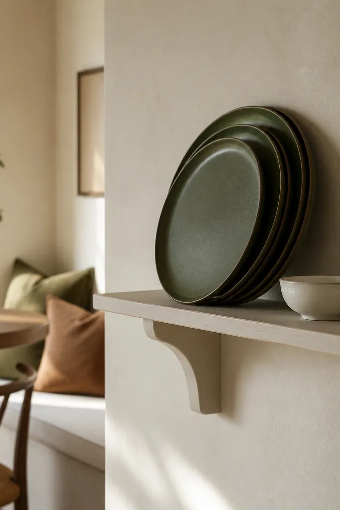
A small plate stack adds color without taking over the room. Moss green is the farm color that reads “Stardew” without turning the space into a holiday theme. The shelf makes it vertical, which is key in budget interiors because it reduces how much you need to buy for surfaces. Plates also look good even when they’re empty.
Choose plates in the same glaze tone, even if the shapes vary. Stack 3-4 plates, then place a small bowl or folded cloth in front to anchor the arrangement. Keep the shelf height so the bottom plate sits roughly at eye level when standing.
Wipe plates with a dry microfiber cloth right before styling. Fingerprints on green glaze show under warm light.
Avoid a shelf that’s too wide. A wide shelf forces you to fill it, and that’s where budget looks start to clutter.
4. Dusty blue tea set in a glass-front cabinet
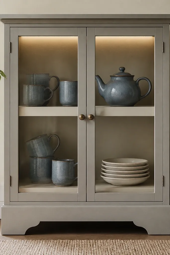
Dusty blue gives you that coastal-soft color pop that still feels farm-friendly. Glass-front cabinets make the room feel curated, but you don’t need expensive sets if you mix thrift finds with one consistent color. LEDs inside the cabinet make everything look intentional and warm. It also turns plain dishes into decor.
Use 6-10 pieces total so the cabinet looks styled, not crowded. Put the teapot on the top shelf and line mugs below. If your cabinet has adjustable shelves, space them so mug handles have breathing room.
Group by function: cups on one shelf, serving pieces on another. Your eye reads it faster.
Avoid overcrowding. Too many pieces make it look like storage.
5. Woven jute runner under a small round side table
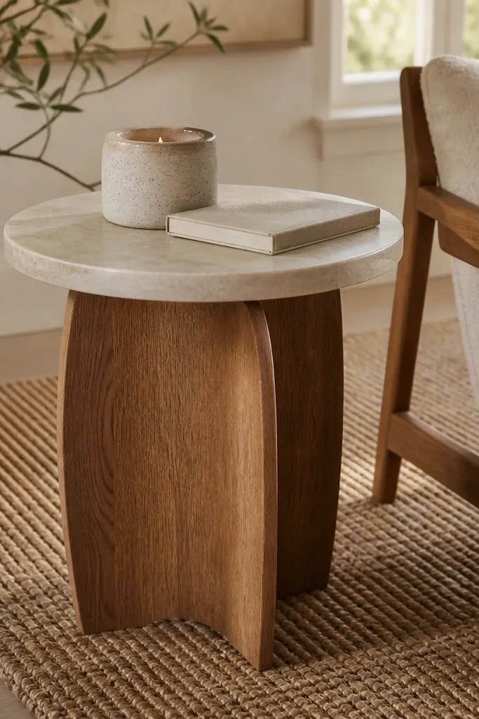
Jute adds texture instantly, and it keeps the room from feeling flat. Natural tan works with cream walls and light wood floors without fighting your other colors. A small round table plus jute underneath gives you that countryside layering. It also hides minor floor inconsistencies.
Choose a jute piece with a tight weave so it doesn’t shed like a cheap mat. Place it so the edges peek out 3-6 inches around the table base. If you have kids or pets, go for a washable jute blend instead of pure jute.
Vacuum with a brush attachment once a week. It stops the fibers from looking messy.
Avoid jute that’s frayed at the edges. That reads worn-out instead of lived-in.
6. Corner lamp with a linen shade and warm bulb
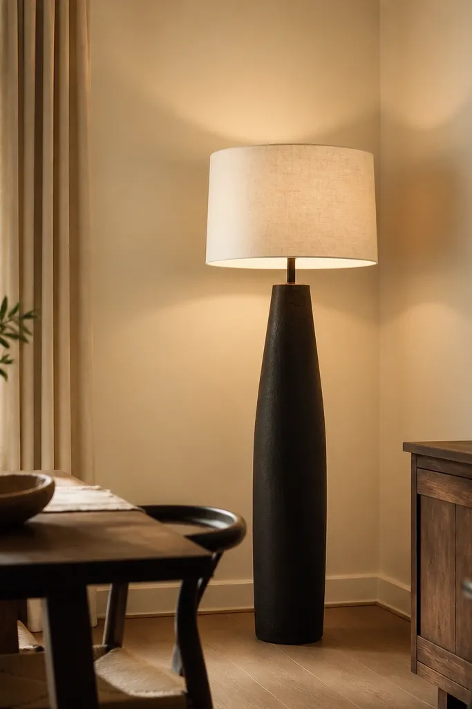
Lighting is the fastest budget upgrade I’ve done for this style. A linen shade spreads light like the game interiors do — no harsh spotlighting. Warm bulbs make cream look creamy instead of gray. When corners get light, the room feels bigger and more comfortable.
Use a bulb around 2700K. If your lamp has a dimmer, set it so the room feels amber at night. Place the lamp so it points slightly toward the wall, not straight down at the table.
Turn off overhead lights for one evening and see how the corners look. If they’re dark, move the lamp 12-18 inches closer to the wall.
Avoid bright white bulbs. They kill the cozy farm vibe immediately.
7. Black wall hook rail for hanging ladles and towels
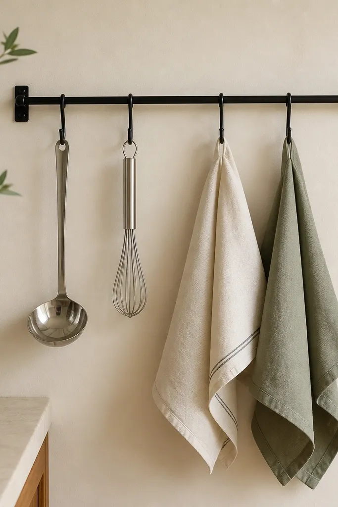
This is how you get the “kitchen tools on display” look without buying a bunch of framed art. Hanging tools create vertical rhythm and keep countertops clear. The dish towels add softness and color that matches the rest of the room. Black rail + metal tools gives you that game hardware contrast.
Pick 6-8 hooks max so it doesn’t look crowded. Towels should be folded into thirds and clipped or tucked so they don’t flop. Keep towel colors to two tones: cream plus one farm shade.
Pro tipHang tools by size. Big ladle on one end, whisk and smaller tools in the middle.
Watch outAvoid mixing heavy chrome and matte black in the same spot.
8. Rust terracotta pot with a single branch arrangement
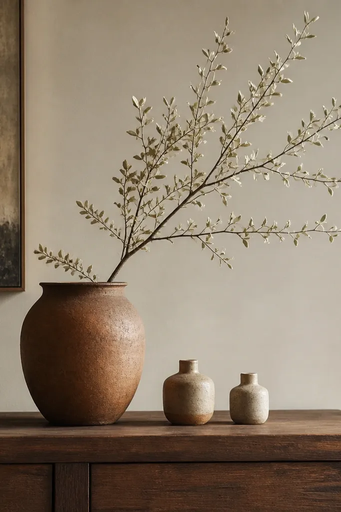
One branch in a terracotta pot looks like a simple farm arrangement you’d actually do. The rust color reads warm and matches wood tones, so it doesn’t feel like an accent color stuck on. This works because the arrangement is tall enough to lift the eye, but it stays minimal. Minimal is the budget win here.
Use a pot with a matte finish so it doesn’t look shiny plastic. Trim the branch so it’s about 1.25 times the height of the pot. Place it on the sideboard so it’s near a lamp or window, not in a dark corner.
Pro tipDust the leaves with a dry cloth before you set it out. Clean greenery looks expensive.
Watch outAvoid fully filled bouquets. They look like store-bought and cheap fast.
9. Short pile striped rug in cream and dusty blue
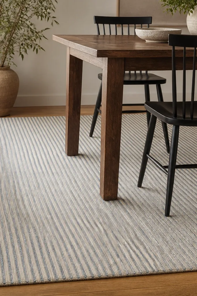
A rug creates the “house interior” feeling because it defines the room like the game’s floors do. Cream-and-dusty-blue stripes echo the farm palette while still looking clean. Short pile is practical for dining because chair legs slide without catching. The stripes also add subtle movement so the space doesn’t look flat.
Choose a rug big enough that the front chair legs stay on it when pulled back. Measure your chair depth and add 6-10 inches. If you can only find a slightly bigger rug, that’s better than too small.
Pro tipUse a rug pad underneath. It keeps the rug from bunching, which makes it look sloppy.
Watch outAvoid high-pile rugs under dining chairs. They snag and look worn fast.
10. Thrifted wood cutting boards as wall decor
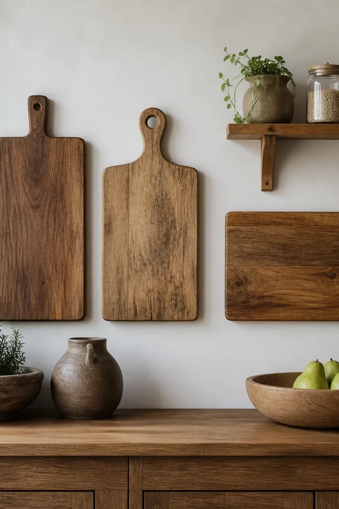
Cutting boards on the wall give you instant “kitchen lived-in” energy without buying art. Wood tones unify the room and make everything feel handmade. Different board sizes add depth, and the natural grain catches warm light. If you like the Stardew kitchen vibe, this is the most believable budget wall treatment I’ve used.
Choose boards in 3 sizes: one large (about 12x18 inches), one medium, one small. Mount them with picture hooks or prop them on a small shelf ledge. Keep the spacing so you can see the grain patterns.
Pro tipWipe boards with mineral oil if they look dry. It makes the grain pop and hides minor scratches.
Watch outAvoid boards with heavy varnish shine. They look like they came from a cookware set display.
11. Open shelving with labeled jars and a dark tray
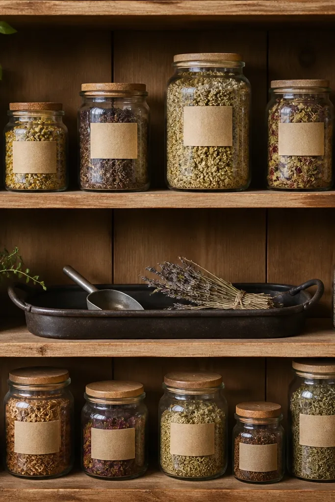
Open shelving is a budget hack because jars and trays are cheaper than full decor sets. Labels keep it from looking random. The dark tray adds contrast and gives you a “staging platform” for small items. This setup reads like a working kitchen, which is the Stardew interior vibe.
Use shelves that are at least 10-12 inches deep so jars don’t hang off the edge. Put the largest jar on the bottom shelf and keep jar heights consistent on the middle shelf. Use one herb bunch or a single dried bundle so it doesn’t turn into a craft store explosion.
Label with a consistent font and spacing. Even if labels are simple, consistency makes it look intentional.
Avoid mixing jar sizes randomly without any pattern. It looks like pantry leftovers.
12. Wool-look throw folded on the chair back
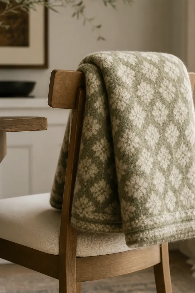
Textiles are what make the interior feel cozy instead of staged. A wool-look throw adds that soft, slightly rough texture the game interior suggests. Muted green ties into the farm palette, and cream keeps it calm. Folding it over a chair back is quick, and it looks natural even in a dining room.
Choose a throw about 50-60 inches wide so it drapes with weight. Fold it in thirds, then let the edge fall 2-4 inches down the seat back. Pick a pattern that repeats — simple checks or small woven lines look best.
Mist the throw lightly with water and let it dry to relax stiff edges from shipping.
Avoid throws that are too thin. They sit flat and look cheap.