1. Warm Greige with a Honey-Oak Floor
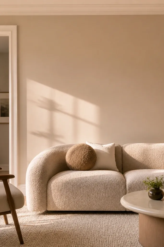
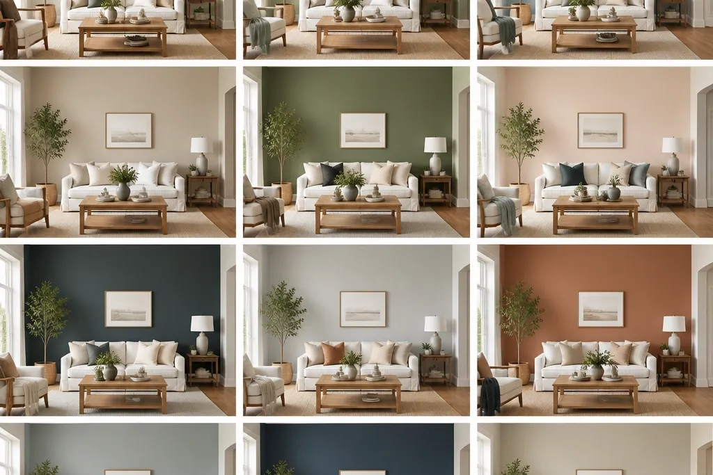
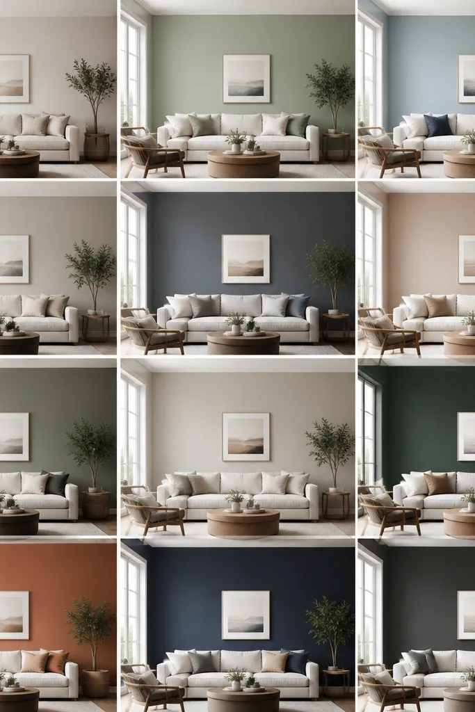
This is my go-to when the room has honey oak floors and you want “neutral” without the sadness of pure gray. Warm greige has enough beige in it to stay friendly under warm bulbs. It also gives you a runway for natural materials like jute, rattan, and light wood frames.
Pro tipHold a small swatch next to your floor plank under evening light — if the wall looks pink, it’s right.
Go with eggshell on the walls for daily wipe-downs. Pair the wall with a cream rug (not bright optic white) and choose curtains in oatmeal or light camel linen. Keep the trim a soft white with a warm hint so it doesn’t clash.
Watch outAvoid blue-gray greige with honey oak — it turns the room slightly sickly by night.
2. Soft Sage for a Calm, Not-Sickly Green
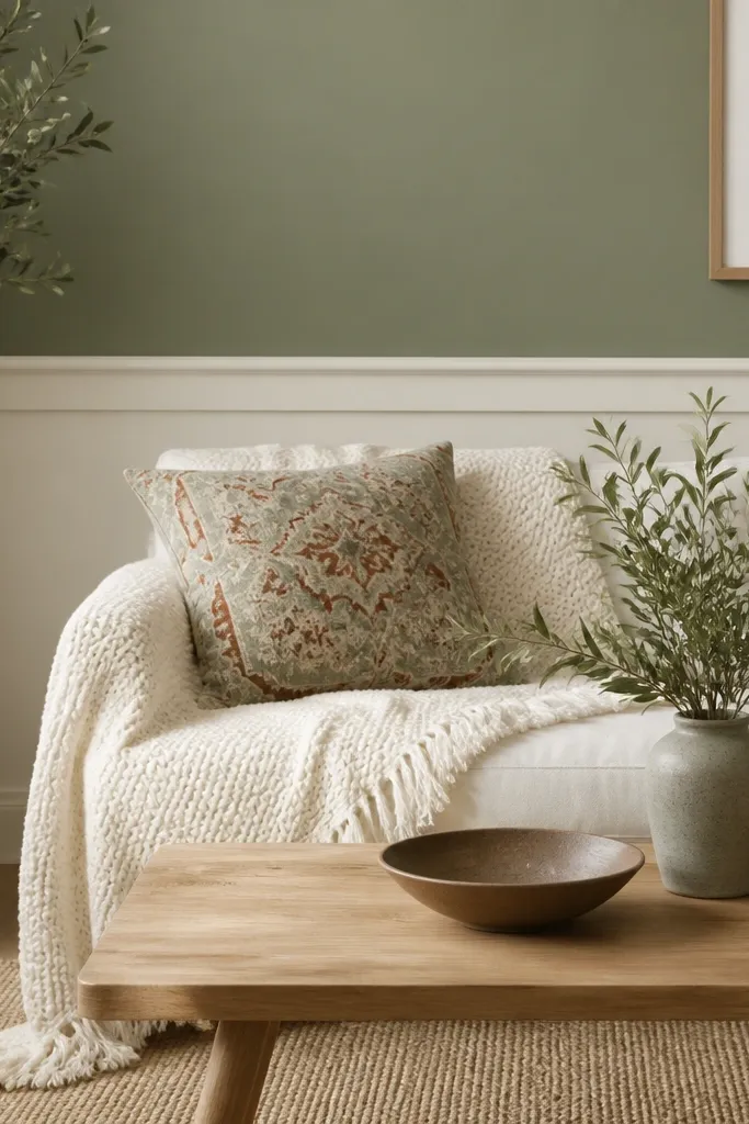
Soft sage works because it’s gray-green, not neon green. That gray base keeps it from feeling “farmhouse craft paint” and helps it blend with both warm and cool furniture finishes. I like it in living rooms that need breathing room because it visually slows everything down.
Use a flat or matte finish if the walls have texture or minor dents. If the room gets messy (kids, dogs, lots of fingerprints), choose matte with a good scrubbability rating. Pair with clay, cream, and brushed brass for warmth.
Test sage with one terracotta item on the floor (a throw pillow or small vase) so you can see the color harmony quickly.
Skip bright leaf greens — they make beige furniture look dingy.
3. Milky White Walls with Warm Trim
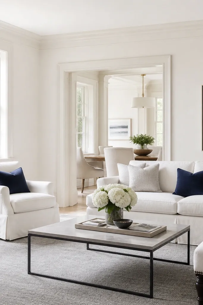
Milky white is the most forgiving “beginner” choice because it doesn’t demand perfect matching. The key is that it’s not an icy white; it has a creamy base so it doesn’t look sterile. In rooms with low natural light, this gives you brightness without the stark contrast that makes spaces feel smaller.
Paint trim and walls from the same color family but not the same exact value. Choose a wall white and a trim white that’s slightly brighter. For fabrics, lean into oatmeal, light gray, and navy so the room looks intentional.
If you’re using dark wood furniture, pick a white that looks slightly warm next to it — true cool whites can look gray against dark oak.
Avoid optic white on walls in a living room — it can reflect harsh light onto skin and make the room feel cold.
4. Greige with Charcoal Trim for a Modern Frame
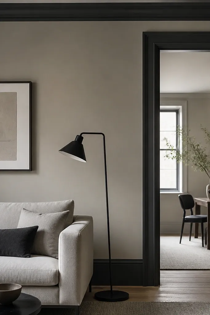
This look is about creating edges. The wall stays neutral and calm, while the charcoal trim gives you definition that makes the room feel designed. It also hides scuffs on trim better than a pure white if you have high traffic.
Pro tipMask carefully and paint trim after the wall has cured at least 24 hours — you’ll get cleaner lines.
Choose a wall greige with a warm-neutral undertone. For trim, use a semi-gloss or satin finish in charcoal so it’s washable. Pair with black metal, light gray textiles, and a rug with subtle pattern so the contrast doesn’t feel too sharp.
Watch outAvoid painting charcoal trim with flat finish — scuffs will show and it looks dull.
5. Buttery Cream for a Cozy, Sun-Ready Room
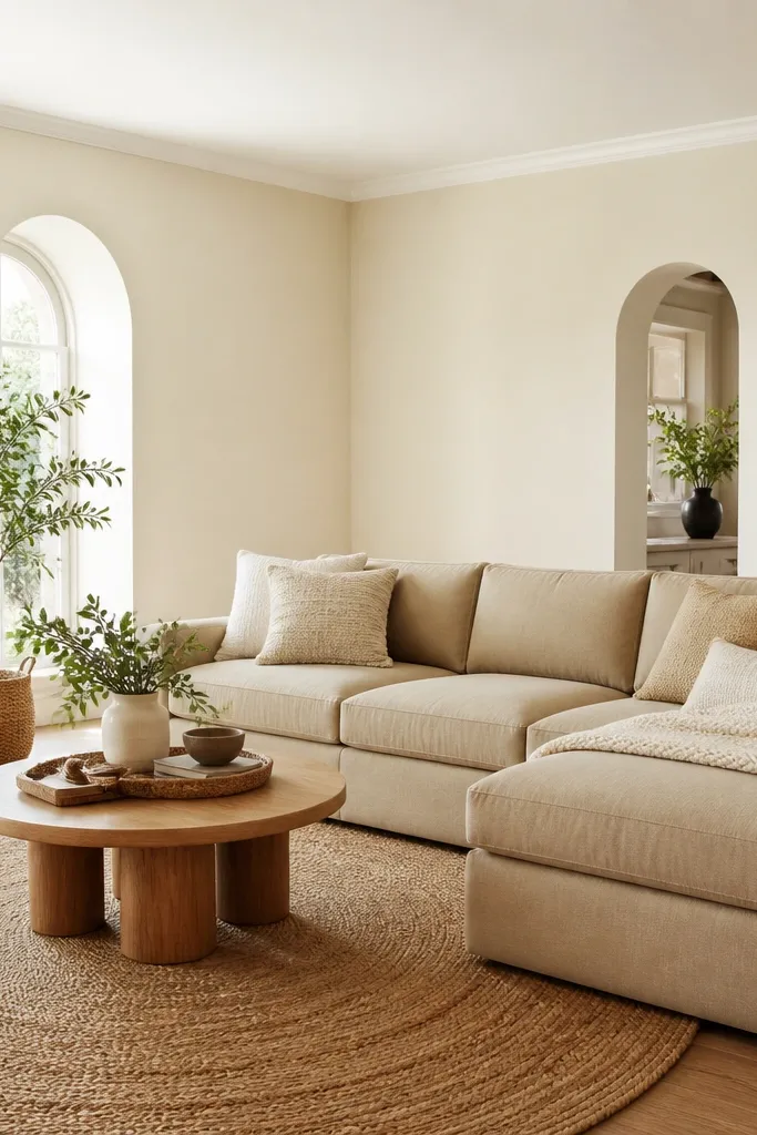
Cream is warmer than white, but it doesn’t have to look yellow. This buttery direction makes living rooms feel lived-in and soft, especially when you have tan leather, wicker, or light wood. It’s the kind of color that makes patterned pillows look richer.
Use eggshell so you can wipe coffee splashes and fingerprints from the lower wall. Pair with white curtains that are off-white, not bright white, and add one darker anchor like walnut or espresso wood. Keep artwork frames in wood or matte black.
If your room has north light, add a warm lamp and test cream near that lamp — undertones show up fast.
Skip pale yellow creams if your room already has warm beige flooring — it can go too golden.
6. Clay Rose for a Soft Pink That Doesn't Read Barbie
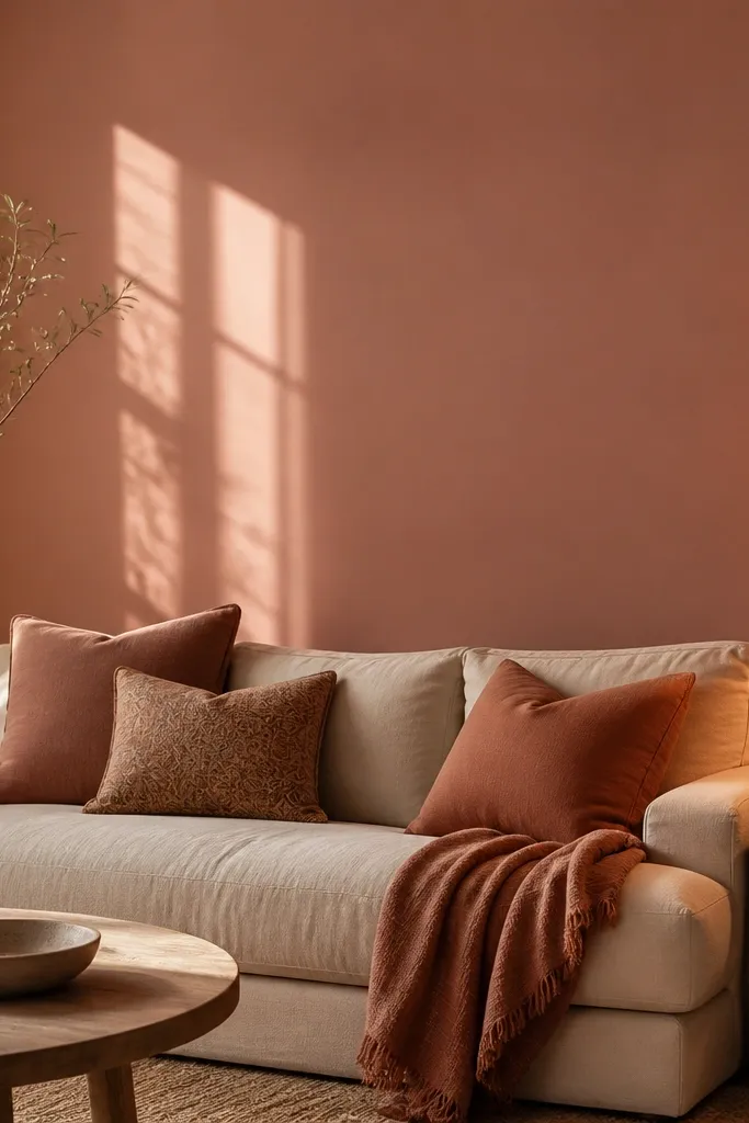
Clay rose gives you color without turning your living room into a themed room. It’s desaturated, so it plays well with neutrals and natural textures. I like it when you want warmth but you don’t want beige to feel boring.
Pick a paint with a dusty undertone — you should see more brown than red. Pair with linen, boucle, and light wood. For contrast, use deep olive or espresso accessories sparingly so the pink doesn’t compete.
Bring home a fabric swatch in your current throw or curtain and test paint against it — this saves you from picking a pink that clashes.
Avoid hot pink undertones — they show up loud in evening light.
7. Light Blue-Gray for a Fresh but Grounded Feel
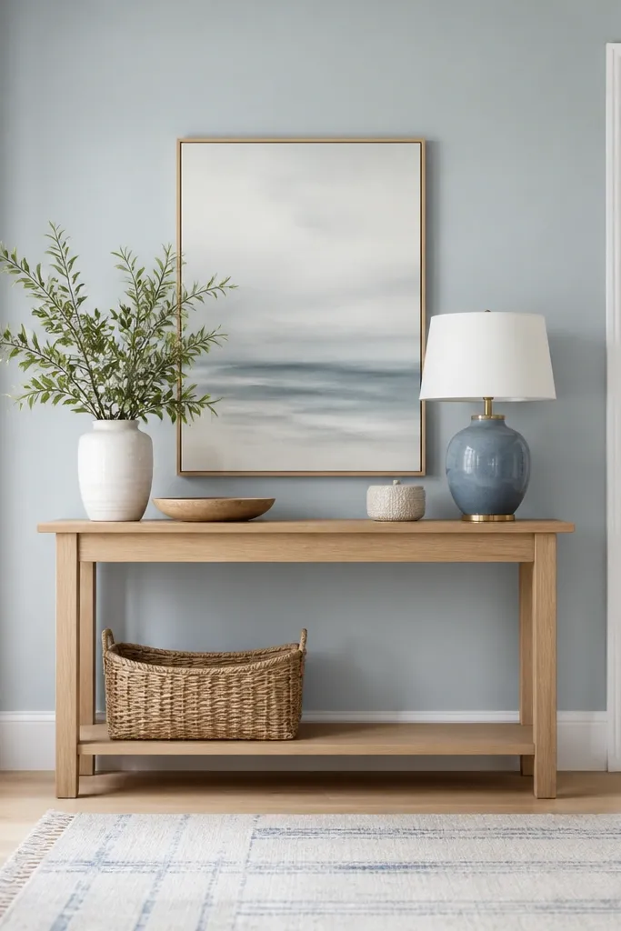
Blue-gray works when you choose a shade that has enough gray to stay calm. This is one of my favorite living room paint color ideas beginner because it’s forgiving with furniture color — whites, creams, and wood all cooperate. It also makes rooms feel cleaner, especially when you have white built-ins.
Pro tipIf your ceiling is yellowed or your room has warm bulbs, test the blue-gray twice — morning and evening. If it looks greenish, go one shade lighter.
Use satin or eggshell for durability, especially near the seating area. Pair with pale oak and warm metals like brushed nickel or brass. Add off-white curtains so the room stays bright.
Watch outAvoid very saturated blue-gray — it can overpower small living rooms quickly.
8. Charcoal Accent Wall Behind the Sofa
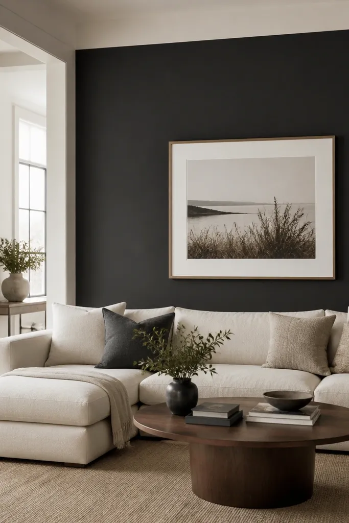
A charcoal accent gives you drama without repainting every wall. I like it behind the sofa because it frames the seating area and makes the rug feel more anchored. Under daylight, it reads deep and neutral; under lamps, it stays moody but not brown.
Pro tipUse painter’s tape to create a crisp rectangle and paint the accent in one continuous session — charcoal marks show if you stop and start.
Keep the other walls a warm off-white so the room doesn’t shrink. Use semi-gloss or satin for the accent if the wall takes fingerprints. Choose light-colored upholstery and artwork with white matting to keep the space bright.
Watch outDon’t choose charcoal if the room gets almost no light — it will feel like a cave.
9. Warm White with Gray Undertone for Modern Minimal
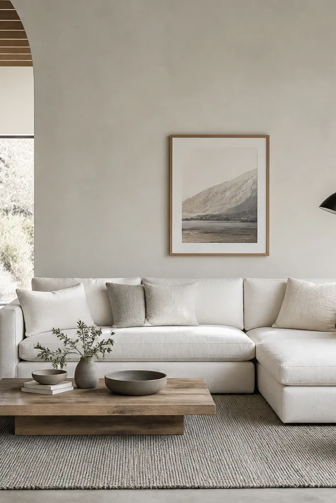
This is the “clean modern” option that still avoids the cold look of icy whites. The gray undertone keeps it from going yellow, but it stays soft enough for everyday living. It’s especially good if you have modern furniture in white, light gray, and black.
Pro tipIf you have cool-toned flooring like driftwood, this white is a safe match — test against one plank in daylight.
Choose eggshell for wall durability. Pair with textured neutrals: bouclé, knit throws, and a flatweave rug. Keep trim either the same white family or slightly brighter so it reads intentional.
Watch outAvoid pairing this with warm honey floors — the mismatch shows up fast.
10. Deep Forest Green for a Library-Style Living Room
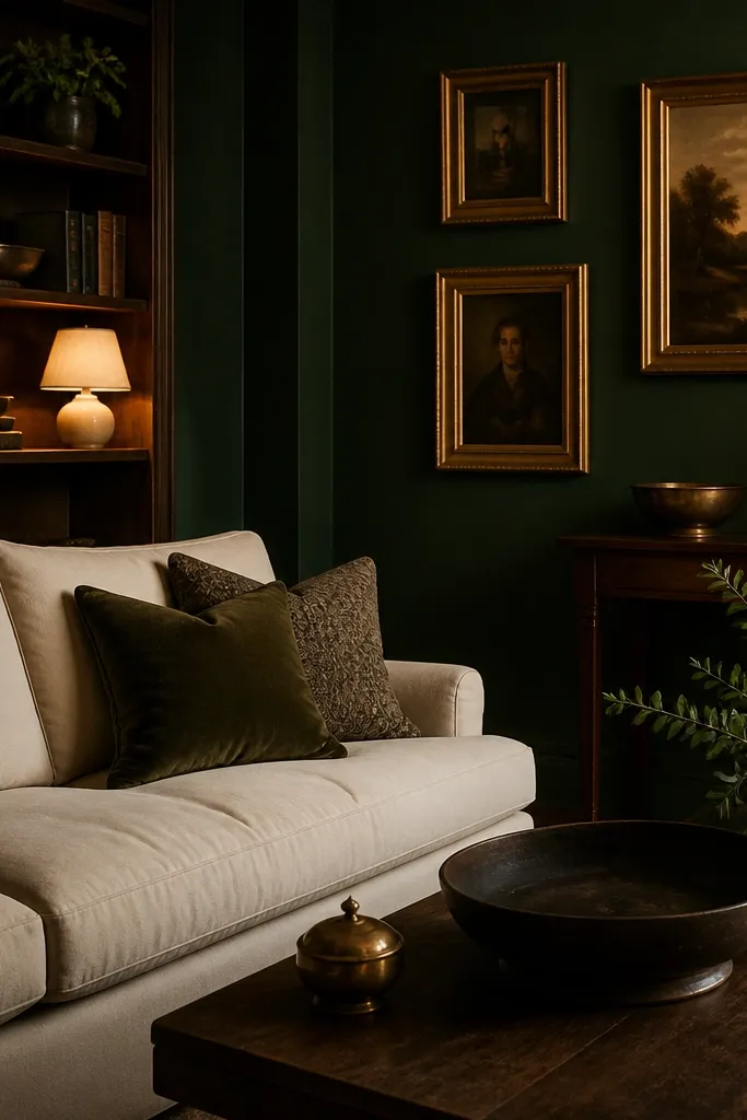
Deep forest green makes the room feel grounded and expensive-looking. It also makes brass and warm wood look richer. When you add cream upholstery, it balances the darkness so you don’t lose all the brightness.
Use eggshell or satin — darker colors show scuffs, and washable paint helps. Pair with warm whites, cream textiles, and gold or brass accents. If you have patterned curtains, choose them with cream base and small green repeats.
Paint the ceiling the same color family but not the same shade — I usually keep ceiling white so the room doesn’t feel pressed in.
Skip forest green in rooms with heavy overhead glare — it can look flat and dark.
11. Earthy Terracotta Clay Walls for Heat and Personality
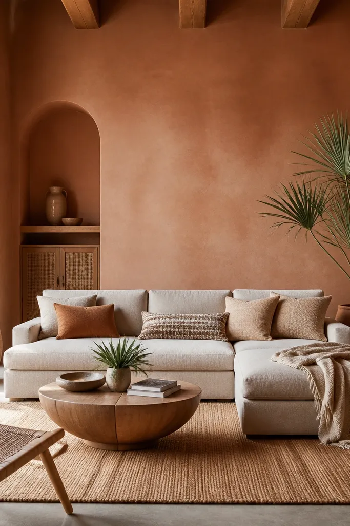
Terracotta gives your living room warmth you can feel. It works because it has brown and red mixed in, so it pairs with both beige and darker woods. I’ve seen it make plain furniture look styled without adding extra decor.
Choose a matte finish if your walls are smooth; choose eggshell if you need wipeability. Pair with cream, camel, and olive accents. Keep metals in brass or matte black so the terracotta doesn’t fight chrome.
Test terracotta in two spots — near a window and near a darker corner. The corner often shifts darker.
Avoid bright orange terracotta — it reads “craft room” fast.
12. Olive Green for a Soft, Mature Color Story
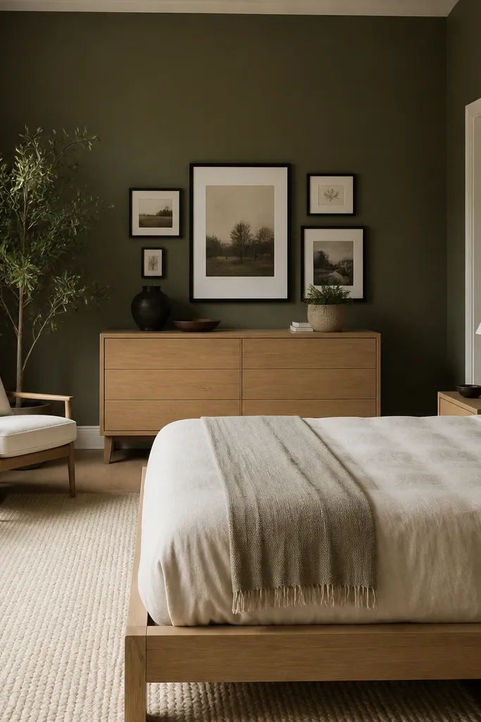
Olive is more forgiving than it sounds. The trick is choosing muted olive with a gray base, not yellow-leaning olive. It works with wood tones, leather, and natural fibers, and it doesn’t scream in daylight the way brighter greens can.
Pro tipIf you have mustard accents already, olive can tie everything together. If your decor is all cool gray, olive will look out of place.
Use eggshell for the main walls since olive can show scuffs. Pair with cream upholstery and textiles that have black or charcoal in the pattern. Add a warm white ceiling and off-white trim for clean contrast.
Watch outAvoid yellow-olive if your room has lots of cool gray furniture — the clash is immediate.