1. Blush Morning Coffee Widget Strip
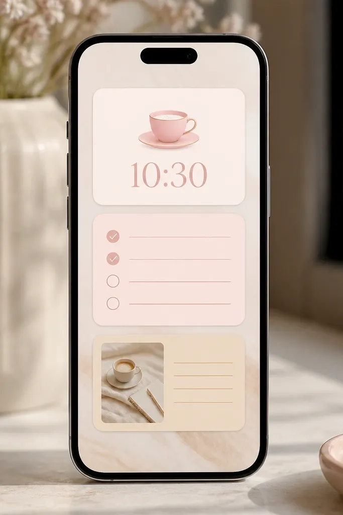
This setup works because it repeats a single blush tone across three widgets, and it keeps the coffee theme consistent. The widget icons stay minimal — one coffee symbol and no extra graphics — so the pink looks airy instead of loud. I like using rounded corners and slightly off-white text so it feels like morning light.
Use a blush background image (pink wash or solid pale pink) and set widget sizes to match: top widget slightly taller, middle widget medium, bottom widget short. Choose a checklist-style widget with a subtle pink frame and set the text color to off-white or light cream. Keep the checklist items to 2-3 lines so it doesn’t crowd the screen.
Make the checklist your “brew” steps: Grind, Brew, Sip. Seeing it every morning makes the widget feel useful, not decorative.
Avoid bright hot-pink text — it looks harsh next to off-white icons and makes the whole screen feel cheap.
2. Dusty Rose Grocery List Tile
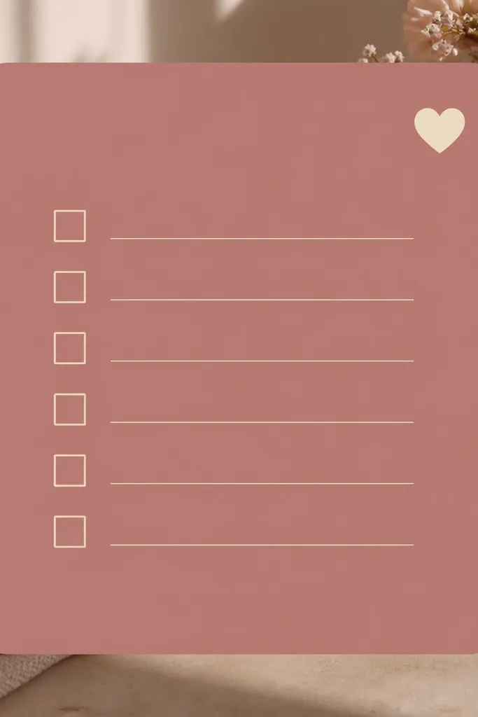
A grocery tile looks clean because it has a job and a simple layout. Dusty rose is forgiving when your phone icons are colorful; it softens the contrast. The heart icon is small and tucked in a corner, so it reads as aesthetic, not childish.
Set one large list widget in the center of your home screen. Use a muted cream font color and keep line length short by using short item names like “berries,” “yogurt,” “spinach.” If you have multiple lists, pick one for the widget and keep the rest off the home screen.
Pro tipUse categories with one word labels: “Fruit,” “Dairy,” “Veg.” Short labels keep the widget readable.
Watch outDon’t cram 10+ items — if the widget fills with lines, it stops looking like a designed tile and starts looking like a screenshot.
3. Pink Recipe Card Countdown
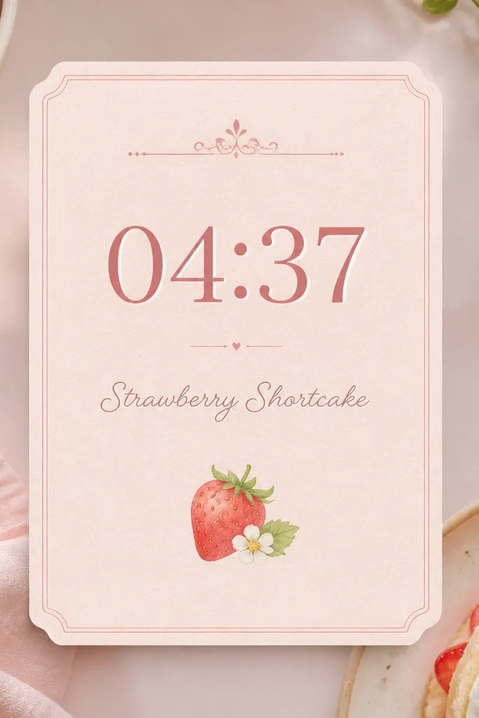
This one makes your screen feel like a kitchen station. The “recipe card” look works because the background reads like paper and the text stays centered. A countdown element adds movement — even if it’s static most of the time, it still feels active.
Pick a widget that supports a countdown or timer display and place it top-left. Use a paper-texture background (light pink with subtle grain) and keep the recipe name to 1-2 words. If your widget allows it, set the accent color to strawberry pink and the text to warm cream.
Pro tipSet it for repeat tasks like “Chicken roast 25 min” or “Pasta water 10 min” so the widget matches real cooking.
Watch outSkip busy backgrounds with flowers all over — they fight with the timer text.
4. Rose Quartz Photo Frame Widget
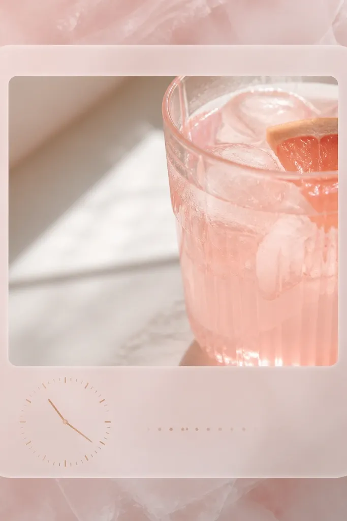
Photo frames work because you get instant “pink aesthetic” without changing every widget. The rose quartz effect comes from a translucent frame and a light background that keeps skin and drink colors soft. When the photo has highlights, pink looks glossy instead of flat.
Use a high-contrast but soft-lit photo: pink lemonade, strawberry smoothie, or a pastel pink table setting. Place the widget in the upper right so it balances text widgets on the left. Choose a frame color that matches the brightest pink in your photo, not the darkest shadow.
Crop the photo so the brightest pink area sits near the top third — it keeps the widget readable.
Don’t use a dark photo; it makes pink frames look muddy and the text gets lost.
5. Blush Calendar Mini Month
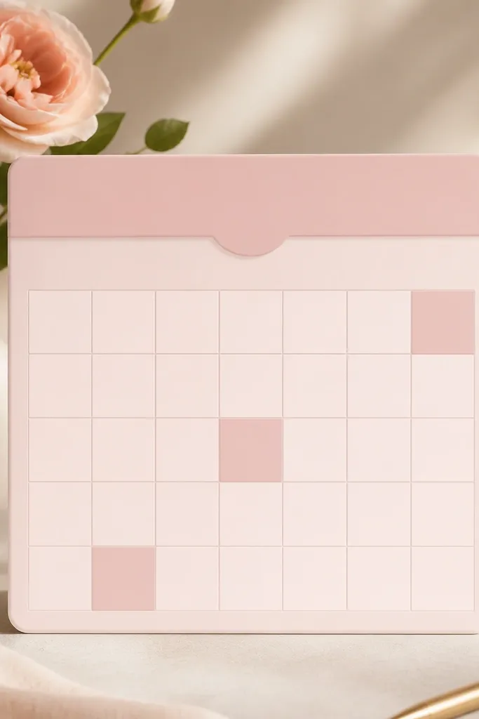
A mini month widget keeps your dining plans looking organized and pretty. The blush background makes the calendar feel warm instead of office-gray. Highlighting only a few dates keeps it from turning into a pink mess.
Choose a calendar widget that lets you color-highlight events. Set 3-5 recurring food events like “Meal prep Sunday,” “Grocery run,” “Dinner with friends.” Keep the rest unhighlighted so the pink accents feel intentional.
Pro tipUse one color for food events only. If you use five colors, the widget stops looking aesthetic and starts looking like a system.
Watch outAvoid neon date highlights — they look out of place with blush backgrounds.
6. Pink Tea Time Sticky Note
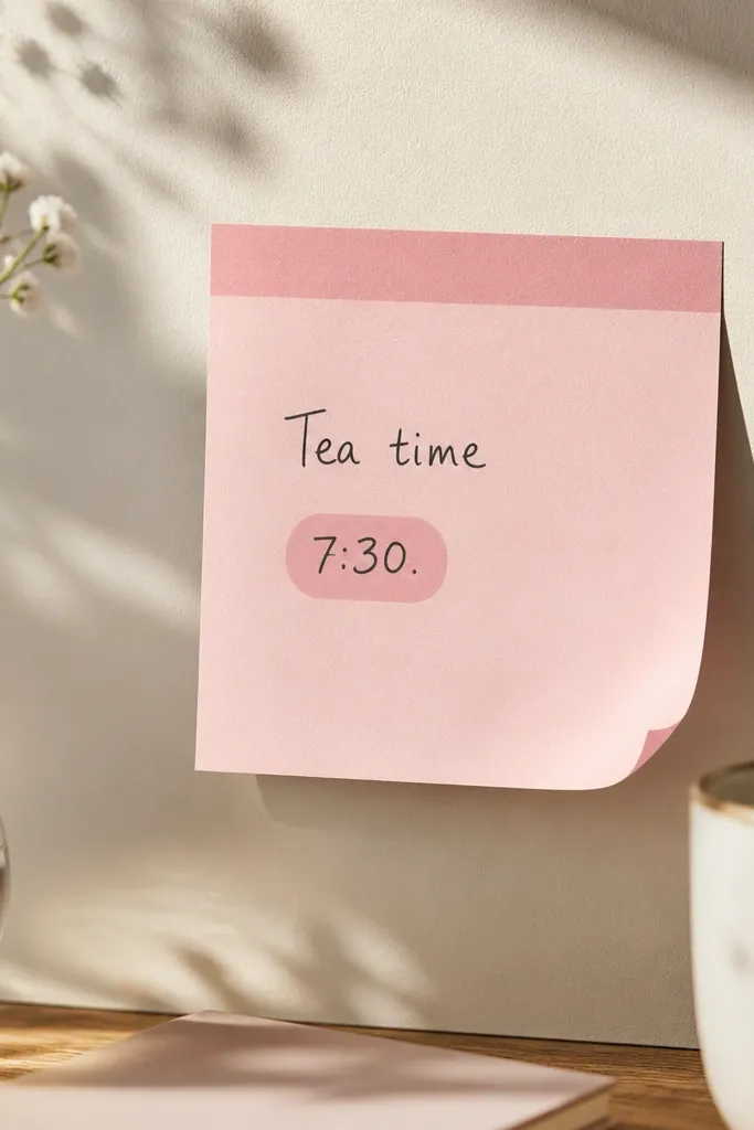
Sticky-note widgets look cute because they mimic something you’d actually write on. Pink header strips add structure, and short text keeps it clean. I like these when your home screen needs a little personality but you don’t want a full theme.
Use one sticky-note widget, not three. Keep the header strip a medium blush (not hot pink) and the main text in off-white. Put it near a larger widget so the layout feels balanced.
Pro tipWrite one phrase you’ll repeat weekly, like “Tea after dinner.” It makes the widget feel lived-in.
Watch outDon’t use long paragraphs — sticky notes look best with 1-3 lines.
7. Strawberry Jam Search Bar Widget
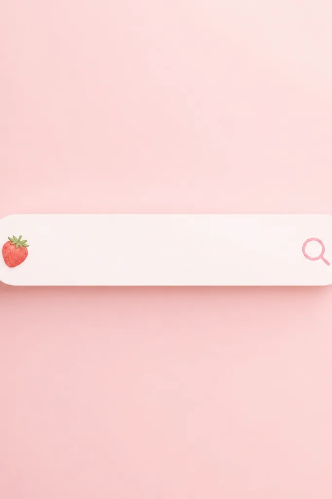
A search-style widget keeps your home screen practical while still looking sweet. The trick is keeping it minimal: one icon, one input prompt, one consistent pink gradient. Strawberry-pink accents make it feel like a kitchen tool.
Use a light pink gradient background and set the widget’s accent color to a strawberry shade. Keep the widget width wide enough that the text is readable, then place it below your main widget. If your phone allows it, use a simple font instead of a script font.
Pro tipSet it to a shortcut you actually use, like searching “quick dinner” or “air fryer.”
Watch outAvoid busy gradients with multiple bright colors — they make the search bar look like an ad.
8. Blush Utensil Icon Dock Widget
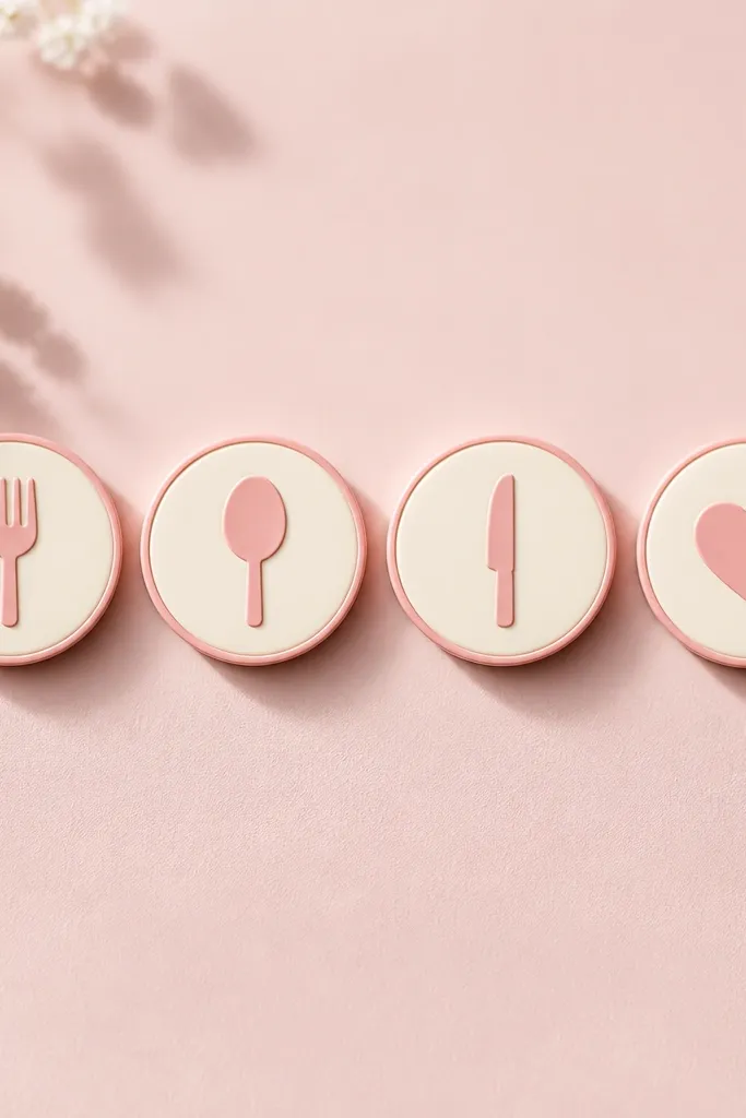
Icon docks look great when you keep them limited. Four icons is my sweet spot because it stays scannable. The cream icons with pink outlines tie them to the rest of your pink palette without covering the screen in color.
Use circular icons with thin outlines in blush pink. Keep the background a near-white pink so the icons pop. Place this widget where you tap often — bottom third of your screen works well.
Use only kitchen shortcuts: grocery list, meal planner, recipes, and timer. That’s how it stays useful.
Don’t add extra app icons around it — the dock stops being the “anchor” and looks crowded.
9. Rose Water Quote Widget (Short Lines Only)
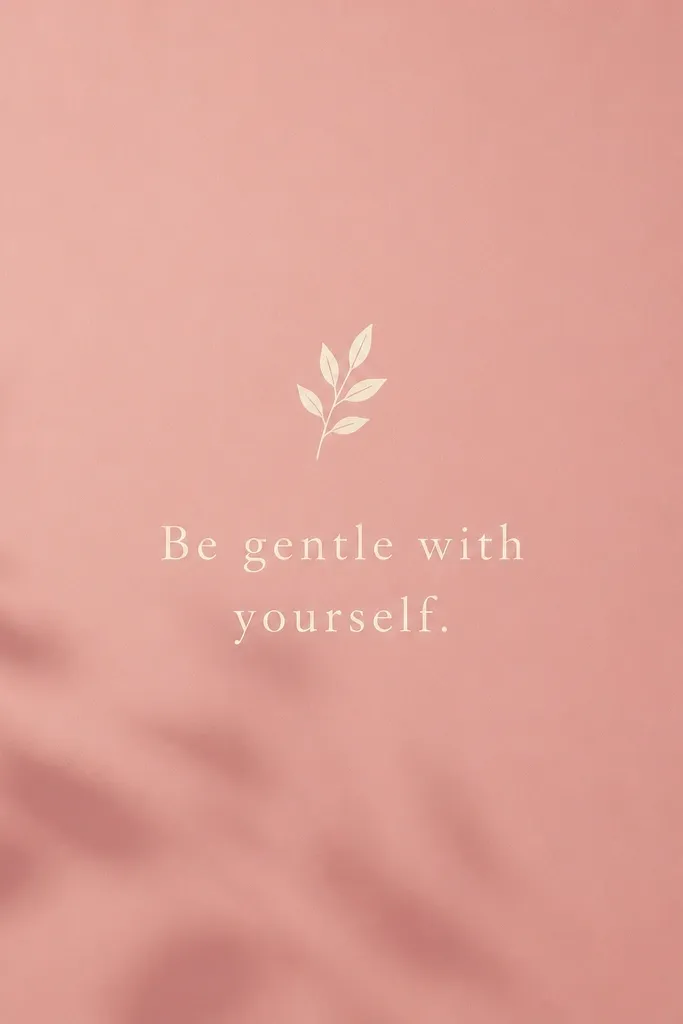
Short quote widgets work because they behave like decor even when they’re still text. Rose water pink backgrounds look soothing and don’t clash with kitchen photos. The spacing matters — if the quote fills the widget, it looks like a flyer.
Pick a widget that displays a single text block and keep the quote to one sentence or even a phrase. Use a cream font color and increase line spacing if the settings allow it. Place it next to a practical widget like a list or calendar so your screen feels intentional.
Pro tipWrite your own quote that matches a routine, like “Cook once, eat twice.” It feels personal.
Watch outAvoid script fonts that are hard to read — pink makes low-contrast fonts worse.
10. Blush Meal Prep Checklist Grid
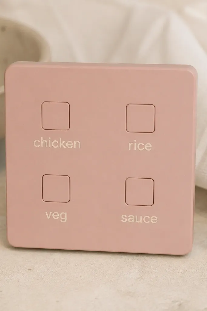
A grid checklist looks neat because it uses structure. Meal prep works with a repeatable set of items, and the grid makes it quick to scan. The blush background keeps it soft, and the cream text stays readable.
Use exactly four items per week in the widget grid. Choose a widget style with square or rounded square boxes. Keep the font size medium — if it’s too small, you’ll hate looking at it while cooking.
Pro tipUpdate the labels weekly, but keep the same order so your brain learns where things are.
Watch outSkip 6+ boxes — grids get cramped fast on home screens.
11. Pink Fresh Flowers Micro-Photo Widget
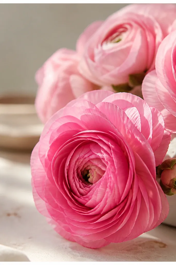
Micro-photo widgets are the easiest way to get pink aesthetic without clutter. The thin white border makes the photo feel framed, like a little print. I like using flowers because the colors are naturally layered — bright pink petals and softer pink stems.
Use a small widget size so the photo stays crisp. Choose a border color that matches your other widgets — off-white works best. Keep the photo bright and avoid heavy shadows so the background doesn’t fight the border.
Pro tipUse one photo across your whole screen for consistency — same lighting, same tone.
Watch outDon’t use a busy photo with lots of objects — it looks messy at small size.
12. Dusty Rose Water Tracker Widget
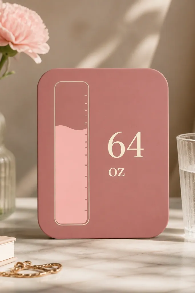
Water trackers look good in pink because the fill color creates a natural gradient. Dusty rose hides the “app UI” vibe and makes the widget blend with decor. The vertical graphic also saves space compared to long text progress bars.
Set the goal to something realistic you follow during meal times, like 6-8 cups. Choose a widget style with a clean progress graphic, not a rainbow one. Place it near a coffee or meal widget so your routine feels connected.
Pro tipUse cups instead of ounces if your brain likes quick numbers.
Watch outAvoid neon fill colors — they look like a fitness ad on a decor screen.