1. Oak Table + Linen Runner Kitchen Anchor
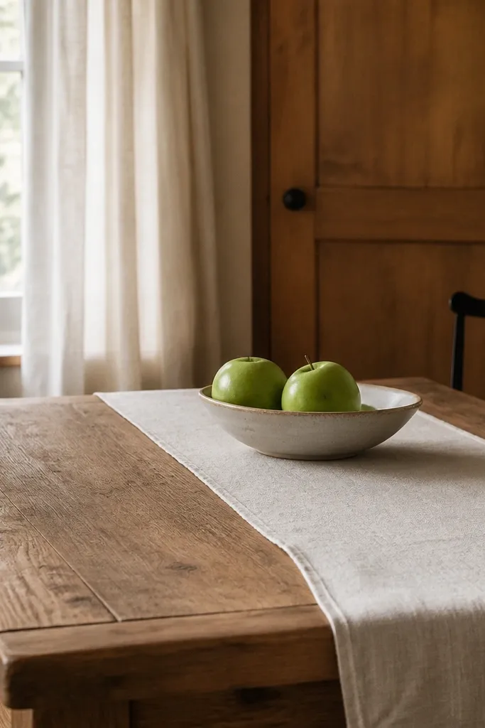
This setup works because the runner and table share the same warm neutrality, so your eye lands on one calm center. Off-white linen-look reads cozy instead of sterile, and green fruit adds the “farm” color without turning the room loud. The ceramic bowl keeps the texture handmade-looking, not glossy.
Use a table runner that covers about 1/3 of the tabletop width, centered. Choose a linen-look fabric with a visible weave, not smooth satin. For the bowl, pick matte ceramic in cream, speckled white, or light clay so it matches the curtain tone.
Hang a small framed print or shelf above the table only after you place the runner. I do it in that order so the scale matches the tabletop.
Avoid bright white runners with high-gloss ceramic — the contrast makes it look like a showroom, not a farm kitchen.
2. Window Curtains in Warm Cream Linen-Look
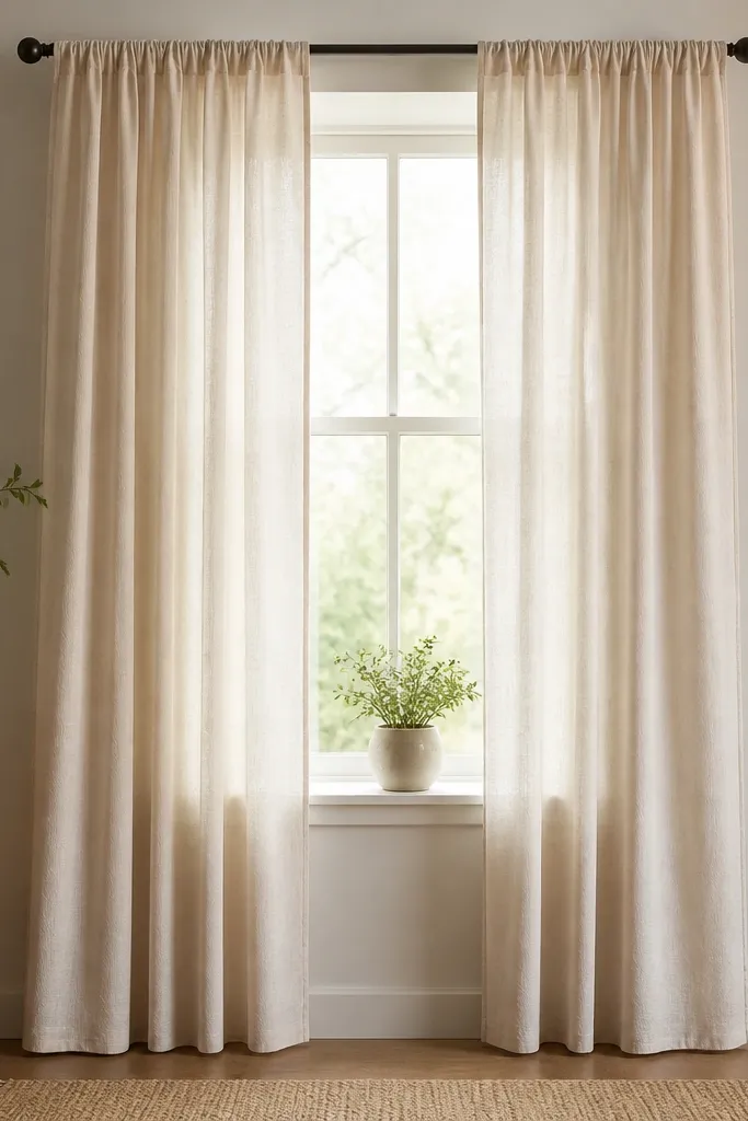
Stardew-style interiors feel lived-in because the window fabric is soft and slightly imperfect. Warm cream linen-look gives that old-cabin warmth without going gray or blue. The plant on the sill adds a natural color break that still stays within the palette.
Choose panels that are 2-3 inches wider than your window frame on each side for gentle fullness. Mount the curtain rod close to the ceiling so the window feels taller. Hem the bottom so it lands 1-2 inches above the floor for a clean line.
If your curtains look too stiff, lightly steam them and let the folds settle. One minute with a handheld steamer changes everything.
Avoid sheer curtains that are too see-through — you lose the cozy privacy that makes the room feel like a home.
3. Countertop Apothecary Jars for Pantry Color
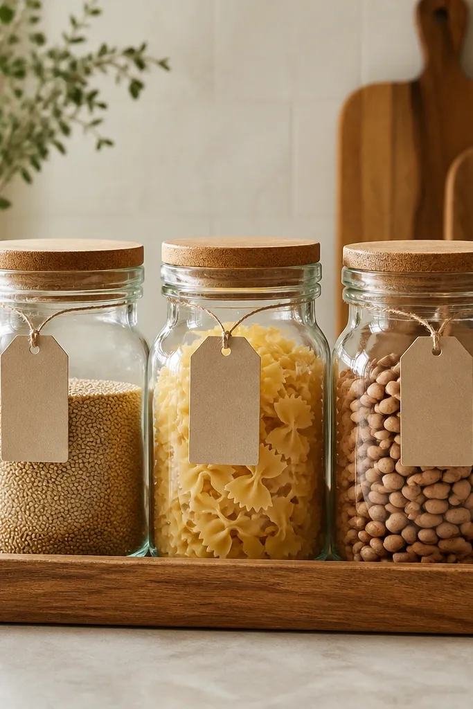
These jars make your kitchen look “planned” even if you’re using thrifted dishes. Clear glass keeps everything light, and the warm contents create natural color without buying matching decor. Paper labels make it feel like a real pantry system.
Pro tipGroup by color first, then by size. I sort my beans and pasta into tones before I place the jars so the shelf looks intentional.
Use jars with similar heights so they line up neatly. Put them on a wooden tray so spills don’t become a mess. Labels should be hand-written or printed in black ink on kraft paper; keep the font simple and small.
Watch outAvoid mixing wildly different jar styles with shiny metal lids — it reads cluttered instead of farmhouse.
4. Cast-Iron Black Stove Shelf Styling
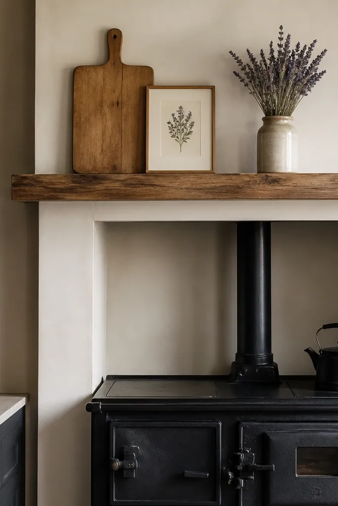
Black stove accents give you that game-inspired contrast against warm woods and creams. The key is to keep the styling vertical: one cutting board, one print, one vase. Dried lavender or herbs add soft color without needing fresh flowers every week.
Choose one shelf height where items sit close together, not spread out across the whole mantel. Use a ceramic vase in off-white or clay brown, not bright white. Keep dried stems short enough that they don’t look like a tall craft project.
Dust the shelf and wipe the vase before styling. Clean surfaces make black metal look like a deliberate choice, not neglect.
Avoid too many small figurines. On a stove shelf, three medium items beat seven tiny ones.
5. Dark Walnut Bench by the Dining Wall
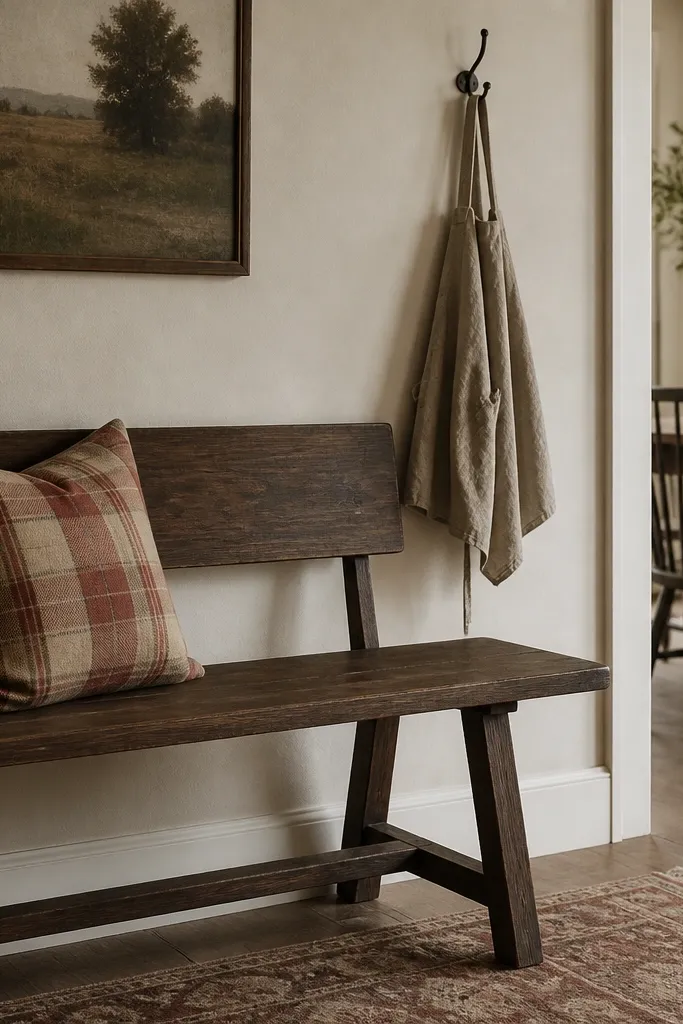
A bench grounds the dining area and makes it feel practical, like you eat here every day. Dark walnut adds depth, while the plaid pillow brings the “farm season” color story without turning the room into holiday decor. The wall hook adds the lived-in detail that Stardew interiors love.
Pro tipIf your wall is blank, hang the hook at chest height from the floor and let the hanging item touch the bench side by a few inches.
Pick a bench width that leaves 18-24 inches clearance from the table edge to walking space. Use one plaid pillow only, in muted tones like brick-red and oatmeal. Add one hanging item on a hook so the wall has a purpose.
Watch outAvoid bright primary red plaids — they look store-bought and harsh next to warm wood.
6. Shaker Cabinets with Brass-Tone Knobs
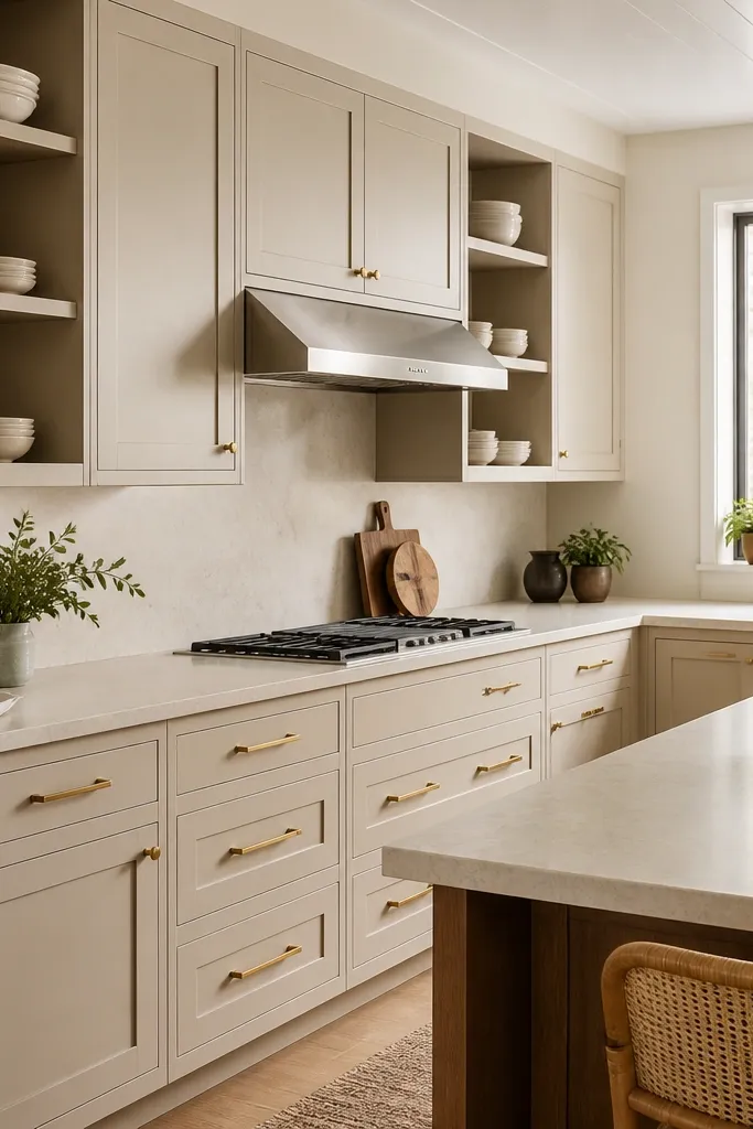
The Stardew look is plain and functional, not ornate. Shaker doors read like old farm craftsmanship, and brass-tone hardware ties the room together with warmth. Open shelving only works if the items are consistent in color and height.
If you can change hardware, choose knobs that are brushed brass or antique brass — not shiny gold. For open shelves, stick to cream, white, or warm stoneware. Arrange plates upright and bowls stacked, keeping no more than two “types” visible at once.
Measure shelf height for your tallest plate or bowl before you commit. I’ve had shelves that look fine empty but look cramped once dishes are in.
Avoid mixing chrome hardware with warm wood — it looks like a modern renovation that didn’t finish.
7. Woven Baskets for "Hidden" Storage
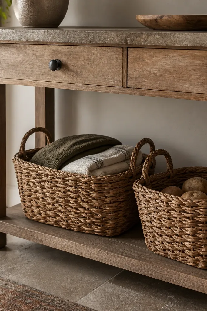
Woven baskets add texture without adding clutter. They make the room feel functional, and the natural fibers soften the hard surfaces of cabinets and countertops. Off-white towels keep the palette steady, while olive gives you one grounded accent.
Pro tipStarch your linen towels lightly before folding. Crisp edges make them look more “farm” and less like laundry.
Pick baskets with a similar color to your wood base — light oak baskets for light rooms, darker seagrass for darker rooms. Fold towels so they stack flat and show edges, not loose piles. If you display produce, keep it in one basket so it reads intentional.
Watch outAvoid plastic bins with woven covers — you’ll see the wobble and it breaks the spell.
8. Ceramic Pitcher + Fresh Herb Bundle
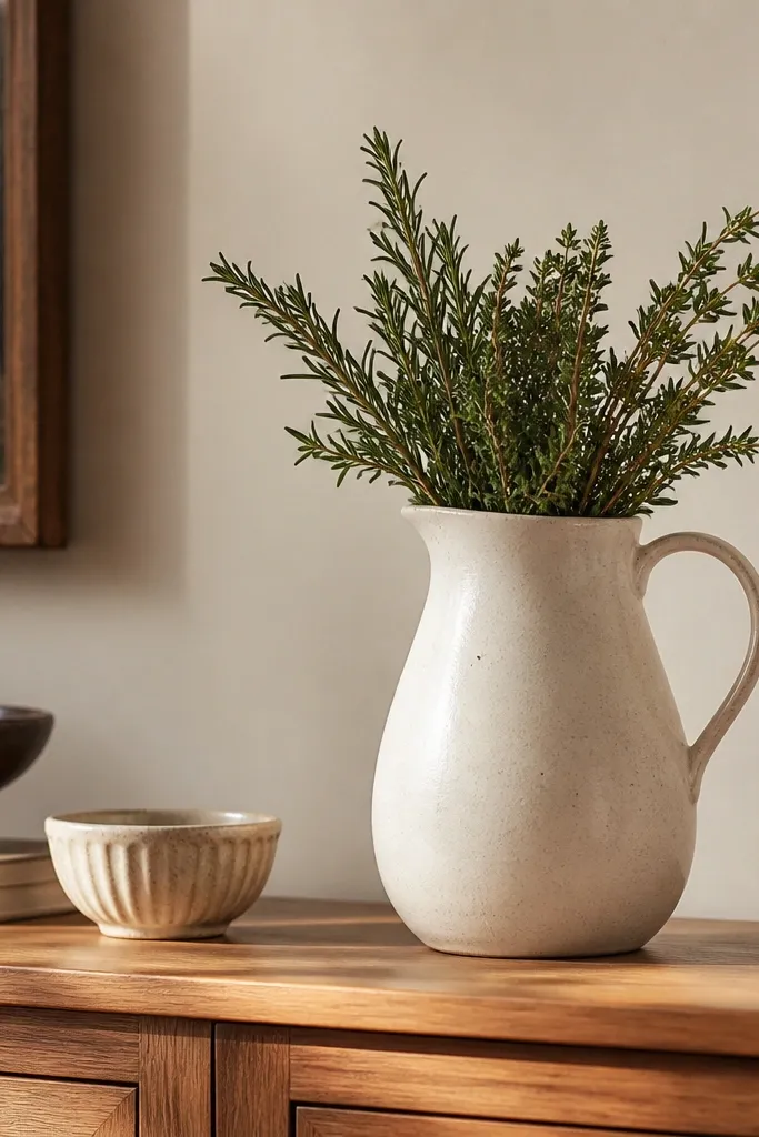
This is the fastest way to add life to a Stardew kitchen. A ceramic pitcher has weight and a slightly imperfect glaze, which reads handmade. Herbs bring green movement, but the pitcher keeps the color from spreading everywhere.
Choose a pitcher size that fits your shelf depth without crowding — about 6-10 inches tall for sideboards. Trim herb stems so they sit below the rim and don’t look messy. Replace herbs every 3-5 days for the best look.
Add a thin layer of water and a small piece of floral foam if your herbs droop. I do it for mint and parsley so the bundle stays upright.
Avoid glass vases with bright stems — they look like a modern bouquet, not farm kitchen decor.
9. Tile-Style Tabletop Runner in Muted Sage
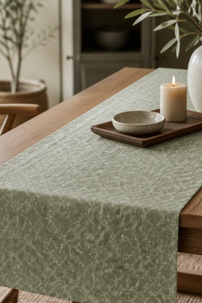
Muted sage gives you that “garden season” color without going bright. A pattern that looks tile-like feels cottage and handmade, especially when paired with plain wood and plain dinnerware. The candle and dish add warmth and a second texture layer.
Pro tipPlace the candle slightly off-center so it matches the natural imbalance of farm life — perfectly centered looks too formal.
Pick a runner width that leaves 4-6 inches of table visible on each side. If your walls are warm cream, sage will pop without clashing. Pair with white or cream plates and wood utensils so the pattern stays the star.
Watch outAvoid neon sage or thick novelty patterns — they look like party decor.
10. Corner Reading Nook with Farm Quilt Throw
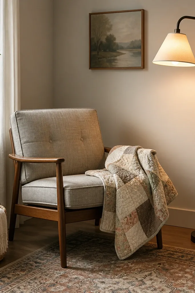
A reading nook makes the interior feel like someone actually lives there, not just stages for photos. A quilt throw adds that stitched, timeworn look that matches Stardew’s cozy interiors. The warm lamp glow turns the corner into a daily hangout spot.
Use a floor lamp with a shade that is fabric or matte, not reflective. Drape the quilt so it covers the chair back and falls over the side by about 8-12 inches. Keep the basket close enough to hold a blanket or book.
Put the lamp on a dimmer if you can. Even cheap dimmers make the room feel softer at night.
Avoid matching throw sets. One quilt plus one plain pillow looks more authentic than a coordinated set.
11. Open Wall Shelf with Consistent Plate Colors
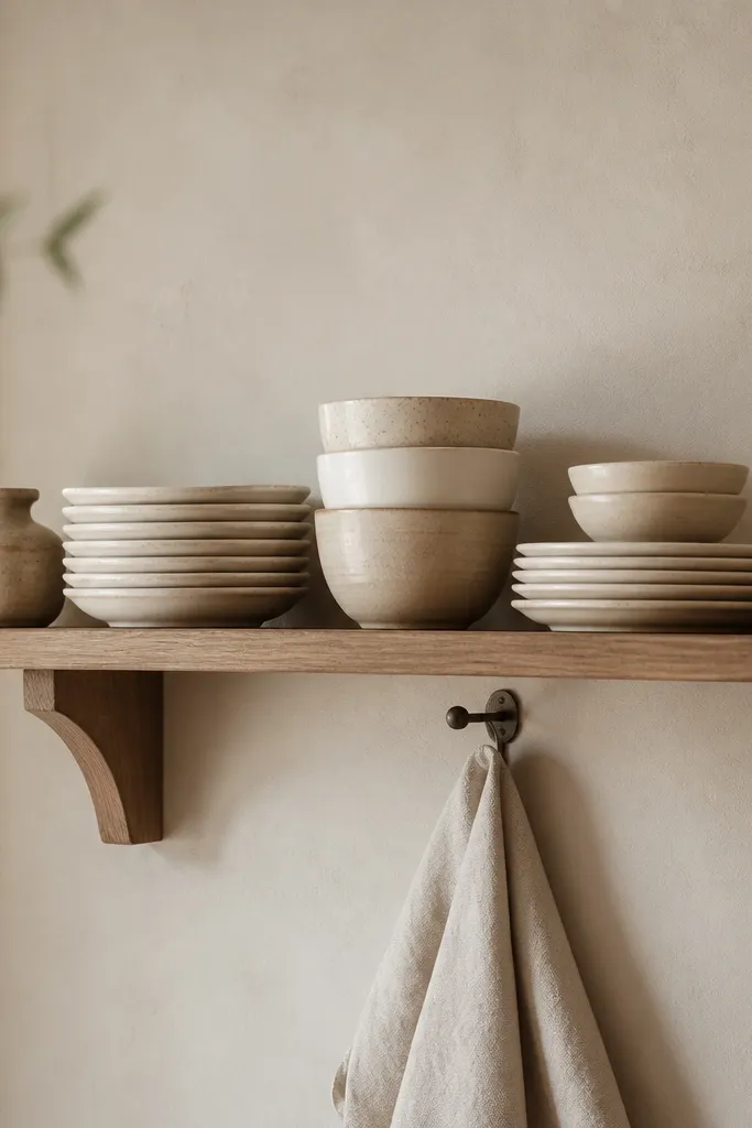
Open shelves are where your Stardew vibe becomes obvious. Consistent plate colors make the shelf look like a system, not a dump. The hanging towel adds that practical farm detail that reads “kitchen life,” not “decor only.”
Use a shelf that’s deep enough for plates without overhang — about 7-9 inches deep. Stack plates upright and interleave bowls at the bottom. Keep jar shapes similar so the shelf looks balanced.
Wipe plate rims with a dry microfiber cloth before styling. Finger smudges show up fast on light ceramics.
Avoid mixing too many colors on one shelf. If you see more than three main tones, it turns into visual noise.