1. Blush mug + frosted glass clock corner
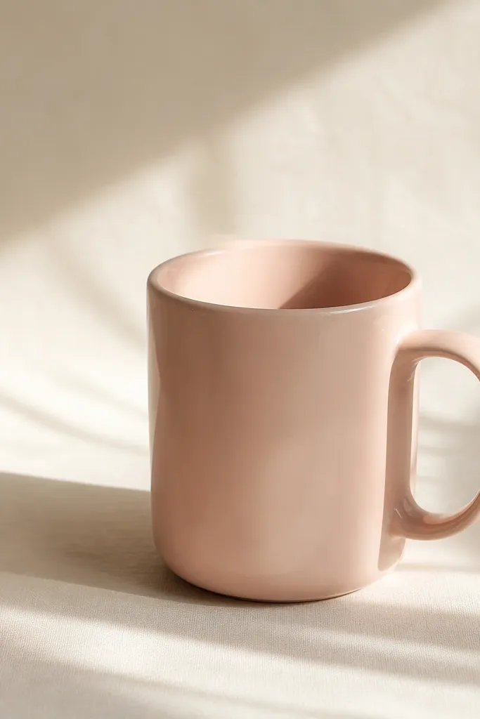
This look works because blush reads calm and “clean” next to warm white. The frosted glass adds a milky texture that makes the photo feel intentional, not flat. I like it for a daily clock widget because the pale tones don’t fight with text. It also hides messy desk edges — the jar blocks them.
Use a 6-8 oz blush mug (matte glaze if possible) and a small frosted jar or cup. Put both on a cream placemat or plain printer paper for a smooth background. Crop the photo so only the mug handle and the top half of the jar show — leave space in one corner for your widget.
Pro tipShoot with window light from the left and turn your phone 10-15 degrees to the side so the mug handle catches a soft highlight.
Watch outAvoid bright white backgrounds with hot pink mugs — it makes the pink look neon and cheap.
2. Dusty rose tea tray with one tiny flower
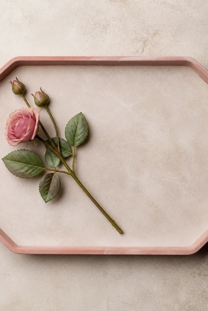
Dusty rose + one flower keeps the scene tidy. The diagonal stem gives movement, so your widget doesn’t look like a sticker slapped on top. Tray texture (lacquer, painted wood, or faux leather) makes the background feel styled even when you use a simple widget layout. This setup is great for a calendar widget because it reads like a real “morning routine” photo.
Pick a tray in dusty rose, or use a neutral tray and add a rose-colored placemat under it. Keep the flower small — a stem with 1-3 blooms looks best. Crop so the stem runs behind the widget, not through the text.
Put a piece of translucent pink tissue paper under the stem to create a faint pink glow in the background.
Don’t use a full bouquet — multiple flowers clutter the background and make the widget text harder to read.
3. Pink checkered placemat and snack box
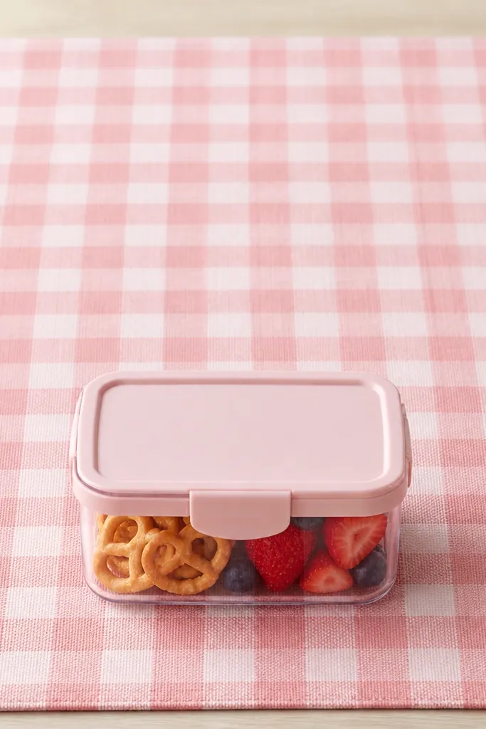
Patterns make widgets look designed, but only if the pattern is consistent. The checkered placemat creates a grid that aligns with widget text, so it stays readable. A clear snack box adds a little transparency, which keeps the pink from getting heavy. This is one of my go-to looks for a “to-do” widget because the grid makes the list feel organized.
Use a placemat with small-to-medium checks (not tiny gingham). Choose a snack box lid that matches your pink anchor — blush or dusty rose. Place the box slightly off-center so the widget doesn’t cover the lid.
Pro tipTurn on “grid” in your camera app and center the widget over a single check column for cleaner alignment.
Watch outAvoid mixing two patterns (checks plus stripes) — that’s where it starts looking like bargain packaging.
4. Pink marble coaster under a phone stand
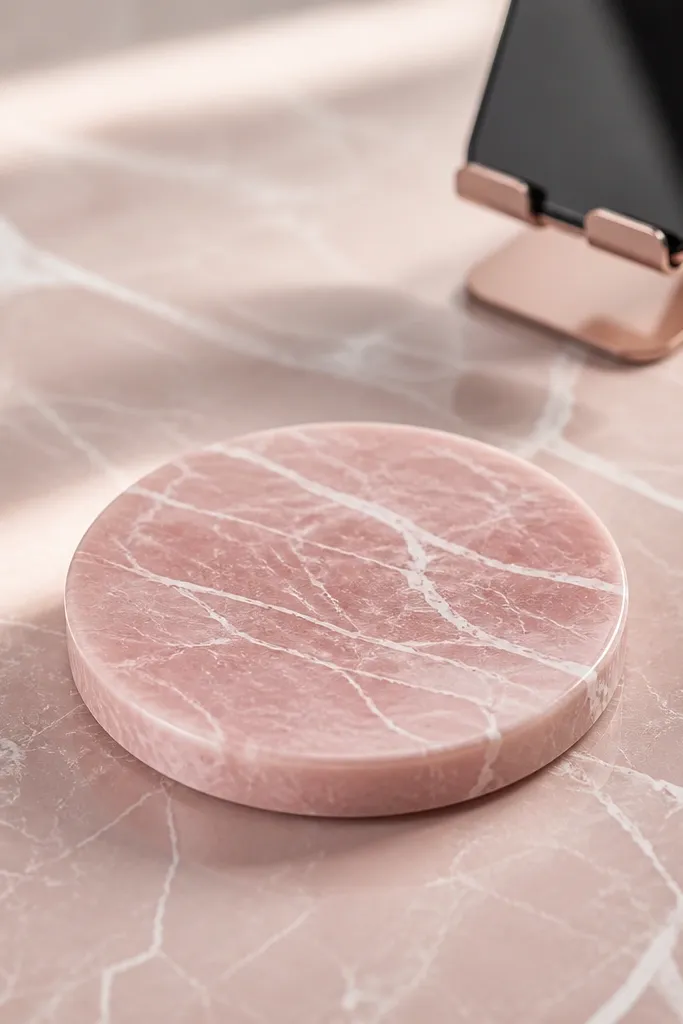
Marble gives you texture without clutter. Pink veining looks expensive even when the coaster is cheap, because the pattern is doing the work. The phone stand adds scale, so the widget feels like it lives in a real kitchen setup. I like this for widgets that show a time + weather because the marble background makes icons pop.
Get a marble-look coaster (vinyl or resin) in blush pink or mauve. Place it on a neutral surface like light wood or cream laminate. Blur the stand slightly by moving it closer to the lens and tapping to focus on the coaster.
Pro tipUse a soft matte filter effect by lowering contrast in your photo editor by 10-15 points so the pink stays gentle.
Watch outAvoid glossy, high-shine coasters — they create glare that wrecks widget text.
5. Hot pink spoon and white sugar jar
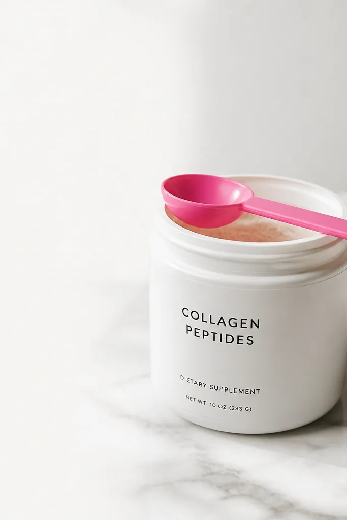
This is a high-contrast pink idea that reads “fun kitchen” without looking childish. The hot pink spoon gives a bold accent, while the white jar keeps the background calm. You get a clean negative space area for the widget, which makes the text look crisp. It’s great when you want a bolder aesthetic but still want readability.
Use a plain white jar or small ceramic container. Add a hot pink spoon (plastic or metal) and place it diagonally. Crop so the jar fills one side and the widget sits on the clean white portion.
Wipe the jar surface with a dry microfiber cloth right before shooting to remove fingerprints and keep the highlight smooth.
Avoid cluttered labels and busy jars — the widget text competes with tiny print.
6. Blush linen napkin fold + ceramic plate edge
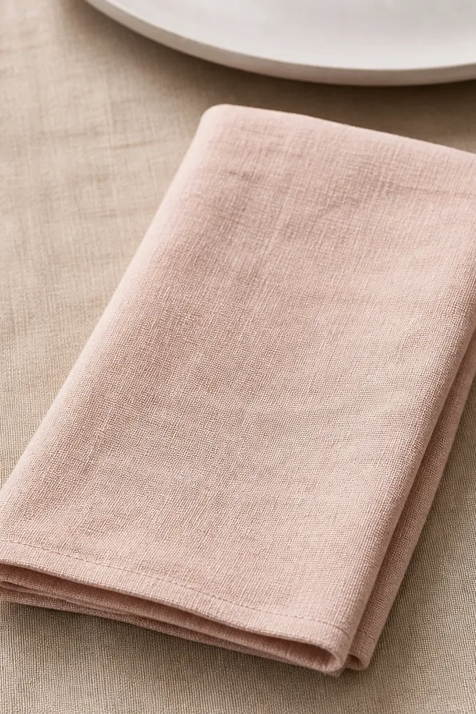
Fabric texture makes everything look intentional. Linen in blush gives you a soft, matte surface that hides harsh lighting and makes widgets feel cozy. The plate edge adds a hint of dining without forcing you to photograph a whole table. This works really well for a “notes” widget because the texture is subtle behind text.
Use a blush linen napkin or even a linen-look cotton. Fold it with a single crease — don’t make it too origami. Place a white plate partially in frame so you get curved highlights but no distractions.
Pro tipShoot from slightly above (about 30-45 degrees) so the napkin fold lines lead toward the widget area.
Watch outAvoid wrinkled fabric that bunches up — it creates dark lumps under text.
7. Dusty rose stationery stack behind widgets
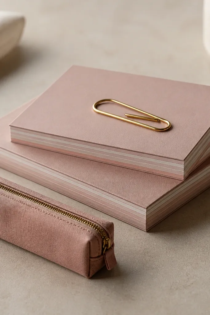
Stationery looks good on iPhone widgets because paper edges create natural layers. Dusty rose keeps it soft and “kitchen organizer” instead of party decor. The pen case adds a clean vertical shape that makes the widget layout feel structured. I used this for a weekly planner widget and it looked like my phone had a real desk behind it.
Use two notepads with slightly different pink shades. Keep the top pad aligned so the edges form a neat stack. Place the widget over the smooth top surface and leave the bottom edge for paper texture.
Lightly tape the stack to your table before shooting so nothing shifts and the layers stay straight.
Avoid stacks with too many colors — three pink shades max looks styled.
8. Pink gradient wallpaper made from roses water
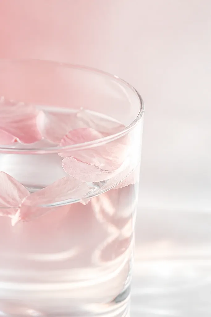
This one is sneaky: you’re not decorating with objects, you’re decorating with color gradients. The petals stain the water just enough to make a smooth pink wash that looks custom. Text stays readable because the background is light near the top. I use it when I want the widget to feel airy and clean.
Use a clear glass, add a few pink rose petals (real or faux that you soak), and let the water sit 10-20 minutes. Take your photo in natural shade so the gradient stays soft. Crop so the brightest area sits behind your clock or icons.
Pro tipEdit by lifting shadows slightly (+10) and lowering saturation by 5 so the pink stays believable.
Watch outAvoid dark, cloudy water — it turns into muddy gray behind text.
9. Pink ceramic tiles + measuring spoon lines
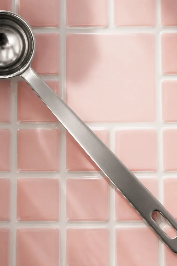
Tiles give you a repeating pattern that looks intentional, like a mini kitchen backsplash. The measuring spoon adds thin metallic lines that look crisp under widget icons. This setup is perfect when you want a slightly “design studio” vibe without buying expensive decor. It also helps you line up text because the tile grid is stable.
Use pink tile adhesive sheets or a small tile sample board if you already have one. Lay it flat on a table for easy photographing. Place one measuring spoon diagonally and keep it in one layer of focus.
Pro tipTake the photo straight-on (phone parallel to tiles) so the grid doesn’t skew under the widget.
Watch outAvoid reflective tile sheets with strong glare — they make icons look washed out.
10. Blush candle jar + white dish towel
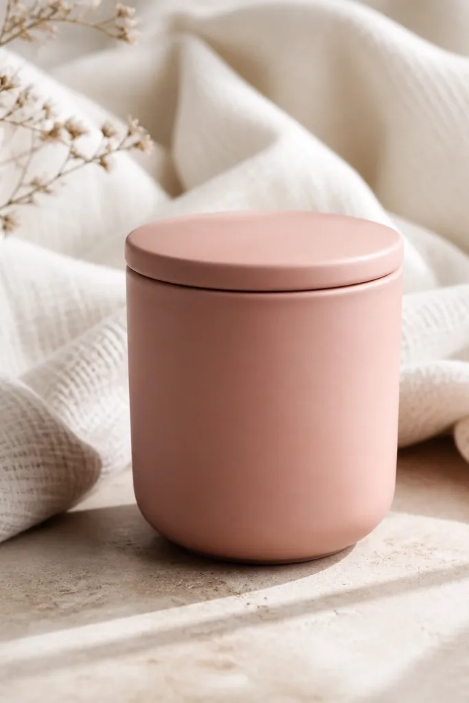
This combo gives you a cozy dining-room vibe without clutter. The candle jar adds a round shape and gentle highlight. The dish towel is matte and forgiving, so text stays readable. I like this for a widget that shows a quote or a short list because the towel texture gives warmth.
Choose a blush candle jar with a matte or lightly frosted finish. Drape a white dish towel behind it so the towel fills most of the frame. Leave one open area for the widget — don’t cover the candle lid with the text.
Use a tiny bit of fabric softener spray on the towel so it drapes smoother for photos.
Avoid busy printed towels — the pattern competes with widget typography.
11. Dusty rose cutting board edge + cookbook spine
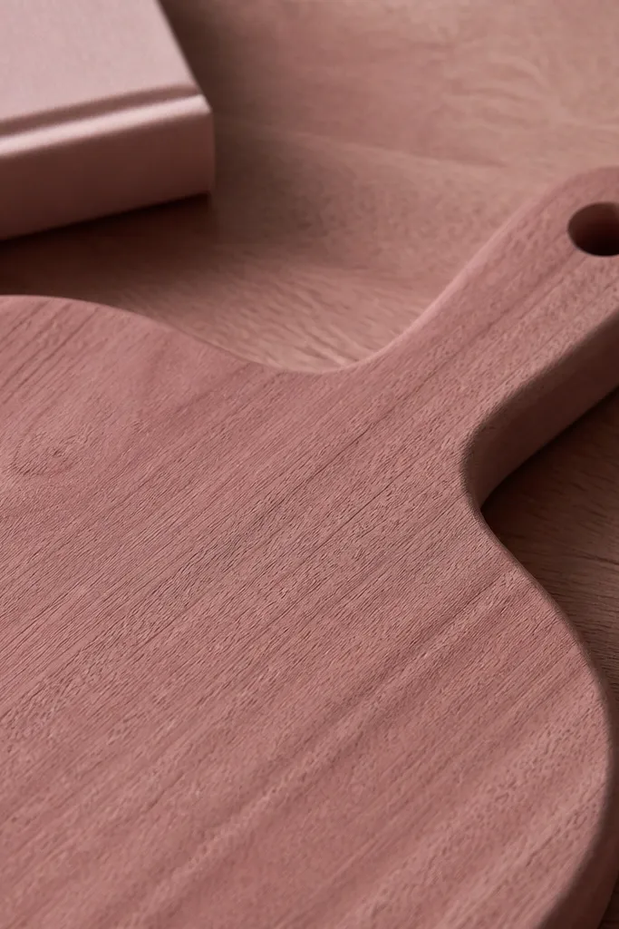
Kitchen props make widgets feel real, and cutting boards look great because they have texture and warm color. Dusty rose is a better choice than bright pink here because wood grain already adds warmth. The cookbook spine gives a vertical element that makes your widget placement feel balanced. It’s a good match for a food calendar or reminders widget.
Pick a cutting board with a painted top but natural edges. Place it at a slight angle so the grain catches light. Crop tightly so you focus on the board surface, not the whole book cover.
Shoot at f/1.8 style blur by using Portrait mode so the board stays sharp and the background softens.
Avoid glossy plastic boards — they look cheap in pink.
12. Pink gloss lip balm on cream paper
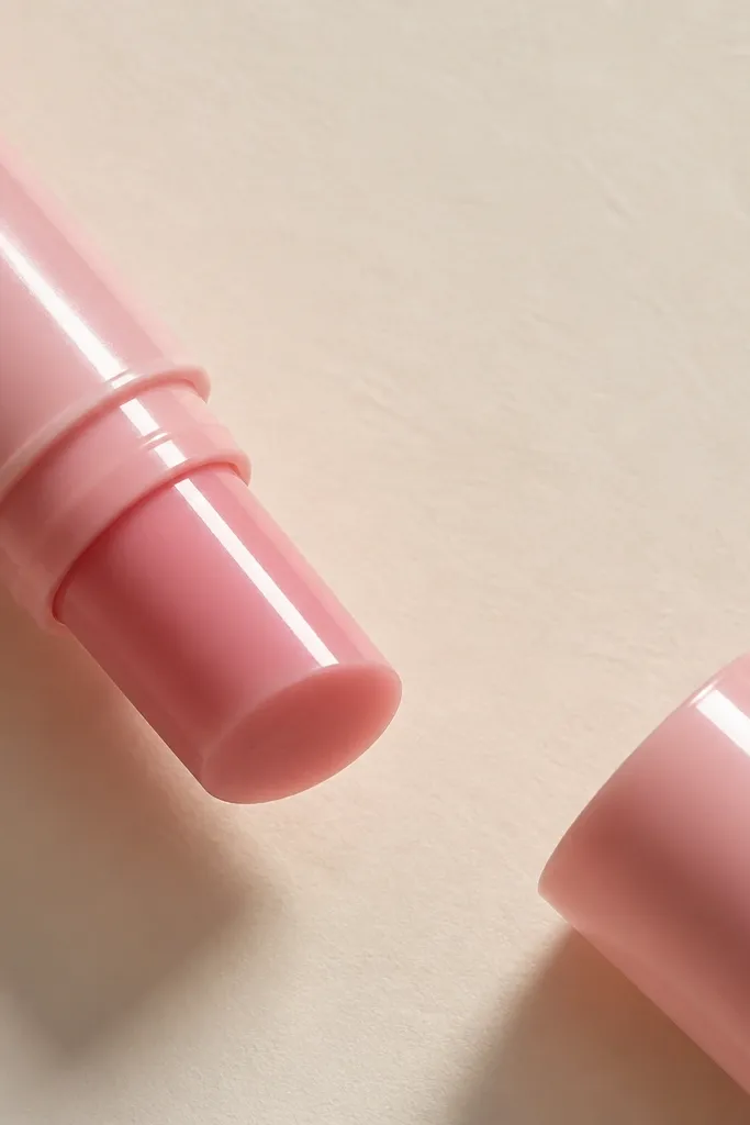
This is a beauty prop trick that works in kitchens too. The glossy tube gives you a controlled shine, so the photo looks “finished” even with minimal objects. Cream paper keeps the background light and uncluttered. If you want your widget icons to pop, glossy accents do it better than matte-only scenes.
Use a pink lip balm tube or any small glossy pink tube. Place it on cream cardstock or a brown paper bag for texture. Keep the widget over the blank paper, not over the tube highlight.
Angle your light so the glare lands near the edge of the widget area, not behind the text.
Avoid heavy glittery tubes — the tiny sparkles turn into noise behind widgets.