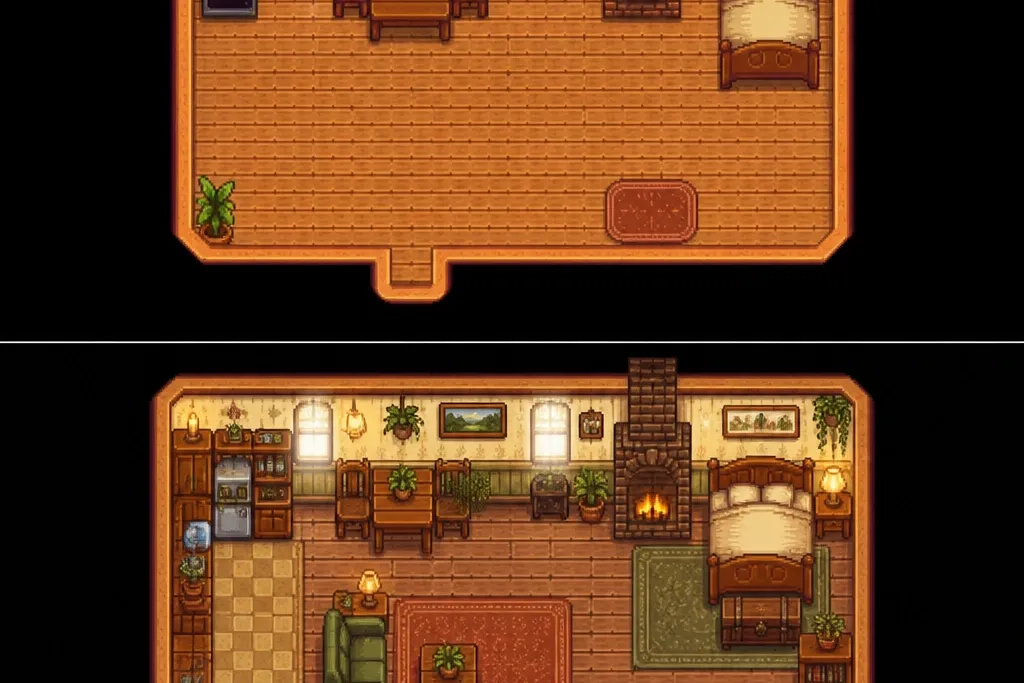
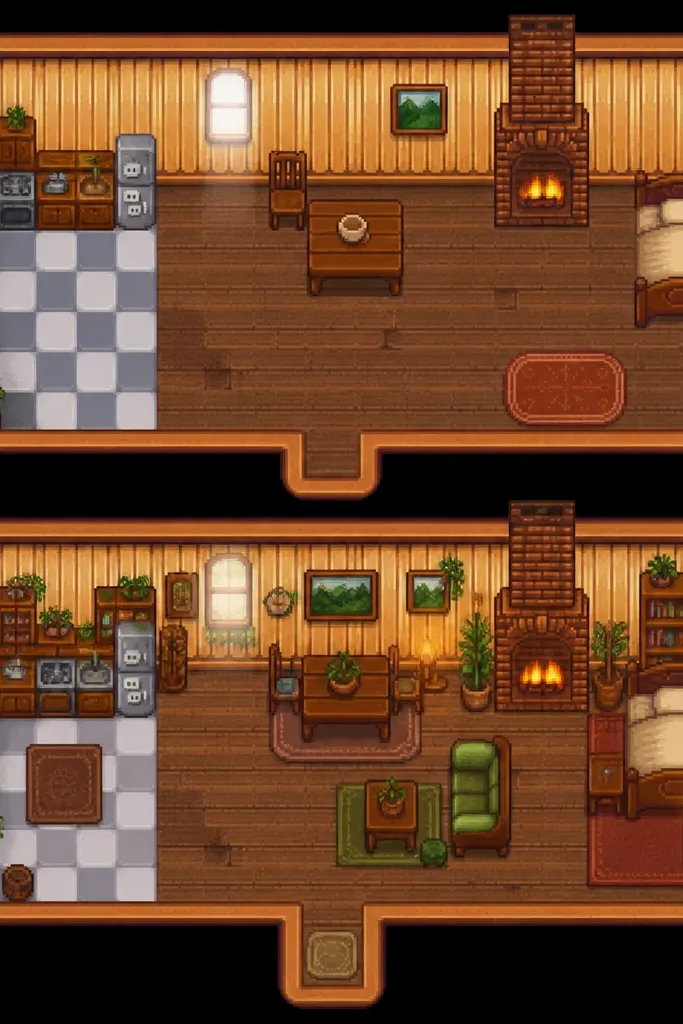
1. Doorway-to-table runner that makes the whole room read warmer
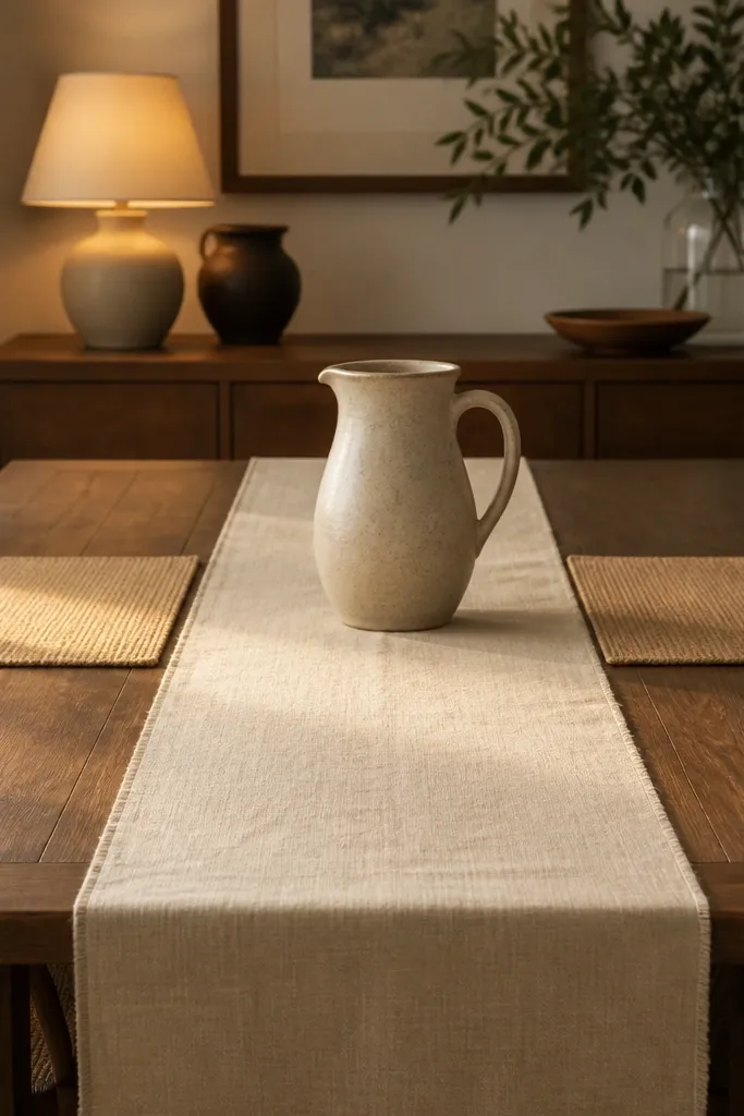
A long runner is the fastest way to create a Stardew-like staging line. I choose cream or oatmeal linen because it catches light softly instead of reflecting like satin. The runner also gives your table a clear “path” from the doorway, which makes the interior feel designed even if chairs and walls are plain.
Pro tipFold the runner ends once so they drape straight and don’t bunch. Steam it and then lay it out for 10 minutes so the creases relax.
Use a runner that’s about 1/3 the table width and long enough to stop 4-6 inches before the far edge. If your table is 48 inches wide, aim for a 16-inch runner. Pair it with placemats in tan, oatmeal, or natural jute texture so the whole dining area stays in the same warm family.
Watch outSkip polyester-looking runners with a shiny surface — they read modern and make the room feel like a staged photo.
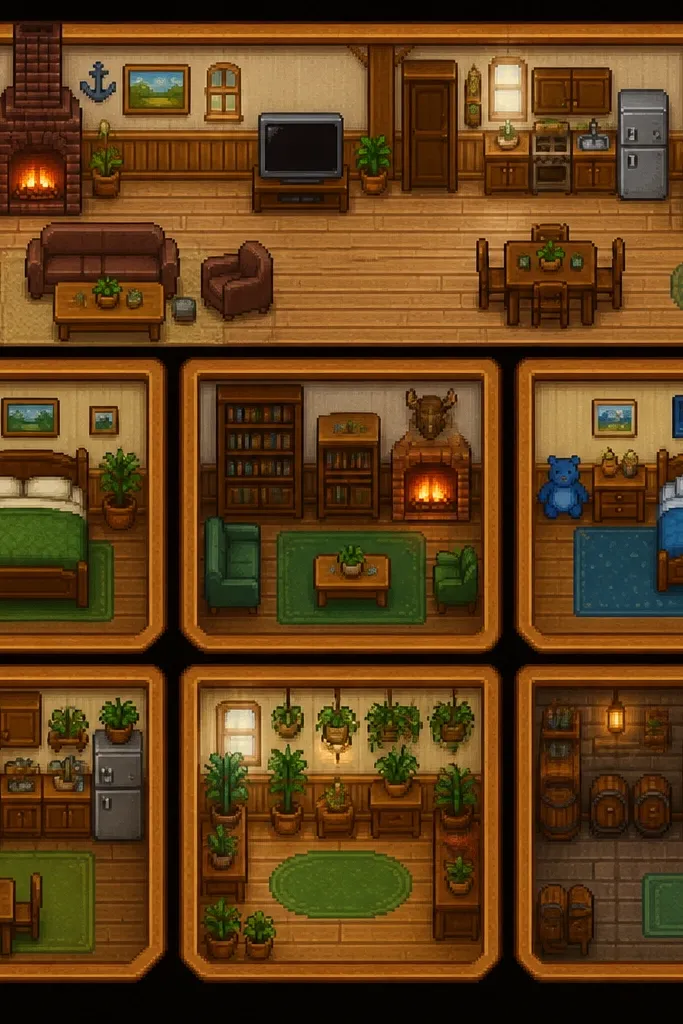
2. 2700K lamp swap for that honey-glow Stardew lighting
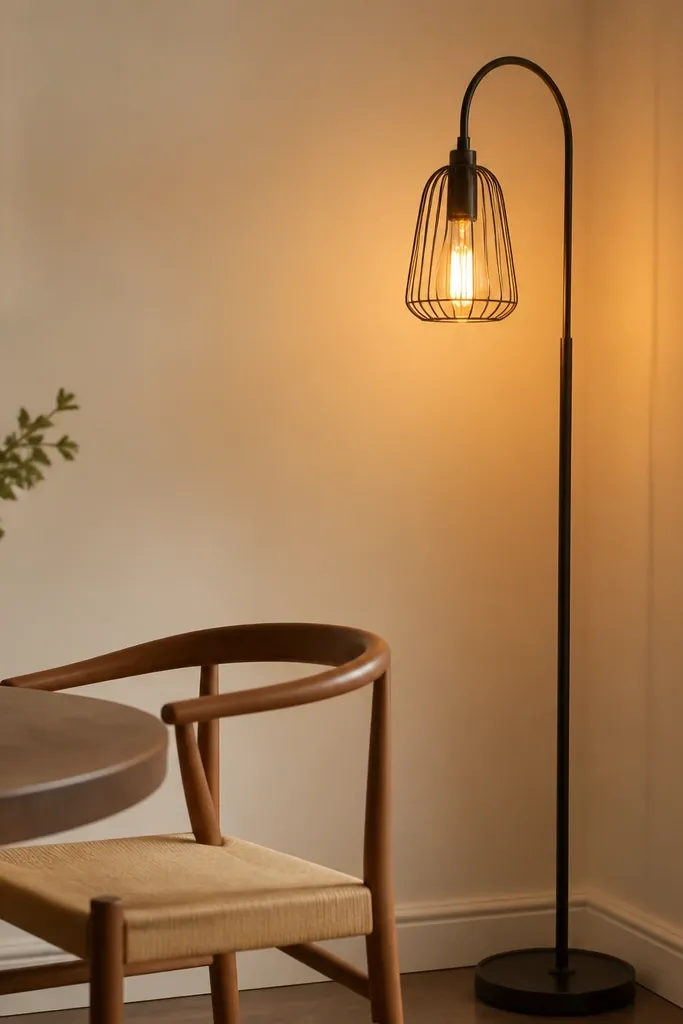
The Stardew vibe is mostly light temperature and shadow softness. I switch every bulb I can to 2700K and put the lamp so it throws light sideways across the table and wall. That angle makes wood look warmer and makes painted walls look creamy instead of flat white.
Choose a bulb labeled 2700K, not “soft white” without a temperature. If you have a lamp with a fabric shade, keep it — fabric shades spread light and hide harsh hotspots. Place the lamp 12-18 inches from the wall for a gentle shadow gradient.
Turn off the overhead light for photos and everyday use. Your room will look more “cottage” instantly.
Avoid 4000K daylight bulbs — they turn everything into a grayish rental look.
3. Matte wood + painted wood mix using one shared undertone
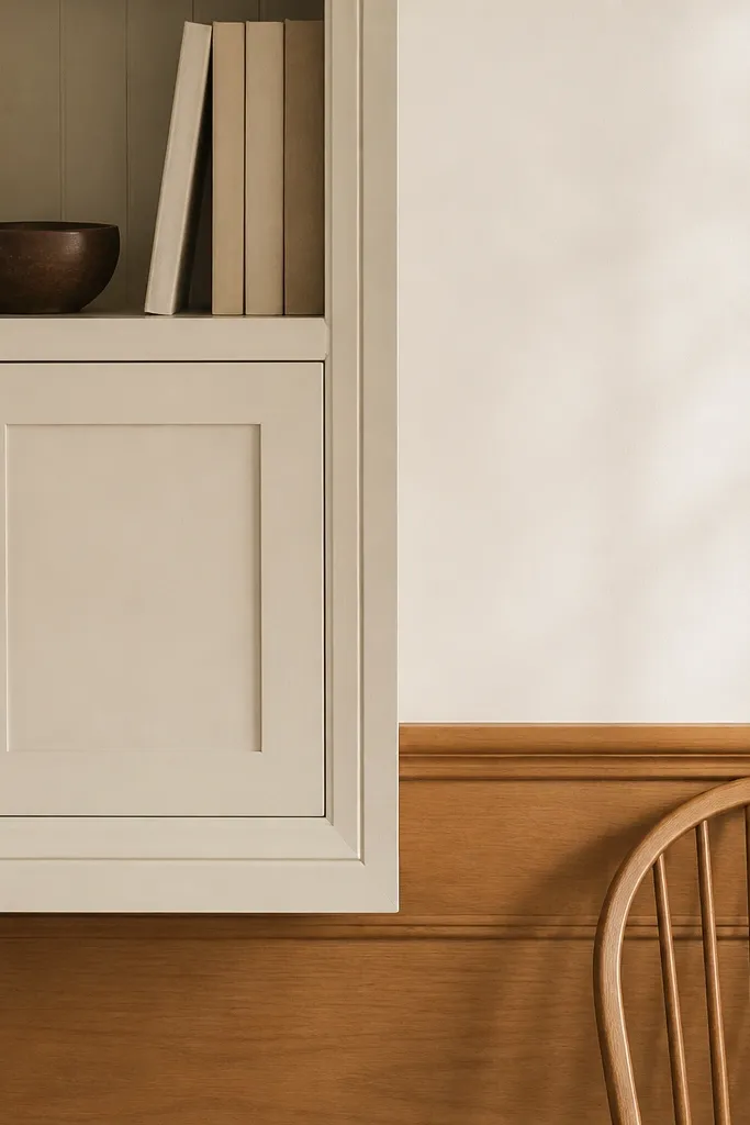
Stardew interiors feel like the house is made from real materials, not matching finishes. I mix matte painted wood with matte honey wood, but I keep the undertone consistent: warm cream paint and golden oak tones. When the undertone matches, mismatched pieces look like they belong together.
Pro tipWipe one wood surface with a tiny amount of furniture wax (test first). It brings back a warm, low-sheen look that reads like “lived with.”
If your painted furniture is too cool (blue-gray), warm it by adding a small cream lamp shade and cream textiles. For wood, choose honey, oak, or walnut with a matte oil finish look. Don’t use high-gloss white — it throws bright reflections.
Watch outSkip glossy lacquer cabinets and shiny laminate — they look like game UI, not a cozy house.
4. Sage tea towel wall moment (functional decor)
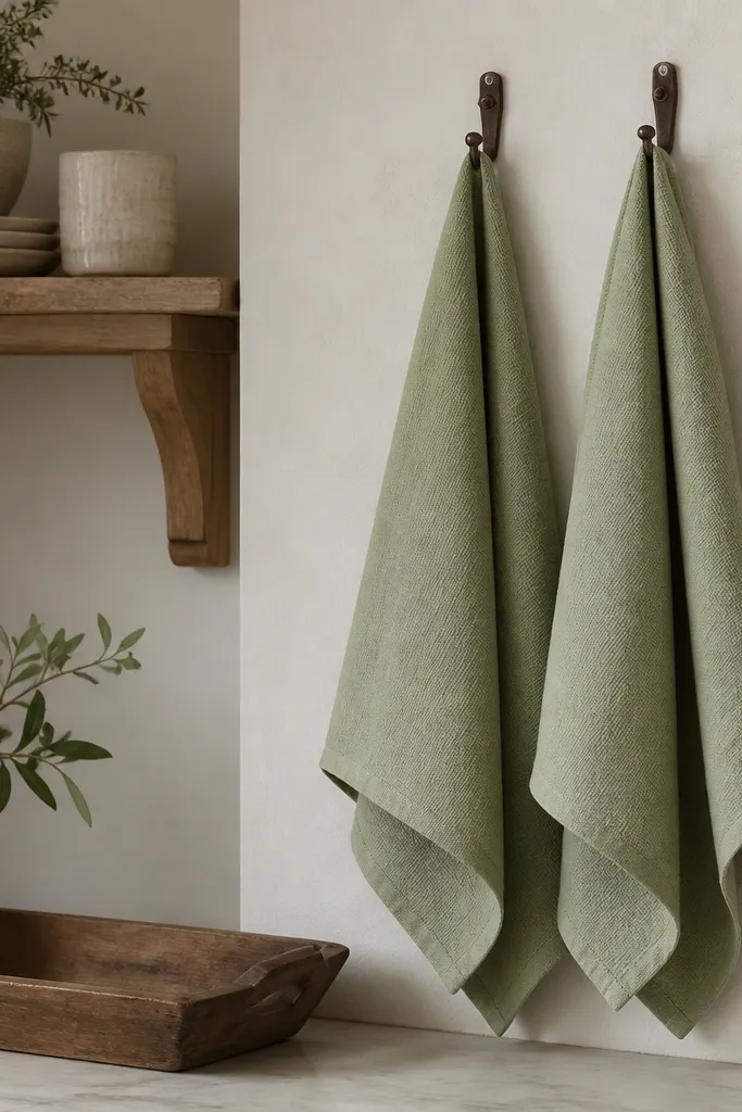
Tea towels are the easiest way to add Stardew color without committing to a whole paint job. Sage green looks like garden herbs, and because towels are woven cotton, they add texture that your walls can’t. It also stays useful, which is exactly how cottage kitchens feel.
Pro tipUse matching towel rings/hooks so the hardware blends into the wall. Brass looks warm; black looks too modern unless the rest of the room is dark.
Pick towels in sage, dusty olive, or muted green with a visible weave. Hang them near the sink or on a small towel rod at about chest height (around 45-50 inches). If you have open shelving, tuck a folded towel at the front like a little “stack.”
Watch outDon’t hang towels that are bright neon green — they read like a novelty kitchen.
5. Woven baskets under a shelf for the 'gathered' look
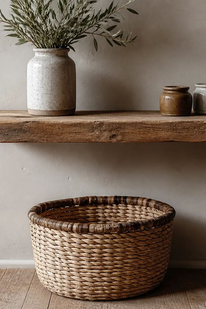
Baskets make a room feel lived-in because they add volume and texture in a place people ignore. I use natural woven baskets under shelves or on the floor beside a chair to hold chargers, napkins, or extra table linens. The woven pattern creates depth even in small rooms.
Pro tipLine baskets with a thin cloth liner in cream so items don’t look messy through the weave.
Choose baskets in natural tan or straw color with a matte finish. Keep basket height low enough that the shelf items stay visible. For a Stardew kitchen, use baskets around 10-14 inches tall and 12-16 inches wide so they don’t swallow the corner.
Watch outAvoid plastic storage bins — they show through and kill the cottage texture.
6. Ceramic pitcher centerpieces instead of tall vases
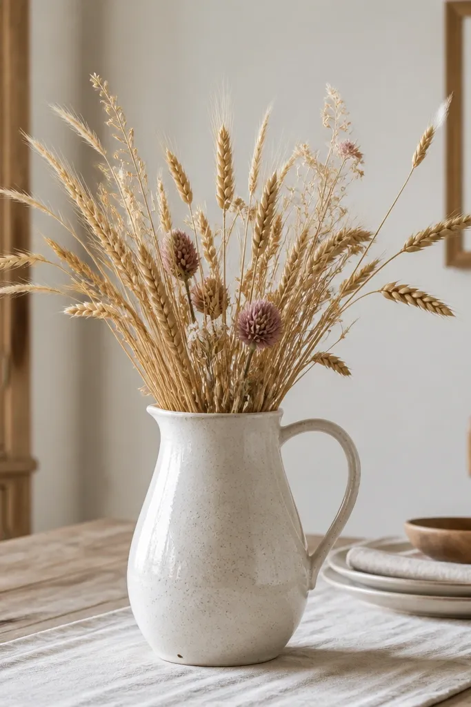
Tall vases can overpower a small Stardew-style dining area. A ceramic pitcher reads more rustic and “kitchen used,” especially when it’s off-white or speckled. Dried wheat, eucalyptus, or small dried stems give you that farm-garden feeling without needing fresh flowers.
Look for a pitcher with a handle and a wide mouth. Fill it with 1 bundle of dried stems and trim them so they sit 8-10 inches above the table. Keep the stems mostly neutral — cream, pale green, and light brown.
Dust the pitcher and stems with a dry cloth before styling. It keeps it from looking dusty in photos.
Skip glossy bright-colored vases — they look like modern store decor.
7. Chalky wall paint finish using warm white, not bright white
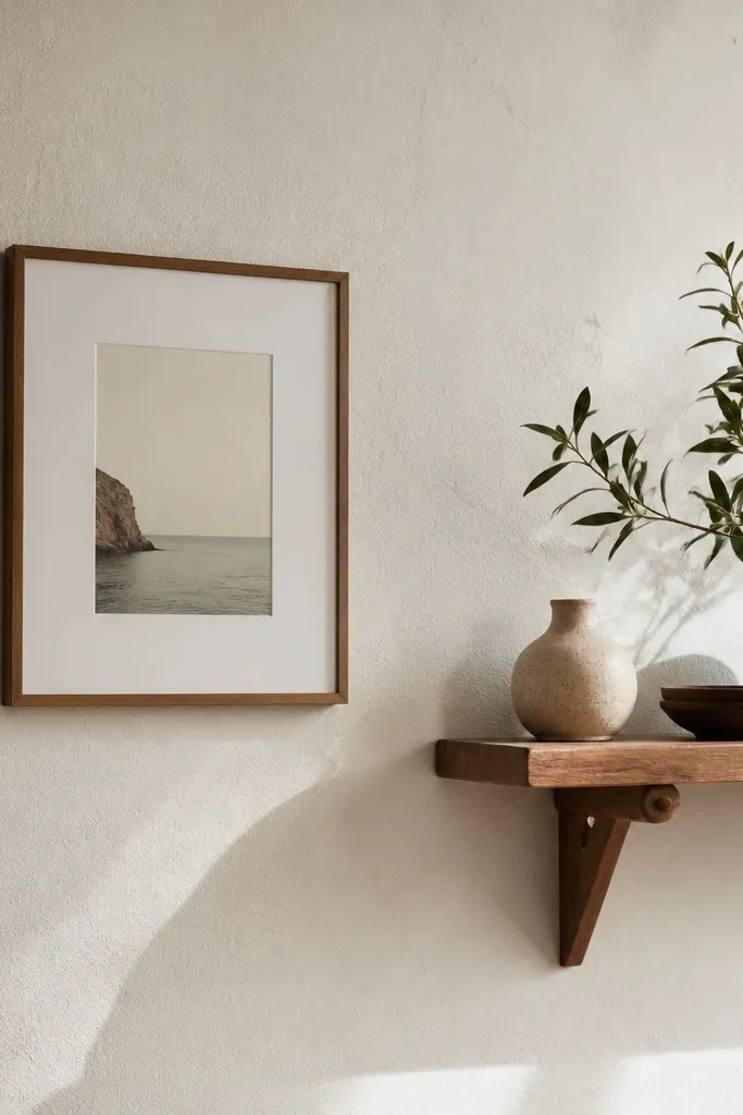
Stardew interiors have walls that look soft and absorb light. I use warm white with a matte or eggshell finish, then I add texture with frames, shelves, and fabric. If the wall is too bright white, the room looks like a clean office.
Choose warm white with a yellow undertone. Matte hides imperfections, but eggshell is easier to live with near kitchens. After painting, leave the room unstyled for a day so the paint cures and looks even under your lamp light.
Hang your first shelf after the paint cures for 48 hours. You’ll get cleaner edges and fewer spots.
Avoid satin paint on walls — it reflects light and makes everything look sharper and less cottage.
8. Gallery ledge shelf with mismatched frames in one color set
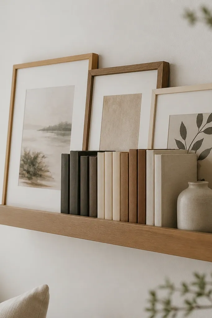
Frames are where Stardew house interiors get that storybook feel. The trick is not matching everything; it’s matching the palette. I use wood-tone frames and cream mats, then prints with muted greens, soft reds, and old-paper backgrounds so nothing screams “new.”
Use a narrow shelf, about 4-6 inches deep, and keep frames within a 24-30 inch span. If frames are different sizes, align the bottom edges. Use paper prints or botanical-style images with muted saturation.
Put one frame slightly lower than the others. It looks hand-placed instead of grid-perfect.
Skip black metal frames unless your room already has dark hardware and you balance it with warm wood.
9. Dining chairs with seat cushions in linen or cotton blend
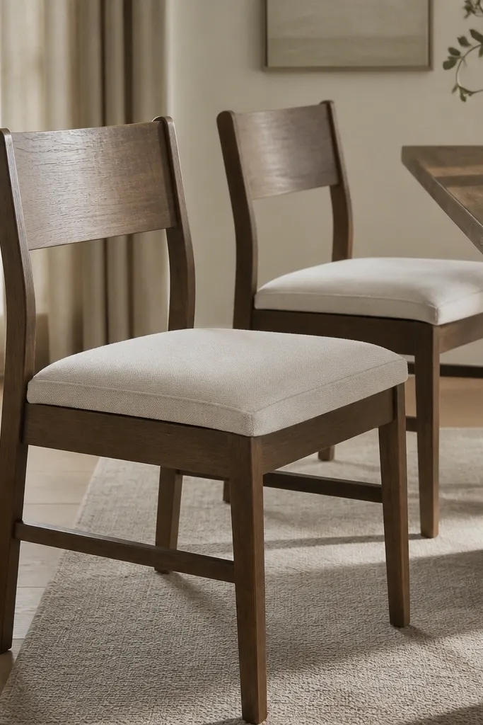
Cushions make the room feel used by real people, not staged. I pick linen or a cotton-linen blend in oatmeal, sand, or pale blush. The neutral fabric lets the room’s color come from smaller items like towels and flowers.
Measure your seat width and buy cushions that cover the entire seat with 1 inch overhang max. If you sew, use outdoor fabric only if your room gets sunlight all day; otherwise cotton-linen looks softer. Keep cushion height around 1.5-2 inches for that cottage sit.
Add chair cushions plus one throw draped over a backrest. It creates a layered look without adding extra clutter.
Avoid thick faux leather cushions — they look too sleek for Stardew.
10. A small rug with worn edges in warm cream and muted red
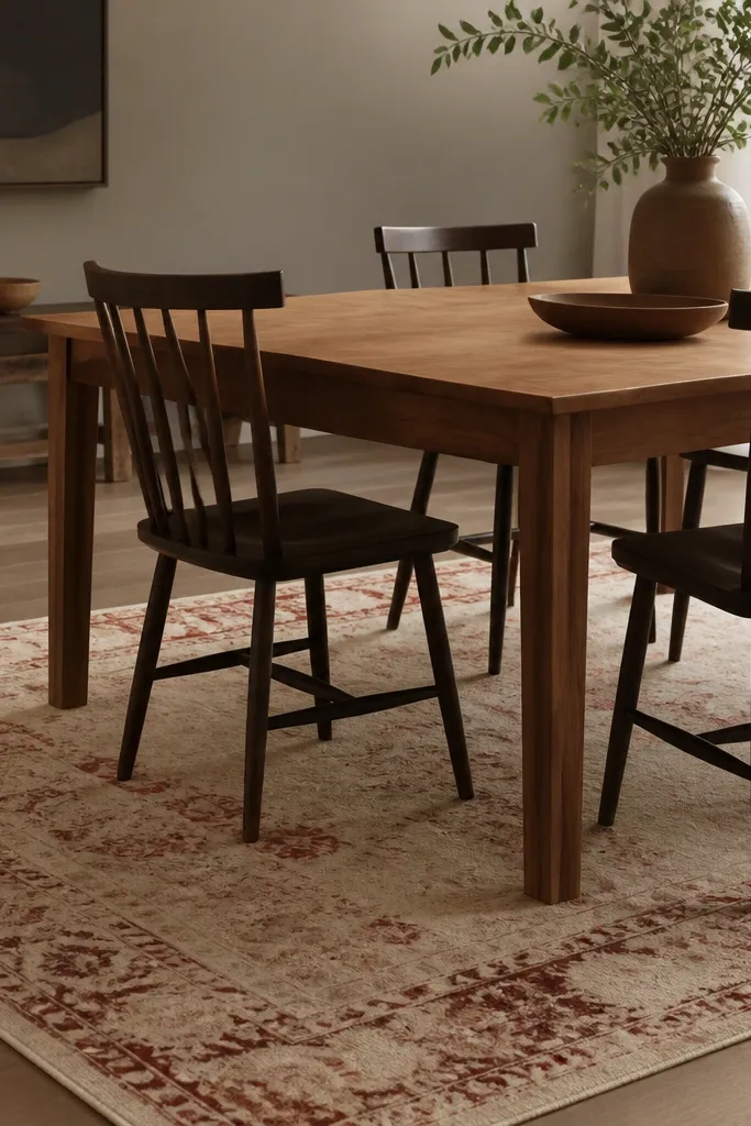
A rug anchors the dining zone and adds that “this has been here a while” feeling. I choose rugs that look slightly worn rather than perfectly crisp. Warm cream with muted red-brown patterns looks like farmhouse textiles and ties into wood and painted walls.
Pick a rug sized so it extends 8-12 inches beyond chair legs on the sides. If your table is 36 inches wide, aim for a 5x7 or 4x6 depending on the room. Keep the pattern low-contrast so it doesn’t fight your wall art.
Use a rug pad even for a thin rug. It stops sliding and keeps the edges flat in photos.
Avoid high-contrast modern geometric rugs — they read like contemporary furniture stores.
11. Fireplace mantel styling with books, a candle, and a wooden tray
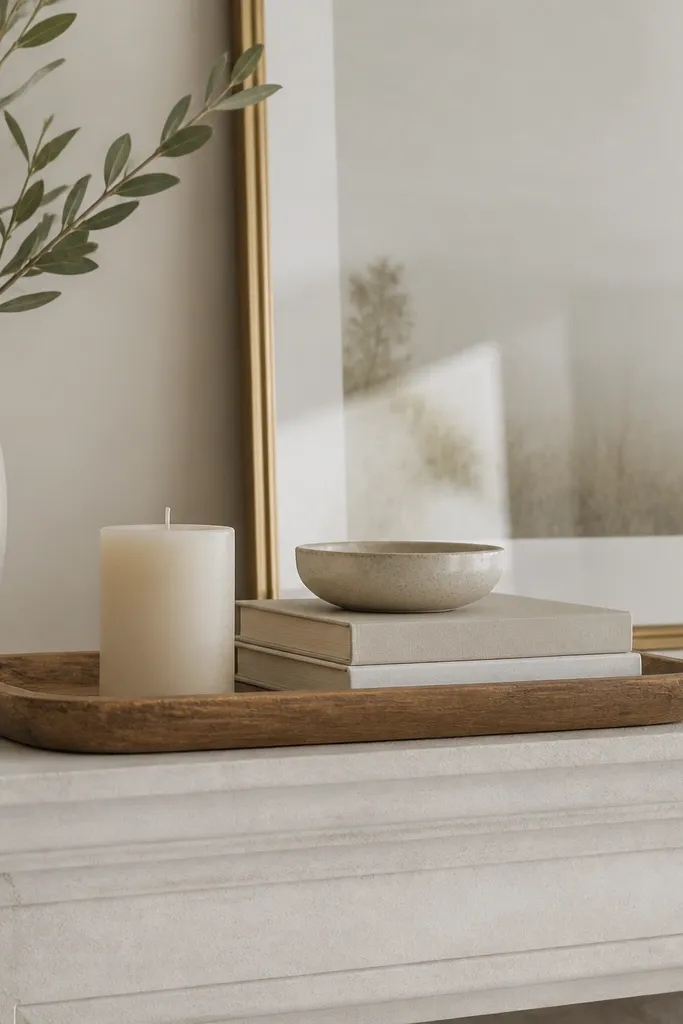
Mantels in Stardew houses feel practical and lived-in. I style with a tray so everything lines up, then add a candle and a bowl for movement. Books bring color through their spines without needing bright decor items.
Use a tray in dark walnut or light oak. Keep the candle short (around 3-4 inches tall) so it doesn’t look formal. Stack two books with one spine showing warm colors like muted red, olive, or cream.
Leave 2-3 inches of empty space on the sides of the tray. It keeps the mantel from looking crowded.
Skip tall candlesticks and heavy decor on small mantels — it looks like you stuffed the space.
12. Window sill herbs with mismatched pots in muted clay tones
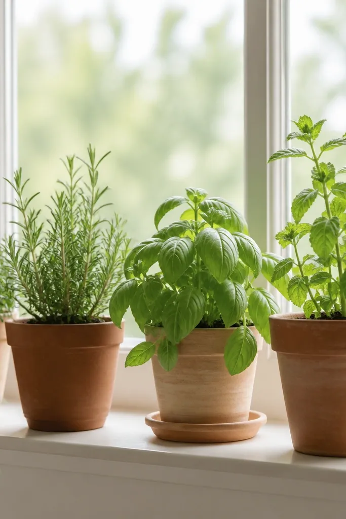
Herbs make the whole room feel like it’s part of the farm cycle. I use muted clay pots — terracotta, oatmeal, and faded stone gray — because they look like they belong in an old kitchen. The green leaves give you the Stardew garden color without adding bold decor.
Pick 2-3 plants, not five. Keep pot sizes within a 2-inch diameter difference so it looks intentional. Place a shallow tray under the pots to catch drips and keep the sill clean.
Rotate plants weekly so they grow evenly toward the light. Uneven growth makes it look neglected, not cozy.
Avoid plastic pots with bright labels — they show through the leaves and ruin the vibe.