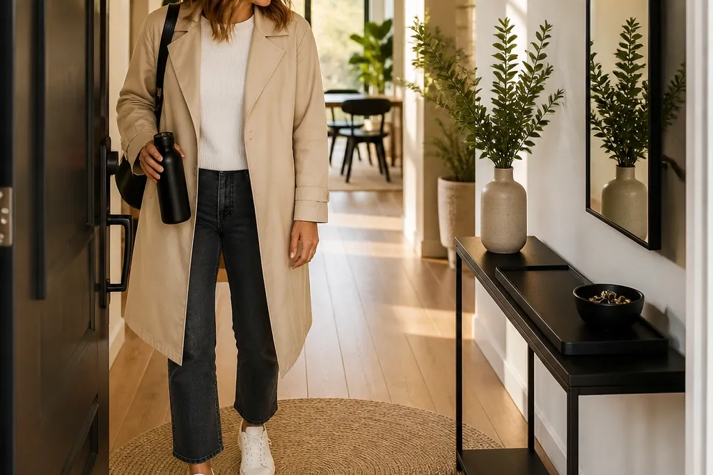
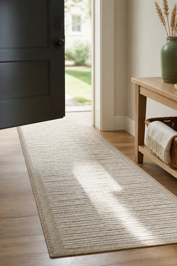
1. Wipeable console with a matte-black tray landing zone
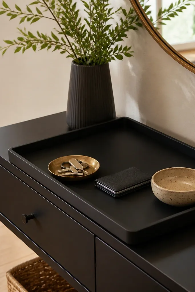
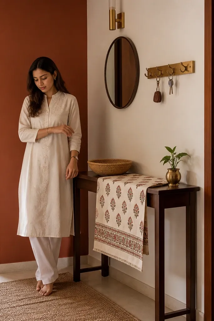
This setup fixes the most common foyer problem: the console becomes a catch-all. A wipeable tray creates one obvious place for keys, a card holder, and a small catchall bowl, so the mess stays contained. Matte-black looks sharp against light wood and hides fingerprints better than glossy finishes. Pair it with one framed print and a small glazed ceramic vase so the entry reads styled even when you’re busy. The goal is a clean surface first, decor second, so the look stays polished for photos and daily life.
Start with a console that has a sealed top or lacquered finish, then place a matte-black tray centered 8-10 inches from the front edge. Set keys and daily items in the tray only, and keep the rest of the console for three objects total. Add a slim framed print above or a standing frame on one side, then place one small glazed ceramic vase on the opposite side so the composition balances.
Pro tipUse a felt or rubber liner under the tray so it doesn’t slide when you toss keys in.
Watch outDon’t leave mail, loose cords, or bags on the console surface — that’s what makes it look cluttered fast.
2. Shoe bench with a fabric-free top and hidden bin
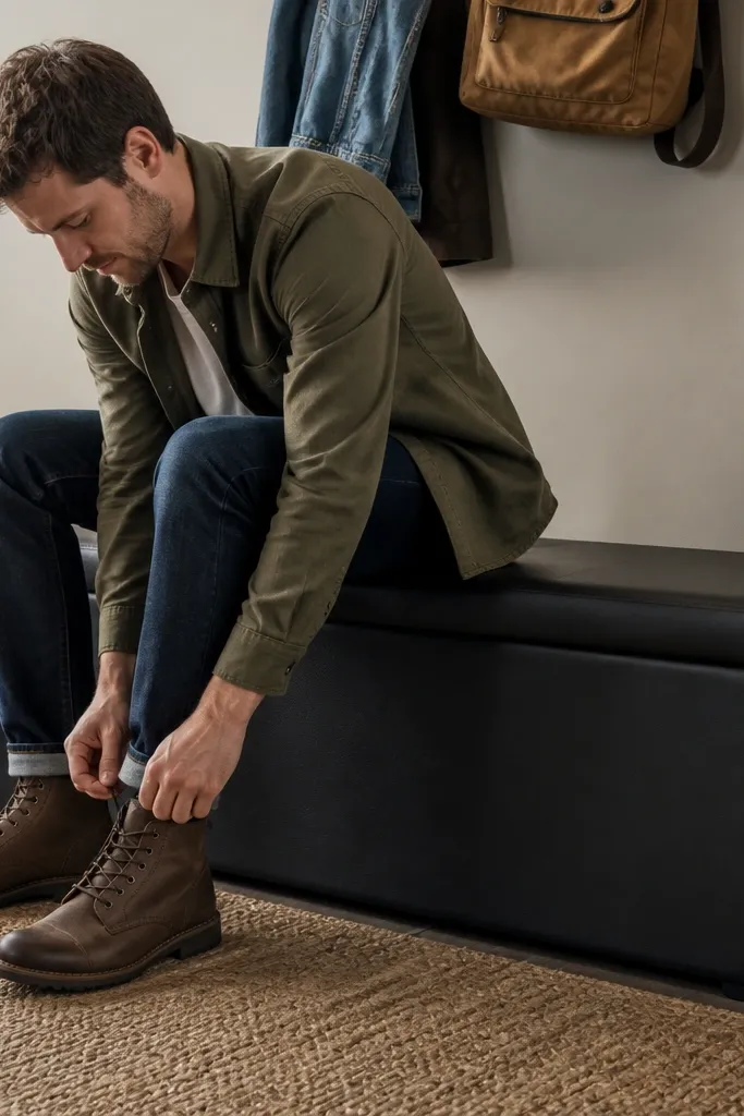
A shoe bench solves clutter and makes the entry feel finished because it gives you one function: sit, take shoes off, store them. Choose a bench with a closed bottom bin or a hinged lift top so shoes stay out of sight. For low-maintenance, go for leather, faux leather, or a tightly woven performance fabric in a dark neutral; loose textured upholstery catches scuffs and looks worn quickly. Style it with one tall vase or a slender lamp on the adjacent console surface, not on the bench top. This keeps the “welcome” look intact even when the day is chaotic.
Measure the space first: leave about 30 inches of clearance where people walk through the entry. Place the bench with the seat parallel to the wall and centered under a nearby piece of wall art or mirror. Store shoes in the hidden bin and place only one decorative item on the nearby surface, like a vase that won’t tip or collect dust easily.
If you get wet shoes, add a tray or mat inside the bin so moisture doesn’t smell or stain.
Skip an open cubby shoe rack — it looks messy the moment shoes pile up.
3. Full-height mirror with a thin black frame
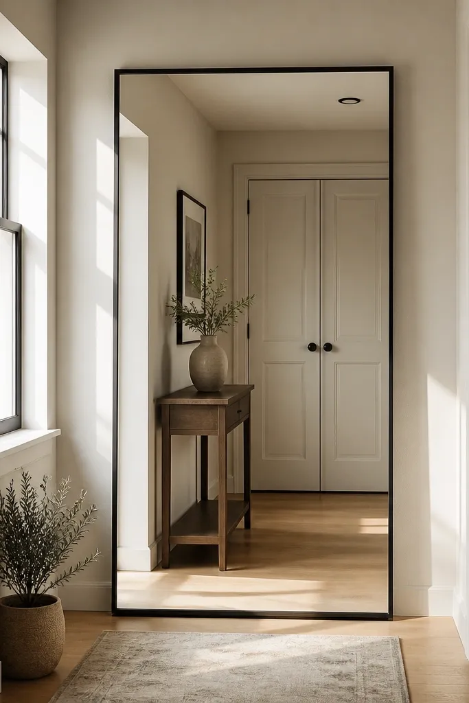
A full-height mirror instantly makes a foyer look bigger and cleaner, and it photographs well because it reflects light and reduces the sense of clutter. A thin black frame keeps the look modern and crisp without taking over the room. Place it where it catches natural light from a nearby window or overhead fixture. Add one small plant or a single ceramic pot at the base and stop there. If your entry is small, this is one of the highest impact low-maintenance decor upgrades because you don’t need constant styling.
Mount or place the mirror so the reflective surface sits about 6-10 inches above the floor line, depending on your baseboard. Center it on the wall beside the entry door or next to the coat zone where it won’t get bumped. Add one grounded item at the base, like a medium-height plant in a glazed pot, and keep everything else off the floor near the mirror.
Pro tipWipe the mirror with a microfiber cloth weekly and you’ll keep that crisp look without extra effort.
Watch outAvoid thick, ornate frames in a small foyer — they make the space feel heavier and harder to style.
4. Peg rail with double hooks and a labeled catch tray
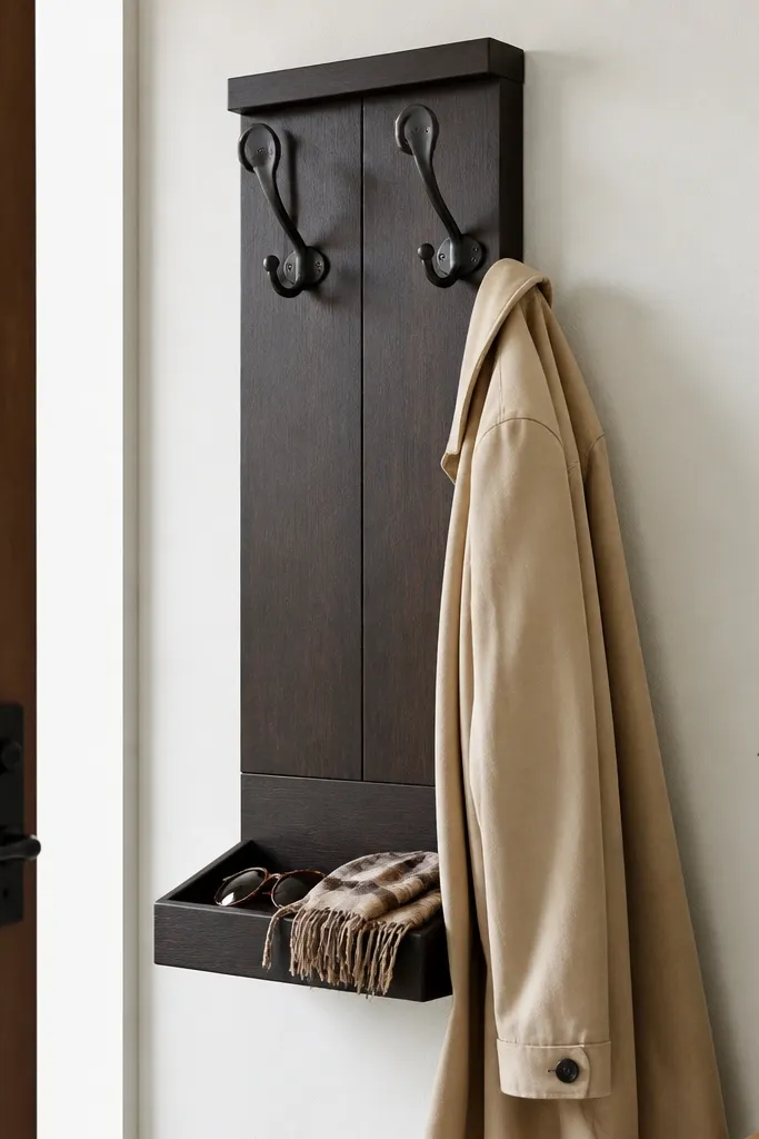
Hooks are the most practical decor in an entry because they control where coats and daily accessories go. A peg rail with double hooks per side gives you room for coats without crowding, and a labeled catch tray below catches sunglasses, gloves, and keys. Keeping it vertical also preserves floor space, which makes the entry feel tidy even when life is messy. Choose a peg rail in warm oak or painted white, then use matching hooks so everything looks intentional. This is low-maintenance because the system is built in — no rearranging needed each day.
Install the peg rail so the top row of hooks sits about 68-70 inches from the floor for easy reach. Add a tray directly underneath with at least 3 inches clearance so items don’t get shoved behind the tray. Label the tray with a simple tag or small adhesive label so everyone uses the same landing spot, and you keep the look consistent.
Pro tipUse two hooks per person for coats and bags — it prevents the “one hook for everything” pile.
Watch outSkip decorative hook styles that don’t hold weight well — coats slide off and the entry looks messy again.
5. Round jute-look rug with a flatweave pattern
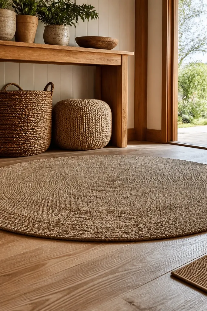
A flatweave rug cleans up the visual noise of an entry by giving the floor a defined frame. Choose a rug with a tight, low pile so it doesn’t snag shoes and it’s easy to vacuum quickly. A round shape softens the entry, especially in narrow hallways, and it photographs well because it creates a focal frame under the main furniture. Stick to neutral tones like oat, greige, or sand with a subtle pattern that hides footprints. This makes the whole entry look more polished without constant decor changes.
Measure the furniture you want to anchor: aim for 8-12 inches of rug showing beyond the front legs of your bench or console. Choose a flatweave with low pile and a non-slip backing or add a rug pad to prevent sliding. Vacuum with a brush attachment and spot-clean with a damp cloth for quick refreshes.
Pro tipRotate the rug every 6-8 weeks to keep foot-traffic wear even.
Watch outDon’t pick a high-pile shag — it looks cozy for two weeks and then shows tracks and debris.
6. Two-tone wall art pair in matching frames
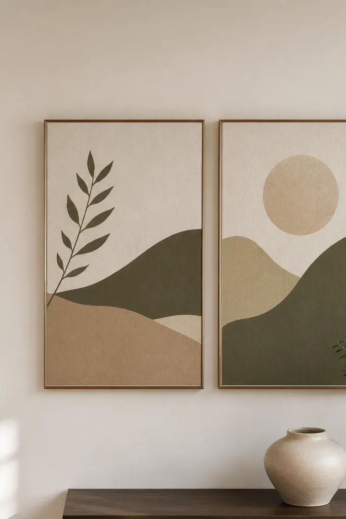
Wall art is the easiest way to make an entry look designed, but most people overdo it or mismatch frames, which makes the space feel busy. Use two matching frames — same color, same width — with prints that share a limited color palette, like warm beige and muted olive. Place them in a tight vertical or horizontal pair above the console so the eye reads a complete composition. This is low-maintenance because you’re not constantly swapping decor; the frames keep the look tidy and intentional. Choose matte or satin finishes on the frames to reduce glare in photos.
Hang the center of the art about 57-60 inches from the floor for a standard eye-level look. Keep spacing between frames around 2-3 inches so it reads as a pair, not a random cluster. Use a simple 2-color palette in the prints and keep the console objects limited to three items so the wall art can carry the vibe.
Pro tipUse museum glass or anti-glare acrylic if your foyer has strong overhead lights.
Watch outAvoid mixed frame finishes — chrome plus wood plus black in one spot creates instant visual noise.
7. Tall glazed ceramic vase with faux stems
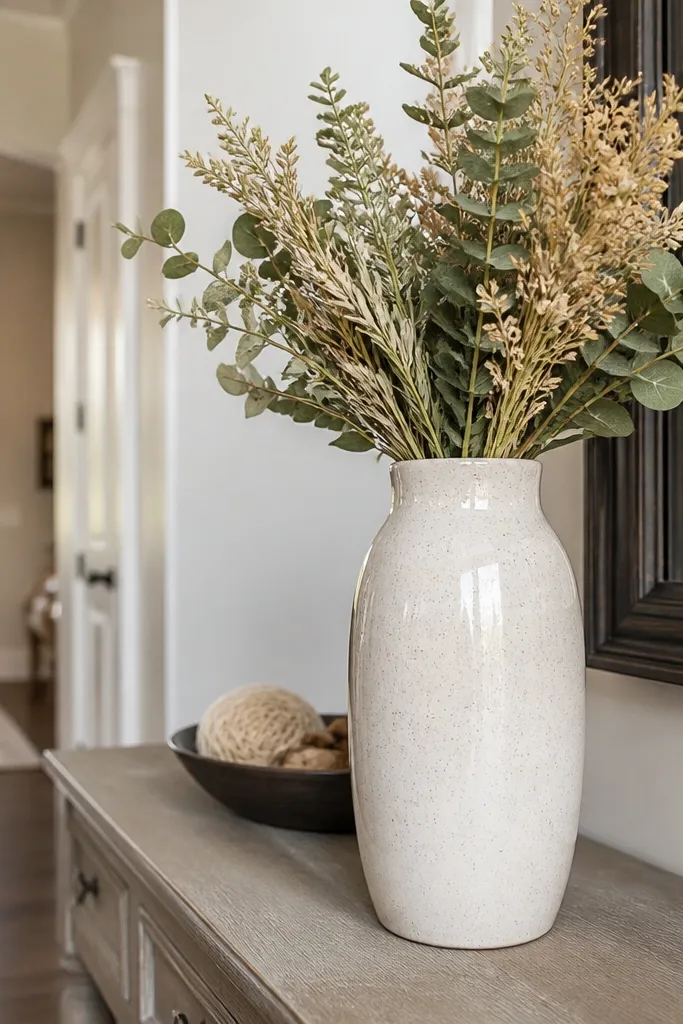
Faux stems get a bad reputation, but the right combination looks clean and stays that way. A tall glazed ceramic vase looks intentional and holds visual weight, while faux stems let you keep a consistent shape without watering or drooping. Choose stems in muted greens, dried wheat tones, or neutral grasses that match your rug and wall color. Placement matters: keep the vase on one end of the console so the height guides the eye upward and makes the entry feel taller. This delivers a polished first impression with zero upkeep.
Pick a vase height of about 14-22 inches so it’s visible but not overpowering in a small foyer. Place it on one end of the console and position the stems so the widest part sits roughly at eye level. Dust the vase and stems with a microfiber cloth once a week and spot-clean the ceramic with a damp cloth as needed.
Pro tipTrim faux stems if needed so they don’t spill past the console edge — that spill is what makes it look messy.
Watch outSkip shiny, overly colorful faux flowers — they look cheap against a polished entry.
8. Brass wall sconce with a linen shade
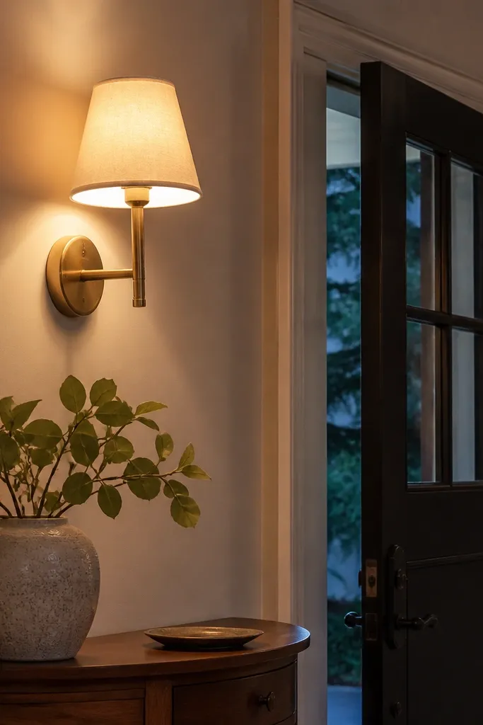
Lighting is decor that you actually use, and a wall sconce makes the entry feel finished without adding more items to surfaces. Brass looks warm against white or cream walls, and a linen shade gives a soft glow that hides the awkward shadows that make foyers look harsh. Choose a sconce with a simple shape and a shade that diffuses light, not a glass globe that highlights dust. Install it at a height that lines up with your art or mirror so the whole wall reads cohesive. This is low-maintenance because you’re buying one fixture and living with it.
Select a sconce with an install plate that matches your existing wiring or hire an electrician if you’re adding new power. Mount the sconce so the center of the shade sits about 60-66 inches from the floor. Use a warm bulb around 2700K so the entry looks inviting and skin tones look better in mirror reflections.
Pro tipSwap to dimmable bulbs so you can adjust brightness for daytime photos versus evening entry lighting.
Watch outDon’t choose a shade that’s too dark — it turns the foyer into a shadowy hallway.
9. Clear glass lantern on a tray with a flameless candle
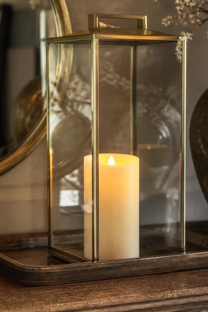
A lantern reads cozy and polished, and flameless candles keep the entry low-maintenance by removing wax mess and wick upkeep. A clear lantern makes the light feel airy, and the glass reflects other decor so the foyer looks more layered without adding clutter. Put it on a tray so any condensation or dust stays contained. Keep the greenery minimal — one sprig or a small eucalyptus bunch — so it looks styled, not like a craft project. This idea suits entries that need warmth but have limited space for furniture.
Choose a lantern that’s about 10-14 inches tall and place it on the center of a small tray. Use a flameless candle sized to the lantern opening so it doesn’t wobble or look too small. Add one small greenery sprig on the tray edge, then wipe the tray and lantern glass with a microfiber cloth weekly.
Pick a candle with flicker and a warm white glow so it looks natural in photos.
Avoid open flames in a small foyer with hanging coats — it creates unnecessary risk and mess.
10. Gallery wall of small mirrors for a brighter entry
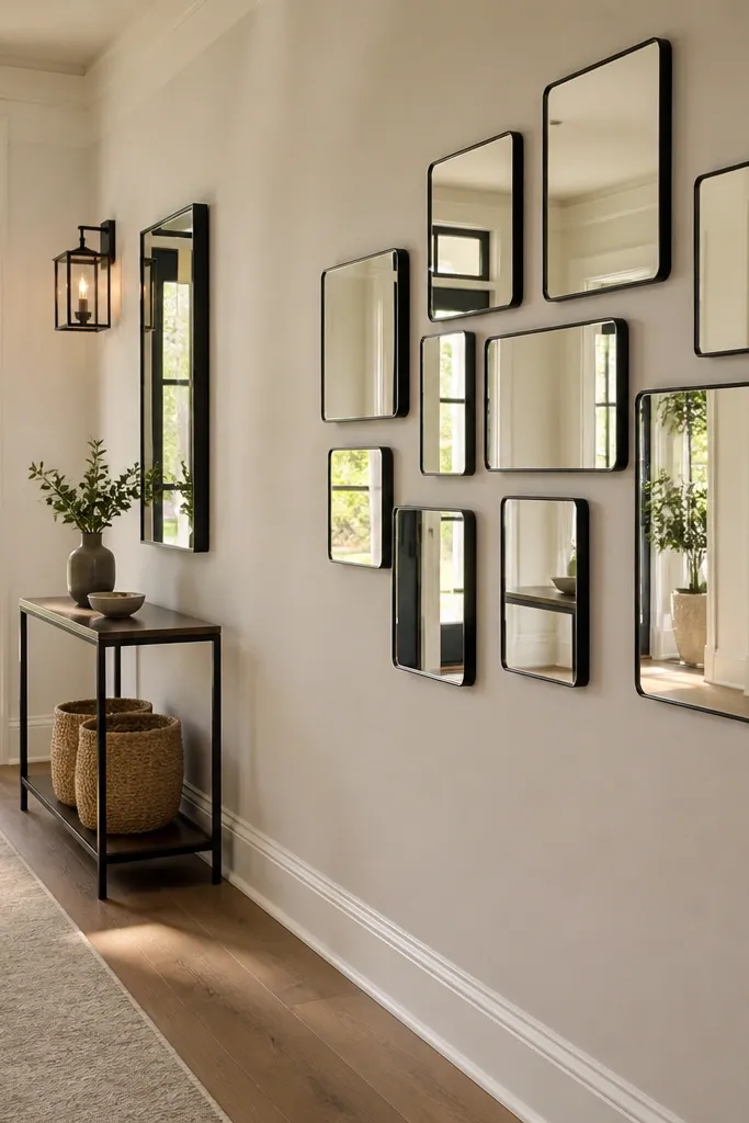
Small mirrors are a trick for foyers that feel dark or narrow. Instead of one big mirror that can feel awkward on a wall, a gallery cluster bounces light from multiple angles and makes the space look more open. Keep the frames consistent — same finish, same thickness — so the cluster looks designed. This works especially well when you have a staircase wall, a tight hallway, or a wall with awkward outlets where a single mirror won’t sit right. Pair the mirrors with one minimal console styling element so the reflective wall doesn’t turn into visual chaos.
Lay the mirrors on the floor first and decide the cluster size, then measure the total width so it fits above the console or along the wall. Mark center points and mount using a level, keeping equal gaps of about 2 inches between frames. Style the console with a single tall vase or lamp and one small tray — total decor on the console stays at two items.
Pro tipUse anti-glare glass or anti-fog coatings if you get humidity near the entry.
Watch outSkip random sizes and mismatched frames — the cluster turns into clutter fast.
11. Over-the-door organizer in a clean neutral color
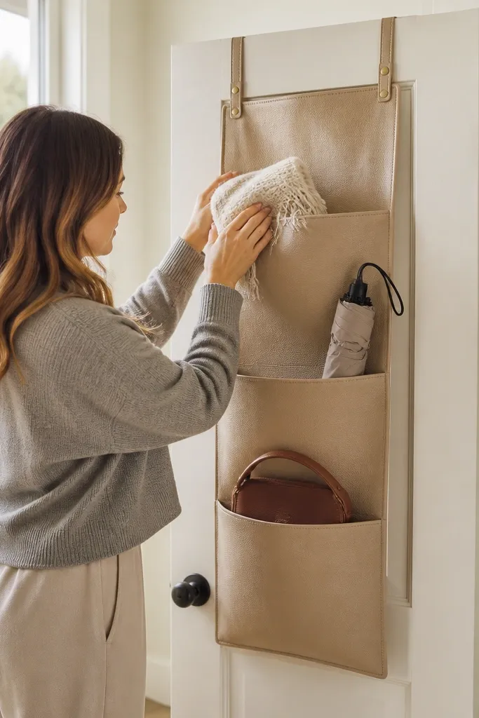
This is the low-maintenance move for families and shared entries. An over-the-door organizer keeps hats, scarves, umbrellas, and small bags in one place without taking wall space or adding another piece of furniture. Choose a neutral fabric or faux leather organizer in black, tan, or cream so it doesn’t look like a utility item. The pockets let you separate items by category, which means you’re not digging through one pile for gloves. It also keeps the foyer floor clear, which instantly makes the entry look more polished.
Hang the organizer on the back of the entry door so it doesn’t interfere with door swing clearance. Use the top pockets for items you grab daily and lower pockets for backups like spare gloves. Wipe the organizer with a damp cloth and let it dry fully, so it stays fresh without deep cleaning.
Pro tipAdd a small label tag to the largest pocket — the visual cue helps everyone use it correctly.
Watch outDon’t pick a bright or patterned organizer — it reads busy in a space meant to look clean.
12. Wall shelf with a closed cabinet bottom for mail
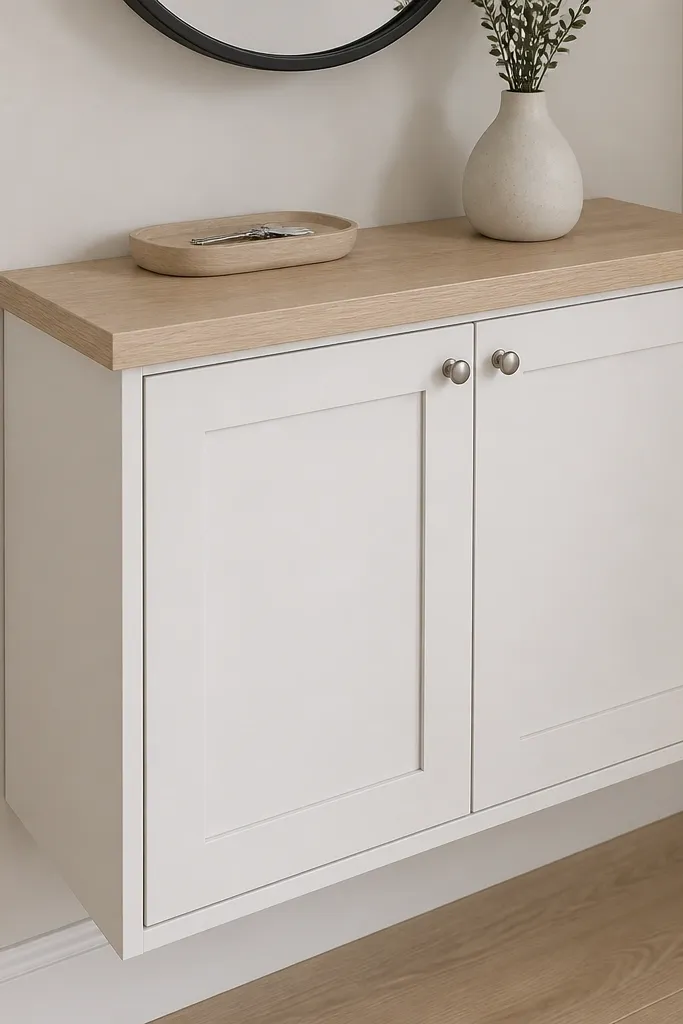
If your foyer mail collects on the console, a wall shelf with a closed cabinet bottom is the fix. The top gives you a place for one or two decorative items, and the cabinet hides incoming paper so the entry stays calm. Choose a shelf-and-cabinet unit in white oak, painted white, or black, matching your hardware finish. Add a mail sorter insert inside the cabinet if you get lots of envelopes. This idea is photogenic because it creates a tidy vertical line and reduces visual mess at eye level.
Measure your door clearance and mount the shelf so the cabinet doors open without hitting the door trim. Place the shelf about 16-18 inches above the cabinet top, then keep decor on the shelf to a single candle and a small frame. Use a simple mail tray or divider inside the cabinet so paper lands immediately and doesn’t spill.
Pro tipKeep the shelf decor to one color family — warm neutrals look best with wood finishes.
Watch outAvoid open mail shelves — paper stacks ruin the polished look in hours.
13. Large floor plant in a matte pot with a simple stand
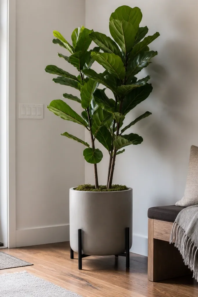
A floor plant adds life and softness without cluttering surfaces, and a matte pot looks upscale even when the plant changes over seasons. Choose a plant with structured leaves like a fiddle-leaf fig or a tall snake plant, depending on your light. The key is the pot: matte ceramic or concrete hides minor scuffs and looks good even when you move it for cleaning. Place the plant near the entry mirror or beside the door so it frames the arrival. This is low-maintenance if you pick a plant that matches your light and you keep dust under control.
Pick a plant pot that’s proportionate to your space, usually 14-18 inches tall for most foyers. Place it in a corner or beside the mirror where it won’t block traffic, leaving at least 4 inches between the pot and the wall. Wipe leaves with a damp cloth monthly and check soil moisture so it doesn’t decline and look messy.
Pro tipUse a saucer or plant tray under the pot so watering never leaves a stain on the floor.
Watch outSkip glossy pots — they show water spots and fingerprints fast.
14. Monochrome runner with a low-contrast pattern
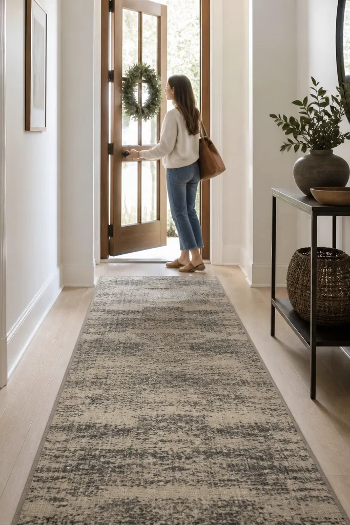
A runner does two things at once: it protects the floor and makes the whole entry feel intentional. For low-maintenance, pick a monochrome runner with a low-contrast pattern that hides foot traffic — think charcoal on greige or navy on sand. Keep the pile low so it doesn’t trap dirt and so vacuuming is fast. When your entry has a runner, you can simplify the console because the floor already reads styled. This works well in narrow entryways where you want the look to feel longer and cleaner.
Measure the hallway length from the entry threshold to the main room opening and choose a runner that leaves 6-10 inches of floor visible at each end. Roll out and center it so the pattern lines up with walls or baseboards. Vacuum with a suction-only setting on low pile and spot-clean spills with cold water and a dab of mild soap.
Pro tipAdd rug grippers at the edges so it stays flat and doesn’t bunch — that bunching makes it look unkempt.
Watch outAvoid high-contrast geometric runners — they show stains and wear more visibly.
15. Console stack of books with a single oversized frame
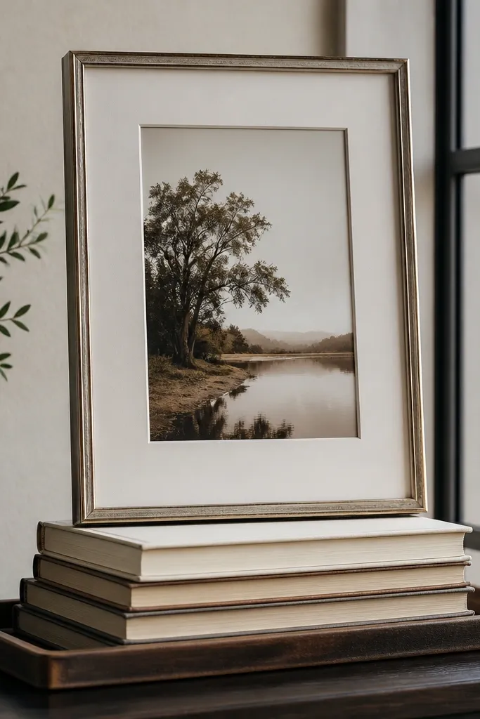
This is the “looks styled in one minute” approach. A small stack of books creates height and texture without adding clutter, and an oversized frame above or beside it sets a strong focal point. Keep the books in one color family like cream covers or muted brown spines, and use a tray or riser so the stack looks deliberate. The oversized frame brings visual weight and makes the entry feel designed even if the console is otherwise empty. It’s low-maintenance because you’re not swapping decor constantly — you just maintain the same arrangement.
Choose 3-4 books and stack them with the thickest book at the bottom; aim for a height of 6-10 inches. Place the stack on one side of the console and balance it with one ceramic object on the other side. Mount an oversized frame above centered over the console so the composition feels anchored, then keep the rest of the console surface empty.
Pro tipUse a thin bookend or a riser under the stack so it doesn’t look like a random pile.
Watch outDon’t mix too many book colors — it turns the stack into visual noise.