1. Lacquer Pink Tray on a Smoked Glass Tabletop
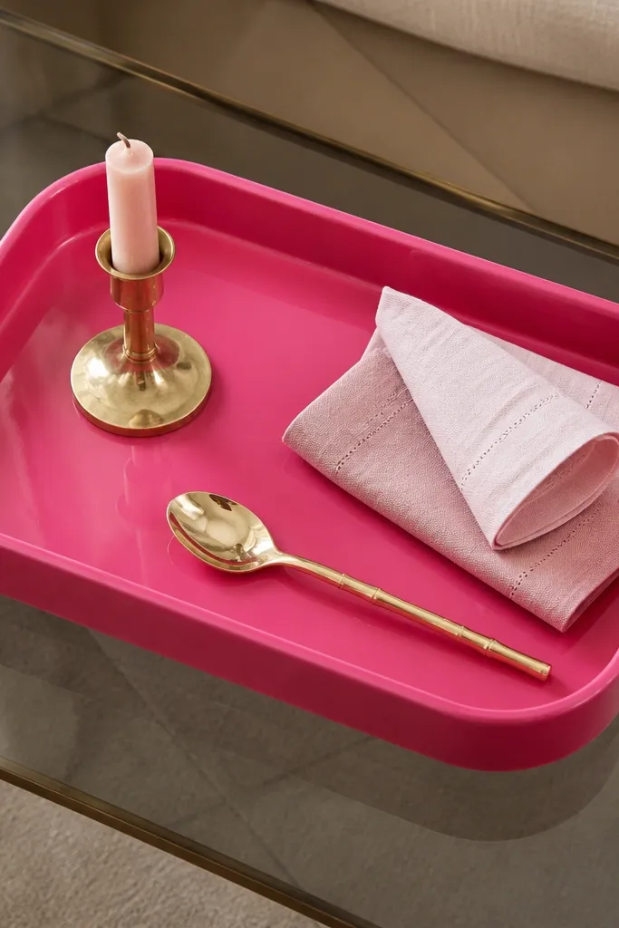
This works because lacquer pink reflects light like jewelry. Smoked glass mutes the pink so it reads styled instead of loud. Add brass in tiny spots and the whole setup starts looking intentional. I like trays because they create a boundary — your pink stays contained and looks more expensive.
Use a tray about 12x18 inches so it fits a coffee table or dining sideboard without crowding. Choose a smoked glass tabletop or a smoked glass serving board as the base layer. Keep the rest neutral: cream napkins and one brass candle holder. Put the spoon or small utensil off-center to avoid the “store display” symmetry.
Wipe the tray with a microfiber cloth right before styling so it catches light cleanly in photos.
Avoid matte craft-paint trays — they look chalky under indoor light and kill the luxe effect.
2. Blush Ceramic Canisters with Brushed Brass Labels
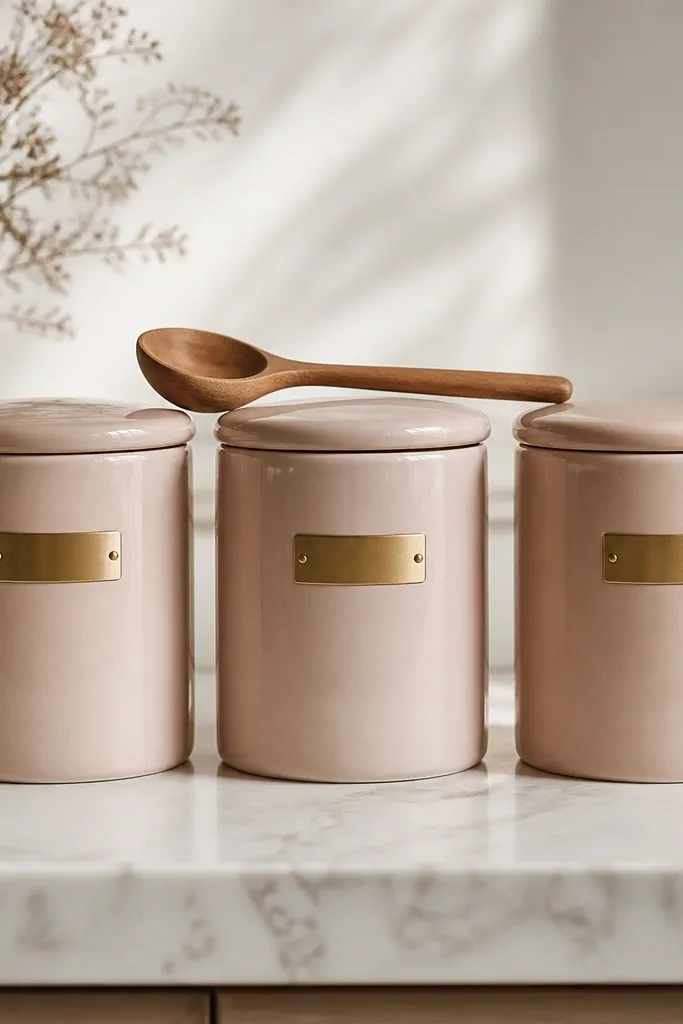
Glazed ceramic has a soft sheen that looks expensive even when the shape is simple. Brass labels make the whole thing feel like a real kitchen system instead of decor clutter. The key is consistent blush tone across all canisters — it’s the repetition that makes it look designed.
Pro tipUse one font style for all labels (even hand-lettered) so the set looks uniform.
Pick canisters with lids that seal well so they don’t look dusty. Use canisters in the same size family (same height, slightly different widths) for a clean row. Label with small brass plates or brass tape on label holders — keep text short. Place them near a window or under warm lighting so the glaze shows.
Watch outDon’t mix glossy and matte canisters in the same row — the mismatch makes the whole thing look pieced together.
3. Pink Ombre Glassware with Black Rim Accents
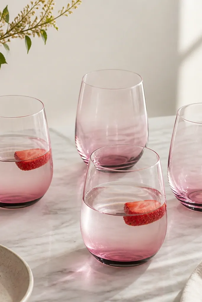
Ombre glass looks expensive because the color fades like a gradient on a designer bag. The black rim gives it a grown-up anchor so pink stays classy. Add one fruit garnish and the glass catches highlights, which reads high-end in both real life and photos.
Choose 4 glasses for dining so it looks like a set. Keep the ombre family consistent — don’t mix different gradient intensities. Use water plus one fruit (strawberry or pink grapefruit) for a clean color echo. Pair with black placemats or a charcoal table runner.
Rinse and dry the rims thoroughly so the black doesn’t look streaky.
Avoid cloudy cheap acrylic drinkware — the surface looks plasticky under kitchen lighting.
4. Rose Pink Napkins Rolled with a Thin Brass Ring
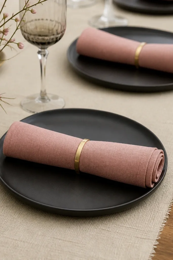
Fabric napkins bring texture, and texture is what makes the “expensive look” believable. The rose-pink tone reads warmer than bubblegum and looks good next to cream and black. Brass rings feel like place-setting jewelry — small but noticeable.
Pro tipIron the napkins first — crisp edges make everything look styled instead of casual.
Use cloth napkins in a rose shade, not neon pink. Roll them to about 1.5-2 inches wide so the ring looks proportionate. Place rings facing the same direction across the table. Use cream linen or off-white cotton as the base so pink doesn’t glare.
Watch outSkip paper napkins with a pink print — they look like a themed party when photographed close.
5. Pink Marble-Look Coaster Set with Gold Edges
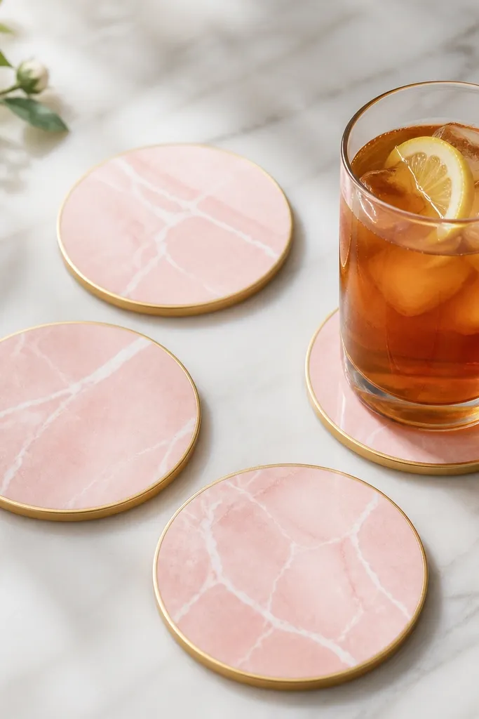
Marble-look prints add depth because the veining breaks up flat color. Gold edges give you a thin reflective line, which tricks your eye into thinking “luxury.” This setup works best on wood or neutral counters where the coaster becomes a focal point.
Pick a set of four so it reads intentional on a dining table. Match the gold to one other gold item in the scene (like a utensil holder or candle base). Keep the coasters spread — don’t cluster them too tightly. Use a clear glass so the coaster pattern stays visible.
Wipe coasters with a damp cloth and dry immediately; marble-look surfaces can show water spots.
Avoid chunky coasters with thick foam backs — they look like bargain protection, not design.
6. Blush Table Runner with a Black Linen Base Layer
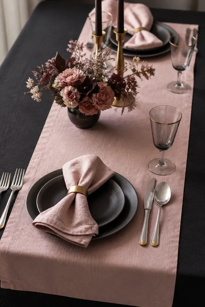
Layering makes pink look layered, not pasted on. The black linen base grounds the blush and makes the runner look like a deliberate designer choice. I’ve seen this work in real dining rooms because it hides spills visually and keeps the pink from looking too sweet.
Pro tipPin the runner down with small binder clips under the table edge so it doesn’t slide during dinner.
Choose a blush runner in a matte fabric like cotton or linen, not shiny satin. Make it about 3-6 inches narrower than the tablecloth so the black border is visible. Keep your plates white or cream and add one brass element like a napkin ring. For a quick update, swap runner only — it changes the whole mood.
Watch outDon’t use a blush runner on a bare wood table without a base — the wood tone competes with pink.
7. Hot Pink Candle Trio on a Cream Ceramic Risers
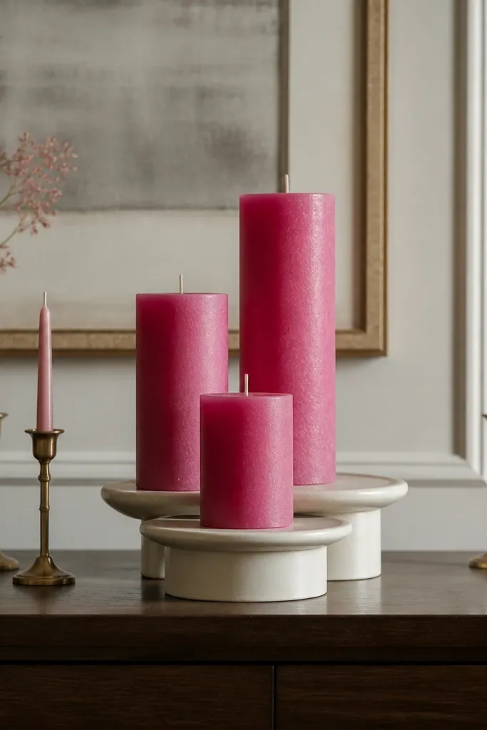
Candles add height and glow, and glow is the fastest way to make pink look expensive. Cream risers soften the bright pink and keep it from dominating the room. With three heights, the arrangement looks “composed,” not random.
Use pillar candles in hot pink, rose pink, or a single hot pink shade. Keep the risers cream or bone white so the candles look centered on a neutral stage. Place tapers behind or to the side only if they match the brass finish. Keep the whole set within a 10-14 inch width so it doesn’t sprawl.
Trim wicks to 1/4 inch before lighting; uneven flames can make the pink look messy.
Avoid multicolor candle sets — mixed pinks and purples look cheap fast.
8. Pink Enameled Utensil Holder with a Black Wood Tray
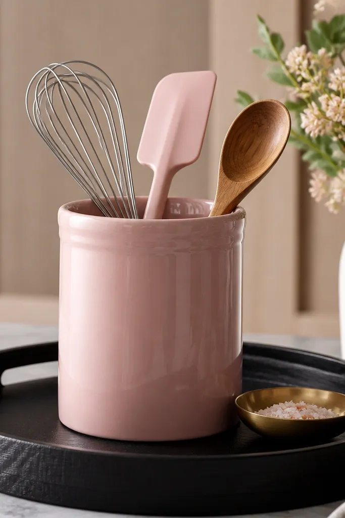
Enameled surfaces look crisp and clean, even when they’re used daily. The black wood tray adds warmth and keeps the pink from looking like bathroom decor. This combo works because utensils are already “busy,” so the base needs to be structured and dark.
Pro tipWipe enamel dry after washing utensils; water spots show up on glossy pink.
Pick a utensil holder with a wide opening so it looks full, not empty. Use a black wood tray about 1-2 inches larger than the base footprint. Add one brass dish or spoon to tie in the metal theme. Keep the counter around it mostly clear so the pink anchor stays the star.
Watch outAvoid chrome utensil holders with pink accents — the mix reads cold and bargain-y.
9. Rose Pink Place Cards in Smoke-Gray Acrylic Holders
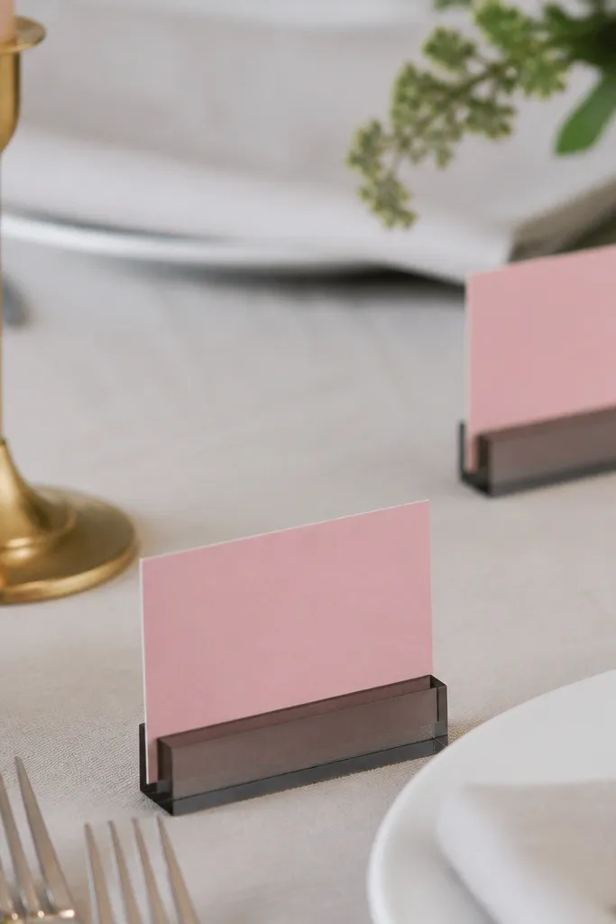
Place cards add a “host energy” that reads expensive in a heartbeat. Smoke-gray acrylic makes the pink feel modern and less like paper craft. I like this setup for dinner parties because it looks styled even if you keep the rest of the table simple.
Use rose-pink cardstock cut into slim rectangles. Write names in black ink with a consistent style (no rainbow pens). Choose acrylic holders that look frosted or smoke-tinted. Place cards at every seat so the table reads cohesive.
Use a single card size across the table so the spacing looks intentional.
Skip glitter pens on place cards — they look messy under warm bulbs.
10. Blush Wall Shelf with Pink Picture Frames and a Brass Shelf Clock
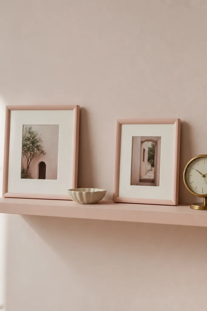
A wall shelf gives you vertical stacking, which makes the room feel designed instead of cluttered. Pink frames with off-white mats keep the look airy. A brass clock adds a functional luxe detail — it’s not just decorative.
Use a shelf in a paint-matched blush or a light wood with a blush tint. Keep frame sizes similar so it looks curated. Use one small ceramic dish as a spacer so objects aren’t touching. Put the clock slightly higher than the frames so the eye moves upward.
Dust shelves weekly; pink frames show dust halos quickly.
Avoid mixing black, silver, and brass accents together on one shelf.
11. Bubblegum Pink Pendant Shade with Warm White Bulb
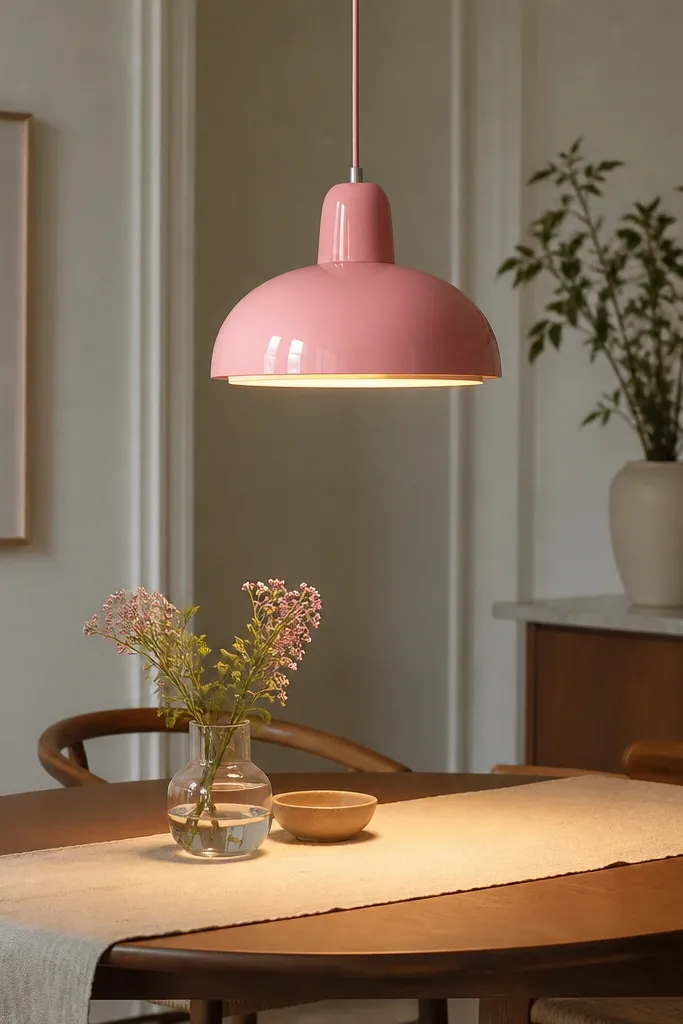
Lighting is the cheat code. A pink pendant shade turns your dining area into a color wash, and it reads expensive when the bulb is warm white (not blue). Smooth glossy shades look richer than fabric shades because they reflect light evenly.
Pick a pendant shade in bubblegum or hot pink, and install it above the table center. Use a warm bulb around 2700K so the pink looks flattering instead of harsh. Keep the ceiling canopy and cord hardware in brass or matte black — match one metal elsewhere. Choose simple tableware so the lamp is the statement.
If your room has cool daylight, use a warm bulb plus a cream runner to balance the tones.
Avoid daylight 5000K bulbs — pink looks sickly and flat under them.
12. Pink Glazed Dough Bowl with an Iced-White Table Setting
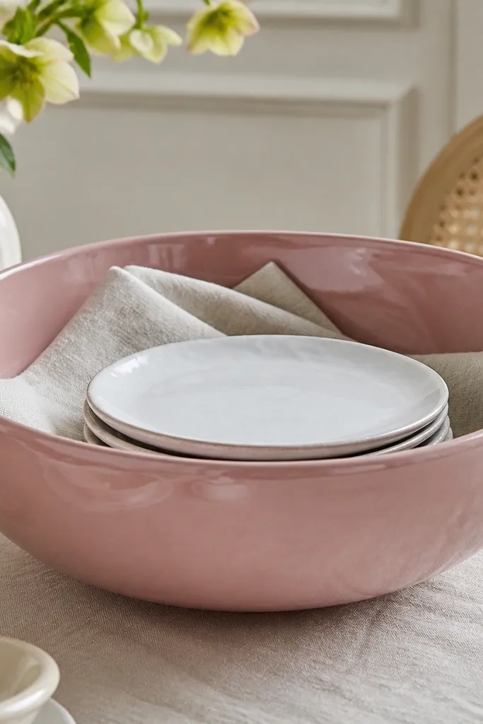
A dough bowl has a sculptural shape, so pink glaze looks like art instead of decor. Iced-white plates and textured linen keep the set crisp and not too sweet. This works because you’re using one big pink object as the anchor and letting neutrals do the rest.
Pro tipWipe the glaze with a dry cloth right before guests arrive; it looks glassy under warm light.
Use a dough bowl size that covers the center space without crowding — think 12-16 inches wide. Fill it with folded napkins or a few pastries on a serving day so it looks lived-in. Pair with iced-white plates and a simple fork set. Add one gold utensil or brass candle near the bowl.
Watch outAvoid filling the bowl with random small items; keep it styled with 1-2 clean objects.