1. Weathered white oak dining set with a sand linen runner
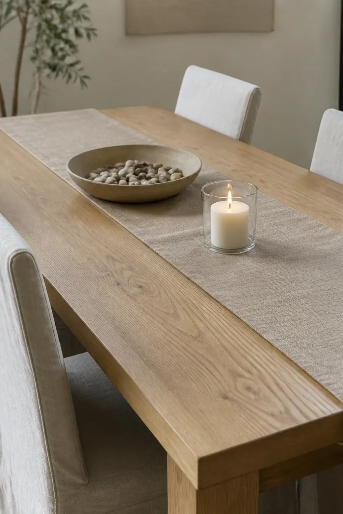
This look works because the table and runner share the same warmth — warm beige reads like sun on pale wood. Weathered white oak gives you that driftwood vibe without making the room look gray. The ceramic bowl grounds everything so the decor feels beachy, not theme-y.
Pick a runner that’s 12-14 inches wide for a standard 60-72 inch table, centered edge-to-edge. Use off-white or cream napkins that match the runner’s undertone, not pure white. For the chairs, choose slipcovers in sand or oatmeal and keep the fabric matte so it doesn’t reflect harsh light.
Add one small ceramic piece that’s slightly irregular, like a speckled bowl. It makes the whole setup look collected instead of bought.
Avoid glossy vinyl placemats — they make the dining area look like a rental.
2. Sea glass napkin colors with simple white plates
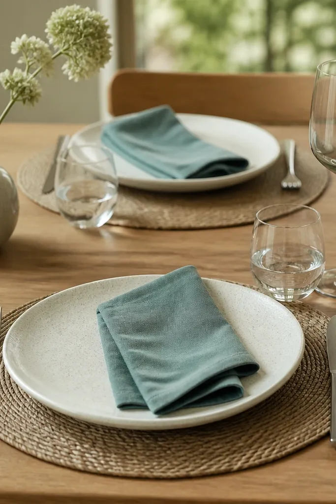
Sea glass tones give you that coastal color hit without going full “turquoise beach sign.” Muted teal-gray looks like it’s been in the ocean for years, which matches the Stardew interior mood. Keeping plates white with light speckling keeps the table bright and lets the napkins do the color work.
Choose napkins that are 18-20 inches square so they fold cleanly into a neat rectangle. Match the placemats to the napkin undertone — woven straw or natural jute works. Use one stem only in a narrow vase so the centerpiece doesn’t compete with daily dining.
Fold napkins the same way for every seat. Consistency is what makes this look “intentional” instead of random.
Skip bright neon teal — it looks like pool party decor, not coastal calm.
3. Rattan chair backs and a driftwood centerpiece tray
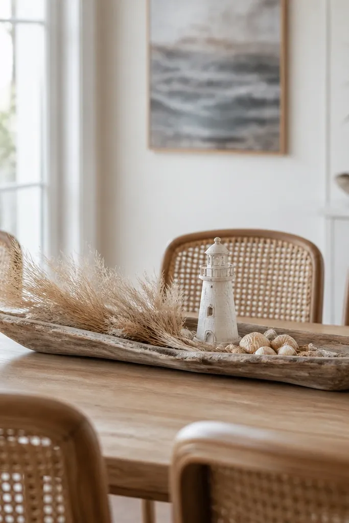
Rattan instantly reads coastal because the texture looks sun-warmed and airy. A driftwood-colored tray ties the room together by adding a single “base” for your beach objects. Dried grasses bring movement and height, which makes the table feel styled even without lots of items.
If your chairs are solid, add rattan chair pads or swap just the seat cushions. Keep the centerpiece tray about 70% of the table width — for a 48 inch table, a 32-34 inch tray looks right. Use dried grasses 12-16 inches tall so they show above the plates.
Anchor the tray with one larger item (the lighthouse or a tall candle) and then add two small fillers. That ratio keeps it from looking like a craft bin.
Don’t scatter shells all over the table — it reads like decoration glued to a theme.
4. Blue-gray striped runner with whitewashed walls
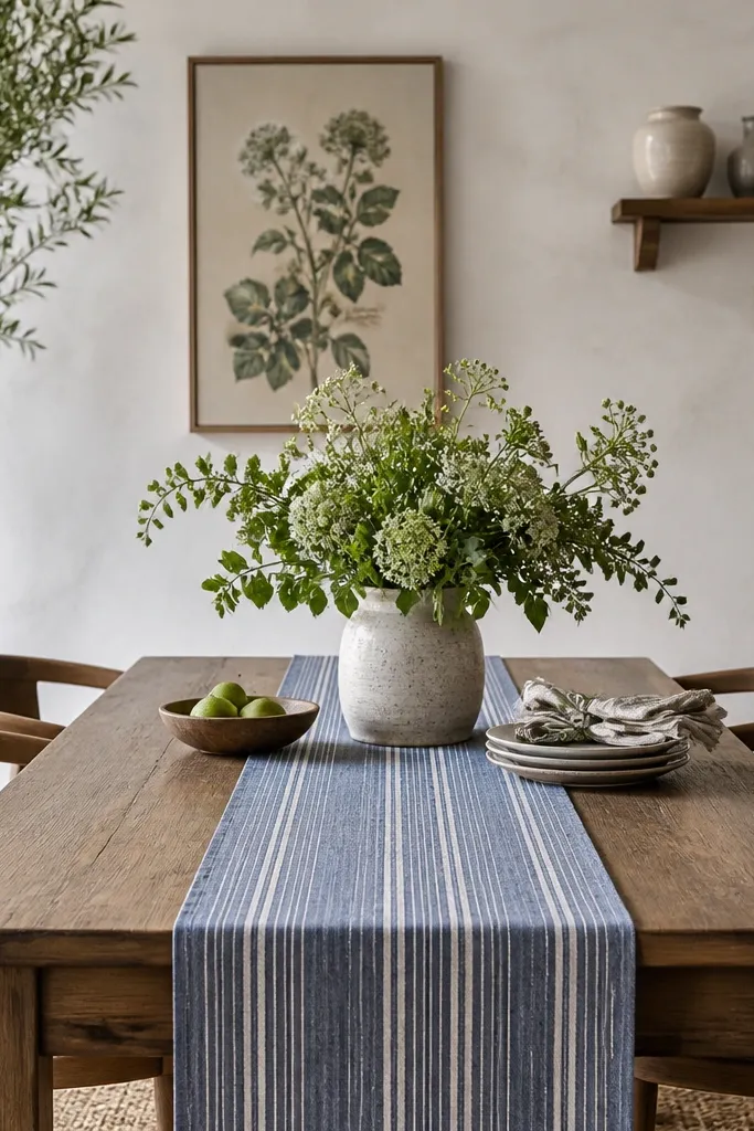
Stripes give you the “beach house” feeling fast because they look nautical without screaming. Blue-gray stripes also blend sea and sky tones, which matches Stardew’s calm color palette. Whitewashed walls add texture so the room doesn’t look flat next to patterned textiles.
Use a runner with thin stripes (about 1 inch stripe width) so it stays subtle. Pair with solid napkins in cream or pale gray. On the wall, pick one framed piece that’s about 18x24 inches and keep the frame light wood or white.
Pro tipHang the art so its center is about 57-60 inches from the floor. It lines up nicely with a dining table sightline.
Watch outAvoid thick, high-contrast navy stripes — they look like a boat deck, not a cozy beach house.
5. Stoneware bowls and linen towels on a open shelf
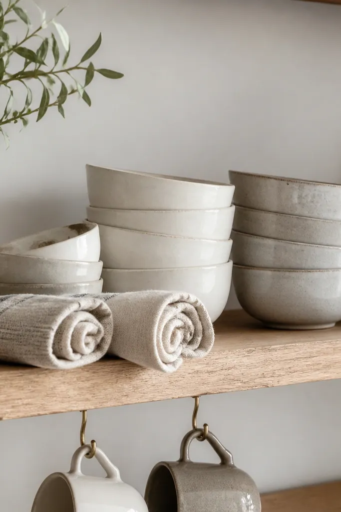
This is the most believable “lived-in” Coastal Stardew look because it uses everyday items arranged on purpose. Stoneware with a matte glaze looks like it belongs in a cabin kitchen. Linen towels add softness and a handmade feel without needing extra decor.
Choose bowls with speckling or slight color variation. Stack three to five bowls per shelf so it looks intentional, not random. Roll towels with the seam facing outward and keep the roll diameter around 2.5-3 inches.
Pro tipUse one color family for the ceramics (warm whites and light grays). Mixing every shade makes shelves look cluttered.
Watch outSkip shiny ceramic that looks like it came straight from a mall display.
6. Woven jute placemats with a pale oak table lamp glow
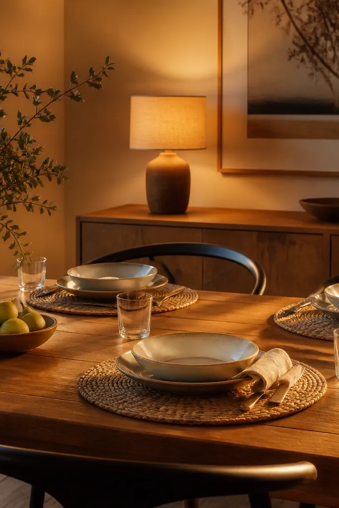
Jute placemats add texture that reads coastal even when the colors are neutral. The lamp matters more than people think — the warm glow is what makes the room feel like late afternoon in Stardew. A linen shade softens the light so shadows don’t look harsh on the table.
Cut placemats to fit your table size visually: aim for 1-2 inches of mat visible around each plate. Choose a lamp bulb at 2700K and keep the shade in beige or oat. Place the lamp so it lights the dining table from the side, not straight above.
Pro tipIf your sideboard has a mirror, don’t add another reflective surface — let the lamp do the warmth work.
Watch outAvoid cool white bulbs (4000K+) — the room turns gray fast.
7. Ceramic starfish and a single tall candle in a glass hurricane
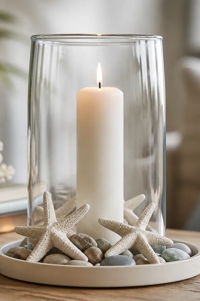
One tall candle gives you height and drama without clutter. Ceramic starfish are a controlled beach nod when they’re limited to one or two pieces. Smooth stones keep the palette grounded and stop the starfish from looking like a kids' craft.
Use a shallow tray about 10-12 inches wide so the items stay tight around the candle. Keep the candle white or cream and matte. Place the hurricane centered on the table runner, not on bare wood.
Pro tipWipe the glass hurricane with a dry microfiber cloth before styling so it doesn’t look smudged under warm light.
Watch outDon’t use lots of small candles — the table ends up looking like a holiday spread.
8. Cafe-style dining wall with thrifted frames and coastal sketches
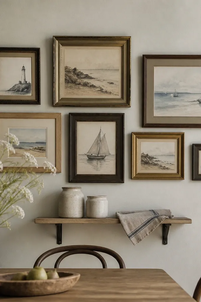
Frames create that Stardew “house interior” feeling because they look like personal history. Coastal sketches are softer than photos and they blend with the muted palette. Thrifted frames add slight wear, which keeps the decor from looking like showroom staging.
Arrange 5-7 frames in a loose grid. Keep frame widths within 1 inch of each other so the cluster looks cohesive. Use paper prints in off-white, not bright white, and keep matting a warm cream.
Pro tipHang the cluster so the bottom row is about 6-8 inches above the table edge. It looks anchored instead of floating.
Watch outAvoid glossy poster prints — they reflect light and cheapen the room.
9. Nautical rope mirror and a driftwood console under it
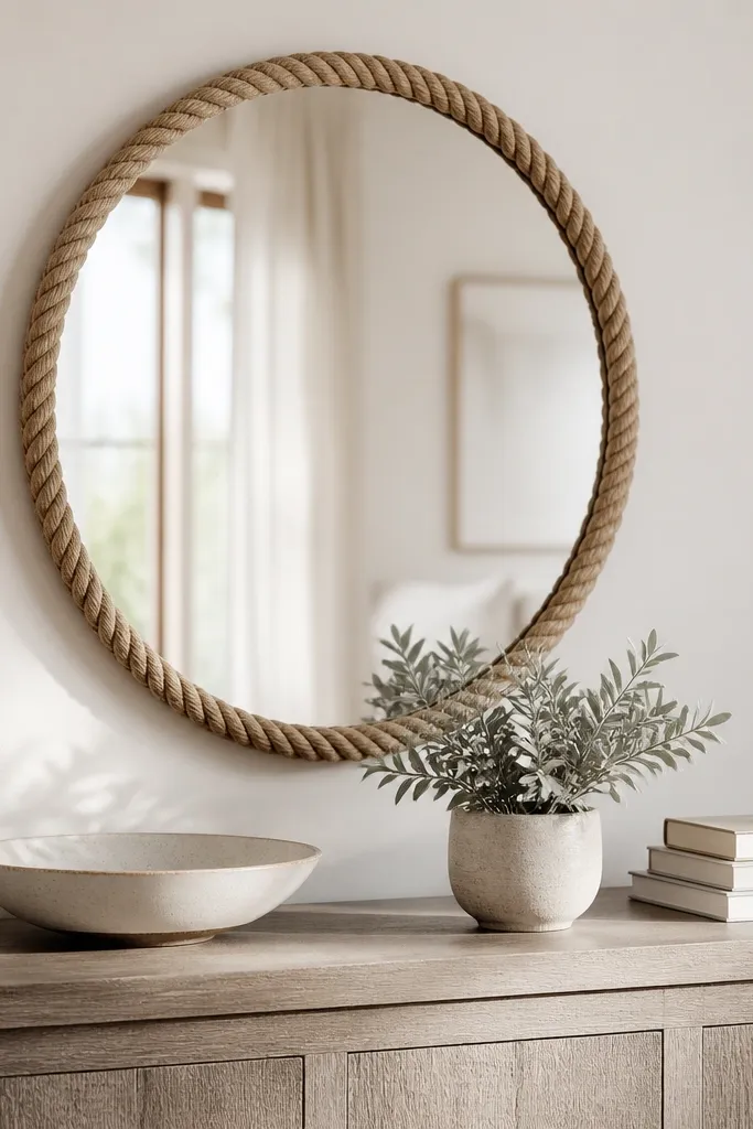
A rope-trim mirror brings the beach vibe in one clean piece. The driftwood console keeps the texture theme consistent with the dining table setup. A plant with silvery leaves reads like beach air — it ties into the sea glass and sand colors.
Pick a mirror diameter around 24-30 inches. Rope trim should be natural tan, not dyed bright. Keep console items minimal: one bowl, one plant, one stack of 2-3 books. That spacing keeps the mirror from looking crowded.
Tilt the mirror slightly so it catches the lamp glow at night. It makes the whole dining zone feel warmer.
Don’t hang rope-trim decor too high above the dining table — it looks like a bathroom feature.
10. Open cabinet display with glass jars of shells and dried lavender
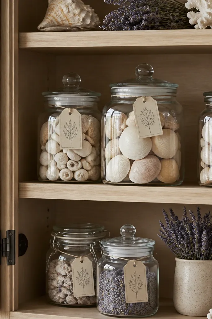
Glass jars make shell decor feel controlled instead of messy. Pairing shells with dried lavender adds a second coastal scent cue and a purple-gray accent that works with sea glass tones. Labels make it look intentional, like it belongs in a kitchen pantry.
Use jars with matching lids — clear glass with brass or white caps looks best. Keep shell quantity low so you still see the jar bottom. Use lavender stems about 4-6 inches long so they don’t spill over.
Dust the shells before filling jars. Fine sand ruins the look fast under cabinet lighting.
Skip glittery shells. They look like party favors and clash with the soft palette.
11. Blue-and-cream plaid chair cushions for a cozy dining nook
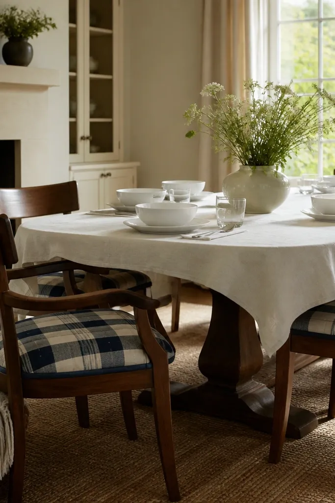
Plaid adds warmth and story, and blue-and-cream keeps it coastal instead of country. Cushions make the dining area feel inviting because you’re adding soft seating texture. A cream tablecloth keeps the pattern from getting too busy and gives that “cozy house kitchen” feel.
Choose cushions with a thickness of about 2 inches so they look plush but not bulky. Match the plaid’s blue to your sea glass accents in the room. If your tablecloth is thin, add a fitted liner so it doesn’t cling or wrinkle.
Swap only the chair cushions seasonally. Keep the table base neutral and change the textiles for quick updates.
Avoid polyester plaid that feels slick — it looks cheap when it catches light.