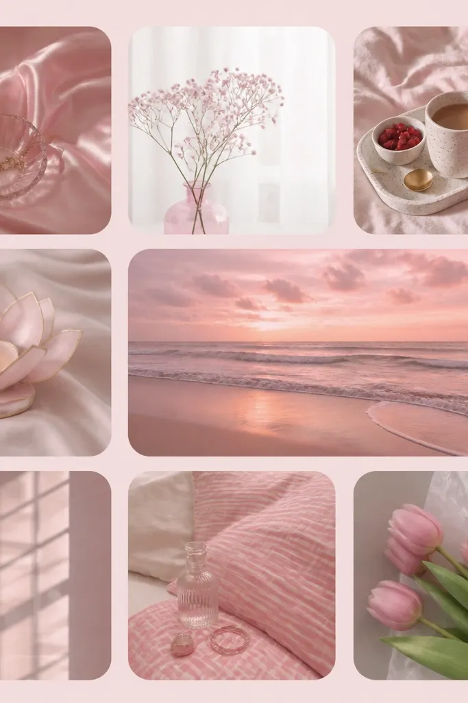
1. Blush Gloss Counter Tray for the Coffee Zone
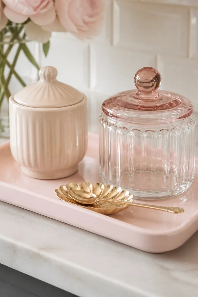
Use a tray that’s about 14-16 inches long so it fits near the coffee corner without touching the sink side. Pair it with one ceramic item and one glass item so you get contrast — blush ceramic + clear glass looks clean even in tiny kitchens.
A glossy tray makes the whole counter look brighter because it reflects overhead light. I like light pink with a smooth finish because it doesn’t absorb shadows the way matte does. Keeping the tray to one tight zone also stops the “everything is pink” chaos.
Watch outAvoid mixing three different pink finishes on the same surface — glossy, matte, and glitter together looks messy.
Pro tipWipe the tray with a microfiber cloth after you set it down. Light pink shows fingerprints faster than beige.
2. Light Pink Linen Runner on a Narrow Dining Table
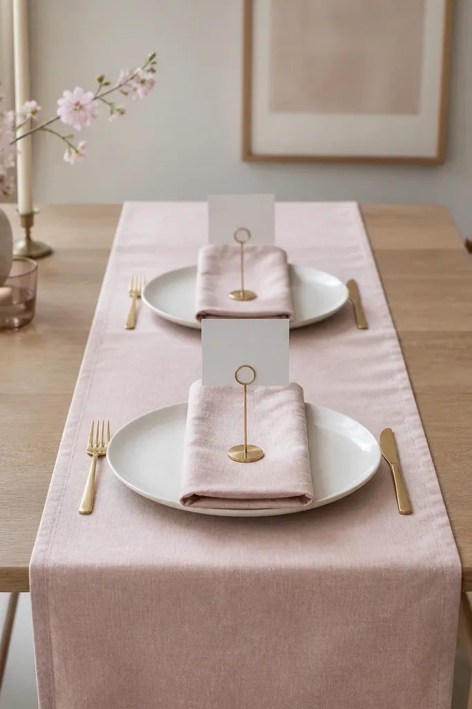
A runner gives you a clear focal strip without taking over the whole tabletop. Linen texture softens the look, and the pale pink keeps it airy. I’ve seen this work in cramped dining nooks because it visually stretches the table length.
Choose a runner width around 13-15 inches for a table under 36 inches wide. Let it hang 1-2 inches past each end and keep the napkins in a matching blush tone, not bright pink.
Steam the runner for 20-30 seconds and smooth it by hand. Wrinkles look casual, but only if they’re controlled.
Skip polyester runners that cling or shine. They look cheap under kitchen lights.
3. Blush Ceramic Canister Set with One Lid Color
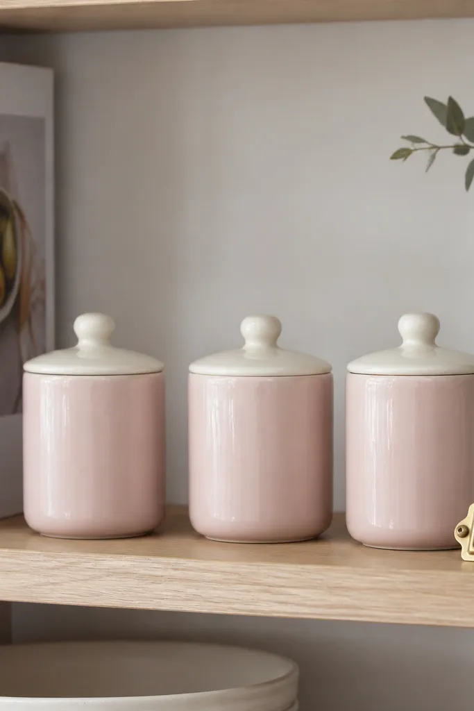
Ceramic canisters bring that cozy, lived-in vibe, and light pink makes them look gentle instead of bulky. The key is keeping the lids one color so the set reads coordinated. I’ve used this to make pantry storage look decorative in kitchens where you can’t hide everything behind doors.
Aim for canisters around 6-8 inches tall and 3.5-4.5 inches wide. Put them on a shelf, not the counter, so you keep daily prep space open.
Label only one or two canisters with small gold or white tags. Too many labels makes it look like a craft project.
Avoid mismatched patterns on each canister. Plain blush with subtle shape variation looks intentional.
4. Acrylic Blush Soap Dispenser + Matching Toothbrush Holder
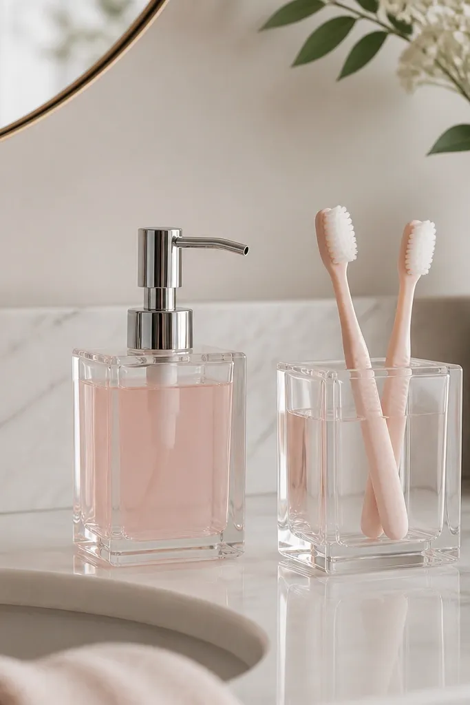
Acrylic looks clean in small spaces because it stays visually light. When the soap is pale pink, it adds color without covering the sink area with fabric. I like pairing the dispenser with one matching accessory so the sink corner looks styled, not random.
Use a dispenser that’s under 9 inches tall so it doesn’t block the faucet. Choose a toothbrush holder with straight sides for a neat look and fill the soap with a pale blush tint, not neon.
Use a funnel and wipe the bottle neck clean. Drips stain acrylic fast.
Don’t use a cloudy soap color. Opaque pink turns the acrylic plastic dull.
5. Pink-Tinted Glass Drinking Jars on a Small Shelf
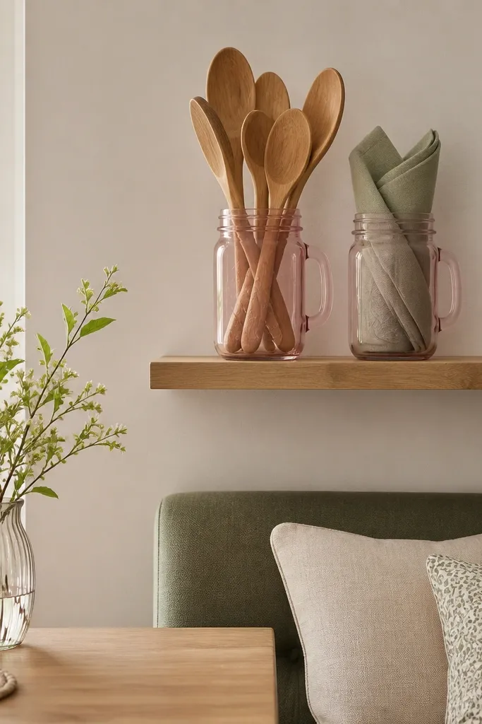
Keep jar sizes different — one around 6 inches tall and one around 8-10 inches. Fold napkins thin and stand them so you can fit more without stacking bulky fabric.
Tinted glass adds softness while still letting you see the contents. That “see-through” quality is why it works in tight kitchens. Pale blush jars also play nicely with white dishware and warm wood.
Watch outAvoid stacking jars too high. If they sit above eye level, they look like clutter.
Pro tipUse one wood detail on the shelf — a small spoon or a tray edge — to stop the pink from looking too sugary.
6. Blush Paper Lantern Pendant Over the Dining Nook
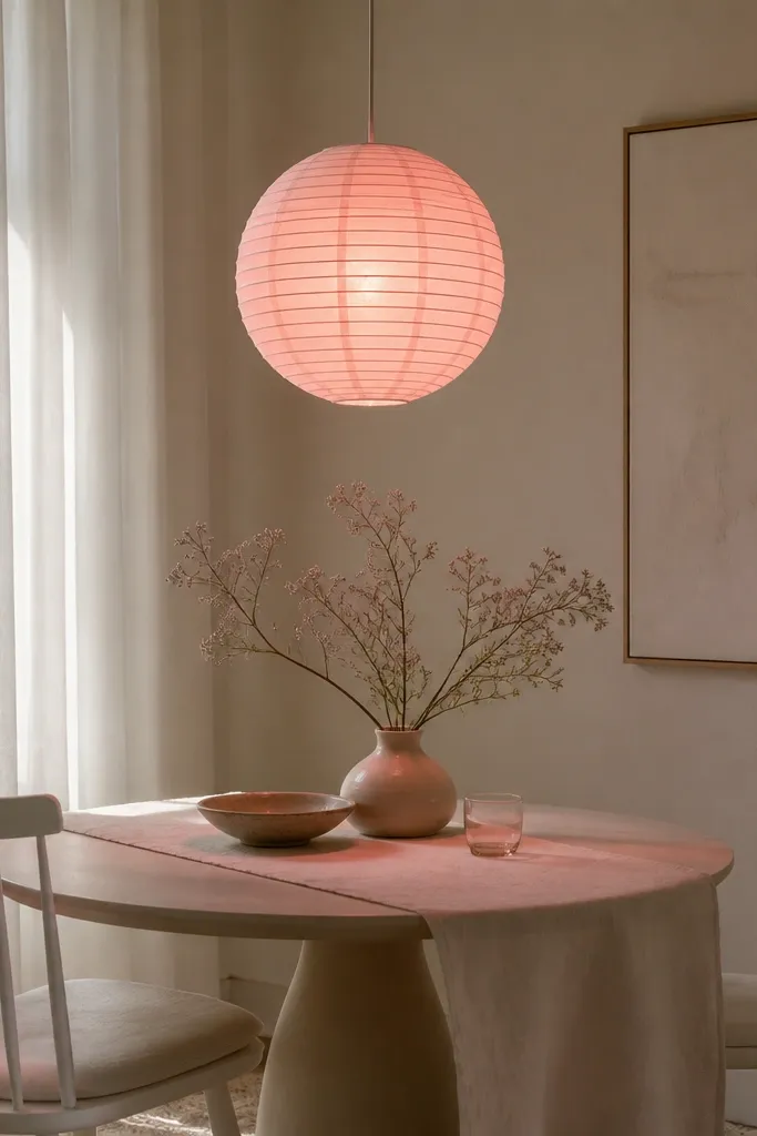
A paper lantern gives you color through light, not just decoration. That matters in small spaces because it changes the mood without taking up surface area. I’ve used this in kitchens where the ceiling fixture felt too harsh.
Hang it low enough to glow over the table, about 28-32 inches from the tabletop. Pair with a pale runner and simple white plates so the glow has a clean backdrop.
Use a warm bulb around 2700K. Cool light makes blush look gray.
Avoid LED bulbs with a blue tint. Pink paper turns muddy under them.
7. Light Pink Framed Print with One-Line Kitchen Quote
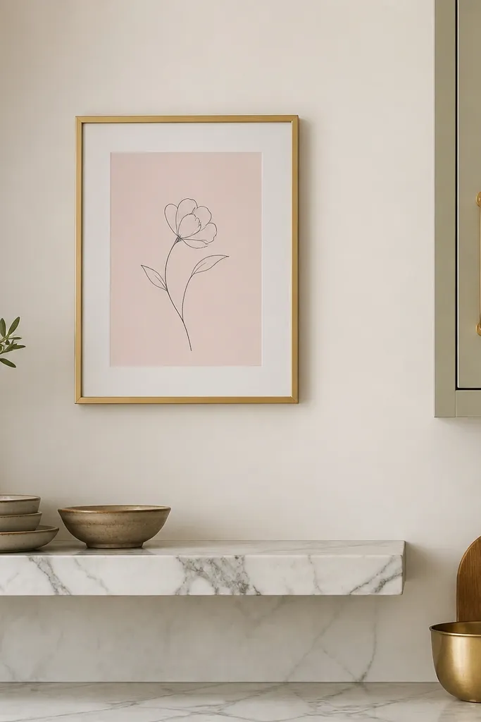
Use a frame size around 8x10 or 9x12 for tight walls. Keep the mat white or cream and let the print take up most of the mat so it reads clearly.
A small print is the fastest way to add light pink without touching countertops. Minimal line art keeps the look modern, and the pale background prevents wall color from fighting your dishes. I place it where your eye lands when you enter the room — usually above a shelf or near the dining nook.
Watch outAvoid busy fonts or multicolor prints. They look chaotic in small kitchens.
Pro tipMatch one metal finish in the room — gold frame with gold cabinet hardware or a gold spoon rest.
8. Blush Napkin Rings Made from Thin Gold Wire
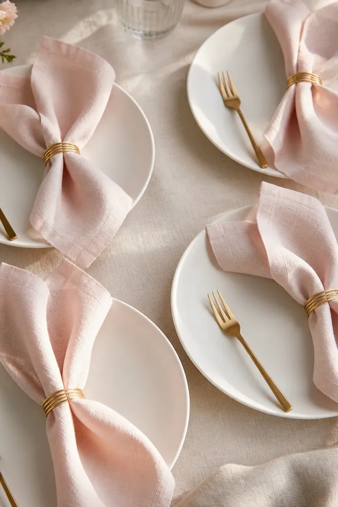
Napkin rings make your table look styled even when you only have a few pieces. Light pink fabric plus thin gold wire reads soft and intentional. I like wire rings because they hold shape through repeated use.
Pick napkins in light blush linen or linen-cotton blend. Use rings that are slim enough to slide over the folded napkin without crushing the fabric.
Fold napkins vertically and leave a little “tail” at the top so the ring sits centered and neat.
Skip chunky plastic rings. They look bulky against slim linen.
9. Small Pink Ceramic Salt Pig + Pepper Grinder Contrast
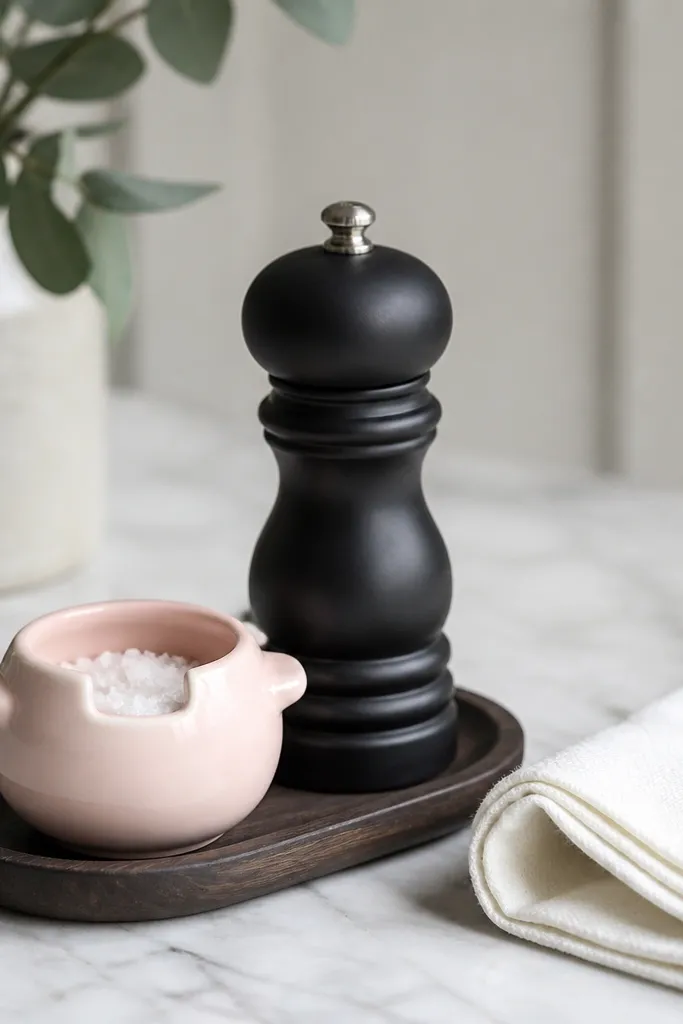
This is a simple trick: keep one item soft pink and the other grounded in black or dark gray. The contrast makes the pink look brighter and more deliberate. I use this pairing when my kitchen has a lot of stainless steel and beige tiles.
Use a salt pig about 3-4 inches tall so it doesn’t dominate the table. Put both items on a small tray or directly on a napkin so you get a styled cluster.
Clean the grinder base and rotate it so the label doesn’t face the room at a weird angle.
Avoid matching everything in pink. It turns flat and loses dimension.
10. Blush Magnetic Spice Labels on a White Metal Rack
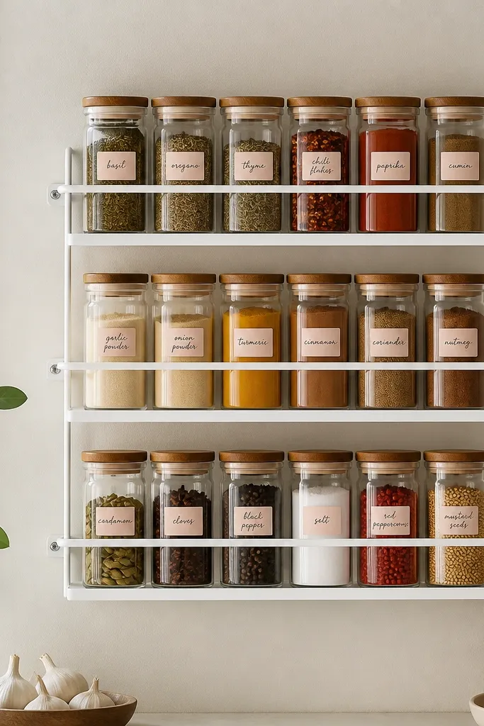
Labels are the unglamorous part that makes a small kitchen look finished. When the labels are light pink on white, they add softness without clutter. I’ve done this on narrow wall space because it keeps jars off the counter.
Use a small spice rack with jars no taller than 6 inches. Print or write labels in pale blush and keep text size consistent — about 12-14pt equivalent so it looks neat from a distance.
Use one label style for all jars — same font and same placement — and leave the jar caps bare if they’re already colorful.
Avoid multi-color label sets. They scream “storage organizing project.”
11. Pale Pink Glass Cutting Board with a White Cloth Underlay
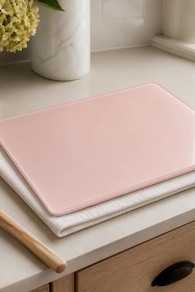
A glass cutting board looks sleek and bright, and the pale pink tint adds softness. The white cloth underlay keeps it from sliding and prevents scratches on counters. I use this when I want a clean aesthetic but I still need a practical surface for quick prep.
Choose a board around 12x16 inches so it stays usable without taking over. Fold the cloth to about 10x12 inches and center it under the board edges.
Wipe glass with a streak-free cleaner and dry immediately. Light pink tint shows water spots.
Skip thick boards that weigh a ton. In small kitchens, you stop using them.
12. Blush Ceramic Mug Tree on a Wall Shelf
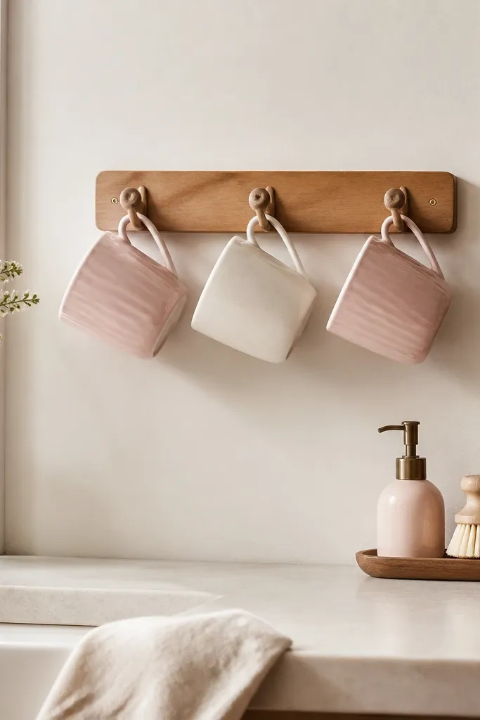
A mug tree saves counter space and turns mugs into decor. Light pink mugs look airy when they hang, because you see gaps between them. I like this setup for small apartments where cabinet space is tight.
Mount the tree under a shelf or near the dining nook, about 4-5 inches below the shelf so it doesn’t hit your head. Keep mugs in a 2:1 ratio — two light pink, one white — so the color stays soft.
Hang mugs by handle alignment. If handles face different directions, it looks messy fast.
Avoid too many mugs. Three to four mugs is plenty for a small visual cluster.