1. Blush Pitcher + Cream Candle Trio on a 30-inch Buffet
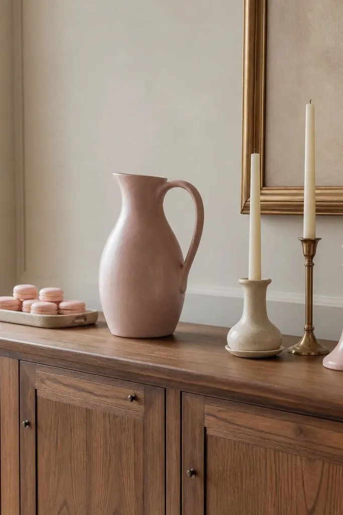
Put the blush pitcher in the middle so the eye has a clear start. The candles bring cozy height and keep the pink from feeling too “decor-only.” I like cream tapers because they read warm next to medium pink and don’t compete. Add a small gold element behind the candles to catch light and make everything look more finished.
Use a pitcher that’s about 10-12 inches tall. Candle holders should be 3-5 inches tall so the center stays dominant but not towering. Place a rectangular tray on each side with 3-4 inches of breathing room from the ends of the buffet.
Pro tipWrap the pitcher handle with a 1-inch strip of blush satin ribbon once, then tie a loose bow — it looks styled without adding more pink objects.
Watch outSkipping the cream candle color and going straight to more pink usually makes the whole buffet look flat and busy.
2. Dusty Rose Runner with Two Side Trays and One Tall Herb Pot
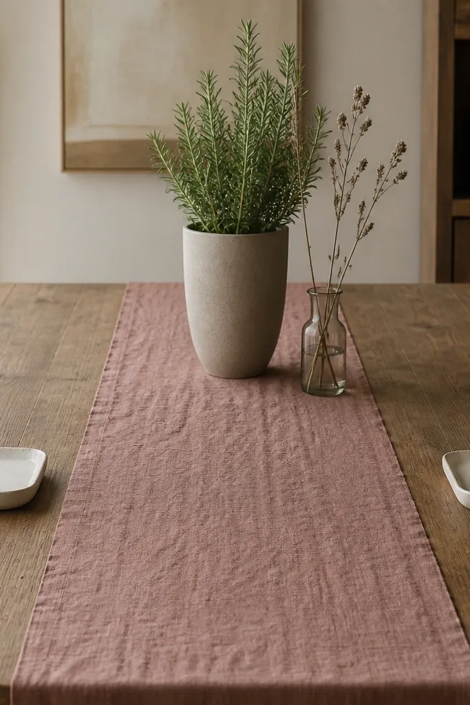
A runner gives you instant color structure. Keep the runner medium pink and matte (cotton or linen) so it looks cozy, not glossy. Then balance it with two small trays that hold neutral items — think white ceramic bowls or oatmeal napkin rings. The tall herb pot adds vertical rhythm and stops the layout from feeling like a flat strip of fabric.
Runner width should be about 14-16 inches on a 36-48 inch table. Place the tall pot about 8-10 inches from the back edge of the table and keep the side trays roughly 6-8 inches away from it. Use one glass vase next to the pot so there’s a reflective break from the matte fabrics.
Pro tipFold napkins into rectangles and set them on the trays so the edges line up with the tray corners.
Watch outUsing a shiny satin runner makes the pink look like party decor instead of kitchen cozy.
3. Pink Tray Corner Styling on a Coffee Station
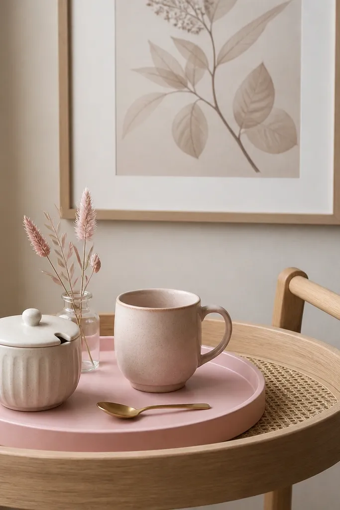
Corner coffee station styling looks best when the tray does the heavy lifting. The tray creates a boundary, so you don’t have to fight with random canisters and receipts. Medium pink on the mug or sugar jar ties it back to the aesthetic without turning every item pink. Glass + gold adds a gentle sparkle that makes the pink feel intentional.
Choose a tray about 10-13 inches wide so it fits on a cart without crowding. Put the mug slightly forward (about half an inch) so it stands out when you pour. Keep the stems low — under 6 inches — so the tray stays usable for real coffee prep.
Pro tipAdd a thin beige linen coaster under the mug so it looks styled even when you’re not using it yet.
Watch outDumping loose items directly on the cart without a tray makes the layout look accidental.
4. Rose Quartz Wall Shelf with 3-Layer Stack
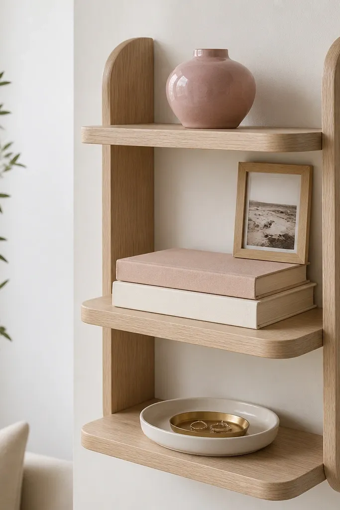
A three-layer stack gives your shelf depth and keeps the pink from floating. Use a small pink vase as the top layer, then ground it with books in cream and oatmeal so the shelf reads calm. The bottom dish catches small reflections and gives you a place for keys or teaspoons. This layout looks cozy even when the shelf is “in motion” with daily use.
Shelf depth should be at least 5 inches so the bottom dish doesn’t hang over. Top layer objects should be under 7 inches tall. Stack books so the tallest spine sits slightly left of center, then place the dish on the right for visual balance.
Pro tipDust the shelf once, then style it. I’ve learned that pink ceramics show dust fast — a clean surface makes the whole thing look expensive.
Watch outMixing too many different pink shades on one shelf reads messy rather than cohesive.
5. Matte Blush Napkin Rings with White Place Setting Grid
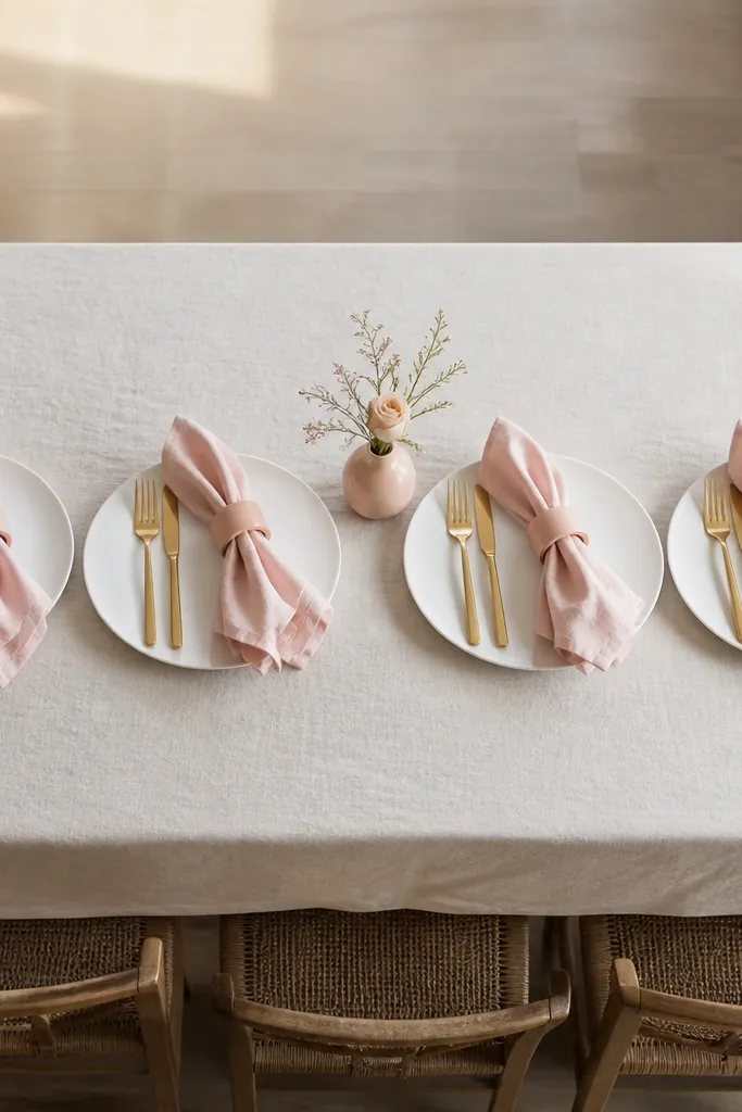
This one is for dinner-table symmetry. The napkin rings are your medium pink anchor while the plates stay neutral and clean. A small bud vase in pink keeps the theme going without making the table feel like a candy store. Gold flatware adds a warm highlight that looks good in low evening light.
Use napkins that are medium pink but matte cotton or linen. Ring diameter should be 2-3 inches so it doesn’t crush folds. Keep the bud vase under 6 inches tall and place it between settings, not on top of each plate.
Pro tipFold napkins with a simple rectangle fold and tuck the end under the ring so the fold stays crisp.
Watch outUsing a patterned pink napkin without another pattern in the room makes the table look chaotic.
6. Pink Glass Cloche Over a Cream Dessert Plate
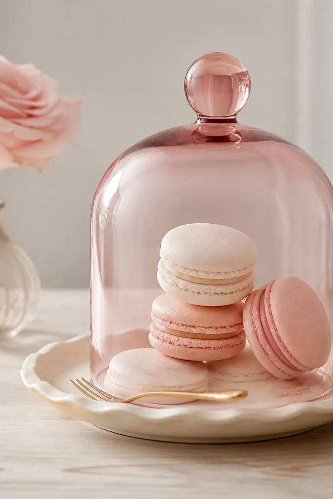
A cloche makes the layout feel curated because it creates a dome boundary. The pink tint is subtle, so it reads cozy instead of loud. Pair it with a cream plate and blush accents to keep the palette soft. This setup also makes your kitchen feel styled even when you’re just setting out snacks.
Pick a cloche with a base diameter around 7-9 inches. Put the cream dessert plate under it so the cloche doesn’t look like a random cover. Keep the rose behind the cloche, slightly off-center, so it doesn’t block the view.
Pro tipDust the glass cloche with a microfiber cloth before styling. Fingerprints ruin the pink tint fast.
Watch outPutting the cloche on a busy patterned table surface — it fights for attention.
7. Blush Ceramic Bowl with Fruit + a Mini Candlestick
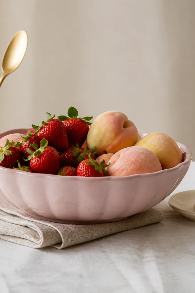
Food layouts look best when you give them a container that matches your aesthetic. A medium pink ceramic bowl makes fruit look prettier without adding extra decor. The mini candlestick adds cozy warmth, but keep it cream so it doesn’t turn the whole table into pink overload. Gold flatware and a linen napkin finish it off.
Use a bowl about 9-12 inches wide. Place the candlestick on a small saucer so it doesn’t wobble. Roll the linen napkin and tuck it under the bowl edge so the texture shows through.
Choose fruit with natural blush tones — strawberries plus peaches look better together than bright red + bananas.
Using a glossy pink bowl — it shows fingerprints and looks less cozy.
8. Two-Height Pink Candles on a White Tray
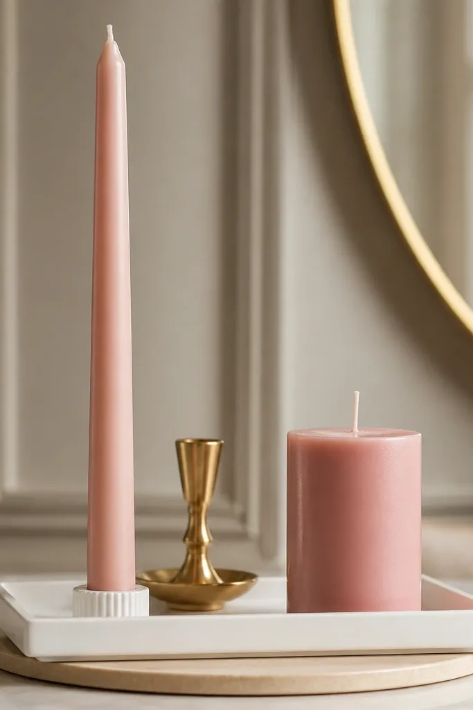
Candles create instant mood, but the layout needs height contrast. Put one tall taper and one shorter pillar so the arrangement has structure. Use a white tray to keep the pink from spreading everywhere. Gold behind the candles gives a reflective line that makes the pink look deeper.
Tray should be 14-18 inches long. Keep at least 2 inches between the tall taper and the edge of the tray. Use pillar candles in a matte finish so the pink reads soft.
Pro tipTrim the taper wick after each burn day. A longer wick makes the flame look uneven and the pink wax looks messy.
Watch outPlacing candles directly on wood without a tray — wax spills ruin the look.
9. Pink Picture Frame Lean + Mirror Catch on the Sideboard
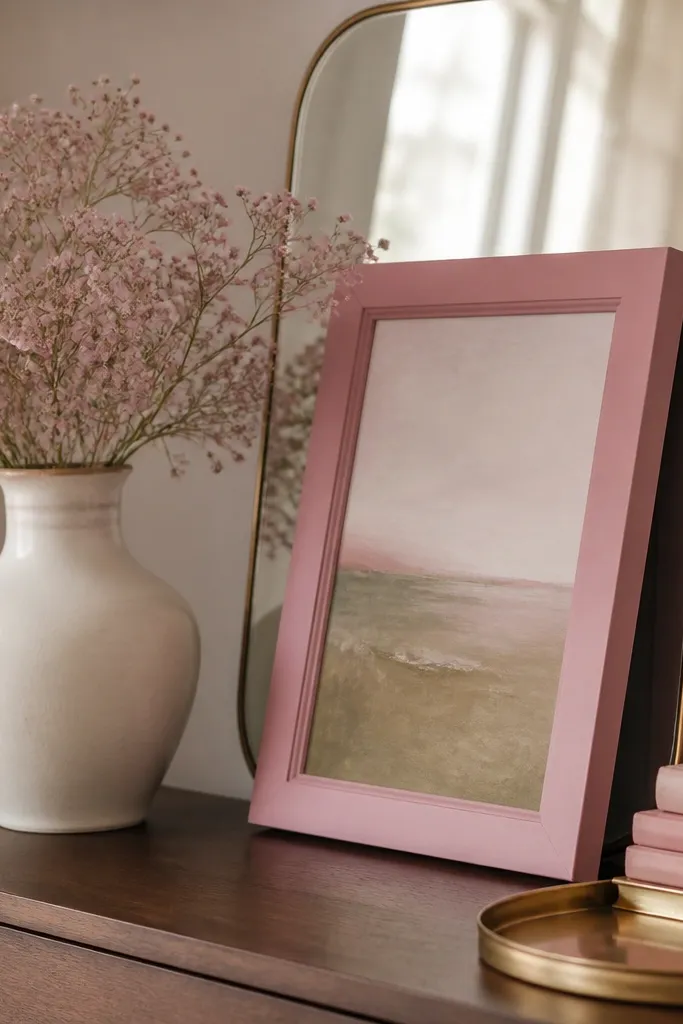
This layout uses negative space, which is how you keep pink from becoming clutter. The pink frame is the anchor, and the mirror doubles the brightness so the pink looks warm. Baby’s breath adds soft texture without adding more color. The gold tray gives you a place for tiny items and keeps the bottom area tidy.
Use a frame that’s 8x10 inches or slightly bigger. Place it behind the vase so it doesn’t block the flowers. Keep the mirror small enough to fit between two ends of the sideboard without crowding.
Pro tipAngle the mirror 10-15 degrees toward a window so the pink looks better in morning light.
Watch outTurning the mirror straight-on to the window — it can glare and wash out the pink.
10. Pink Tile Coaster Stack with a Linen Menu Card Holder
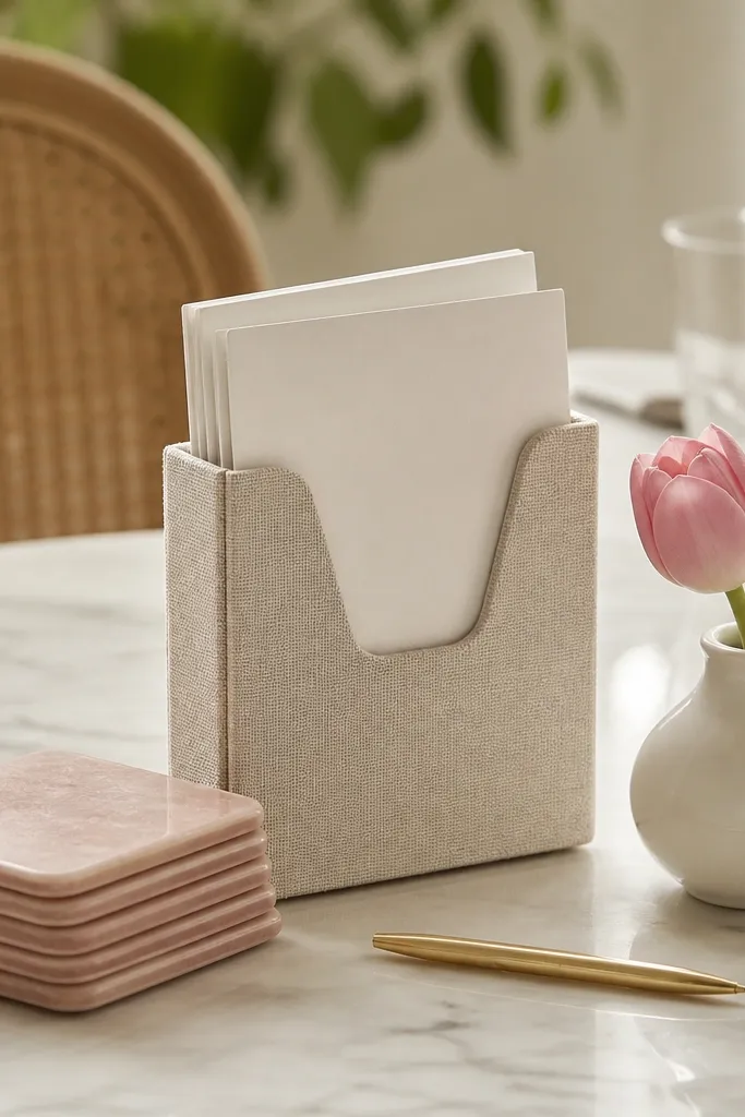
For small surfaces, stackable items solve the “where do I put decor” problem. Pink coasters act like a base platform, giving the layout a graphic, tidy look. The oatmeal linen holder softens everything and keeps the aesthetic cozy. One tulip is enough — you don’t need a full bouquet to get the pink vibe.
Stack 4-6 coasters so the height is visible but not tall enough to block conversation. Place the menu holder on the left of the coaster stack and the tulip vase on the right. Use a single thin gold accessory so the layout doesn’t look flat.
Write the menu card in a simple black marker. The contrast makes the pink look more intentional.
Overfilling with multiple florals — one stem looks cleaner and more modern.
11. Blush Salt Jar + Cream Sugar Jar with a Small Herb Bundle
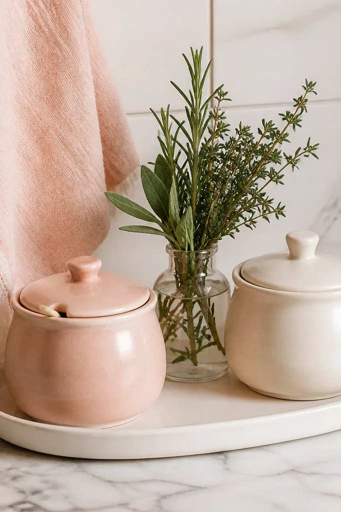
Counter vignettes work best when they look like they belong to the food routine. A blush salt jar and cream sugar jar create a matched set feel without needing a full pink canister wall. The herb bundle adds a fresh, lived-in texture. Keep the glass bottle behind them so the herbs look airy and not heavy.
Use jars that are 5-7 inches tall. Put the jars on a tray that’s about 16 inches long so you can lift it and wipe under it. Place the herb bottle behind the jars, centered, and keep the stems trimmed to 4-5 inches.
Pro tipChoose herbs with thin leaves like thyme. They look delicate next to medium pink ceramics.
Watch outUsing a bright fuchsia jar next to blush — the color clash makes the whole counter feel off.
12. Pink Ombre Candle Votive Cluster on a Round Wood Lazy Susan
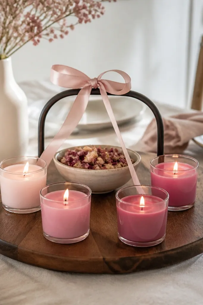
An ombre votive cluster looks balanced because each candle is the same shape. The lazy susan makes the layout interactive, and it also keeps everything grouped. The cream center bowl grounds the pink so it doesn’t look like a themed party. Dried petals add texture without adding more colors.
Use a lazy susan around 14-16 inches wide. Arrange candles in a circle leaving a 3-inch gap for the center bowl. Tie a blush ribbon around the handle once and keep it short — about 6-8 inches of visible ribbon.
Pro tipSwap dried petals for dried rosebud pieces if you want the cluster to read more romantic and less craft-like.
Watch outUsing too many candle holders — five votives looks intentional, ten looks chaotic.