1. Blush linen table runner with a black dot grid
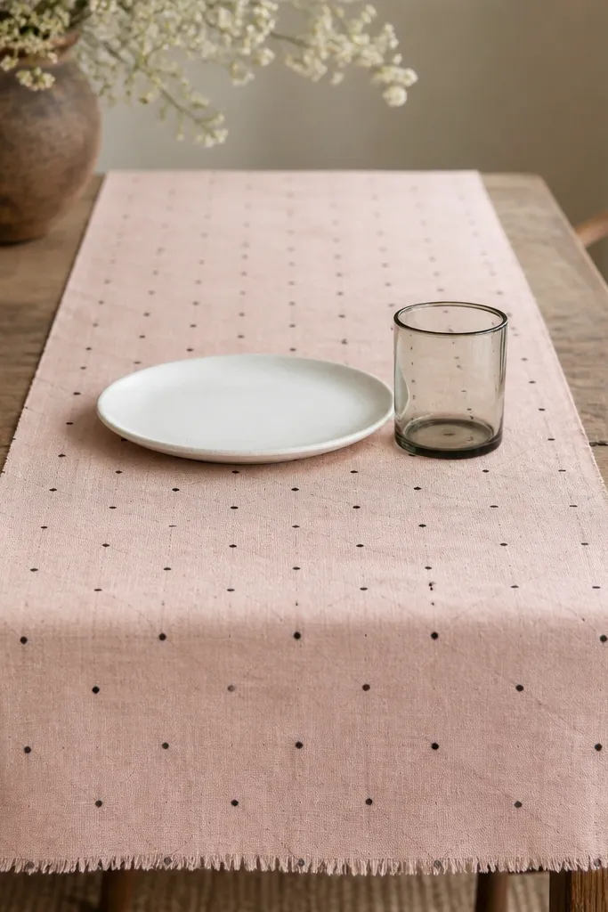
This works because linen gives you that soft, seasonal evergreen feel without looking holiday-specific. The black dot grid reads modern and keeps the pink grounded instead of sweet. Creamy white plates next to the blush make the color look intentional, especially under warm kitchen lighting. The raw edge also helps it look “designed” rather than store-bought and stiff.
Measure your table and aim for a runner width that leaves 4-6 inches of table surface on each side. If you’re using patterned black dots, keep everything else mostly solid white or solid blush. Pair with black flatware handles or a black placemat corner so the dots feel like part of a system.
Pro tipAdd one small black element — a thin black ceramic coaster or a black candle cup — right near the runner’s middle.
Watch outAvoid hot pink runners with high-contrast neon patterns; they make the black look harsher and the whole table feels temporary.
2. Creamy white ceramic tray with blush candle cups and black handles
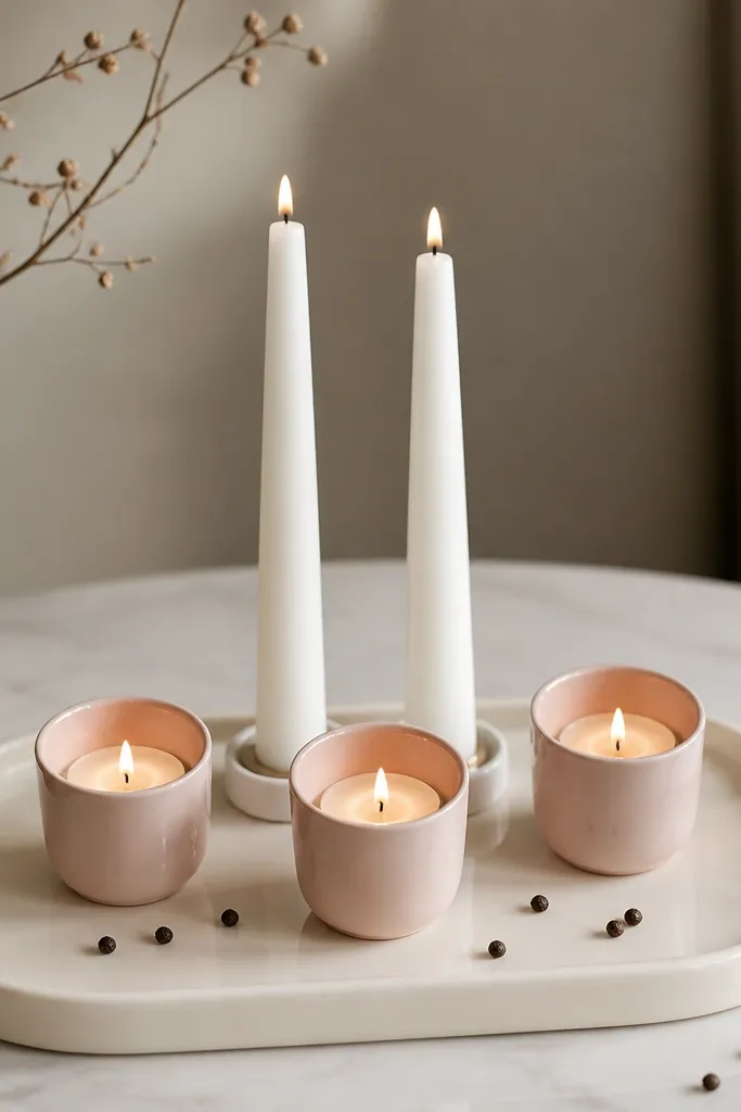
Ceramic glaze gives that evergreen “always there” vibe because it looks finished even when it’s not holiday season. Blush candle cups add warmth and a gentle color wash across the tray. Black handles act like a frame so the tray reads as one piece, not random decor. The scattered dark specks (like peppercorns) echo the black without adding another color.
Use a tray that’s at least 12 inches long so candles have breathing room. Group candles in a tight center cluster, then leave 1-2 inches of open tray space at the edges. Keep candle cups in blush matte or satin so the glossy tray still catches light.
Pro tipIf you want it to look styled fast, put the tray on a white tablecloth or a neutral runner first, then build candles on top.
Watch outAvoid mixing three different pink shades on the same tray; it looks like a clearance bin.
3. Pink and white checker napkins with black embroidery corners
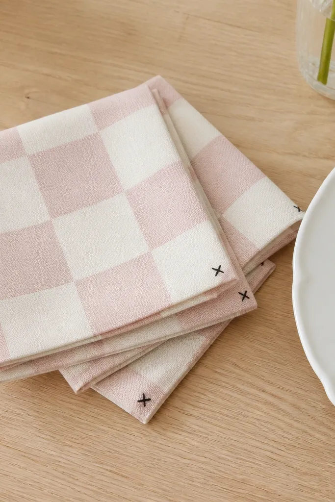
Checkers make dining feel styled immediately, and the black corner embroidery adds a little structure. The pink is light enough to stay evergreen, not seasonal. When napkins match table accents, the whole place setting looks coordinated even if your centerpieces are simple. This combo also photographs well because the pattern gives texture.
Fold napkins into a simple triangle or a quick rectangle roll. Aim for napkins that are about 18-20 inches square so they drape without looking skimpy. Keep the rest of the table mostly solid — white plates, blush glass or clear glass, and one black utensil.
Pro tipUse black utensils or black napkin rings once per place setting. One repeated black element beats adding more decor.
Watch outAvoid pairing checker napkins with a busy patterned placemat; it turns the table into visual noise.
4. Wall gallery of pink-and-white prints in black frames
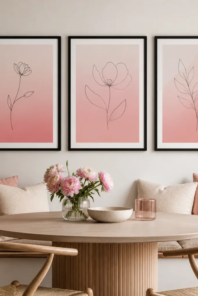
This is the “always looks finished” option because wall art doesn’t get buried under dishes. Black frames give you the evergreen structure, while pink/white prints keep it airy. I like line drawings with light blush gradients because they echo the kitchen’s ceramics and dishware. You get seasonal feel through color, not through seasonal characters or themes.
Hang frames so the bottom edge is about 60 inches from the floor for most dining chairs. Use the same frame size for all pieces — it looks deliberate. Choose prints that repeat the same pink tone across all three so it reads like one set.
Pro tipPut one matching black object below the gallery — a black tray or black vase — so the wall and table talk to each other.
Watch outAvoid glossy frames if your kitchen has strong overhead lights; glare makes the pink look washed out.
5. Blush ribbed placemats with black leather coasters

Ribbed placemats add texture without pattern overload. Black leather coasters bring in a deeper tone that keeps blush from looking pale. Because the placemats are ribbed, they catch light gently and look styled even when you’re just eating cereal or toast. This setup also works daily because the materials are practical.
Choose placemats that are at least 12x18 inches so they hold the mug and a plate without peeking out. Keep coaster size around 4 inches for mugs and 5-6 inches for teacups. If your coasters are shiny, reduce glare by placing them under warm bulbs rather than direct white ceiling lights.
Pro tipLayer a small white runner strip under the placemats if your table has scratches or uneven color.
Watch outAvoid thin placemats that curl at the edges; they make the whole table look unfinished.
6. Black and blush striped dish towels rolled in a white ceramic crock
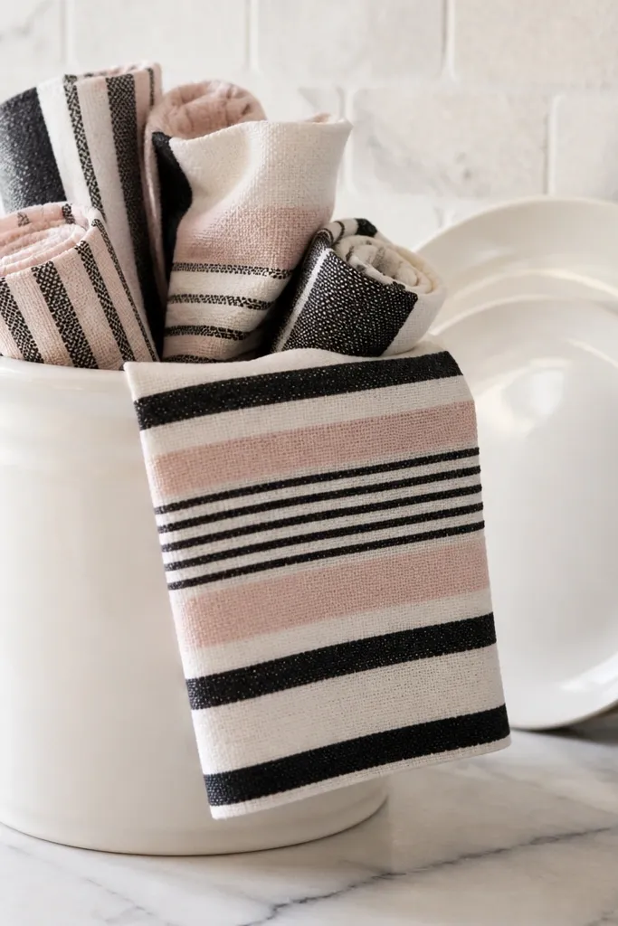
Dish towels are one of the only décor items you replace frequently, so making them part of the theme is smart. Stripes create a clean rhythm, and the white crock keeps the setup airy. Black stripes add contrast that makes the blush look richer. Rolled towels also look intentional instead of messy.
Use a crock that’s wide enough to hide the roll ends, or you’ll see uneven edges. Roll towels to about 1.5-2 inches thick and pack them snug, leaving one roll slightly angled for a styled look. Wash towels in cold water to keep the blush from fading unevenly.
Pro tipSwap in new towels every season but keep the same black/white structure so the theme feels evergreen.
Watch outAvoid mismatched towel sets with different pink hues; it reads chaotic at counter height.
7. Pink-tinted glass bottles for utensils and flowers with black labels
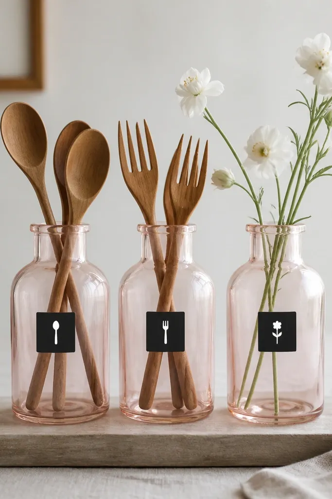
This looks curated because the bottles are the same shape, even if the contents change. Pink tint adds a soft filter over whatever you put inside. Black labels make it feel like a set and tie into your dining black accents. White flowers keep the palette bright and prevent the pink from turning dusty.
Pick bottles that are at least 8 inches tall so utensils don’t spill over the rim. Use waterproof labels so you can wipe the bottles without peeling. Keep label placement consistent — same height on each bottle.
Pro tipAdd one bottle of empty space — just a bottle with a little water and a single stem — so it doesn’t look overstuffed.
Watch outAvoid random bottle shapes with different pink tints; the theme falls apart fast.
8. Blush and white sugar jar with a black lid and gold-free sticker
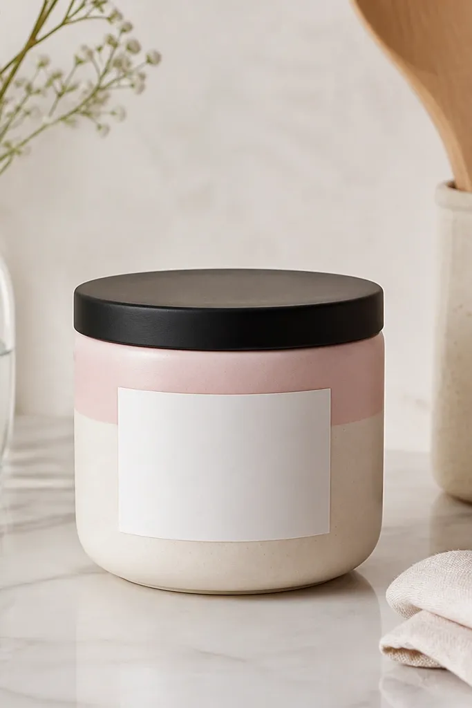
Appliance clutter is real, and jars help because they hide it. The blush band gives color without demanding attention, and the matte black lid makes it feel grounded. Since it’s on a kitchen shelf or counter, it acts like an evergreen anchor. The sticker style helps it look cohesive with your other black accents.
Choose jars that are clear enough to see contents, or keep it filled so it looks consistent. Keep the blush band width around 1.5-2 inches so it doesn’t overpower the white. Use a label you can replace easily when the jar empties.
Pro tipPut the jar next to one black item — a black-handled scoop or a black spoon rest — so the lid color repeats.
Watch outAvoid glossy gold labels; they fight the pink/black palette and read off-theme.
9. Pink ombre placemat set with matte black napkin rings
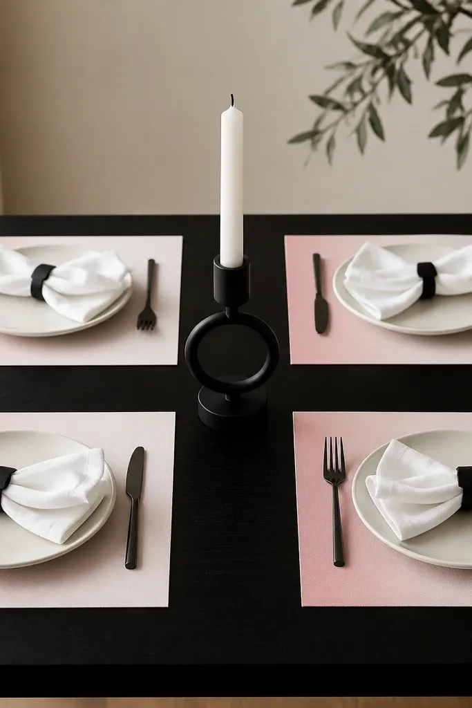
Ombre gradients feel more “designed” than simple stripes because they soften edges and look good year-round. The black napkin rings add a clean line that separates each place setting. If you keep the rest of the table minimal, the gradient stays elegant and not busy. This is the kind of setup that still looks good when you swap in different plates.
Pick ombre placemats where the deepest pink is around blush shade, not rose red. Use rings that are about 2 inches wide so they sit flat and don’t twist. Keep centerpieces simple — one black candle and a small white dish.
Fold napkins so the ombre placemat is still the first thing your eye sees.
Avoid adding a patterned centerpiece on top of ombre placemats; the gradient already provides the visual interest.
10. Pink and black salt and pepper set on a white marble board
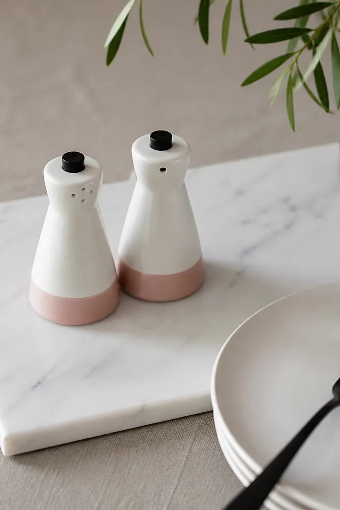
The marble board makes everything look like a styling moment, even for weeknight meals. Pink bases are subtle, so the set reads seasonal without screaming “theme.” Black tops tie into the rest of the palette and prevent the pink from feeling too light. It’s small decor, but it’s visible at eating height.
Use a board about 10x14 inches so the set doesn’t feel cramped. Wipe the board dry after cleaning so pink parts don’t get cloudy from water spots. Keep the rest of the table mostly white so the set is the focal point.
Place the salt and pepper set slightly off-center toward the guest side; it looks more natural than perfectly centered.
Avoid sets where the pink is neon; it clashes with creamy whites and makes the board look dingy.
11. Black wire fruit bowl with blush ceramic accents
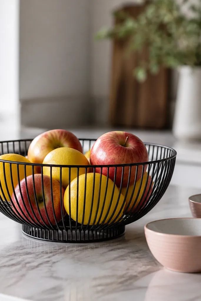
Fruit bowls are the easiest evergreen décor because you can keep them filled and switch the contents seasonally. The black wire keeps the look modern and prevents the counter from becoming too soft. The blush ceramic mini bowls add the pink/white theme without adding clutter. It’s practical decor that stays put.
Use a fruit bowl with a black finish that doesn’t show fingerprints. Place blush mini bowls at the corner of the bowl’s base, not directly under it, so the counter has visual breathing room. Keep ceramic interiors white so the fruit colors pop.
Pro tipPair lemons or white peaches with the blush bowls for a clean pink-white contrast.
Watch outAvoid placing random pink decor too close to the fruit; it makes the counter feel crowded and messy.
12. Blush ceramic utensil crock with black silicone handles
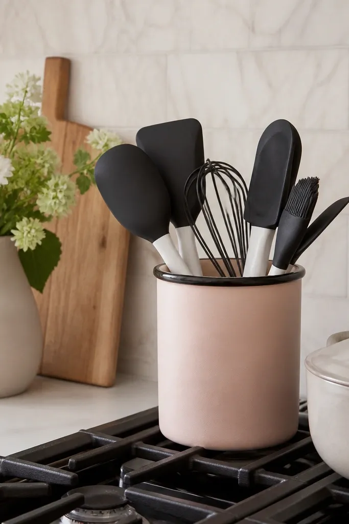
This option is for people who hate hiding tools. The crock keeps the mess contained, and the black silicone handles bring contrast that makes blush look deliberate. Because utensils get used daily, this arrangement stays “styled” without extra work. It also prevents the kitchen from looking too sweet.
Choose a crock with a wide opening so tools don’t jam and look bent. Keep white-handled tools minimal — one or two — to avoid breaking the palette. Wipe the crock rim often so grease doesn’t dull the blush.
Pro tipAdd one black tool with a slightly different shape, like a whisk, so the silhouette variety feels intentional.
Watch outAvoid a crock that’s too small; jammed utensils look sloppy fast.