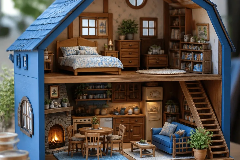
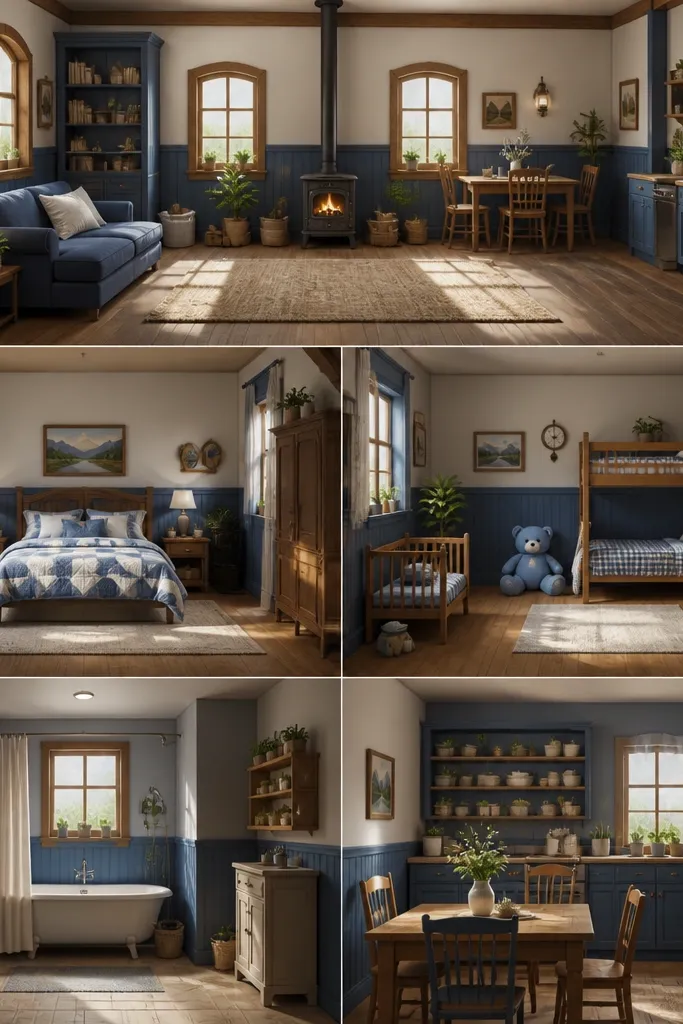
1. Dusty Blue Dining Wall with Peel-and-Stick Paneling
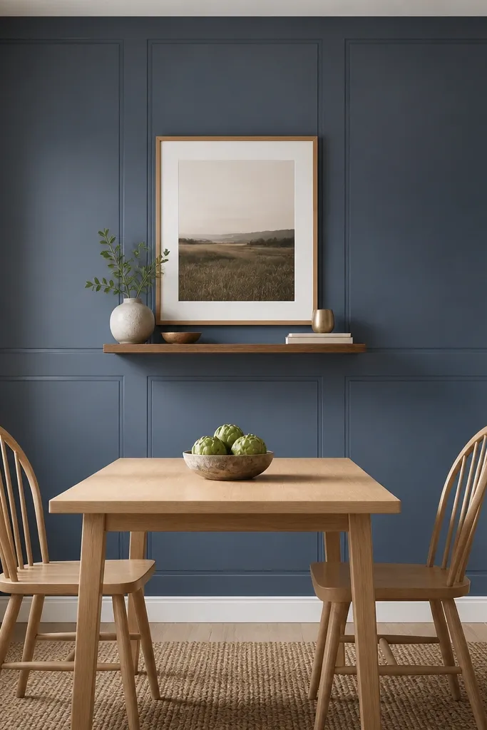
Cover only one wall or the area behind the dining chair backs. Choose a panel wallpaper in dusty periwinkle or slate-leaning blue, then keep your dining chair upholstery in cream, oatmeal, or light gray. Add a 18x24 framed print centered at eye level so it doesn’t fight the pattern.
This look mimics the painted wall panels you see in cozy farm interiors. The blue is muted so it reads like aged paint, not a blue accent wall. Panel shapes add structure, which makes rented walls feel designed even when the furniture is simple. I pair it with warm wood tones so the room stays inviting and not sterile.
Watch outAvoid glossy wallpaper — it reflects your overhead lights and makes the blue look harsh.
Pro tipTest the wallpaper on a small square with your exact lighting using painter’s tape to mark placement.
2. Linen-Look Curtains in Soft Cornflower with Clip-On Rods
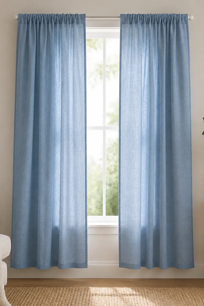
Curtains are the quickest way to get that calm sky-blue feeling. Linen-look fabric reads like painted walls in the game because it has a matte weave. Clip-on or tension rods keep it renter-friendly and let you switch the look seasonally. The key is letting the fabric drape, not hang stiff.
Measure from the top of the window trim to where you want the hem. If you want that cottage fall, aim for 84 inches total curtain length for standard-height windows, then trim only the bottom if needed. Pair with warm white sheers or skip sheers if you want the blue to be the star.
Hang the curtains on a slight diagonal gather by spacing clips every 6-8 inches so the fabric looks “hand-set,” not baggy.
Don’t use shiny satin curtains — they catch light like a disco and ruin the cozy vibe.
3. Blue Table Runner Over Warm Wood and Woven Placemats
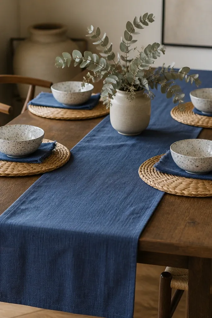
Choose a runner that’s 14-16 inches wide and about 72-84 inches long depending on your table. Place it centered so it overhangs about 2-3 inches at both ends. Use placemats that are 12-13 inches wide so they don’t crowd the runner.
A runner instantly frames the dining area like a painted scene. Blue fabric against warm wood makes the whole table feel calmer, and the woven placemats add the “farm basket” texture. I like a runner in matte cotton or linen-look because it folds naturally and looks real. Keep the rest of the table simple so the blue reads like a single cohesive layer.
Watch outAvoid a runner that’s too bright royal blue — it looks like a party table, not a calm cottage.
Pro tipPress the runner with a steam iron on low and let it hang for 10 minutes; the folds look more “settled.”
4. Removable Blue Shelf Styling with White Matte Ceramics
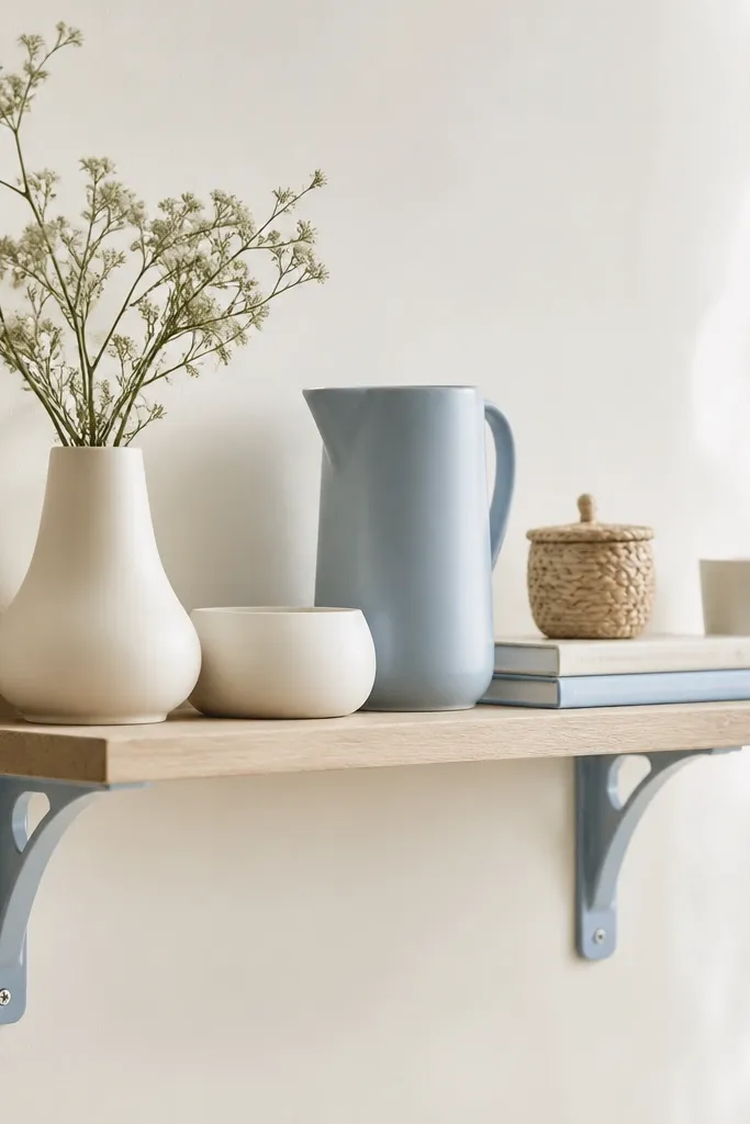
Use removable wall shelves with included adhesive brackets or hook-style mounts rated for your wall type. Keep items at different heights: one tall pitcher, two medium bowls, and one small basket. Aim for 60-70% neutral (white/cream) and 30-40% blue.
Shelves give you that lived-in “kitchen counter” feeling, and they don’t need permanent wall anchors. White matte ceramics keep the blue from getting heavy, and a single blue pitcher ties the palette together. I like styling in odd numbers so it looks natural, not like you measured it.
Watch outDon’t cram everything edge-to-edge — the shelf should have breathing room around the blue pitcher.
Pro tipWipe the shelf first with a dry microfiber cloth; adhesive mounts stick better to clean dust-free surfaces.
5. Blue and Cream Rug Layering in 2x4 for the Dining Spot
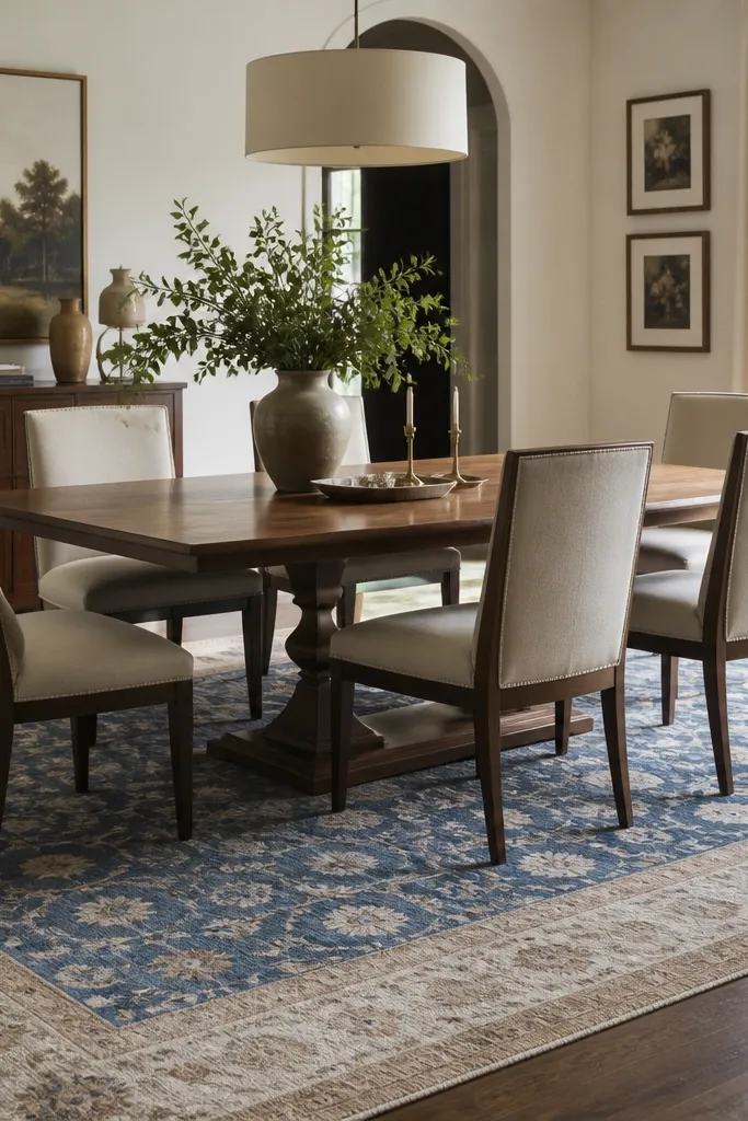
For most dining tables, a 2x4 rug works best if chairs stay on it when pulled out. If your chairs scrape the edge, go 2x6 or choose a runner that extends farther. Use a rug pad with grip so it doesn’t slide when you move chairs.
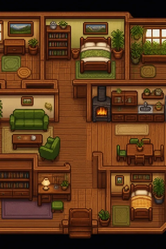
Rugs pull the whole stardew valley house interior for renters removable look together because they sit under every chair and table. I use a blue-and-cream pattern so it reads like painted floors with worn texture. Layering a thinner rug under a patterned one adds softness without bulking up too much.
Watch outAvoid shag rugs in dining — crumbs and spills get trapped fast.
Pro tipDo a quick tape test: tape painter’s tape lines on the floor to map the rug outline before you buy.
6. Renter-Friendly Blue Kitchen Counter Backdrop
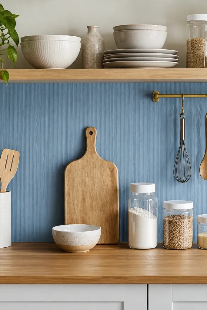
Measure the wall section between your counter and upper cabinets. Use a removable backsplash sheet in matte blue, not high-gloss. Add a 12-14 inch long tray across the counter to pull everything into one zone.
This gives you that “painted wall” effect behind everyday items. The blue vinyl or peel-and-stick backsplash makes the counter look styled even when you’re mid-week busy. Keep the kitchen objects in white, wood, and a few blues so the backdrop doesn’t look busy.
Watch outDon’t place the backsplash over greasy areas — it will lift at the edges within weeks.
Pro tipUse a microfiber cloth to wipe the wall with isopropyl alcohol on a hidden spot to improve adhesion.
7. Blue Window Valance with No-Sew Clip Clips
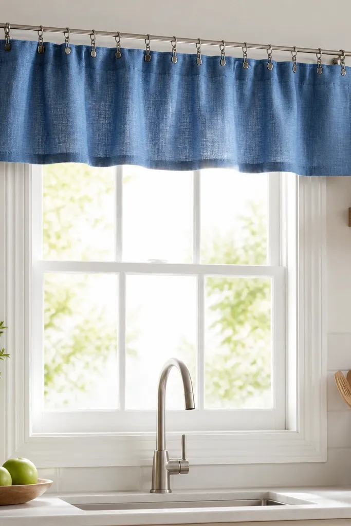
Valances are small but powerful in kitchens where you can’t hang long curtains. A blue valance adds that stardew valley house interior feeling right at eye level. Clip attachment keeps it renter-safe and lets you remove it without fighting with rod brackets.
Choose a valance fabric around 2-3 inches longer than the window width so it gathers nicely. Tie it to a tension rod placed just above the trim. Pair it with a plain white cafe curtain or skip the cafe panel if you want more blue focus.
Gather the valance by pinching every 5-6 inches before clipping; it looks hand-set instead of uniform.
Avoid stiff polyester that stands straight — it looks like a store display.
8. Stardew-Style Blue Drying Rack Look with Towel Sets
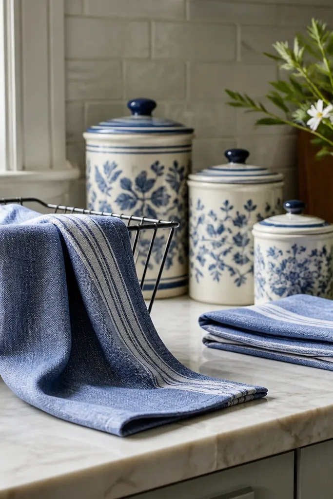
In these interiors, everyday kitchen items look like decor. Blue dish towels draped in a natural fold create that lived-in, farm-house vibe. I like cotton towels with a subtle texture because they look like they belong there, not like you bought them for a photo.
Pick two towels: one solid dusty blue and one blue-and-white stripe or small dot. Drape the larger towel over the rack so it covers about half the rack’s width. Keep canisters white or light beige so the towels do the color work.
Wash the towels once before styling so the fabric softens and lays flatter.
Don’t use microfiber cleaning towels — they look too modern and slick.
9. Removable Blue Wallpaper Behind the Coffee Corner
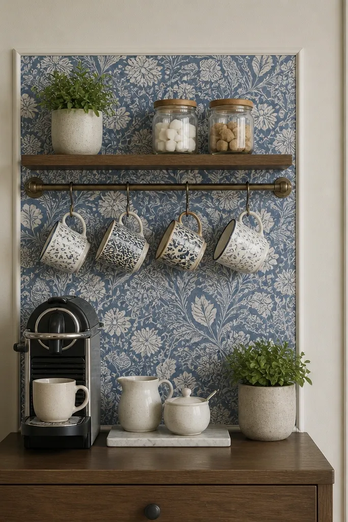
Small wallpaper zones look more intentional than covering the whole room in one go. A coffee corner is perfect because everything you place there repeats the palette. Choose a pattern that’s subtle — it should read as texture at a glance. The blue background makes white mugs look crisp and cozy.
Apply wallpaper to a rectangle behind the station, roughly 24-36 inches wide. Use a removable mug rail or hooks to keep mugs accessible. Add one wood element like a small tray under the coffee maker.
Trim wallpaper edges using a craft knife and a straight metal ruler so the line looks clean.
Avoid busy wallpaper with heavy contrast — it fights with the mugs and bottles.
10. Blue Wooden-Effect Tray Styling for the Entry Table
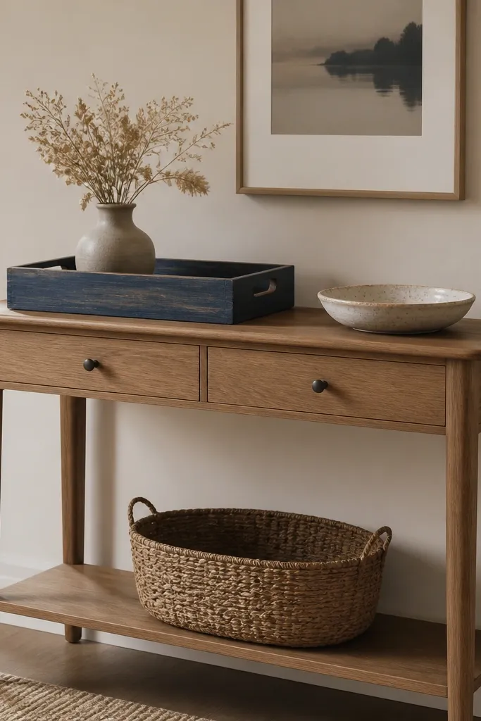
Choose a tray around 14-18 inches wide for a small entry table. Put one tall item (vase) and one flat item (ceramic dish) on top, then store cords or mail in a woven basket below. Keep the tray color in the same blue family as your textiles.
A tray is how you make rentals look styled without installing more furniture. The blue tray ties your kitchen and dining palette together, and the wood-effect finish keeps it warm. I like trays because they hold the “farm clutter” in a neat rectangle. That makes the room feel calmer even when you have real life stuff on the table.
Watch outAvoid trays with shiny lacquer — they look cheap under warm bulbs.
Pro tipDust the tray rim and edges; the clean edges make the blue look intentional.
11. Blue Cushion Covers with Warm Throw Blanket on a Slipcover Chair
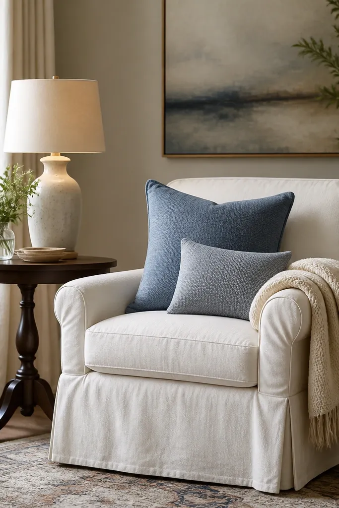
If you can change cushions, you can change the whole mood fast. Blue cushion covers bring the stardew valley house interior color into the living area without touching walls. Use a warm cream throw to stop the blue from feeling cold. I choose covers with a matte weave so they look like fabric from a cabin, not from a showroom.
Pick two cushion sizes: one 18x18 and one 20x20 for a layered look. Match your blue to your dining runner or curtains. Drape the throw so it falls 8-12 inches down the side of the chair, not straight across.
Steam the covers lightly before placing them; wrinkles make even good fabric look off.
Don’t mix three different blues — stick to one blue tone and vary only the lightness.
12. Woven Basket Storage with Blue Labels and White Jars
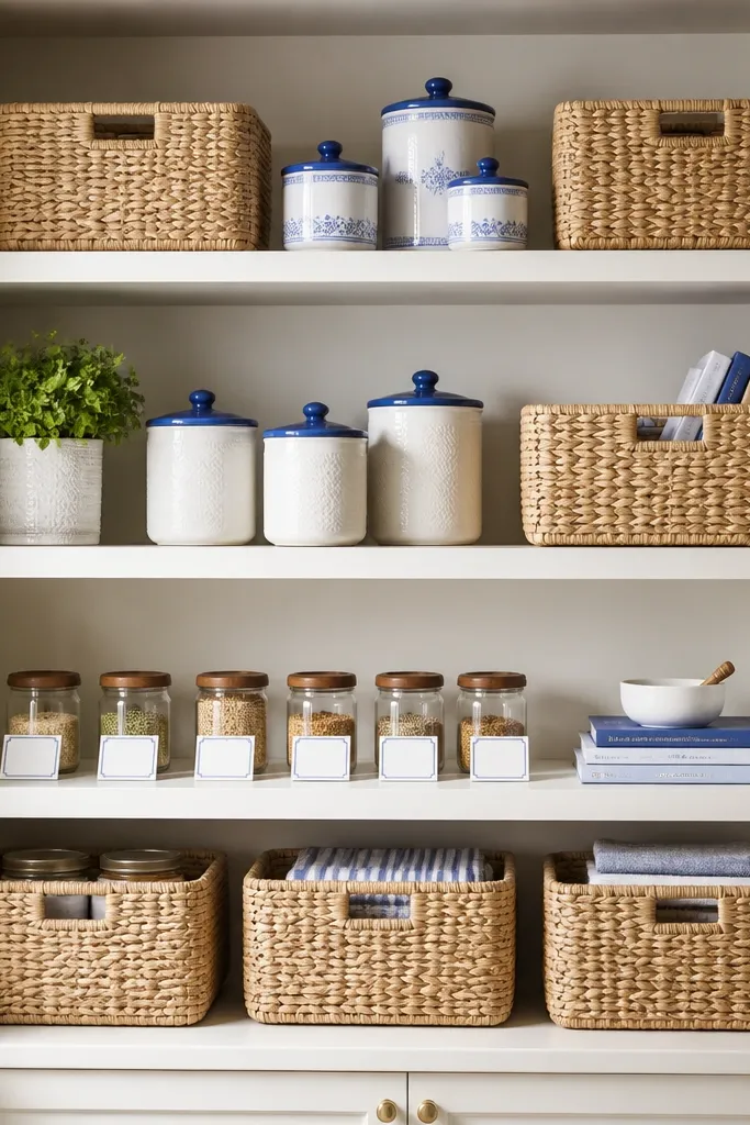
Use baskets that fit the shelf depth so they sit flush without gaps. Put jars in a single row so the shelf looks level. Add blue labels on white paper or cardstock so it matches your fabrics.
Storage is part of the look. Woven baskets add texture and hide mess, while white jars keep the palette clean. Blue lids or labels repeat the stardew valley house interior color without forcing you into painting or drilling. This setup also helps renters because it scales as your kitchen fills up.
Watch outAvoid plastic bins with clear sides — they show clutter and cheapen the texture.
Pro tipLabel with a pencil first and erase; you’ll get the spacing right before you commit.