1. Charcoal walls with a warm white trim line
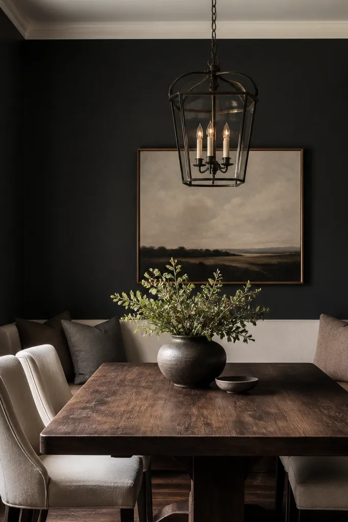
Paint the walls a charcoal that leans brown, not gray-blue. I like shades that read like “espresso smoke” in daylight, because they still let wood and ceramics pop. Keep trim warm white so it doesn’t fight the dark — the contrast makes the room feel older and more lived-in. Under warm bulbs, charcoal turns into a gentle backdrop instead of a cave.
Pro tipBefore you commit, paint a 2-foot swatch and check it at night with the exact bulb you plan to use (2700K looks different than 3000K).
Use matte or eggshell for walls; flat matte hides scuffs better in kitchens. Keep trim in warm white with a satin finish so it catches light without glare. If you have open shelving, paint the back panel the same charcoal for depth.
Watch outAvoid pure black walls — they make ceramic highlights look harsh and everything else looks dusty.
2. Espresso cabinet refresh with oil-rubbed hardware
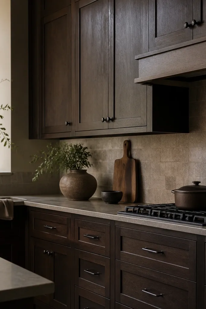
The Stardew kitchen vibe reads as “wood that has been handled for years.” An espresso finish does that, especially when it’s paired with oil-rubbed bronze hardware. The hardware should look slightly softened, not shiny — it keeps the room from feeling modern. Match the hardware finish across cabinet pulls, faucet, and any wall hooks.
Pro tipSwap one drawer pull first and live with it for a day. The “before/after” will tell you if the undertone is warm enough for your lighting.
If you’re staining, sand to a smooth finish and apply a stain with brown undertones, then seal with a satin topcoat so the grain shows. If you’re painting, use a cabinet paint system and finish with a satin clear coat. Keep the hardware spacing consistent so the lines feel intentional.
Watch outAvoid mixing brushed nickel with deep espresso — it looks like a different house.
3. Worn butcher block runner with a linen placemat stack
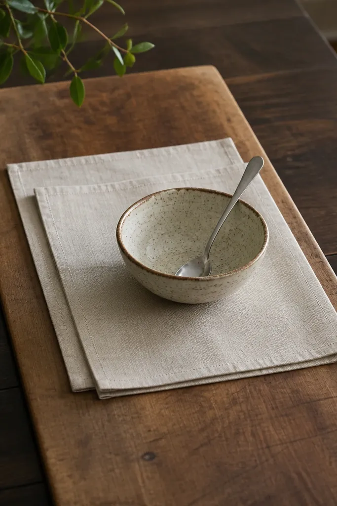
Dark moody rooms need one warm surface that looks practical, like food happens here. Butcher block adds that lived-in warmth even when the rest of the room is dark. Linen placemats keep it grounded — they don’t reflect light like polyester. The combo makes the table feel ready for dinner, not styled for photos.
Pro tipDry brush or lightly sand the edges of the runner (just the corners) so it looks handled, not brand new.
Use a runner that covers the center third of the table width, not the whole surface. Layer one oatmeal placemat under a smaller charcoal placemat so you get depth without clutter. Pick ceramic bowls in cream, clay, or muted olive.
Watch outAvoid glossy tableware and satin fabrics together — the highlights look “store bought” in dark lighting.
4. Stoneware wall shelf with mismatched mugs
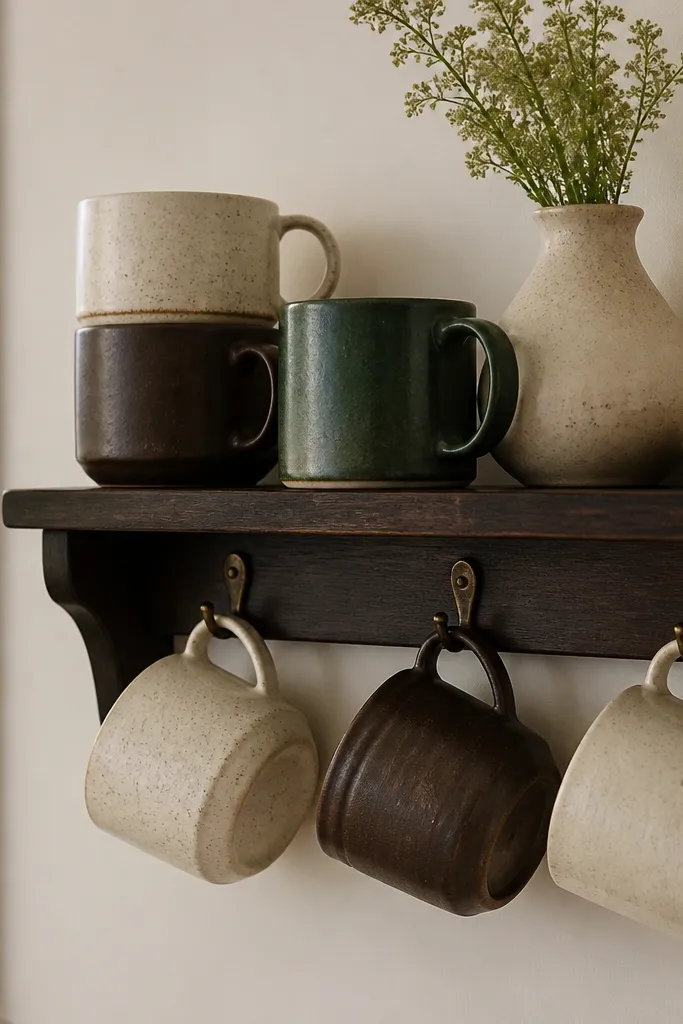
Open shelving is where Stardew interiors feel real. Stoneware mugs look better in a dark moody room because their matte glaze catches warm light at the rim. Mismatched colors add character, but keep the palette tight: cream, espresso brown, and one muted green. The shelf becomes functional decor, not just “stuff on a wall.”
Pro tipGroup mugs by color first, then break the rule with one “odd one out” mug in deep green or smoky blue.
Mount the shelf so the bottom is about 54 inches from the floor, then stagger mugs so handles aren’t all at the same height. Use small S-hooks or mug racks so you don’t stack them in a way that blocks the glaze. Add one ceramic jug or small jar for height variation.
Watch outAvoid clear acrylic shelves — they look modern and cheap against dark walls.
5. Lantern pendant with a frosted warm bulb
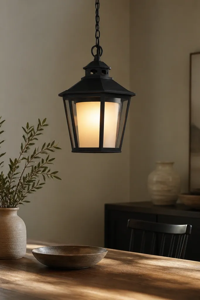
A lantern pendant creates that cozy Stardew lighting without needing candles everywhere. The black metal frames the light so it feels intentional, and the frosted bulb prevents harsh glare on plates. When the light is warm and diffused, dark walls start to look inviting instead of heavy. It also makes wood grain look deeper.
Hang the pendant so the bottom sits about 30-32 inches above the tabletop. Choose a frosted or globe bulb around 2700K, and if you can, use a dimmer so evenings feel warmer. Keep the cord finish black or dark brown so it disappears against the ceiling.
Test light levels by turning it on in late afternoon for 10 minutes before you adjust anything else.
Avoid bright cool-white bulbs — they make stoneware look gray and kill the mood.
6. Deep green runner rug with a low pile
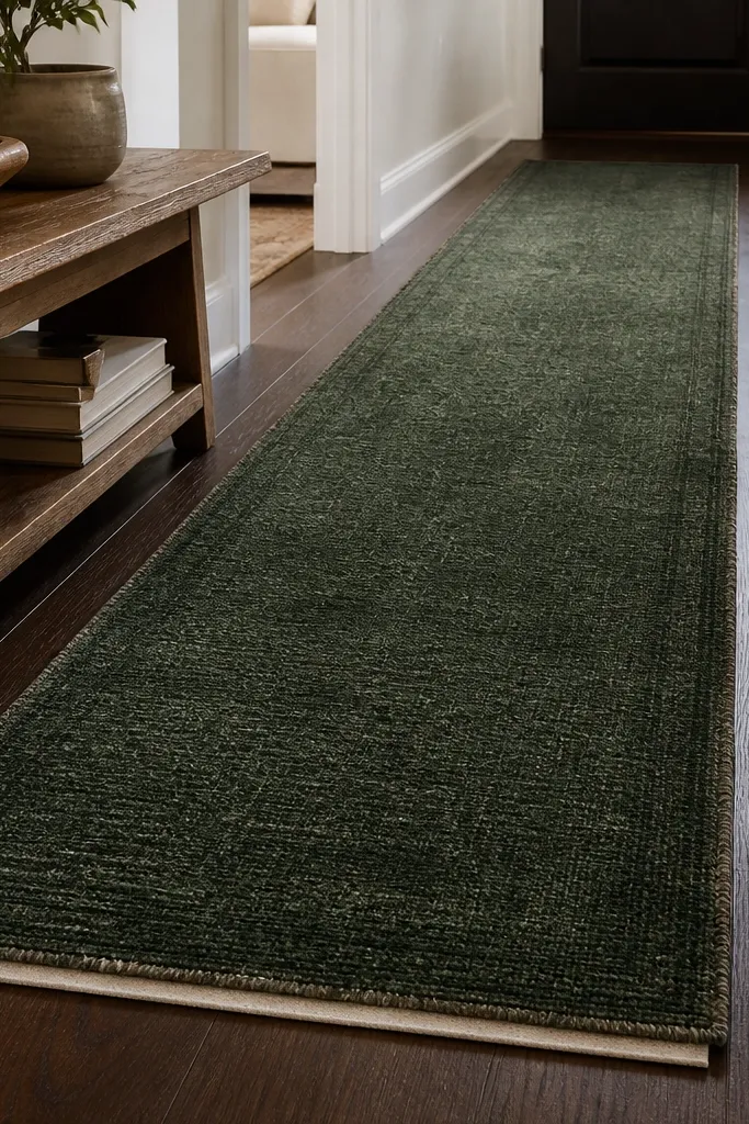
A moody kitchen needs a grounding layer you can walk on without slipping into darkness. Deep green reads like pine forest, and it pairs beautifully with charcoal walls and espresso wood. Low pile matters because it doesn’t look fluffy or new — it reads like an older rug that has survived real life. Subtle texture keeps the room from looking flat.
Use a runner sized so it leaves 6-10 inches of floor showing at each end if the room is narrow, or center it in a dining area under the table seats. Pair with warm brass or dark wood furniture so the green doesn’t fight metal. Choose a rug with a slightly muted pattern, not high-contrast geometric.
If the rug feels too dark, add one cream textile (placemat or curtain edge) so the room gets a visual “breath.”
Avoid high-pile shag in a dark moody scheme — it looks plush and modern fast.
7. Blackened metal candle sconces on ceramic bases
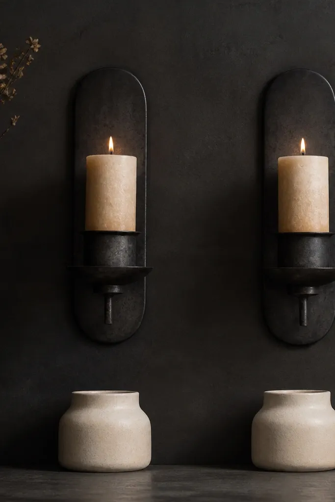
Real candles are the fastest way to get that moody Stardew glow, and sconces make it look intentional. Blackened metal keeps the sconces from looking shiny and slick. Ceramic bases catch candlelight softly, which makes the flame feel warmer. This setup gives you a “warm center” even when everything else is dark.
Use LED candles if you want the look without smoke, but pick ones with a flicker pattern that feels slow and natural. Space sconces so there’s about 24-30 inches between them on the wall. Keep candles chunky — thin tapers look out of place in a dark room.
Put a small tray under the candle base so melted wax doesn’t land on the wall shelf or table.
Avoid placing candles directly on glossy shelves — wax residue shows up instantly.
8. Muted floral curtains in faded burgundy linen
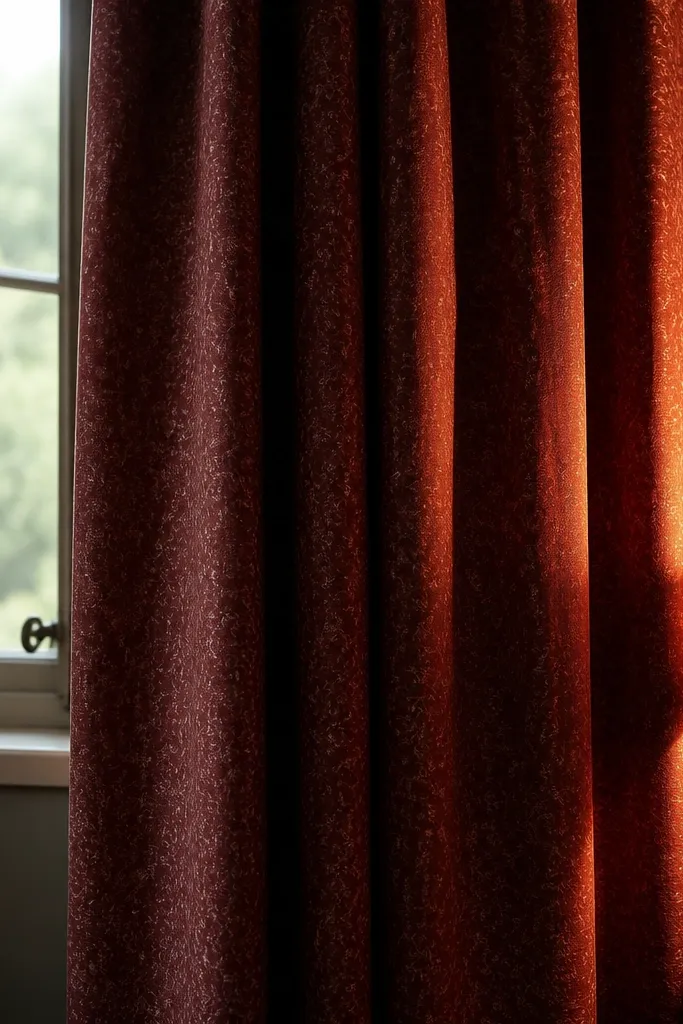
Dark moody kitchens need softness you can see at a glance, and linen curtains do that. Faded burgundy reads like old dye, not modern “wine red.” The fabric texture makes the window feel like part of the room rather than a bright rectangle. When the light hits the folds, it creates a gentle gradient that looks like a cozy cottage.
Pro tipChoose a pattern with low contrast — tiny faded florals look Stardew; bold modern prints look like a different theme.
Hang the curtain rod close to the ceiling, with the bottom of the panel ending just above the floor or 1 inch above it. Use a linen blend if you want easy care, and steam the folds so they fall in thick waves. Line the curtains if your kitchen gets strong daylight.
Watch outAvoid bright red curtains — they compete with charcoal and make the room look harsh.
9. Corner bar cart with dark wood trays and clay jars
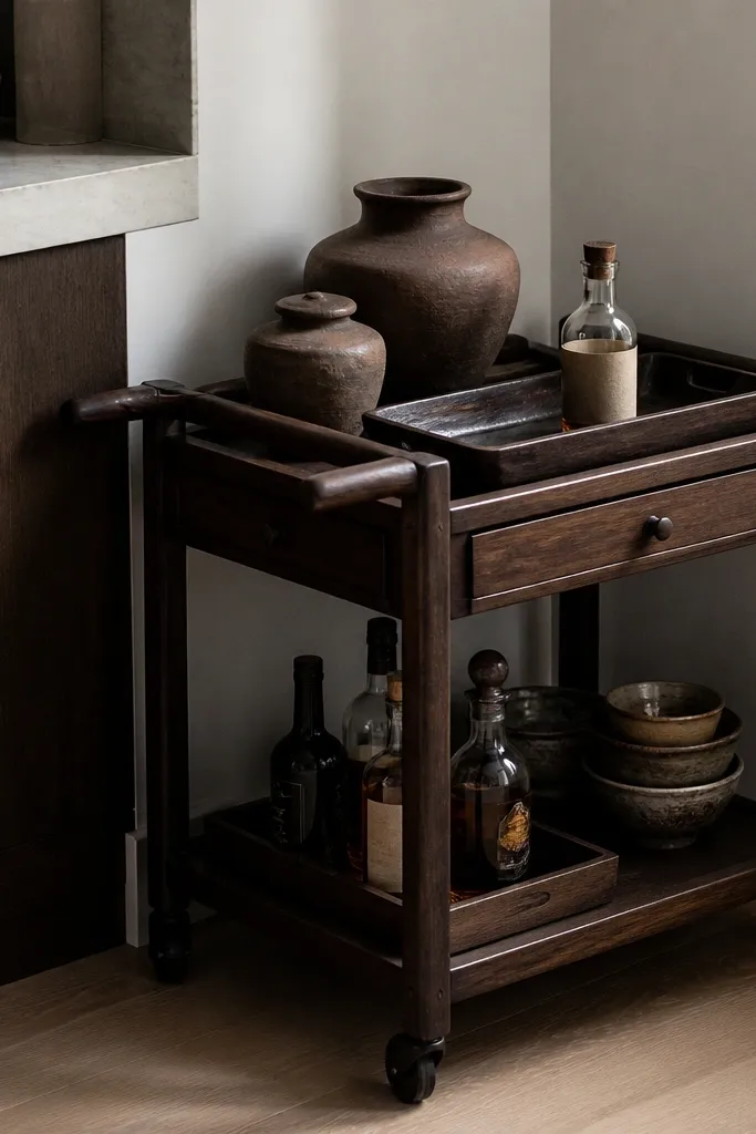
A bar cart in a dark moody kitchen reads like a practical hobby space. Clay jars and brown paper labels feel farm-house without looking like a costume. Dark wood trays keep everything aligned, so the cart doesn’t turn into “random kitchen stuff.” It also gives you a place to store mugs, tea, or spices in a way that looks like decor.
Pro tipWipe the cart surfaces with a slightly damp cloth and dry immediately so the wood doesn’t look dusty under warm bulbs.
Use two tiers only if you want it to feel calm; three tiers look busy in dark rooms. Keep jar heights mixed, but limit to 6-8 pieces so you can actually see the shelves. Add one metal element — a dark bottle opener or small brass candle cup — to bounce warm light.
Watch outAvoid clear glass jars filled with bright candies — they scream “snack aisle.”
10. Framed botanical prints with black matting
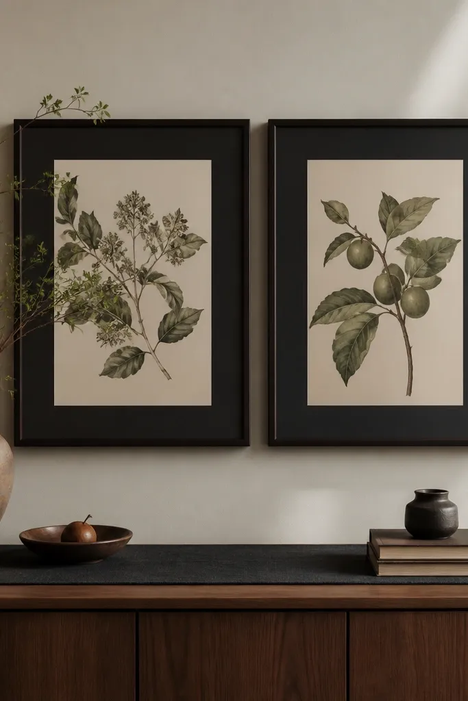
Botanical art works because it gives the eye something organic to rest on in a dark room. Black matting keeps the prints from floating, and the dark frame matches the rest of the kitchen hardware. Choose prints with muted greens, dried yellows, and brown ink — those tones blend with espresso wood and charcoal paint. The result looks like something you’d find in an old house, not a modern gallery wall.
Pro tipIf you’re printing your own, lower contrast slightly so the lines look faded like old paper.
Use frames in matte black or deep espresso. Keep mat opening around 1.25-1.5 inches so the art feels airy, not cramped. Hang the pair so the centerline is about 60 inches from the floor for easy eye-level viewing.
Watch outAvoid bright white mats — they punch holes through dark moody walls.