1. Oatmeal Wool-Blend with a Low Pile That Hugs the Floor
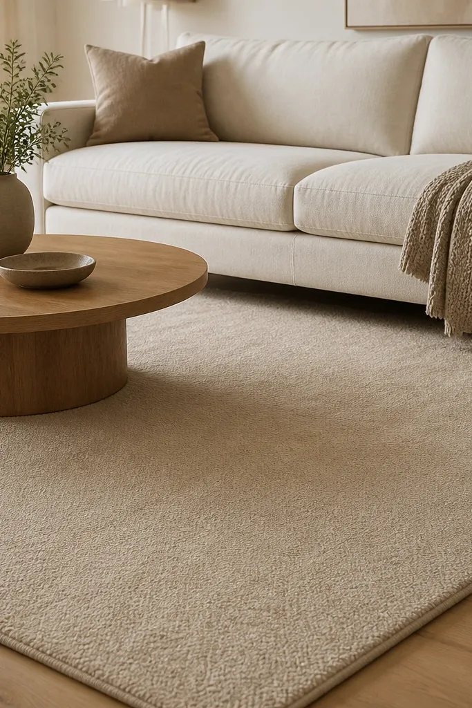
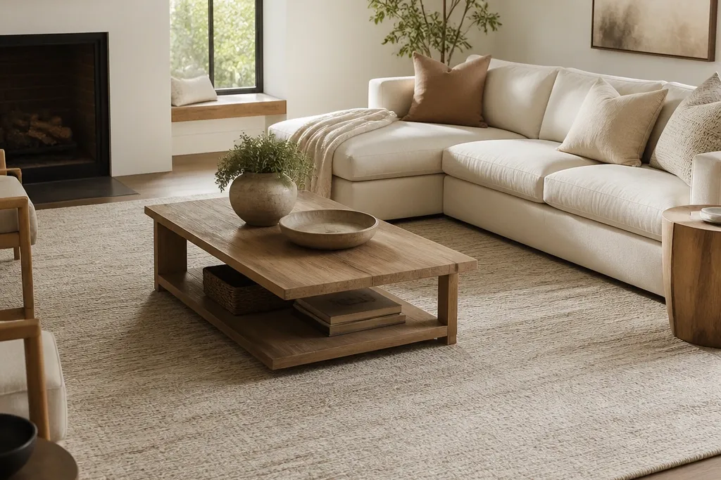
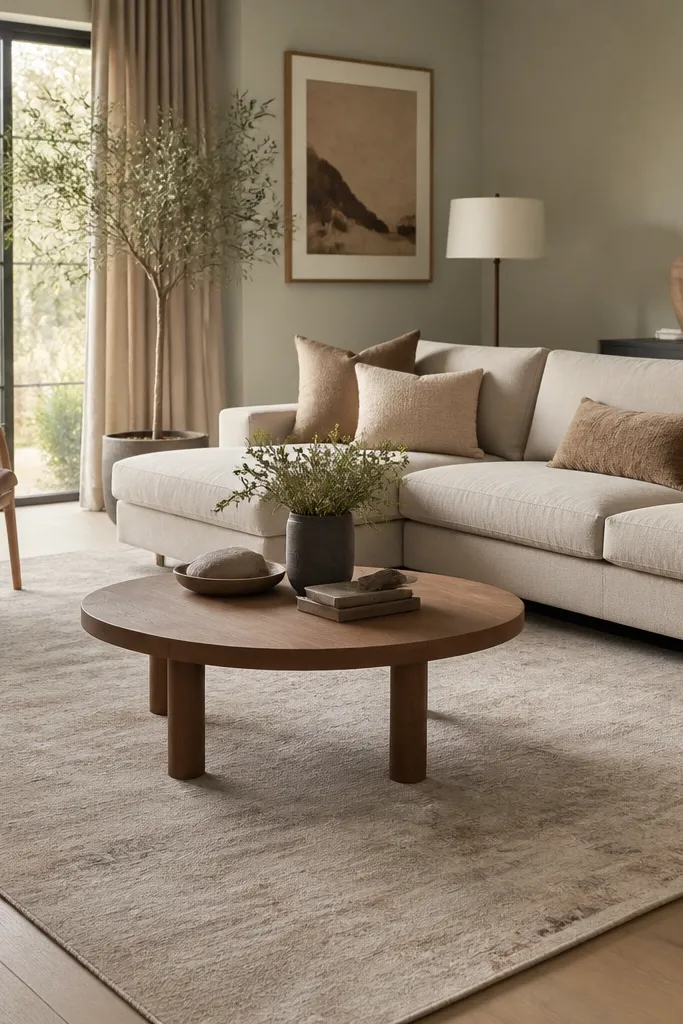
This look feels cozy because the pile is dense and doesn’t create big shadows, which makes the room look softer. Oatmeal also warms up gray walls and cool undertone floors. I like tonal shading because it hides everyday dust and faint footprints better than a perfectly flat solid. The lack of pattern means you can layer pillows and art without fighting the rug.
Aim for a pile height around 0.25 to 0.4 inches. Pair it with light upholstery like cream, ivory, or oatmeal linen so the rug reads intentional, not washed out. Use a rug pad that’s grippy and thick enough to stop sliding — I prefer 8mm felt or a felt-rubber blend under wool-style rugs.
If your room gets bright afternoon sun, choose a rug with slightly warmer undertones so it doesn’t bleach toward white over time.
Avoid high-sheen “solid” rugs with a printed look — they show wear lines fast and don’t feel soft.
2. Sand Striped Runner-Style Rug in a Living Room Layout
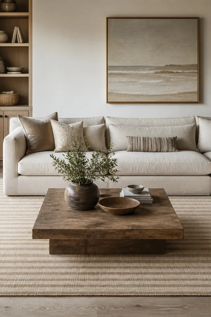
Horizontal stripes create a pulled-together feeling because they guide your eye across the seating group. The “faded” stripe look works because the contrast is low, so it doesn’t feel busy. Sand and taupe give warmth without the yellow cast that some beige rugs have. I’ve used this in rooms where the walls are off-white and the furniture is darker — the stripes add structure without making the room look harsh.
Choose stripes with a small-to-medium repeat so they don’t overpower large furniture. Use a rug length that fully covers the coffee table footprint and extends far enough for the front legs rule. Style it with textured throws in oatmeal, camel, or light cognac leather accents.
Match stripe direction to your main sight line — if your couch faces a TV on the far wall, keep the stripes running left-to-right.
Skip rugs with thick, high-contrast stripes — they read graphic and kill the cozy mood.
3. Greige Textured Loop Pile for a Soft, Tactile Center
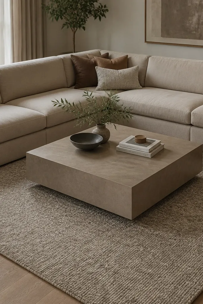
Loop pile traps air and feels warmer than flatweaves, even when the room is cool. Greige mottling hides lint and pet fur better than a single-tone solid. This look also makes neutrals feel layered because the texture adds dimension without adding color. I like it in living rooms where you want cozy without a “boho” vibe.
Pick a loop pile with short loops so it doesn’t snag on chair legs. Pair with smooth fabrics like cotton sateen curtains or a low-pile leather ottoman so the textures don’t compete. Use a grip pad — loop pile can shift if you go too thin underneath.
Pro tipTo keep it looking new, rotate the rug 180 degrees once or twice a year if it’s in a sun path.
Watch outDon’t choose a loop pile with long, loose loops — they flatten fast and look tired.
4. Cream Border Rug with a Quiet Center Panel
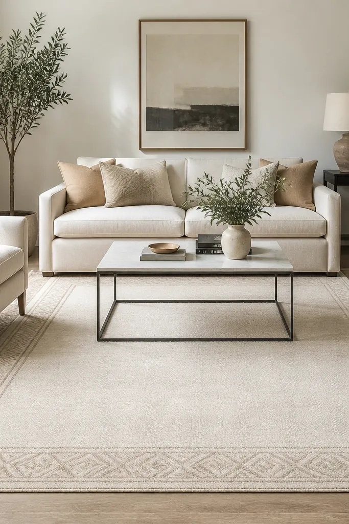
A border gives you “finished” edges, which makes the rug look bigger and more intentional. Keeping the center light prevents the room from feeling heavy. Cream with a taupe border is also forgiving — it works whether your decor leans warm or cool. I’ve used this in small living rooms where you want structure but not a dark anchor.
Choose a border that stays within two shades of the main color. Place the rug so the border is visible on all sides of the coffee table. Style with wood tones (oak, walnut, or ash) and keep your wall color either warm white or light gray.
Pro tipIf your furniture is very dark, use a cream base so the rug doesn’t disappear visually.
Watch outAvoid thick, dark borders on already-dark rooms — they shrink the space visually.
5. Warm Taupe Medallion with Low Contrast Lines
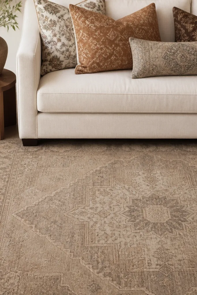
Medallions add that “designed” feeling, but low contrast keeps it cozy instead of formal. Warm taupe reads softer than gray and pairs with both brass and matte black hardware. The faded outlines also hide minor stains and foot traffic marks. I like this in living rooms with solid-color walls because it gives one visual anchor.
Look for medallions where the main lines are in taupe and the background is warm cream or oatmeal. Keep the furniture upholstery simple so the pattern becomes the focus. Pair with a coffee table that has rounded edges to keep the vibe soft.
Pro tipCenter the medallion under the coffee table so it looks aligned, not accidental.
Watch outSkip high-contrast medallions (dark lines on bright white) — they look crisp, not cozy.
6. Oatmeal Flatweave with a Fringe Edge That Reads Casual
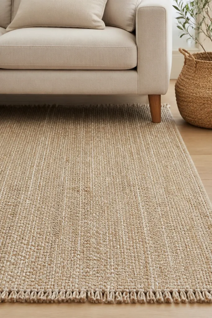
Flatweaves feel cozy when they have real texture and a warm neutral palette. The fringe adds a casual finish that makes the room feel lived in. This is a great choice if you like natural materials and you have a casual sofa fabric like cotton or linen. In my experience, flatweave neutrals also hide vacuum lines and light dust better than shiny pile rugs.
Choose a flatweave with tightly woven threads so it doesn’t snag on shoes. Keep fringe ends clear of heavy chair legs by leaving a little extra rug margin. Use a pad with a non-slip top layer — flatweaves can slide without it.
Pro tipVacuum with suction only (no beater bar) to keep the weave from fluffing.
Watch outDon’t pick a thin flatweave with a slick backing — it moves and looks sloppy fast.
7. Stone Gray Textured Wool Look for Cool-Wall Rooms
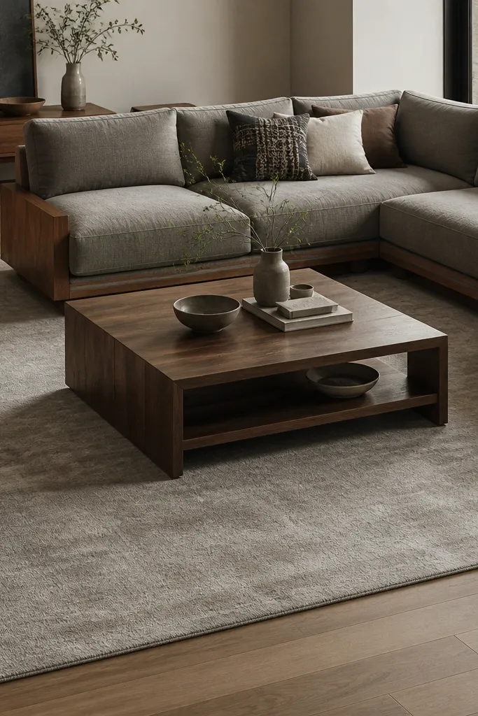
Stone gray gives you a neutral that still feels cozy because the texture prevents it from looking flat. It works especially well when your walls are cool (true white, light gray) and the room needs warmth. Mottling hides dust and makes sunlight look softer on the floor. I like it paired with camel, cognac, and brushed brass so the gray doesn’t feel sterile.
Pick a rug that reads slightly warm under daylight, not blue-gray. Use a rug pad that prevents slipping and protects hardwood. Keep your coffee table wood tone lighter than you think — pale oak makes the gray feel inviting.
Bring a throw pillow in camel or oatmeal next to the rug so the gray doesn’t become the only tone.
Avoid blue-gray rugs in rooms with warm wood — you end up with a clashing temperature.
8. Cream-and-Tan Geometric Block Pattern with Soft Edges
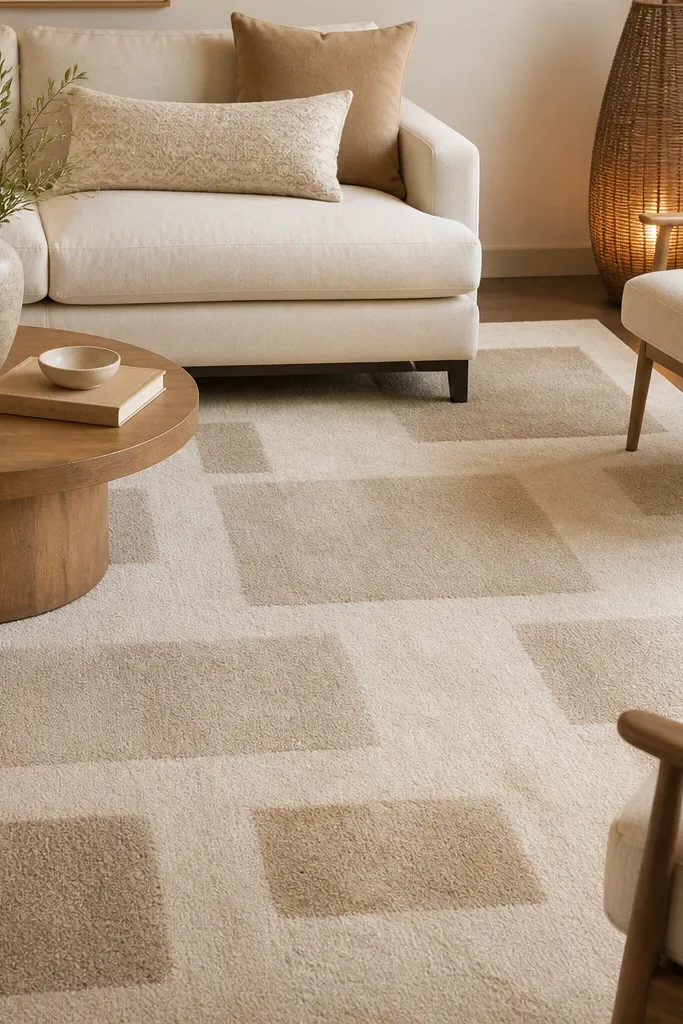
Geometric blocks add structure without the stiffness of high-contrast patterns. Cream and tan keep it neutral and cozy, and the imperfect edges feel handcrafted. This one works when your room has modern lines (sleek sofa, straight curtains) and you want the floor to counterbalance with warmth. I’ve found it also hides minor discoloration because the pattern breaks up the surface.
Choose a block pattern where the tan is no darker than medium caramel. Keep furniture upholstery in solids or subtle textures so the blocks stay the main visual. Use a slightly larger size than you think for this pattern so the grid doesn’t crop visually.
If you hang art above the sofa, align one row of the blocks with the bottom edge of the art for a calmer look.
Skip tiny micro-patterns — they can feel busy up close and look dated in photos.
9. Warm White Solid Rug with a Natural Jute-Style Backing
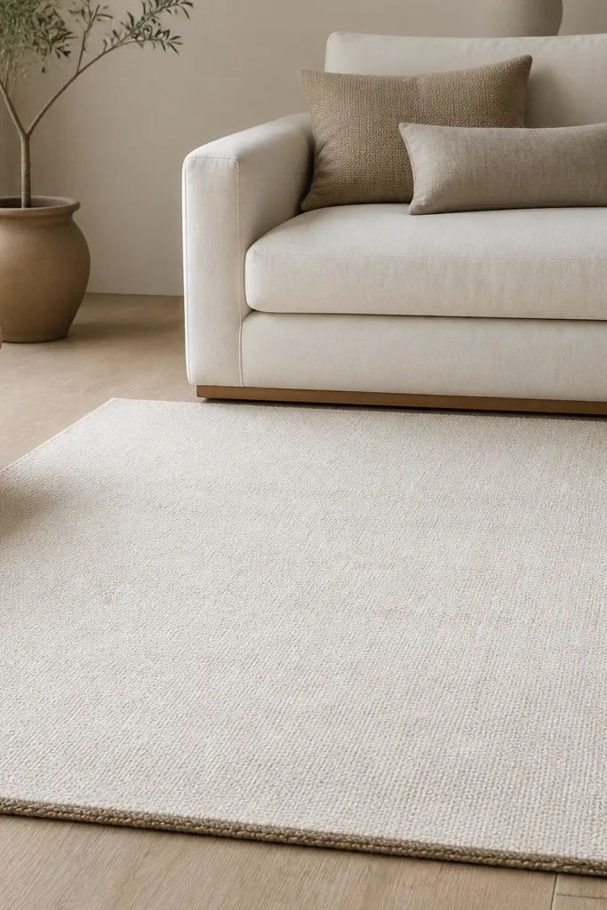
This is the “cozy clean” option: warm white keeps the room bright, and the natural texture makes it feel softer than a flat mat. The earthy undertone matters — pure white can look cold and unforgiving. I use this when the living room has dark furniture and I want the floor to lift it. It also makes patterned pillows look more intentional instead of heavy.
Pick a rug with a dense weave so it doesn’t look see-through on hardwood. Keep the rug size generous so the warm white reads like flooring, not an accessory. Pair with natural fibers like jute, sisal, or woven cotton for a consistent material story.
Pro tipSpot-clean quickly with a damp cloth and a drop of mild soap; warm white shows water marks if you let it dry unevenly.
Watch outAvoid pure white rugs with no texture — they show every footprint.
10. Taupe and Cream Vintage-Style Distressed Rug Look
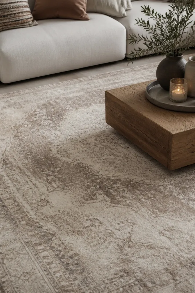
Distressed neutrals feel cozy because they look lived-in, not manufactured. The fading creates depth, so the rug doesn’t look flat even when your walls are plain. Taupe and cream also play well with older wood tones and brass accents. I’ve used this in rental-friendly setups because it hides the minor scuffs that happen from moving furniture.
Choose distressing that stays within a 2-3 tone family, not stark cream against charcoal. Keep the furniture upholstery muted so the rug’s “wash” stays the focus. Use a pad with a bit of thickness for comfort and to reduce slipping.
Pro tipPlace a light-colored throw over the sofa arm so the rug’s cream echoes it.
Watch outDon’t pick distressing that looks too gray — it can tip into cold farmhouse.
11. Cappuccino Ombre Rug with a Gentle Gradient
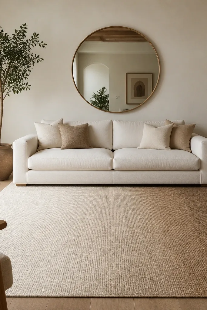
A gentle ombre creates warmth without a traditional pattern. It gives you movement across the floor, which makes the room feel cozy even if you keep the rest of the decor minimal. Cappuccino is forgiving because it hides stains better than lighter neutrals. The textured finish keeps the gradient from looking like a printed filter.
Look for an ombre that’s smooth and low contrast, not dramatic. Place the lighter side toward the brightest window so the room looks balanced. Pair with ivory, oatmeal, and warm gray for a cohesive palette.
Pro tipIf you have a dark sectional, orient the ombre so the lighter end sits under the coffee table area.
Watch outAvoid high-contrast ombre — it looks like a dyed backdrop, not a cozy rug.
12. Linen-Blend Textured Rug in Warm Greige with Micro-Herringbone
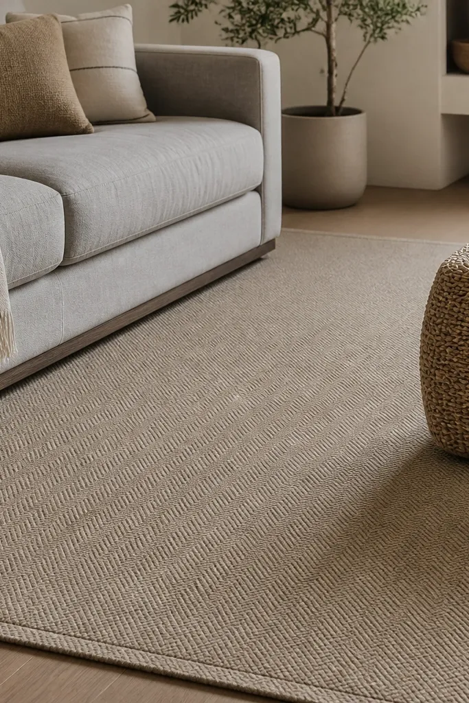
Micro-herringbone gives you a “fancy but quiet” texture. Warm greige keeps it neutral, and the weave direction adds depth so the rug doesn’t look flat. This is a great choice when you want cozy but your room already has enough pattern elsewhere. I like it with solid curtains and simple geometry furniture because the rug adds texture, not visual noise.
Choose a rug where the herringbone lines are within one shade range. Keep the edges clean and straight — sloppy fringe can cheapen the look. Pair with linen-texture bedding or throws to match the fabric language.
Run the herringbone lines parallel to your longest wall for a calmer, more “intentional” layout.
Skip rugs where the herringbone is printed — it wears off and looks flat quickly.