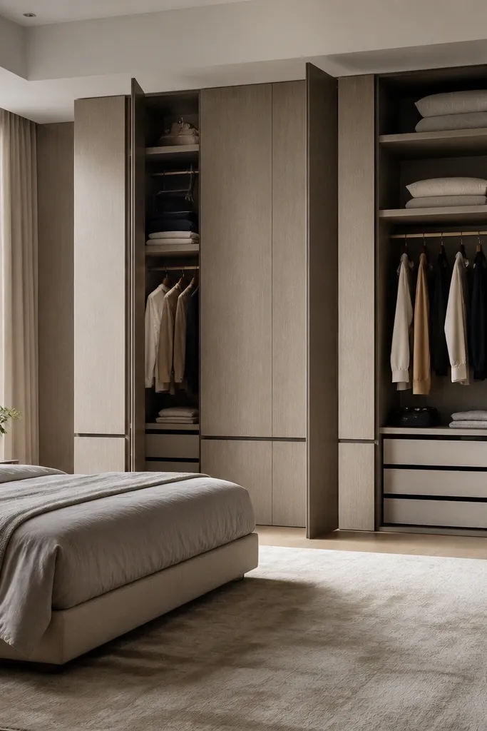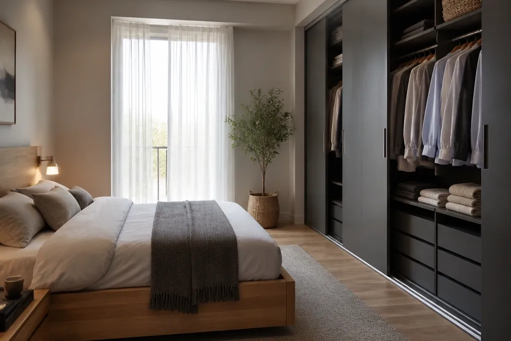
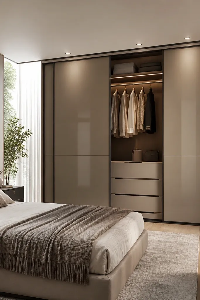
1. Matte Ash Grey with Thin Black Frame Lines
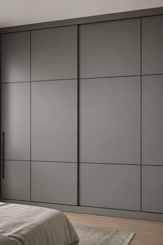
This design works because the matte ash grey stops the wardrobe from reflecting bedroom light in a harsh way. The thin black frame lines add structure without turning the look into a heavy “classic” style. It also hides minor wall imperfections because the wardrobe edge reads as a crisp boundary.
Use 18mm pre-laminated or HPL boards in ash grey with a matte finish. Keep the frame lines thin, around 12-15mm, and repeat the same line thickness across all shutters. Pair it with black handles of 128-160mm length depending on shutter height, and keep the top strip minimal so the unit doesn’t look bulky.
Pro tipMatch your bed headboard hardware tone to the handle finish so the room looks intentional, not mixed.
Watch outAvoid glossy grey shutters — they show fingerprints and make the whole unit look cheaper under warm lights.
2. Walnut Veneer Look with Center Vertical Slat Panel
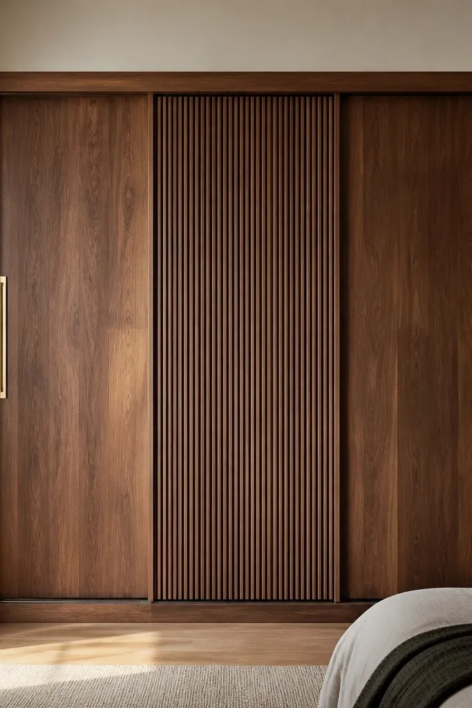
Walnut tones warm up a bedroom fast, and vertical slats add height without needing extra décor. The slats break the flat surface just enough to look designed, especially when light hits the ridges. I’ve seen this combination make small rooms feel more “finished” even when the rest of the wall is plain.
Choose a walnut laminate or veneer-look board and keep the slat spacing consistent at about 10-12mm. Put the slatted panel in the center shutter so the eye lands there when you enter the room. Use 160-180mm warm gold handles so the metal doesn’t look too small against the slat texture.
If your wall paint is off-white, go slightly darker walnut so the wardrobe doesn’t blend into the background.
Don’t mix cool greys with walnut — it makes the slats look mismatched and cheap.
3. All-White Shutters with Recessed Panel Detailing
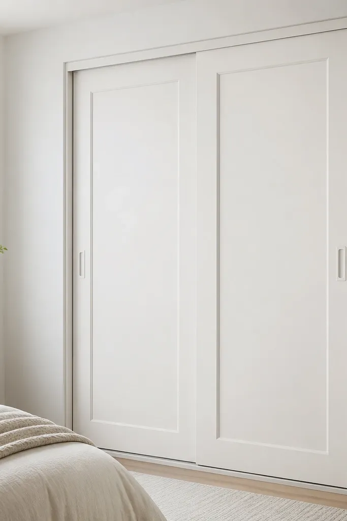
Recessed panels give depth without adding color. In a modern bedroom, this is my go-to when you want clean walls and no visual clutter. The recessed lines also make the wardrobe look custom because the shadows change through the day.
Use matte white laminate (not glossy) and make panel depth around 6-8mm so the shadow is visible. Keep the frame width minimal, around 15-20mm. Pair with silver or brushed nickel handles only if your room already has cool metal accents.
Pro tipUse a soft grey baseboard or skirting tone so the white almirah doesn’t look floating.
Watch outSkip high-gloss white — it reflects light and shows smudges every time you open the shutters.
4. Two-Tone Greige with Vertical Stripe Center
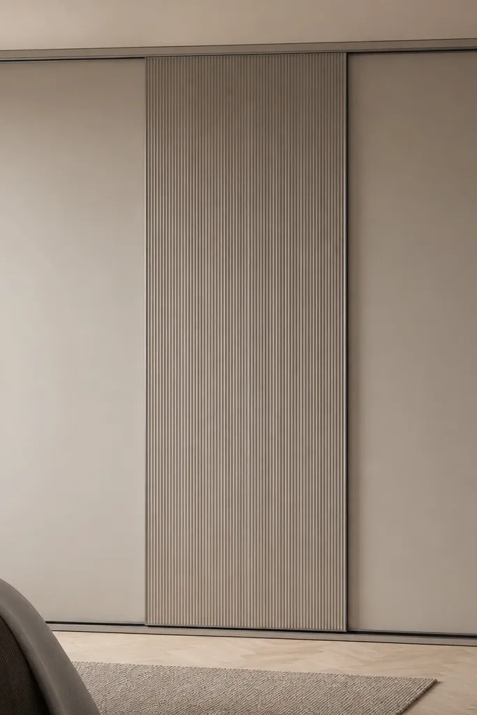
Two-tone greige looks modern because it creates depth using one color family. The vertical stripe center pulls the eye upward and makes the ceiling feel taller. It also hides dust better than pure white because the tone is forgiving.
Pick light greige for outer shutters and slightly darker greige (2-3 shade steps) for the center. Make the stripe width around 20-25mm repeated evenly. Use dark grey handles and keep interior lighting warm white so the wardrobe doesn’t look blue.
Pro tipPlace this against a wall with one simple feature like a bed back panel or a framed artwork, so the wardrobe becomes the main “clean” element.
Watch outAvoid random stripe widths — uneven spacing reads messy and cheap.
5. Mirror Insert Shutters with Soft Frosted Border
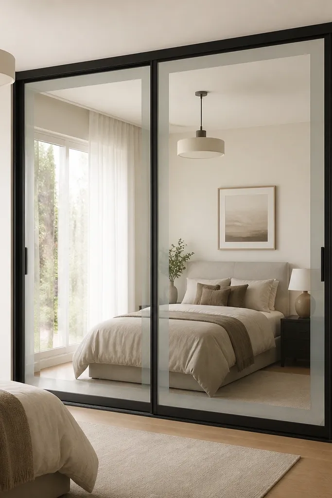
Mirror inserts widen the bedroom visually, but the frosted border keeps it from looking like a plain reflective cabinet. I like this design when the room has limited natural light because the mirror bounces light without glare. Frosted edges also hide minor smudges better than full clear glass.
Use 4mm mirror with a frosted vinyl border or etched border strips about 10-15mm wide. Keep the black frame matte and slim, around 15-18mm. For bedrooms with clutter, use mirror only on the outer shutters and keep the inner section solid.
Pro tipClean mirror panels with a microfiber cloth and a quick glass cleaner — streaks show more on mirrors in matte-lit rooms.
Watch outDon’t put mirror on every shutter if your bedroom has lots of small items — it multiplies visual noise.
6. Smoke Grey with Textured Fabric-Look Shutter Panels
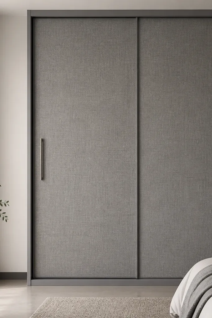
This is a sleeper hit for modern bedrooms because it adds tactility. The fabric-look texture hides minor scratches and gives a warm, calm feel compared to plain laminate. In my experience, it pairs beautifully with bed linens in sand, taupe, or charcoal.
Use a textured HPL or laminate with a linen-like finish for the panels, and keep the rest of the unit plain matte smoke grey. Choose handle bars in matching grey rather than bright chrome. Keep the texture limited to one or two shutters so the room doesn’t look heavy.
Use a soft lighting temperature around 2700K so the texture reads cozy, not dull.
Skip glossy “fabric” finishes — they look plastic under light.
7. Lacquered Sage Green with Brass Pulls
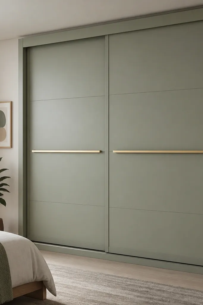
Sage green looks modern because it’s muted and calm, not loud. Brass pulls add warmth and make the green feel intentional rather than random. This is the kind of wardrobe that makes a bedroom look styled even if your wall art is minimal.
Use matte lacquer or matte laminate in sage green and keep shutter detailing minimal. Brass pulls should be 120-150mm depending on shutter width. Pair with white bedding and light wood bedside tables so the green doesn’t fight your furniture.
Pro tipIf your walls are cream, keep the sage slightly more grey than yellow so it doesn’t clash.
Watch outAvoid neon green or overly saturated sage — it reads trendy for a season, then feels dated.
8. Graphite Black with Light Oak Vertical Edge Strip
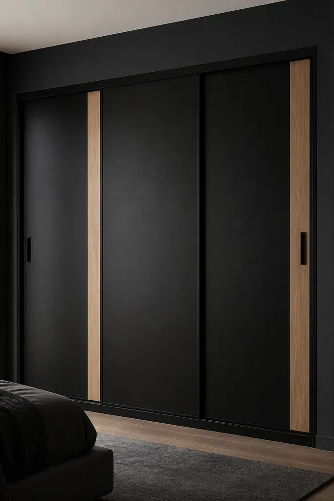
Graphite black looks sleek, and the light oak edge strip stops it from becoming a heavy block. The contrast also helps the sliding doors track visually, so the wardrobe looks “designed” rather than industrial. This one works well in bedrooms that already have light wood floors or oak-toned furniture.
Use graphite matte boards and add a 20-25mm light oak strip along the vertical edges of each shutter. Keep the center section solid black to maintain clean lines. Use black handles with a soft satin finish, not mirror-shiny.
Pro tipAdd a warm white wall light near the wardrobe so the oak strip shows tone variation.
Watch outDon’t pair graphite black with cold grey walls — the contrast looks harsh.
9. Stone Grey Panels with Micro-Studded Texture
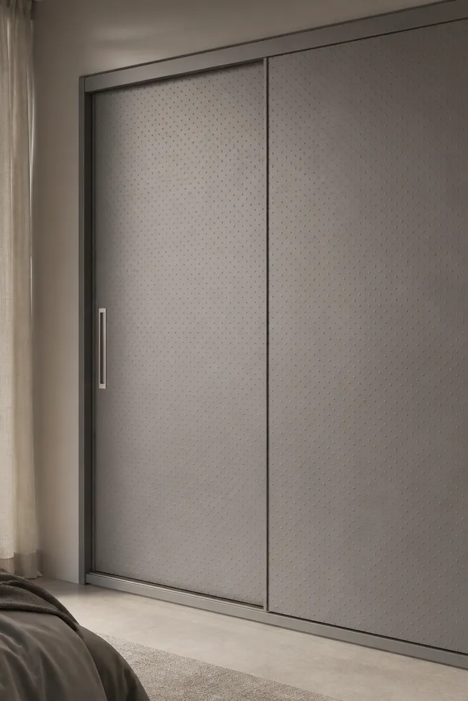
Micro-texture makes the wardrobe look high-end because it catches light softly. Stone grey gives a calm, modern base while the tiny texture keeps it from looking flat. I’ve used this in bedrooms where the walls are plain and the client wants something interesting without bold colors.
Choose a micro-textured laminate or HPL and keep the pattern uniform across shutters. Use brushed steel handles to match the texture’s cool tone. Keep interior lighting warm white so the grey doesn’t turn blue.
Pro tipRun your hand across the texture before finalizing — if it feels too rough, it will grab dust and look worn faster.
Watch outAvoid big 3D patterns — they look dated and collect dust in the grooves.
10. White + Oak Combo with One Glass Shutter
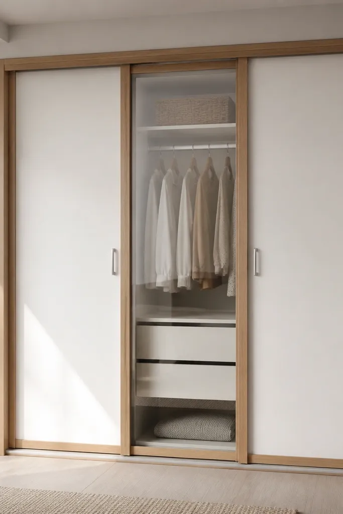
This design is a smart compromise: you get the airy feel of glass without turning the entire wardrobe into a display case. The oak frame adds warmth and keeps the white from looking sterile. Clear glass works best when you keep the shelves inside organized with matching baskets or folded stacks.
Use oak-toned strips around the glass panel frame, about 25mm wide. Choose clear glass only for one shutter so the rest stays solid. Keep the glass shelf spacing consistent and add a small LED strip inside if you want a clean glow.
Pro tipUse uniform storage bins inside the glass section so the reflection always looks tidy.
Watch outDon’t leave random hangers visible inside the glass — it looks messy fast.
11. Cream Shutters with Horizontal Walnut Line
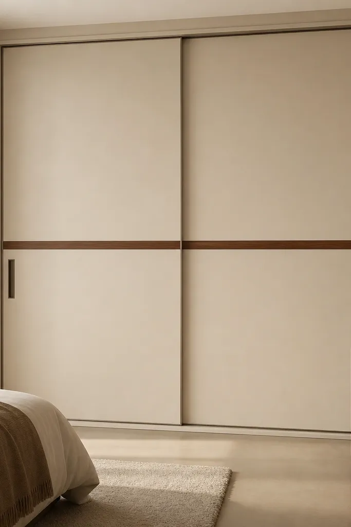
A single horizontal line makes a sliding almirah look modern because it creates one strong graphic element. Cream keeps it soft and bedroom-friendly, while walnut grounds it. This is one of the easiest designs to match with different bed headboard styles.
Use matte cream laminate and add a walnut band about 50-70mm wide across the shutters, aligned at the same height on all doors. Handles should match walnut tone so the eye reads one continuous line. It looks best in bedrooms with light curtains and warm lighting.
Pro tipKeep the band perfectly level during installation — a slightly tilted band makes the whole unit feel off.
Watch outAvoid multiple competing bands — two or three lines start looking like a sticker sheet.
12. High-Gloss Teal with Chrome Edge Strip
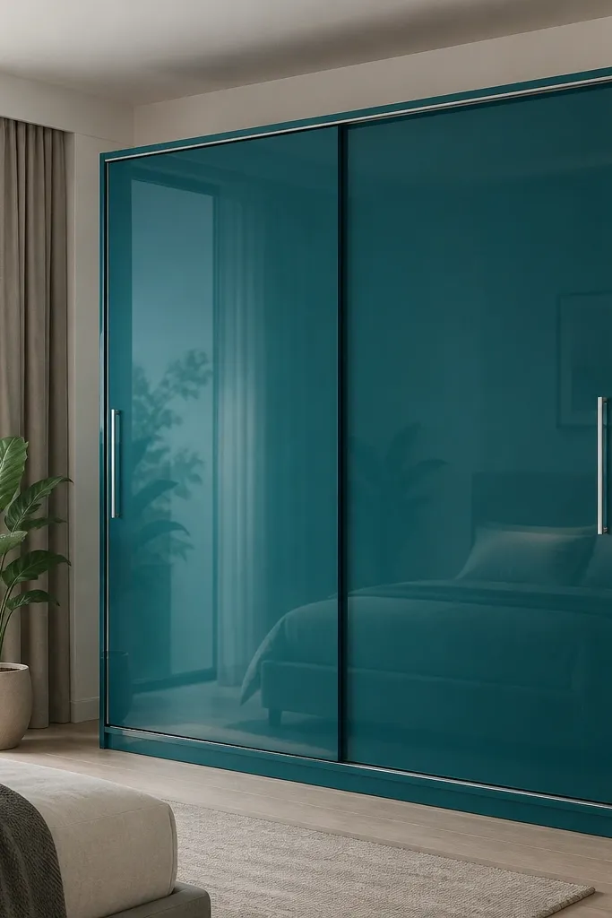
If you want a modern look with personality, teal works better than bright blue because it reads deeper and calmer. The chrome edge strip adds crisp reflections and makes the wardrobe look sharper. I only recommend this when your room has clean, minimal décor; glossy surfaces show dust and fingerprints.
Use a true high-gloss shutter laminate or acrylic finish in teal. Keep edge strips narrow at 10-12mm so it doesn’t look overdone. Pair with light bedding in white, cream, or warm grey and add a chrome lamp or frame so the metal doesn’t feel random.
Pro tipWipe fingerprints right after installation dust settles — glossy finishes look best when kept clean.
Watch outAvoid this in kids' rooms unless you’re ready for frequent cleaning.