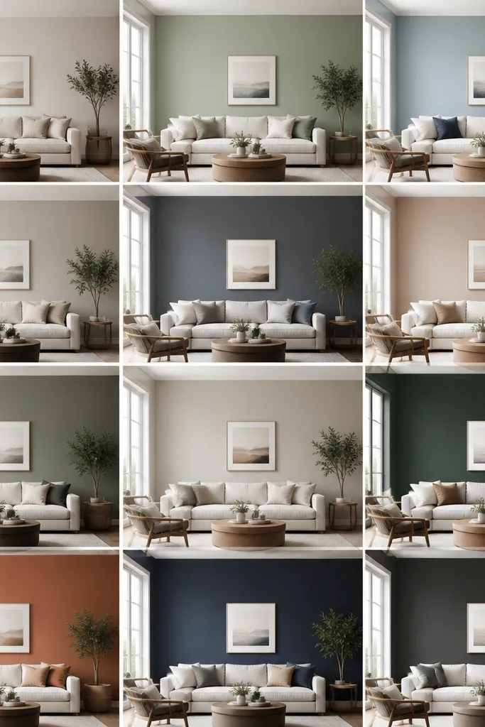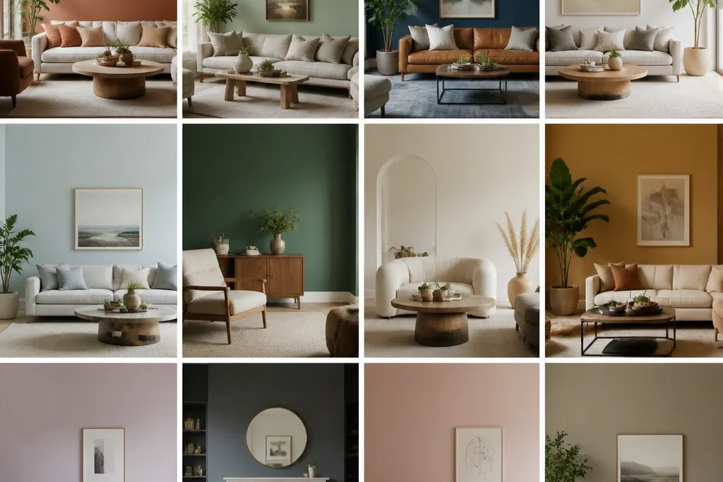
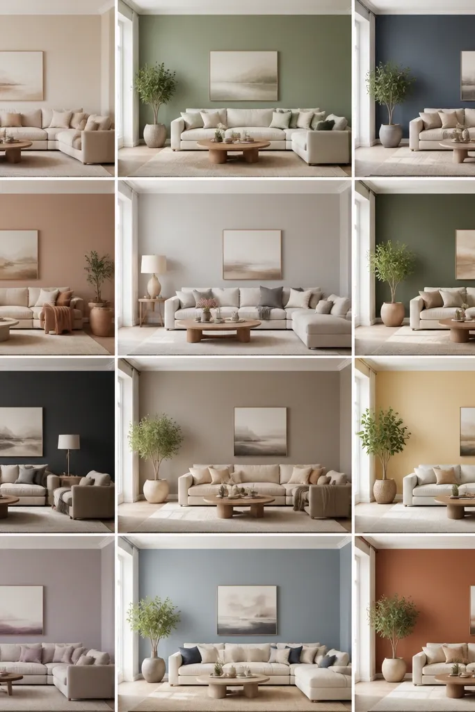
1. Linen White with Warm Trim
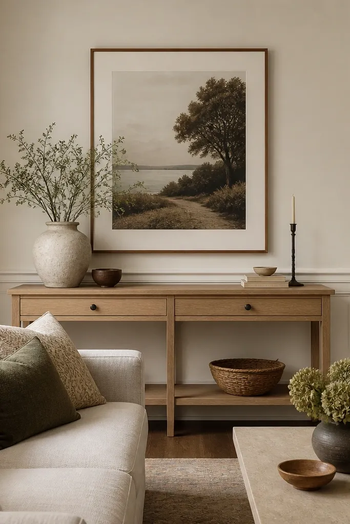
Linen white looks bright without the cold, bluish glare you get from pure white. I like it when the room has warm wood or tan textiles because the walls stay soft in daylight and don’t turn gray at night. This shade also makes beige, camel, and oatmeal fabrics look richer instead of flat.
Pro tipIf your samples look too yellow, shift to a linen white with a tiny gray lean and test next to your rug, not just on the blank wall.
Paint the walls in a warm white with an eggshell finish. Keep trim in the same family but slightly cleaner — think warm white trim that’s a half-step brighter. Pair with light oak, woven jute, and brass or aged gold accents.
Watch outAvoid bright pure white on warm wood — it often makes everything look yellowed and uneven.
2. Greige That Leans Beige
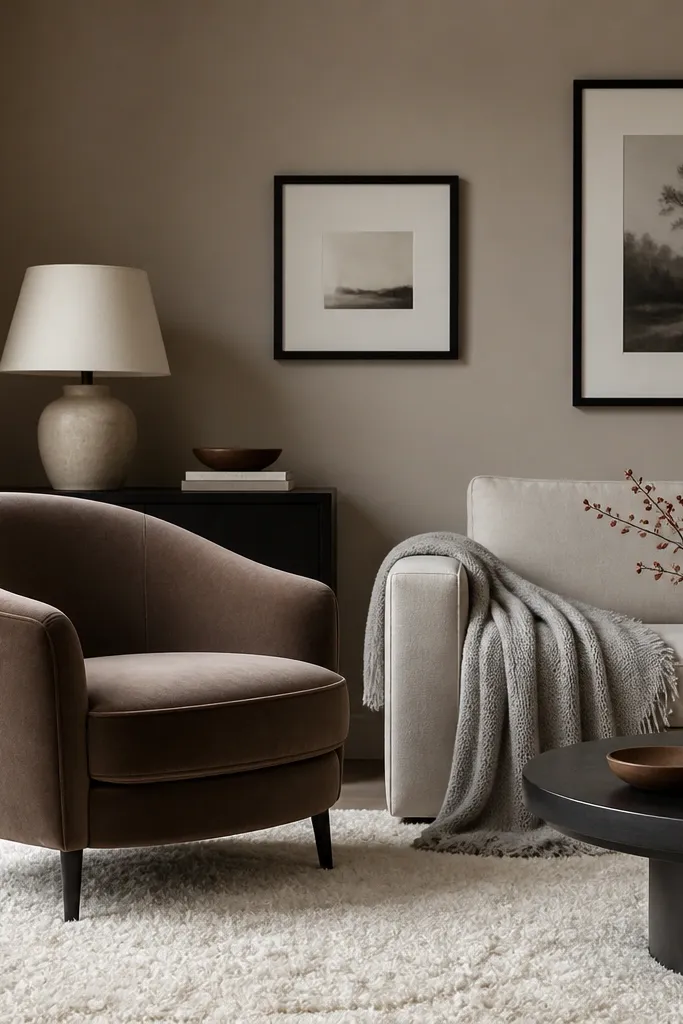
Greige only works when it has a clear undertone. Beige-leaning greige keeps gray from taking over and makes leather, linen, and wood tones look cohesive. It’s a great “in-between” when your room has both warm and cool elements, like oak floors plus gray accents.
Choose a greige that sits closer to taupe than to silver. Use eggshell on walls and keep your ceiling white (not greige) so the room doesn’t feel heavy. Pair with matte black frames, light gray textiles, and light oak side tables.
Test two greiges: one beige-leaning and one gray-leaning, then pick the one that makes your wood look more even in color.
Avoid greige with a strong green undertone — it makes beige rugs look sickly.
3. Soft Sage for a Calm, Grown-Up Room
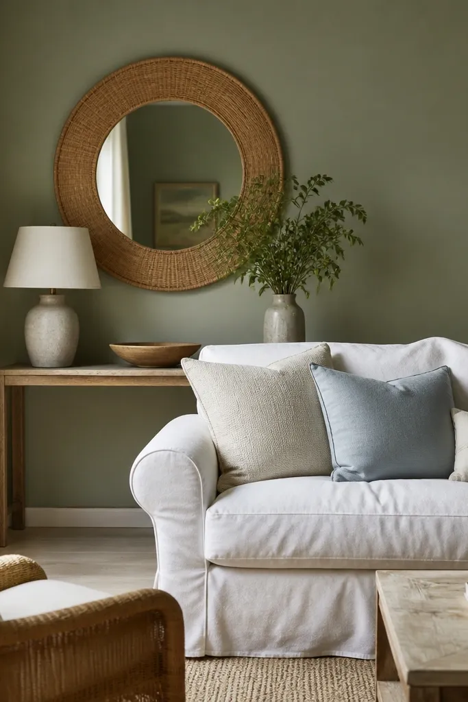
Soft sage reads like muted green, not “kitchen herb.” It gives the room a gentle freshness while staying grounded enough for everyday living. This color also plays well with natural textures — rattan, linen, and light wood — because it doesn’t demand attention.
Pick a sage that’s gray-green or yellow-green, then test next to your sofa. Use eggshell for a soft, fabric-like wall finish. Pair with white trim, oatmeal textiles, and warm wood tones so the green stays creamy.
If sage looks too muted, add contrast with darker legs on furniture or a charcoal rug runner.
Avoid bright mint sage — it can overpower warm wood and make the room feel childish.
4. Blue-Gray for a Quiet Coastal Feel
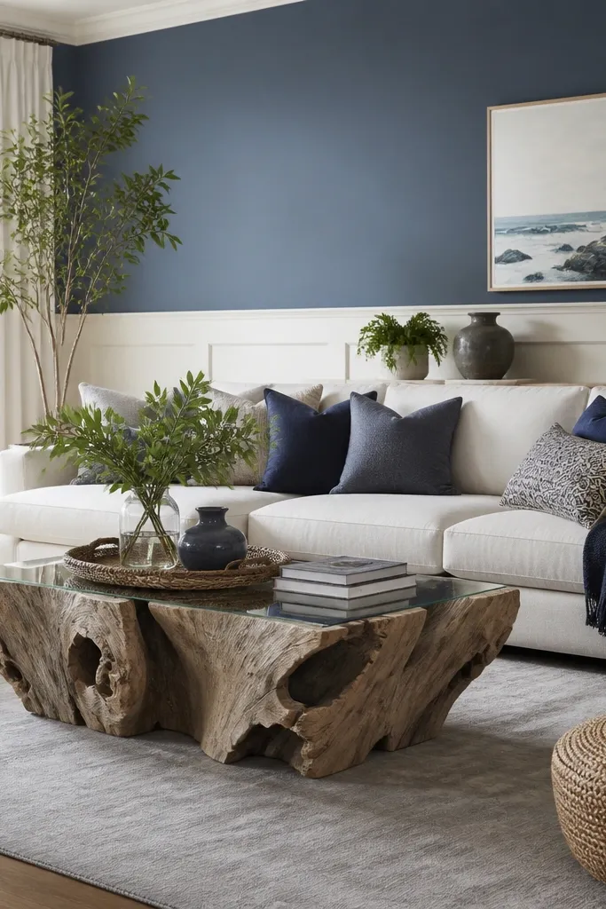
Blue-gray makes a living room feel cooler and calmer without turning sterile. I like it when the room has navy, weathered wood, or off-white fabrics because the tones connect. It also hides wall imperfections better than crisp whites in my experience.
Use a blue-gray with a slight gray undertone (not too green). Keep trim white and choose a matte or eggshell sheen to prevent glare. Pair with navy accents, driftwood textures, and silver or brushed nickel hardware.
Test it beside a navy pillow; if the pillow looks dull, the wall is too green and you should switch undertones.
Avoid blue-gray that pulls purple — it can clash with warm lamps and make skin tones look off.
5. Warm Sand for Low-Contrast Rooms
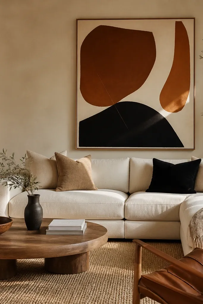
Warm sand adds color depth without feeling dramatic. It works when your room has lots of light neutrals and you want the walls to stop disappearing. Sand also makes terracotta and rust accents look intentional instead of random.
Pro tipIf sand looks flat, add one darker anchor — a walnut coffee table or a charcoal curtain panel.
Choose a sand color that reads beige-brown, not yellow highlighter. Use eggshell on walls so the color looks soft, like plaster. Pair with cream upholstery, jute or sisal rugs, and art with burnt orange or rust tones.
Watch outAvoid yellow-beige sand — it can make the whole room feel dated and overheated.
6. Charcoal Wash for a Modern, Grounded Look
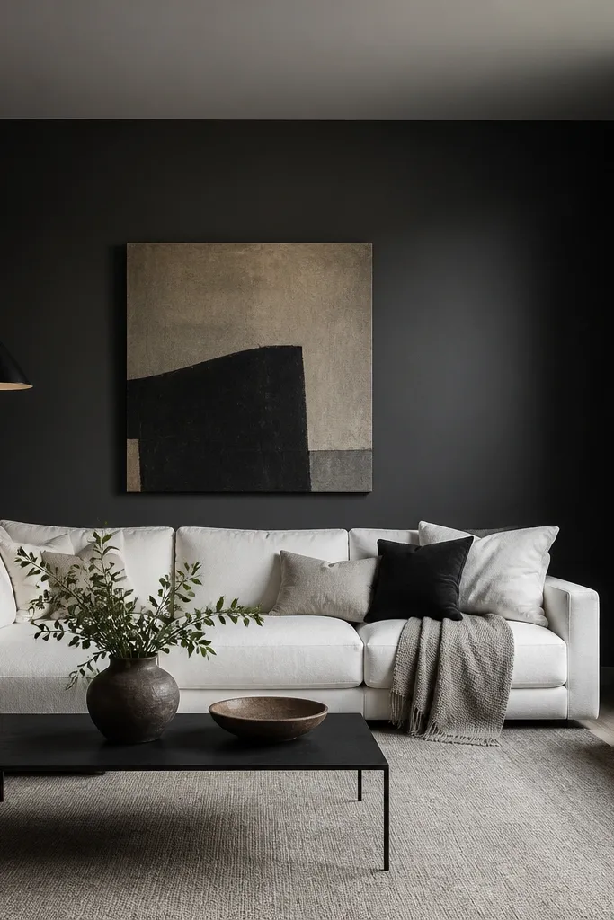
Charcoal walls make furniture look crisp and modern, especially with light upholstery. I’ve used a charcoal wash style where the wall is evenly coated but still looks slightly textured, so it doesn’t feel like a flat cave. It’s the fastest way to make a plain living room feel designed.
Go for a charcoal that’s not pure black — a deep slate reads more expensive. Use eggshell and keep lighting bright with warm bulbs around 2700K. Pair with white furniture, pale oak, and black hardware for a clean match.
If the room feels small, paint only one wall charcoal and keep the rest in a warm white to protect the floor-to-ceiling openness.
Avoid flat black on all walls with dark floors — it can swallow the room fast.
7. Brick Clay for a Cozy, Earthy Mood
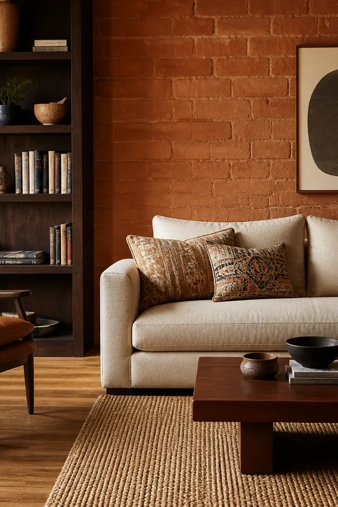
Brick clay brings warmth you can feel, and it makes natural materials look better. It’s also forgiving with brass, copper, and dark wood because the undertone is already earthy. In rooms with white trim and medium oak, it looks like a lived-in cabin without being heavy.
Pro tipBalance brick clay with cool-ish whites in decor — think stone or oatmeal, not stark optical white.
Pick a clay that leans more brick than orange. Use eggshell and keep your trim bright white or warm off-white. Pair with cream textiles, walnut furniture, and rugs with muted red or rust accents.
Watch outAvoid neon orange terracotta — it reads cheap and makes skin tones look warm in a bad way.
8. Deep Forest Green for Drama Without the Black
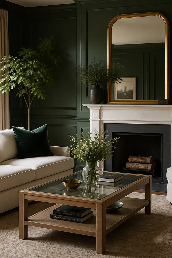
Forest green adds drama but still feels softer than black. It flatters warm metallics like brass and gold and makes light wood look brighter. When you pair it with cream, it creates a high-end contrast that doesn’t feel harsh.
Choose a deep forest with a blue-green undertone so it doesn’t turn brown in shadow. Use eggshell for walls and satin for trim if you want a subtle sheen. Pair with white trim, cream upholstery, and a gold mirror or sconce.
Add one woven texture like a jute or seagrass rug so the green doesn’t look too formal.
Avoid forest green with a strong yellow undertone — it can look muddy next to brass.
9. Muted Plum for a Creative Corner
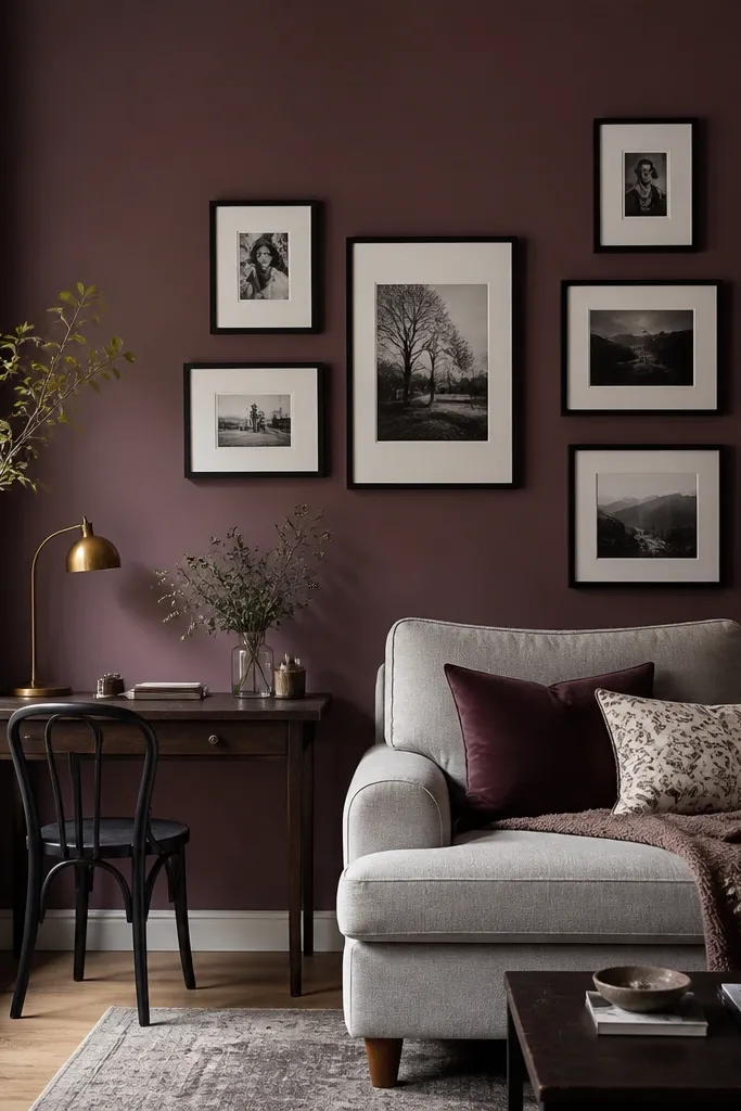
Muted plum is a grown-up way to use purple. It adds personality while staying dark and moody enough to anchor a gallery wall. I like it in spaces with black accents and light gray or cream textiles because the purple doesn’t fight the neutrals.
Pick a plum that reads more wine than lavender. Use eggshell so the color looks like velvety paint, not plastic. Pair with black picture frames, cream throws, and a rug with gray to keep the room from tipping too warm.
If you have warm wood floors, keep your lighting warm (2700K) so the plum stays rich instead of brown.
Avoid lavender-plum — it can make gray furniture look dirty.
10. Soft Blue with White-Washed Wood
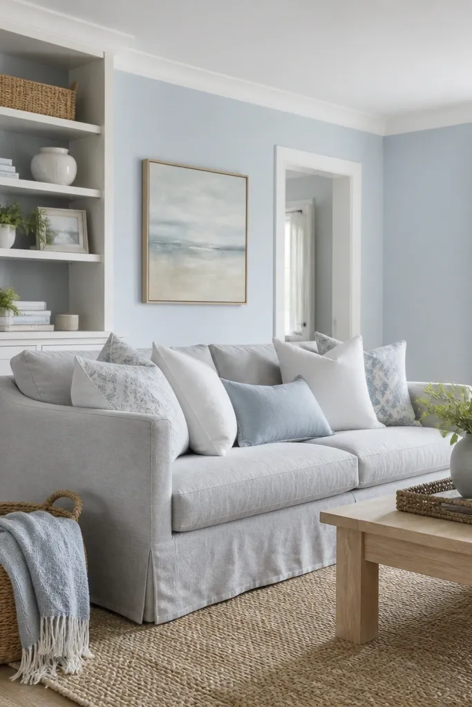
Soft blue makes white-washed wood look airy and clean. It also brightens rooms that get indirect light because the blue adds a gentle color cast instead of pure brightness. Use it when your decor is already light and you want the walls to add shape.
Pro tipTest your blue with a white pillow from your sofa. If the pillow looks dingy, the blue is too saturated.
Choose a powder blue with a gray undertone, not a vibrant sky blue. Use eggshell and keep trim crisp white. Pair with pale wood, woven textures, and light gray or navy accents.
Watch outAvoid high-saturation blue in a small living room — it can feel like a fish tank at night.
11. Classic Creamy Off-White with Warm Undertone
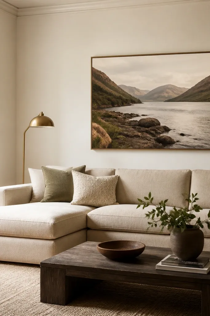
Creamy off-white gives you the “expensive hotel” look without the sterile vibe of bright white. It hides minor wall flaws and keeps the room inviting in the evening when lamps kick on. This is my go-to for families because it doesn’t show scuffs as much as colder whites.
Pro tipIf you have kids and pets, pick a paint line that has a washable finish and don’t go too matte.
Use a creamy off-white in eggshell. Keep ceilings slightly brighter but still warm, and match your trim to the same family. Pair with brass, warm gray fabrics, and medium wood.
Watch outAvoid cool off-white with pink undertones — it can clash with warm wood and make the room feel off.
12. Warm Gray with a Mocha Undertone
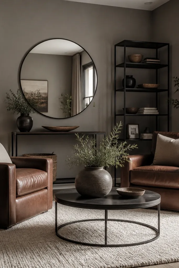
Warm gray with a mocha undertone looks soft and forgiving. It’s the shade I pick when the room has brown leather or dark wood, because the gray stops looking icy. The result feels modern but not cold.
Choose a warm gray that has brown in it, not green. Walls in eggshell, trim in a warm white. Pair with leather browns, black metal, and cream or warm ivory textiles.
If your gray looks too beige, add a cooler element like a light blue throw pillow to balance it.
Avoid warm gray that leans green — it makes brass look dull and beige look yellow.