1. Warm greige with honey undertone
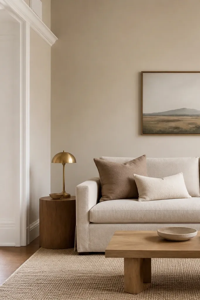
This is the greige that makes wood look expensive instead of yellow. The key is a honey-leaning undertone, so your oak or walnut doesn’t turn gray. Pair it with oatmeal, camel, and brushed brass for a calm, lived-in feel. In my rooms, this shade looks best when you have light natural wood and you want warmth without turning the space yellow.
Pro tipIf your greige sample looks too peachy, go one step cooler on the undertone rather than choosing a darker shade.
Paint the main walls in the warm greige and keep trim crisp white. Use eggshell sheen on walls so it hides minor wall texture and still cleans well. For accents, choose linen curtains in off-white and a rug with a tan warp so the room stays cohesive.
Watch outAvoid greige that reads blue-gray — it makes warm rugs look dirty.
2. Soft taupe for a grounded, not heavy, look
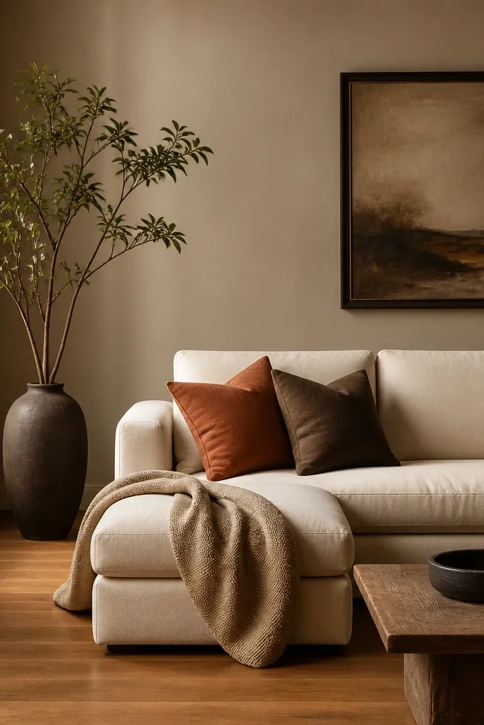
Taupe is the neutral I reach for when the room needs grounding but you don’t want a dark cave. The trick is picking a taupe that’s neither too gray nor too pink. This shade makes medium oak floors look rich and keeps white trim from looking harsh. It also plays nicely with earthy textiles like clay, cocoa, and woven cotton.
Pro tipTest taupe samples on the wall near the floor — taupe can look different at baseboard height.
Use taupe on all walls if the room is small or narrow — it keeps lines calm. If you have a fireplace, paint the surround the same taupe and let the mantle be the slightly lighter trim. Keep lighting warm (2700K bulbs) so the taupe stays cozy.
Watch outDon’t choose taupe with a strong purple cast — it shows up in the evening.
3. Cool greige for modern furniture and stone floors
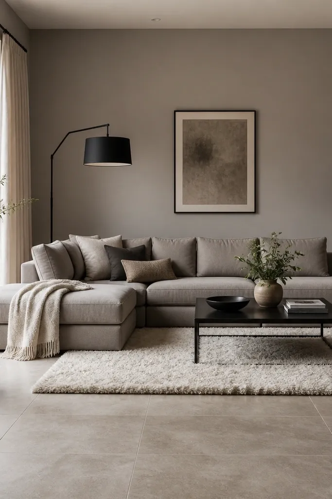
Cool greige is the neutral that keeps modern shapes crisp. If you have stone floors or lots of gray in your furniture, a warmer greige can make the whole room feel mismatched. A cool greige counterbalances that and keeps metals like black and chrome looking sharp. It also works with white art, because the wall doesn’t compete with it.
Pro tipIf the sample looks green in the corners, switch to a greige described as having gray undertones rather than yellow.
Pick a greige that looks closer to light cement than warm sand. Use eggshell on walls and satin on any trim for a crisp edge. Keep your accessories in white, smoke-gray, and matte black so the color story stays intentional.
Watch outAvoid warm beige over stone tile — it can make the tile look sickly.
4. Butter-cream off-white for cozy rooms
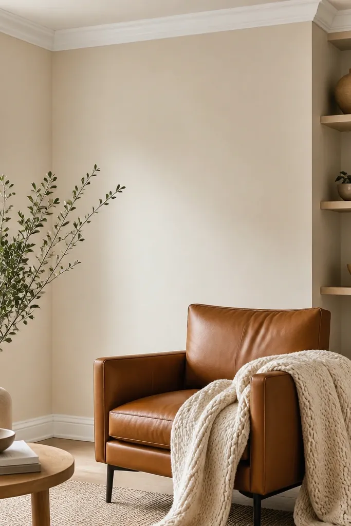
Butter-cream off-white is the off-white that doesn’t feel icy. It gives you that “fresh paint” look while still warming up wood and leather. This shade is great when your living room has a lot of natural textures — wool, woven baskets, or leather. In my experience, it keeps white trim looking clean instead of blue.
Paint walls and ceiling the same butter-cream if you want the room to feel bigger. Keep crown molding and baseboards a true bright white for contrast. If you have darker floors, add a light rug to keep the room airy.
Bring home two off-white samples and compare them on the same wall — one will look too yellow and one will look too blue.
Avoid off-white with a strong gray undertone — it can make the room feel cold even with warm lamps.
5. Greige with a pink-beige undertone (the tricky one)
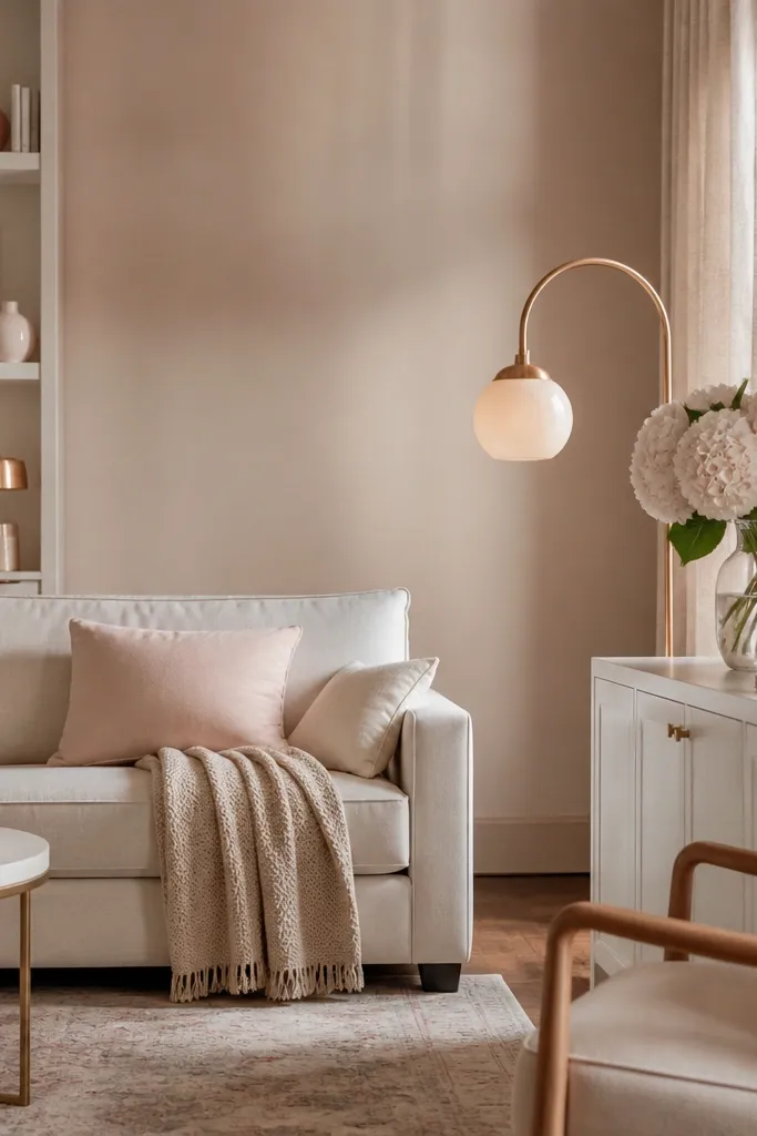
This is the greige that looks luxe when you have warm light and blush or oatmeal fabrics. The pink-beige undertone can sound scary, but in a room with cream textiles it reads neutral and soft. It’s also a good match for rose-gold and warm brass. When it works, it makes white furniture look warmer and more inviting.
Use it on walls only, and keep trim a clean bright white. If your room has lots of cool gray furniture, this undertone will fight it — you’ll see it right away. For fabrics, go with oatmeal, cream, blush, and warm taupe.
Do a sample check near a window that gets morning sun — the pink shows up fast there.
Don’t pair this with stark cool whites or blue-based grays.
6. Light warm beige for airy, family-friendly rooms
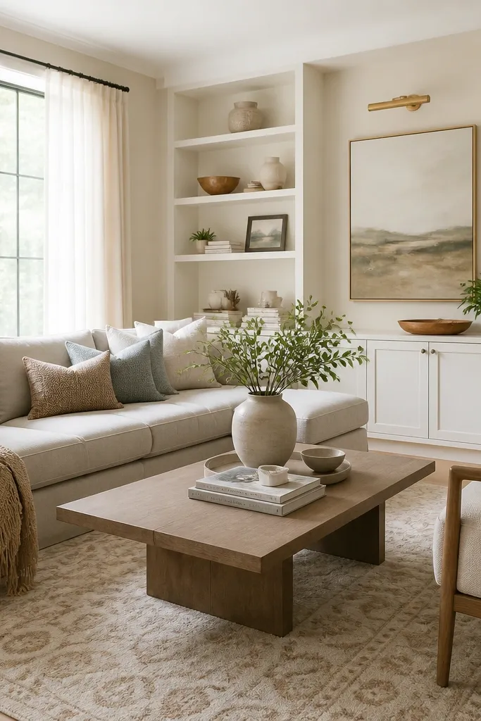
Light warm beige is the neutral I pick when I want the room to feel bright but not sterile. It hides everyday scuffs better than very light gray, and it doesn’t show wall imperfections as much as pure white. This shade also makes multi-color rugs look tied together without you having to match every tone.
Pro tipIf your beige looks too pale, go one shade darker rather than adding gray.
Choose a beige that’s not too close to white — if it’s too pale, it can look washed out. Paint walls in eggshell for easy wipe-downs. Keep built-ins and trim in a slightly brighter white so you get definition.
Watch outAvoid beige that’s too yellow — it reads dated in evening light.
7. Sandstone neutral for a sunlit look
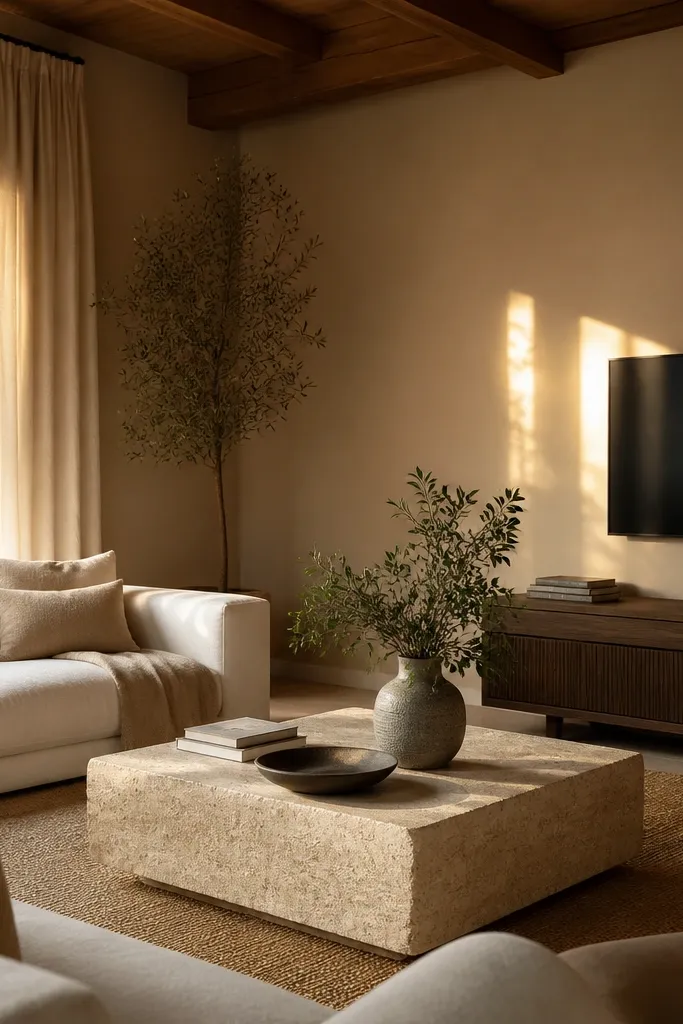
Sandstone neutral gives you that sun-warmed feeling without turning into a full-on tan. It’s especially good if your room has large windows and you want the walls to look good all day. The color sits between beige and taupe, so it blends with woven textures and darker wood. In my house, it made jute rugs look intentional instead of accidental.
Pro tipTest sandstone samples on a wall that gets direct sun — it will shift more than you expect.
Use it as your main wall color and keep accents in deep espresso, natural linen, and soft ivory. If you have a dark couch, add a lighter throw blanket to prevent the room from feeling bottom-heavy. Pair with black metal lighting if you want a sharper edge.
Watch outSkip sandstone that leans orange — it can look like a permanent summer shade.
8. Soft mushroom for a calm, modern backdrop
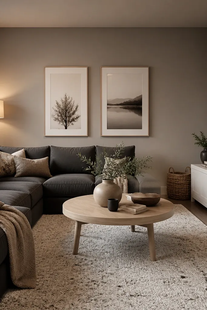
Mushroom is my go-to neutral when the room has a darker sofa but you still want a light feel. It’s gray-brown, not muddy, and it makes charcoal look clean instead of gloomy. The color also helps patterned rugs look cohesive because it sits in the middle of beige and gray. This is a great choice if you want modern without going cold.
Pro tipIf mushroom looks too gray, warm it with a cream rug and a brass lamp before you repaint.
Paint all walls in mushroom and keep trim crisp white or slightly warm off-white. If the room is small, avoid going too dark — mushroom should be light enough that it doesn’t swallow the window. Add one medium-contrast element like a tan leather chair or a walnut coffee table.
Watch outAvoid mushroom with a green undertone — it clashes with many beige leathers.
9. Pocket-linen off-white with a subtle gray
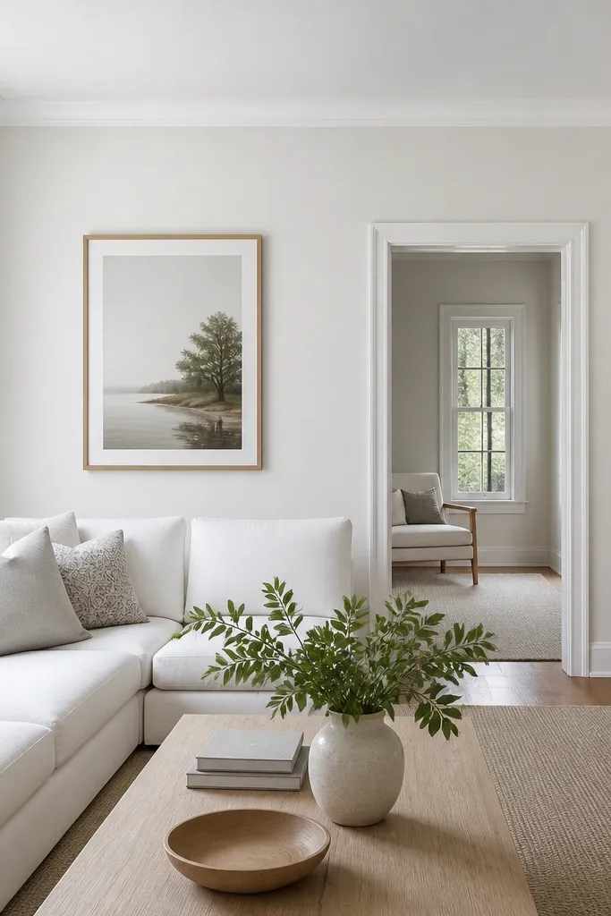
This neutral reads like clean linen. The subtle gray keeps it from looking yellow, and it still feels soft rather than crisp. It’s perfect when you have white upholstery and you want the room to feel tidy without going stark. I’ve used this when the kitchen opens to the living area because it creates a consistent, calm flow.
Use it on walls and ceiling for a wraparound effect, then keep trim bright white. Choose textiles that have woven texture — linen, cotton, or boucle — so the gray whisper shows up as depth. Pair with cool metal accents like chrome or brushed nickel if you have them.
Hold a white piece of paper next to your sample — if the sample looks darker than the paper, it’s doing the job.
Don’t pick an off-white that’s too close to the gray on your rug — you’ll lose contrast.
10. Warm ivory for rooms with dark trim or dark floors
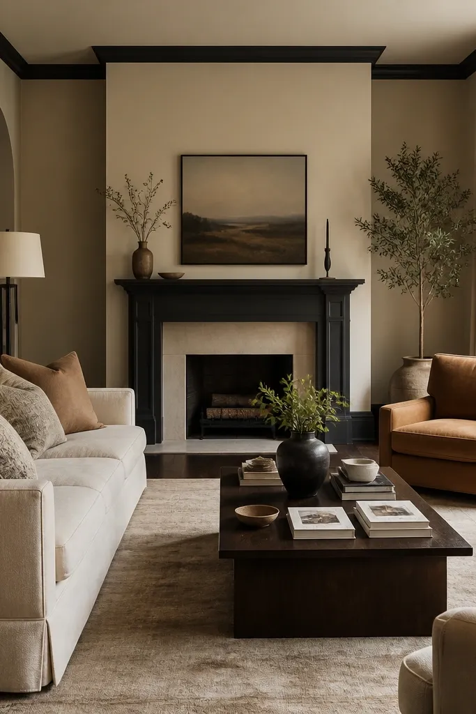
Warm ivory is a smart choice when your room already has dark floors or darker trim. The warmth keeps it from feeling heavy, and the depth contrast makes the room feel designed. This color also looks good with camel, cognac, and natural leather. In rooms like this, pure white walls can look too stark against dark wood.
Pro tipIf the room feels too contrasty, lighten the trim by one step instead of changing the wall color.
Paint walls warm ivory and let trim stay darker if you already have it. If your trim is currently bright white, consider warming it slightly so it doesn’t look like a cool sticker on warm walls. Add a medium rug in cream or sand to bridge the contrast.
Watch outAvoid warm ivory that’s too close to beige if you want a cleaner, brighter look.
11. Putty gray-beige for a heritage-meets-modern feel
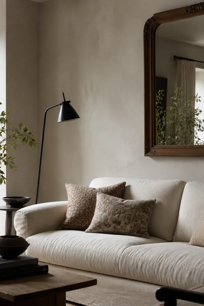
Putty color sits in that sweet spot where it feels classic but still works with modern furniture. It has enough gray to calm down warm woods, yet enough beige to keep it from feeling sterile. This is the neutral I pick when the room has both traditional and contemporary pieces. It makes mixed metals look intentional too.
Paint walls in putty and keep trim in an off-white rather than a bright blue-white. Use a mix of textures: velvet pillows, a woven throw, and a matte ceramic vase. If you have a patterned wallpaper accent somewhere, putty walls help it read as decoration instead of noise.
Match the paint undertone to your largest wood piece, usually the coffee table or media console.
Skip putty that’s too gray — it can make traditional wood look flat.