1. Magnetic Berry Tile Centerpiece Tray
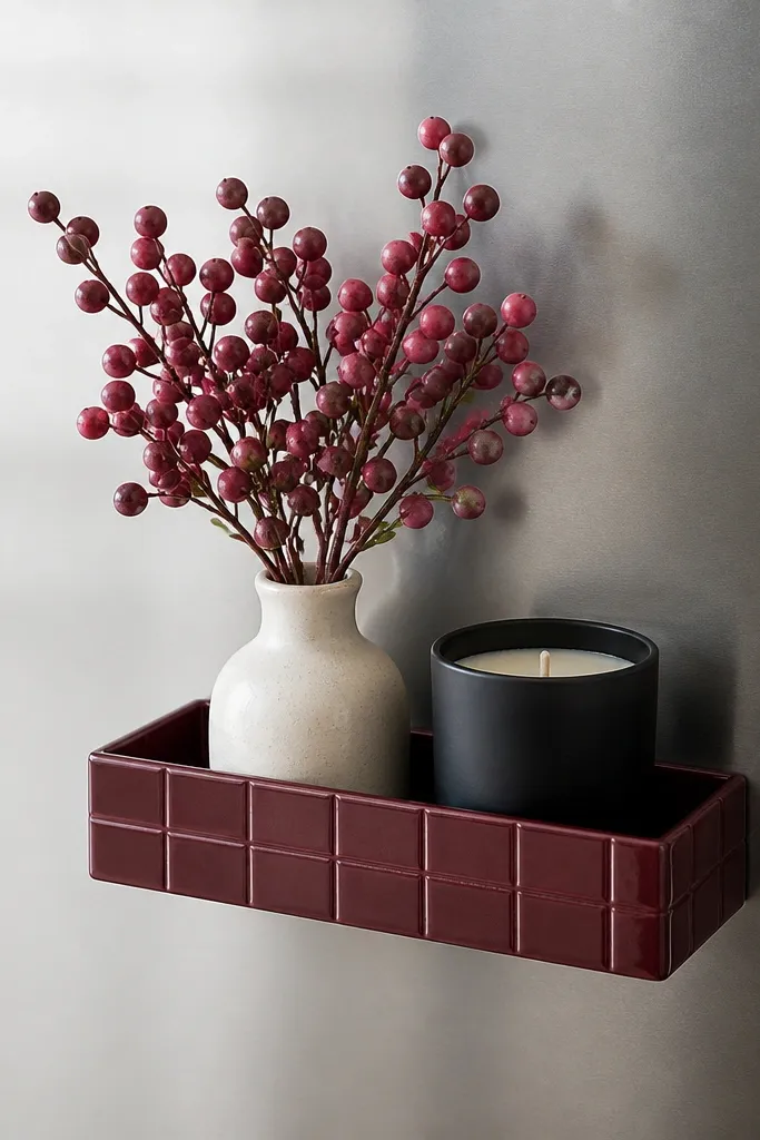
This is a “doesn’t fight the rental rules” centerpiece. The tray sticks magnetically to metal surfaces, so it looks like decor, not storage. I like berry tones because they stay readable in both warm and cool lighting, and the matte black candle jar keeps the pink from looking sugary.
Choose a tray sized to your fridge door width so it sits centered with at least 2 inches of breathing room on each side. Use one cream element (vase or ramekin) and one black element (candle or tray insert) so the pink has contrast. Keep the faux berries short enough that the arrangement doesn’t block cabinet handles.
Pro tipWipe the fridge with rubbing alcohol, let it dry, then attach the tray so magnets grip instantly.
Watch outAvoid shiny hot-pink accessories on stainless — they look like party supplies instead of kitchen decor.
2. Tension-Rod Pink Curtain for the Dining Window
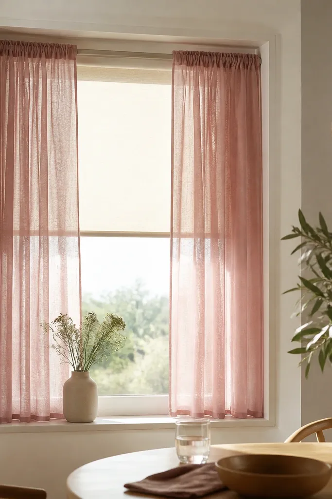
A curtain changes the whole vibe because it frames the room. Dark pink sheers give a moody glow without blocking daylight, and the light-through fabric makes the color feel intentional. Pairing it with a neutral under-layer (cream blind or sheer) keeps it from turning heavy during the day.
Pick a tension rod that matches your window width and use it inside the frame so you don’t need wall anchors. Use a fabric that drapes (voile, lightweight linen blend, or sheer polyester) and hang it so the hem ends 1-2 inches above the sill. Add tiebacks in black or deep plum ribbon for evenings.
Steam the curtains before hanging; the folds look better immediately and you won’t fight wrinkles.
Skip stiff fabric that stands out — it makes the window look temporary.
3. Clip-On Dark Pink Table Runner with Non-Slip Back
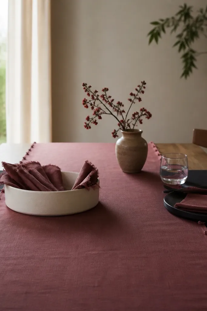
This runner gives you the “styled table” look without taping or permanent adhesives. The non-slip back keeps it from sliding when you set down plates, and the clip points keep it straight. Dark pink here reads like a deliberate color choice because it sits between your plates and table edge.
Measure your table length and choose a runner that covers about 70% of the tabletop, leaving the ends visible. Use black place mats or a black charger plate underneath so the runner doesn’t float. Fold napkins into a simple rectangle and tuck them into a shallow bowl for a clean moment.
If your table is glossy, add felt pads under the non-slip backing so it grips harder and won’t scratch.
Avoid thin runners that wrinkle fast — they look messy within one meal.
4. Slip-On Chair Covers in Plum Velvet-Look
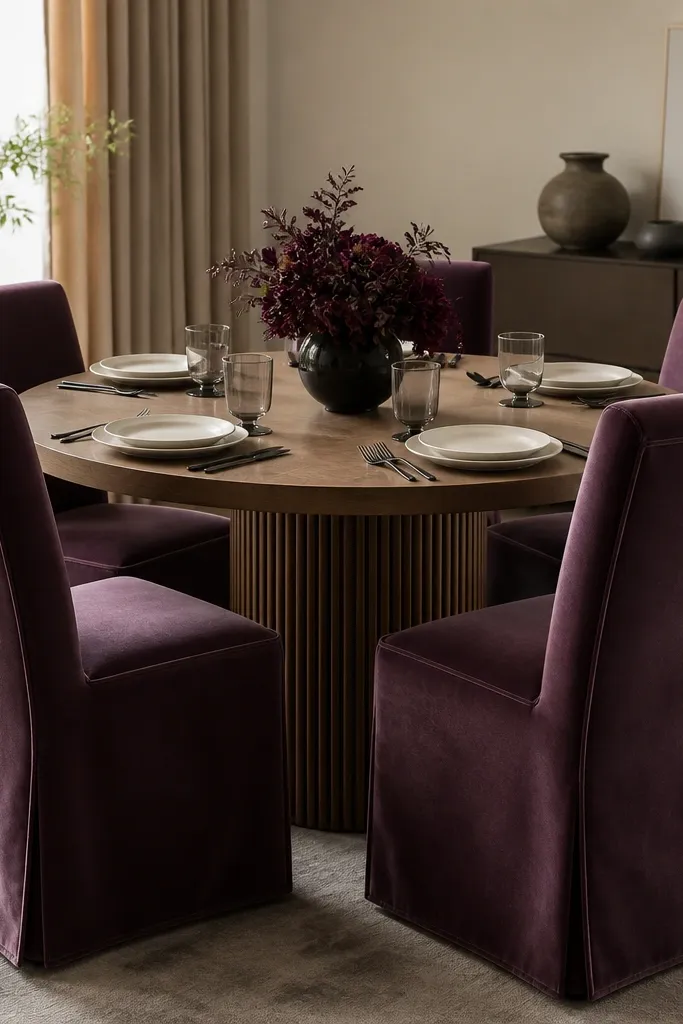
Chair covers are the fastest way to make a rental dining area feel finished. Plum with a velvet-look texture catches light and makes dark pink accents look richer. When you pair it with cream and black, the whole table reads like a planned dinner setup.
Choose slipcovers with elastic hems and a back panel that fits your chair height. I prefer covers that reach the seat edge cleanly without pooling — aim for 1 inch of slack maximum. Keep the chair legs visible so the room doesn’t look bulky.
Pro tipUse a fabric steamer right before guests come over; velvet-look fabric looks best with soft nap direction.
Watch outDon’t buy covers that are too small — tight covers pull and make the table look lumpy.
5. Peony Pink Wall Art on Removable Rails
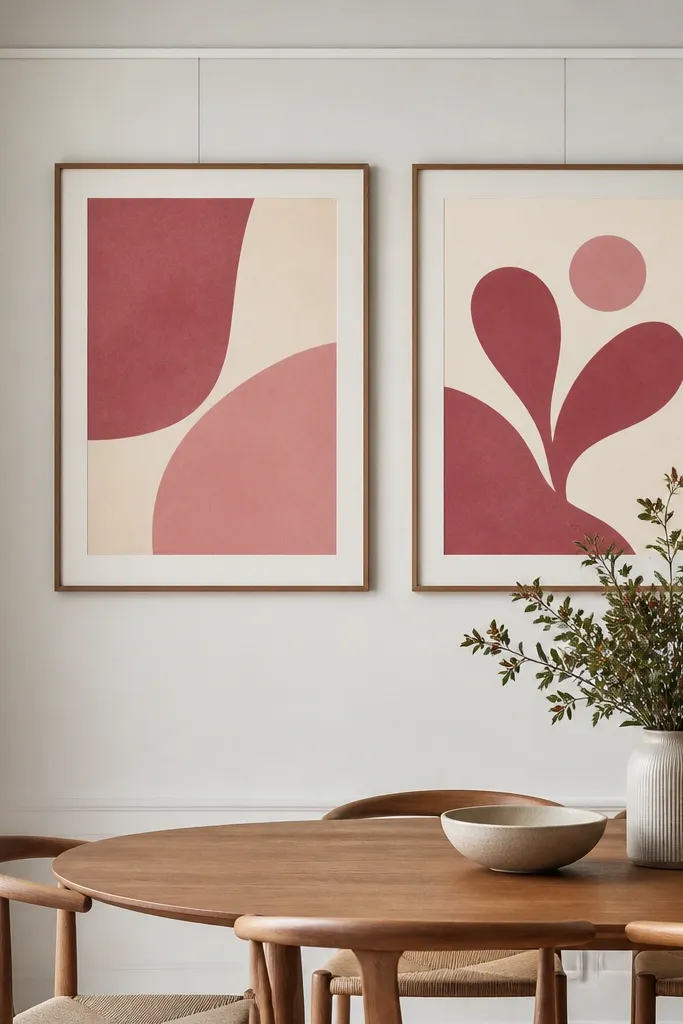
Wall art makes the dining space feel “done,” but renters need a method that comes off cleanly. Removable rails let you adjust height, and dark pink prints add a moody color echo from the tabletop. I like prints with cream negative space because they keep the wall from feeling crowded.
Hang the art so the bottom edge sits about 60 inches from the floor for most dining setups. Use two frames side-by-side with equal spacing, and keep them aligned with the center of the table. If your frames are heavy, use the rail’s labeled weight capacity and don’t guess.
Lay the frames on the table first and check proportions with a measuring tape; wall alignment looks better when the spacing is exact.
Avoid single small prints alone — they look like a quick add-on instead of a focal point.
6. Dark Pink Heat-Resistant Liners for Shelf Styling
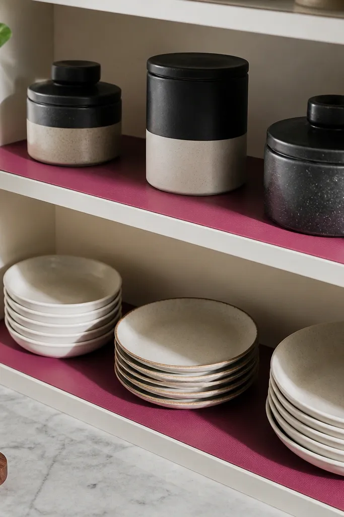
Shelf liners are one of the most underrated removable pink aesthetic widgets because they change the background color without hanging anything. Heat-resistant liners handle spills and splatters, so the pink stays clean-looking. When you style plates and glassware on top, the dark pink becomes an intentional base layer.
Measure shelf depth and cut liners with a sharp utility knife on a self-healing mat. Leave a 1/8 inch gap at the back so the liner doesn’t buckle when it warms. Stick to a matte liner finish so it doesn’t glare under overhead lights.
Use a damp microfiber cloth and a tiny bit of dish soap; liners clean fast and keep the pink looking even.
Skip fabric liners — grease stains show and they look tired quickly.
7. Magnetic Spice Tin Set in Deep Berry
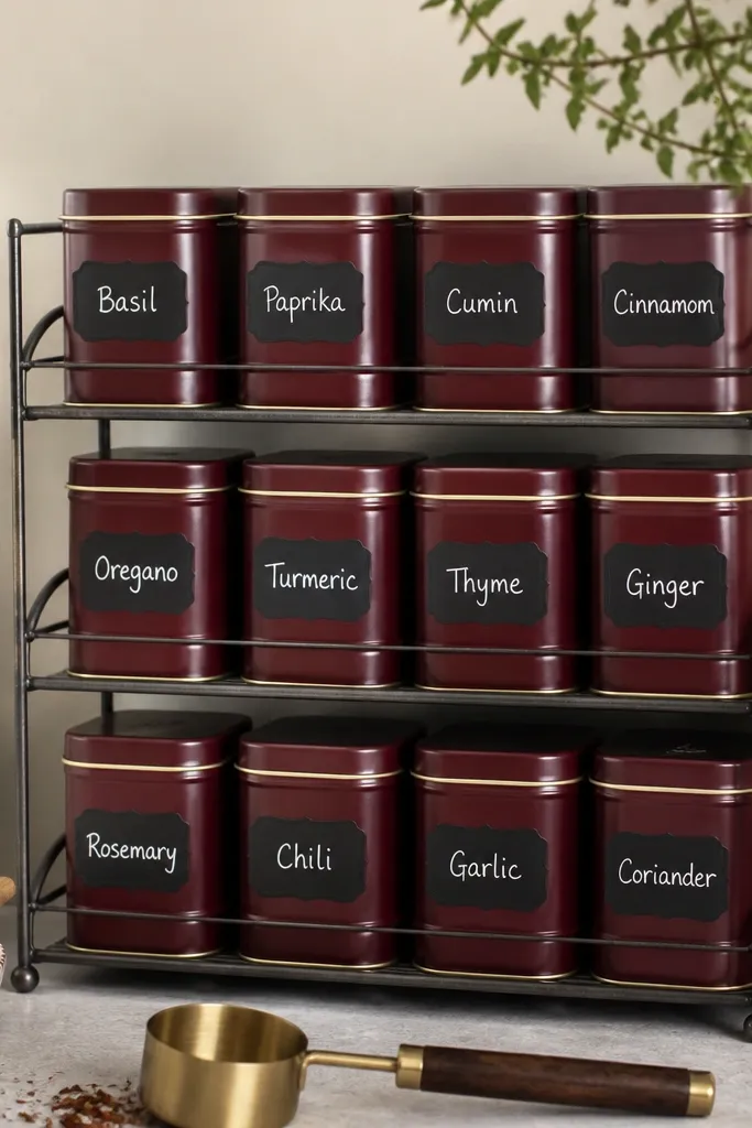
This turns “kitchen clutter” into a color-coded look you can remove when you move. Magnetic tins look clean on metal backsplashes or appliance sides, and the dark pink grouping adds structure. Use black labels so the pink doesn’t dominate every glance.
Pick tins that match in size so the row looks uniform. Label with a consistent font or template and keep the same number of lines per tin. Store only the spices you actually use; too many tins make it look crowded.
Pro tipWipe tins before sticking labels; oils make stickers peel faster than you think.
Watch outAvoid mismatched tin heights — the row starts looking sloppy after a week.
8. Removable Faux-Wood Tray with Pink Candle Inserts
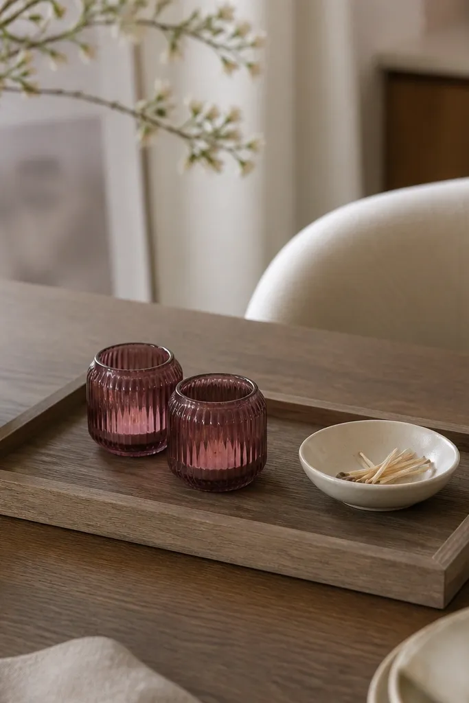
A tray is a cheat code for “cohesive styling” because it keeps small items contained. Dark pink candle holders add warmth, and the faux wood tone balances the color so it doesn’t read like a themed party. I like this for end-of-day lighting — it makes the room feel softer without changing your whole kitchen.
Choose a tray that’s wide enough to hold candles plus a small centerpiece without touching. Use LED flameless candles if you rent and want zero smoke worry near curtains. Place the tray on a table surface that gets stable light; avoid near the stove where heat can warp plastics.
Add felt pads under candle holders so the tray doesn’t scratch and so it stays steady.
Don’t mix tall candles with low table decor — the height mismatch makes the arrangement look accidental.
9. Dark Pink Napkin Rings from Matte Resin
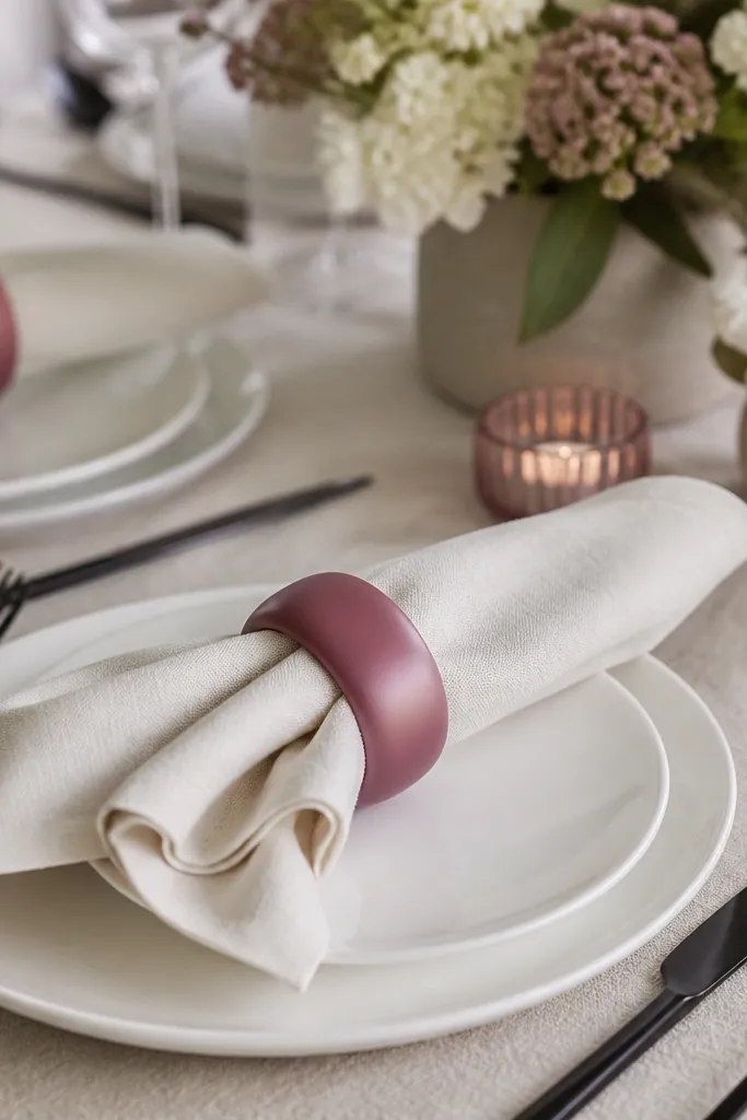
Napkin rings are small, but they change photos and real meals because they sit at eye level. Matte resin in deep berry looks expensive next to cream and black. When you keep napkin folds consistent, the whole table looks styled even if everything else is simple.
Use rings that have enough inner diameter for your napkin thickness; don’t force it. Fold napkins into a simple rectangle or a quick triangle — keep the fold height under 2.5 inches. Match the ring color to at least one other pink item so it feels like a set.
Lightly mist napkins with water and smooth before folding; wrinkles show through thin fabric.
Avoid glossy rings — they glare under overhead lights and look cheap fast.
10. Pink Ombre Place Mats with Easy-Wipe Top
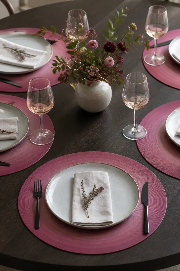
Place mats are the workhorse removable decor because they handle spills and still look good. An ombre effect keeps the pink from being flat and helps it blend with different shades of dinnerware. Matte texture hides water spots better than shiny vinyl.
Buy mats that are heat-safe if you use hot plates. Size them so your plates have at least 1 inch clearance around the edges. For a consistent look, use cream plates and black cutlery so the ombre becomes the star.
Pro tipRotate mats halfway through dinner events; the sun exposure fades corners at different rates.
Watch outSkip mats that curl at the edges — they make the table look like a temporary yard sale.