1. Rosewood glass panel widget
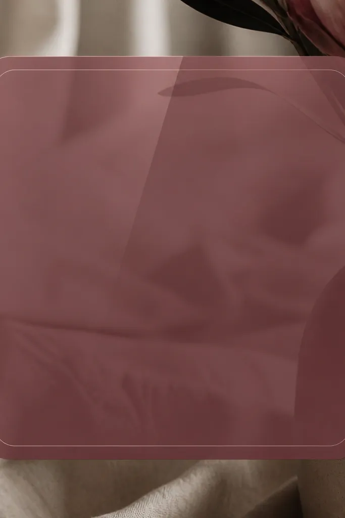
This look is the one I use when my dark pink starts to feel too loud. The rosewood pink stays deep because the background is translucent, and the thin white border keeps everything crisp. I like pairing it with off-white text so it reads cleanly against the panel. The modern part comes from the straight border, consistent padding, and simple typography.
Use a widget background that mimics frosted glass — a gradient from deep rosewood at the edges to slightly lighter pink at the center. Add a 1-2 px light border if your widget editor allows it, and keep the text area centered. Works great for a clock widget at the top because it stays readable while still looking styled.
Pro tipIf your editor lets you choose text color opacity, set it to 90-95% white instead of pure white for a softer look.
Watch outAvoid full-opacity pink backgrounds with dark text — that combo looks cheap fast.
2. Dusty magenta paper cutout widget
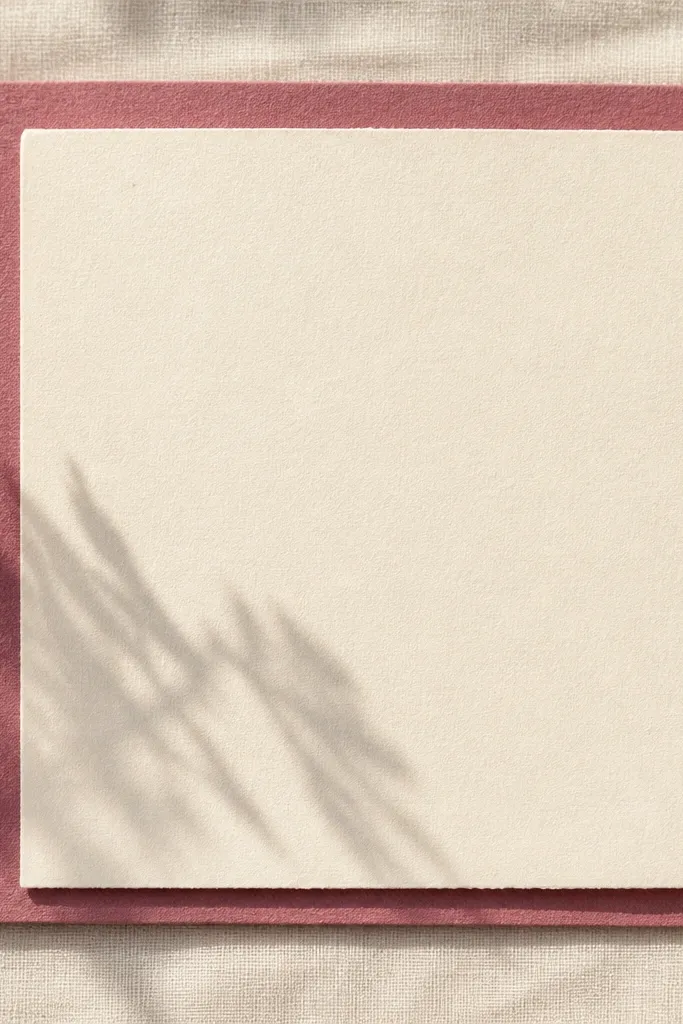
Paper textures make dark pink feel cozy instead of aggressive. The cutout effect — darker layer behind, lighter panel on top — gives you depth without using neon colors. I like this for recipe or grocery widgets because it feels like a note you’d pin to a fridge. Keep the shapes simple: one large rectangle and one smaller “label” inside.
Create a background with a dusty magenta rectangle, then place a cream label panel centered with rounded corners (radius about 18-24 px on most screens). Add a shadow that’s very soft and slightly offset down-right. Use black or charcoal text on the cream label, not directly on the magenta.
Pro tipUse one small accent line under the title in the same dusty magenta shade to tie it together.
Watch outSkip heavy drop shadows — thick shadows make the paper look like a sticker.
3. Berry leather frame widget
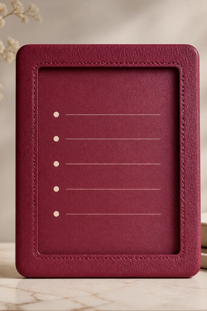
Faux leather grain is the fastest way I’ve found to make dark pink look “real” and expensive. The berry tone stays grounded, and the texture keeps it from looking flat. A leather frame also makes your widget feel structured, like a menu cover. Pair it with cream text and tiny dot bullets for a clean, modern dining vibe.
Set the widget background to a berry pink leather texture (matte grain, not glossy). Put a cream inner panel inside the frame, with rounded corners slightly smaller than the outer frame. Keep font sizes consistent: big for the header, small for the list. This is perfect for a “today’s plan” widget.
If you can control grain intensity, choose medium grain — heavy grain competes with the text.
Don’t put bright white text directly on the leather — it can look harsh.
4. Rosewood marble slab widget
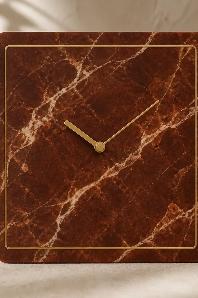
Marble patterns make dark pink feel like a countertop, which instantly ties into kitchens and dining. The rosewood color reads premium when the veining stays light and subtle. A thin gold line border is the metallic accent that keeps it modern instead of romantic. I like this for a “dining reservation” widget or a countdown tile.
Pick a marble image where the veining is cream or pale blush, not bright white. Add a thin gold border around the widget and keep the inner content centered with lots of padding. Use a clean sans-serif font in warm off-white. Keep the widget text minimal so the marble pattern stays the hero.
Match your widget border color to your phone case hardware tone if you have one.
Avoid busy marble with thick black veins — it overwhelms the pink.
5. Matte concrete blush block widget
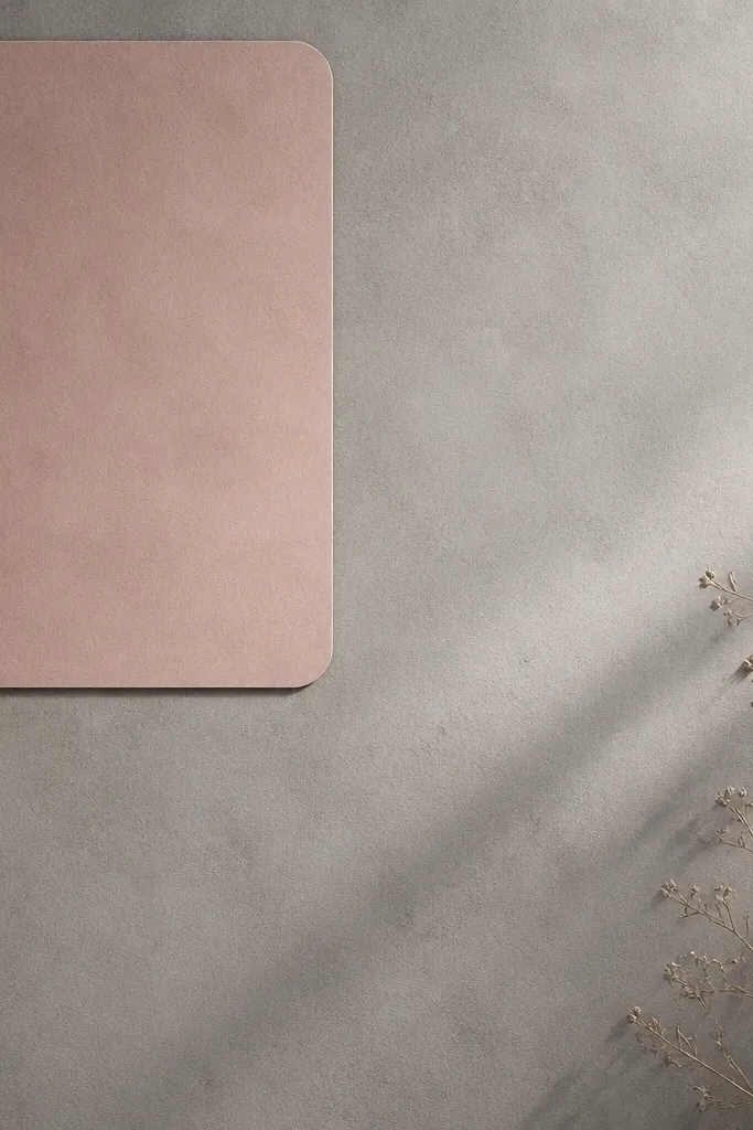
This is my go-to when dark pink starts to feel too feminine for a modern kitchen vibe. Concrete gray makes it feel architectural, and the blush block gives you that pink hit without covering the whole screen. The contrast keeps the layout readable, which matters for widgets that show time and tasks. It looks clean because your eye has a neutral area to rest on.
Use a matte concrete texture background. Place a blush pink rounded rectangle panel in the top-left, leaving a wide margin on the right side for text. Keep text in charcoal or deep gray. This layout works well for a “menu of the day” or “next meal” widget.
Keep the pink block at about 30-35% of the widget width so it feels like an accent, not a takeover.
Don’t use a glossy pink block — it clashes with the matte concrete.
6. Deep pink vertical stripe organizer widget
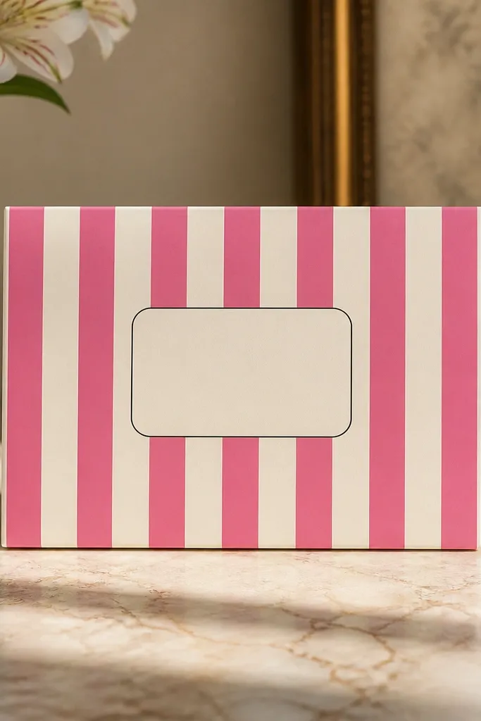
Vertical stripes make a widget feel organized and modern, especially when the stripes are narrow and consistent. Dark pink stripes create rhythm without requiring a complicated layout. The cream label in the center keeps the text readable and gives you a “menu card” feel. This looks great when you want multiple widgets to feel like part of one set.
Set the stripe width so each stripe is about 8-12 px on your editor canvas, with alternating deep pink and cream. Add a cream label panel centered with rounded corners around 20 px. Put your text in black or very dark charcoal and keep it short. Great for a “shopping list” widget with 3-4 items.
Use the same stripe background across 2-3 widgets so the whole screen looks like one system.
Skip thick stripes — they make the widget look like a pattern fabric instead of a modern tile.
7. Rosewood scalloped border widget
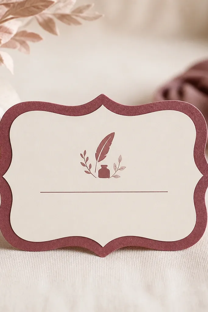
Scalloped edges soften dark pink and make it feel decorative without going childish. I use this when I want “pretty” but still modern — the key is keeping everything else minimal. The cream center stops the scallops from taking over, and a small icon cluster gives you that widget charm. It looks especially good for dining themes like tea time or dessert planning.
Create a rosewood border with scallops that are shallow, not huge. Keep the cream inner panel larger than the border thickness so the scallops read as framing. Use one icon (fork, spoon, or a tiny cup) and one short label. Keep the font small but crisp.
Match your icon color to the rosewood shade so it feels like one design layer.
Don’t add multiple decorative borders — scallops plus extra lines look busy.
8. Dusty magenta gradient corner swipe widget
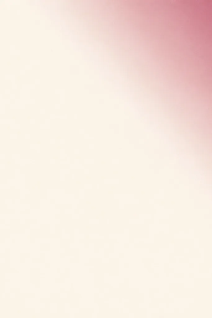
Corner swipes keep dark pink modern because they act like light, not paint. The gradient gives depth, while the big neutral area keeps text sharp. This is perfect for widgets that need to show details like time, weather, or a short note. It also helps when you have many widgets and the screen already feels pink.
Use a cream background. Add a dusty magenta gradient triangle or wedge in the top-right corner, fading toward transparent as it moves inward. Keep your text in charcoal and align it left for a neat reading path. Works best for a compact widget under your main clock.
If your editor allows it, reduce saturation slightly so the gradient looks like colored light.
Avoid full-screen gradients — they make the widget feel washed out.
9. Berry menu card widget with brass rules
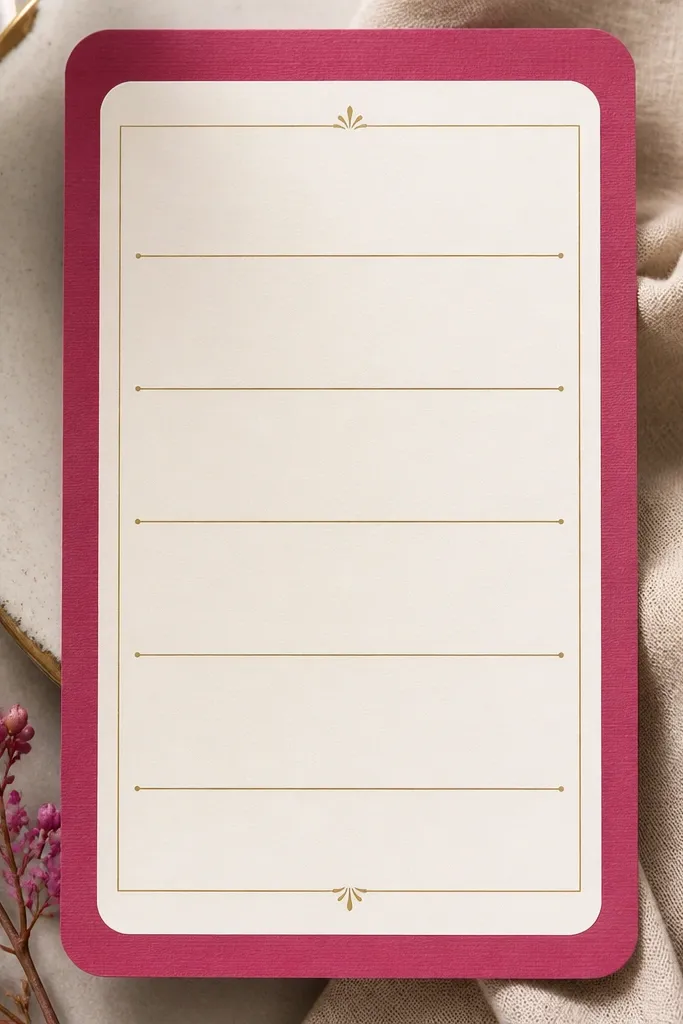
Menu-card styling is clean and functional, and it makes dark pink feel intentional. The brass rules add warmth, which balances pink so it doesn’t skew too cool. I use this for “meal plan” widgets because rows of text look natural inside a card. The modern look comes from spacing: enough air between lines so it feels like print design.
Set the outer background to berry pink. Put a cream panel inside with rounded corners, then add 2-3 thin brass lines across the panel. Use small caps or a simple sans-serif font for the row labels. Keep row text short — 2-4 words per row.
Use consistent line spacing across the widget so it doesn’t look like a pasted screenshot.
Don’t use thick gold borders — it reads like costume jewelry.
10. Rosewood photo tint widget for dining pics
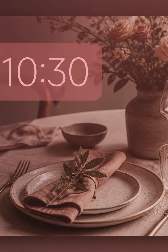
If you want your home screen to feel lived-in, tinted photos do it fast. The rosewood overlay unifies the colors so your dining images look like they belong together. The translucent dark pink text block keeps the time or label readable, even on busy images. This is the most “real life” pink widget idea.
Choose a photo with light areas (plates, napkins) and not too much clutter. Apply a rosewood tint overlay at low-to-medium opacity, then add a semi-transparent dark pink rectangle behind the text. Keep the text centered and use white or off-white fonts. This works best for a larger widget block.
Pick photos with natural neutrals (cream, tan, gray) so the rose tint looks smooth, not muddy.
Avoid using bright pink photos without tinting — the widget will fight itself.
11. Dusty magenta dotted grid widget
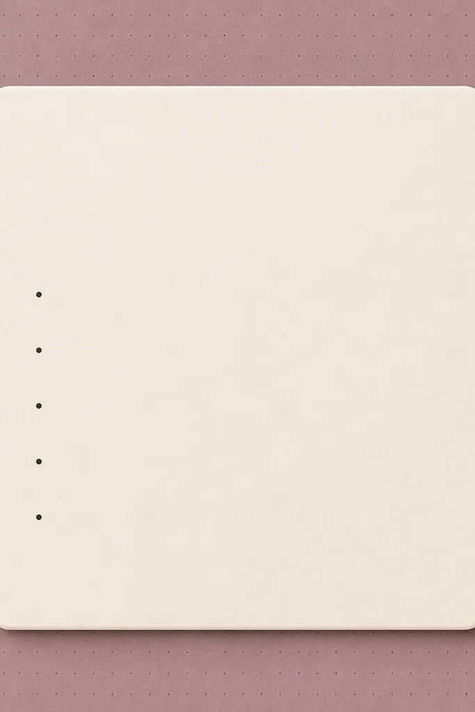
A dotted grid reads modern and calm, and it makes dark pink feel like design paper. The dots are light and subtle, so the widget doesn’t scream pink. I like it for planning widgets because dots make lists feel structured. When you combine the grid with a cream center panel, the text stays readable and clean.
Use a cream base or very light gray base with a faint dotted pattern in dusty magenta. Center a cream or off-white panel with rounded corners on top of the grid. Use black or charcoal text with dot bullets in dusty magenta. Keep the widget copy short.
Pro tipSet the dot size small (think 2-4 px) so it feels like a print texture, not a polka-dot costume.
Watch outDon’t increase dot opacity — it turns into a busy background.
12. Rosewood outline icon cluster widget
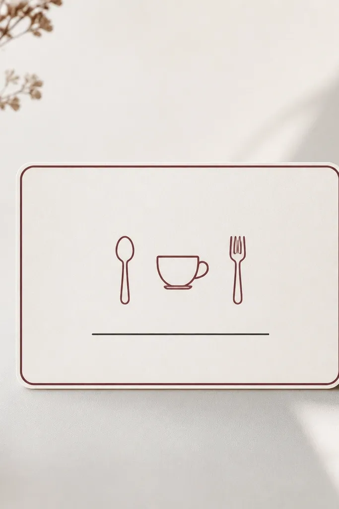
Outline icons keep dark pink modern because they don’t fill the screen with color. The rosewood outline border gives you structure like a frame. I like this for quick widgets where you want mood without reading a lot of text. The icon cluster also helps your kitchen theme feel consistent across apps.
Use a neutral background (cream or light gray). Add a thin rosewood outline border around the widget. Place three outline icons in a row at the top center, then one short line of text below. Keep icon stroke thickness consistent and avoid filled icons.
Pro tipUse one icon style across your whole screen (same stroke weight) so it looks designed as a set.
Watch outSkip mixed icon styles — outline plus filled icons makes it look messy.