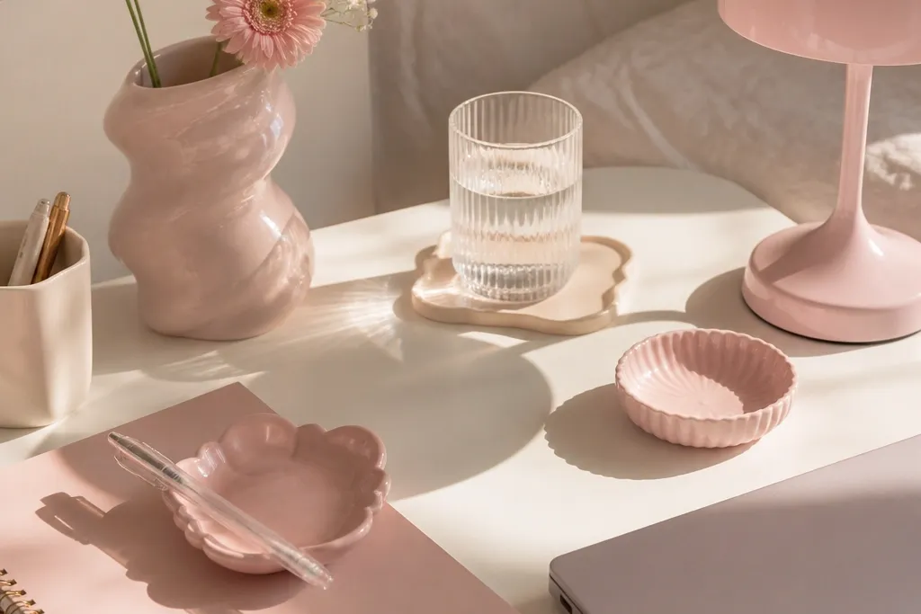
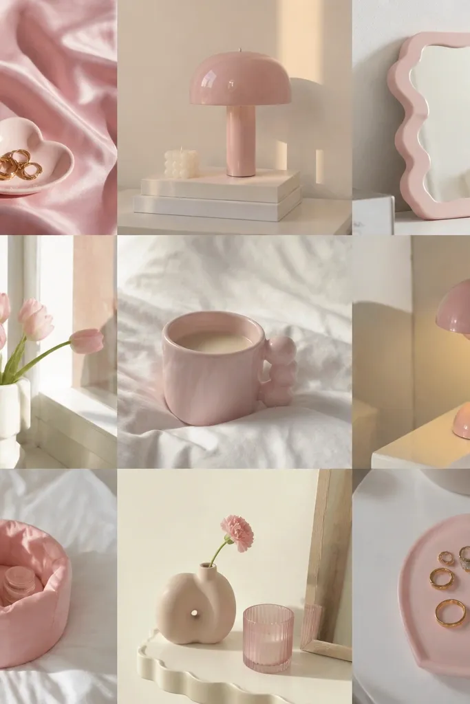
1. Blush Milk Tea Widget Set
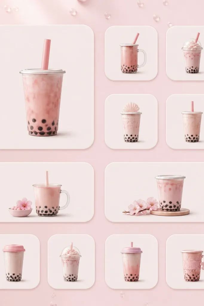
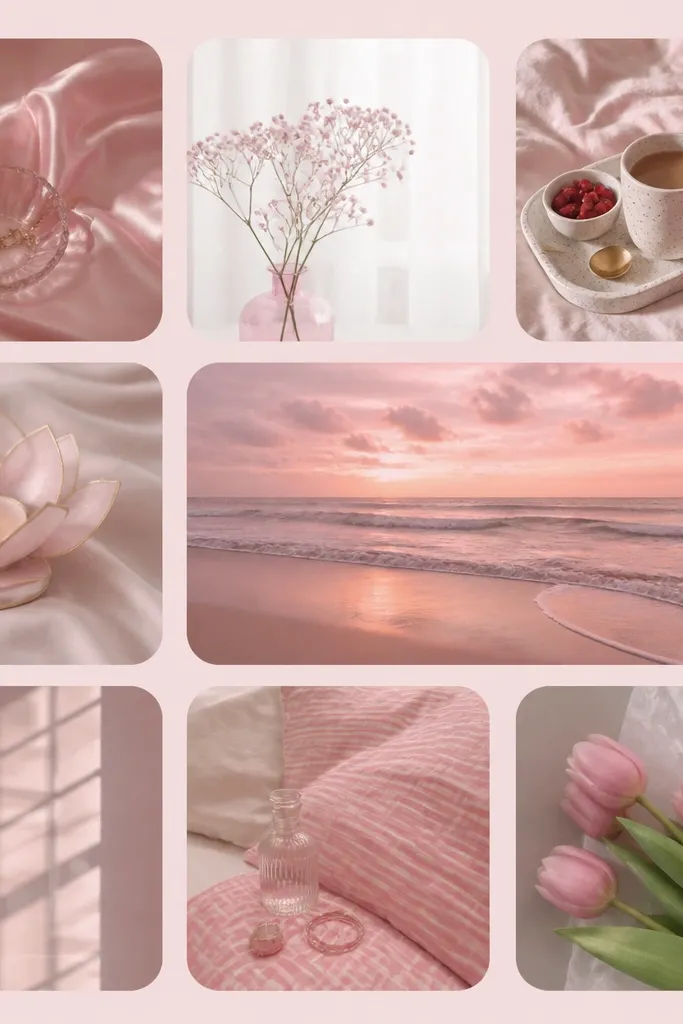
Use a matte off-white widget background with blush tea icons so the pink feels creamy, not loud. Milk tea visuals also give you natural highlights — the little steam lines and cup shading make the whole screen look cozy. I like this because it hides small imperfections in widget alignment; the icons pull your eye back to the center.
Set your wallpaper to a pale pink with subtle bubbles or dots. Use 2-3 widgets with the same rounded-cup icon style, then fill the rest with smaller widgets that have matching blush frames. Keep the widget corner radius consistent so it looks like one set.
If your widgets look too flat, add a thin border in a slightly darker blush than the wallpaper.
Avoid bright fuchsia icons on this setup — they make the milk-tea theme look like a different aesthetic.
2. Pink Checkered Cafe Notes
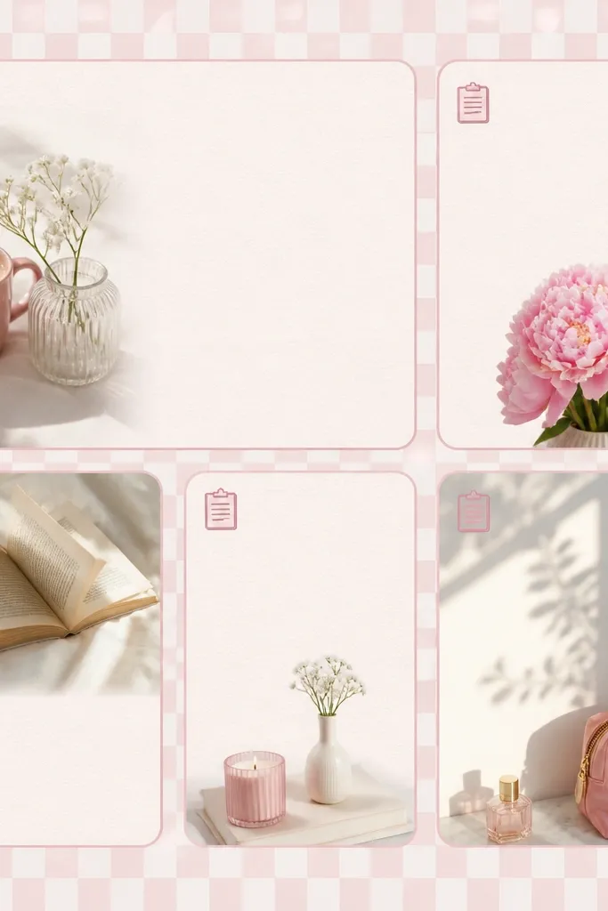
A checkered pattern reads like a cafe tablecloth, which makes pastel pink feel intentional. Dusty rose icons on a soft check background look like printed stationery. This works because the pattern gives structure, so you don’t need complicated widget designs.
Pick a wallpaper that has a small check, not big squares. Use 1 medium widget and 3 smaller widgets, all with the same note icon family. Make sure the widget cards have a border color close to the check’s rose tone.
Set your icons to a single pastel theme so the grid doesn’t look like it’s mixing sticker styles.
Skip high-contrast black text widgets — they ruin the “printed paper” feel.
3. Heart Frame Calendar
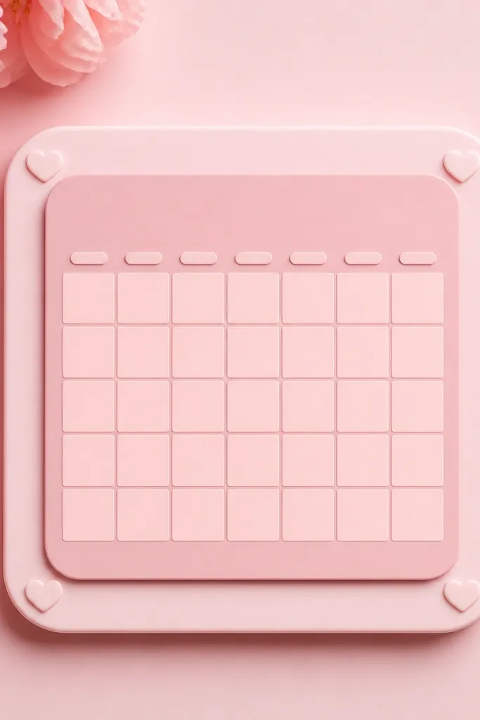
Heart frames are the fastest way to make a widget setup look cute without adding clutter. The trick is to keep the hearts tiny and place them only in the corners — then your calendar stays readable. I’ve used this layout for busy weeks and it still looks clean.
Use a calendar widget with a rounded square style. Choose a frame color that is 1-2 shades darker than the wallpaper. Place it near the top-left and keep the other widgets smaller and simpler so the calendar stays the star.
Pro tipSet your widget text color to a pale pink-gray, not pure white, so it blends into the frame.
Watch outDon’t use big hearts all over the widget — it turns readable info into decoration.
4. Rosy Marble Time Blocks
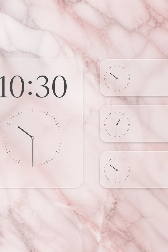
Marble veining gives you depth, and depth makes pastel pink look expensive even on a budget. Semi-transparent widget cards let the marble show through, so the screen feels cohesive. I like using time blocks because they look like little “schedule notes” floating over the stone.
Choose a marble wallpaper that is mostly pale pink with thin gray lines. Use 2 time/date widgets and keep their card borders the same gray tone. Keep widget text in a soft dark gray for clarity.
Pro tipIf the marble is too busy, reduce widget transparency by choosing a slightly more solid widget background.
Watch outAvoid neon icons on marble — they look pasted on instead of integrated.
5. Bubblegum Icon Grid
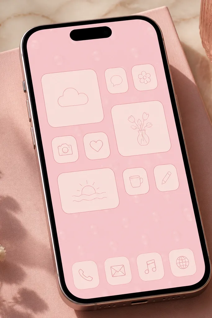
This look is about consistency more than theme. When your widget icons, app icons, and widget borders all use the same line weight and blush palette, the whole thing reads as one designed system. Bubblegum pink works because it’s bright enough to look fun but still stays pastel.
Use a bubblegum wallpaper with small glossy circle highlights. Pick one widget icon style (line icons or filled icons) and stick with it. Arrange widgets in a grid pattern: two medium widths, then one small row.
Pro tipKeep your widget borders either all visible or all invisible — mixed borders look messy fast.
Watch outSkip multi-color icons — pastel setups look best when the pink is the main color.
6. Pink Vanilla Checklist
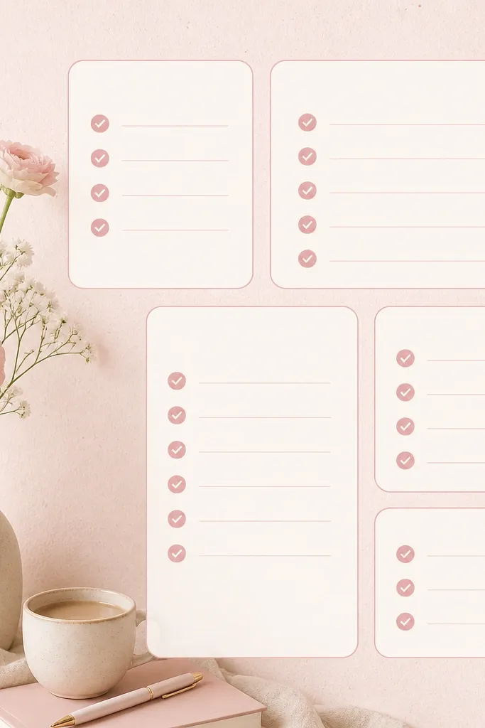
Checklist widgets make pastel pink feel practical, not just pretty. Off-white backgrounds keep the pink calm, and thin outlines look like printed planner pages. I’ve used this for meal prep and it makes the home screen feel like a tidy desk.
Use one medium checklist widget and pair it with two smaller “reminder” widgets. Keep the outline color the same shade as the wallpaper’s undertone. Choose icons in a single line style to keep it soft.
Pro tipSet the checklist widget to show fewer items so the text stays crisp and not crowded.
Watch outAvoid thick, dark borders — they make pastel look like a sticker sheet.
7. Blush Polaroid Wallpaper Widgets
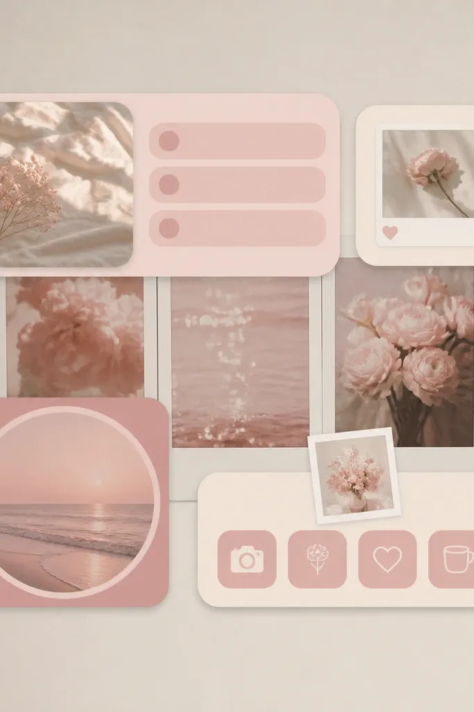
Polaroid-style wallpapers add “memory” vibes without needing extra decor. The faded edges blend naturally with widget cards, so your grid looks cohesive. This is a great option if you like photos but don’t want to build a whole collage.
Pick a wallpaper with faded polaroid frames in cream and pink. Use widgets with photo-frame or camera icons. Keep only one widget row using the polaroid theme; the rest should be simpler cards so the screen doesn’t overload.
Match the widget card color to the cream polaroid edge, not the brightest pink.
Don’t add too many different icon themes — photos + mixed icons makes it feel chaotic.
8. Satin Bow Widget Corners
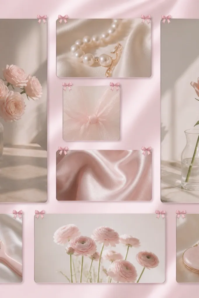
Bows make pastel pink look gift-wrapped. The best version places bows in corners, not the center, so your content remains readable. I like satin-sheen wallpapers because they reflect light in a way that makes the pink look smoother on-screen.
Choose a wallpaper that looks slightly glossy, like fabric. Use widget backgrounds in matte cream or very pale pink so the sheen doesn’t overpower. Put the bow-themed widget near the top-left and keep other widgets plain with matching borders.
Pro tipIf your bow icons feel too busy, switch to only one bow widget and keep the rest as simple cards.
Watch outAvoid heavy gradients inside widgets — bows + gradients can look like cheap phone themes.
9. Pink Sprinkles Quick Stats
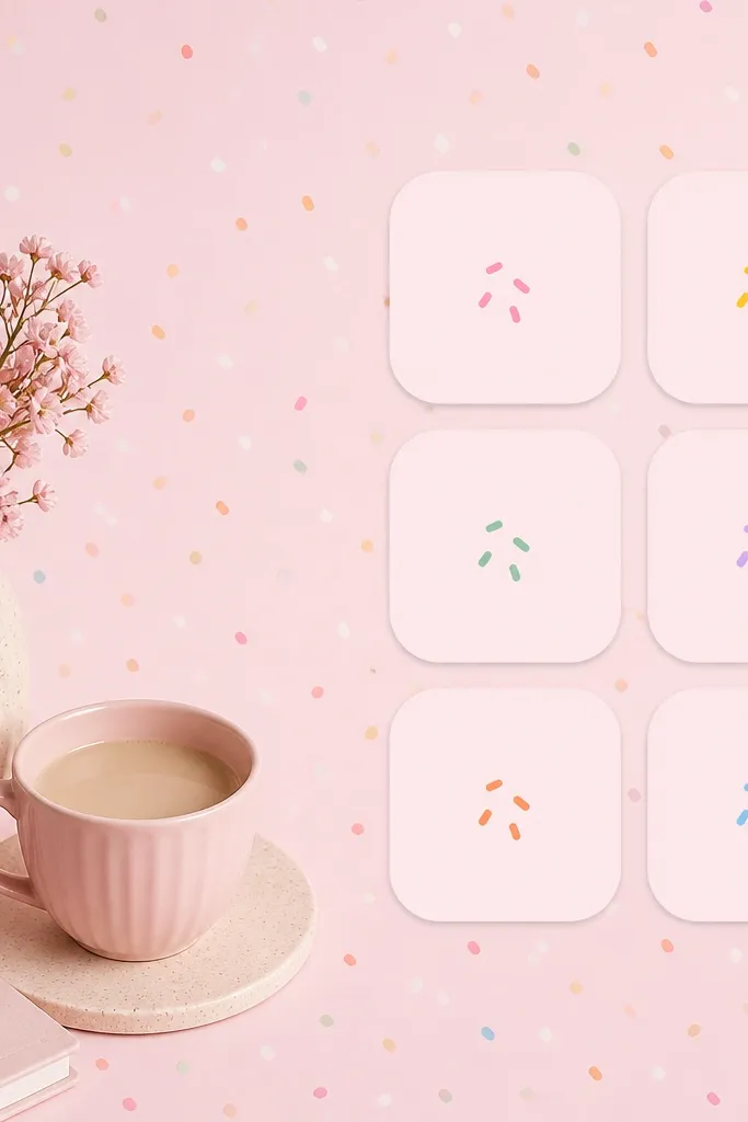
Sprinkles read as playful, and playful makes pastel pink feel youthful without needing a full “kawaii” takeover. Use quick stats widgets because they stay readable even when the background is fun. The sprinkle dots also give you a natural pattern that fills space.
Pick a wallpaper where sprinkle dots are mostly one color family (pink and cream). Use 2-3 small stats widgets with the same tile style and rounded corners. Keep the text in a darker pink-gray for legibility.
Pro tipUse one widget tile with a slightly darker pink background so your eye has a focal point.
Watch outSkip multi-colored sprinkles — pink-only sprinkles look cleaner and more aesthetic.
10. Dusted Rose Recipe Cards
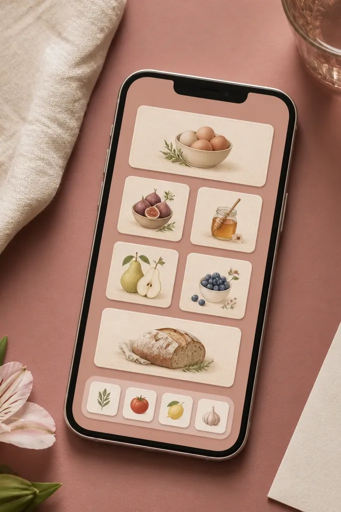
Recipe card styling makes a kitchen vibe on your phone, and it looks cute even if you’re not using kitchen apps. The faux paper texture is the secret — it makes pastel pink feel like stationery. I’ve used this when I meal-plan, and it keeps my home screen from looking generic.
Use a wallpaper with a dusty rose base and cream accents. Choose widgets with food icons (fork, spoon, or simple dish silhouettes). Keep borders cream and add a soft shadow so the cards look layered.
Put one “today” widget in the top row, then keep the other recipe cards smaller.
Avoid glossy plastic-looking widget backgrounds — paper texture looks right here.
11. Blush Galaxy Gradient Widgets
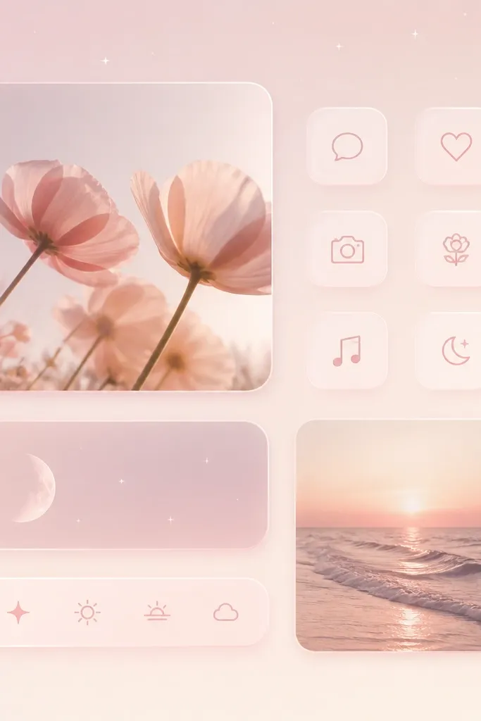
A blush galaxy works because the gradient stays soft while the specks add detail. Glassy widget cards can look expensive if the color stays within pink and cream. This setup looks great on iPhones with bright displays, because the glow effect looks smooth.
Choose a gradient wallpaper that is mostly pale pink, not purple. Use glass-style widgets with a gentle glow and keep borders subtle. Pair one medium widget with two small ones so the glow doesn’t overwhelm.
Pro tipSet widget transparency so text remains readable in daylight.
Watch outAvoid dark mode text on a glowing background — it can look washed out.
12. Pale Pink Planner Blocks
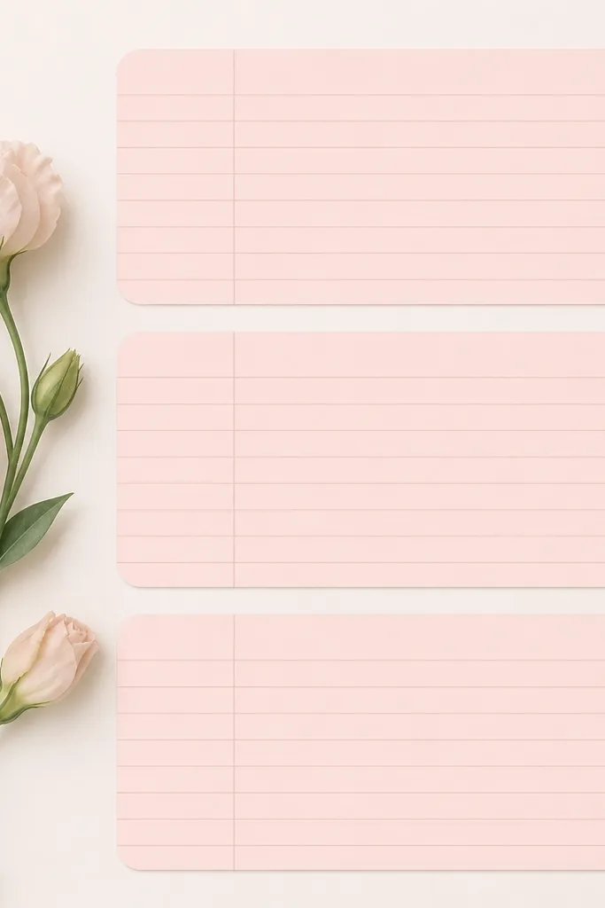
Planner blocks make your iPhone feel like a desk organizer. Thin line details add structure, and the near-white blush base keeps everything calm. I like this when I want a pastel aesthetic that still feels adult and clean.
Use a near-white blush wallpaper so widget cards stand out. Pick one planner-style widget background with subtle lines, then match the other widgets by using the same card color. Keep your widgets in a neat top-to-bottom order.
Pro tipUse consistent spacing between widgets — even a 2-3 pixel gap difference is noticeable.
Watch outDon’t mix planner lines with checkered or sprinkles — it looks like too many themes.