1. Walnut Frame Clear-Glass Double Doors
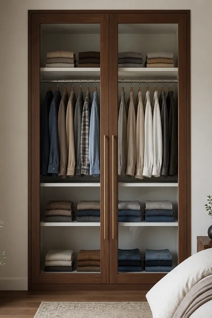
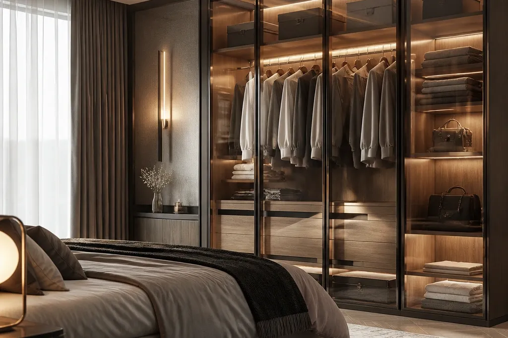
This look works because walnut warms up the transparency. Clear glass shows organization, so it looks luxe when the inside is controlled. The brushed brass pulls the eye toward the doors and makes the hardware feel intentional. I like this design in bedrooms with warm-toned flooring or beige walls.
Keep the frame slim — around 1.5 to 2 inches wide visually — so it doesn’t overpower the room. Use 2700K LED strips inside with a hidden channel along the top so the light spreads across shelves. For styling, use matching bins in off-white or light grey so the glass reflects a calm palette.
Pro tipInstall a simple label system on shelf dividers so you can keep the inside looking “finished” even on busy weeks.
Watch outAvoid mixing dark interior shelves with clear glass — it makes reflections look like clutter.
2. Matte Black Frame with Frosted Center Panel
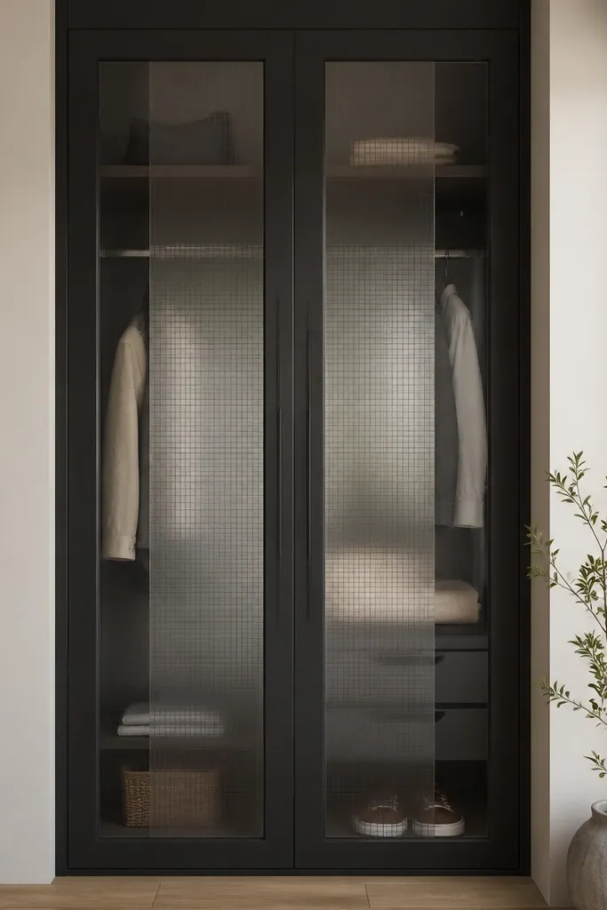
Frosted glass hides everyday mess while still letting the room breathe. Matte black gives a modern, sharp outline that looks expensive even in small bedrooms. The clear side strips let you peek at a couple of styled items so the unit doesn’t look flat. This is the design I recommend when you can’t guarantee perfect organization every day.
Ask for frosted panels at least 60% of the door area so the hiding effect is real. Keep the interior shelves light — white or cream — so the frosted sections don’t look dark. Pair with a light bed headboard and neutral bedding so the black frame doesn’t feel heavy.
Use one intentional display — a single row of folded sets or two perfume bottles on the top shelf — so the clear sections look curated.
Don’t go for glossy black frames with cheap hardware; the reflections look messy and the whole unit feels temporary.
3. Off-White Lacquer with Tinted Smoke Glass
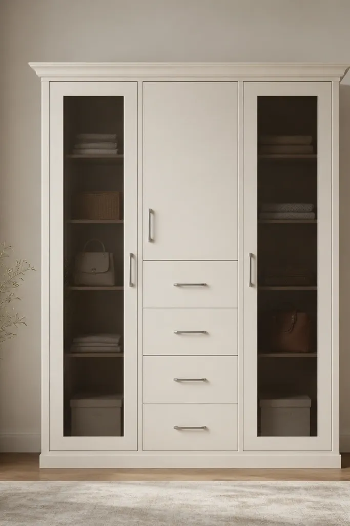
Smoke-tinted glass is the sweet spot when you want privacy without losing the airy vibe. Off-white lacquer keeps the bedroom bright, and the solid drawer center breaks up the visual weight. Tinted glass also reduces glare from ceiling lights, which is a big deal in bedrooms with bright fixtures. This setup looks especially good with grey or oatmeal walls.
Tint depth matters — pick a medium smoke that still lets you see shelf shapes but not clutter. Keep the handle finish consistent across drawers and doors. Inside, use light beige dividers and keep hanger area separated from folded stacks with a vertical partition.
Pro tipIf your room has west-facing sunlight, tinted glass will cut the harsh reflection more than clear glass.
Watch outAvoid pairing smoke glass with very dark interiors — it turns the inside into a shadow box.
4. Glass Door + Solid Base Two-Tone Wardrobe
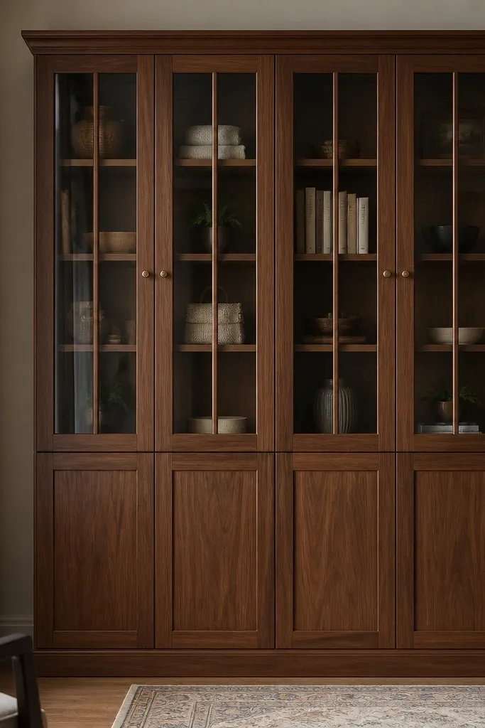
Two-tone wardrobes look balanced because the solid base anchors the furniture. The glass top keeps the room airy and gives you that “floating” feel. Vertical mullions inside the glass add structure and make the unit look taller. This design is great when your bedroom has a patterned rug or stronger wall colors and you want the wardrobe to calm the space.
Keep the split line around the mid-height of the wardrobe so it doesn’t look accidental. Use clear glass only on the top section if you can style what you store there. For the base, keep drawers for socks, tees, and accessories that don’t need display.
Use vertical organizers inside the glass section so items line up — the glass shows alignment better than random stacks.
Don’t put clear glass on the bottom section if you store bulky items there — it looks chaotic through the reflections.
5. Herringbone Interior Behind Glass
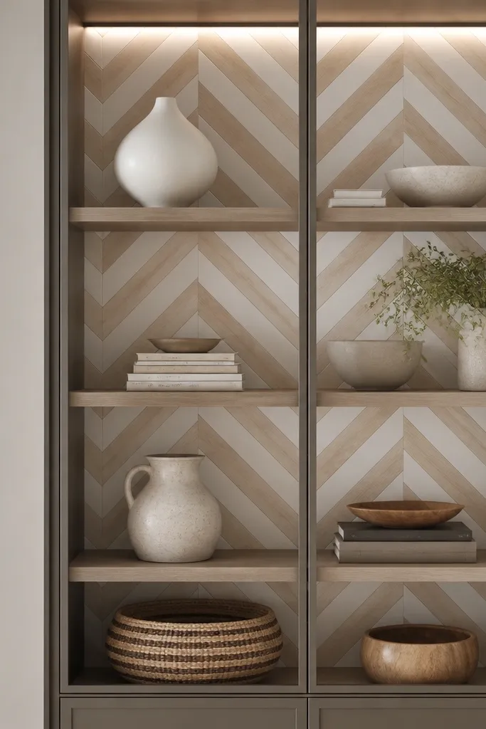
The pattern gives the glass doors something beautiful to reflect, even when your clothes aren’t perfectly color-matched. Light herringbone is subtle enough to stay calm in a bedroom, but it reads premium. Clear glass shows the backing, so the interior becomes part of the design instead of just storage. I’ve used this look in guest rooms where people open the wardrobe and notice the finish.
Use a backing pattern that stays within one light wood tone and one off-white. Keep shelves a simple matte white so the pattern doesn’t fight with your folded clothes. LED strip should be warm and indirect — mount it behind a thin diffuser so you don’t see bright dots.
Stick to neutral folded tones like white, cream, and light grey; the herringbone will carry the visual interest.
Avoid loud patterns or high-contrast backing under clear glass — it makes the whole unit look busy.
6. Arched Top Glass Display Cabinet Style
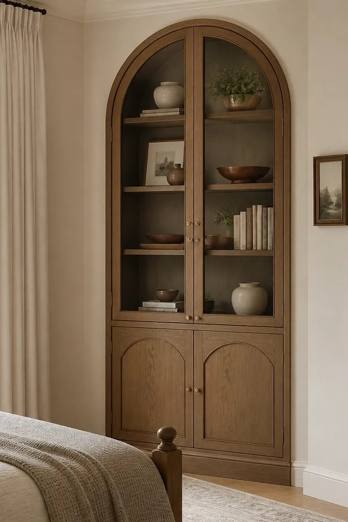
Arched top glass adds softness to the bedroom and makes the almirah feel like a display piece, not a storage box. The arch shape catches light differently, so it looks “designed” even with simple interiors. This is ideal if your room has rounded headboard corners or a vanity mirror with an oval/arched frame. It also works when you want to show a few folded sets or decorative baskets.
Keep the arched section at the top third of the unit so it doesn’t look like a half-done renovation. Use tempered glass for safety and ask for rounded edge finishing on the frame. Inside, place a single shelf at eye level for styling and keep the lower section for daily use.
Use two identical baskets on the lower shelf so the glass reflects symmetry through the arch.
Skip tiny arched details; small arches look like a cheap sticker effect when the frame is thin.
7. Grid-Mullion Glass with Integrated LED
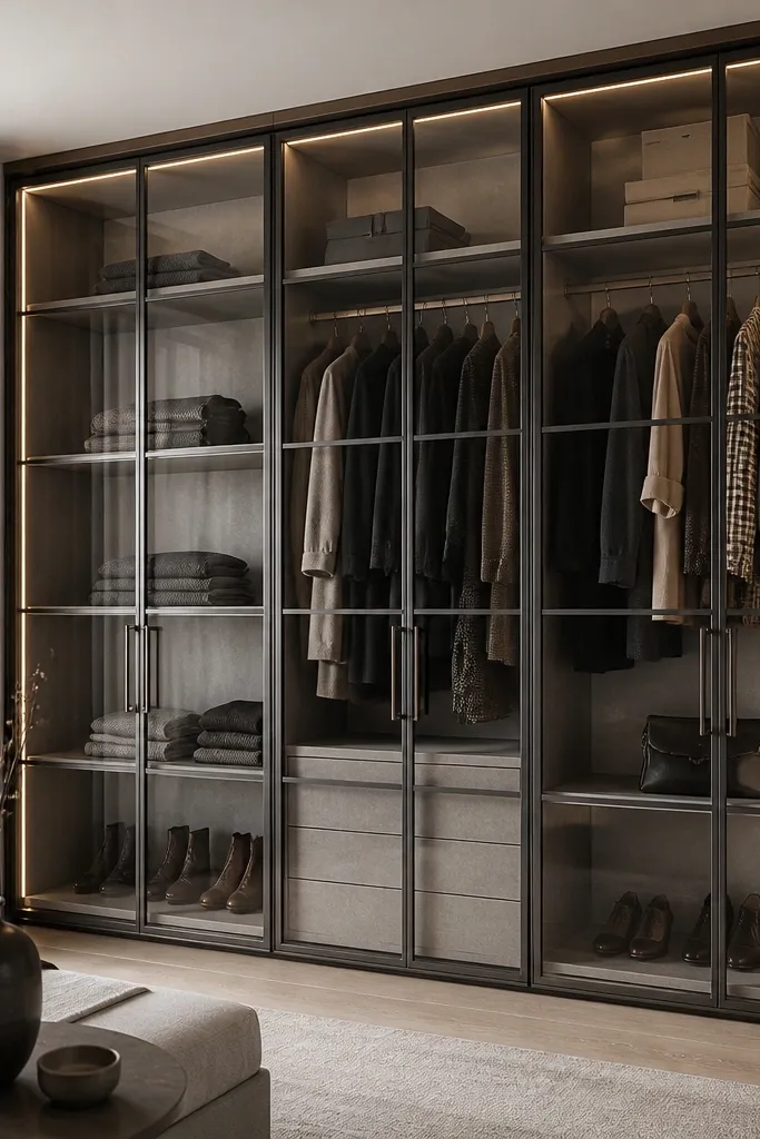
Grid mullions make the glass look architectural. When you add integrated LED, the grid lines glow and the wardrobe looks like a custom built-in. This design works best in bedrooms with clean modern decor — think solid color walls and minimal patterns. The grid also helps you style because compartments guide how you stack items.
Ask for mullion thickness around 1 inch visually so the grid reads crisp. Keep your interior shelf depth consistent and don’t overstuff — glass shows gaps and empty space. Use warm LED and a diffuser so you don’t get bright streaks along the glass.
Pro tipCreate a “front row” rule — keep the first shelf fully aligned and the second shelf slightly less full. It prevents the glass from looking bare or cluttered.
Watch outAvoid cool white LEDs (6500K); the glass turns bluish and looks harsh in bedrooms.
8. Corner Glass Almirah with Wraparound Frame
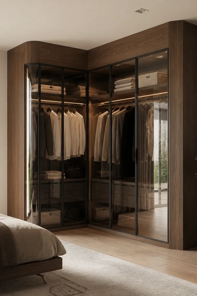
Corner glass wardrobes solve a layout problem — wasted space that usually becomes a clutter corner. A wraparound frame keeps it from looking like two separate units. The tint helps hide hanging clutter while still showing you have storage depth. This is a smart choice for small bedrooms where you need storage without blocking circulation.
Measure the corner depth carefully and plan for door swing clearance if hinged doors are used. If you go with sliding doors, ensure the track is aligned so the corner seam doesn’t leave a visible gap. Inside, put one hanging rail per side and keep folded shelves near the center where light hits.
Pro tipUse a light interior color on the inner corner wall; it makes the whole corner glow through the glass.
Watch outDon’t mount corner units too close to the bed — glass reflections will bounce off the mattress and look busy at night.
9. Slim Vertical Glass Slats with Hidden Storage
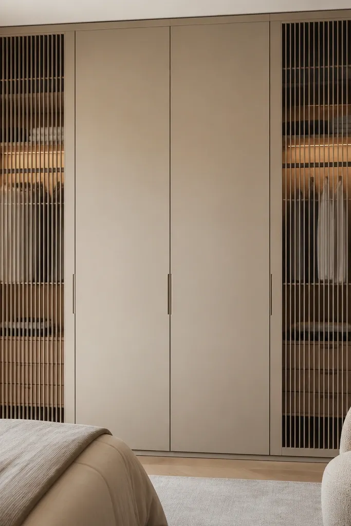
Vertical glass slats keep the look light while still giving you privacy because the openings are narrow. It also makes the wardrobe appear taller and more tailored. The hidden storage in the middle section means you don’t have to keep every item on display. This is my go-to when the bedroom has a lot of furniture already and you want the wardrobe to visually “thin out.”
Keep the slat spacing tight and consistent so it looks intentional, not like damaged glass. Use clear slats only on sections where you can keep items neat — add baskets for folded items. For the solid middle, use drawers or swing doors for daily clutter.
Pro tipHang only one category behind slats — like shirts — and keep rest in solid sections so the wardrobe stays calm.
Watch outAvoid wide open glass panels with slatted framing — it looks like an unfinished partition.