1. Cobalt Medallion on Cream Ground
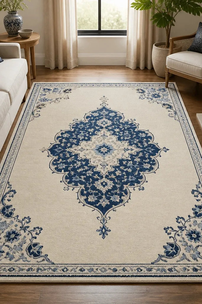
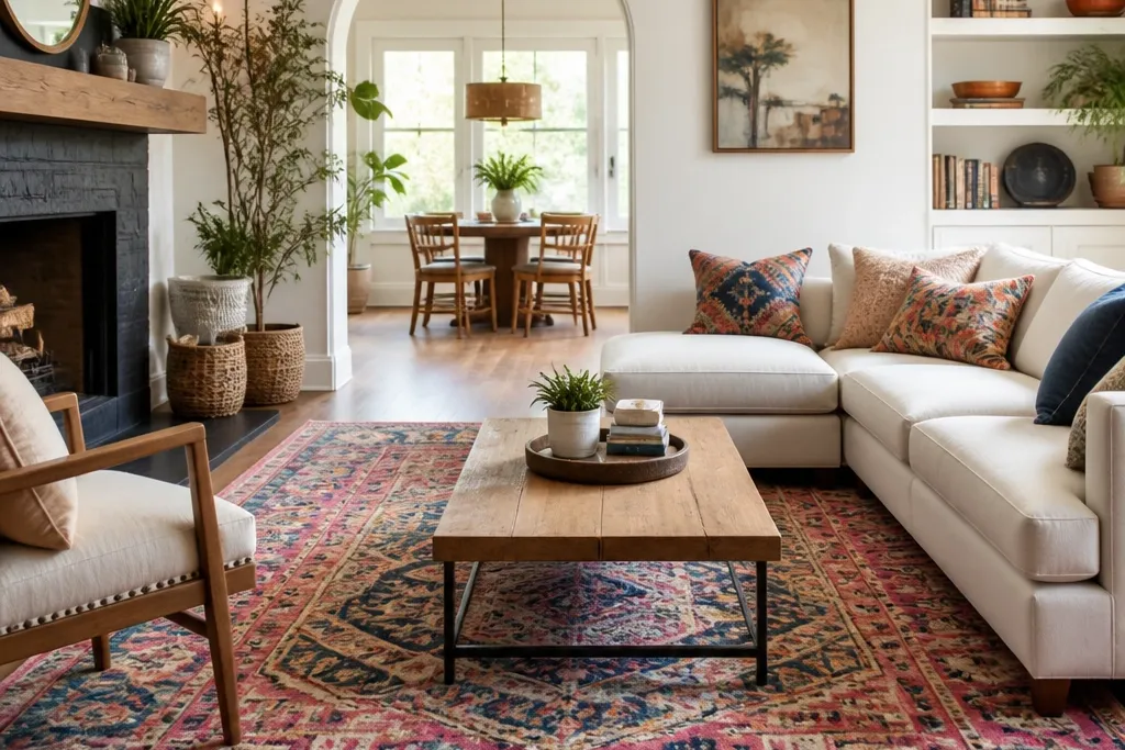
This rug style works because the cream ground gives you breathing room while the cobalt medallion adds the color hit. The blue reads “cool” and makes warm wood floors look richer. Medallion symmetry also frames your furniture like a picture mat, so everything sits more neatly.
Use it under a sofa with a simple silhouette so the medallion becomes the focal point. Pair it with solid-color pillows in cream and a second blue tone (navy or periwinkle) so the pattern doesn’t feel one-note. Keep wall art simple — one large piece or a tight set with light backgrounds looks best.
Add a cobalt throw blanket folded on one side of the sofa to repeat the rug color without adding more patterns.
Skipping a repeat of blue around the room makes the rug look like it was dropped in last.
2. Terracotta and Olive Geometric Blocks
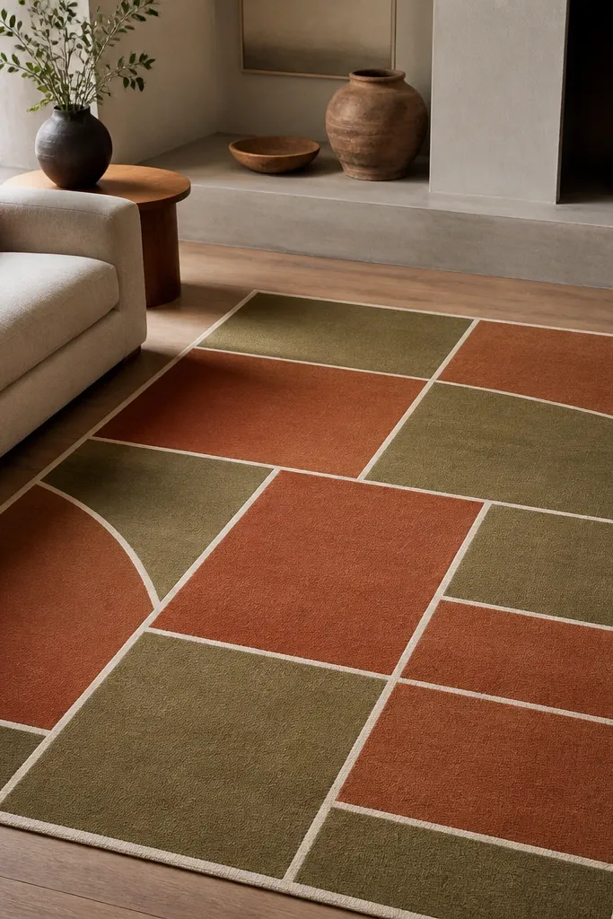
Terracotta plus olive feels warm and grounded, and the geometric block layout keeps it modern. The cream separators stop the colors from blending into a muddy mix. When you want “colorful” but still wearable with lots of neutrals, this combo is the one I reach for.
Pro tipIf your room has brass hardware, pick terracotta with a slightly dusty tone instead of bright orange.
Choose a rug with clear borders or straight edges so it looks intentional under coffee tables. Pair with linen or cotton upholstery in oatmeal, sand, or light gray. Add one olive accent like a framed print mat or a plant pot to tie it together.
Watch outUsing multiple warm colors that are all bright (orange, red, yellow) without a muted green makes the palette feel loud.
3. Sunflower Yellow Runner-Style Rug in a Square Layout
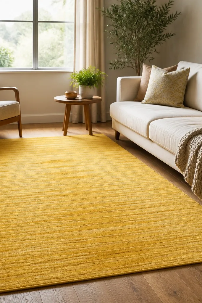
A vivid yellow rug changes the mood immediately because yellow bounces light. The key is choosing a rug with a subtle pattern so the color stays the star, not the design. Lengthwise placement also makes the seating area feel longer and more intentional.
Pro tipPick one piece of art with a yellow note (even a tiny line) so the room feels connected.
This works best when your seating faces one wall — place the rug so it runs from the entertainment wall toward the room’s center. Keep the rest of the decor in white, natural wood, and one warm accent like honey leather or tan ceramics. Use yellow pillows only once or twice so the rug remains the anchor.
Watch outPutting a highly patterned yellow rug in a room with patterned curtains makes everything compete.
4. Rainbow Stripes With a Navy Base
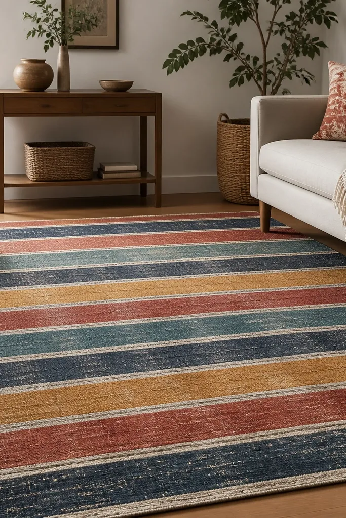
A navy base is the trick that keeps rainbow stripes from feeling juvenile. The stripes still bring fun color, but the dark ground makes it look grounded and “adult.” This is the rug I use when a room needs energy but you don’t want a full-on maximalist vibe.
Pair it with furniture in navy-adjacent tones like charcoal, indigo, or washed denim. Add a solid area for contrast: one smooth throw and one plain cushion beat a pile of patterns. If your walls are white, this rug makes them look brighter.
Choose stripe widths that are medium (not razor-thin) so the pattern reads clearly from the couch.
Using bright white upholstery with a high-contrast rainbow rug can make the whole room feel harsh.
5. Teal Shag With Warm Copper Accents
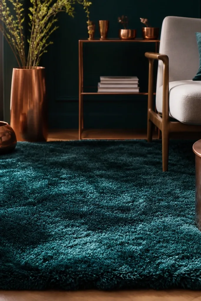
Shag changes everything: the same teal looks softer and more luxurious because the fibers scatter light. Teal is also flexible — it plays well with warm metals like copper and brass without turning the room cold. The plush texture makes a living room feel calmer, which matters when the color is bold.
Pick a shag height you can actually live with: aim for about 1 to 1.5 inches of pile, not super tall. Place it under a sectional so foot traffic stays centered. Pair with warm neutrals like camel, oat, or cream to keep the teal cozy.
Use a lint roller before guests — shag shows fuzz fast, and quick maintenance keeps it looking new.
Choosing a shag without a plan for shedding and vacuuming — it will frustrate you.
6. Magenta Moroccan Trellis on Taupe
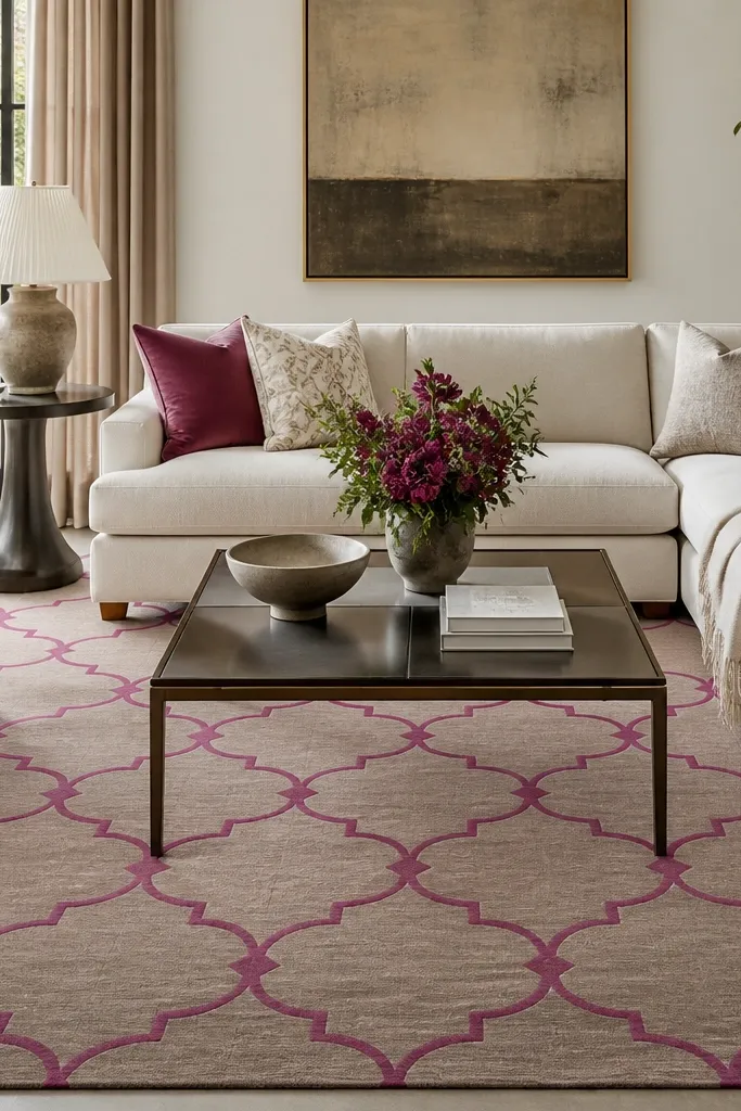
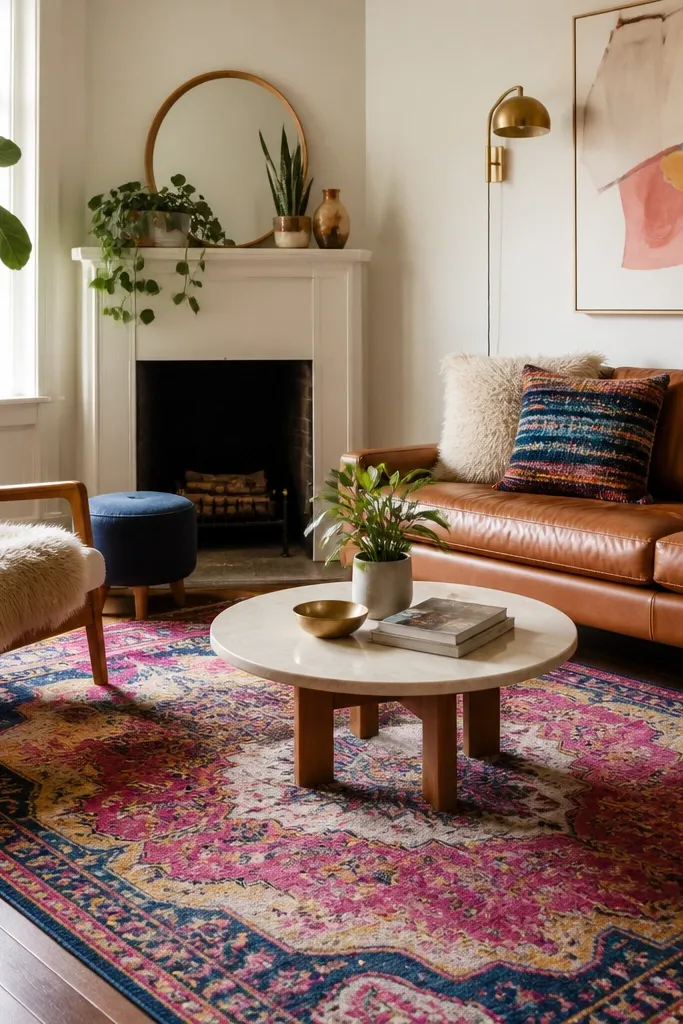
Magenta on taupe looks high-end because the neutral base makes the pink feel intentional. Moroccan trellis patterns create movement, so the room feels more dynamic even when the furniture is simple. It’s a strong choice if you want color that’s feminine without drifting into hot-pink chaos.
Keep other pinks minimal: one magenta pillow set or a single-toned art print is enough. Use darker wood or black metal furniture to make the magenta pop. If your walls are warm white, taupe helps everything look cohesive.
Match the rug magenta to a single item like a vase glaze or lamp shade so the hue feels “placed.”
Pairing magenta with orange and neon lime at the same time — it turns the palette chaotic.
7. Forest Green Fade Wash With Off-White Border
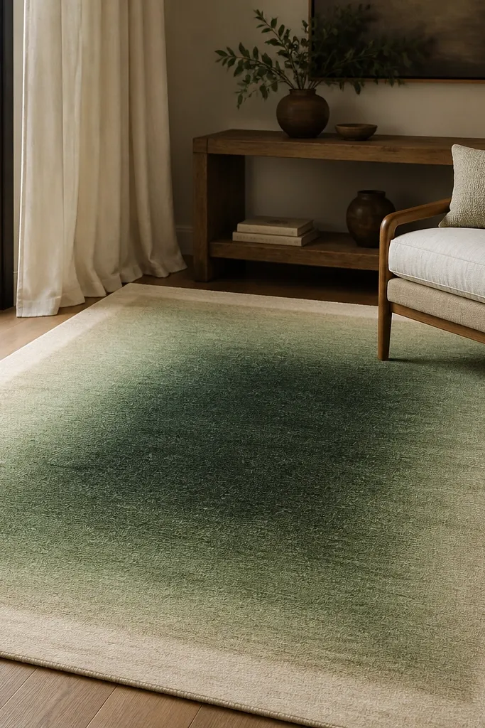
A fade wash rug is colorful without being busy. Forest green feels rich and grounded, but the gradient keeps it from looking heavy in a bright room. The off-white border gives you a clean frame so the rug looks finished even with simple decor.
Use it in rooms with lots of natural light because the fade shifts through the day. Pair with cream slipcovered furniture, light oak, and textured throws like chunky knit. A single plant in a dark pot ties the green to the room naturally.
Add one off-white cushion with a subtle texture (boucle or rib) so the border color feels echoed.
Choosing a green rug that’s too close to your sofa color — you’ll lose the contrast.
8. Indigo Ikat-Style Waves in Soft Colors
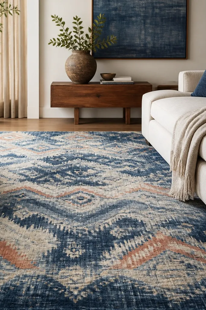
Ikat-style wave patterns create a “hand-dyed” look that feels cozy, not crisp. Indigo gives you depth, and the soft coral accent keeps it from reading cold. This is a great option when you want color but your furniture is mostly neutral and you don’t want sharp geometry.
Pick a rug where the indigo is the dominant tone. If the coral is faint, that’s perfect — it adds interest up close without taking over. Pair with off-white curtains and one coral item like a small bowl or a framed print.
Place the rug so the wave direction runs toward your seating, not sideways — it makes the space feel more organized.
Buying a rug where the coral is too bright compared to the rest of your decor.
9. Rainbow Tie-Dye Panels on Gray
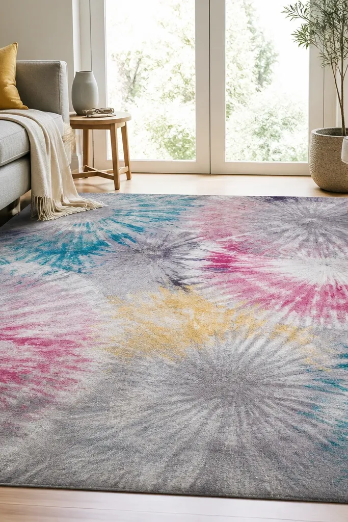
Tie-dye patterns look fun, but gray keeps them stylish. The panel approach means you get multiple colors without a full busy repeat, so it reads cohesive from across the room. I like this when someone wants “colorful rugs” energy but has a gray sofa or gray walls.
Pro tipChoose one rug color for the throw — I usually pick teal or pink depending on your lamp tones.
Use a low-pile version if you have a coffee table with thick legs — it keeps furniture from wobbling. Pair with pillows in one or two of the rug colors, not every color. Keep other textiles solid so the tie-dye stays the star.
Watch outMatching the rug with three different patterned fabrics — you’ll feel overstimulated.
10. Bright Aqua Border With Cream Center
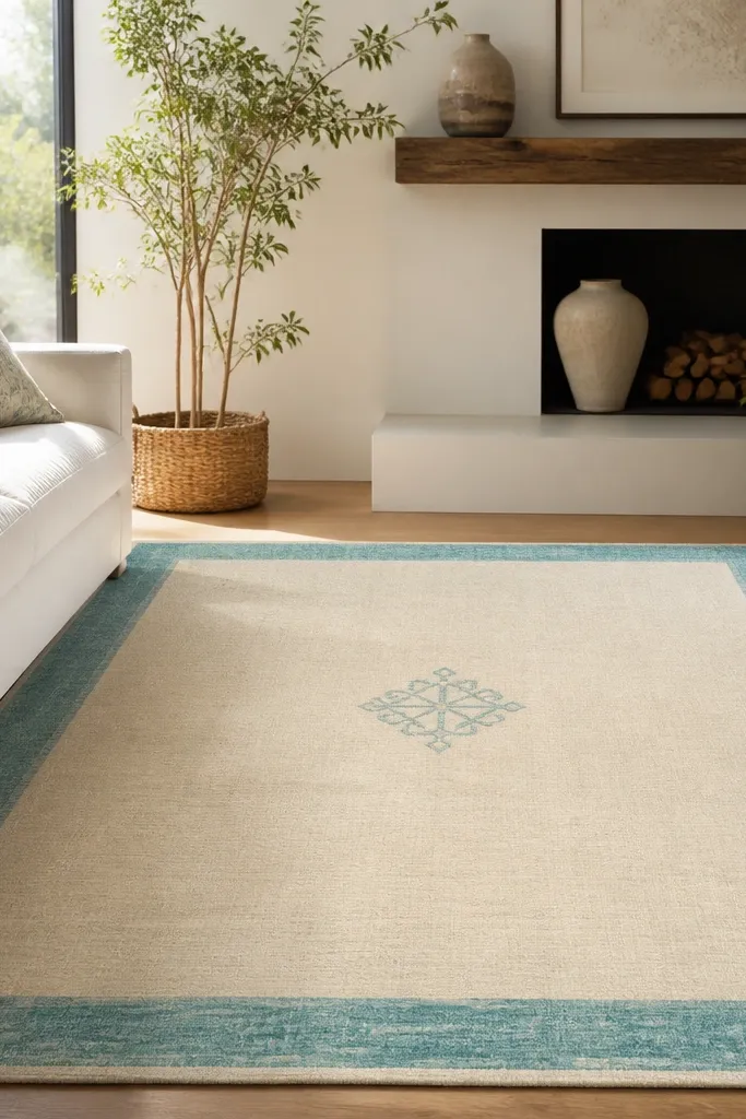
Borders are my favorite cheat code for color. This rug gives you a strong aqua hit at the edges while keeping the center calm, which helps your furniture look less busy. Cream in the middle also makes the room feel brighter without adding more visual weight.
Pro tipUse a rug pad with extra grip for this style because the border draws attention to any slipping.
Place it so the border lines up with your room’s edges — straight corners matter. Pair with white or light gray upholstery and add aqua only in small decor pieces like a cushion or a glass tray. If you have dark floors, the aqua border makes them look more polished.
Watch outLetting the rug shift under foot traffic — the border will look crooked.
11. Coral and Navy Botanical Sprigs
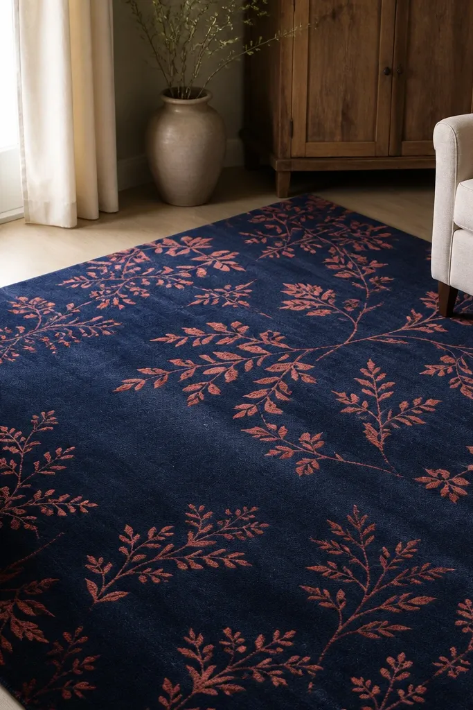
Botanical sprigs give movement without huge blocks of color. Navy makes coral look clean and modern instead of beachy, and the scattered pattern hides wear spots. This is a strong pick if you want a colorful rug that still feels calm when you’re watching TV.
Pair with light tan or natural wood furniture, plus one navy accent like picture frames or a lamp base. Coral can show up in a throw blanket or a single pillow set. Keep wall art mostly neutral with one coral detail.
If your room has a lot of greenery, pick coral that leans toward salmon — it looks natural with leaves.
Using bright red decor with coral rug — the tones fight.
12. Mustard and Charcoal Micro-Check
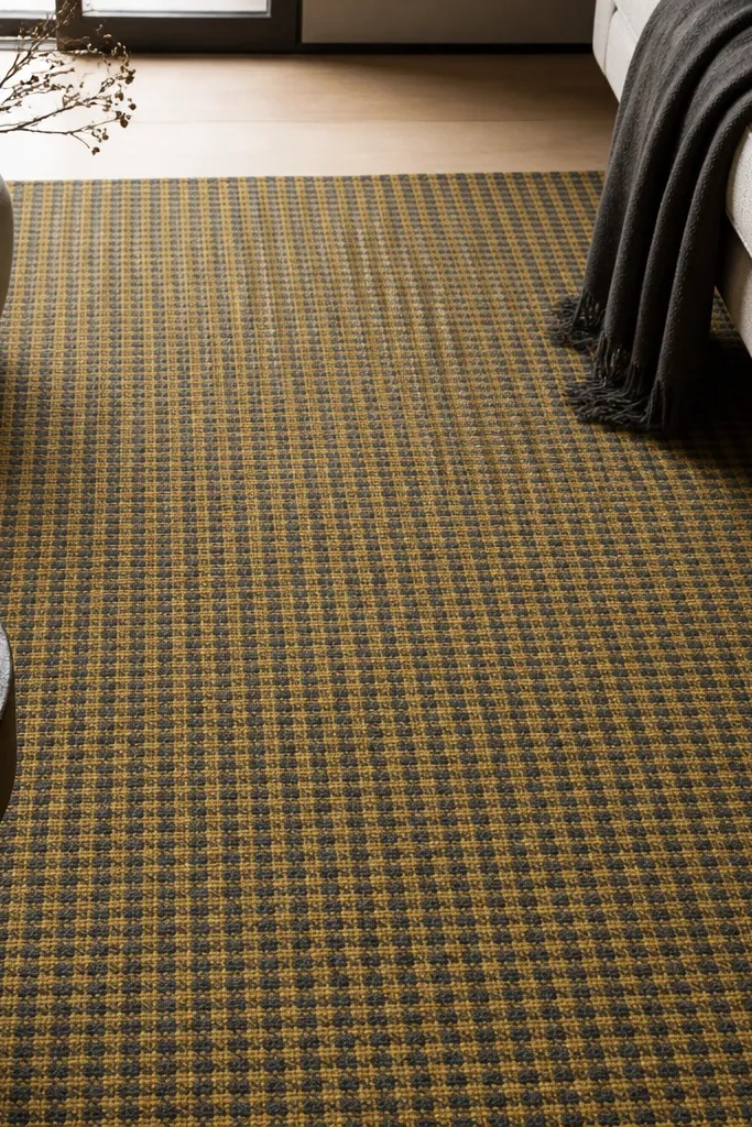
Micro-check patterns feel lively but stay controlled. Mustard adds warmth and brightness, while charcoal keeps it from turning into pure sunshine. This rug looks great when your living room has mostly solid furniture and you want pattern without big motifs.
Choose a micro-check where the mustard is medium, not neon. Pair with black or dark bronze metal accents for a crisp look. If your sofa is gray, this rug adds contrast without clashing.
Use mustard in one place you notice daily — I like it in a lamp shade or a small framed print mat.
Using a rug with oversized checks in a small living room — it can feel busy fast.