1. Sand-and-Charcoal Linear Stripe Under a Light Sofa
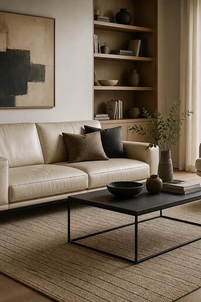
Thin vertical lines make a room feel taller, and charcoal keeps it from looking washed out next to cream upholstery. The sand base reads warm without turning yellow, which matters if your walls are cool white. I like linear stripes because they look crisp even when the room is casual, like lived-in throws and a couple mismatched pillows. You get a modern frame for everything else.
Pro tipIf your floor is warm oak, choose sand with a hint of beige instead of gray-beige to avoid a muddy clash.
Use an 8x10 if your sofa is around 90-100 inches and you have one lounge chair. Keep the stripe spacing tight (about 1-2 inches between darker lines) so it reads modern instead of country. Pair with a light wood coffee table and matte black accents for balance.
Watch outAvoid thick, high-contrast stripes that look like a rug version of a barber pole — they date fast.
2. Faded Olive Geometric Blocks With a White Media Wall
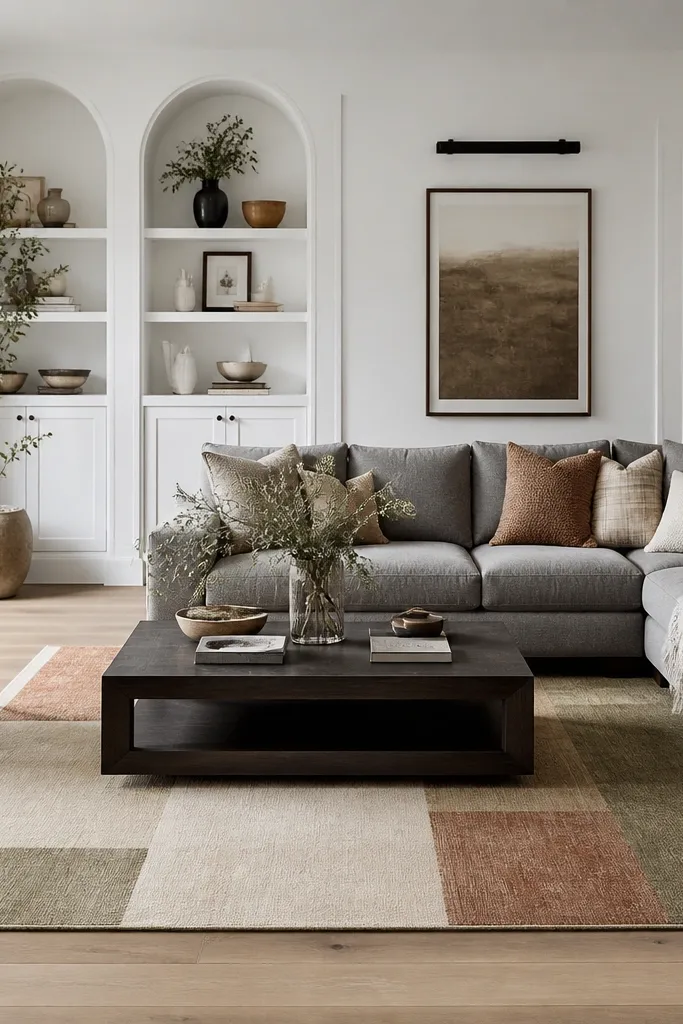
Geometric blocks feel modern, but the faded palette keeps the look soft enough for real homes. Olive works especially well when your media wall is white because it adds depth without shouting. I’ve used this setup in a room with lots of glossy surfaces, and the rug’s muted tones cut the shine. It also hides everyday crumbs and light scuffs better than bright whites.
Pro tipUse two pillow colors that appear on the rug — olive and clay — so the rug becomes the color map.
Go with a 7x9 if you want the rug edge to clear walkways on both sides of a sectional. Keep the rug’s dominant color off-white so it ties to the wall, then pull olive into accessories like a throw or one ceramic vase. If you have a rug pad, choose one with grippy texture so the low pile doesn’t slide.
Watch outAvoid bold primary colors in a washed style. The mismatch makes it look like the rug is older than the furniture.
3. Black Micro-Grid on Warm Gray for a Sleek, Low-Contrast Look
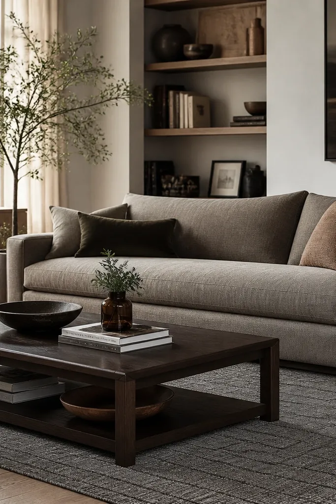
A micro-grid is modern because it reads architectural, but it’s subtle enough not to fight wall art. Warm gray prevents the room from feeling cold, and the tiny black grid adds structure. This is one of my favorite “grown-up” rug looks for contemporary homes with neutral walls. It also makes patterned curtains look intentional instead of random.
Choose a rug where the grid lines are thin and consistent, not chunky. Size it so the coffee table sits centered with 10-14 inches of rug visible on each side. Pair with matte black frames or lamp bases so the grid’s black echoes the hardware.
If your room has chrome fixtures, swap them for matte black or brushed nickel. The micro-grid looks best next to matte finishes.
Avoid a grid that’s too large. Big squares look like a tile showroom.
4. Ivory Tonal Medallion That Looks Like Texture, Not a Print
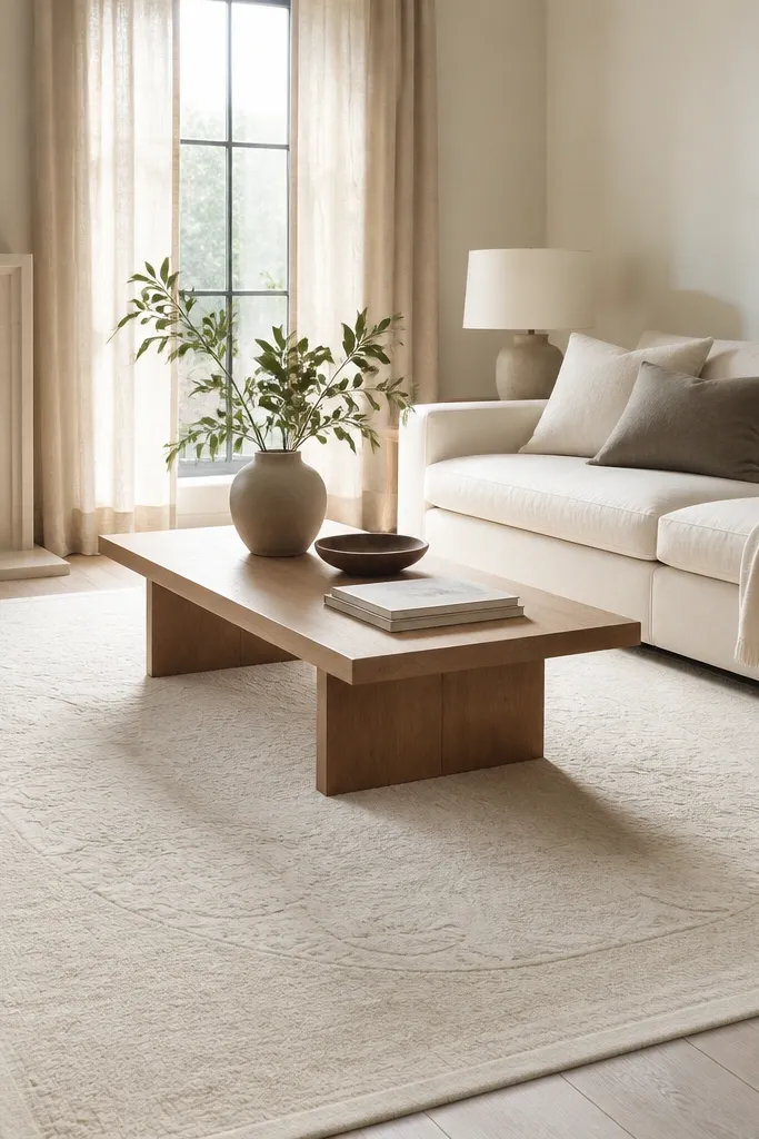
A tonal medallion gives the modern “interest” without the loudness of a traditional print. When the pattern stays in the same family as the base, it reads like texture under soft lighting. In my experience, this is the perfect bridge rug if you want contemporary style but your home still has classic details like crown molding. It also makes beige walls look richer.
Look for a rug with a slight pile variation or flatweave texture so the medallion shows when light hits it. Use a 8x10 under a sectional and keep the border minimal so it doesn’t feel ornate. Pair with light oak or walnut furniture — both work with ivory.
Test it with your lamp on. Tonal patterns pop differently under warm bulbs than daylight.
Avoid medallions with sharp contrast. That reads traditional, not contemporary.
5. Terracotta and Ecru Abstract Splash for Warm Modern Rooms
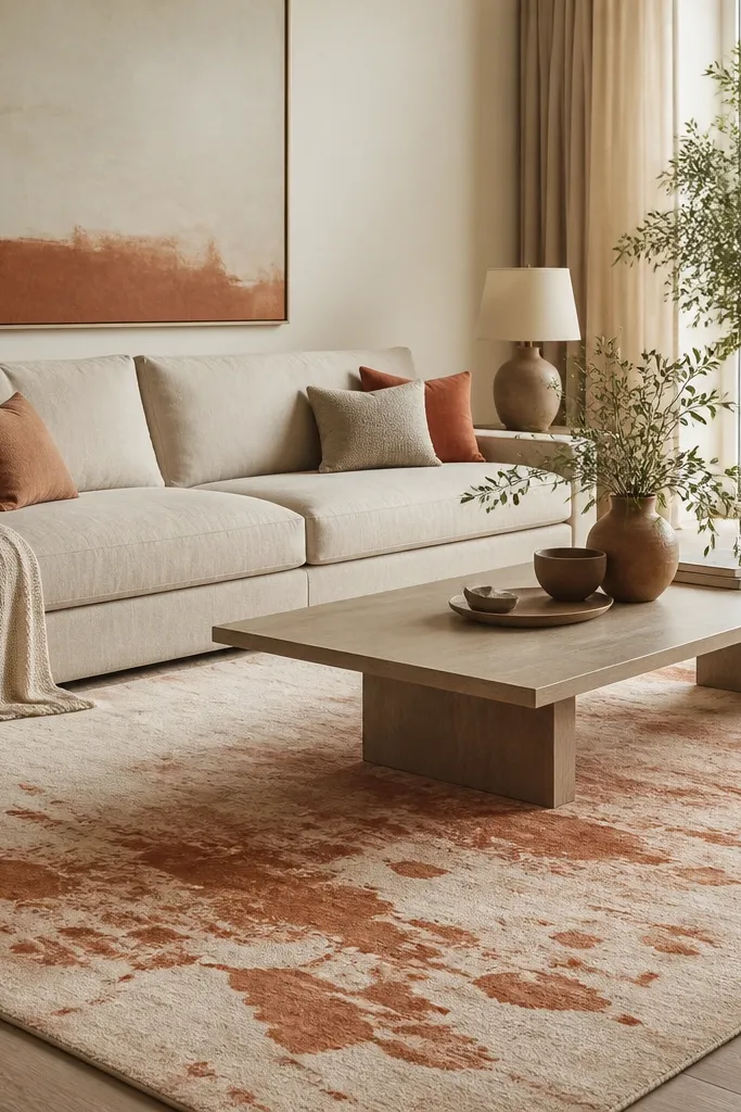
Abstract splash patterns add motion without looking like a kids' art project when the colors are controlled. Terracotta gives warmth that gray furniture can’t. I’ve used this in rooms with white walls and black metal accents, and it instantly makes the space feel lived-in. The ecru base keeps it bright even when you add darker pillows.
Pro tipBring in one solid terracotta item — a ceramic bowl or a throw pillow — so the pattern feels intentional.
Choose terracotta that leans slightly muted (think clay, not orange-red). Keep the abstract shapes irregular but not chaotic — you want clusters, not random dots. Size it so the rug edge is visible behind the sofa about 6-8 inches.
Watch outAvoid high-saturation orange. It turns the rug into the whole room’s loudest color.
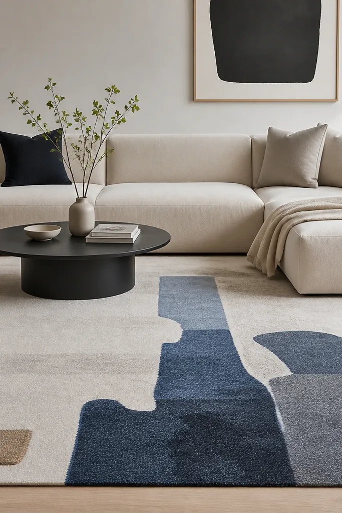
6. Deep Navy Overdyed Look With a Light Leather Sectional
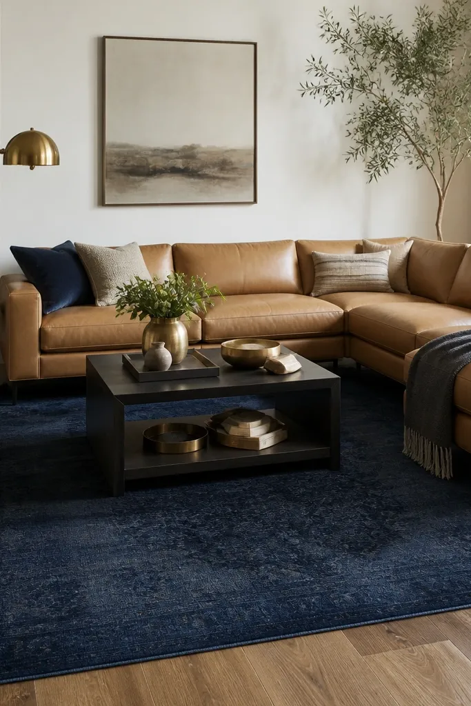
Overdyed navy looks modern because it feels like color has depth instead of a flat print. Against light leather, it creates contrast that still feels calm. I like this rug when the room has a lot of light neutrals and you need one darker anchor. It also hides wear marks better than lighter rugs.
Pro tipUse a rug pad with full coverage. Overdyed rugs show wrinkles more easily if the pad is thin.
Pick an 8x10 if you want the rug to extend under the front legs of the sectional. Keep brass and warm wood tones in play so the navy doesn’t feel too cold. Add a couple navy pillows or a textured throw with a similar tone.
Watch outAvoid navy rugs with a strong geometric border. The contrast makes it look like a transitional style instead of contemporary.
7. Monochrome Wave Pattern in Charcoal and Cream
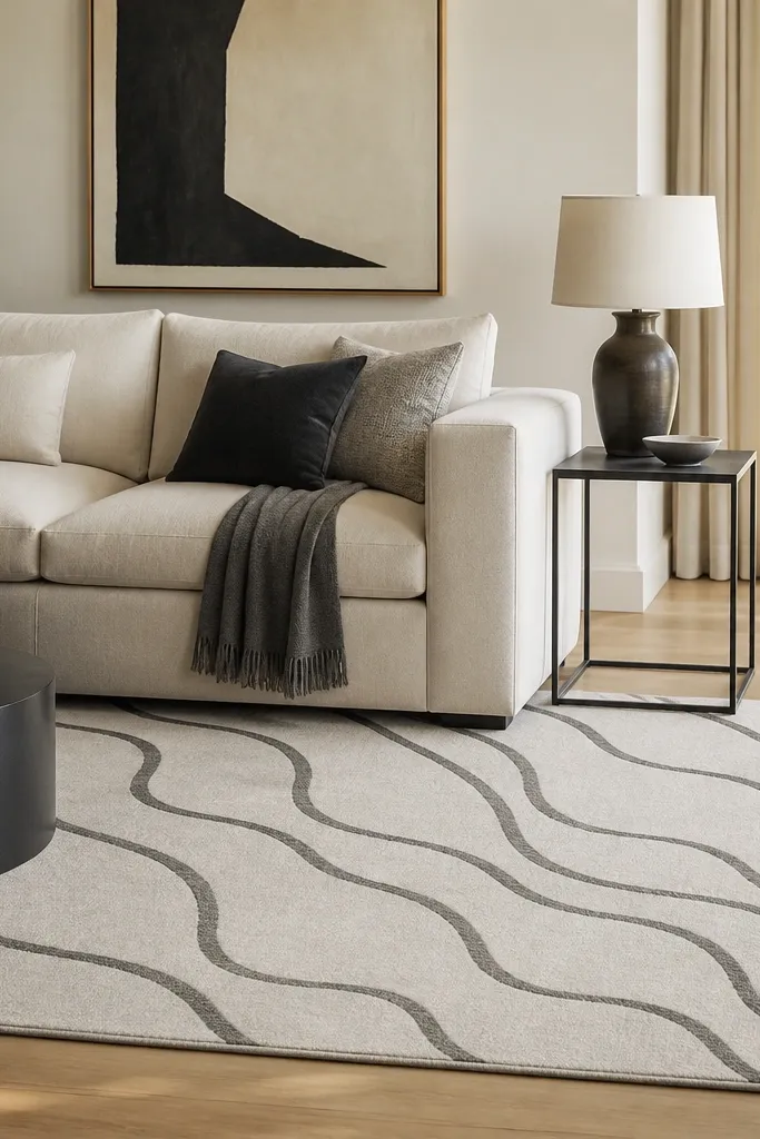
Waves give movement, but monochrome keeps it modern. Charcoal on cream looks sharp under daylight and still soft at night. This is a good choice if you want pattern but you don’t want a strict grid or blocks. It makes simple furniture look styled without adding extra decor.
Choose wave spacing that’s medium-sized — not tight like screen-printed fabric. Size the rug so the wave pattern stays centered under the coffee table, not cropped on one side. Pair with matte black frames or a charcoal accent pillow.
If your curtains are solid white, add one cream cushion and one charcoal cushion to match the rug’s two main tones.
Avoid glossy or shiny wave rugs. The sheen looks cheap in indoor lighting.
8. Cream Flatweave With a Narrow Black Edge for Designer Simplicity
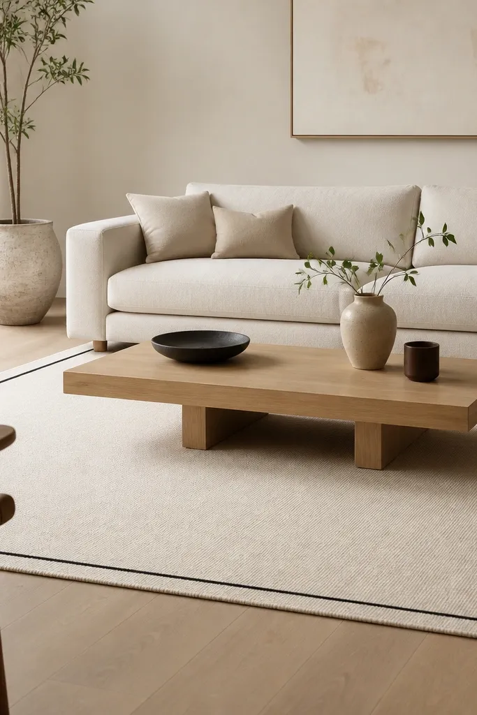
A narrow edge is one of the easiest ways to make a plain rug look intentional. It gives a graphic outline that works with modern furniture legs and sharp lines. Cream keeps the room bright, and the black edge ties to dark hardware like picture frames or a TV stand. This setup is especially good when your walls already carry visual weight with art.
Get a rug with consistent edge thickness — not a thick border that looks like it was added later. Use 6x9 for smaller seating zones or 8x10 if you have two chairs. Keep pillows mostly solid so the border stays the main graphic detail.
Trim the rug pad so it matches the rug footprint exactly. A pad that peeks out ruins the clean border look.
Avoid a border that’s fuzzy or uneven. It reads like low-quality finishing.
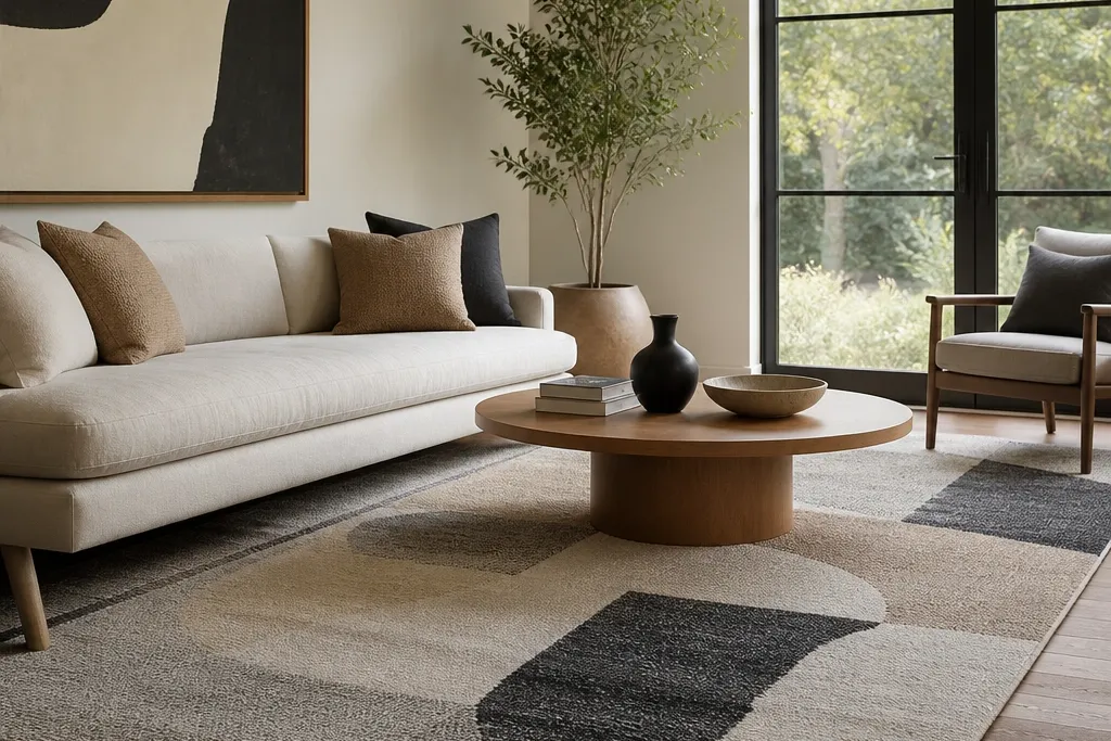
9. Gray and Taupe Color-Block Runner Feel in an Area Rug Format
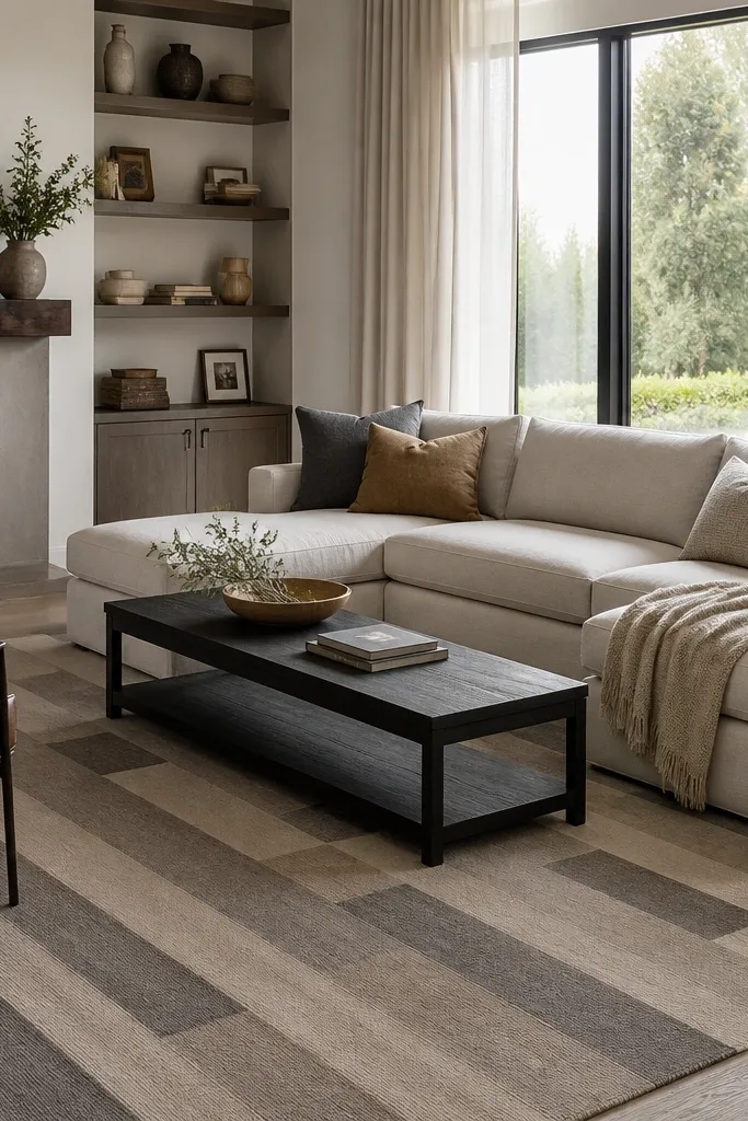
Color-blocking in long rectangles gives a modern “movement” while still looking grounded. The taupe and medium gray combination works with both warm and cool floors, depending on your lighting. I like this when the room has a long sofa or a chaise, because the rug pattern echoes the line of the seating. It keeps the space from feeling boxy.
Pro tipAdd one taupe accessory like a textured lamp shade or a woven basket to match the warmer block color.
Pick blocks that are wide enough to read from the doorway — aim for shapes about 6-10 inches wide. Center the pattern under the coffee table so the long blocks line up with how you walk through the room. Use a non-slip pad to keep the low pile from creeping.
Watch outAvoid color-block rugs with too many shades. If there are more than 4, it stops looking modern.
10. Oatmeal Sheen Abstract Lines for a Softer Modern Look
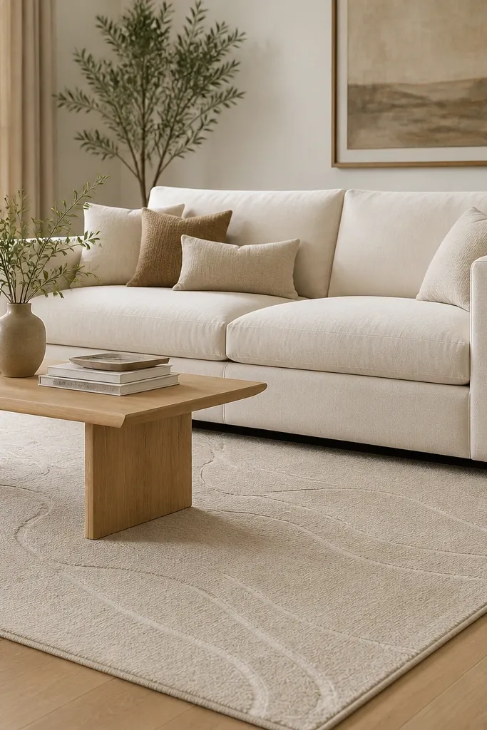
This is the “modern but cozy” rug I reach for when the room has soft upholstery and you don’t want harsh contrast. The slight sheen catches light in a way that makes plain furniture look more designed. Abstract lines keep it contemporary without turning it into a strict geometric grid. Oatmeal also blends with most wall colors without going stark.
Choose a rug where the line pattern stays tonal — cream-on-oatmeal or oatmeal-on-oatmeal. Keep the coffee table in a light finish so the sheen doesn’t fight dark surfaces. If you have pets, prioritize a rug pad with strong grip and plan to vacuum regularly.
Rotate the rug during the first month if you see traffic marks. It evens out the wear pattern.
Avoid heavy pile with sheen. High pile + shine looks staged and messy quickly.
11. Charcoal Oversized Area Rug With a Hidden Subtle Pattern
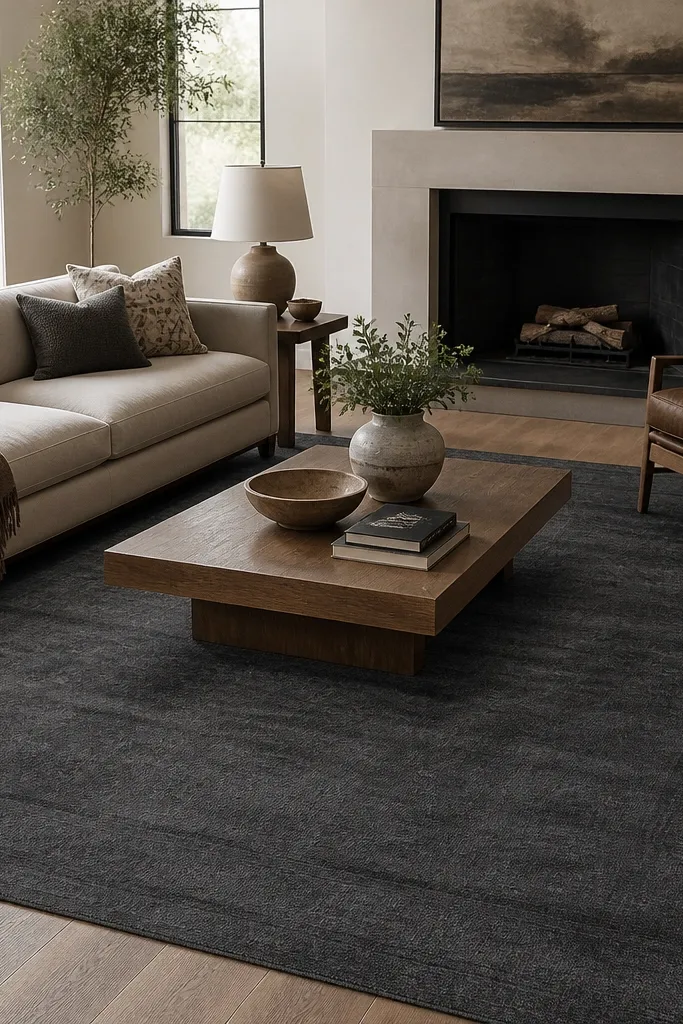
A dark oversized rug makes the room feel more high-end because it removes visual clutter from the floor. The key is that the pattern stays subtle — you want depth, not a loud print. I’ve done this in homes where the floor has small imperfections or inconsistent wood tone. The rug becomes the visual reset button.
Go bigger than you think: if the seating area is 8x10, consider 9x12 so the rug reaches the chair legs. Use a lighter coffee table or legs so the rug doesn’t swallow the furniture. Keep pillows in cream, camel, or muted blue to keep the room from going too monochrome.
If the room is small, choose dark gray instead of black. It reads modern without shrinking the space.
Avoid a dark rug that’s too short. A short dark rug looks like a square stain.
12. Light Blue and Chalk White Geometric Tiles
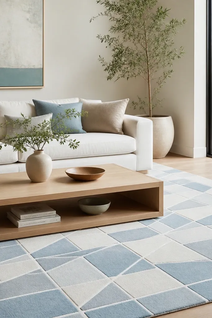
Light blue adds calm without pushing the room into coastal territory if the pattern is graphic. A tile-like geometry feels modern because it’s structured and repeatable. This setup works when your walls are white but you want a color that doesn’t look like accent-only decor. I like pairing it with woven textures like jute baskets so the rug doesn’t feel too flat.
Pick a rug where the blue is pale and slightly dusty, not sky-bright. Size it to fit under the coffee table with 8-12 inches of rug visible around it. Use white curtains or off-white blinds so the chalk white on the rug matches the room.
Add a single light blue throw pillow and keep the rest neutral for a clean modern effect.
Avoid thick, fuzzy tile patterns. They look like they were printed on cheaply dyed fabric.