1. Oatmeal Flatweave with a Thin Border for a Clean Living Room
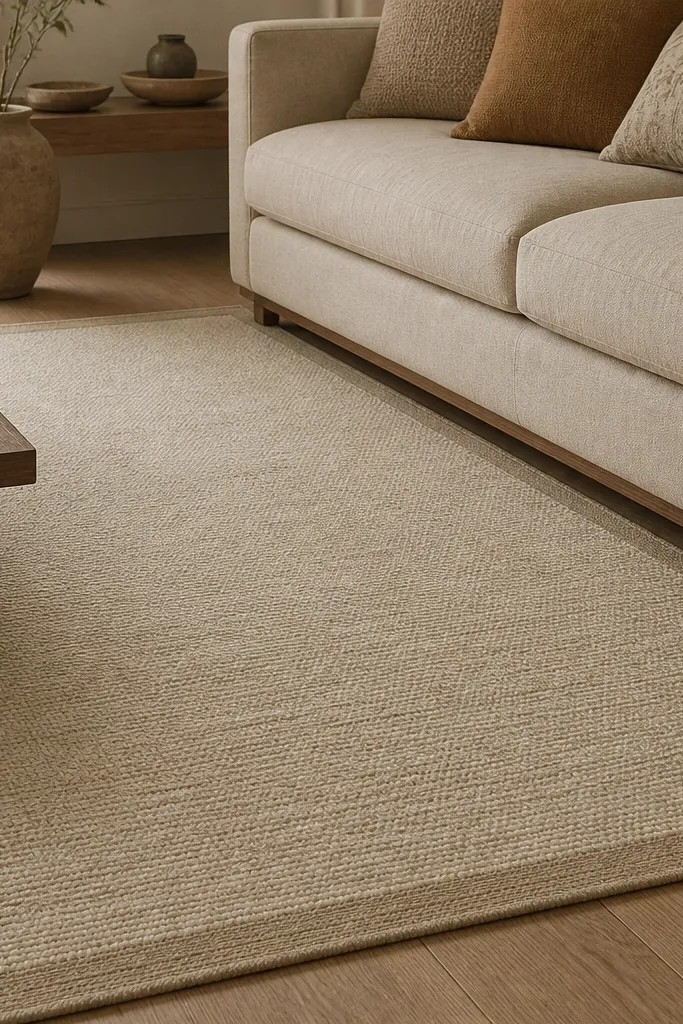
This is the rug I reach for when a living room needs calm but you still want it to look styled. Oatmeal hides everyday dirt better than pure white, and the thin border keeps the edges looking deliberate against wood floors. The tight weave reads tidy, even after months of vacuuming. Pair it with warm neutrals like cream, tan, and soft greige so the rug looks like part of the room, not a separate purchase.
Pro tipLay the rug, then move your seating in tiny increments until you see the front legs sit fully on the rug — that’s where the “designer” look starts.
Use a 5x8 under a two-cushion seating layout so the sofa’s front legs land on the rug. If your room is narrow, rotate the rug so the border runs left to right with the longest wall. Add a low-contrast pillow set in cream and sand tones and keep your coffee table wood or metal finishes warm so nothing clashes.
Watch outAvoid a thick, shaggy rug in high-traffic homes because it looks matted fast and makes the whole room feel tired.
2. Terracotta Medallion Rug that Warms Beige Walls Instantly
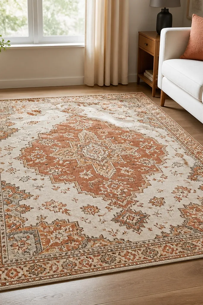
Terracotta in a medallion pattern creates instant warmth and gives your eye a focal point without needing a lot of decor. The cream base keeps it bright, and the rust tones echo wood shelves or brass lamp bases. I like this look when the walls are beige or light greige because the rug adds warmth without turning the room orange. The medallion also makes the room feel more “finished” even if your furniture is simple.
Choose a 6x9 if you have a sofa plus two chairs. Center the medallion so it aligns roughly with the middle of the coffee table. Keep other pattern limited — one textured throw or woven baskets are enough. If you have dark furniture, add a lighter curtain panel so the terracotta doesn’t feel heavy.
Pull one pillow fabric from the rug’s terracotta tone. Even a small match makes the room look intentional.
Skip rugs with too much black in the pattern if your room already has black accents everywhere — it can make the space feel busy.
3. Blue-Gray Geometric Rug for Crisp, Modern Comfort
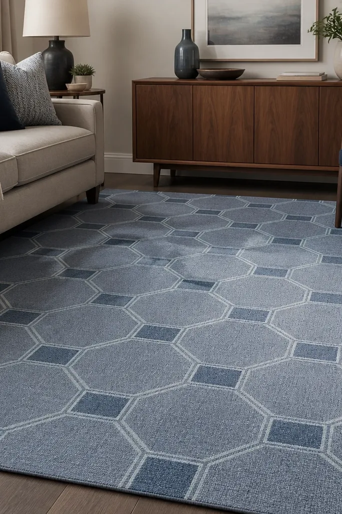
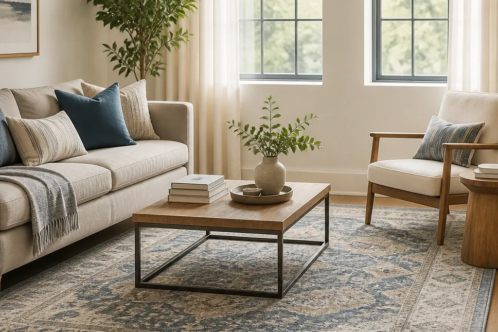
A blue-gray geometric rug makes a living room feel crisp while still staying cozy. The pattern is structured, so it works well with straight-lined furniture and simple decor. I’ve used this exact color family in rooms with warm wood floors by adding a cream layer in the pillows or curtains to bridge the temperature gap. The geometric look also helps hide minor stains because the pattern breaks up the surface.
Pick a low pile with tight geometry so it doesn’t snag on chair legs. Use a 5x8 or 6x9 depending on how wide your seating is. Keep your sofa fabric in cream, oatmeal, or soft gray so the rug’s blue-gray becomes the main color moment.
If your walls are warm beige, choose a rug with a slightly smoky gray instead of a pure cool blue.
Avoid oversized, high-contrast geometric patterns in small rooms — they can make the space feel smaller and louder.
4. Vintage-Style Distressed Oatmeal Rug for Rental-Friendly Flexibility
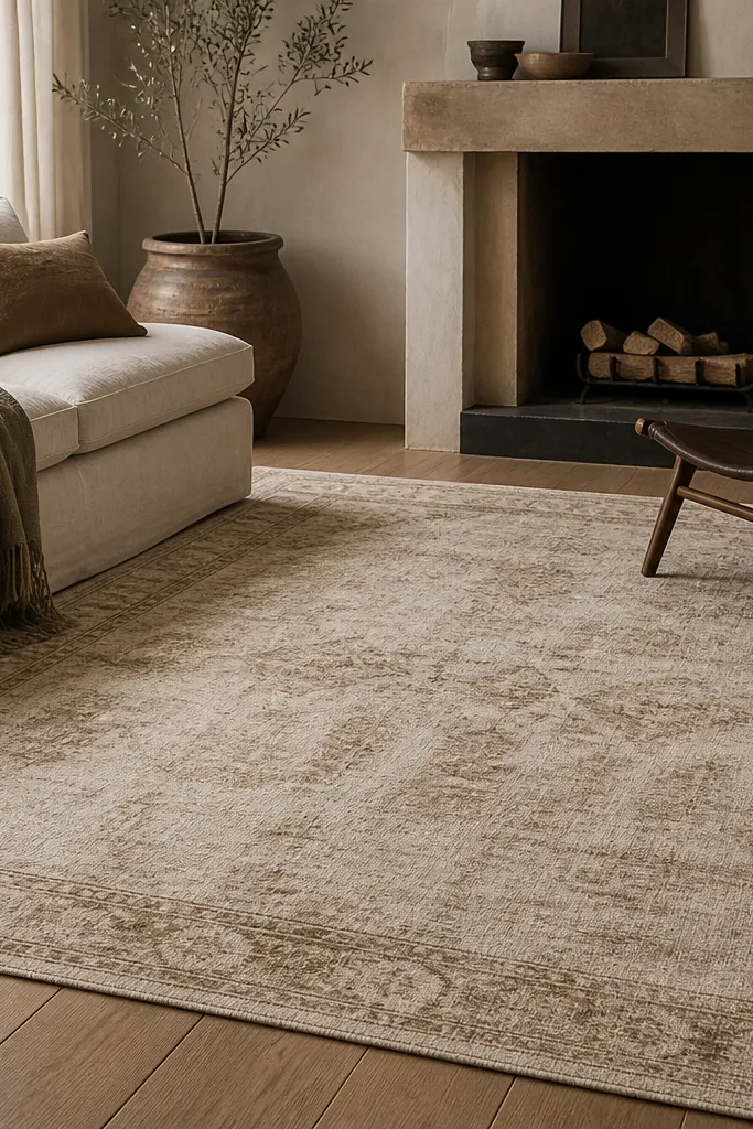
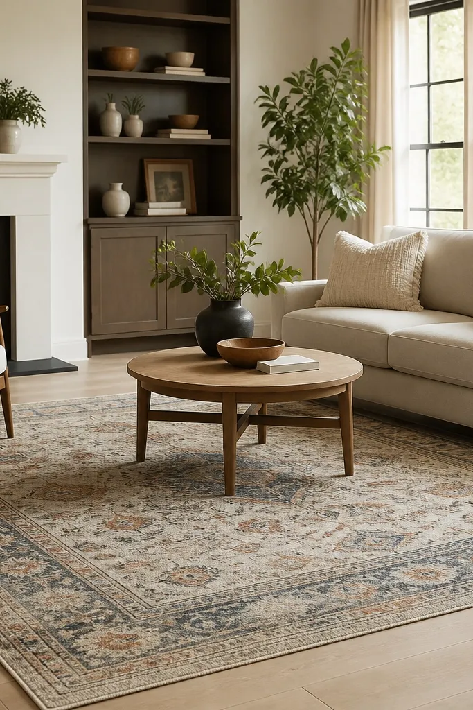
Distressed vintage-style rugs hide wear in a way solid colors can’t. The fading and mottling mask small spills and vacuum marks, which matters when you live in the space, not just stage it. Oatmeal also plays nicely with almost any wall color and wood tone. The muted border gives structure so your living room doesn’t look like a temporary setup.
Go for a 5x8 if your sofa is about 80-90 inches wide. Center the rug so the border is even on both sides of the seating group. Use simple decor: a large tray, a few books, and one textured lamp shade.
Test color under your real lighting. Look at the rug in late afternoon and compare it to your sofa fabric before you commit.
Avoid rugs that are too gray if your room has warm undertones — the contrast can make both look dingy.
5. Charcoal and Cream Runner-Look Rug in a Long Narrow Living Room
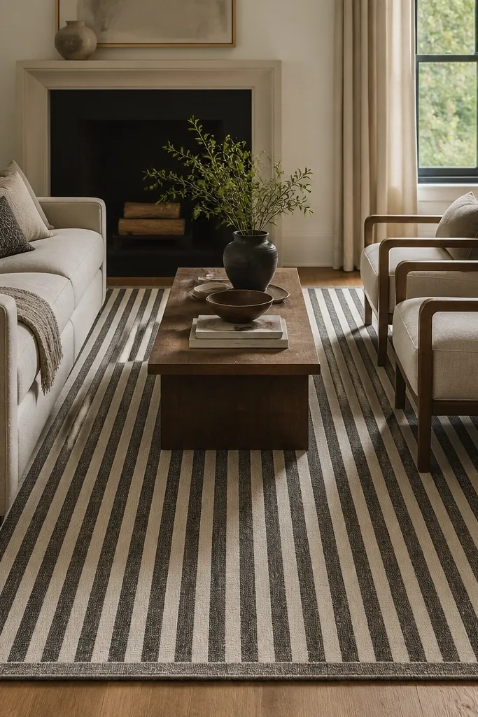
If your living room is long and narrow, stripes help your eye glide instead of bumping into awkward corners. Charcoal and cream gives you contrast without going full black. I like this when people have a sofa facing the TV on a long wall and the room feels stretched. The rug makes the seating area feel aligned and intentional.
Use a 2.5x8 or 3x10 size if you have that kind of layout. Place it so the front legs of the sofa are on the rug, even if the back legs are off. Keep chair placement tight to the rug edges so it reads as one zone.
Match stripe direction to your main pathway — if you walk in from the entry on the long side, keep the stripes running with your walk.
Avoid placing stripes perpendicular to the longest wall — it can make the room feel choppy.
6. Sage Green Flatweave Rug for a Soft, Airy Feel
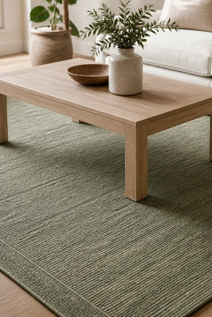
Sage green is one of the easiest “color” rugs to live with because it looks calm in daylight and still cozy at night. The flatweave texture adds warmth without looking shaggy. I use this when the living room has white trim and light wood, because sage adds depth without turning the room into a color project. It also hides lint well because the weave is tight and textured.
Pro tipBring home two swatches of your curtains or sofa fabric and hold them next to the rug in your living room lighting.
Choose a 6x9 if you have a sectional. If you have a standard sofa, a 5x8 works. Pair with ivory, oatmeal, and light tan leather or woven fabrics so the green stays muted. Add a throw in dusty rose or rust if you want a warmer accent.
Watch outAvoid neon or bright mint shades — they look cheap fast and fight with warm wood tones.
7. Black and Oatmeal Moroccan-Inspired Rug for High Contrast Without Chaos
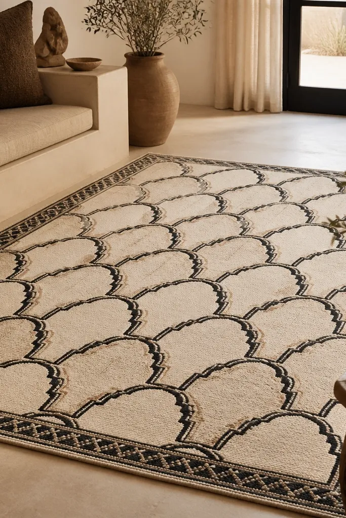
This pattern style gives you movement and structure at the same time. The key is keeping the color count low: black and oatmeal only, with a light ground. It looks modern, but it still feels grounded because the pattern is symmetrical. I’ve used this in living rooms with beige walls and black metal accents, and it keeps the room from looking flat.
Use a 6x9 or 8x10 depending on seating size. Place it so the pattern’s center aligns with the coffee table. Keep your furniture in warm neutrals and add one solid throw blanket in oatmeal or cream so the room doesn’t feel like it’s all pattern.
If your walls are light, pick a rug where the background is cream, not gray. The warmth makes the black feel softer.
Skip rugs with lots of tiny multi-color specks — they can look dusty even when they’re clean.
8. Cream Shag-Style Look with Low Pile for Cozy Without the Mess
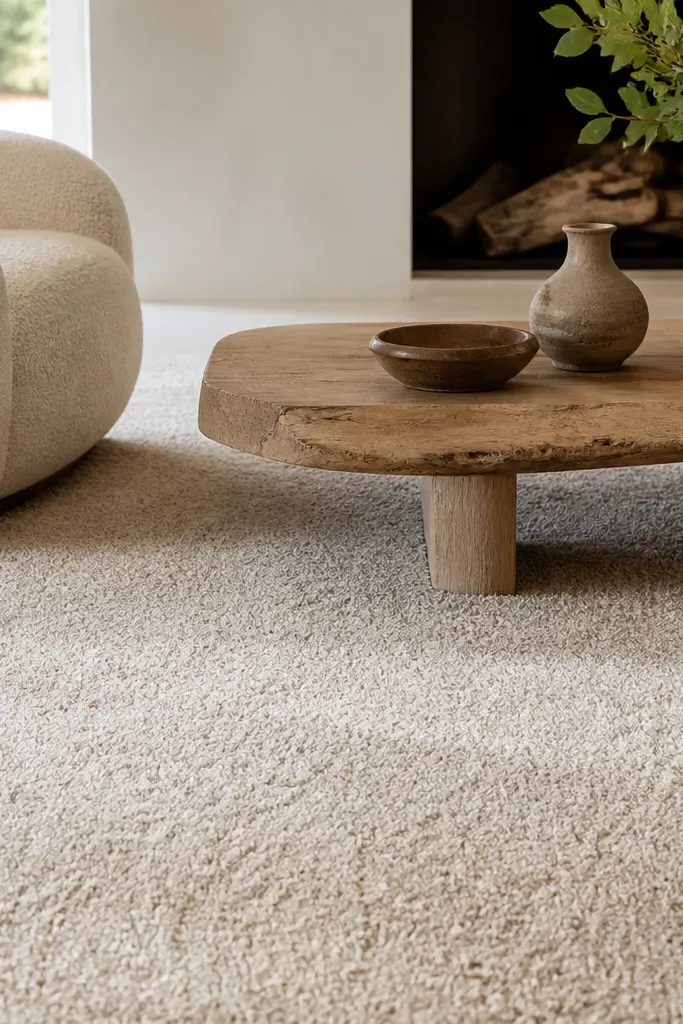
I’m picky about “cozy” rugs because most plush ones turn into a maintenance job. This look uses a low pile with a shag-style texture so you get that soft visual without the long fibers that grab crumbs. Cream makes the room feel bright, and the texture adds depth even with minimal decor. It works great in living rooms with plain furniture — the rug does the styling.
Choose a size that fully covers the front legs of your seating group. Keep your vacuum settings gentle and avoid beater bars on high texture. Match it with warm white curtains and a wood coffee table so the cream feels intentional, not stark.
Test for shedding by rubbing your hand across the pile for 30 seconds. A budget rug that keeps shedding after delivery is a headache.
Avoid true high-pile shag in homes with pets or kids. The cleanup is never as easy as the marketing photos.
9. Warm Gray and White Striped Rug to Make Furniture Look Taller
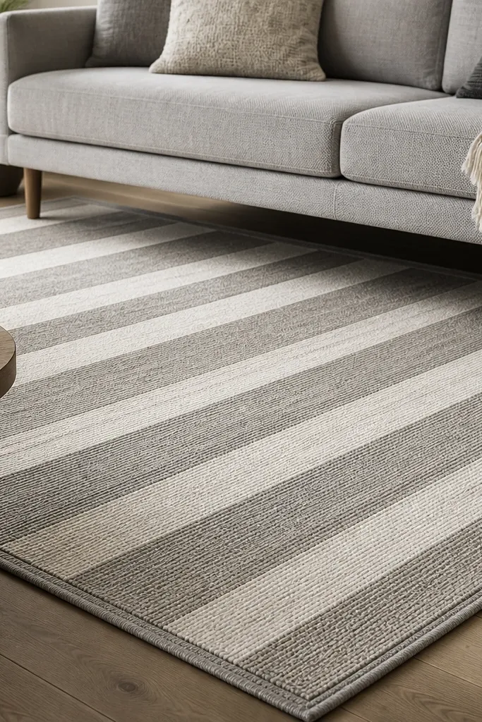
Vertical or slightly angled stripes can make a room feel taller and cleaner. Warm gray and white keeps it modern without going icy. I like this when your walls are neutral and your furniture is low-profile, because the stripes add a sense of height. The rug also hides footprints better than solid colors.
Pro tipUse a rug pad with grip for striped rugs. It keeps the pattern from shifting and looking off-center.
Use a 5x8 if your seating is compact. Keep the stripes parallel to the longest wall so the room doesn’t look tilted. Add plain solid cushions and one patterned pillow if you want interest, but keep it limited.
Watch outDon’t choose stripes that are too thin and high-contrast — they can look like a cheap print.
10. Rust and Cream Block Pattern Rug for a Farmhouse-Lite Living Room
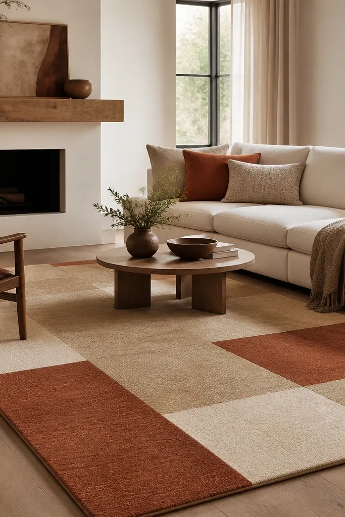
Block patterns bring structure without feeling formal. Rust and cream adds that lived-in warmth I like in living rooms with wood shelves and woven textures. The grid layout makes it easier to style with mixed furniture because the rug gives the floor a clear rhythm. It also hides everyday scuffs because the tones are varied but still coordinated.
Pro tipWhen you style, repeat rust once in decor — a ceramic vase or a woven basket in the same tone.
Pick a 6x9 for a sofa and chair combo. Keep your sofa fabric in cream, oat, or light tan. Add one dark accent like black frames or a matte black lamp so the rust doesn’t run too orange.
Watch outAvoid rugs with bright orange-red rust if your room already has warm red tones like terracotta clay pots.
11. Navy Border Rug with a Soft Neutral Center for TV Walls
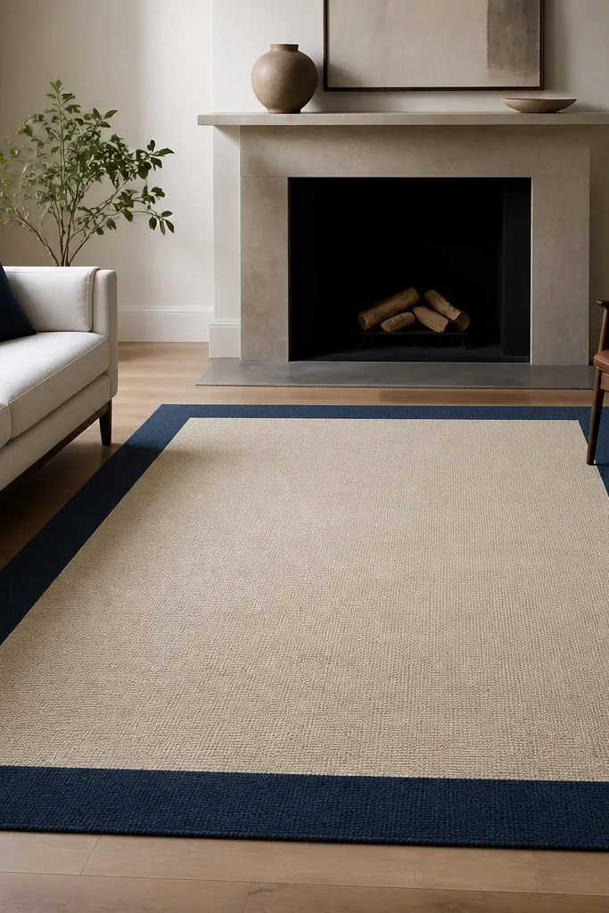
A navy border gives you a “picture frame” effect that makes the whole seating area look intentional. The beige center keeps the room light and makes navy feel grounded instead of heavy. I like this for living rooms with a TV wall because it visually anchors the furniture around the screen. The border also makes the rug look more expensive than it is.
Pro tipMatch the navy border to a curtain or frame color, not to random decor. One repeat is enough.
Choose a size where the border sits under the coffee table and extends evenly past the chairs. A 5x8 is great under a sofa, while 8x10 works if you have multiple seating pieces. Pair with navy or indigo throw pillows and keep other patterns minimal.
Watch outAvoid navy rugs with a grayish cast if your walls are warm beige — it can look mismatched.
12. Sand and Olive Geometric Rug for Earthy Minimalism
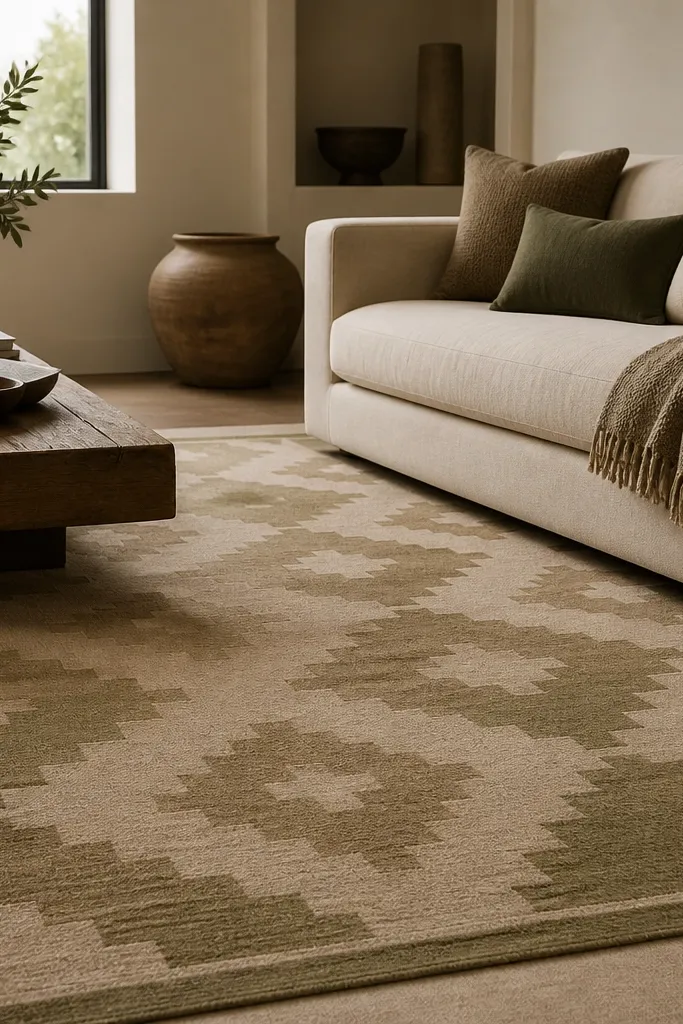
Sand and olive looks grown-up without feeling heavy. The geometric shapes create interest, but the muted palette keeps it calm. This rug works well when you want minimal decor but don’t want the room to feel sterile. I’ve used it in living rooms where people have a lot of white and light wood — the olive adds depth.
Pro tipIf you have a lot of beige already, choose a rug where olive is clearly visible — subtle green can disappear and look gray.
Use a 6x9 under a sofa and two chairs. Keep the coffee table in light wood or natural stone look. Add a neutral throw in oatmeal and one olive accent pillow so the colors feel connected.
Watch outSkip high-gloss or shiny fibers in this palette. They catch light weirdly and can look cheap.