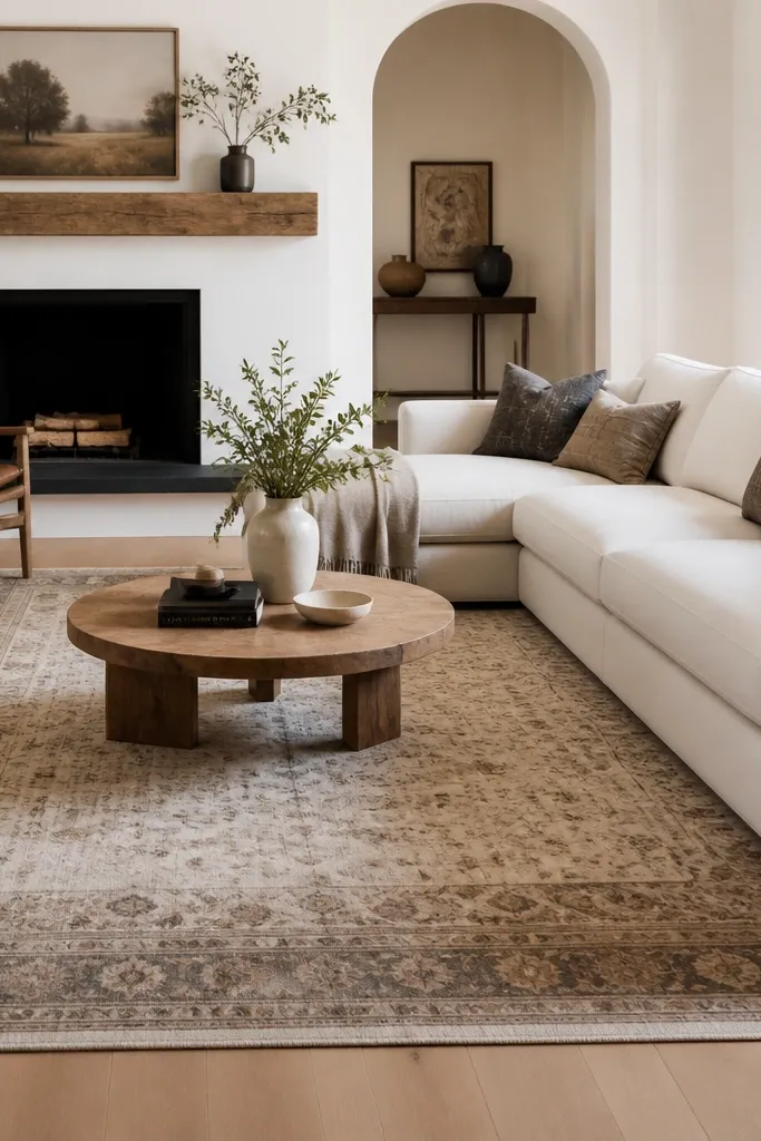
1. Sand + Oatmeal Flatweave with a Cream Sofa
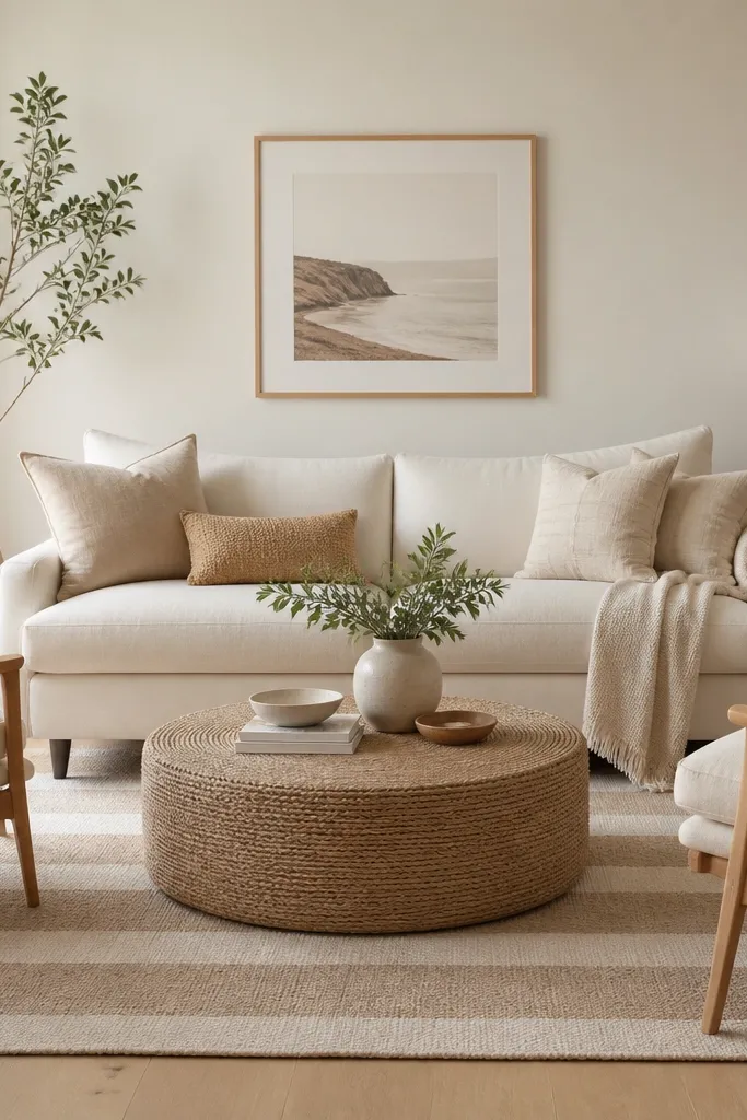
This look works because flatweave texture adds warmth without adding visual weight. Sand and oatmeal tones blend with cream upholstery, so you get “soft” contrast instead of harsh contrast. The subtle stripe direction helps guide the eye across the seating area, especially with a long sofa.
Use a 8x10 rug under an 84-90 inch sofa so the front legs land on the rug. Keep the throw blanket in off-white or oat, and choose pillows with one small pattern at most. If your coffee table is jute or light wood, stick to natural fibers so everything reads consistent.
Lay the rug so the stripes run the long direction of the room — it makes the whole space feel longer.
Avoid matching the rug to the sofa color too closely; you need a small value difference so the sofa doesn’t disappear.
2. Black + Ivory Medallion for a Formal-leaning Setup
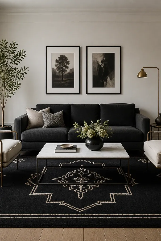
Medallions make a living room feel “finished” because they create a visual center under the coffee table area. The black-and-ivory combo is high-contrast but still classic, and it pairs well with charcoal furniture without turning the room into a monochrome cave.
Choose a 9x12 if your sofa is 90+ inches and you have a pair of chairs; it keeps the pattern from feeling cramped. Use one metal finish (brass or black) and repeat it in the lamp and picture frames. Keep wall art simple so the rug does the heavy lifting.
Add a solid cream runner-style pillow cover next to patterned cushions to calm the medallion.
Skip tiny, dense medallions if you have a very small room — they look busy fast.
3. Terracotta Grid Rug with White Slipcovered Chairs
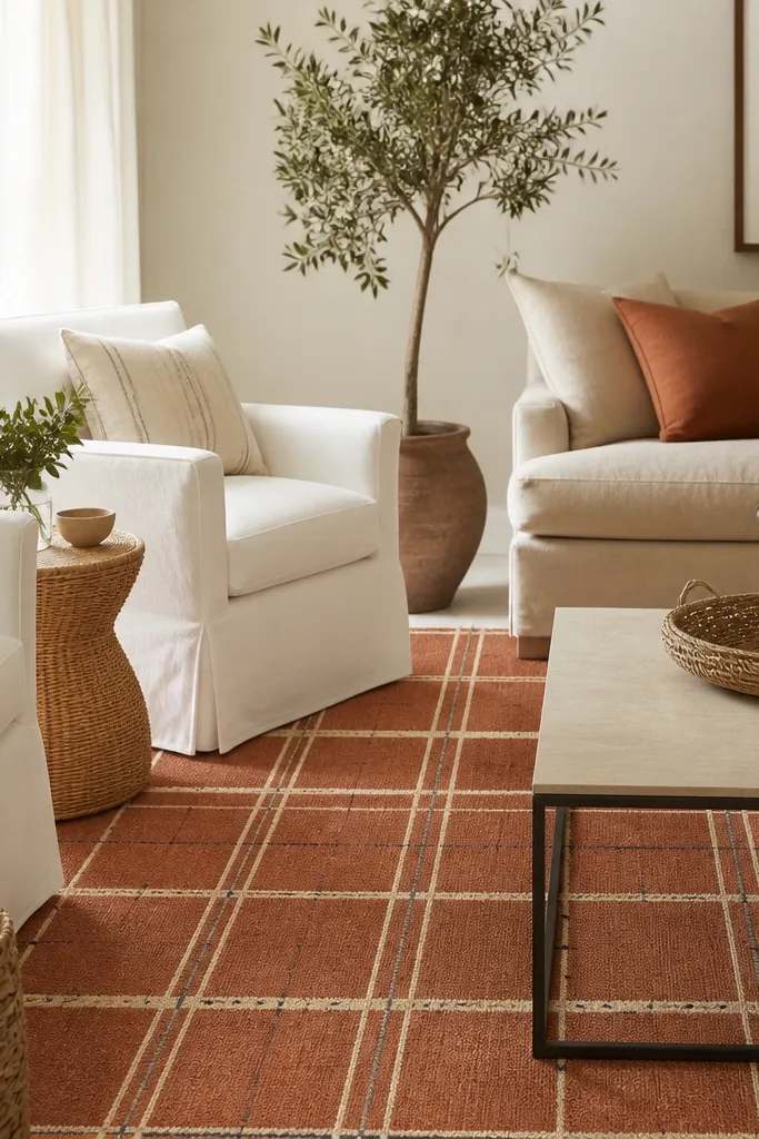
A grid pattern looks crisp and modern, but terracotta keeps it warm. The white slipcovers make the terracotta pop, and the grid lines add structure without looking stiff. When your room has lots of white, a terracotta rug adds color that doesn’t feel loud.
Pick an 8x10 rug if your seating zone fits under a coffee table about 48-54 inches wide. Choose throw pillows that repeat terracotta in a different texture (matte cotton or linen). Add one solid cream element like a shade or cushion so the grid doesn’t feel harsh.
Match the terracotta undertone to your wood or clay decor; go more orange if your wood is honey, go more red if your wood is darker.
Don’t pair terracotta with cool gray rugs — it makes the undertone fight.
4. Olive + Cream Moroccan-inspired Repeat Pattern
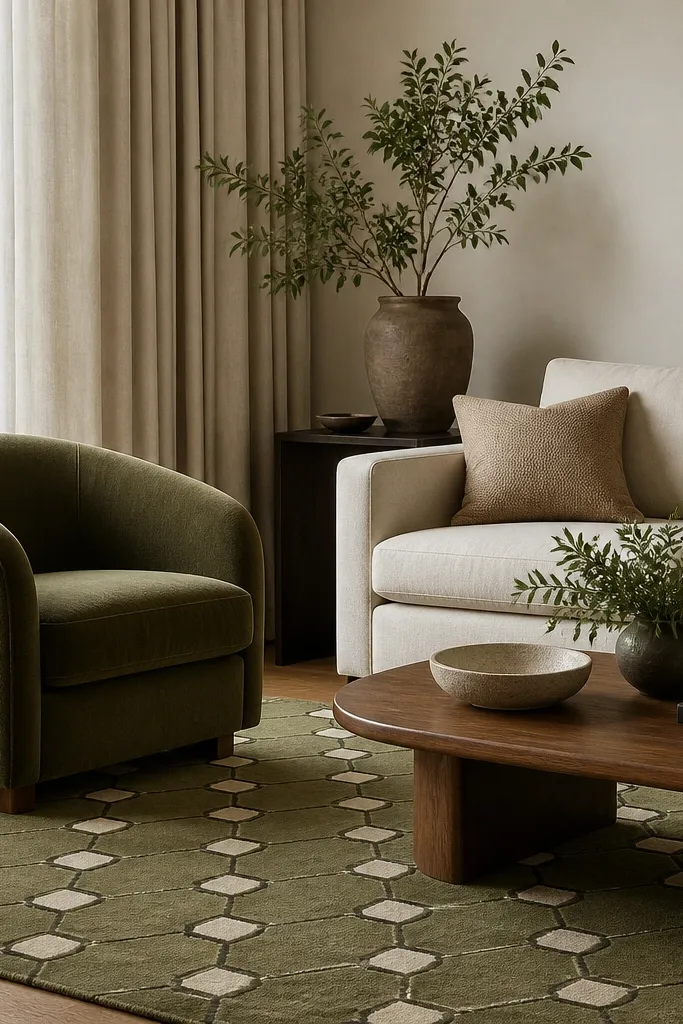
Geometric repeats feel energetic but still controlled when the palette is tight. Olive brings depth, and cream keeps the room from getting heavy. The thin black outlines add definition so the pattern doesn’t blur into the furniture.
Use a rug around 8x10 for a medium seating area, and place it so the coffee table sits centered with at least a few inches of rug visible on each side. Keep your other patterns minimal: one small pillow pattern is plenty. Choose olive accents in matte fabrics to avoid shininess that competes with the rug lines.
Pro tipIf your olive chair is more muted, pick a rug olive that’s slightly lighter than the chair so it layers without merging.
Watch outAvoid mixing multiple strong pattern scales (big rug pattern plus big curtains) — it looks chaotic.
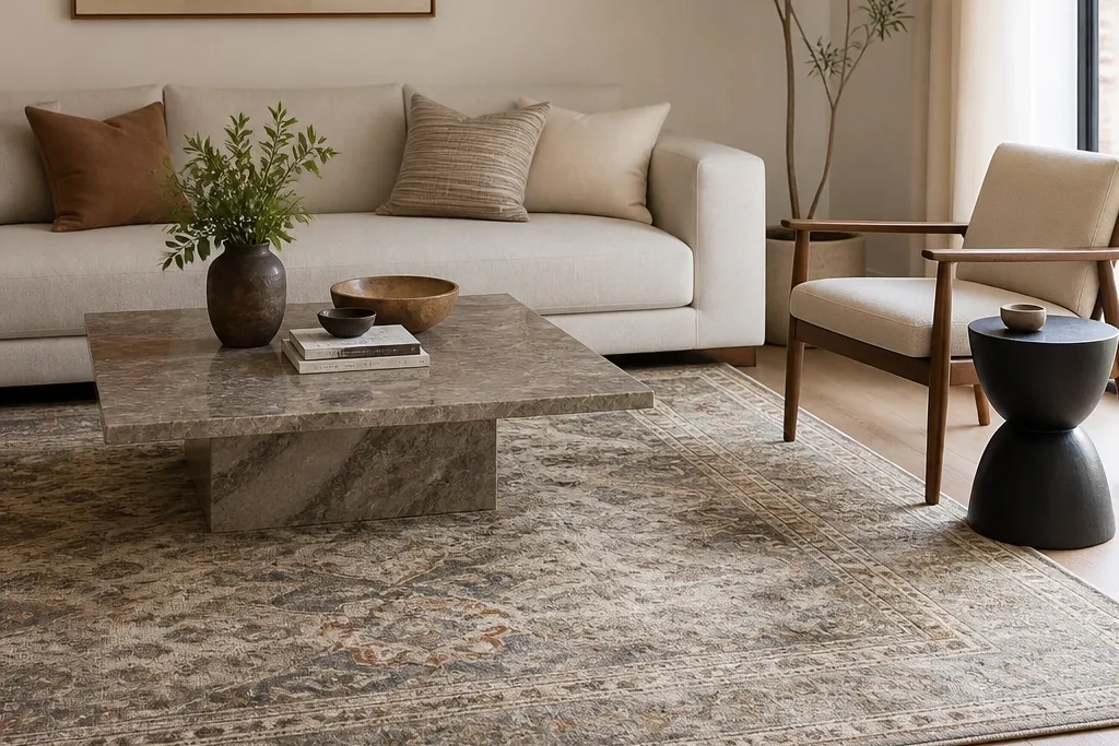
5. Muted Blue Distressed Persian Look Under Light Wood
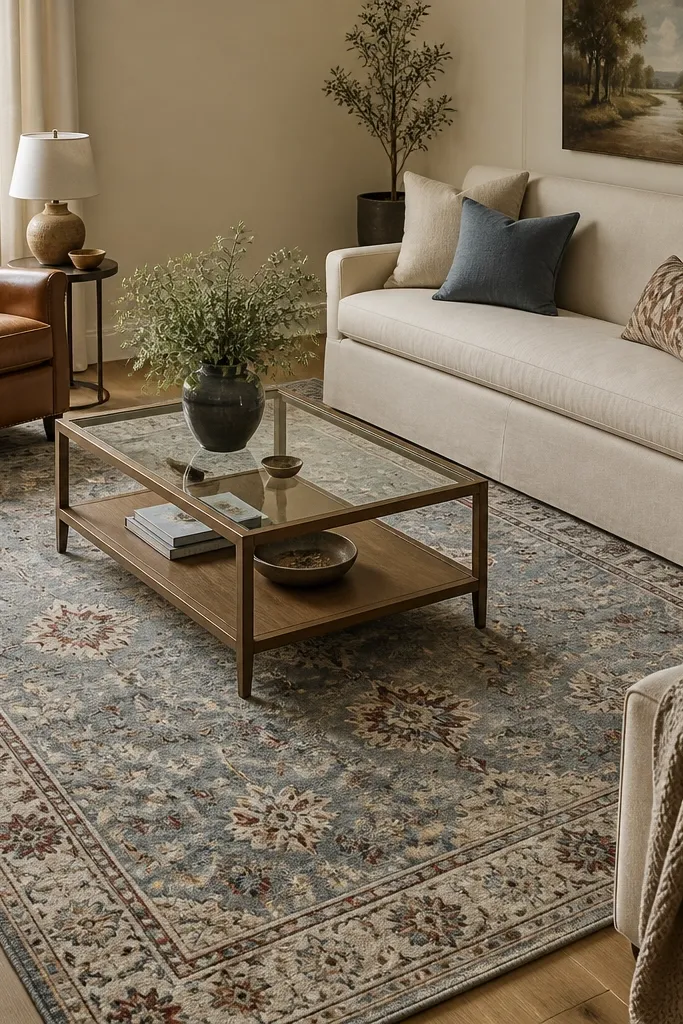
Distressed Persian styling gives you instant “collected over time” energy without needing actual years of wear. Muted blue anchors the room and makes beige furniture look warmer. The worn accents keep the rug from feeling too perfect, which is what makes it look believable in a lived-in home.
Go with an 8x10 if your sofa is 84 inches; if you have two chairs, consider 9x12 so the corners don’t get cut off. Keep your decor warm: leather, wood, and cream. If your art includes blue, the rug will tie it together quickly.
Pro tipPull one accent color from the rug (the red-brown) into a single pillow or a small ceramic piece.
Watch outDon’t choose a rug with bright, saturated red if your room already has warm orange tones — it clashes.
6. Charcoal Shag-Style Rug for Movie-night Comfort
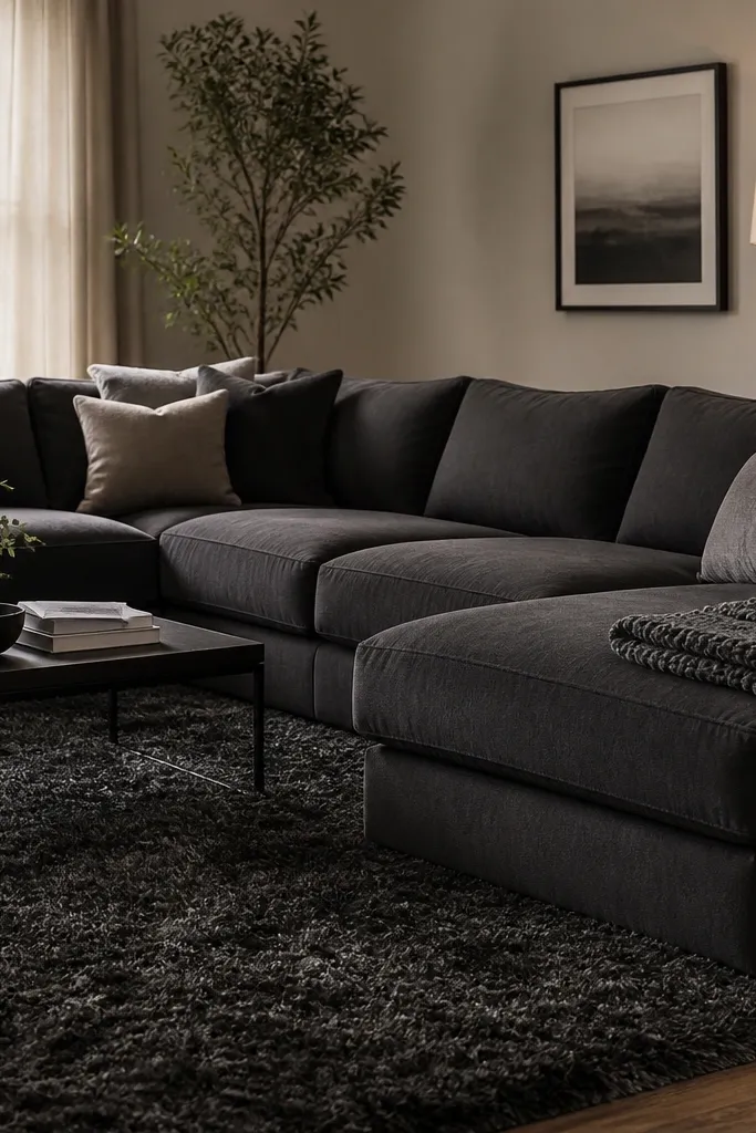
A higher pile rug changes the whole feel of the room. Under a sectional, it makes the space feel cushioned and less echo-y, especially on hard floors. Charcoal hides everyday dust and footprints better than lighter shag.
Choose a rug with a pile height you can actually see and feel in person; online photos can mislead. For a sectional, I like 9x12 to cover the full seating and make walking in feel intentional. Pair with simple, solid pillows so the texture stays the star.
Rotate throw pillows so one side is always facing the rug — it makes the pile look even and prevents weird light streaks.
Skip white shag in a high-traffic room; it shows wear in weeks.
7. Cream + Gray Washable Rug for Busy Households
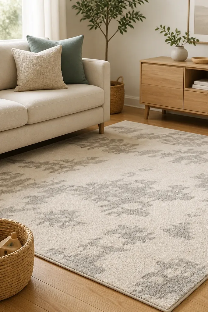
Washable rugs are the only “pretty” option I trust in daily chaos. The cream base brightens the room, and the gray pattern hides small stains between cleanings. Low pile also works with vacuum heads without shredding the fibers.
Pick a low-pile rug with a short, tight weave and a pattern that breaks up spots (blotches or loose lines). Choose 8x10 as a starting point for most sofa-plus-chairs layouts. Keep the rest of the room simple so the rug doesn’t fight with too many prints.
Treat spills fast: blot with a clean towel, then use cold water first before any cleaner.
Avoid high-contrast black-and-white washable rugs — they show track marks and vacuum scuffs.
8. Rust + Cream Stripe Rug for Narrow Rooms
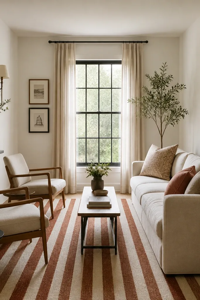
Vertical or straight stripes work like visual rulers. In narrow rooms, they make the space feel taller and more aligned, so your furniture looks less squeezed. Rust adds warmth without needing a lot of other color.
Use a 2.5x8 or 3x8 runner only if you truly have one main walking path; otherwise go wider. If your room is about 11-12 feet wide, an 8x10 is safer even if it covers more than you’d think. Pair with plain pillows in cream and a rust accent only.
Pro tipTie the rust stripe to a rust-toned throw or ceramic so the stripes feel intentional.
Watch outDon’t rotate stripes diagonally in a narrow room — it makes the layout look off-balance.
9. Natural Jute with a Thin Cream Border
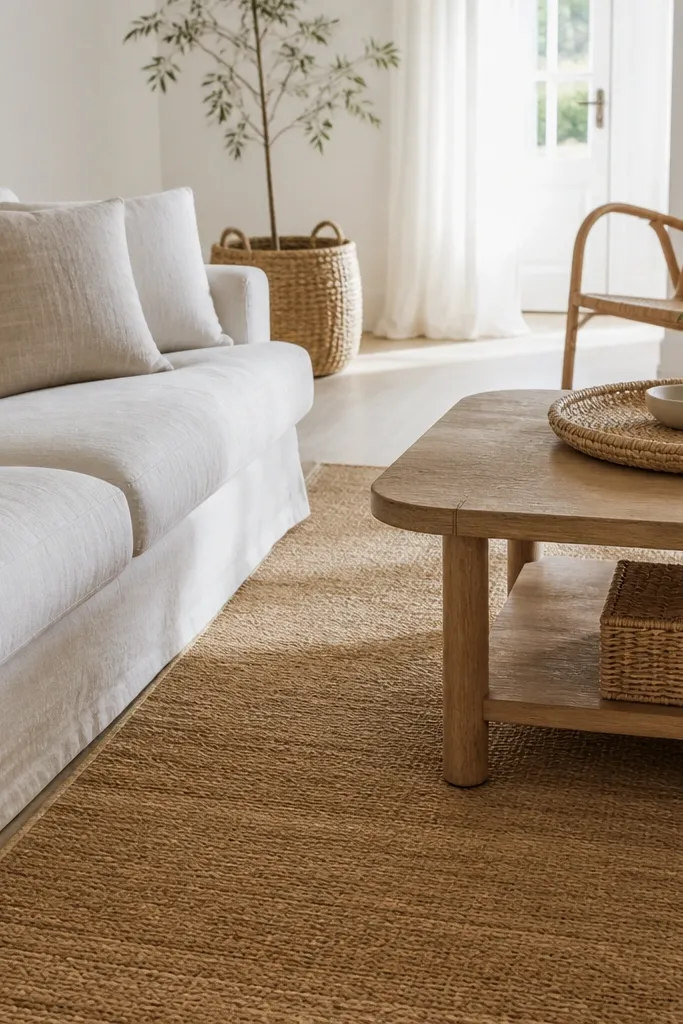
Jute looks casual, but the border keeps it from looking unfinished. The natural fiber texture adds warmth and hides minor imperfections. When your room has linen and rattan, a jute rug makes the materials feel like they belong together.
Choose a flatweave jute with a low, even weave. Size it so the sofa front legs land on it — that’s how jute stays “grounded” instead of looking like a decorative mat. Use a cream or off-white cushion cover to echo the border.
Use a rug pad with grip — jute slides when the room is humid.
Skip dyed jute that looks too uniform; it reads plastic in daylight.
10. Black-and-White Geometric for Modern Minimalist Rooms
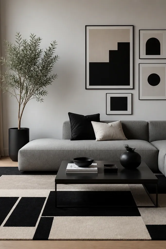
Geometric rugs add “design” without adding clutter. The contrast gives crisp edges to furniture silhouettes, which is why minimal rooms look finished fast. Off-white keeps it from feeling sterile, especially with gray upholstery.
Choose an 8x10 so the geometric blocks aren’t cut off too aggressively. Keep your wall art frames in black or dark wood so the rug and frames speak the same language. If you have a lot of hard surfaces, add one soft textile like a wool throw.
Pro tipPick one accent color from your decor (green plant or amber lamp) and let it be the only color besides black and off-white.
Watch outAvoid mixing this rug with another high-contrast pattern on pillows; you’ll get visual noise.
11. Beige Base with Navy Border for Traditional Rooms
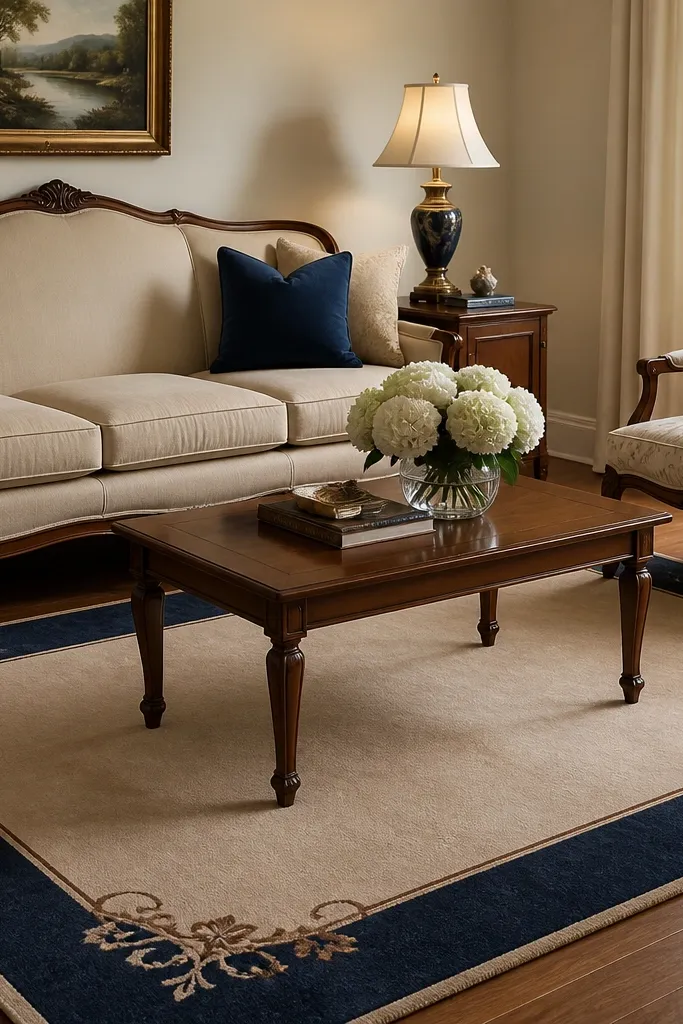
Borders make rugs look built-in, like they belong to the room’s architecture. A navy border adds structure and frames the seating area, which is perfect for traditional furniture shapes. The beige field keeps it calm and lets your sofa fabric stay the main texture.
Use a 9x12 if your coffee table is around 60 inches long or if your chairs sit wider than the sofa. Keep your navy accents consistent in pillows and lamp bases. If you have patterned curtains, keep them lower contrast so the rug border is the defining line.
Pro tipCenter the rug so the border corners align roughly with the room’s main sight lines from the entry.
Watch outDon’t choose a border that’s too thin; it can look like a cheap printed edge.
12. Light Gray Washable Rug with Micro-Pattern for Apartments
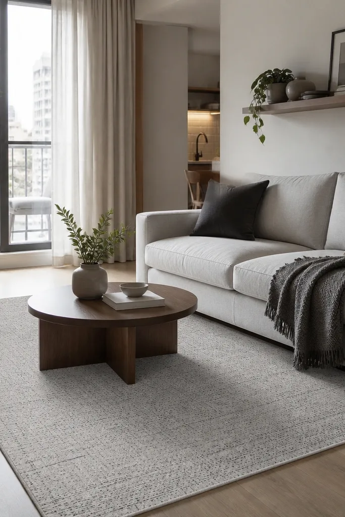
Micro-pattern rugs are the best solution when you want color control in a small space. Light gray brightens the room without showing every footprint like white. The pattern breaks up the look of dust and minor scuffs.
In apartments, I usually pick 5x8 or 6x9 depending on the sofa width. Make sure the front legs of the sofa touch the rug; floating looks worse in small rooms. Choose a rug pad that’s thin so doors still clear.
Pro tipIf your space is tight, use a rug that matches your wall paint value, not its exact color.
Watch outSkip rugs with thick fringes in narrow walkways — they catch feet and look messy fast.