1. Oatmeal Wool-Blend with Low Speckle for a Softer Living Room
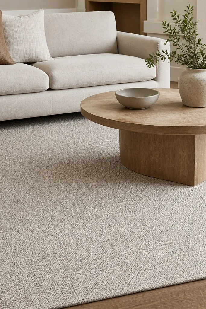
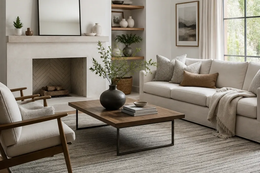
This look uses a wool-blend surface that reads calm but doesn’t look flat. The low speckle hides tiny dust and vacuum marks, which matters in real households. It also adds a gentle grain to the floor so your furniture doesn’t float. I like it under cream, camel, and soft gray because the speckle pulls those tones together.
Pro tipIf you have a darker wood floor, choose a rug with a slightly lighter oatmeal base so you get separation at the edges.
Go for a rug that feels like a firm flatweave or very low pile, around 1/4 inch. Keep the furniture legs visible so the rug anchors without making the room feel heavy. Pair it with a warm white rug pad and simple wood tones like oak or walnut.
Watch outAvoid a pure solid beige rug when your room has patterned pillows — solids show every footprint and vacuum line.
2. Greige Grid Flatweave for Clean Lines
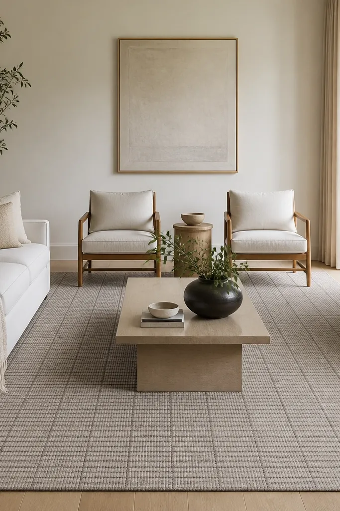
A grid pattern gives you structure without turning the room into a showroom. The greige tone works with both warm and cool palettes, which is why it’s my fallback when I’m unsure about undertones. The flatweave thickness keeps sightlines open and makes the room feel taller. It’s especially good with modern furniture, track arms, and simple metal accents.
Pro tipMatch grid direction to your room lines — if your sofa is parallel to the TV wall, keep the grid parallel too.
Choose a rug where the grid lines are only one shade deeper than the base, not high-contrast. Size it so the coffee table sits centered, and leave 10-14 inches of rug visible beyond the table edges. Use a thin rug pad so the grid doesn’t warp or curl at the corners.
Watch outSkip rugs with thick raised borders; they can look like a cheap table runner translated to the floor.
3. Sand Jute Blend with a Flat Border for Coastal-Elegant
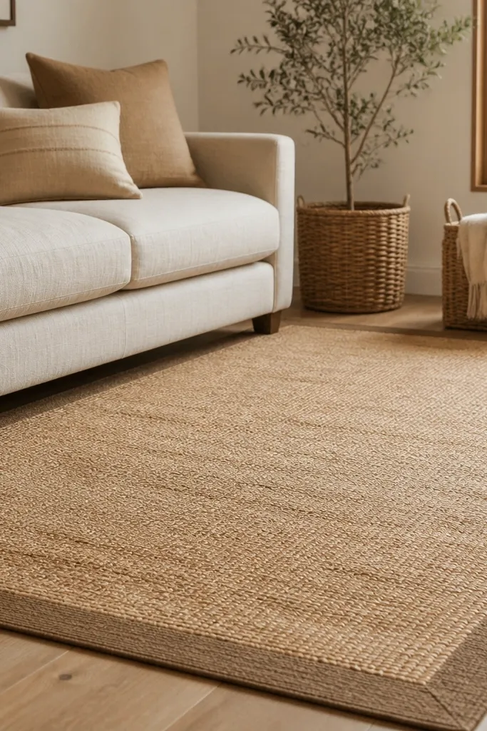
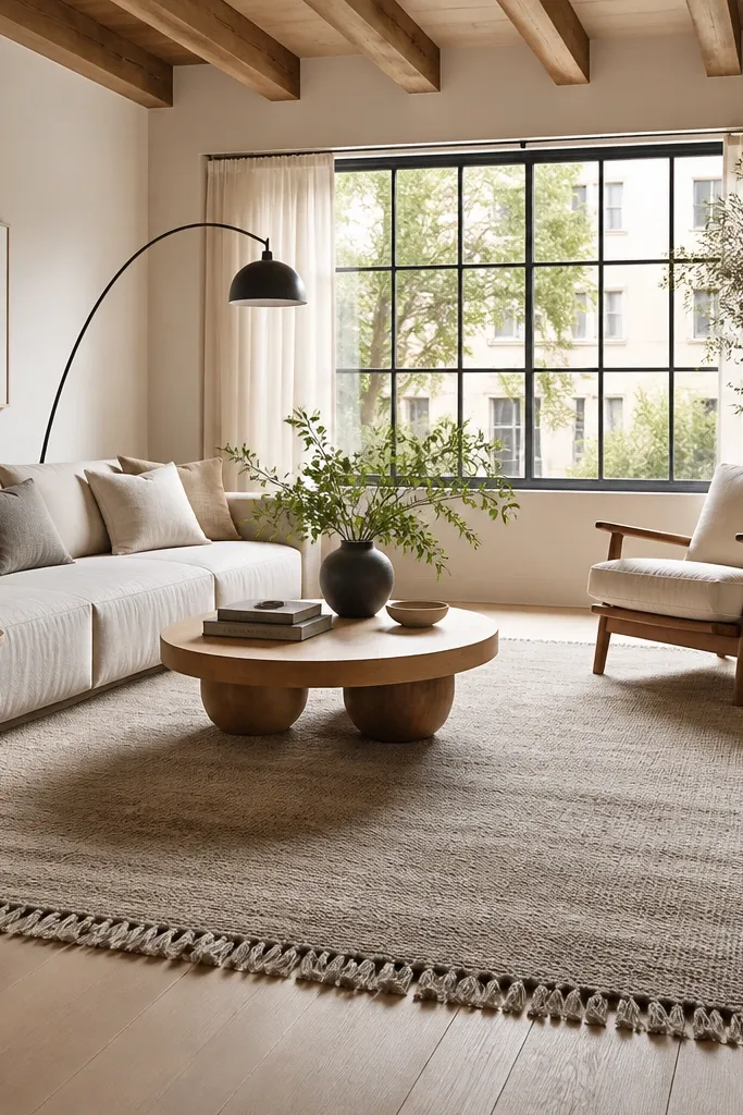
Jute blend rugs bring a natural, matte finish that makes neutrals look intentional. The border gives you a finished edge, so the rug doesn’t look like it’s floating. I like this when your living room has rattan, light oak, or linen curtains because the textures talk to each other. It also makes beige walls look warmer without adding yellow.
Pick a jute blend rather than pure jute if you have kids or pets. Keep the pile low so it’s comfortable and easy to vacuum. For placement, center the rug under the coffee table and make sure the border is straight — crooked borders scream “off the rack.”
Spot clean with a damp white cloth and mild soap. Don’t soak; jute fibers can stiffen if they dry too unevenly.
Don’t choose a rug with a frayed, unfinished edge if you want elegant interiors — it reads casual even when the color is neutral.
4. Warm Taupe Moroccan-Style Trellis with Soft Contrast
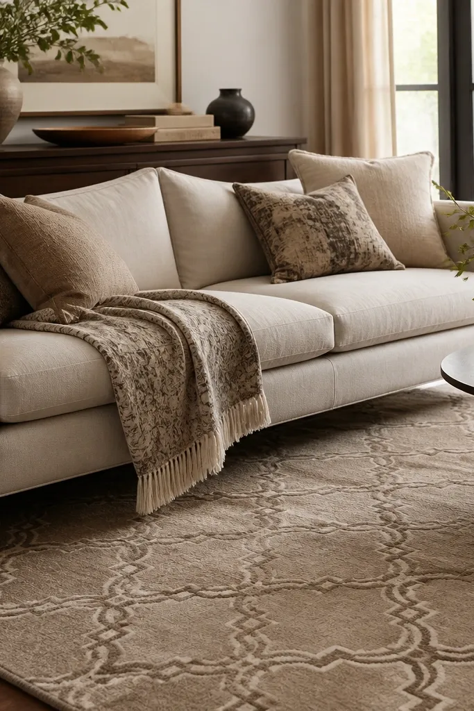
This is the kind of pattern that looks expensive because it’s controlled. The trellis draws your eye across the room, but the soft contrast keeps it from feeling busy. Warm taupe works great with chocolate leather, caramel leather, and off-white upholstery. It also hides wear better than a high-contrast design.
Pro tipIf your walls are cool gray, warm it up with a rug like this and add one warm metal tone (brass tray or lamp base).
Look for a rug where the pattern is woven in two to three closely related shades, not outlined in a single dark color. Use it with solid cushions and keep your coffee table simple so the rug is the star. If you have a large rug already, this look is perfect for filling a seating area without needing extra décor.
Watch outAvoid tiny, dense trellis patterns in a small living room — they can make the floor look like it’s shrinking.
5. Cream + Light Gray Ombre Runner-Style Rug in the Living Room
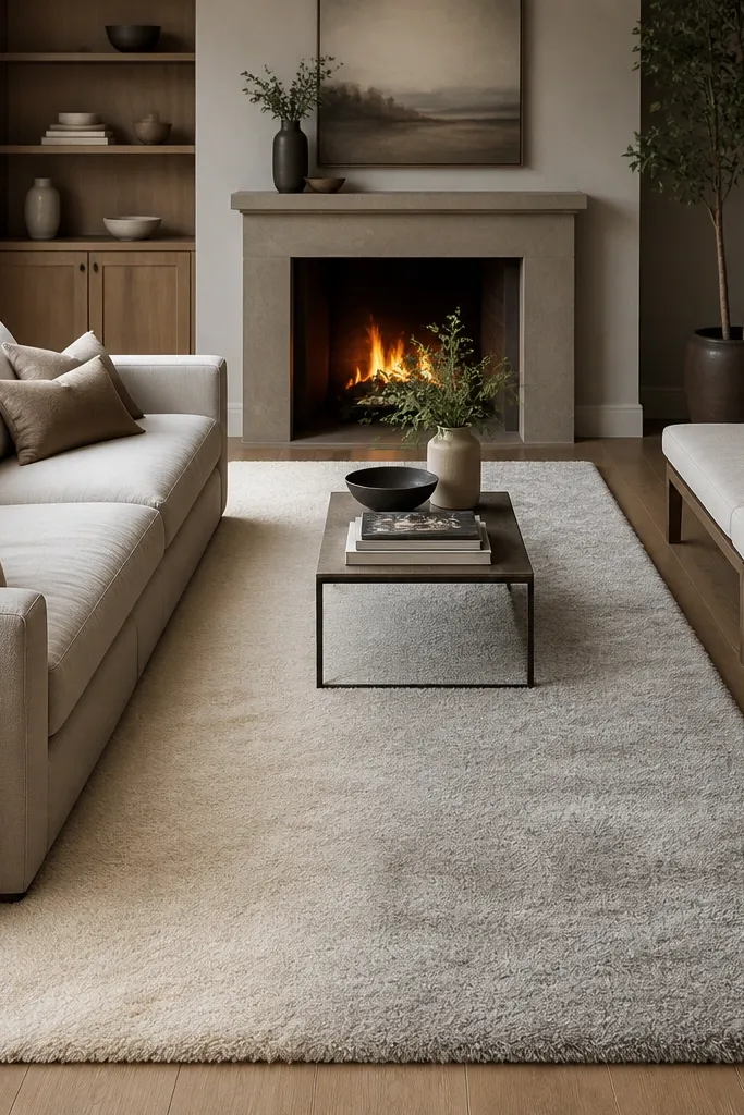
Ombre adds movement without turning neutral into boring. The gradient makes the room feel wider because it creates a gentle fade across the floor. I like this when your living room has a long wall and you want the seating area to feel pulled together. Cream-to-gray undertones also play nicely with marble-look coffee tables and light stone décor.
Pro tipBefore you commit, place painter’s tape on the floor in the rug outline. Ombre rugs look different depending on which end faces the entry.
Choose an ombre where the transition is gradual, not a sharp band. Size it so the longer direction runs with your seating wall, and center the sofa on the rug’s lighter half. Pair with two-tone textiles like cream curtains and gray pillows to keep the gradient from clashing.
Watch outSkip high-contrast ombre rugs; the banding can look like a dyed sheet.
6. Taupe Stripe Rug with Wide Bands for Modern Warmth
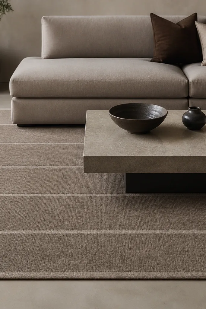
Wide stripes make a neutral rug feel intentional and architectural. The horizontal bands lengthen the room visually, which is a win in living rooms that feel narrow. Taupe keeps it warm, and the slight tonal difference reads soft instead of loud. This works with low-slung furniture, boucle textures, and matte black accents.
Pick a stripe width that’s bold but not thick — you want bands that are about 1-2 inches visually on a full-size rug. Keep your seating legs low so the stripes aren’t interrupted by tall furniture feet. If your coffee table is rectangular, align the stripe direction with the table edges.
If you have tall curtains, keep the stripe direction horizontal so the room doesn’t feel visually “stacked.”
Don’t use a striped rug with stripes that are too perfectly symmetrical if your room has lots of asymmetry — it can look staged.
7. Stone Gray Flat Pile with Hand-Loom Look
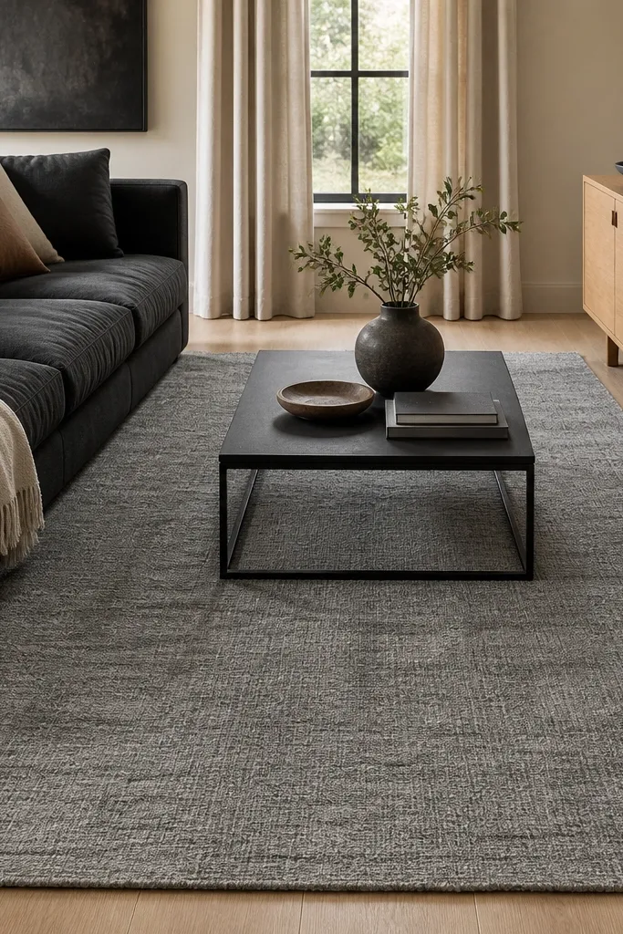
A hand-loom style flat pile gives you that worn-in feel without the mess of a vintage rug. The tonal variation keeps dirt and minor footprints less noticeable. Stone gray is a great neutral when you have dark furniture, because it keeps the room from feeling too heavy. It also pairs well with warm metals and natural linen.
Pro tipTest the rug in daylight and evening light. Some grays shift purple; you want a gray that stays gray.
Choose a flat pile that looks woven, not printed. Aim for a rug pad that grips — in my living room, the wrong pad made the rug shift every time we moved a chair. Keep the rug edges visible around the seating area so it frames the conversation zone.
Watch outAvoid super-smooth synthetic flat rugs; they look shiny and show vacuum scratches.
8. Cream High-Low Pile for a Soft, Plush Step
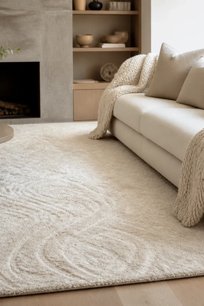
High-low pile is the easiest way to make a neutral rug feel luxurious. You get shadowing when the light hits, so it doesn’t look like a plain sheet on the floor. Cream with high-low texture makes the room feel warmer even if your walls are white. It’s great for living rooms where you want comfort underfoot, not just visual anchoring.
Pro tipRotate the rug every 6-9 months if your seating area gets strong sun. The pile can fade unevenly.
Pick a rug thickness around 3/8 to 1/2 inch so it feels plush but still works with furniture legs. Use a thicker rug pad so the pile doesn’t compress and flatten quickly. Keep the rest of the room simple; high-low pile already adds visual texture.
Watch outAvoid high-low pile in homes with heavy rolling chairs; the pattern can trap wear marks fast.
9. Oyster and Charcoal Abstract Neutral for Busy Households
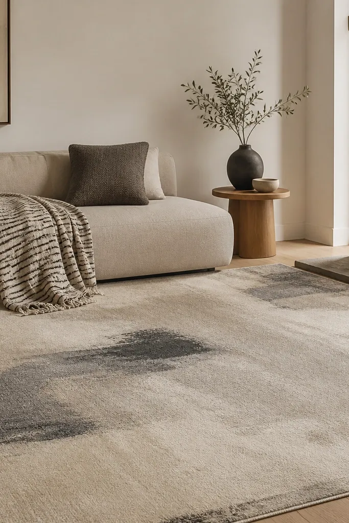
Abstract neutral rugs hide life. If you have kids, pets, or you just cook and track things in, an oyster base with charcoal flecks disguises stains and traffic better than flat solids. The irregular pattern breaks up footprints and makes the rug look intentional even when it’s not perfectly clean. It’s also a good bridge when your furniture spans multiple neutrals.
Pro tipWhen you vacuum, use a suction-only pass first. Then brush the pile lightly to avoid lifting fibers in the flecked areas.
Look for charcoal that’s muted, not jet black. Size it so the abstract shapes don’t get cut off too aggressively at the edges; center the largest shape under the coffee table. Pair with solid cushions and one metal tone like brushed nickel or aged brass to keep the look calm.
Watch outSkip rugs where the contrast is too strong; high-contrast abstracts can feel chaotic in small living rooms.
10. Warm Cream Vintage-Style Medallion with Light Distressing
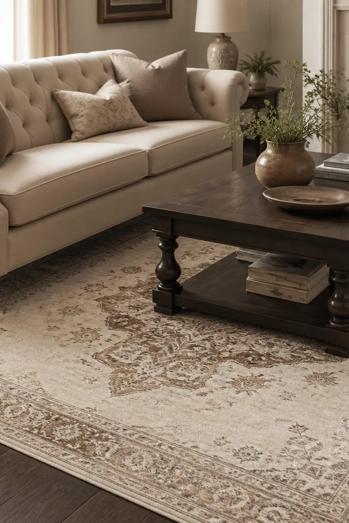
A medallion rug gives you “collected” energy without needing antique furniture. Light distressing makes it look lived-in from day one, which is why it works in modern rooms too. Cream keeps it bright, and the taupe-brown tones match wood and leather easily. This is my pick when the living room feels too new and sterile.
Choose a medallion where the center sits comfortably within the seating zone. For an 8x10, the medallion should land under the coffee table, not above the sofa back. Pair with solid upholstery and keep wall art simple so the medallion isn’t competing.
If you have a patterned curtain, pick the medallion rug with fewer border details to avoid visual overload.
Avoid heavy black distressing; it can read grimy instead of antique.
11. Light Oat Modern Geometric with Thin Lines
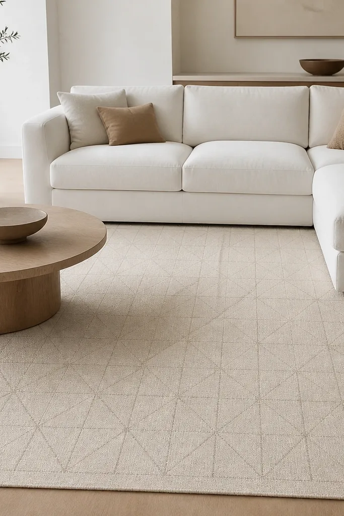
Thin-line geometry looks neat and modern, but it still adds rhythm. The light oat base keeps it neutral and forgiving, and the subtle line color adds dimension without overpowering the furniture. This rug works well when your room has clean-lined furniture and you want a little interest underfoot. It also photographs well because the pattern stays readable without being bold.
Pro tipPlace the rug so the geometric lines align with the longest wall. It makes the room feel straight and calm.
Pick a design with line thickness that stays delicate. If the pattern is too chunky, it will look like a stencil. Make sure the rug size fits the seating area so the geometric repeats feel spaced, not crowded. Use a low-profile pad so the lines don’t blur when you walk.
Watch outDon’t choose a geometric rug with bright off-white that’s colder than your trim; it can look mismatched.
12. Walnut Tone Flatweave for Warm Depth
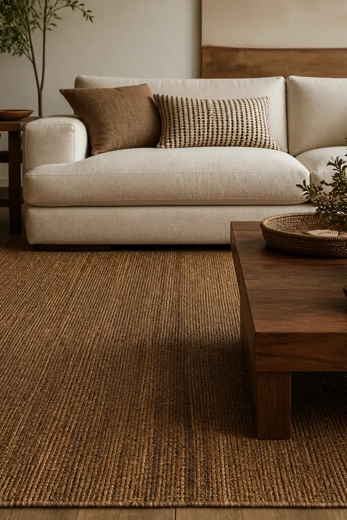
A walnut-toned neutral adds depth without going dark-dark. The natural weave texture makes it feel grounded, especially in rooms with light walls. This is the rug I reach for when your furniture is cream but your floors are too cool — the walnut tone warms everything up. It also works with earthy accessories like terracotta pots and leather throws.
Choose a flatweave that’s not too thick, around 1/4 inch, so it doesn’t fight with low furniture. Pair it with warm white or ivory upholstery, not stark white. Keep your throw pillows in shades of cream, caramel, and muted olive for a cohesive palette.
If your room has brass fixtures, this tone makes brass look richer instead of yellow.
Avoid flatweaves that look almost black; they can swallow a small living room.