
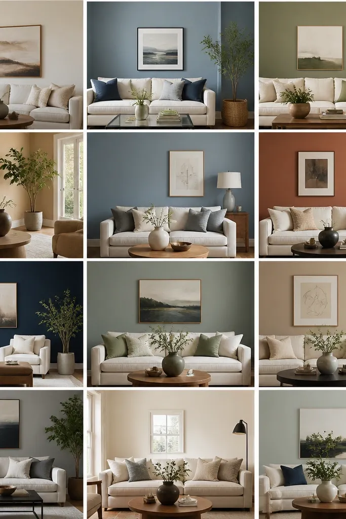
1. Marry Warm Wood With Sanded Clay
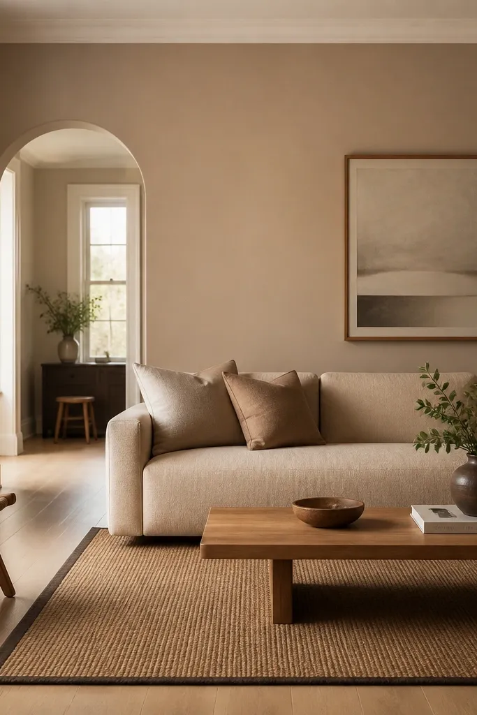
Behr’s warm clay-beige family makes a living room feel grounded without turning into “rental beige.” The color reads like sun-warmed plaster, especially next to oak flooring. Pair it with natural fibers like jute, linen, and cotton so the walls don’t look flat. This is one of the easiest routes to modern cozy because it works with both light and medium wood tones.
Pro tipPaint a 2-foot wide test swatch on the wall beside the sofa and watch it next to the rug during the evening.
Use eggshell on walls for a clean, wipeable finish that still looks soft. Keep trim an off-white (not blue-white) so the wall warmth stays consistent. Add contrast with a rug that has a darker stripe or border and hardware in brushed brass or matte black.
Watch outDon’t pair warm beige walls with bright white trim that has a blue cast.
2. Greige That Doesn't Go Purple
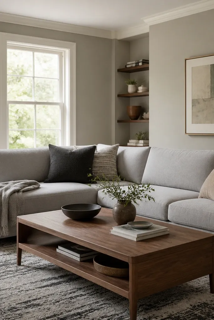
A good greige has to behave in both daylight and lamp light. The right one looks like smooth concrete with a hint of warmth — no lilac shadow at night. It also pairs cleanly with gray upholstery because the wall doesn’t fight the sofa’s undertone. When you want modern without feeling sterile, greige is your workhorse.
Choose a greige that lands closer to taupe than lavender. If your lamps are warm bulbs, test under those too. Style with walnut, black accents, and textiles that have oatmeal or taupe threads so the room looks intentional.
If your greige sample looks slightly purple, swap to one with more beige undertone and repaint the swatch area.
Skip the “cool gray” greige if your room has warm wood floors — it often turns ashy.
3. Creamy White Walls That Still Feel Cozy
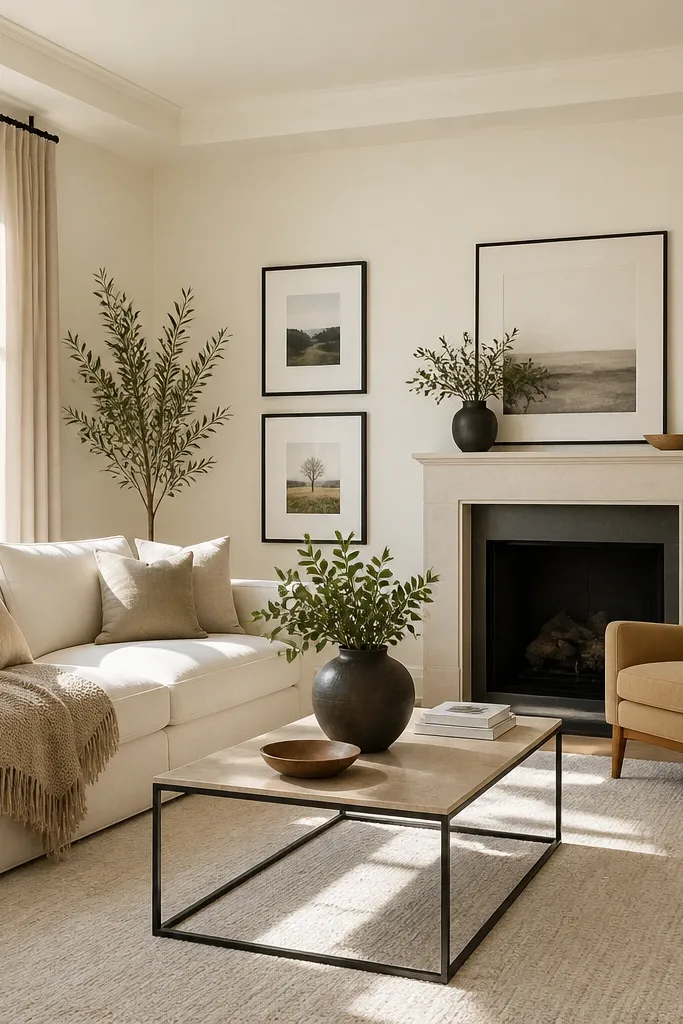
Creamy white is the cozy pick when you want light but hate the sterile look of true white. It gives you contrast for art and keeps the room airy. Under warm bulbs, it stays flattering instead of turning yellow or dingy. This look is especially good if your living room is small or has only one window.
Paint walls in eggshell and keep the ceiling slightly brighter only if you know your existing trim color. Use linen curtains in ecru instead of pure white to keep the warmth. Add depth with a darker rug and black frames so the room doesn’t read flat.
Test creamy whites on a north-facing wall if you have one, because that’s where undertones show up first.
Avoid pure bright white if your floors are warm — it usually makes everything look mismatched.
4. Soft Mushroom for a Mature Cozy Look
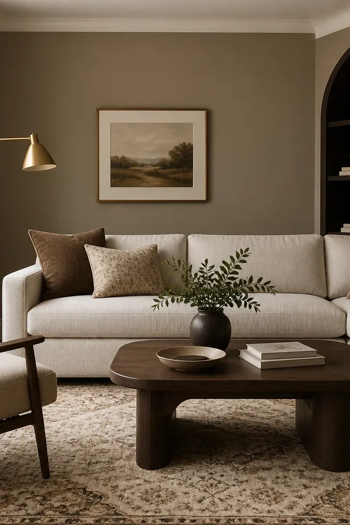
Mushroom taupe feels older-school cozy without looking heavy. It has enough gray to pair with modern black accents, but enough brown to stay warm next to wood. I like it when the room has a mix of materials — velvet chair, wood table, and a knit throw. It’s a color that makes textiles look richer.
Use it on all walls if the room has decent light; if it’s dim, consider painting only the main wall behind the sofa. Pair with oatmeal, camel, and mocha to keep undertones consistent. Add brass or warm metal so the taupe doesn’t go cold.
Hold a white pillow up to the wall in the late afternoon. If it looks slightly warm instead of gray, the color is right.
Don’t pair mushroom taupe with icy blue decor — it clashes fast.
5. Light Greige With a Dark Rug Anchor
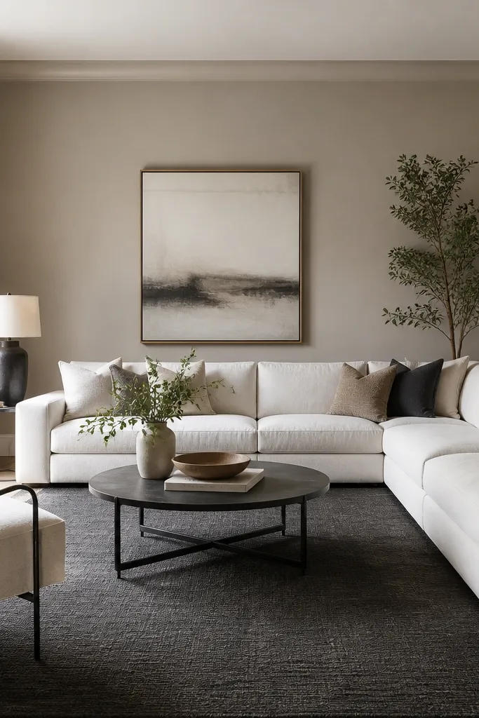
Light greige works when you want a modern, clean base but still need cozy. The wall color stays close enough to white to brighten the room, yet it adds warmth so it doesn’t look like a hallway. The dark rug gives you the contrast that makes the room feel styled. This combo is what I reach for when people want “modern” but their taste leans warm.
Choose a light greige that’s not too gray. Keep pillows in cream and beige, and add one darker texture like a boucle or a wool throw. If your rug is charcoal, match metal accents to black so the room feels pulled together.
Tape painter’s plastic over your sample swatch and compare it against the rug in different lighting. Match the undertone, not just the value.
Don’t choose a light gray wall if your rug is warm brown — it can turn everything muddy.
6. Warm Taupe for Dark Wood Rooms
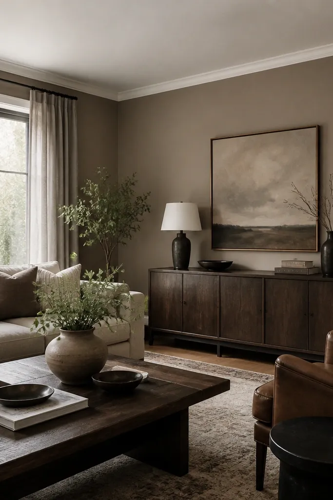
Warm taupe makes dark wood look intentional instead of heavy. It softens the contrast and keeps the room from feeling like a showroom. Leather and walnut look best when the wall has a brown undertone, not a red-orange one. This color is a “set it and forget it” choice when you already own dark furniture.
Paint in eggshell for wipeable everyday living. Pair with warm gray textiles and avoid stark icy whites on pillows. If you have dark floors too, add one lighter element — like a cream rug or pale wood side table.
If you have leather, press a sample against the leather and check it in lamp light. Warm taupe should make the leather look rich, not dull.
Avoid cool-toned gray walls with dark wood — they often make the room feel smaller.
7. Soft Sage for Calm Modern Cozy
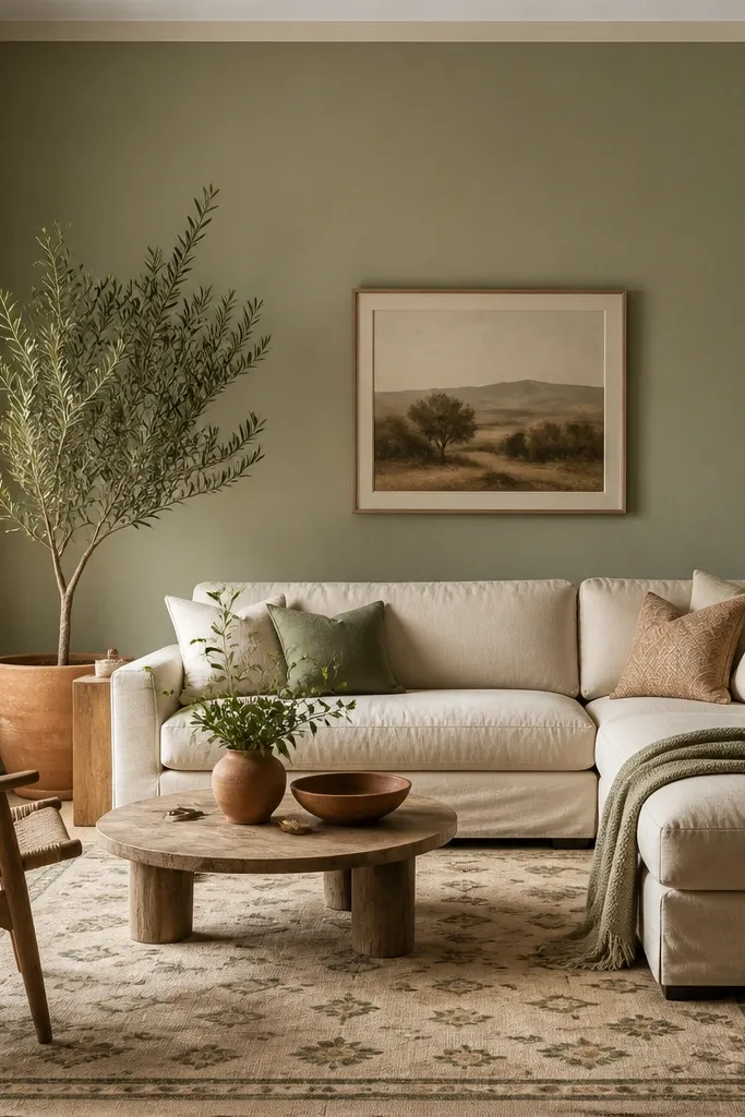
Muted sage is the color that makes a modern cozy room feel lived-in without turning into farmhouse green. It reads like dusty air, especially with natural light. Sage also plays nicely with white trim that has a warm undertone. Add plants and you get a gentle, fresh vibe that still feels cozy.
Pick a sage that’s not too saturated; you want it to look gray-green, not mint. Use linen curtains in off-white and keep decor in terracotta, cream, and dark wood. A flatweave rug with beige and olive threads makes the palette feel grounded.
Test sage on the wall that gets the most sunlight. If it turns too green, go one shade deeper but still muted.
Skip bright mint or highly saturated greens — they look trendy for a week and tiring by month two.
8. Dusty Blue-Gray for Evening Comfort
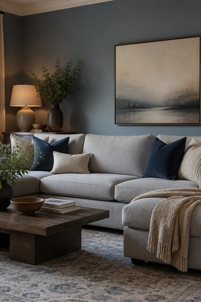
Dusty blue-gray gives you a calm backdrop that still feels warm when lamps are on. It’s the gray that doesn’t look flat because it has enough color to catch light. This is a great pick when you want modern but you’re tired of beige and greige. Blue-gray also makes wood floors look cleaner.
Choose a blue-gray that leans gray, not blue. Pair it with warm whites and avoid stark cool whites in trim. Add navy or charcoal accents through pillows and a rug border so the wall color feels intentional.
Paint a second swatch next to a white wall in your home, then compare them under the same bulb type.
Avoid choosing blue-gray without warm bulbs if your fixtures use cool daylight bulbs — it can look harsh.
9. Warm Putty for a Lived-In Neutral
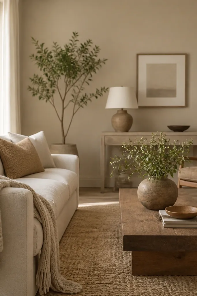
Warm putty is the neutral that looks good even when your decor changes. It sits between beige and taupe, giving you warmth without the yellow cast. When you add texture — boucle, knit throws, woven baskets — the color turns cozy fast. It’s also forgiving if you have a lot of different neutrals in the room.
Use it as your main wall color and keep trim creamy white. Choose decor in cream, oatmeal, and soft brown leather or cognac tones. If you want modern, add one black element like a lamp base or picture frame.
If your room has white built-ins, sample putty near them. You want the built-ins to look creamy, not gray.
Don’t paint putty over walls that still have strong red or orange undertones without priming.
10. Charcoal-Gray Accent Behind the Sofa
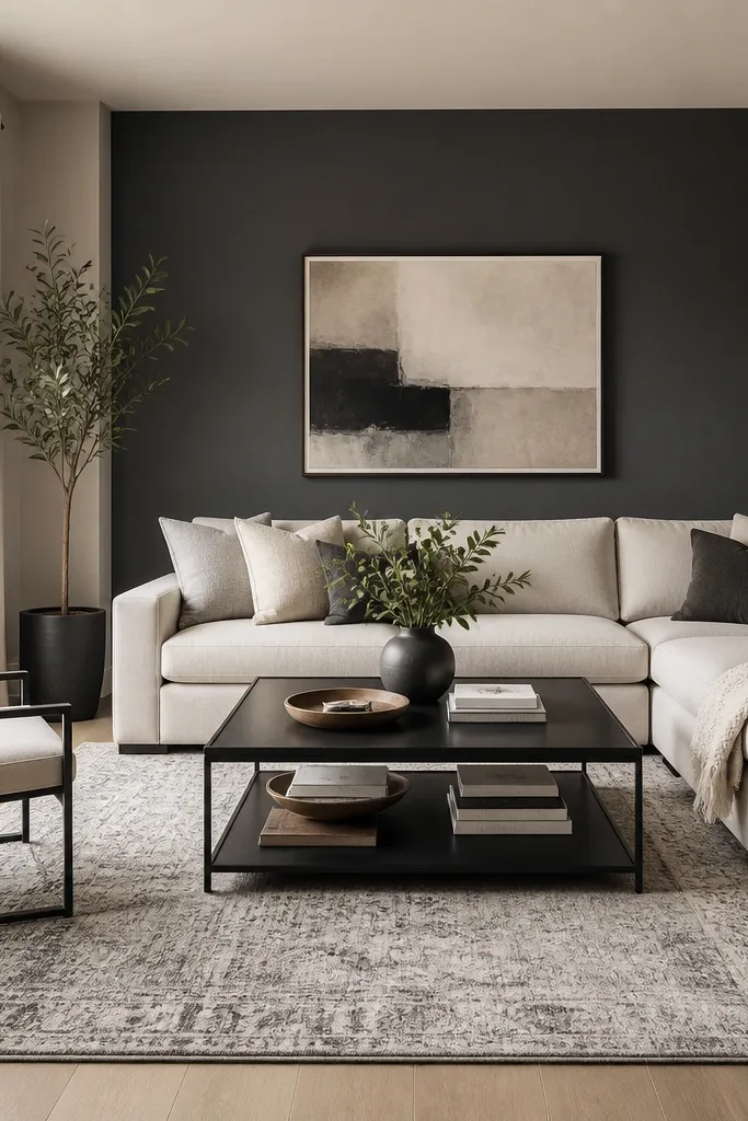
A charcoal accent wall gives you that modern depth without turning the whole room dark. Behind a sofa, it frames the seating and makes art pop. I like charcoal when the room has light floors and bright windows — it keeps the look grounded. You get cozy drama without the “basement” effect.
Pro tipMask carefully with painter’s tape and press the edge with a plastic putty knife to prevent bleeding.
Paint only the wall behind the sofa or the wall with the largest art. Keep surrounding walls a light warm gray or greige so the contrast feels designed. Use satin or eggshell depending on your wall scuffs; satin on an accent wall can look too shiny in some rooms.
Watch outDon’t pick a charcoal that has a blue undertone if your wood furniture is warm — it can look cold.
11. Mocha Brown for a Soft Coffeehouse Feel
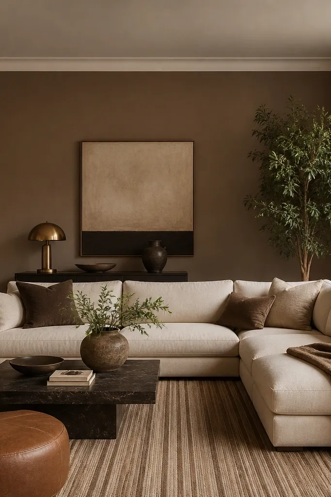
Mocha is for people who want cozy that feels intentional, not beige. It has enough brown to make wood and leather look rich, but it’s muted enough to stay modern. Under warm lighting, it looks like soft coffee foam on a latte. Pair it with creamy upholstery and warm metals for a comfortable, grown-up vibe.
Use mocha on the main walls only if your room has decent daylight or you’ll feel closed in. If your room is small, use it as an accent wall and keep the rest light greige. Choose curtains in cream or light tan and keep patterns subtle.
Put a sample swatch next to a piece of white art paper. If it looks creamy instead of gray, the mocha will feel warm.
Avoid pairing mocha with cool steel-gray decor — it makes the room look off-balance.
12. Warm Light Gray That Reads Like Linen
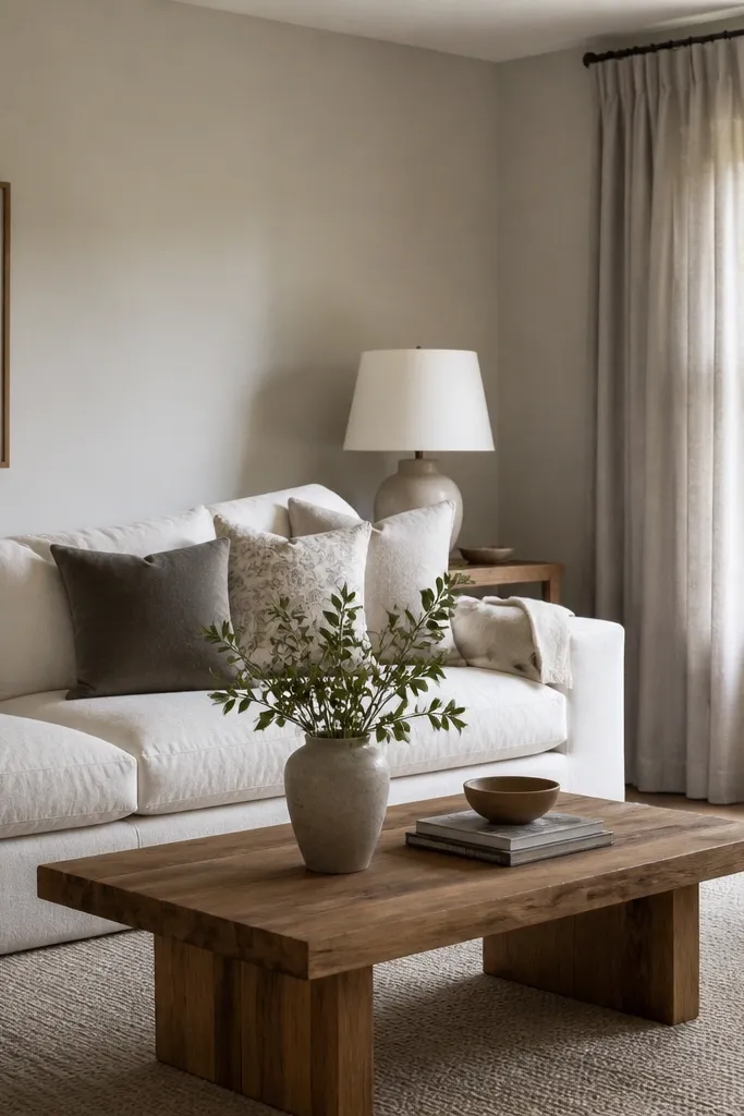
Warm light gray is the “modern cozy” move when you want gray but not cold. It looks like linen fabric: soft, slightly warm, and never too blue. This color makes whites look warmer and gives you a clean backdrop for layered neutrals. If you have a lot of beige and cream decor, this is the gray that won’t clash.
Pick a light gray with beige undertones and keep trim in a warm off-white. Use eggshell for walls so it wipes clean and still looks soft. Add texture through a wool rug or a chunky knit throw so the gray doesn’t look flat.
Hold your phone camera in the room and take a photo at night. If the gray looks bluish, swap to a warmer sample.
Skip light gray with a strong blue undertone — it makes beige decor look dirty.