1. Powder Periwinkle Behind the Bed with Cream Trim

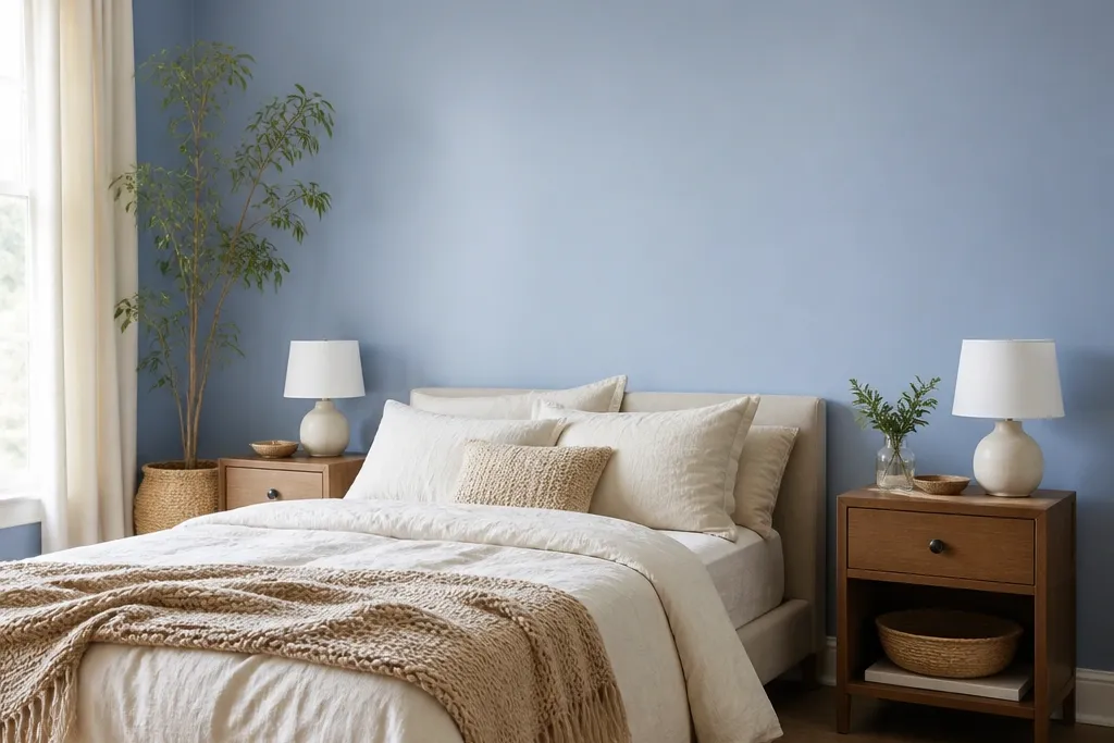
Go for a powdery periwinkle blue when you want “sleepy calm” more than drama. This shade looks soft even in bright rooms, and it makes white bedding feel cleaner without feeling stark. Keep the finish matte and add simple cream trim lines so the blue looks framed, not random. Pair with ivory or cream linens, not bright optical white, because that keeps the blue from looking icy. This idea works best when your bedroom is smaller or you want the color to visually push the room toward cozy instead of heavy.
Start by painting only the wall behind the bed. Use painter’s tape to create a crisp border that’s 2-3 inches wide around the edges, then paint the blue first and let it dry fully. Apply two coats of matte wall paint, then switch to the cream trim color for the border using an angled sash brush. For bedding, choose a duvet cover in linen or linen-blend in cream and add one textured throw in oatmeal. Budget-friendly approach: paint is usually the biggest cost, with trim materials and tape as the rest.
If your paint samples look too gray in the morning, swap to a periwinkle with a hint of purple rather than true blue.
Avoid glossy blue — it reflects lamp glare and can make the room feel sharper at night.
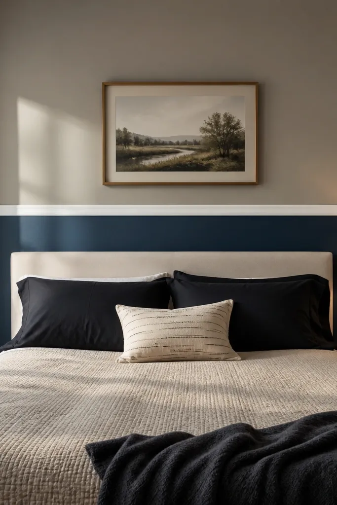
2. Navy Cocoon Wall with Warm White Ceiling Edge
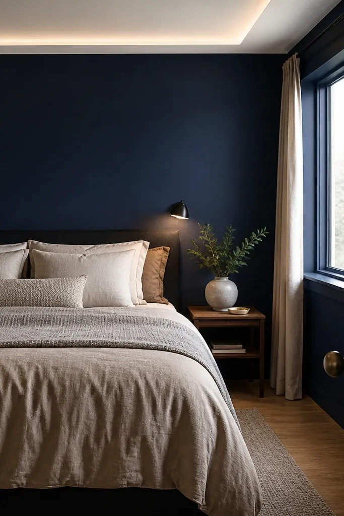
Deep navy is for bedrooms that feel too airy or noisy — it creates a cocoon effect and makes the bed feel grounded. To keep it relaxing (not heavy), lighten the top edge with a warm white ceiling line so the room doesn’t feel like it’s pressing down. Navy looks best with warm neutrals: sand, oatmeal, camel, and wood tones. If your bedroom has a lot of cool metal hardware, switch to brushed brass or aged gold in frames and lamps. This works especially well in larger rooms where a light accent can feel like “nothing happened.”
Pro tipUse a warmer white on the ceiling edge, not pure white, or the navy will look harsher in photos.
Mask a clean 1.5-2 inch warm white band along the ceiling line on the accent wall before you paint the navy. Paint the navy in two coats with matte or eggshell (matte if you can keep it clean, eggshell if you need easier wipe-down). After curing, paint the warm white band and touch up edges with a small foam roller for a smooth finish. Style the bed with a beige or oat duvet and add a textured headboard or fabric pillow covers in boucle or cotton. Keep curtains in a light warm tone so the navy has something gentle to contrast against.
Watch outDon’t pair navy with cool gray bedding — it makes the whole room feel cold.
3. Slate Blue Plaster Look for a Soft, Spa Vibe
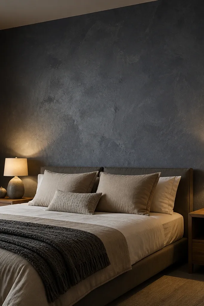
A plaster-look slate blue is the best option when you want blue to feel calm without turning flat or flat-out “painted.” The micro-texture catches light from bedside lamps and reduces harsh reflections, which makes the room feel more like a spa suite. Choose a slate blue with gray undertones so it reads soothing, not saturated. Pair with taupe, cream, and natural fiber textures like jute or sisal in a rug. This is ideal for bedrooms where you want a high-end look but you can’t or don’t want to do paneling.
Use a plaster-look wall product or a faux plaster technique kit designed for walls (not a thin spackle-only approach). Prep the wall by patching holes and sanding smooth, then apply a base coat in a very light gray-blue tone. Apply the plaster-look layer with a trowel, working in small sections; scrape lightly for a soft, uneven surface. Let it dry, then seal it if the product calls for sealing. Finally, style with a neutral duvet and textured pillows so the wall texture becomes the hero instead of competing patterns.
Keep the rest of the room matte and fabric-heavy: linen bedding, matte black frames, and a textured rug make the wall look intentional.
Skip high-contrast wall art right away — the texture plus strong art can make the scene busy.
4. Light Blue Vertical Paneling for Tall, Resting Lines
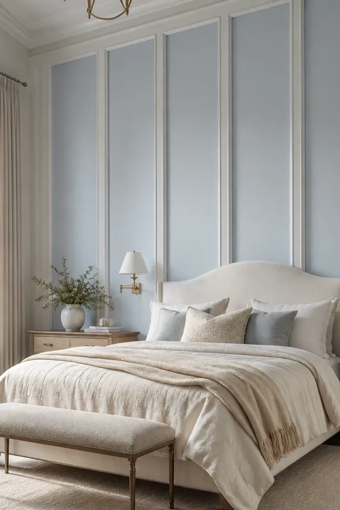
Vertical paneling makes a bedroom feel taller and calmer because your eye travels up and down instead of across. Paint the panels a light, airy blue and keep the trim crisp white so the lines read clean. This is a smart pick if your room has a low ceiling or if the wall behind your bed feels too plain. The panel texture adds depth without needing a mural. When you pair it with simple bedding — solid duvet, minimal pattern — the whole setup reads relaxing and organized.
Pro tipAdd one matching blue pillow cover in the same paint tone to tie the panel wall to the bedding.
Plan the panel spacing first: for most bedrooms, aim for panels about 8-12 inches wide with 1-2 inch trim rails. Install thin MDF or wood panel strips using construction adhesive and small finishing nails, then fill seams and sand. Prime thoroughly, then paint the panels in your chosen light blue with a matte finish. Paint trim rails and edges in a bright warm white. Finish by placing a headboard that sits close to the wall so the panel lines look continuous behind the bed.
Watch outDon’t choose a saturated sky blue — it can feel energetic instead of restful.
5. Two-Tone Blue Half-Wall with a Soft White Top
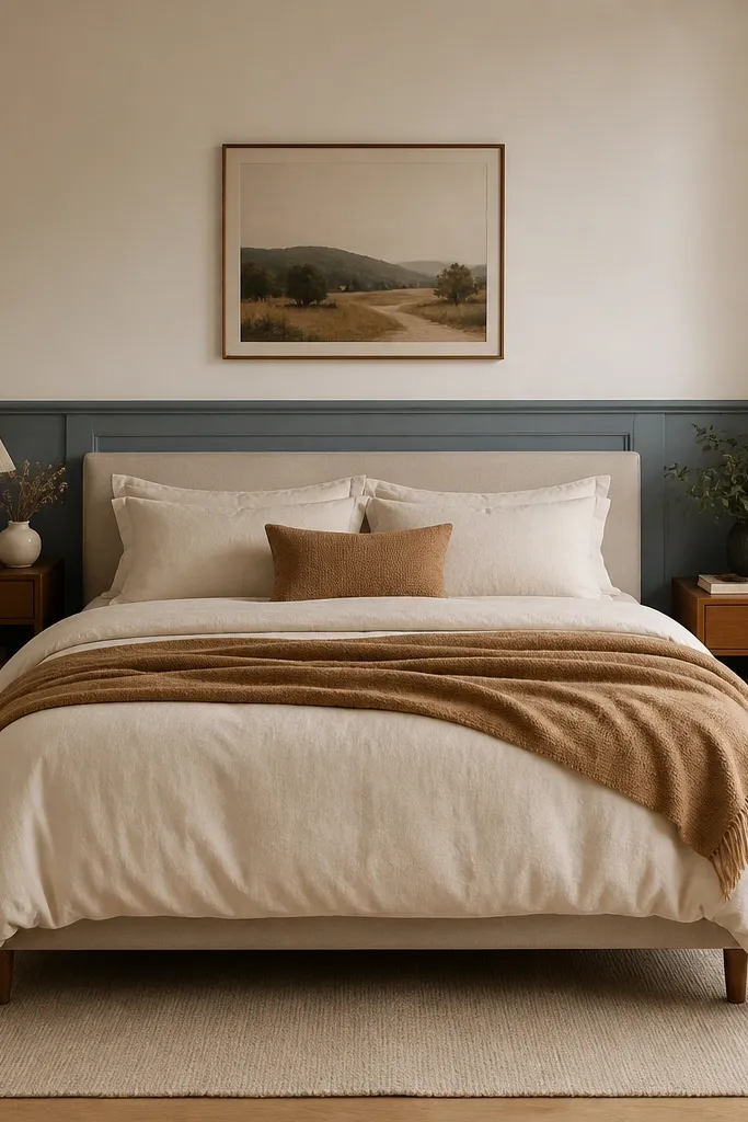
A two-tone half-wall gives you the calming benefit of blue with extra visual structure, which helps bedrooms look finished. The trick is keeping the top section a soft white, not a bright one, so the blue feels like a gentle base rather than a block. This is especially flattering in rooms with wainscoting or where you want to hide uneven wall sections. It also makes the bed feel centered because the visual break lands around eye level. Choose a muted blue for the lower half to keep it soothing.
Pro tipPick your blue and white from the same paint family so the undertones match under warm lamps.
Measure the wall height and decide where the break should land: 36-48 inches from the floor is a common range, but match it to your bed height for a balanced look. Mask a straight line using a laser level or a long spirit level. Paint the bottom section in matte muted blue, let it dry, then tape off and paint the top section in soft white. Add a thin trim rail at the break if your wall doesn’t already have one. Style with cream bedding and a rug that has both blue and neutral tones to unify the palette.
Watch outAvoid a harsh line without trim — it looks DIY instead of designed.
6. Cerulean Gradient from Dark to Light

A gradient makes blue feel dynamic but still relaxing, because it creates a smooth shift rather than a hard color block. Keep the gradient subtle: darker at the bottom, lighter near the ceiling. That placement makes the room feel taller and calmer when you’re in bed. Cerulean works well when you want “fresh” instead of “heavy,” and it looks great with white bedding and light wood furniture. Use this idea when your bedroom has decent natural light and you want something more interesting than flat paint.
Pro tipUse a matte finish and blend in one direction to avoid streaks that catch lamp light.
Start by choosing three paint samples in the same blue family: one dark, one mid, one light. Paint the wall base with the mid tone, then roll the dark tone about 12-18 inches up from the floor. Blend upward using a wide brush or a foam roller while the paint is still wet, then finish with the light tone near the ceiling edge. Let it dry completely, then touch up any uneven transitions with a dry brush technique. Keep the bedding simple so the gradient stays the hero.
Watch outDon’t go high-contrast — a dramatic gradient reads more like decor than calm.
7. Blue Botanical Mural with Negative Space
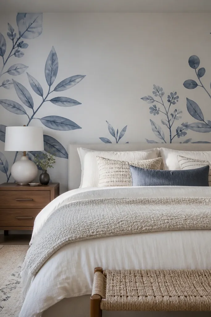
If you want relaxing but still want personality, choose a blue botanical mural that leaves plenty of white space. The negative space keeps the wall from feeling busy and helps the room feel airy. Look for botanical art in soft blues (sage-blue, muted indigo, dusty periwinkle) rather than deep saturated navy with black outlines. This works best behind the bed because the mural becomes a calm “view” when you’re lying down. Pair with solid bedding in warm white so the mural doesn’t compete with patterns.
Measure your bed width and aim for the mural to cover about 70-85% of the wall behind the bed. Choose either peel-and-stick mural panels or paint-your-own stencil kit; for a clean look, panels are easier if your wall is flat. If painting, use a projector grid or light pencil marks to position the main stems so they align with the center of the bed. Keep the mural centered and level at eye height — the top should sit below the ceiling trim. Style with white or cream duvet, then add one small blue accent pillow to echo the mural tones.
Choose a mural with lighter outlines or no outlines — it reads softer and more restful in the evening.
Avoid full-coverage murals that turn the whole wall into a pattern wall.
8. Dusty Indigo with Linen Headboard for a Cozy Night Mode
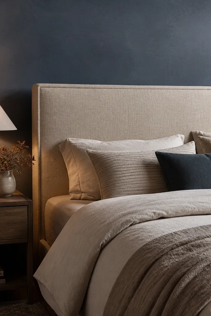
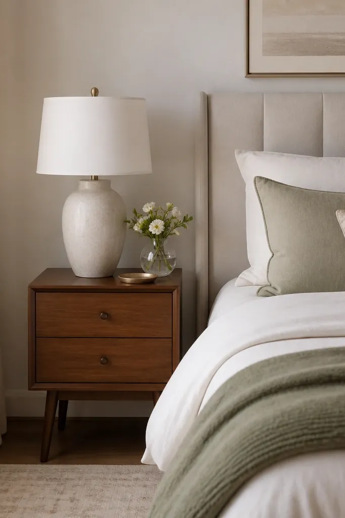
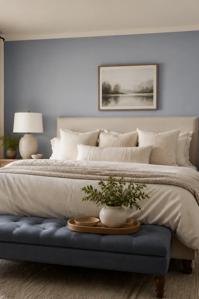
Dusty indigo is a relaxing middle ground — deeper than periwinkle, softer than navy. It looks best when you pair it with linen textures because the wall color and fabric both have a muted, natural feel. A tall linen headboard makes the wall feel intentional and keeps the color from feeling like “paint only.” This is a great option for bedrooms that have darker furniture or a lot of browns, because indigo plays well with warm woods. If your room gets evening-only light, this combo looks especially cozy.
Paint the accent wall in matte dusty indigo using two coats for even coverage. If your wall has a strong undertone (yellowish or patchy), prime first so the blue doesn’t go blotchy. Add a tall linen headboard that sits 1-3 inches from the wall and covers the lower portion of the accent wall. Choose bedding in oatmeal or sand and add pillows in linen and one in a muted blue fabric. Finish with warm lighting — bedside lamps with warm bulbs make the indigo feel calmer.
Match the headboard fabric undertone to the wall — go either all warm beige linen or all cool gray-linen, not mixed.
Avoid shiny satin bedding with indigo — it reflects and makes the wall feel harsher.
9. Blue and White Checkerboard Accent with Softened Colors
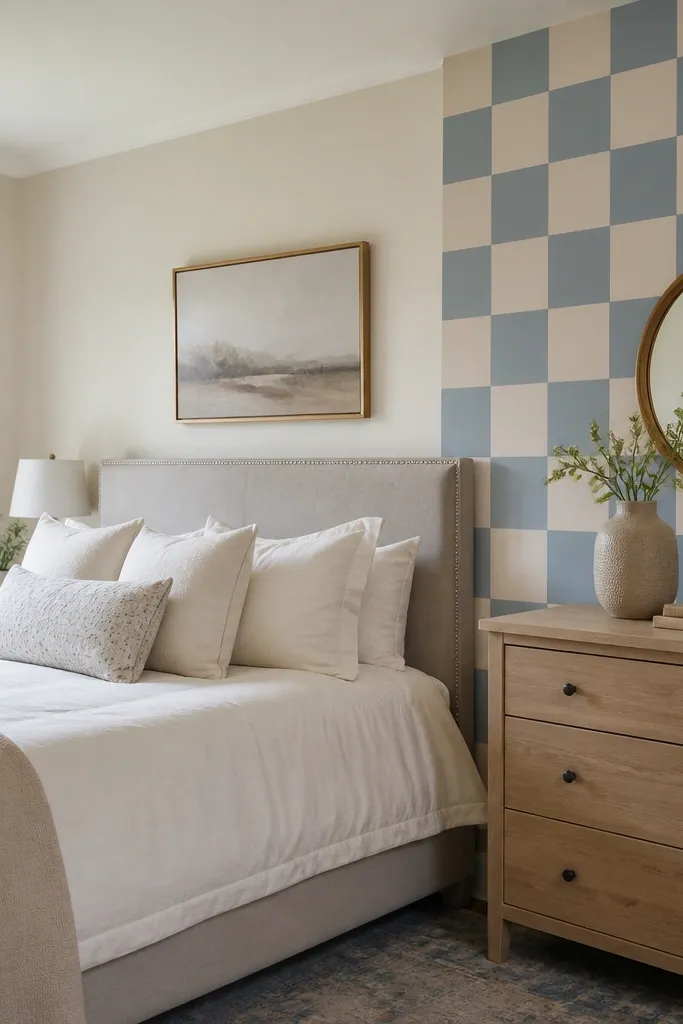
A checkerboard accent can look surprisingly relaxing when the colors are softened and the pattern scale is right. Use muted blue and warm white, not bright primary blue, and keep the squares medium-sized so it doesn’t read childish. This idea works well in kids' or guest rooms where you want personality but still want a calm palette. It’s also photogenic because the pattern creates structure behind the bed. Keep bedding mostly solid to let the wall do the talking without turning the room into a visual scramble.
Tape a grid on the wall before you paint. Choose square sizes around 6-8 inches wide for most bedrooms; smaller can look busy, larger can dominate. Use a level and measure twice so the pattern lines up with the bed center and doesn’t drift. Paint the base color first, then tape off alternate squares for the second color. Remove tape carefully while paint is slightly tacky for crisp edges. Choose a duvet in warm white with a blue throw pillow to echo the wall without adding more patterns.
Use matte paint for both colors so the checkerboard looks soft, not glossy and loud.
Don’t mix two blues that are too different in temperature — warm-cool clashes make the pattern feel restless.
10. Monochrome Blue Wallpaper Panels Around the Bed
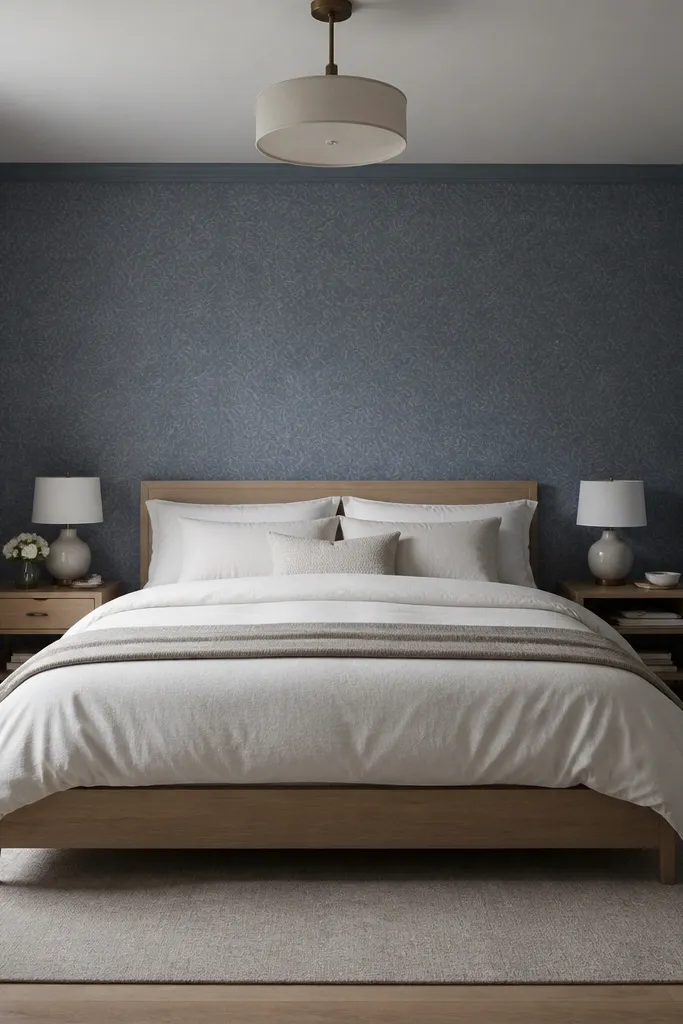
Wallpaper panels can look calmer than full-wall wallpaper if you keep it monochrome and controlled. Pick a blue wallpaper with subtle texture or faint pattern, then wrap it around the bed wall and possibly 12-18 inches onto the adjacent walls. The monochrome keeps the bedroom relaxing while the texture adds depth in photos. This is a good move if your walls have slight imperfections — wallpaper hides them better than paint. Keep the rest of the room simple: solid linens, minimal framed art, and warm wood furniture.
Measure the bed wall width and cut wallpaper panels so seams land where the eye won’t focus — usually near corners or centered beneath the bed’s sides. Apply wallpaper paste or use peel-and-stick if your wall is smooth and clean. Use a level to start the first strip straight, then align subsequent strips carefully. Trim edges with a sharp utility knife and smoothing tool. After it’s installed, add a simple frame gallery in warm white or wood to avoid competing with the subtle pattern.
Choose wallpaper with a matte surface — it blends better with lamp lighting at night.
Avoid high-contrast wallpaper patterns — they can make the bedroom feel busy instead of calm.
11. Blue Ombre Wallpaper Top-to-Bottom Soft Fade
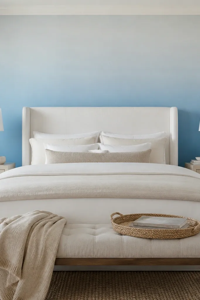
Ombre wallpaper gives you the gradient effect without the messy blending, and it looks extra smooth behind the bed. For a relaxing atmosphere, choose an ombre that fades gently from darker to lighter in one direction, ideally with the lightest part closer to the ceiling or upper wall. This helps the room feel airy while still giving you a strong design moment. Pair it with white or cream bedding and a warm-toned rug so the wall becomes the calm center of the room. If your bedroom gets uneven lighting, ombre also helps hide small wall imperfections.
Pick an ombre wallpaper roll that matches your wall height; most bedrooms need 1.5-3 rolls depending on the pattern repeat. Prep the wall by cleaning and patching, then mark a vertical guide line so the pattern starts straight. Apply strips from top to bottom, smoothing from the center outward to avoid bubbles. Trim at ceiling and baseboard edges with a sharp blade. Finish with a simple headboard that covers the wall’s lower area so the fade feels intentional behind you.
Match your bedding color to the lightest ombre tone for a cohesive, restful palette.
Avoid ombre that fades in the wrong direction — if the darkest part sits near the ceiling, it can feel heavy.
12. Powder Blue Shiplap Accent with Warm White Ceiling
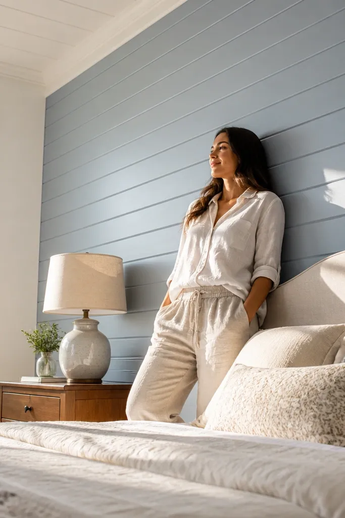
Shiplap adds horizontal texture, which softens the look of blue and makes the wall feel more grounded. Powder blue shiplap reads cozy and cottage-clean, especially when you keep the ceiling and trim warm white. This is a great option if your bedroom has wooden furniture or you want a more tactile, lived-in feel. The texture helps the wall look good from multiple angles, so photos don’t look like a flat paint job. Keep bedding in cream and add one natural fiber layer like a woven throw.
Pro tipUse a small roller for paint on shiplap ridges so coverage is even and you don’t get patchy shadows.
Measure the wall behind the bed and calculate shiplap coverage, including an extra 10% for cuts. Install shiplap boards over studs or existing backing, starting level at the bottom. Fill nail holes with wood filler, sand smooth, then prime. Paint two coats in matte powder blue, then paint trim and ceiling band warm white. Style with cream duvet and a woven rug in jute or natural wool for warmth.
Watch outDon’t skip priming — blue over raw wood can turn uneven and streaky.
13. Blue Velvet or Fabric Panel Accent for True Bedside Calm
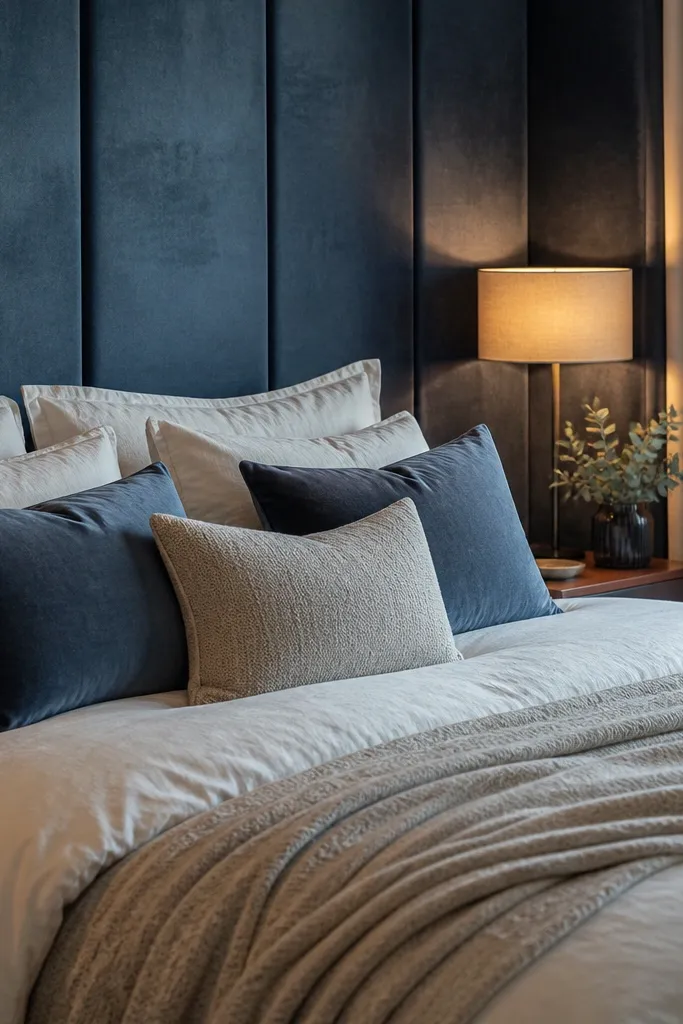
A fabric panel wall turns blue into a sensory color. Velvet or thick upholstered panels absorb light, which makes the bedroom feel quieter and more relaxing than paint. Choose a muted blue like dusty sapphire or smoky blue rather than bright electric blue. This idea works best when your bed has a clean, modern frame so the fabric texture becomes the focal point. It’s also excellent for bedrooms where you want a calmer sound feel, because soft surfaces reduce echo compared to bare walls.
Pro tipIf you want it to look luxe in photos, choose a fabric with short pile (velvet) instead of a thin curtain fabric.
Pick a panel system or DIY fabric panels: MDF backing with fabric stretched tight works well. Cut panels to fit the wall behind the bed, usually in 24-36 inch wide sections so seams are controlled. Attach the panels to the wall with screws and anchors, then stretch fabric over each panel and staple the edges on the back. Cover the seams with matching trim or a thin welt cord. Finish by adding a simple duvet in cream and pillows in coordinating blue and neutral tones.
Watch outDon’t choose a bright, glossy satin fabric — it reflects light and can feel sharp.
14. Soft Blue Color-Blocked Wall with an Oversized Arched Frame

Color blocking gives you a relaxing blue wall that still feels designed, especially when you add an oversized arched frame shape. Use two adjacent blue tones: a lighter blue for the main field and a slightly deeper blue for the arch panel behind or above the bed. This creates a calm focal point without needing a full mural. The arched shape feels softer than sharp rectangles, which helps bedrooms feel less “construction” and more cozy. Pair with off-white bedding and a warm wood bed frame for balance.
Tape out the main rectangle first and paint the lighter blue across the accent wall in matte. Then create an arch template using cardboard and tape; trace and tape the deeper blue arch area. Paint the deeper blue inside the arch, remove tape for clean lines, and touch up edges with a small angled brush. If you want it extra polished, add a thin trim border around the arch using a pre-primed trim strip. Style with a large arched mirror or framed art that matches the arch shape so the wall feels cohesive.
Keep the deeper blue arch tone within 1-2 steps of darkness from the main blue so it stays soothing, not dramatic.
Avoid three-tone color blocks — they start to look like a craft project instead of a relaxing bedroom.