1. Geometric painter's tape panel in 3 colors
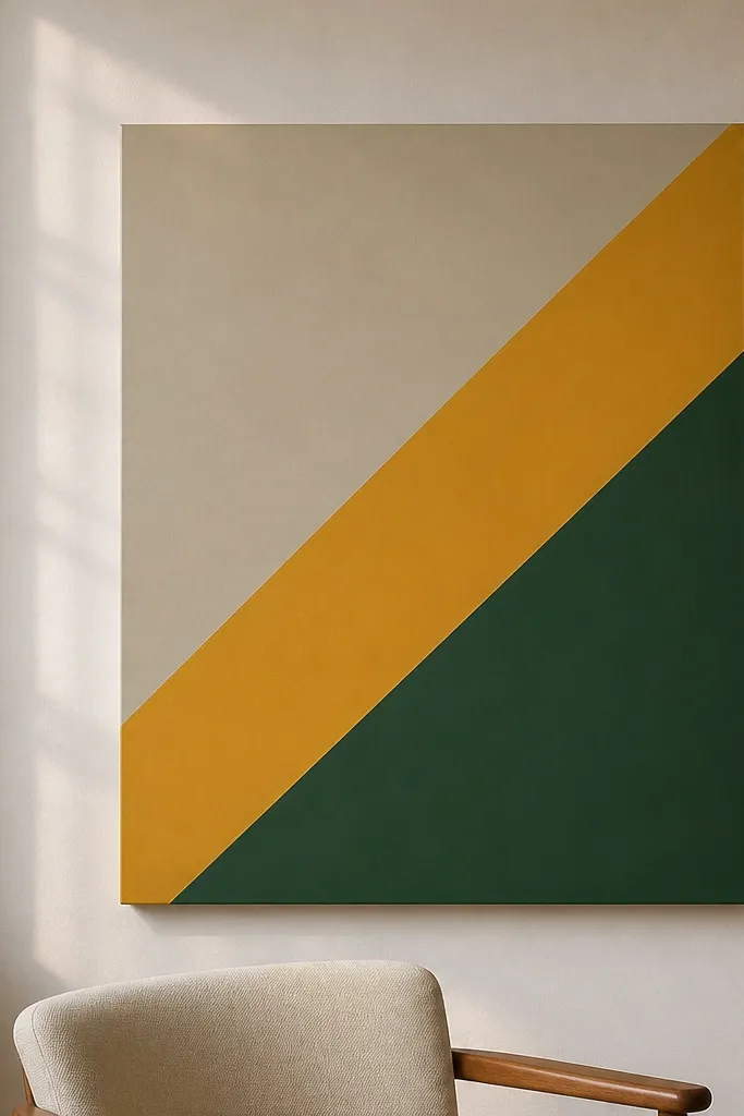
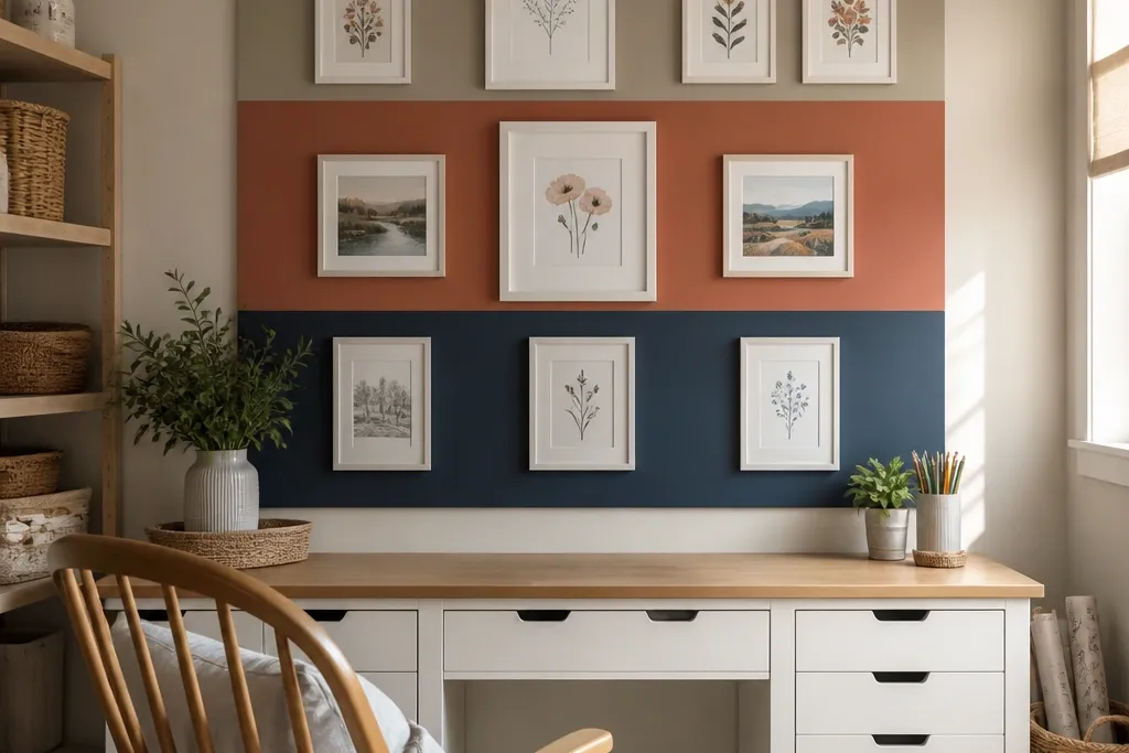
This is the fastest way to make a craft room wall look designed without buying a bunch of decor. Use a plain MDF board or foam board at least 24x36 inches, then paint three colors with matte finish — one warm neutral and two stronger tones. Painter’s tape creates crisp borders that read clean in photos, even when you’re using a budget paint set. Place it centered above your desk so the shapes align with your work surface and feel intentional instead of random.
Cut your panel to 24x36 inches, then sand lightly and wipe with a damp cloth so paint sticks. Tape a simple layout: pick one big shape (like a diagonal or block), add two medium shapes, then fill the rest with thin stripes. Paint in this order: base coat first, then the strongest color, then the third color. Remove tape while the last coat is still slightly tacky to keep edges sharp.
Pro tipUse a small foam roller for the big areas and a fine angled brush for the tape borders.
Watch outDon’t use glossy paint — it shows brush marks and tape bleed.
2. Fabric-wrapped foam board banner with stitched edges
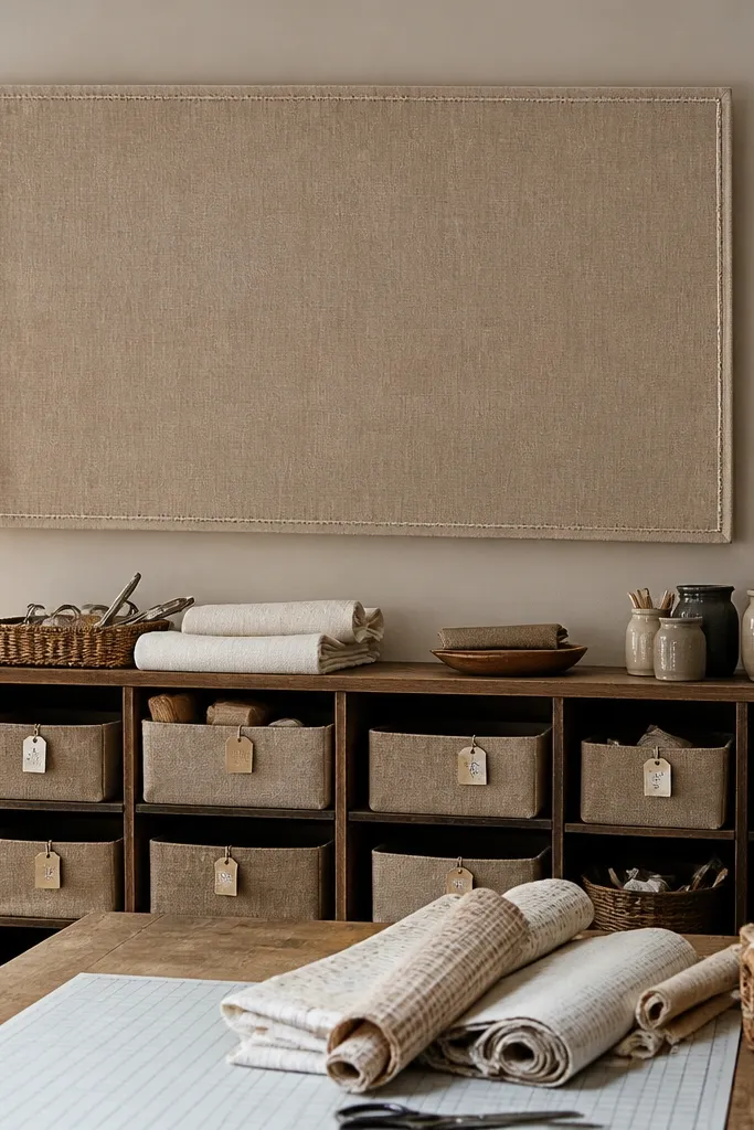
Fabric looks expensive when it’s stretched tight and framed by a clean edge. Wrap a foam board with a heavier cotton or linen-look fabric, then sew a simple stitched border using contrasting thread. Choose one solid fabric and one thread color so the piece looks graphic, not craft-project messy. Hang it horizontally above shelving or vertically beside a pegboard so it breaks up the hard lines of organizers.
Cut foam board to 12x24 inches or 16x24 inches. Wrap fabric on the back with spray adhesive or glue, pulling tight so there are no wrinkles, then trim flush. Stitch a straight border along the front edge using a sewing machine or hand stitch with even spacing. Add a simple hanging method: two picture hooks on the back at about 2-3 inches down from the top.
Press the fabric with a warm iron before wrapping so you don’t lock in creases.
Skip thin quilting cotton — it sags and makes the edges look uneven.
3. Corkboard frame with scroll saw-style cutouts
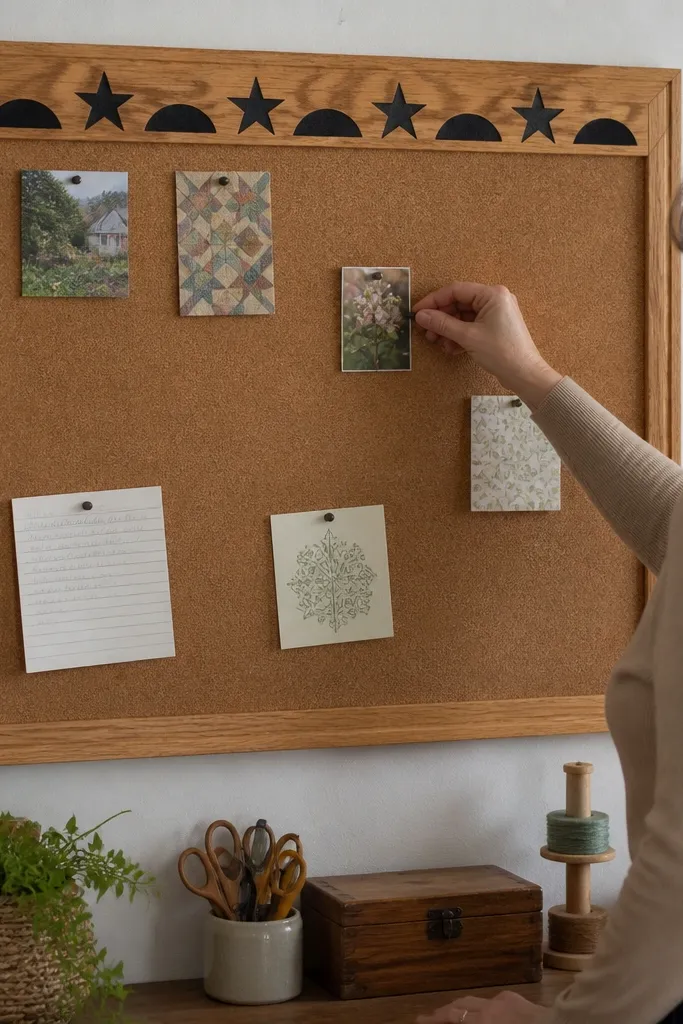
A corkboard is practical, but it looks plain when it’s just a flat sheet. Upgrade it by adding a frame and a row of decorative cutouts along the top edge — even simple scroll-saw shapes look great. Use warm wood or matte black paint for the frame so it matches hardware and tool accents. This works best on the wall next to your main desk, where you pin patterns, color swatches, and deadlines without losing visual style.
Buy a cork sheet and cut it to fit a frame opening, or mount cork to a backing board first. Build a frame from 1x2 trim or thin wood strips, then paint it matte. Cut a top row of 3-5 identical shapes from thin plywood or craft wood and glue them on after painting. Mount the cork panel with sturdy picture wire or French cleats.
Pro tipUse white or cream push pins if you want it to look neat in photos.
4. Mirror + paper collage mood board in a shadow box
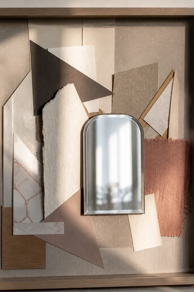
If your craft room wall looks empty, a shadow box collage adds personality without taking over the whole wall. Layer heavyweight paper, fabric scraps, and thin cardstock shapes on a backing board, then place a small mirror off-center so it reflects light. The mirror makes the piece look more expensive and gives you that bright “studio” feel. Keep the palette tight — two colors plus one neutral — so it reads clean instead of busy.
Use a pre-made shadow box frame (8x10 or 11x14) with glass. Cut a backing board from cardstock or thin wood and glue your paper layers in a staggered pattern, leaving some negative space. Add the mirror piece at an angle using mounting dots so it catches light. Seal edges with a light dusting of clear adhesive spray and hang with the frame’s hardware.
Pro tipChoose paper with different textures (matte, linen-look, and a subtle shimmer) so it photographs well.
Watch outDon’t use thin copy paper — it wrinkles and looks cheap behind glass.
5. Pegboard grid with color-coded tool labels
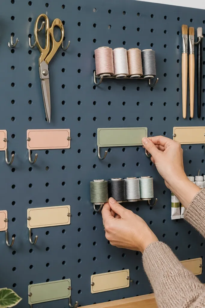
Pegboard is practical, but it becomes art when the layout is strict and the labels look designed. Paint the pegboard the same color as your frame accents, then add hooks in a regular grid pattern. Use small label cards with a single font style and color-code by category: sewing, painting, paper crafts. This looks sharp in a craft room because it turns a functional wall into something orderly and photo-ready.
Mount a pegboard panel sized 24x36 inches or 36x48 inches. Paint it matte if needed and let it cure fully. Mark your hole spacing and place hooks first, then add label cards on small clip-on holders or paper sleeves behind acrylic tabs. Keep labels consistent: same width, same alignment, and a maximum of 2 lines per label.
Pro tipUse painter’s tape to map label positions before you place anything permanent.
Watch outDon’t mix random hook sizes — uneven spacing is what makes it look messy.
6. Staggered floating shelves with framed swatches
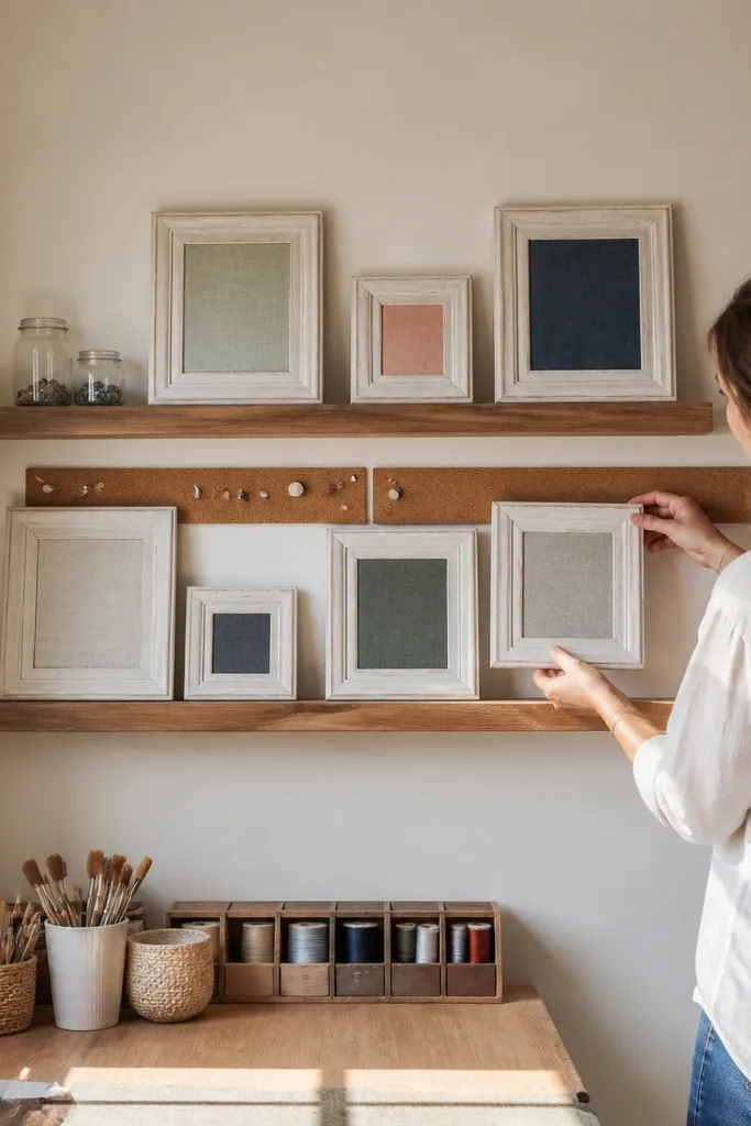
This idea gives you wall decor that also helps you work. Floating shelves look clean, and framing swatches makes your supplies look intentional instead of scattered. Use a set of small frames in one finish, filled with fabric squares, paint chips, or patterned paper. The staggered heights create movement without clutter, especially when you keep everything within the same color family.
Install two floating shelves: one about 10-12 inches deep and the other slightly shorter, placed so the frames sit at eye level. Use 4-6 small frames (8x10 or smaller) and fill them with swatches cut to fit — press fabric flat first. Arrange frames by color gradient or by material type, then place a few small objects on the shelf edges, not in the middle. Anchor shelves with wall studs and level everything before you tighten the final screws.
Pick one frame finish and repeat it across all pieces so the wall reads cohesive.
Avoid crowding — keep at least 1 inch of breathing room between frames.
7. Large fabric wall hanging with a dowel rod
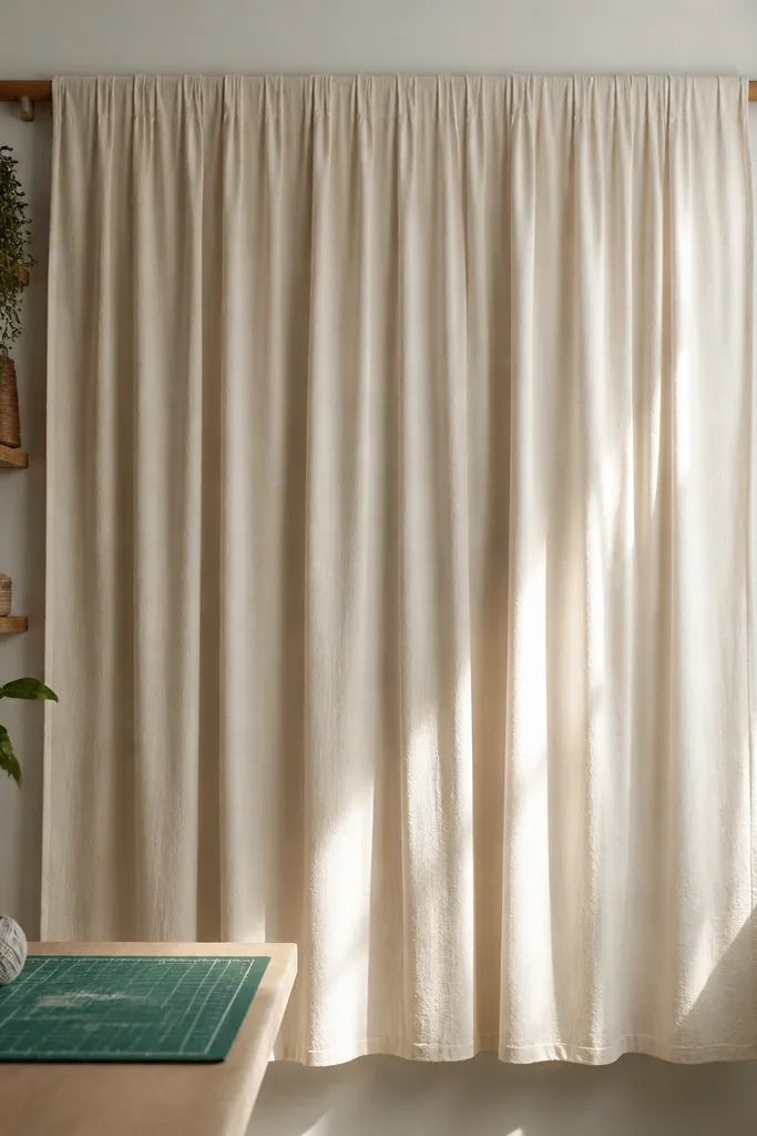
A big fabric wall hanging instantly softens a craft room and looks good from every angle. Use a lightweight but structured fabric like cotton gauze or linen-blend, then hem the sides so it drapes evenly. Add a simple wooden dowel at the top, and gather the fabric in controlled folds so it doesn’t look like a bedsheet. This works especially well on a wall that has lots of hard surfaces like shelves and pegboards.
Cut fabric to 36-48 inches wide and 28-36 inches tall. Hem the sides and create a top pocket for the dowel rod. Insert the dowel and secure the fabric with evenly spaced tacks or fabric ties so folds stay consistent. Hang with two sturdy brackets so the dowel sits level and the fabric doesn’t twist.
Pro tipChoose one bold pattern and one neutral — keep the rest of the room simple so the hanging becomes the focal point.
Watch outDon’t use stretchy knits — they curl and fight the dowel.
8. Painted shadow box with mini paper-cut landscape shapes
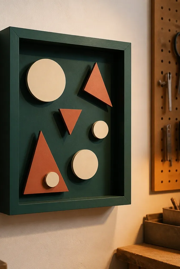
This is a clean way to get depth on a budget. Paint the shadow box backing in a solid color, then layer paper cutouts at different heights using foam adhesive squares. The result looks like a designer piece because the layers catch light and create real shadow. Keep your shapes simple: circles, triangles, and a single curved “path” shape so it looks intentional rather than chaotic.
Pick a shadow box size like 11x14 or 12x12 with depth. Paint the backing matte and let it dry fully. Cut 5-8 shapes from cardstock, then place them from back to front using foam squares to create 1/4-1/2 inch depth. Seal the top edges and hang with the frame’s hardware.
Pro tipUse one color for most shapes and one accent color for just 1-2 pieces to guide the eye.
Watch outDon’t glue layers flat — you need the shadow gap for the photogenic look.
9. Washed-wood letterpress wall art using thrift frames
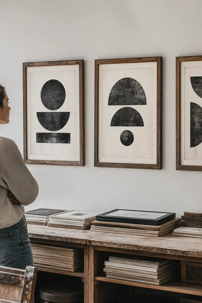
Typography wall art looks sharp in craft rooms because it’s clean and doesn’t compete with supplies. The budget trick is to use thrift frames, paint them white or warm wood, and insert prints made from your own cut-and-print templates. Letterpress-style text — even if it’s just a faux effect — looks cohesive when all pieces share the same font and spacing rules. Put a 2-3 frame set above a desk or along a narrow wall to create a “studio signage” vibe.
Scour for identical thrift frames or buy a set with the same frame depth. Paint them with matte white or a warm wood tone and replace the original art with your own printed typography. Keep the text size consistent: for example, one line at 72-90 pt, one line at 36-48 pt. Hang in a straight line with equal spacing of about 2-3 inches between frames.
Pro tipUse off-white paper inside the frames so the typography feels softer than bright white.
Watch outDon’t mix fonts across the set — it ruins the cohesive look.
10. Tile-style mosaic wall using peel-and-stick vinyl
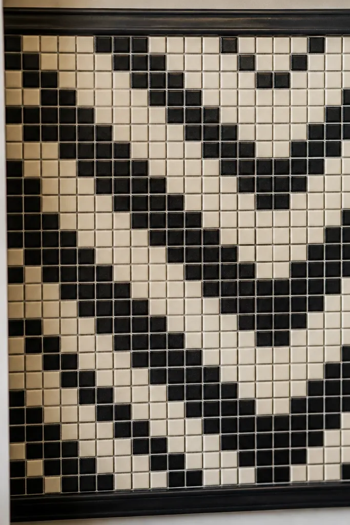
Small tiles look expensive, and peel-and-stick vinyl is the budget path. Create a tile mosaic pattern on one section of wall, then frame the edges with a thin trim strip so it looks built-in. Use a pattern with simple geometry like small black and cream squares or a subtle chevron so it reads clean under indoor lighting. This works well behind a craft chair or along the side of a workspace where you want visual interest without hanging more objects.
Measure a square area like 24x24 inches or 24x30 inches and plan your tile count based on the vinyl sheet size. Clean the wall thoroughly and let it dry. Apply tiles in rows, using a straightedge and painter’s tape guide so grout lines look straight. Add thin border trim on top after the vinyl sets so the edges look finished.
Pro tipPick vinyl with a matte finish so the pattern doesn’t glare under overhead lights.
Watch outSkip applying to dusty walls — bubbles show up fast.
11. Rope + dowel hanging with framed mini art clips
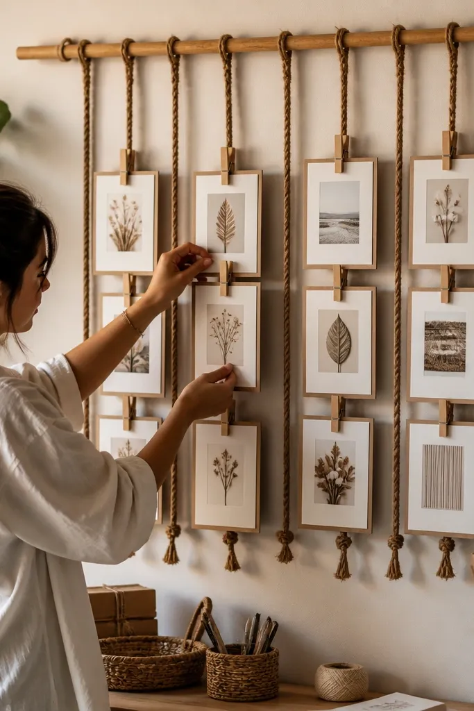
This gives you a “creative wall” look without permanent clutter. A dowel at the top keeps the frames aligned, while rope adds texture that looks good next to baskets and wood shelves. Use small frames or mini art cards clipped in matching clothespins so everything looks uniform. It’s great for rotating seasonal prints, new sketches, or fabric swatches you want to show off instead of hiding in a folder.
Mount two wall anchors and run rope to a wooden dowel, keeping the dowel about 3-6 inches below your target hang height. Use small frames that are light enough to clip without sagging, or use cardstock art cards in clear acrylic sleeves. Clip 6-10 pieces evenly spaced along the dowel, then tie rope knots so the display can be adjusted later. Add a simple backing strip behind the frames so the wall behind looks tidy.
Use the same clip color across all pieces so the wall reads styled, not random.
Don’t overload the dowel — if everything touches, it stops looking curated.
12. Painted mason jar organizer wall with label tabs
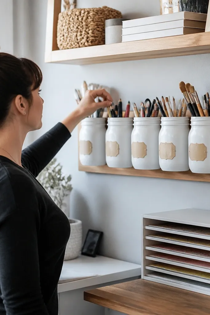
Wall-mounted jars make craft rooms look clean because materials have a home. Paint the jars or use matching jar lids, then mount them in a neat row with identical spacing. Add simple label tabs cut from cardstock and laminated or covered with clear tape so the labels look crisp. This idea is photogenic because the jars create a repeating pattern, and the labels read clearly even when you’re busy working.
Mark a level line on the wall and mount a backing board first if you want extra stability. Attach jar holders or use metal brackets sized for jars, spacing them about 3-4 inches apart. Paint jars with matte spray paint, then let them cure fully before mounting. Label with 1-2 word titles and attach labels with a small clip or glued tab.
Group like items — ribbons together, brushes together — so you don’t end up with a visual mix.
Avoid clear labels without borders — they fade into the glass and look unfinished.