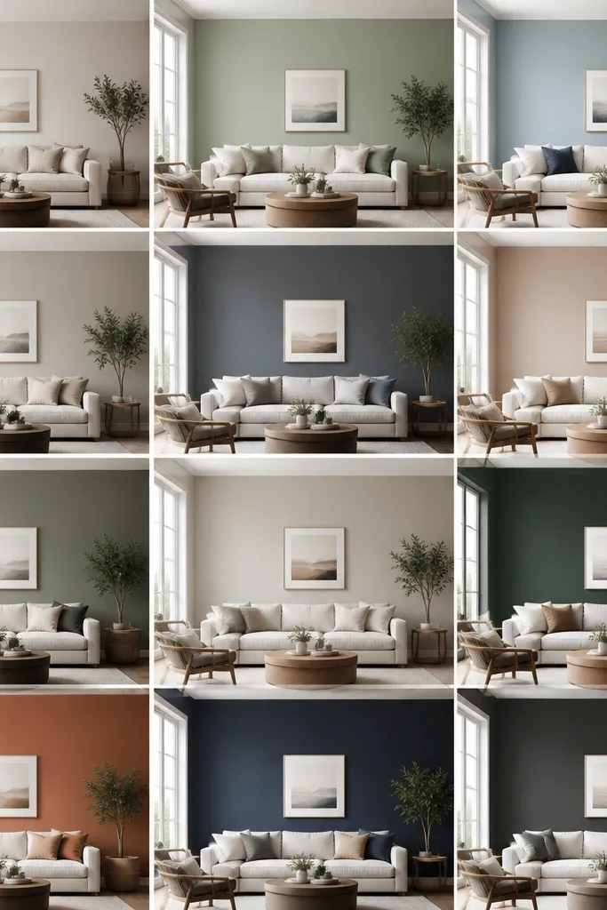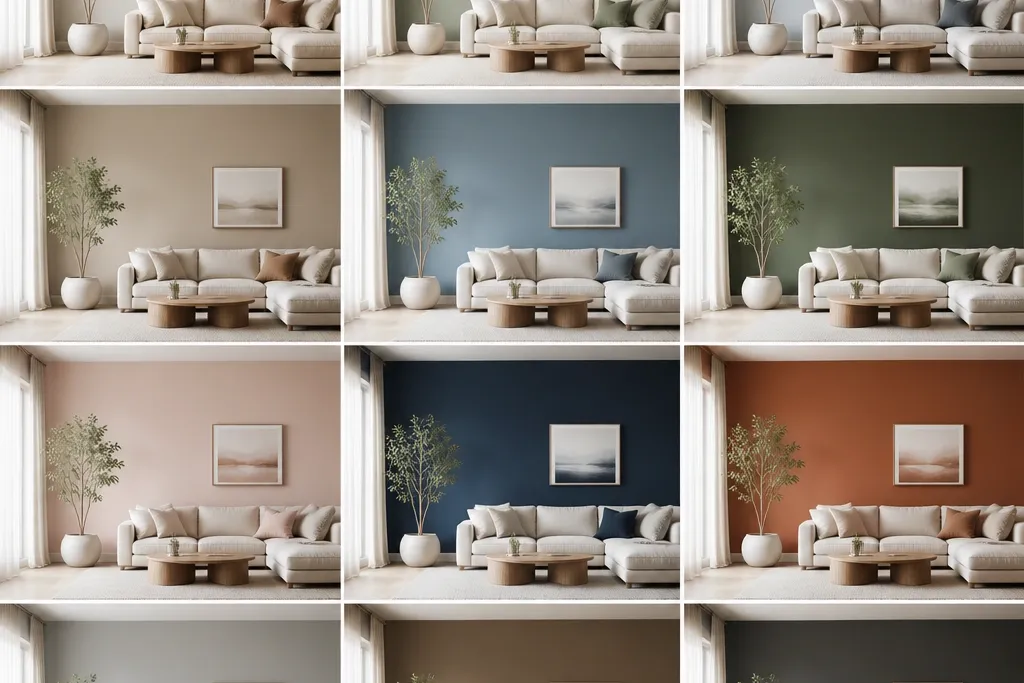
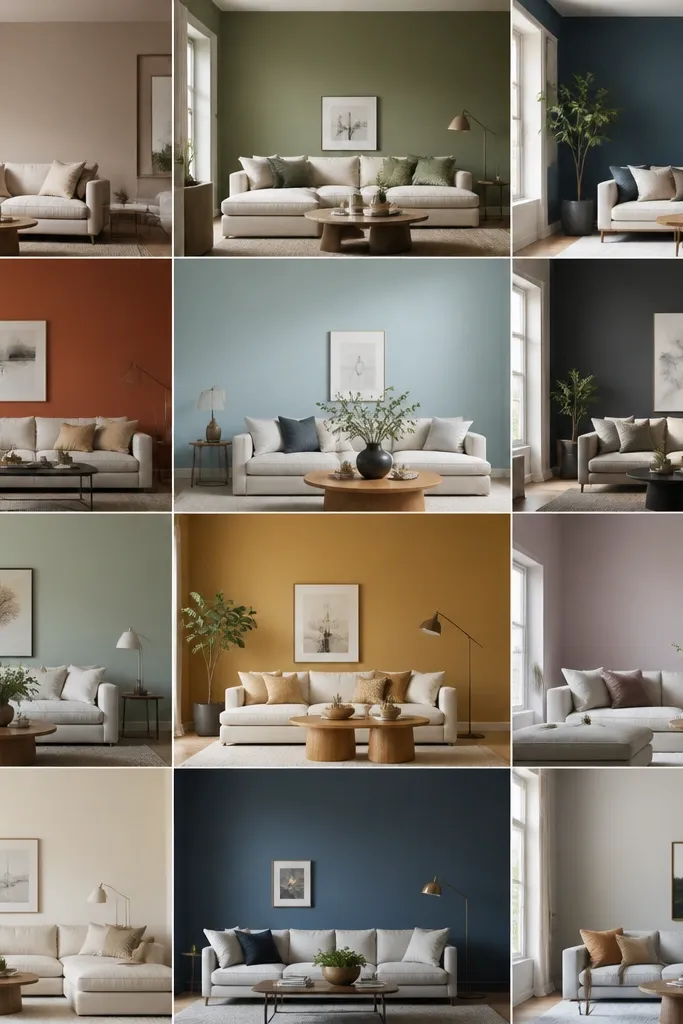
1. Creamy Ivory With Cool-to-the-Touch Trim
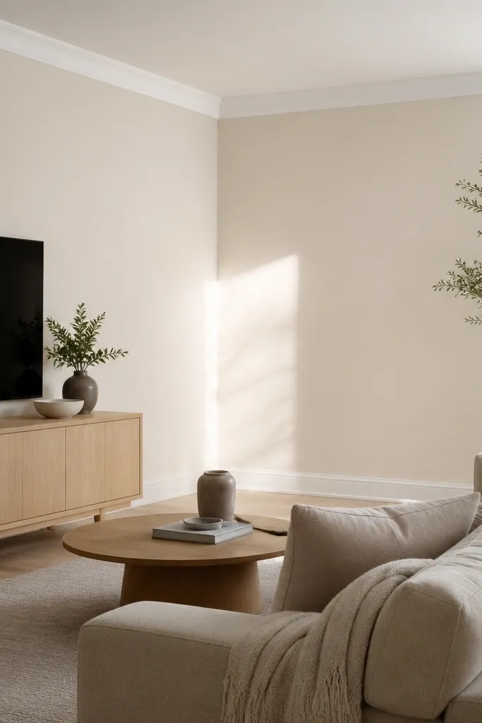
This is for rooms that feel tired under daylight but still need warmth at night. The creamy ivory keeps the space bright without turning the room yellow, and the clean cool white trim makes edges look sharp. I’ve seen this combo make beige carpet look intentional instead of dated. It also flatters linen, boucle, and light wood because the wall color stays neutral.
Pro tipUse 2-inch painter’s tape and paint the trim first, then roll the wall for a super clean line.
Paint the walls in a creamy off-white with a slightly warm undertone. Keep trim in a true bright white (semi-gloss on trim, satin on walls). If you have dark wood, this is one of the safest picks because the contrast looks crisp, not harsh.
Watch outAvoid gray-white trim with warm ivory walls — it often makes the whole room look dingy.
2. Warm Greige That Doesn't Go Green at Night
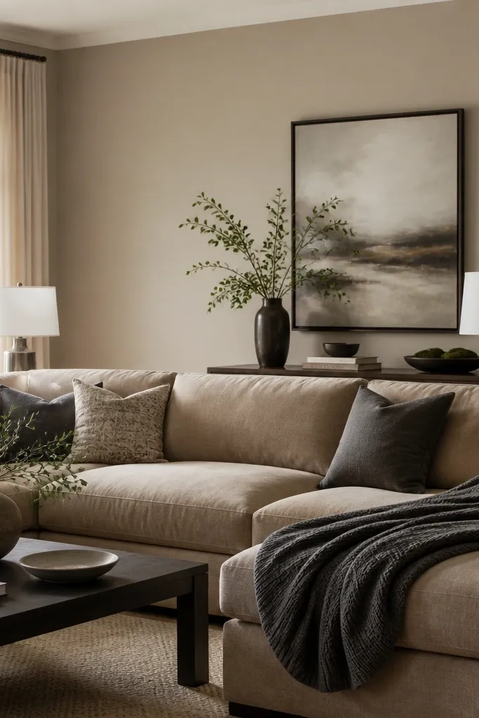
Greige is tricky, but when it’s right it hides imperfections and makes everything look coordinated. This warm greige has enough warmth to play nice with oak and honey-toned floors, and it has enough gray to keep white furniture from looking yellow. The result is calm and grounded, not flat. It also makes brass and nickel both look deliberate.
Choose a greige described as warm or beige-leaning, not green-leaning. Test it with a 12x12 patch and compare next to a brass lamp and a nickel lamp. Pair with warm white bulbs so the gray part doesn’t feel icy.
If your room gets a lot of indirect light, add a slightly warmer white on trim so the greige stays creamy.
Avoid picking greige from a tiny swatch in fluorescent store lighting — it can turn green once it hits your wall.
3. Greige With a Slight Pink Hue for Soft Depth
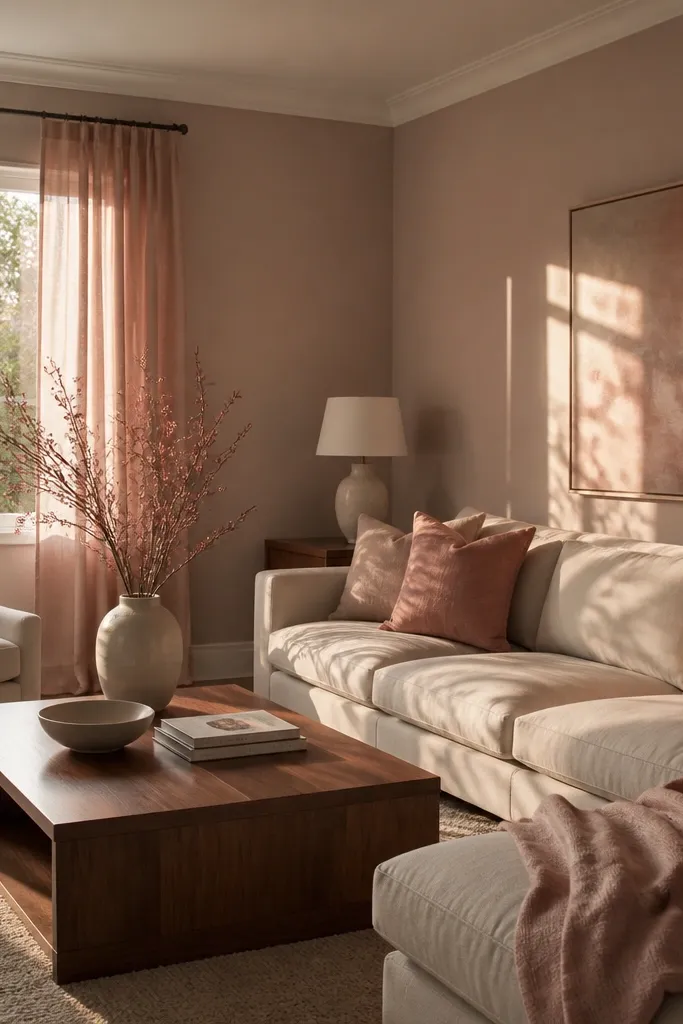
This color family is for people who want “neutral” but hate how standard greige looks gray and tired. The slight pink undertone adds softness and makes cream textiles look richer without going pink. In rooms with warm wood, it balances the warmth so the room doesn’t feel too golden. It also works great with rose-gold accents and textured fabrics.
Pro tipBring home a sample and place it next to your sofa fabric — if it pulls too red, you’ll see it immediately.
Look for a greige with pink undertone, not beige-only. Use satin finish on walls and keep ceiling white. If you have dark upholstery, the pink-leaning greige adds warmth without making the room feel loud.
Watch outAvoid pairing this with cool gray trim — it can exaggerate the pink and make it look dusty.
4. Sage Green That Reads Like Dusty Linen
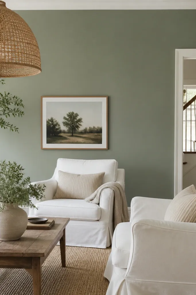
Sage is one of the best “aesthetic” greens because it doesn’t demand attention. This muted sage reads like dusty linen — soft, lived-in, and calming. It pairs beautifully with off-white textiles and light woods, and it keeps the room from feeling sterile the way straight gray can. In my experience, it also makes black accents look less severe.
Pro tipTest it on a wall that gets afternoon light — sage can go yellow if you choose the wrong undertone.
Choose a sage that looks slightly gray in the paint chip, not bright or yellow. Pair with warm white trim and keep floors in the spotlight using natural wood tones in decor. If you have green plants nearby, this makes them look more intentional.
Watch outAvoid bright mint — it reads cheap fast and makes white furniture look harsh.
5. Muted Olive for a Cozy, Grown-Up Living Room
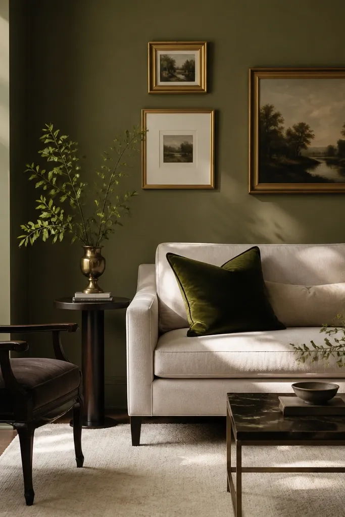
Muted olive gives you depth without the drama of deep forest. It makes warm metals look warm and it gives neutral furniture more personality. If your living room has beige or tan upholstery, olive walls make the fabric look richer instead of washed out. It also hides scuffs better than very light colors.
Pick an olive that is more gray-brown than yellow. Use satin on walls for easy wipe-down and a smooth finish. Keep trim creamy white so the olive doesn’t feel like it’s floating.
Use a warm bulb (2700K) and keep brass lamps — cool lighting makes olive look muddy.
Avoid pairing olive with cool gray floors — the room can feel like a mismatched office.
6. Blue-Gray That Works With Brown Leather
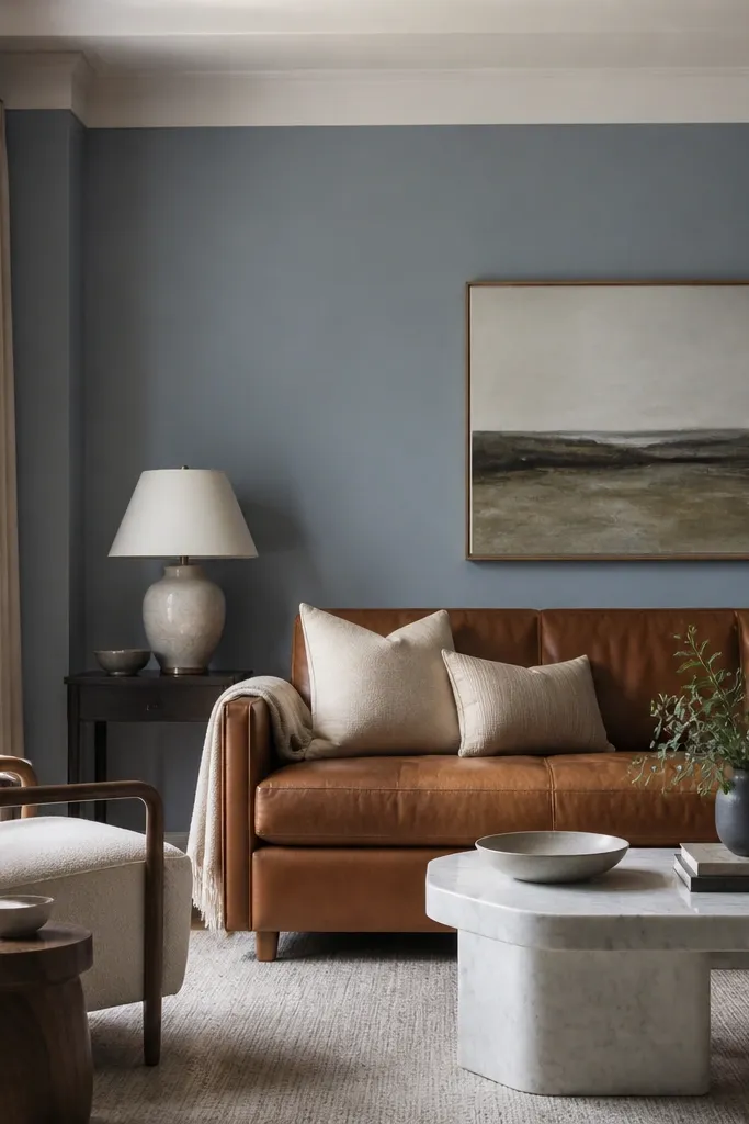
The right blue-gray turns brown leather from “heavy” into “classic.” You want a blue-gray that leans slightly neutral so it doesn’t turn purple under warm lighting. With brown leather and warm woods, it creates a clean background that makes throw pillows and art pop. I like this color when the room has a lot of leather, because it reduces glare.
Choose a blue-gray with a gray base, not a strong blue pigment. Paint walls in satin and keep the ceiling a pure white. Add one soft white element like a rug or curtains to keep the room from feeling too dark.
Hold a white pillow up against the wall — if it looks gray, your blue-gray is too cool.
Avoid slate-blue colors that look almost black — they make brown leather look greasy.
7. Warm Light Gray for Spaces With Lots of White Furniture
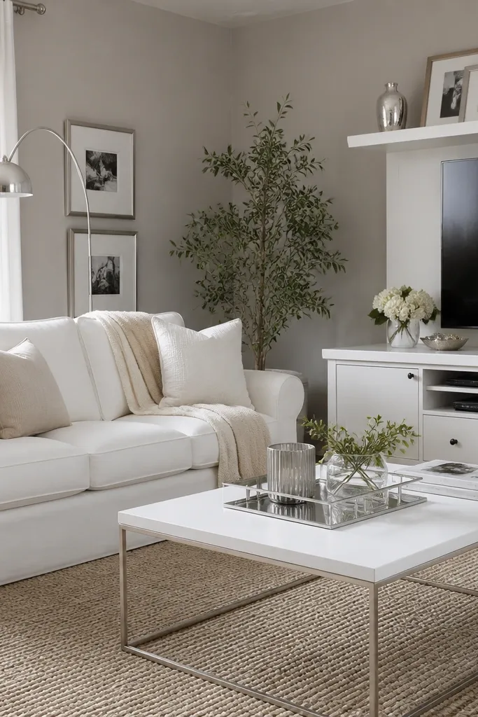
Warm light gray is the fix for rooms that have too much white and feel sterile. The warmth keeps it from turning the room cold, and the light value keeps it from shrinking. This is a good choice if you have white curtains, white shelves, or a white entertainment unit. It also makes metallic decor look smoother instead of stark.
Pick a light gray that reads beige-warm, not blue. Use satin walls and keep baseboards bright white. If you have dark flooring, this color helps balance it without making the room heavy.
Paint a 2-foot vertical strip near the window — your window light tells you the truth faster than a horizontal swatch.
Avoid “icy” light gray — it makes warm wood and cream fabrics look off.
8. Charcoal Accent Wall Behind the TV
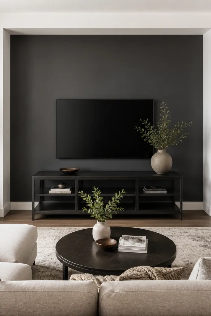
One charcoal wall gives you depth and makes the TV area feel intentional. I like charcoal that is true charcoal, not blue-black, because it stays neutral with different decor styles. It also hides the small scuffs you get behind a couch or where people walk past. The rest of the room can stay light so the accent doesn’t swallow everything.
Pro tipAdd a 1-2 inch lighter border with painter’s tape if you want it to look like a built-in feature wall.
Keep the other walls in a warm white or cream. Tape carefully around the TV wall edges and paint with a roller first, then cut in with a brush. Use satin or eggshell — matte can show roller marks under strong lighting.
Watch outAvoid painting the whole room charcoal — you’ll regret it when the evening light goes dim.
9. Deep Navy for a Library-Quiet Mood
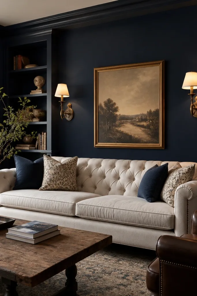
Deep navy makes a living room feel like it has a soundtrack — calm, private, and grounded. It’s especially good when your furniture is cream, camel, or warm brown. Navy also makes gold and brass shine without looking flashy. In rooms with large windows, it can handle daylight without turning gray.
Use a navy that looks almost black in shadow but clearly blue in light. Choose satin walls so it cleans easily. Keep trim in a warm white and ceiling white so the navy doesn’t creep upward.
If your room faces north, test in the afternoon — some navies look flat early morning.
Avoid navy with a strong purple lean — it can look theatrical and cheap.
10. Terracotta Clay for Warm, Earthy Energy
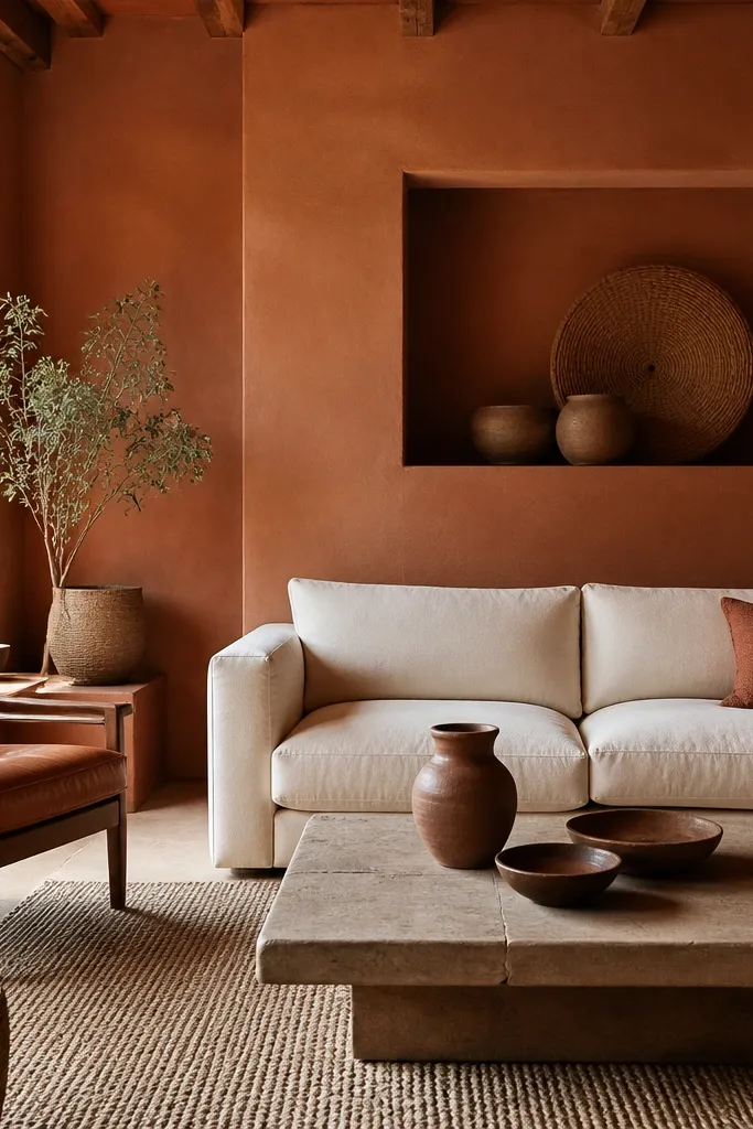
Terracotta clay creates instant warmth, especially when your decor has natural fibers like jute, rattan, or wool. It also plays well with black metal — the contrast looks intentional, not harsh. If your living room feels cold because of tile or dark floors, terracotta fixes it fast. It’s bold, but it still reads cozy instead of trendy.
Pro tipAdd one olive or sage accent pillow to keep terracotta from feeling one-note.
Pick a clay tone that is more orange-brown than red. Use a matte or eggshell finish on walls depending on how many scuffs you get. Pair with cream and warm white trim to keep it from feeling like a restaurant.
Watch outAvoid bright terracotta that looks like a brick — it can overpower art and make the room feel loud.
11. Muted Coral for a Soft, Friendly Pop
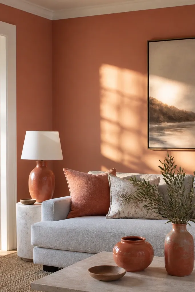
Muted coral is a color paint idea for living room walls if you want warmth without going full orange. It lifts neutral furniture and makes skin tones look better in photos. The trick is choosing coral that has a touch of beige so it reads calm, not candy. It works great with gray, cream, and natural wood.
Choose a coral with a beige base. Keep trim bright white and ceiling white so the coral doesn’t look dusty. Use warm bulbs to make it look flattering instead of pink.
Test it next to a cool gray rug if you have one — if the coral turns too rosy, switch undertone.
Avoid pink-coral that leans too magenta — it can make the room feel juvenile.
12. Butter Yellow That Doesn't Look Like a Kitchen
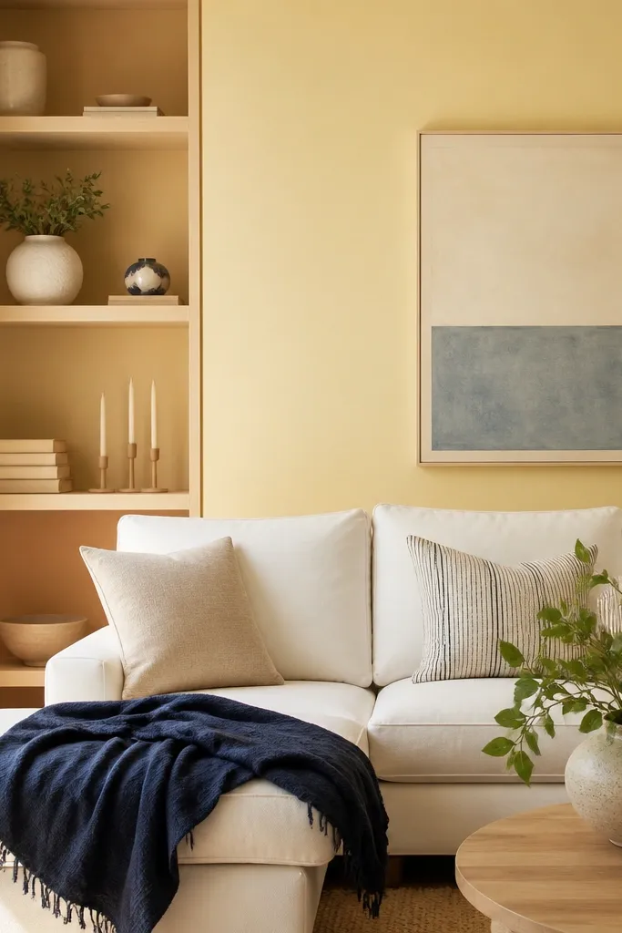
Butter yellow is the safe way to use yellow in a living room. It gives brightness without the high-energy look of lemon. When paired with navy or charcoal accents, it feels grown-up and grounded. I’ve used this in rooms with low light where people thought they needed “white,” and the result looked warmer and more lived-in.
Pro tipPaint a sample on the wall opposite the window — yellow shifts a lot with direction.
Choose a yellow that looks creamy and slightly muted. Use eggshell walls because it gives a soft glow and hides minor roller marks. Keep trim crisp white and add one darker accent like navy art or a dark rug.
Watch outAvoid bright school-bus yellow — it reads cheap and makes skin tones look off.