1. Oat + Powder Wall Shelf Line
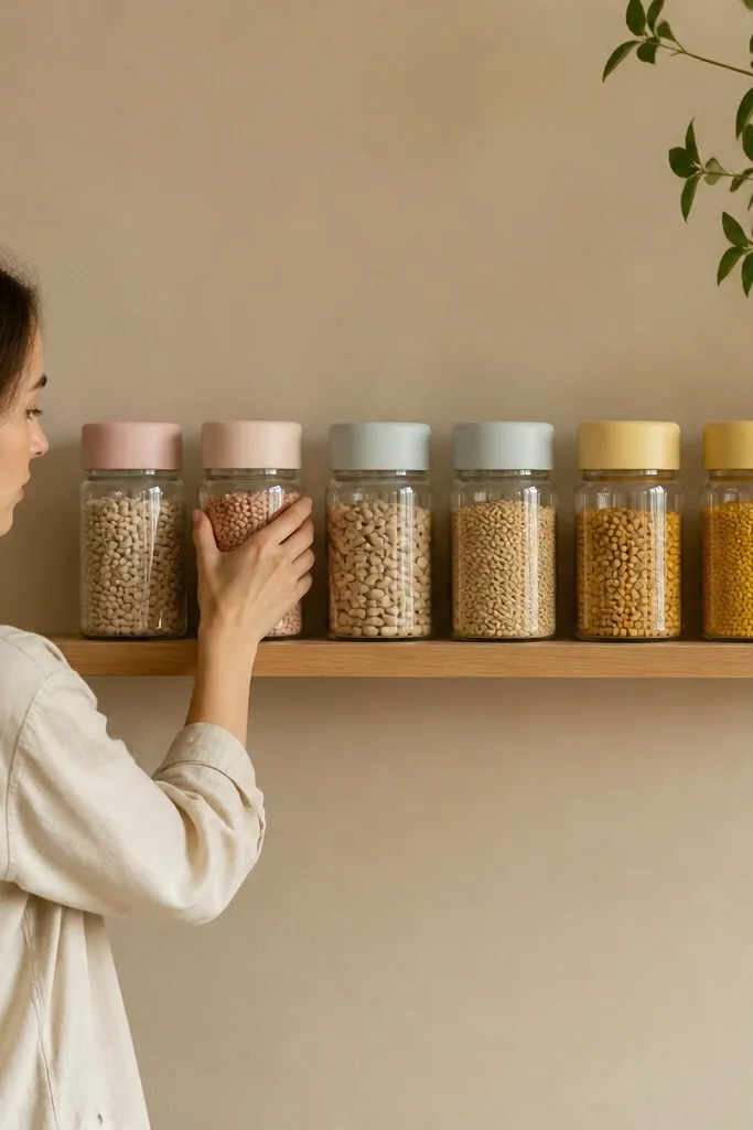
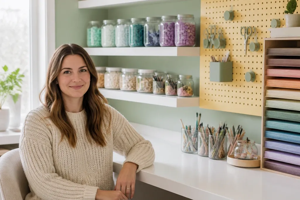
A single wall shelf line in warm white and oat wood makes your craft room look intentional fast. Pastels stay soft when they’re grouped by color families in matching containers, not mixed in random heights. Use matte ceramic or thick glass jars with matching lids so the sparkle doesn’t fight your palette. Keep the shelf height consistent and leave 2-3 inches between items so it reads airy instead of cluttered. This solves the common mistake where supplies look like a yard sale even when you’re using pretty colors.
Start by measuring your wall and picking a shelf length that covers about 60-70% of the wall width above your craft table. Install two shelves with the bottom shelf about 54-60 inches from the floor for easy reach and a clean sight line. Fill the shelves with 6-10 jars total, grouping powder pink together and pale blue together, then add one oat-toned basket at the end for balance. Aim for 70% closed or lidded containers and 30% open decor so the room stays soft even when you’re actively crafting.
Use the same label style on every jar — white paper with a light gray pen looks better than mixed fonts.
Avoid mixing jar sizes randomly; it makes pastels look messy instead of planned.
2. Butter Yellow Pegboard with Matte Hooks
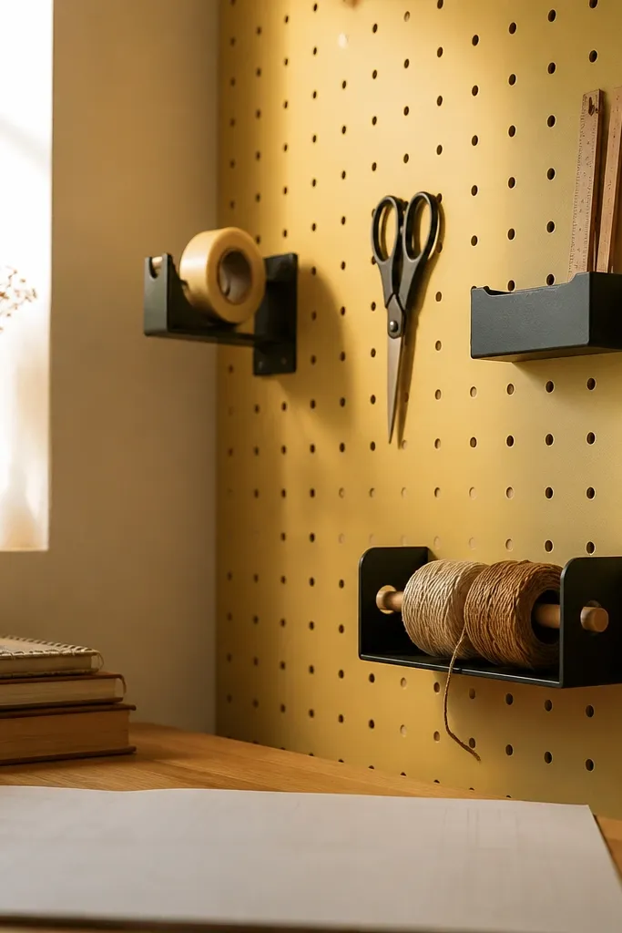
A butter yellow pegboard instantly creates a bright, friendly backdrop for tools without letting the tools take over. Matte hooks and matte tool holders prevent the “hardware shine” that turns pastel rooms harsh. Hang your frequently used items only — scissors, a tape dispenser, a small ruler rack, and a twine caddy — so the pegboard reads curated. Pastel storage on a warm yellow board looks creamy and cohesive, especially with light beige or warm white bins below. This fixes the mistake where everything is either hidden away or displayed with no grouping.
Mount a pre-drilled pegboard so it sits 2-4 inches above a storage shelf or cabinet, giving you a visual break. Paint or wrap it in butter yellow, then seal with a matte finish so the surface doesn’t glare under overhead lights. Add 10-16 matte hooks in a grid pattern, leaving empty space for seasonal swaps. Install a small twine rail and a tape dispenser holder near your work spot, then keep the rest of the pegboard for tools you grab daily.
Put the heaviest items at the bottom row so the top stays airy and photogenic.
Don’t hang every craft tool — a pegboard full of chaos kills the pastel calm.
3. Sky Blue Desk Mat and Warm White Work Tray
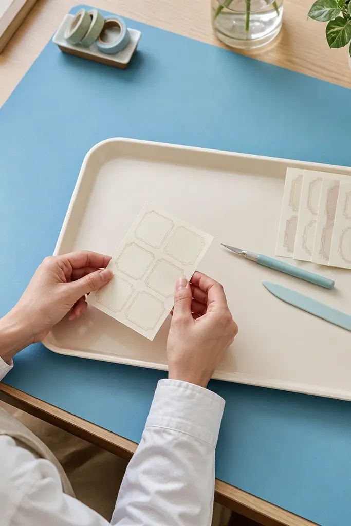
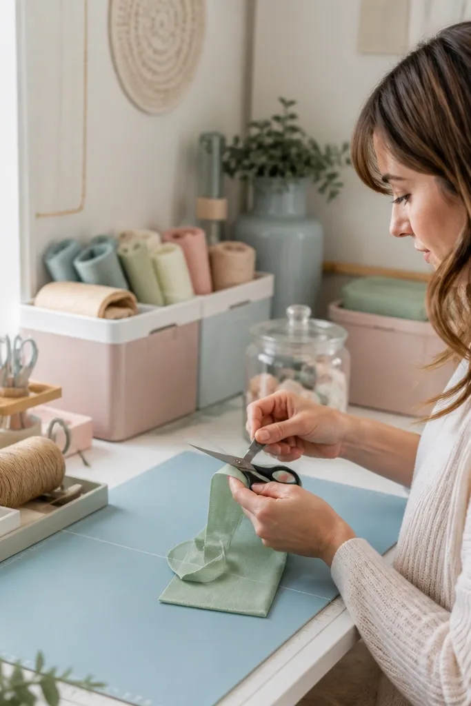
A sky blue desk mat anchors your work area and makes every pastel project look cleaner. The mat creates a consistent background for cutting, folding, and labeling, so the table doesn’t look like a patchwork of scraps. Pair it with a warm white tray so tools have a defined home that looks neat even between projects. Use a matte surface mat, not glossy vinyl, so you don’t get glare that washes out colors. This solves the common mistake where your craft table becomes the dumping ground, making the whole room look less soft.
Pro tipUse a small clear cup on the tray for pens, but keep it only for one pen color family so it doesn’t add visual clutter.
Choose a desk mat size that covers at least the front half of your table, ideally 24x36 inches for most craft desks. Place it centered, leaving 2-3 inches of table edge visible so the room doesn’t feel swallowed. Add a warm white tray about 12x18 inches near the front-right corner for scissors, tape, and a glue stick. Keep the tray empty when you’re not working by returning tools after each session.
Watch outAvoid a glossy mat; it reflects light and turns pastels gray.
4. Sage Fabric Curtain Behind a Photo-Friendly Corner
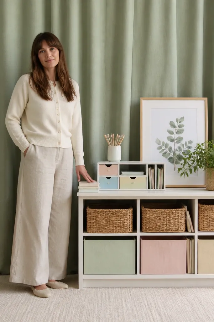
A sage fabric curtain gives your craft room a soft backdrop that makes pastels look intentional. Curtains hide messy edges, cords, and storage gaps without adding pattern overload. Choose a medium-weight fabric that holds shape and drapes — linen blend or cotton twill look best for a calm, matte finish. Keep the curtain slightly wider than the corner so it falls in smooth folds instead of flat panels. This fixes the mistake where the background is a wall of mixed storage and your cute supplies don’t look good together.
Pro tipIron or steam the curtain before styling; crisp folds photograph better than wrinkled fabric.
Hang a tension rod or ceiling track 6-8 inches higher than the area you want to frame. Let the curtain extend 3-6 inches beyond the side edges so the folds don’t end abruptly. Style the corner with 2-3 pastel items at eye level: one small lamp, one basket, one stack of paper pads. Keep the lower half mostly covered by bins or a cabinet so the curtain does the visual work for you.
Watch outAvoid thin, shiny sheers; they look flimsy and reflect overhead light.
5. Pastel Paper Pad Wall in Two Columns
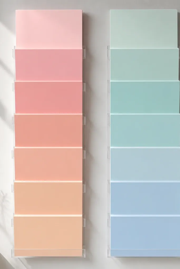
A paper pad display becomes decor when it’s organized like a gallery. Two columns look balanced and keep the eye from bouncing around the room. Use matching magazine holders or acrylic stands so the paper edges align and you get that clean, soft gradient effect. Label each column lightly — for example “Pink + Peach” and “Blue + Green” — with small gray text so it stays subtle. This solves the mistake where paper pads are stacked randomly and the room looks busy even when you’re using pastel colors.
Pick a wall spot near your work table and measure the available width so each column has equal space. Install two vertical holders or place two matching stands so the pad edges line up at the same height. Arrange pads from light to medium within each column, keeping one color family per column. Add one small tray at the bottom for scraps so the display stays tidy even when you’re actively cutting.
Keep pad thickness consistent in the display — a few thick pads can throw off the neat gradient.
Avoid mixing acrylic and wood holders; mismatched materials make the pastel look less cohesive.
6. Peach + Blush Label System for Bins
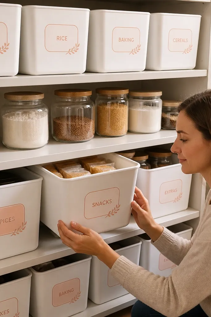
Pastel storage looks good when labels are consistent. A peach-and-blush label system makes bins look like designed objects instead of random organizers. Use white bins with smooth fronts and add labels that use the same font and spacing across the room. Stick to 1-2 label colors maximum so your pastel palette stays soft and controlled. This fixes the common mistake where people use bright label tape on every bin, creating a loud patchwork that ruins the calm look.
Choose bins with flat fronts and lids or drawers that match in color and finish. Create labels on matte white label paper, then print or handwrite using the same pen color and size for all bins. Place labels centered, about 1-2 inches from the top edge of each bin front. Keep the label categories limited: “Stickers,” “Ribbon,” “Paper,” “Tools,” and “Embellishments” so you’re not adding extra visual noise.
Use peach for warm categories and blush for soft categories, but keep the label shape identical (same rounded rectangle size).
Avoid multiple label styles and colors; it turns storage into a guessing game and looks cluttered.
7. Pastel Gallery Wall with Frame Color Matching
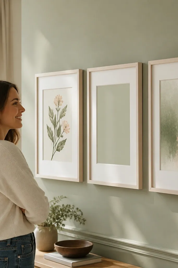
A gallery wall can be calming instead of chaotic when frames match. Use light frames in warm white or pale wood and keep mat colors consistent, so the prints feel like one set. Choose three pastel print types only: one botanical-style illustration, one simple typography card, and one abstract wash. The trick is spacing — equal gaps make it look designed. This solves the mistake where people hang too many different frame finishes, which makes pastels feel scattered.
Pro tipUse glass or acrylic covers that reduce glare if the wall gets direct sun.
Pick a wall section width that fits 3-5 frames total, then choose frames with the same outer size. Lay them out on the floor and keep the vertical alignment consistent so the center frame sits at eye level (about 60 inches from the floor to the center). Use painter’s tape to mark spacing, then hang with a level. Keep prints in a color family: powder pink, oat, sage, and sky blue — avoid adding one bold neon piece.
Watch outAvoid mixing black frames with pastel prints; the contrast reads harsh in a soft workspace.
8. Soft Pink Thread Organizer with Vertical Rows
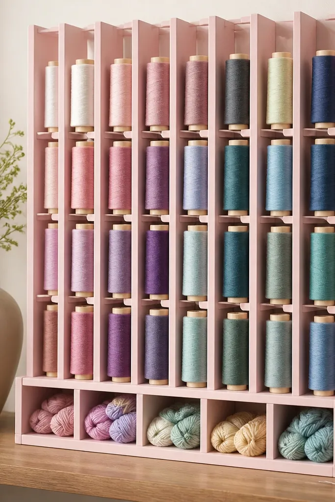
Thread spools are pretty, but they look messy when they’re tossed into one container. A vertical thread organizer makes spools visible without spill-over and keeps the palette readable. Use a soft pink organizer with evenly spaced slots so each spool sits upright and doesn’t lean. Arrange spools in vertical rows by color — warm pastels on one side, cool pastels on the other — so it reads like an art piece. This fixes the common mistake of mixing spools in a jar where labels are hidden and the room looks unorganized.
Buy or build a vertical thread rack with individual channels so spools don’t slide. Place it near your sewing corner or craft table edge where you grab thread quickly. Sort spools first by temperature family, then by shade intensity (lightest to medium). If you have bobbins, store them in a separate labeled drawer so they don’t clutter the front view.
Keep empty slots covered with a simple insert board so the organizer still looks full and intentional.
Avoid a clear bin with loose spools; it looks chaotic fast when you’re working.
9. Pastel Ribbon Wall on a Tension Rod
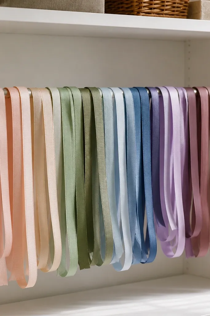
A ribbon wall is one of the prettiest pastel craft room features because ribbon shows color even when it’s not in use. A tension rod setup lets ribbons hang in soft loops, which looks airy instead of tangled. Group ribbons by color family and finish — satin for shine, grosgrain for texture, and cotton for matte — so the wall looks designed. Keep the ribbon lengths consistent so the wall has a rhythm. This solves the mistake where ribbons end up in a drawer and your room looks less colorful even though you own the prettiest materials.
Pro tipUse one ribbon width as your base (like 3/8-1/2 inch) and add only one contrasting width for visual interest.
Install a tension rod inside a narrow wall space above a cabinet or desk, keeping it 8-10 inches below the shelf line. Loop ribbons over small clips or ring hooks so the loops sit evenly. Group by color: pale pinks and peaches on one side, sage and sky on the other. Trim ribbon ends to a consistent length so the wall has a uniform look.
Watch outAvoid mixing random ribbon widths and finishes without grouping; the wall becomes visually noisy.
10. Mint Cabinet Doors with Clear Acrylic Drawer Labels
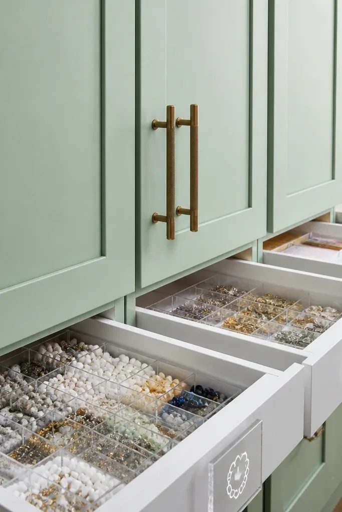
If you want pastel color without clutter, mint cabinet doors with clear drawer labels are the cleanest look. Mint reads fresh and soft, and clear labels let you keep categories visible without adding extra paper clutter. Use drawers for small items like beads, charms, stamps, and paperclips so everything is contained but still easy to find. Keep drawer contents grouped by material type so the label matches what you see. This fixes the common mistake where storage is hidden but hard to navigate, so supplies end up on the table and the room loses its calm.
Choose a cabinet with drawers or add drawer organizers inside a basic cabinet. Paint or select mint doors and keep hardware in a similar finish like brushed nickel or satin brass. Apply clear acrylic label holders on drawer fronts, then insert printed labels in a soft gray font. Fill each drawer with one category and keep the visual spread small by using small bins inside the drawer.
Use consistent bin heights inside drawers so the front label view stays neat.
Avoid stuffing drawers loosely; lumpy contents make the room look messy even with pretty cabinets.
11. Pastel Floor Rug with Pattern Scale Rules
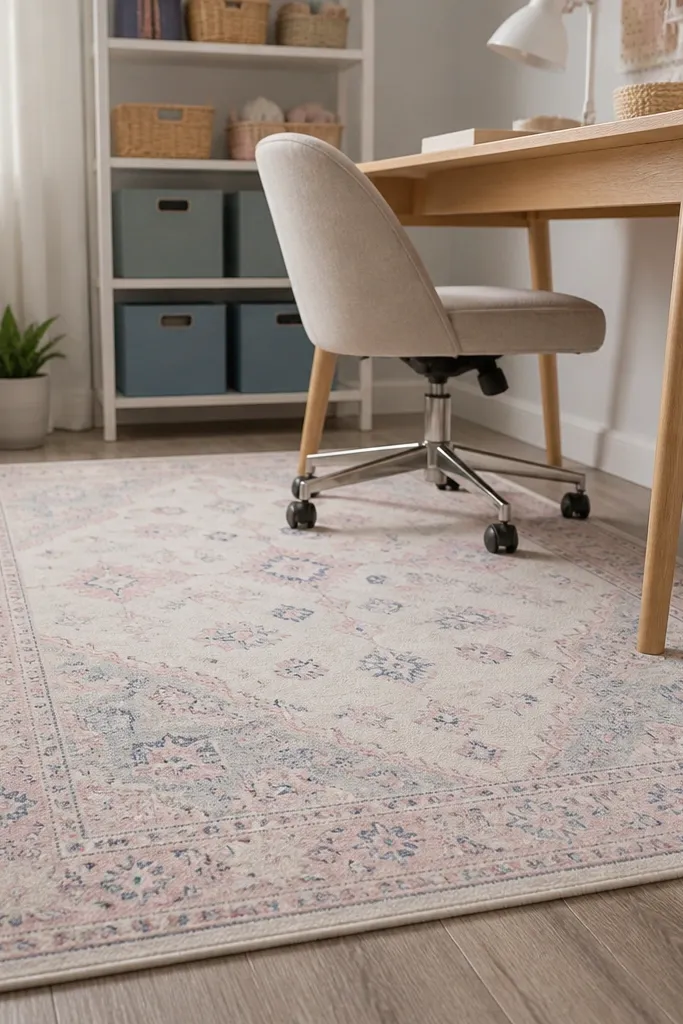
A pastel rug ties the room together and makes the workspace feel soft, but only if the pattern scale matches the room size. Choose a rug with small-to-medium pattern so it doesn’t compete with shelves and bins. Keep the rug palette to two pastels plus warm white or oat so it doesn’t create a fourth color that clashes. The rug also protects your floor from dropped glitter, adhesive spills, and paper scraps — practical and pretty. This solves the mistake where the floor stays bare or has a loud rug that makes your pastel decor look off.
Pro tipAdd a non-slip rug pad so it stays flat; wrinkled rugs ruin the “soft and clean” look.
Measure your craft zone and pick a rug size that extends at least 8-12 inches beyond your chair and desk footprint. Choose a rug with a matte finish and a low pile if you use a chair with wheels. Place it centered under the work area so your chair legs sit on the rug. Vacuum regularly and spot-clean spills early since glitter and glue set into fibers.
Watch outAvoid large bold florals in tiny craft rooms; the pattern scale fights your pastel palette.
12. Warm White Storage Bench with Pastel Cushion Pops
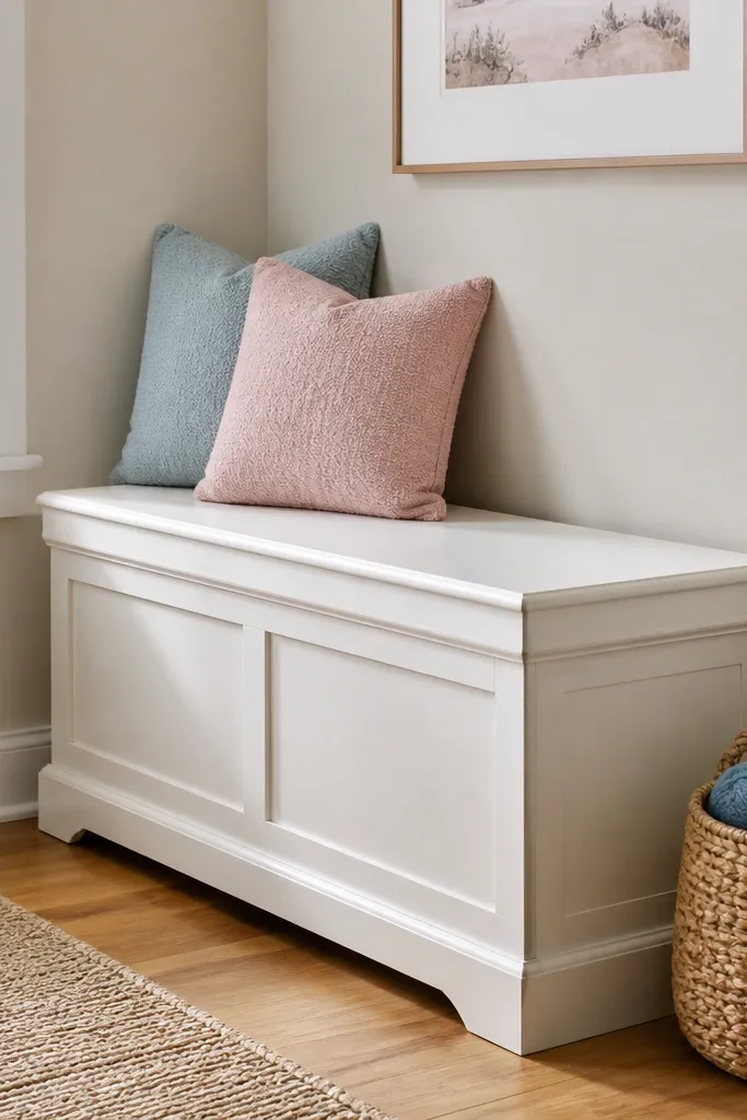
A storage bench gives you the best of both worlds: hidden supplies and a soft seating spot that makes the room feel cozy. Warm white keeps it airy, while pastel cushion pops add color where your eye naturally lands. Choose cushions with textured fabric like cotton-linen or boucle for a gentle look that photographs well. Keep cushion colors limited to mint and blush (or sky and peach) so the room stays in one pastel story. This fixes the mistake where seating is either plain or messy, pulling attention away from the craft work.
Pick a bench with a hinged top or drawers so supplies disappear in seconds. Place it where you sit most often — usually next to the craft table — and leave 18-24 inches of walking space around it. Add two cushions in coordinating pastels, sized to fit the seat snugly (around 18x18 inches or 20x20 inches). Put one small throw or blanket folded at the side, then store the rest inside the bench.
Use cushion covers that zip so you can wash them; a clean fabric surface keeps the pastel look fresh.
Avoid a bench with exposed shelves full of random items; it turns seating into storage clutter.