1. Soft Greige Behind the Headboard With a 1-Inch Ceiling Stop
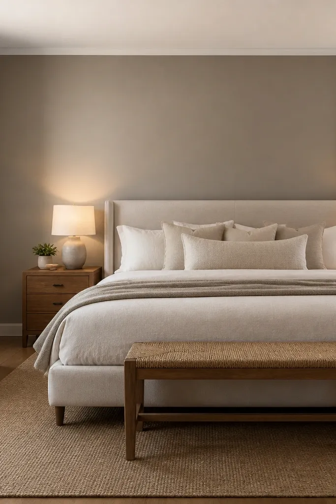
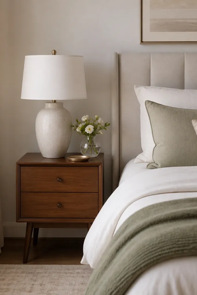
Step 1: Mark a straight line 1 inch down from the ceiling on the accent wall, then tape above and along the line so paint never creeps. Step 2: Roll two coats of a warm greige in eggshell, cutting in first with a 2.5-inch angled brush at corners and edges. Step 3: Remove tape while the final coat is still slightly tacky so the edge stays crisp.
This is the safest “designed” accent wall because greige reads calm in both daylight and warm lamps. Paint it behind the headboard so the color sits at your main focal point, and keep the rest of the room brighter to avoid making the bedroom feel smaller. A 1-inch ceiling stop makes the wall look built-in, not like a rectangle you painted. Finish matters here: eggshell keeps it wipeable near nightstands while still hiding minor wall imperfections. If your bedroom has beige wood or light upholstered furniture, this greige tone usually harmonizes without turning muddy.
Watch outSkipping a ceiling stop and painting flush to the ceiling makes the accent wall look like a mistake, especially in photos.
Pro tipMatch your greige’s undertone to one thing you already have — wood floors, a throw pillow, or the backing of your headboard.
2. Deep Charcoal With Matte Finish for a Hotel-Quiet Mood
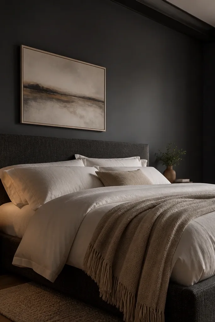
Charcoal makes a bedroom feel grounded, and matte helps it look soft instead of shiny. Put it behind the bed so the darkness wraps around your sleep zone. Choose a true charcoal with cool gray lean if your bedding is white, ivory, or cool-toned gray — it keeps the contrast sharp without looking brown. Matte also hides roller marks better than satin, which is helpful on textured drywall. This look is best when your room has at least one strong light source — a table lamp, sconce, or window — so the wall doesn’t swallow the whole space.
Step 1: Patch and sand until the wall feels smooth by hand, then wipe with a damp cloth to remove dust. Step 2: Prime with a stain-blocking primer if you’re covering off-color paint, then apply two coats of charcoal matte with a 3/8-inch nap roller. Step 3: Tape along the trim and remove tape after each coat’s edges are set but before the paint fully hardens.
Use a foam roller cover for the final coat on tricky areas to reduce visible lap marks.
Using glossy paint on a textured wall — it turns every bump into a highlight.
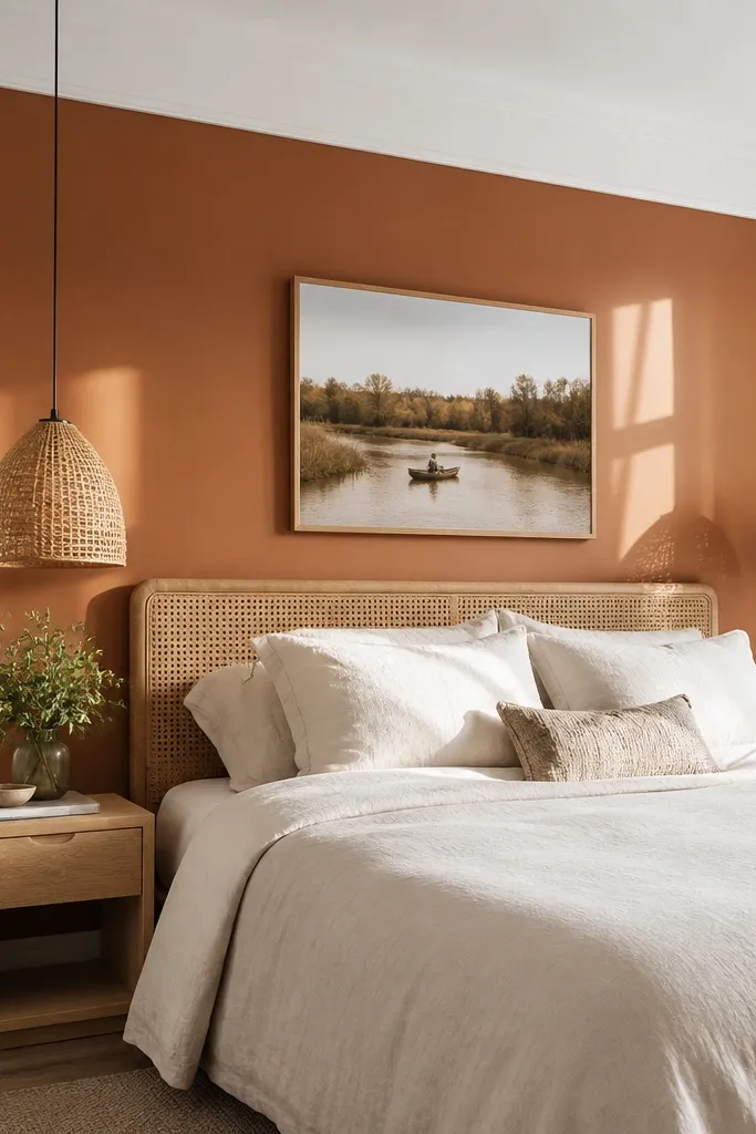
3. Warm Clay Terracotta Accent With a Crisp White Trim Frame
Step 1: Tape a border around the accent wall area, aiming for a 2-3 inch “frame” margin from each edge or trim line. Step 2: Roll clay terracotta in eggshell, starting with vertical sections then finishing with light horizontal passes to even the sheen. Step 3: After the final coat cures enough to touch without smearing, peel tape and touch up any tiny gaps with a small angled brush.
Terracotta adds warmth without needing bold decor. The trick is pairing it with a real frame: paint the accent wall clay, then keep the trim and ceiling in clean white so the color reads intentional. This works especially well with natural materials like rattan, oak, linen, and off-white bedding. Terracotta also looks great when your room has warm lighting — think 2700K bulbs — because it pulls the orange-red undertone forward. If your room feels sterile, this is one of the fastest ways to make it feel cozy and photographed.
Watch outPainting terracotta and leaving existing off-white trim yellow — it makes the whole wall look dingy.
Pro tipPick terracotta based on your flooring: if your floors pull yellow, choose clay with more peach; if they pull gray, choose terracotta with more red.
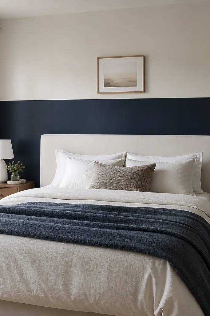
4. Cool Navy Accent With a Half-Wall Height Behind the Headboard
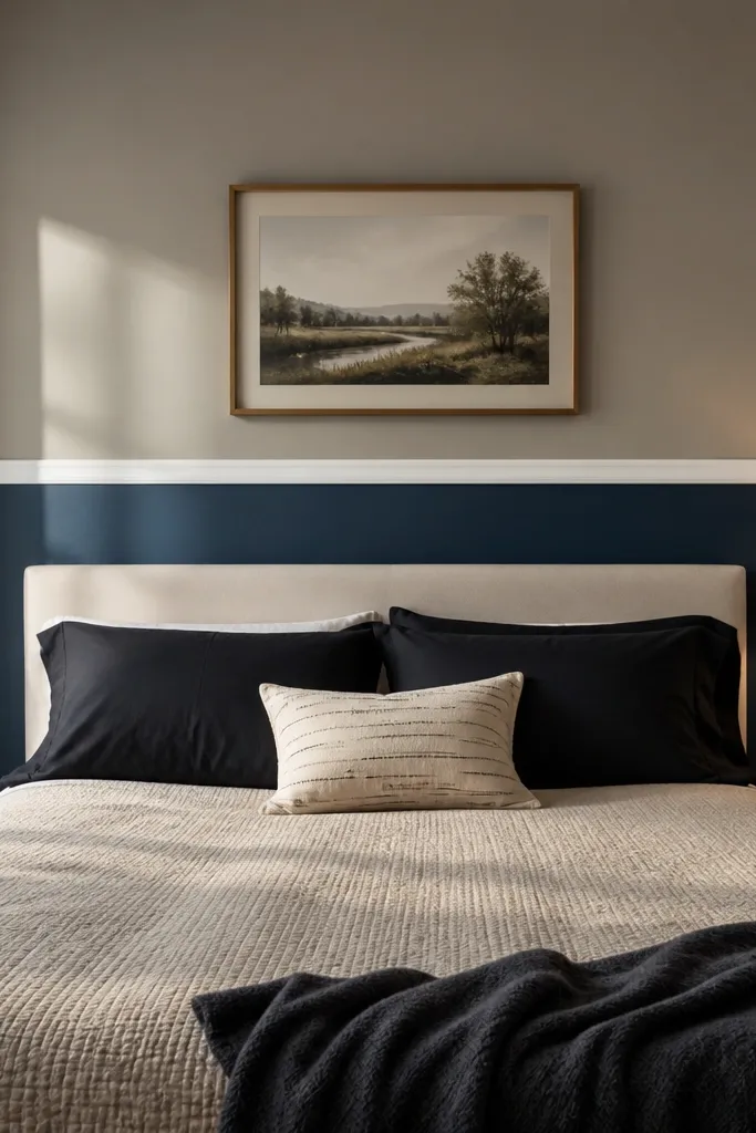
Step 1: Decide your height — a common sweet spot is 48-54 inches from the floor, or align to the top of the headboard if it’s lower. Step 2: Tape a perfectly level line for the boundary, paint the upper wall first, let it dry, then paint navy below. Step 3: Do two coats on the navy section, and cut in the boundary line with a narrow brush for a razor edge.
A half-wall navy accent is a smart way to get drama without making the bedroom feel heavy. You get a strong visual anchor behind the headboard while keeping the upper wall bright for airflow and light reflection. This look works because the eye rests on the horizontal line, and that line makes the room feel taller than a full dark wall. Use a matte or eggshell navy depending on your wall condition; matte hides flaws, eggshell wipes better if you have kids or pets. Pair with white bedding and warm wood to keep the navy from going cold.
Watch outGuessing the boundary height — a crooked line makes the whole room look unfinished.
Pro tipHang art or a sconce so it crosses the boundary line slightly — it makes the half-wall feel built-in.
5. Olive Green With a Subtle Sponge Texture for Depth
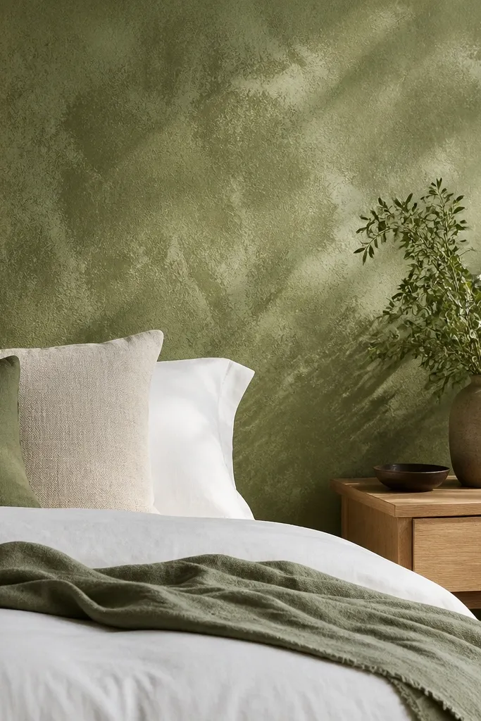
Step 1: Roll one full coat of olive in eggshell and let it dry completely. Step 2: Mix a lighter olive or warm beige glaze to a thin, paint-like consistency, then dab with a natural sea sponge in small sections — stop before it looks striped. Step 3: Keep the pattern irregular but consistent in intensity, then allow it to dry 24 hours before touching up.
Olive green can feel calm or moody depending on the undertone, and a sponge texture makes it look layered instead of painted flat. This is the easiest “texture look” that still photographs well because the light creates soft variation across the wall. Choose an olive that reads green in daylight, not brown. Use a base coat in eggshell, then sponge a slightly lighter shade or a muted neutral glaze so the texture stays understated. This works best in bedrooms with linen curtains, woven baskets, or warm off-white walls that need more visual interest.
Watch outSponge painting over wet or tacky base — it turns into muddy patches.
Pro tipPractice on cardboard first so you learn how much pressure creates the right mottling.
6. Black Accent With Vertical Roller Lines for a Tall Effect
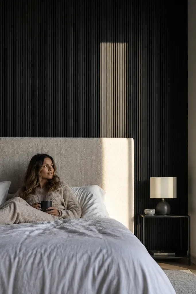
If you want the “editorial” look without wallpaper, vertical roller lines are the move. A black or near-black base makes the texture show up, and the vertical direction visually stretches the wall. Keep the lines subtle — think gentle ribbing, not heavy stripes. Use this when your bedroom feels short or when your bed is low and you want more height behind it. Pair with light bedding and a light wood headboard so the wall doesn’t overpower the room.
Step 1: Paint the whole wall black in eggshell with two coats, then let it cure enough to handle without scuffing. Step 2: For the lines, use a roller with a different nap or a line-roller tool, working in 2-3 foot sections so edges don’t dry too fast. Step 3: Lightly overlap each pass and blend the ends at the corners, then inspect from the bed to confirm the lines read vertical.
Use a matte topcoat over the final texture if the wall looks too shiny under lamp light.
Making the vertical lines too dark and thick — it reads as uneven stripes, not intentional texture.
7. Dusty Rose Blush With a Wash Technique for a Soft Glow
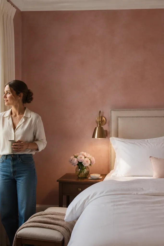
Step 1: Start with a white or very light warm base coat, then apply the dusty rose wash in one thin layer using a wide brush and gentle back-and-forth. Step 2: Immediately soften edges with a dry roller or lightly damp brush so you don’t get hard blotches. Step 3: Build color gradually — usually two wash layers are enough, and you stop when it looks like a tinted wall rather than a full paint block.
Dusty rose is tricky because cheap versions look pinky or chalky. A wash technique fixes that by letting the wall show through in places, so the color looks like fabric dye rather than solid paint. This works beautifully with white bedding and warm brass lamps because blush reflects light softly. Choose a muted dusty rose, not a bright rose, and keep the finish eggshell so it cleans without looking plastic. The result feels romantic but grown-up — perfect for bedrooms that already have neutral furniture.
Watch outTrying to cover in one thick coat — wash techniques fail when you treat them like regular paint.
Pro tipKeep a consistent wet edge on each section; the wall should look even when you step back from the bed.
8. Creamy White With a Greige Color-Block Corner Wrap
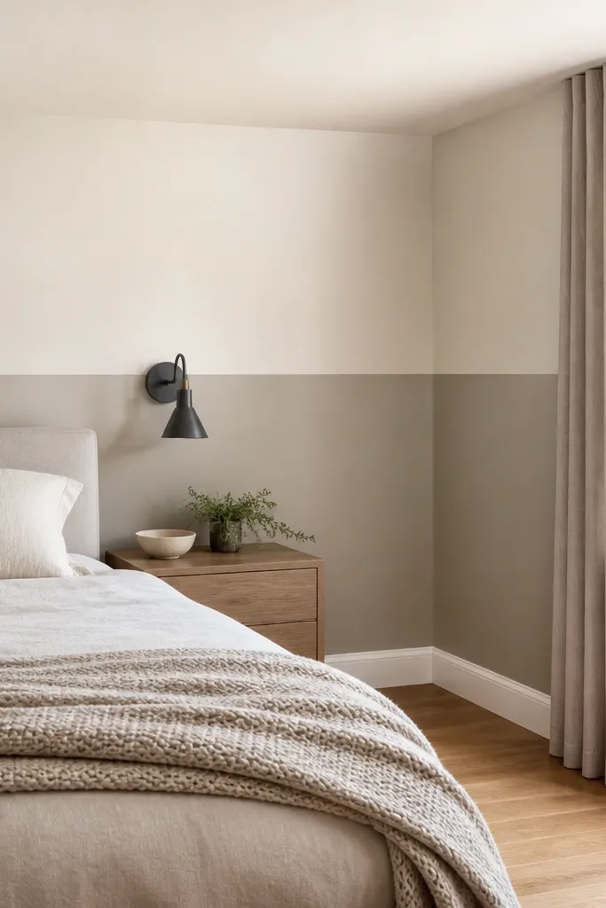
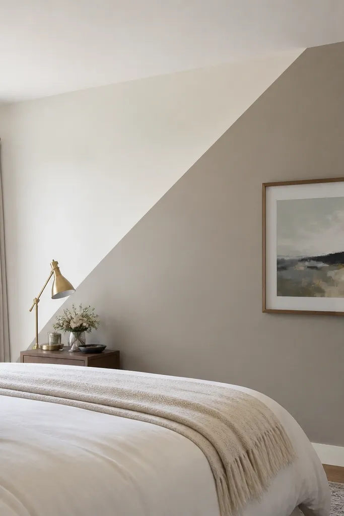
Step 1: Tape the greige area with a gentle arc-free line — straight painter’s tape works, but measure the corner wrap width first so both sides match. Step 2: Paint creamy white on the whole wall, then once dry, apply two coats of greige to the taped corner wrap in eggshell. Step 3: Remove tape carefully and touch up with a small brush at the corner so the greige doesn’t creep.
This is a “small room friendly” accent wall idea when you don’t want a full dark panel. Paint the main wall creamy white, then wrap a greige accent into the corner — usually 12-18 inches on each side — so the room gains depth. The corner wrap reads architectural because it follows the room’s geometry instead of stopping like a rectangle. It’s also easier to keep edges clean since you’re working with fewer large color transitions. This looks best in bedrooms with simple furniture lines and you want the wall to feel calmer but not blank.
Watch outStopping the color right at the corner edge — it makes the accent look pasted on.
Pro tipChoose a greige that matches your wood tone so the corner wrap looks like it belongs.
9. Two-Tone Accent: Dark Taupe Side Panels and a Light Center
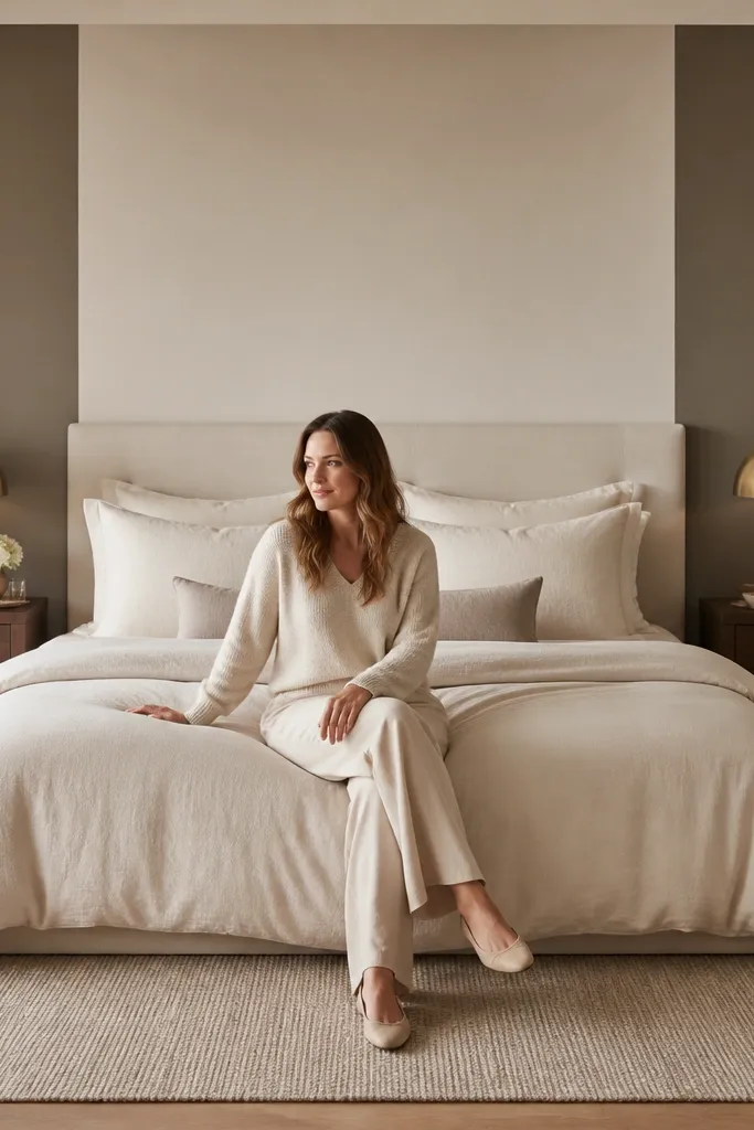
Step 1: Measure the headboard width and plan panel widths — a simple formula is side panels that are 25-35% of the headboard width each, leaving the center for the lighter color. Step 2: Tape the vertical lines, paint the lighter center first, then tape again and paint the darker taupe side panels. Step 3: Use a 2.5-inch angled brush for the panel edges so the lines look crisp, then roll the field evenly to avoid sheen differences.
This two-tone layout gives you the look of custom millwork without actually installing panels. Paint the center section behind the headboard lighter (think warm beige or light greige), then add darker taupe side panels that stop around the same height as the headboard. The contrast frames your bed and makes the space look styled. Use a matte or eggshell depending on your wall texture; eggshell usually looks better under lamp light because it doesn’t absorb every highlight. This is a strong choice for bedrooms with a large headboard that needs visual support.
Watch outUsing two different paint sheens — the wall looks patchy at night.
Pro tipKeep both taupe and center color in the same sheen level so the seam doesn’t look accidental.
10. Light Blue With a Hand-Brushed Edge Around the Headboard
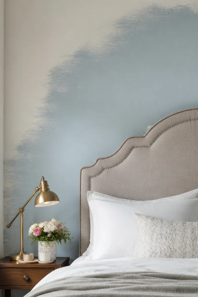
Step 1: Paint the accent area fully in light blue, then tape a rough boundary at the height you want the fade to live around the headboard. Step 2: Remove tape and use a wide brush to feather the edge inward with light pressure, working from top to bottom in small sections. Step 3: Add a second coat only where coverage needs it — don’t keep re-brushing the feather once it looks right.
Light blue can make a bedroom feel airy, but the wrong application looks streaky. This idea uses a hand-brushed edge around the headboard area, where the color looks like it fades slightly at the boundary instead of ending in a hard line. It’s especially pretty if your bed has an upholstered headboard — the softness matches the fabric. Choose a powdery light blue with a touch of gray, and use eggshell for durability. This works in bedrooms that already have white trim and want a gentle color lift without going dark.
Watch outTaping a permanent hard line and expecting it to look “soft” — it will look like a sticker.
Pro tipFeather on dry paint for control; wet feathering turns into muddy edges.
11. Sage Green With a Simple Geometric Block Pattern
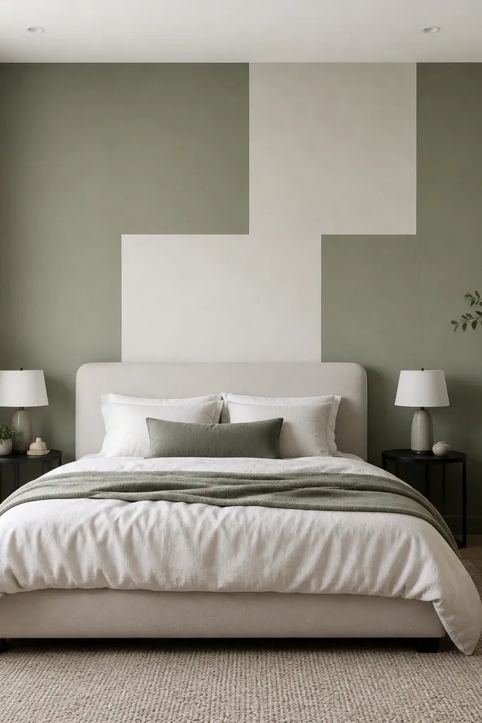
Step 1: Decide your block layout using masking tape grid lines, starting with a big rectangle behind the headboard and adding one or two blocks off to the side. Step 2: Paint the main sage first, let it dry, then tape for the neutral blocks and paint them in warm white in eggshell. Step 3: Remove tape at a consistent angle and touch up block corners with a small brush so the geometry stays sharp.
Geometric blocks make accent walls look intentional fast, and sage green is forgiving enough to stay calm. The trick is using a limited palette: one main sage field, then one contrasting neutral block like warm white or greige. Keep blocks large — think 12-24 inches wide — so the pattern reads from across the room. This is a great option for bedrooms with patterned bedding because the wall gives structure without shouting. If your walls are plain and you want a designer look without wallpaper, block painting is the easiest path.
Watch outMaking tiny blocks — small shapes look messy and hand-painted in a bad way.
Pro tipPress tape firmly into corners with a plastic putty knife so paint doesn’t bleed under.
12. Warm Off-White With a Subtle Color-Wash Over Existing Paint
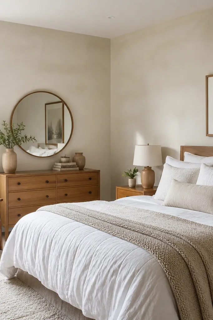
This is the move for bedrooms where you’re scared of committing to a strong color. A warm off-white wash changes the wall’s mood without looking like a bold accent, and it photographs beautifully because it keeps the room bright. Choose a warm off-white that matches your undertone — if your furniture looks yellow, pick a warmer off-white; if your furniture looks cool, pick a greyer off-white. The wash also helps unify mismatched paint sheens from prior touch-ups. It’s a great solution when your bedroom has lots of textures and you don’t want the wall competing.
Step 1: Confirm your current wall isn’t peeling or stained; patch and sand, then wipe clean. Step 2: Roll a thin wash of warm off-white in eggshell using a microfiber roller so coverage stays even without streaks. Step 3: Add a second wash only if the original color still shows through in corners, then let it cure fully before evaluating under both day and lamp light.
Use a white ceiling light bulb test: check the wall in the evening before you decide the undertone is right.
Skipping primer when you’re changing undertones — the old color bleeds through and ruins the calm look.
13. Bold Emerald Green With a Matte Headboard Frame
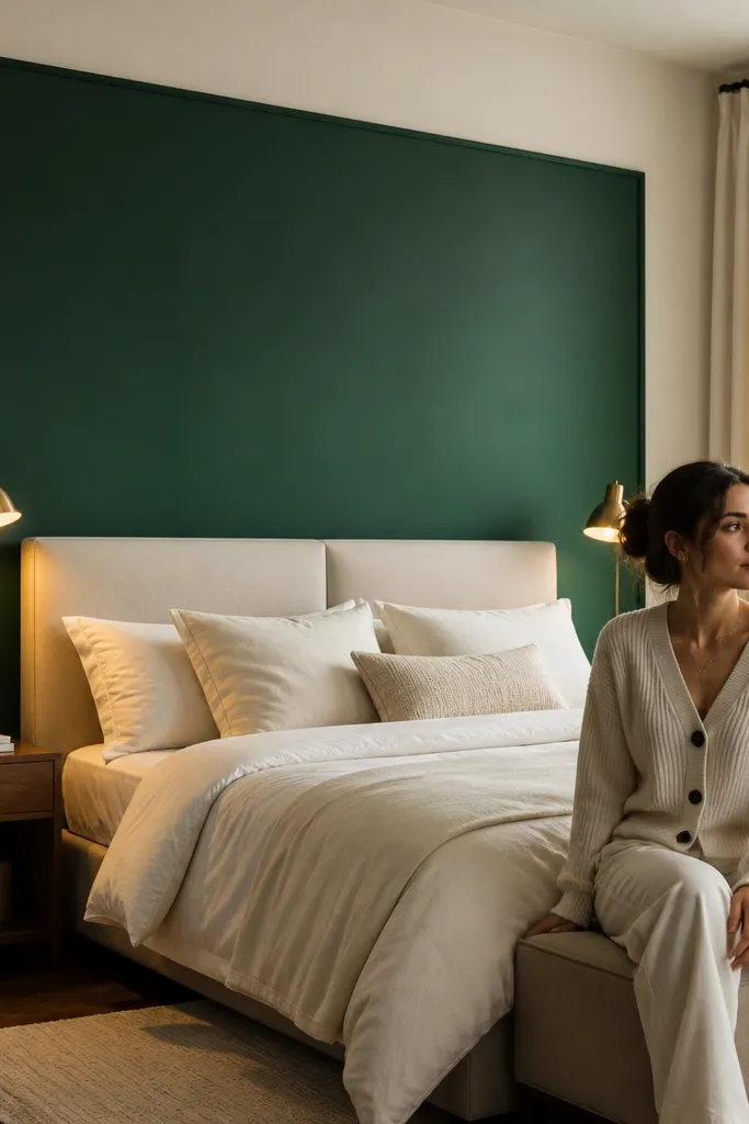
Step 1: Measure the headboard width and height, then tape a rectangle that’s 2-4 inches wider than the headboard on both sides and about 2-3 inches taller than the top. Step 2: Prime any uneven areas, then paint the emerald matte in two coats, cutting in the taped edges carefully with a 2-inch angled brush. Step 3: Remove tape immediately after the final coat’s edge is set, then do tiny touch-ups with a small brush for perfect corners.
Emerald green is one of the few bold colors that still feels classy in bedrooms, especially when you keep the boundary tight. Paint a matte emerald rectangle behind the headboard so it looks like a framed panel, not a random wall color. This works best with light upholstery, cream linens, and brass or black metal accents because the metals pop against deep green. Matte also prevents the wall from looking glossy and cheap under warm lamps. If your bedroom style is modern, transitional, or glam-lite, this is the “one wall, big impact” option that stays photogenic.
Watch outPainting the whole wall emerald when your bed is small — the room can feel swallowed.
Pro tipKeep the surrounding walls a crisp warm white so the emerald reads intentional, not accidental.