1. Chalky sage limewash with a centered bed frame
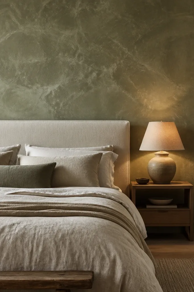
This works because limewash texture makes a light-colored wall feel dimensional without going dark. Sage stays calming for sleep, but it still shows up clearly in photos because the uneven finish catches highlights. Keep it behind the bed so the wall frames your headboard and anchors the whole layout. It solves the “blank wall” problem and avoids the flat look you get with standard eggshell paint. Pair it with warm white bedding and natural wood nightstands so the green reads fresh instead of dusty.
Start by patching and sanding the wall smooth, then prime with a bonding primer if you have stains or glossy old paint. Mix or buy a limewash-style paint in sage (matte) and apply with a wide brush using irregular strokes, working in sections so edges blend while wet. Center the limewash area on the bed: aim to cover from 6-12 inches above the headboard top to the ceiling, or do a full wall if your bed is off-center.
Use a matte topcoat only if your product requires it; extra sealing can smooth out the texture and reduce the glow.
Don’t use a satin finish on limewash-look products — it kills the soft, lived-in effect.
2. Deep charcoal paint with a 2-inch lighter border

Charcoal is dramatic, but the lighter border keeps it from feeling heavy. The border creates a visual edge that makes the wall look designed, even in smaller bedrooms. This is great if your bed is modest and you want the wall to add weight and style without adding clutter. The matte paint finish reduces glare and makes the wall look high-end. It solves the problem of dark rooms that feel gloomy by giving the eye a bright line to land on.
Pro tipKeep the border color warm (cream or ivory), not bright white, so it doesn’t look harsh next to charcoal.
Measure the headboard width and mark a rectangle centered behind it, leaving 1-2 inches of breathing room on each side. Paint the inside area charcoal first with a roller and cut-in brush, then tape a 2-inch border area around it and paint that border a warm off-white. Remove tape while paint is slightly tacky for cleaner edges, then finish with two coats of matte sealer if your paint system requires it.
Watch outSkip thick painter’s tape if your wall has texture — it can leave a raised edge.
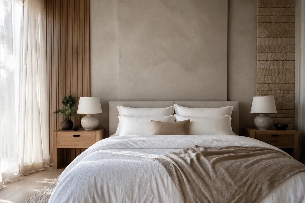
3. Vertical oak slats with a simple rail at head height
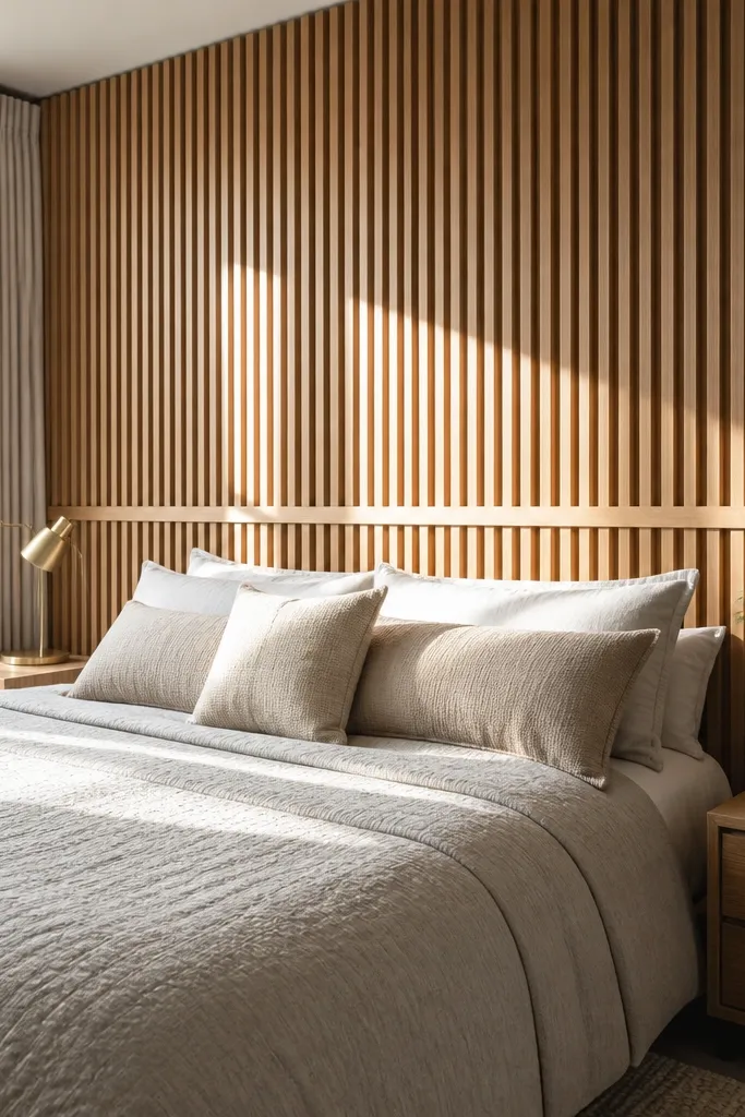
Vertical slats add height and shadow lines, which makes the wall look expensive without complex patterns. Oak tone looks warm and reads well in both daylight and lamplight. The trick is adding a single horizontal rail around head height — it gives the slats a finished rhythm and prevents the wall from feeling like a hallway panel. This is ideal for bedrooms with a low headboard or flat, upholstered bed frame. It solves the “my room needs texture but I don’t want clutter” issue.
Pick slat width around 2.5-3 inches with 0.5 inch gaps, and buy pre-finished oak or stain-grade wood. Mark your centerline with a level, then install the slats starting from the center outward so the spacing looks even. Add a simple horizontal rail band at about the top third of the headboard height, then fill any nail holes and touch up stain or finish.
Stagger the slat lengths if your wall height is odd, but keep the gaps perfectly consistent for a clean photo look.
Don’t install slats over cracked or uneven drywall without shimming — wavy lines ruin the effect.
4. Soft pink with a matte plaster finish and no pattern
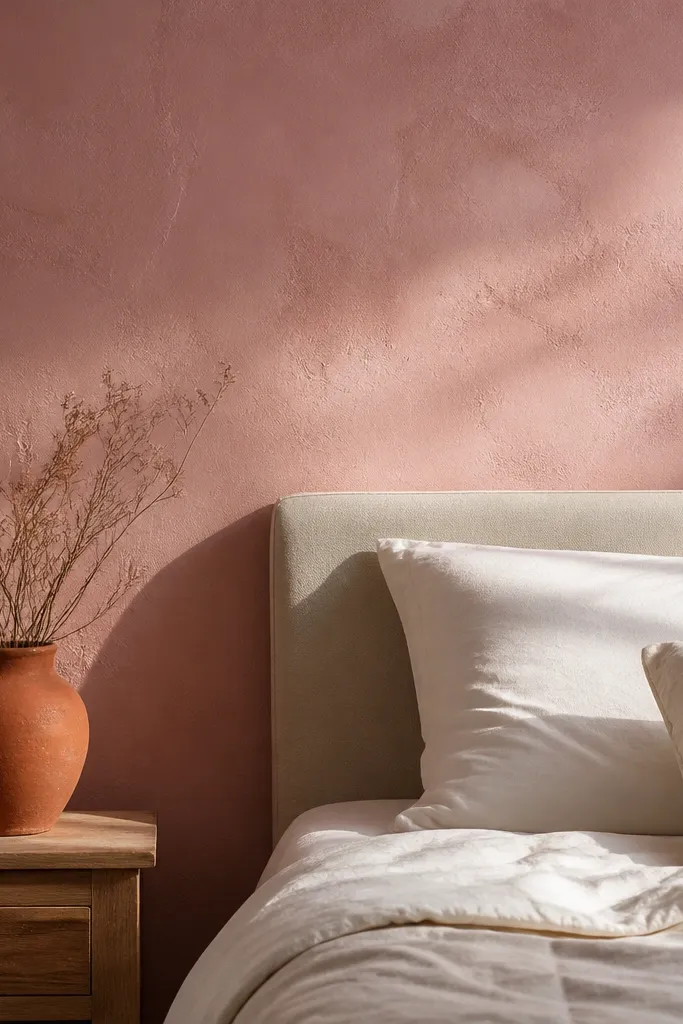
A muted pink can refresh a bedroom fast, but the look only works when the finish is matte and slightly textured, not glossy. Think dusty blush with plaster-like application so it reads cozy instead of childish. The solid color is also a lifesaver if you already have patterned bedding. This option solves the problem of accent walls that fight your linens and decor by staying simple and letting your bedding do the styling. It photographs beautifully because the surface absorbs light.
Pro tipGo one shade deeper than you think for a better contrast against white bedding.
Choose a dusty pink paint and a plaster-effect finish product (or a paint with a limewash/plaster add-on) that dries matte. Tape off the accent wall area behind the bed and apply in thin layers using a trowel or wide brush technique for subtle variation. Let it cure fully, then touch up any scuffs with the same finish so the wall stays even.
Watch outAvoid bright bubblegum pink — it looks cheap under warm bulbs.
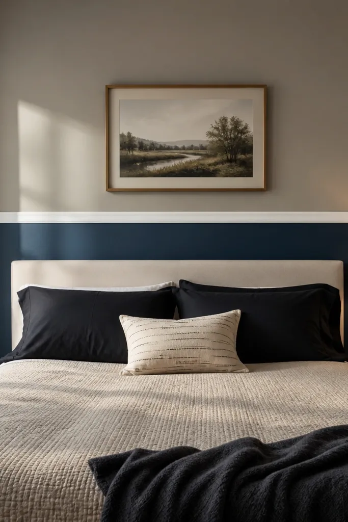
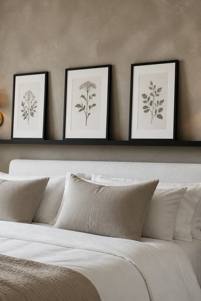
5. Bold navy with a gallery line of framed prints
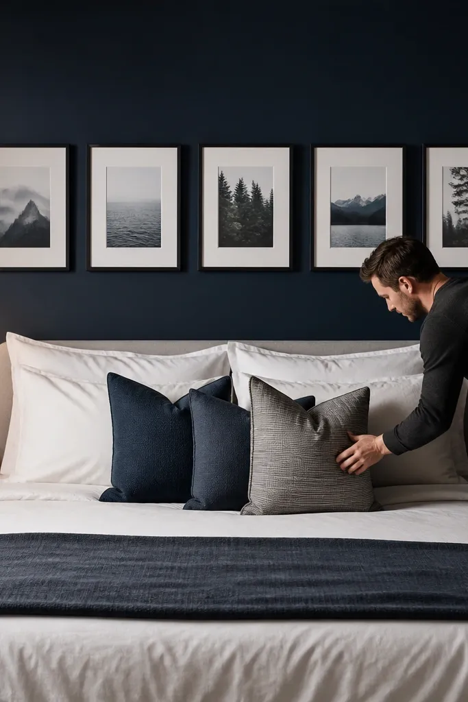
Navy is a strong accent wall color that still feels sleep-friendly when it’s matte. The gallery line approach makes the wall look curated without adding a busy pattern across the whole surface. This works best when your bed is centered and you want the art to act like a headboard extension. Use simple frames so the wall stays clean and photogenic. It solves the “accent wall looks blank” issue because the art creates a focal point immediately.
Paint the full wall navy matte, then wait for full dry time before hanging anything. Choose 3-5 frames, all the same size, and align their bottom edges to a line that sits about 6-10 inches above the headboard top. Use a laser level or a long spirit level to keep the row straight, then hang with wall anchors sized for your drywall.
Use frames in a warm metal like brushed brass or in matte black — both read sleek against navy.
Don’t mix frame sizes in a single row unless you’re intentionally creating an asymmetrical layout.
6. Black-and-white vertical botanical wallpaper strip behind the bed
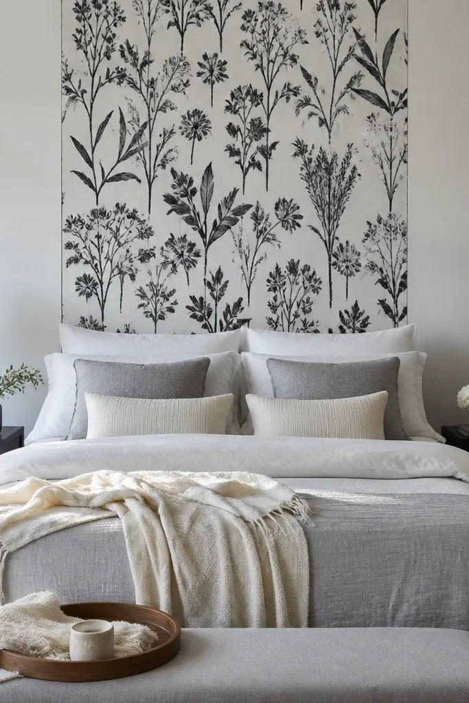
Wallpaper can look messy if you cover too much space, so this is a controlled panel: a vertical botanical print that adds movement without overwhelming the room. The black-and-white palette is forgiving with any bedding color and makes your nightstand lamps pop. Keep the panel behind the bed so the pattern reads as intentional, not random. It solves the problem of people choosing wallpaper that looks great online but feels chaotic in a real bedroom. The vertical orientation also adds height if your ceiling is under 8 feet.
Pro tipMatch the pattern at the seam before trimming — it’s the difference between “nice” and “looks designer.”
Measure the wall area behind the bed and cover a panel width equal to the bed width plus about 4-6 inches total (2-3 inches per side). Find a wallpaper with vertical repeat and plan the seam placement so the main stems align near the center. Prep with primer if the wall is porous, then apply with paste/adhesive per the product and trim edges cleanly around baseboards and outlets.
Watch outDon’t choose a wallpaper with tiny, low-contrast details for dark walls unless you know you have bright lighting.
7. 3D linen fabric panels in warm white
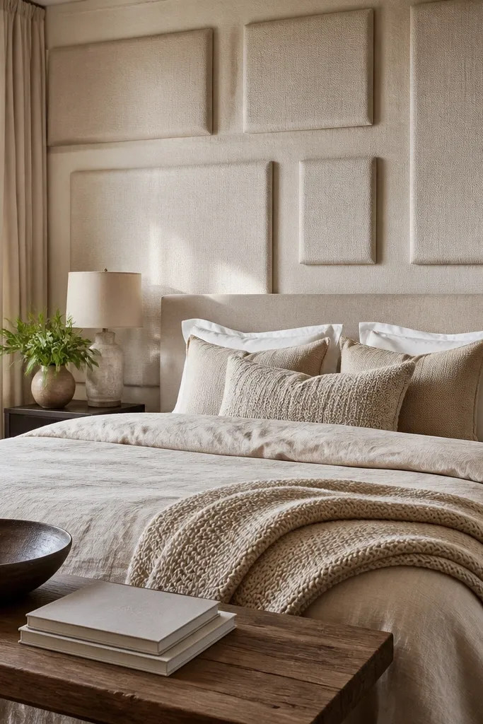
Fabric wall panels add softness and hide wall imperfections, which is a huge win in older apartments or textured drywall. Warm white keeps it airy, while the panel depth creates shadows that look good in photos. This is a smart move if your bedroom needs quiet vibes and your bed is already busy with blankets or pillows. The wall reads cozy instead of stark, and the texture makes your lighting look flattering. It solves the “my accent wall looks flat and cheap” problem because the panel depth does the heavy lifting.
Pro tipLet the fabric panels end just above the bedside lamp height line, not down to the floor, so the room feels lighter.
Pick panels around 2-4 inches deep with a linen blend cover and backing that can be screwed or glued. Mark studs with a stud finder, then install a top rail line first so the panels sit straight. Apply adhesive or use screws where the panel mounting points are, then align seams and fill gaps with trim strips if needed.
Watch outDon’t install fabric panels over dusty walls — they can pull away at the edges.
8. Terracotta tile-look panels with a matte grout line
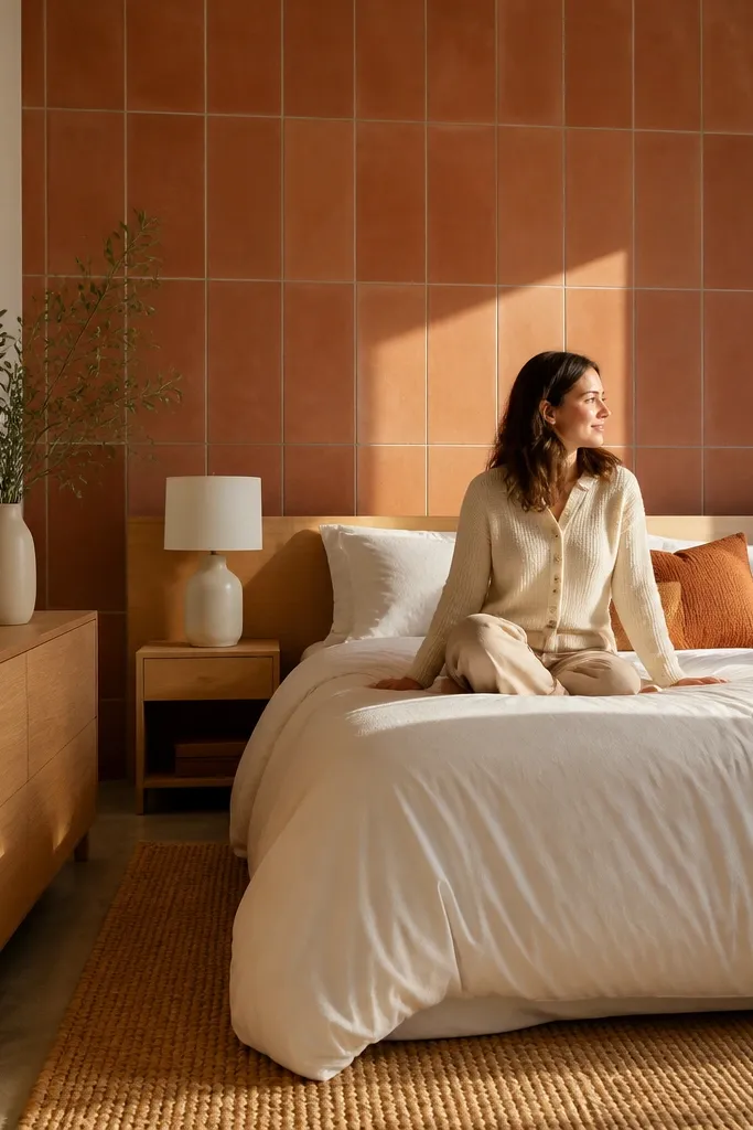
A terracotta tile-look accent wall adds warmth and color depth without the hassle of full custom tile. Choose a matte finish with a visible grout pattern so the wall reads like real masonry in photos. This is best for bedrooms with white bedding and natural wood because terracotta needs contrast to glow. It solves the “my room feels cold” issue, especially in rooms with gray floors or cool-toned walls. The texture also helps hide minor wall unevenness.
Select tile-look wall panels sized for easy cutting, or use tile sheets that install over a smooth, primed surface. Mark a straight starting line using a level, then dry-fit a row behind the bed so you don’t end up with tiny sliver cuts at the edges. Install panels with the recommended adhesive, then use matte grout caulk or grout-style joint compound where the pattern calls for lines.
Keep the tile panel height around headboard top plus 12-24 inches, so it looks intentional instead of like a backsplash.
Don’t gloss-match your grout — shiny grout looks fake and reflects light harshly.
9. Walnut veneer paneling with a simple rectangular frame
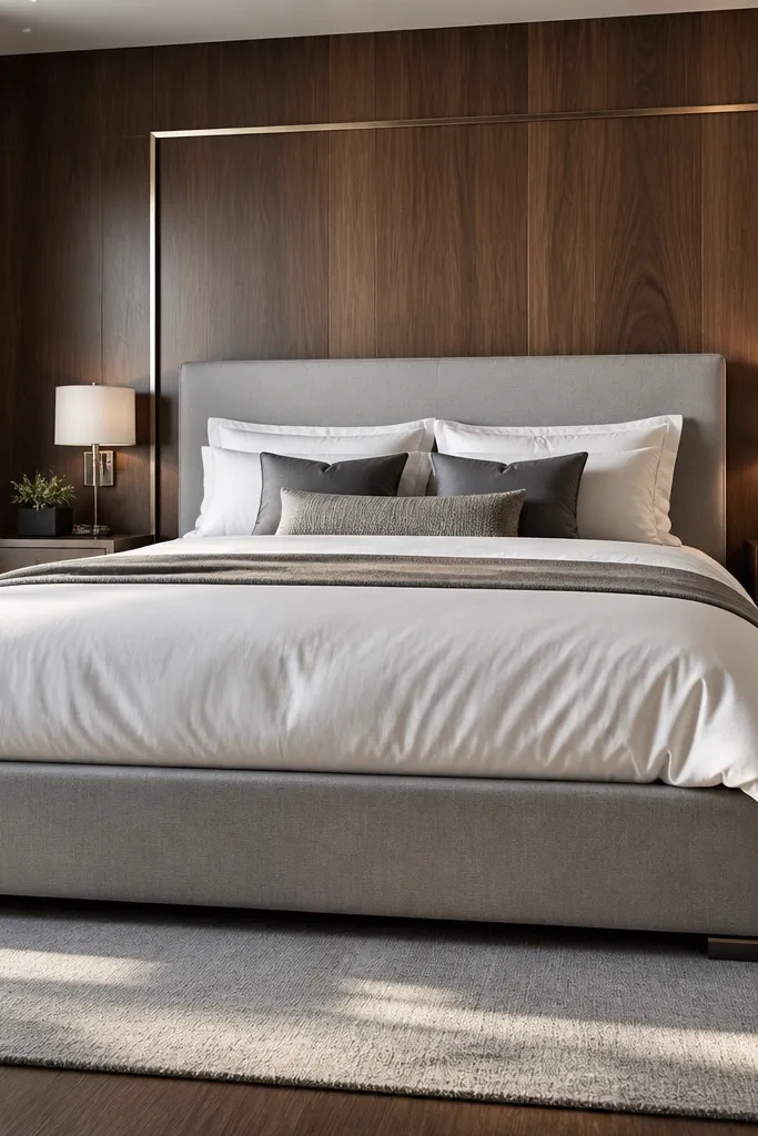
Walnut veneer paneling looks rich because the grain catches light. The rectangular frame makes it feel architectural, not like random wood. This option is perfect when your bedroom furniture is modern or when you want a warm, hotel-like feel without going full dark. It solves the problem of wood accents that look unfinished because there’s no structure around them. Keep the rest of the room light — white bedding, light oak, or warm gray — so the walnut stays the star.
Pro tipUse satin or matte clear coat, not high gloss; gloss veneer shows scratches and fingerprints.
Choose veneer panels or MDF paneling with a walnut finish, then build a simple frame with trim boards. Measure the bed width and create a rectangle centered behind it, leaving 2-4 inches from each side. Install the rectangular surround first, then mount the veneer panel inside, and finish with matching stain touch-up and a matte clear coat if the product is not pre-finished.
Watch outSkip thin, cheap veneer without backing — it can warp and looks wavy in strong light.
10. Soft gray-green paint with a wainscot-style chair rail
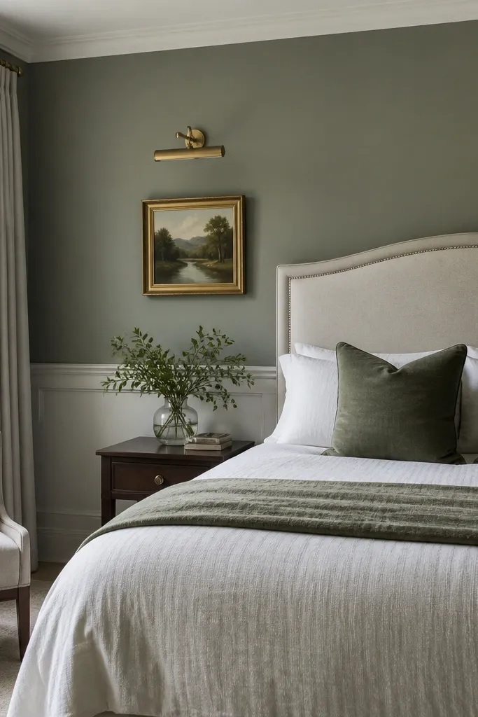
This is traditional, but it photographs modern when you keep the palette calm and the lines crisp. A gray-green upper wall with a lighter lower tone adds structure, and the chair rail line makes the wall look finished even if you don’t add art. It’s a good choice for bedrooms with a classic bed frame or a room that needs visual order. The two-tone approach also makes small rooms feel taller because the eye reads the horizontal line. It solves the blank-wall problem when you want something subtle but styled.
Pick two paint colors: a soft gray-green for the upper half and a warm off-white for the lower half. Mark the chair rail height at about 36-42 inches from the floor for most bedrooms, then install a straight chair rail using a level. Paint the lower first, let it dry, add the upper color, and touch up around the rail edges with a small angled brush.
If your ceiling is low, go lighter on the lower section so the room doesn’t feel top-heavy.
Don’t eyeball the chair rail height — a few inches off makes the whole wall look off.
11. Sunburst wood slats radiating from behind the headboard center

Sunburst patterns look bold and instantly photogenic because they create a clear focal point. Keep the slats slim (about 1-1.25 inches wide) and the finish warm (oak or light walnut) so it feels modern, not rustic. This works especially well behind a simple headboard because the pattern becomes the decoration. It solves the problem of accent walls that rely on wallpaper and can still feel flat — the geometry gives depth and direction. In photos, the sunburst draws the eye straight to the center of the bed.
Pro tipUse a matte clear coat over stained wood — it keeps the pattern readable without glare.
Mark the center point of the bed on the wall, then determine the sunburst radius based on your headboard width. Cut slats and lay them dry from the center outward, keeping equal spacing between lines (use 1/8-1/4 inch spacers). Install the slats starting at the center, then add a thin border trim around the outer edges to make it look intentional.
Watch outDon’t make the slats too wide; wide slats turn the pattern into a heavy, busy mass.
12. Monochrome ombre paint from floor to headboard height
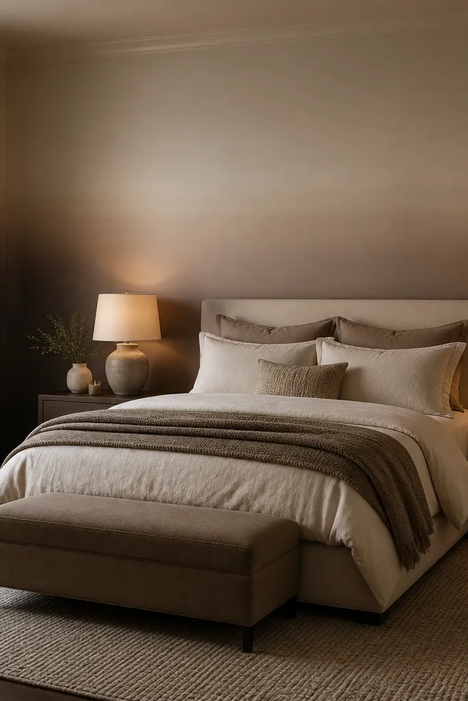
Ombre is a great accent when you want color movement without a busy pattern. The monochrome approach — same hue, different depth — looks clean and adult, and it flatters most bedding colors. Going deeper near the floor adds grounding, while lifting lighter up near the headboard keeps the upper half airy. It solves the “my room needs something but I hate patterns” problem. In low light, ombre still reads because the gradient creates depth.
Pro tipUse a large soft-bristle brush for the blend line; it smooths the transition better than a small foam roller.
Choose one paint color and a lighter version of the same hue for blending. Paint the base area deeper from the floor up to about 24-30 inches, then blend upward using a roller with light pressure and a dry brush technique where the colors meet. Keep a consistent blend height that lines up visually with your headboard top, then clean edges with a cut-in brush around corners.
Watch outDon’t use a high-sheen paint for ombre — the gradient looks blotchy under glare.
13. Gallery wall with 1 large statement canvas and 2 slim frames
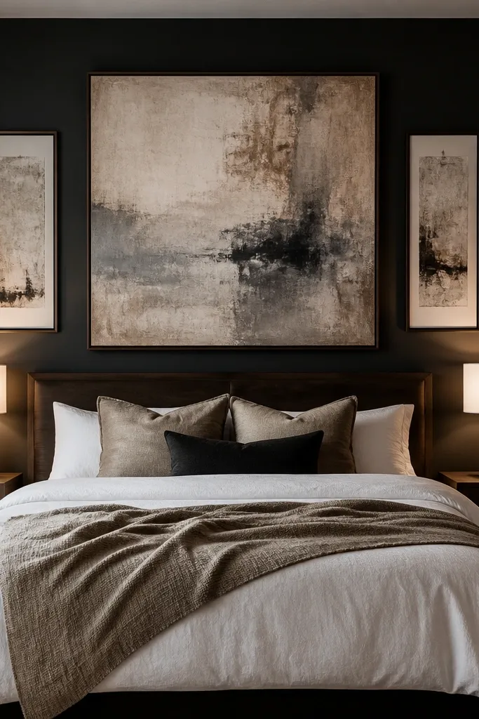
If you want a bedroom accent wall that looks styled but you hate wallpaper, go dark wall plus a tight gallery. The trick is scale: one large canvas (or framed art) centered above the headboard, plus two slim frames flanking it. This composition is photogenic because it reads as a single design block, not scattered decor. Choose a matte wall color like deep green or charcoal, then keep frame colors consistent. It solves the “accent wall needs something” problem without committing to a full pattern across paint.
Pro tipUse museum-mount style frames or frames with thin profiles; thick ornate frames make the wall feel heavy in a bedroom.
Paint the wall matte first and let it dry fully. Pick art that is roughly 60-70% of the headboard width for the large piece, then position the center so it sits about 3-6 inches above the headboard top. Hang the two slim frames symmetrically, using measurements from the center piece edges so spacing looks intentional.
Watch outAvoid mixing wildly different frame depths — shadows between frames can look messy in photos.
14. White textured plaster with a single horizontal shadow gap
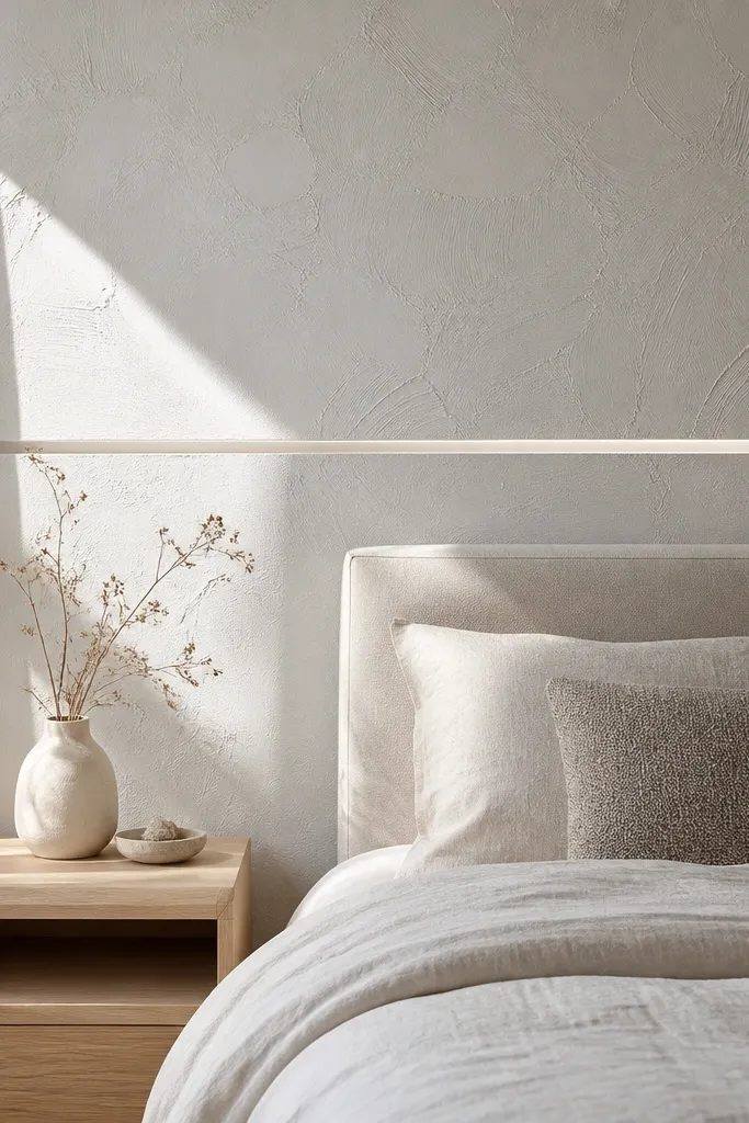
This is the “clean but not boring” accent wall. White textured plaster adds depth without adding color, and the single horizontal shadow gap gives it a modern, built-in feel. The shadow gap looks sharp and is extremely photogenic because it creates a crisp line that catches light. This option fits small bedrooms and rooms with lots of light because it avoids color saturation. It solves the problem of all-white rooms that look sterile — texture makes it warm.
Prep the wall smooth, then apply a white plaster or lime-texture finish in thin layers for variation. Install a slim trim strip to create the shadow gap line at about the headboard top height, leaving a small consistent gap (about 1/4 inch) between trim and wall surface if your system uses spacers. Apply plaster around the trim, let cure, then caulk only the necessary edges for a clean line.
Choose a plaster finish that stays breathable; sealed glossy products can look artificial on camera.
Don’t add multiple lines or trim pieces — one shadow gap looks intentional, three looks busy.
15. Hand-troweled clay plaster in warm sand with a floating bed niche
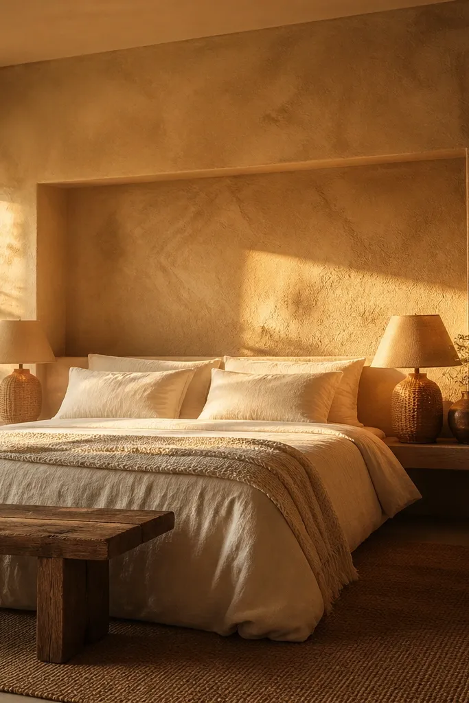
This accent wall idea gives you that “designer built-in” look without the heavy carpentry. Warm sand clay plaster reads soft and breathable, so the wall doesn’t feel harsh at night, which matters when your eye lands on it every time you sit up. The trick is a floating bed niche — a recessed rectangle behind the headboard that frames your bed like a picture, but still feels airy. It fixes the common problem of an accent wall looking flat or too loud by adding depth in one controlled spot. Use it in bedrooms where you want calm, texture, and a clear focal point without adding patterns.
Pro tipKeep the niche edges sharp by using painter’s tape as a guide for the first plaster pass, then pull it while the plaster is still slightly workable. Add a single warm wall sconce or a slim LED strip inside the niche for extra dimension after dark.
Step 1 — Mark the niche: find the centerline of the bed and measure your headboard width. Create a recess outline that is about 6 inches wider than the headboard on both sides, and 12-18 inches tall from the top of the mattress to the headboard height. The niche should sit centered and leave a 2-4 inch flat border of plaster around it. Step 2 — Build the recess: install 1/2-inch drywall or cement board on 2x2 furring strips, then tape and finish the edges so you get crisp lines. Step 3 — Apply clay plaster: use a trowel-grade clay plaster (lime-free if you want more uniform color) and trowel in 2 thin coats, letting each coat firm up before the next. Expect 2-4 hours of active work for one wall section, plus drying time; plan on roughly $120-$250 for materials depending on wall size and plaster brand.
Watch outDon’t make the niche too big — if it covers most of the wall, it starts looking like a TV alcove instead of a framed bed moment.