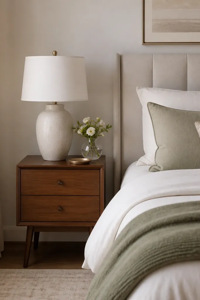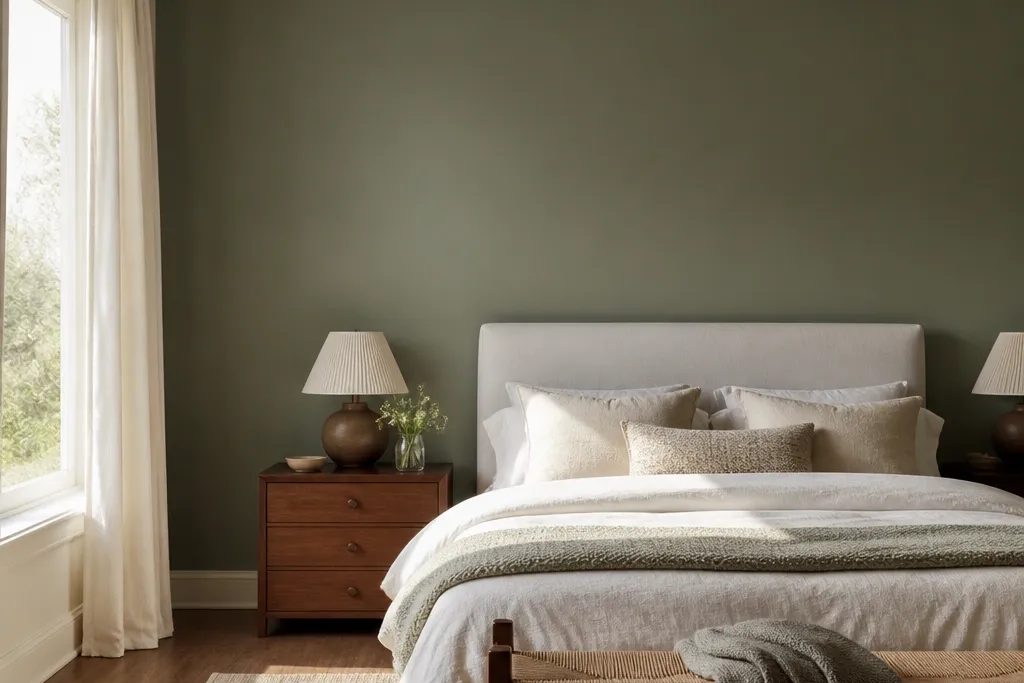
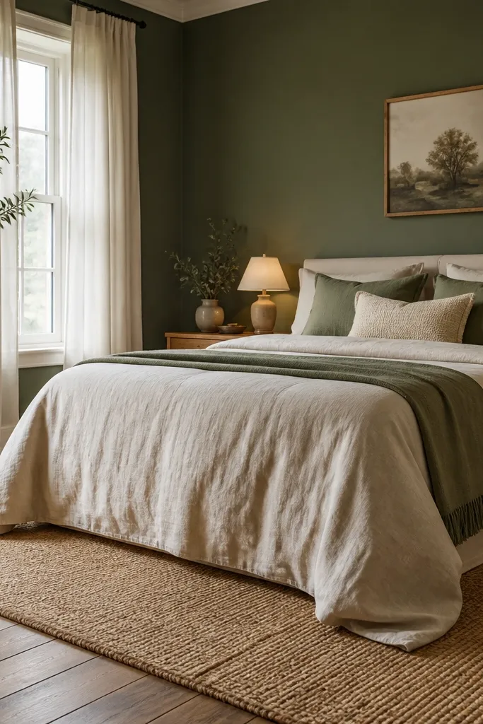
1. Sage eggshell behind the bed with creamy trim
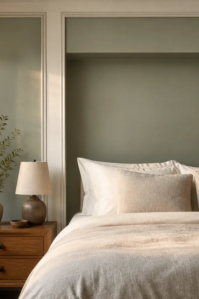
Go for a sage green that leans gray, then finish it in eggshell so the color looks soft instead of glossy. This setup is the easiest path to a calm and cozy bedroom because sage doesn’t fight with warm woods or off-white bedding. Keep the trim creamy white (not bright optic white) so the green reads like a gentle backdrop, not a block of color. Add light linen bedding and a tan or oatmeal throw so the wall has breathing room. This look works especially well in bedrooms with north-facing light where pure green can go flat.
Start by painting a test patch that’s at least the width of your headboard, then view it next to your pillowcases in the evening. Tape off creamy trim and use a bonding primer if the wall has stains or previous dark paint, then apply two coats of sage in eggshell. Install or position your headboard first so you can measure the accent wall height — aim for the full wall behind the bed, from baseboard to near ceiling for the most “finished” look. Budget-wise, expect two to three gallons for a typical queen bedroom accent wall, plus primer and supplies.
Pro tipIf your room is small, keep the ceiling the same creamy white trim color so the green feels like a calm frame, not a heavy panel.
Watch outDon’t use a bright lime-green or high-gloss finish — both make the space feel alert instead of cozy.
2. Olive satin with warm oak headboard contrast
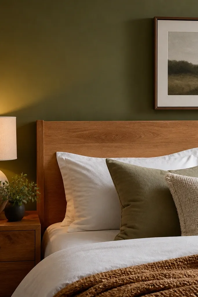
Olive green feels warm and grounded, which is why it pairs so well with oak or walnut furniture. Choose a mid-depth olive (not neon, not gray-olive) and paint it in satin so light bounces softly across the wall. The contrast between olive and warm wood makes the bedroom feel intentional without being loud. Keep bedding in cream, camel, or oatmeal and add one darker accent like chocolate leather or a black lamp base. This is a strong choice when your room gets lots of daylight and you want the green to stay calm instead of bright.
Measure the accent wall area behind the bed and buy paint for two coats, rounding up by about 15% for roller waste. Prep the wall by sanding glossy patches and wiping with a degreaser if you have any fingerprints near outlets. Roll one even coat with a 3/8-inch nap roller for a smooth finish, then cut edges with an angled brush. After two coats, let it cure fully before hanging art — at least 48 hours for handling, longer for full durability.
Pro tipAdd a warm metal lamp or brass picture frame so the olive reads cozy instead of dusty.
Watch outDon’t pair olive with cool gray furniture — it makes the green look sickly.
3. Deep forest green with black metal accents
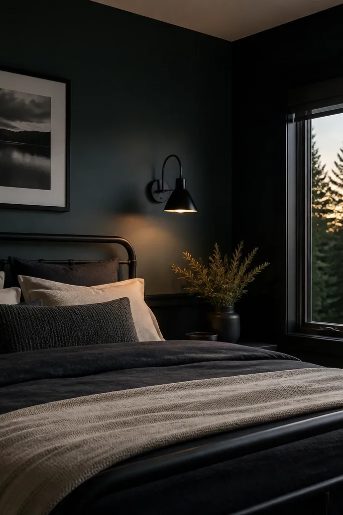
Deep forest green is dramatic, but it can still feel cozy when you control the contrast. Use a deep green that reads almost teal-black in low light, then keep the finish matte or eggshell (eggshell if you want easier cleaning). Black metal — think matte black bed hardware, a black wall sconce, or a black picture frame — makes the green look richer instead of harsh. Balance the darkness with creamy bedding and textured throws in wool or chunky knit. This setup is best for bedrooms where you want a “quiet mood” at night and you have warm ambient lighting.
Pick a deep forest sample and check it under your lamp light, not just daylight. Paint the wall using a roller for even coverage, then do a second coat only after the first is fully dry to avoid streaking. Keep the accent wall placement tight to what you want to visually anchor — behind the bed works best, especially if the bed is centered on that wall. Plan lighting first: install or place two warm bulbs (2700K) so the green doesn’t look flat.
Pro tipUse creamy white bedding with a slight warmth (not blue-white) so the wall feels cozy, not gloomy.
Watch outAvoid bright white bedding and cool-blue lighting — deep green turns icy fast.
4. Vertical wood slat wall with muted green paint
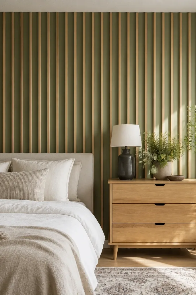
This is the “calm but not boring” accent wall. You paint the slats or paint between them a muted green (sage or moss) while leaving wood tones natural or lightly stained. The vertical lines add height and softness, and the wood keeps the green from looking flat. Use a matte or eggshell finish on the green areas so it feels natural, like a plastered wall. Pair with light bedding and warm curtains so the texture does the work visually.
Install vertical slats spaced about 1 to 2 inches apart on the accent wall, then sand and prime if the slats are raw wood. Paint the green sections with a small foam roller or angled brush to avoid getting paint on the wood unless you’re intentionally painting everything. After drying, seal the wood with a matte clear coat if you left it natural. Finish by adding a headboard or wall art that sits visually in line with the slat rhythm.
Pick mossy green with a little yellow undertone; it looks warmer through the wood grain.
Don’t use high-gloss paint on the slats — reflections make the wall look busy.
5. Plaster-look green with soft lime undertone
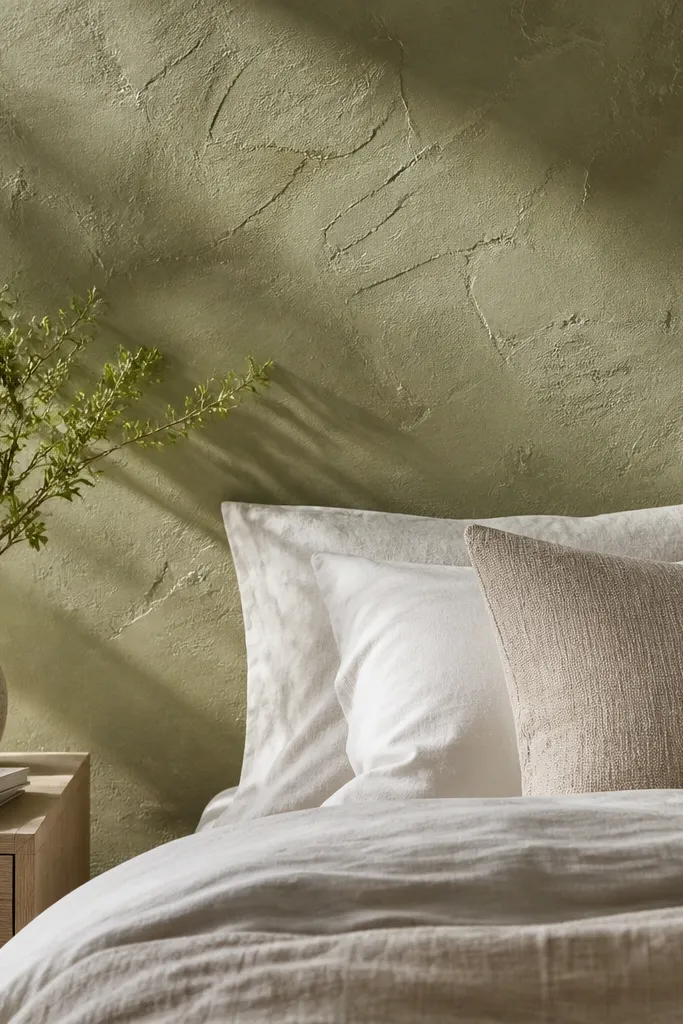
Plaster-look green makes the accent wall feel calm because it has depth without needing a loud pattern. Choose a soft lime-leaning green (still muted, not chartreuse) and apply it with a plaster or trowel texture product so the wall catches light unevenly. The texture hides small wall imperfections and keeps the color from looking like a flat paint patch. Pair with creamy bedding, natural woven baskets, and simple frames so the wall texture stays the star. This works beautifully in bedrooms where you want cozy warmth but don’t want heavy dark color.
Prep the wall by filling holes and sanding smooth, then prime with a bonding primer so the plaster product adheres. Apply the plaster-look compound in thin passes with a stainless trowel, then use a lighter hand for the final layer to control texture. Mix and apply consistently across one wall section to avoid visible banding. Let it cure, then apply a tinted sealer or topcoat if the product requires it for washability.
Pro tipTest the final texture on a small section first — plaster products can look darker after they cure.
Watch outDon’t skip primer; texture products fail adhesion faster than standard paint.
6. Geometric green accent with off-white negative space
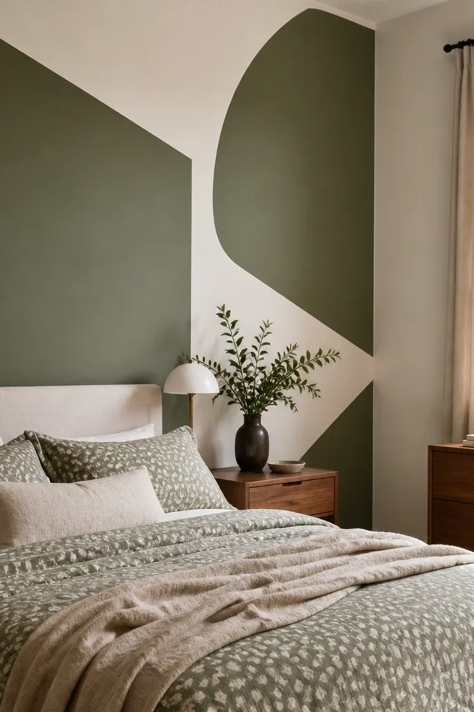
Geometric walls can feel calm if you keep the palette controlled. Use muted green in a few crisp shapes and let off-white do the breathing. The negative space keeps the room airy, and the clean edges make the wall look designed, not accidental. This works well if you have a patterned duvet because the green shapes add interest without turning the whole wall into a busy mural. Choose a sage or moss green and keep the rest of the room in warm neutrals.
Sketch a simple pattern on painter’s paper, then tape it to the wall and use a level to keep lines straight. Paint the green shapes first, then remove tape after the green is touch-dry but not fully cured to reduce tearing. Let it dry, then paint the off-white base if needed and touch up edges with a small brush. Keep the shapes roughly 12 to 24 inches in scale so they read from across the room.
Pro tipUse painter’s tape with a firm press along the edge — crisp geometry depends on pressure, not just tape quality.
Watch outAvoid tiny micro-patterns; they make the wall feel chaotic at night.
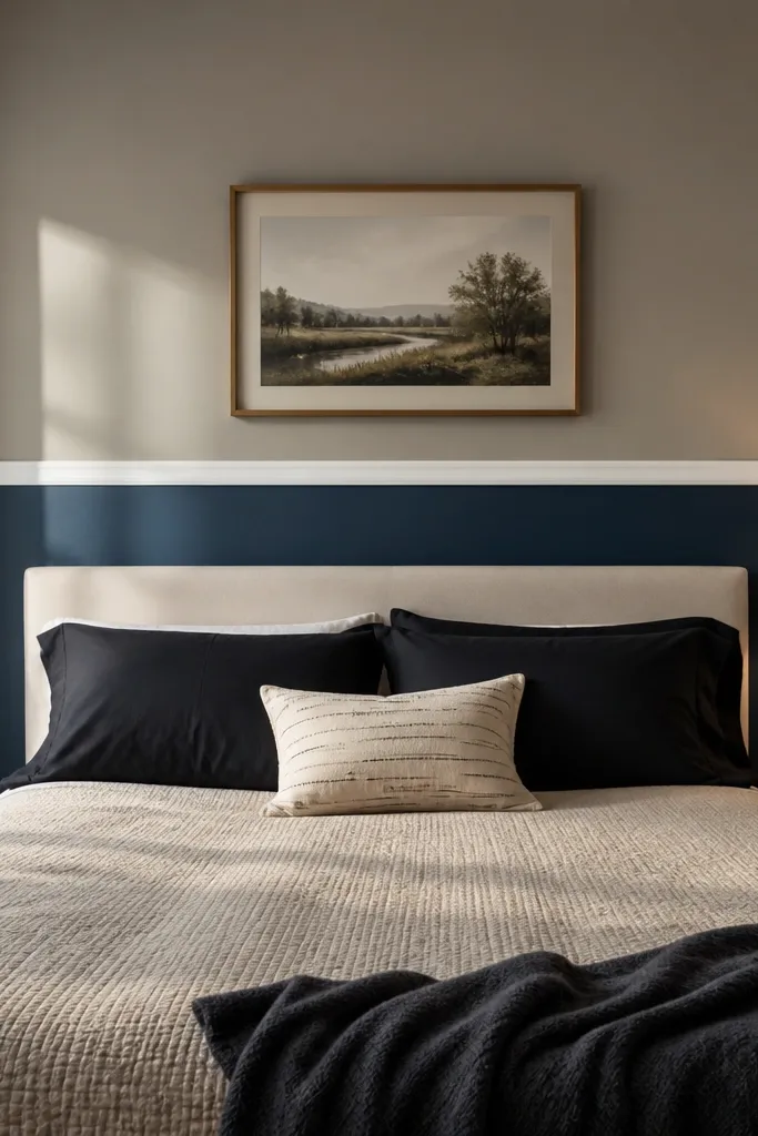
7. Moss green half-wall with a chair rail look
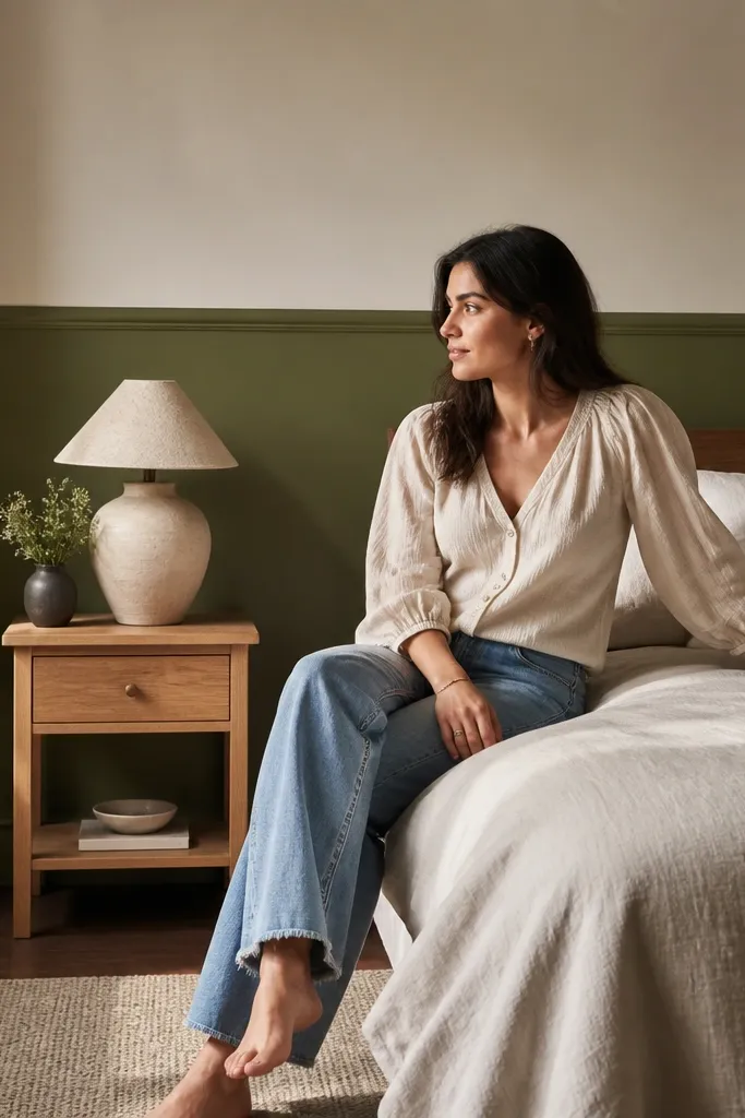
A half-wall green treatment creates coziness without covering every inch of your room. Moss green on the lower half grounds the space, while off-white above keeps it bright and calm. Add a chair rail detail or a simple trim line at about 36 to 40 inches from the floor so the proportions feel intentional. This look is ideal for bedrooms with wallpaper elsewhere, busy furniture, or rooms where you don’t want a bold full-wall color. It also works great in rentals because you can paint it cleanly and revert the off-white portion later.
Measure the room and mark a straight line at 36 to 40 inches using a laser level or long spirit level. Tape along the line and paint the off-white first if your wall isn’t already that color, then paint moss green on the lower section. Use an angled brush for the trim line and a roller for the flat areas. After two coats, remove tape carefully and let everything dry before hanging art.
Pro tipMatch your baseboards and chair rail to the off-white so the green reads like a soft stain block, not a random stripe.
Watch outDon’t pick a bright emerald for the lower half — it overwhelms the room’s height.
8. Dark green board and batten with linen bedding
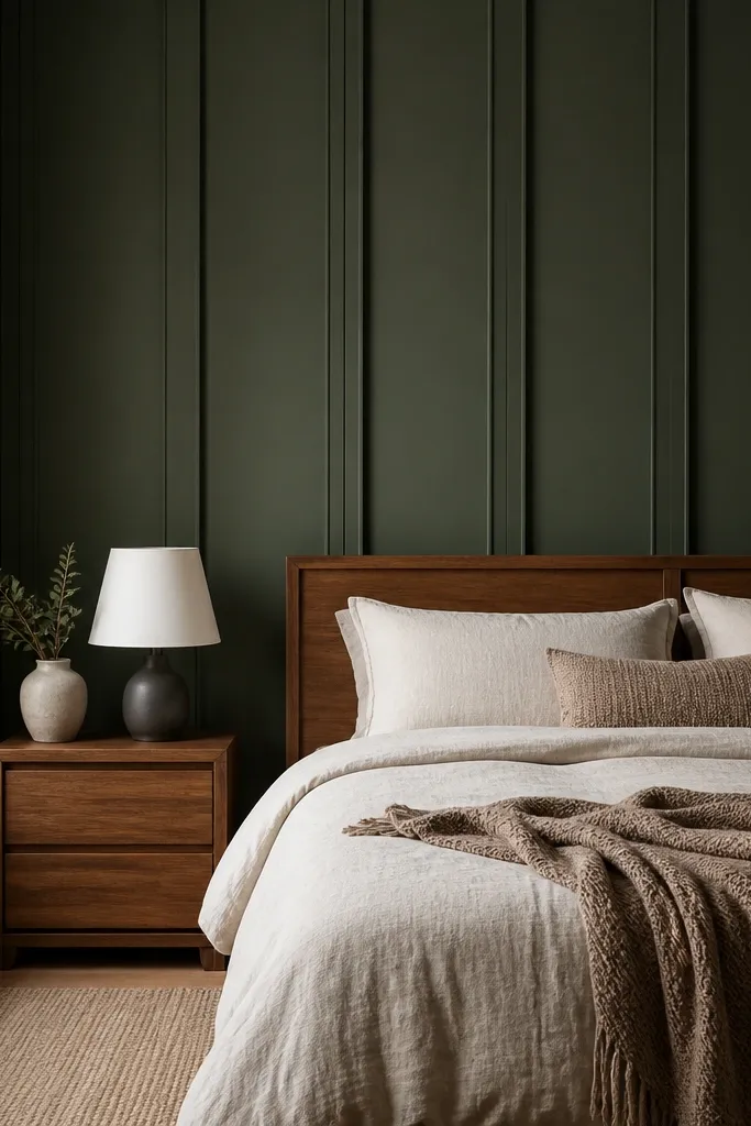
Board and batten makes green feel structured and cozy because it adds shadow lines. Use a dark green like pine or deep moss and keep the trim boards the same color for a monochrome look, or paint trim slightly lighter for more dimension. Linen bedding in oatmeal or natural white keeps the room soft and stops the wall from feeling heavy. This style is a great match for bedrooms with classic molding, or when you want an elevated look without wallpaper. It photographs beautifully because the wall has texture even when the lighting is flat.
Plan board spacing — 8 to 10 inches between vertical boards looks clean in most bedrooms. Install battens over primed drywall with a level and spacers so lines stay even, then fill nail holes and sand smooth. Paint in two coats using an eggshell finish for easier cleaning and subtle sheen. Finish by adding a simple top rail trim if you want a more traditional proportion.
Pro tipUse a warm white for ceiling and trim, so the green reads rich instead of harsh.
Watch outDon’t rush caulking; gaps show more on dark green because they catch light.
9. Emerald green wallpaper accent with one calm color
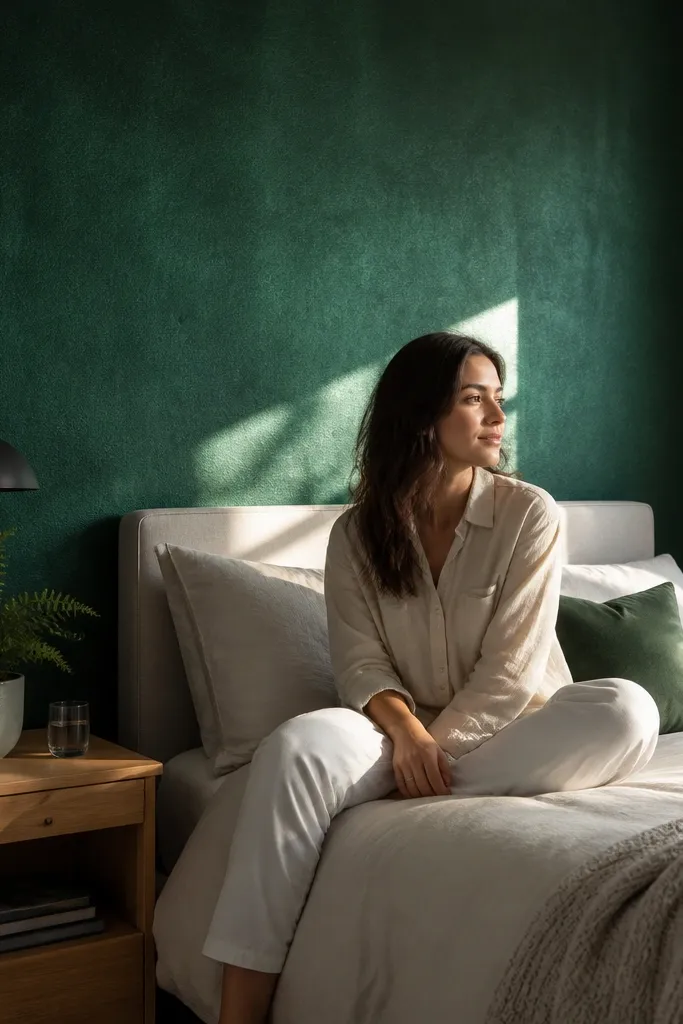
If you want the most photogenic look, use emerald green wallpaper as the accent and keep everything else simple. Choose a wallpaper with a subtle texture or small tonal pattern so it stays calm, not busy. Emerald looks luxurious, but it can get noisy if you pair it with lots of other patterns. Keep bedding and curtains in one calm neutral — cream or oat — and add a single warm wood element like a nightstand. This works best when your bedroom already has simple furniture and you want the wall to do the heavy lifting.
Measure the wall width and height, then buy extra for pattern matching if the design repeats. Prime the wall if it’s porous or uneven, then hang the paper starting from the centerline behind the bed. Smooth each strip with a plastic smoothing tool and trim edges cleanly. Plan for drying time and keep the room at stable temperature while it sets.
Pick wallpaper with a satin or matte finish, not glossy — glossy emerald turns cold under overhead lights.
Avoid mixing patterned wallpaper with patterned bedding; the wall becomes visually crowded fast.
10. Green mural effect using ombré from headboard height
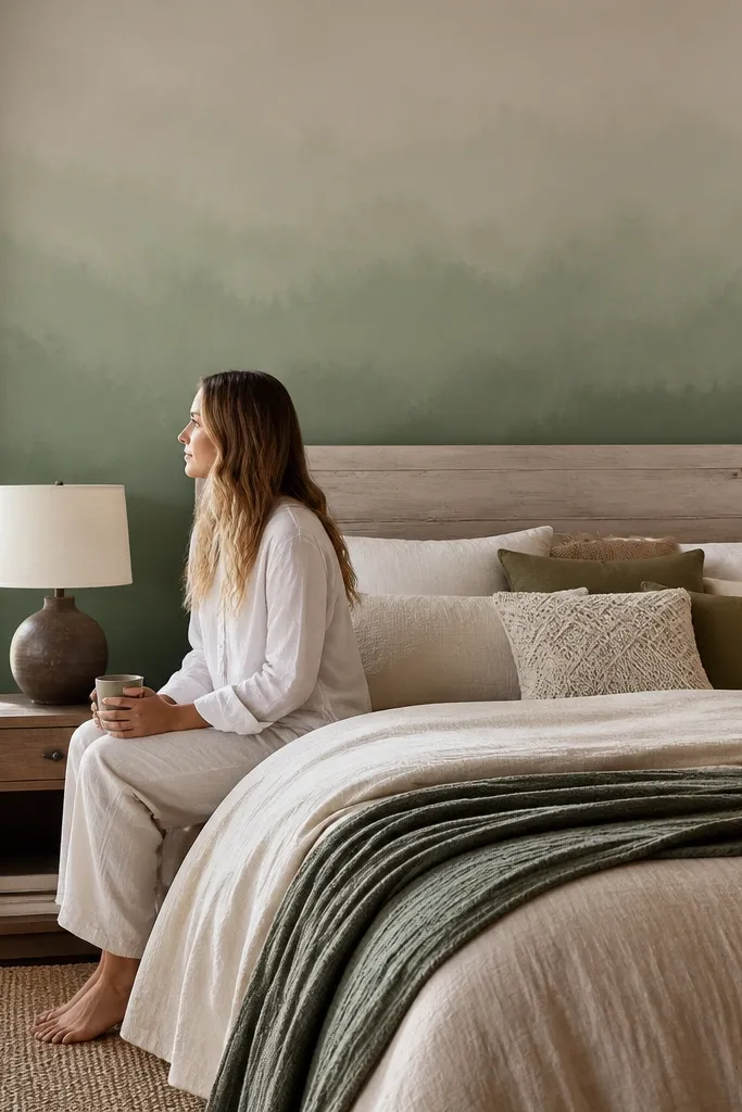
An ombré style green accent feels custom and calm because it blends instead of blocking. Start with a deeper green around headboard height and fade to a lighter sage as you go up or outward. This creates a soothing gradient that visually softens the bed area and reduces the “big color rectangle” effect. It’s perfect when your room has awkward lighting or you want the green to feel like it belongs to the space rather than sitting on top of it. Pair with soft whites and natural textures so the gradient stays the focus.
Mark where the deepest green should start — usually around 24 to 30 inches above the floor, depending on your headboard height. Paint the base with the lighter sage, then add the deeper green in a band. Blend the edges with a large dry brush or sponge while the paint is still workable, then step lighter in two passes until it looks like a smooth fade. Use painter’s tape only to control the start line; blending should be freehand.
Pro tipUse two paint colors from the same brand family (same undertone) so the blend looks natural, not muddy.
Watch outDon’t try to blend with wet paint that’s already skinned over — you’ll get harsh stripes.
11. Muted green with linen wall panels and fabric-covered headboard
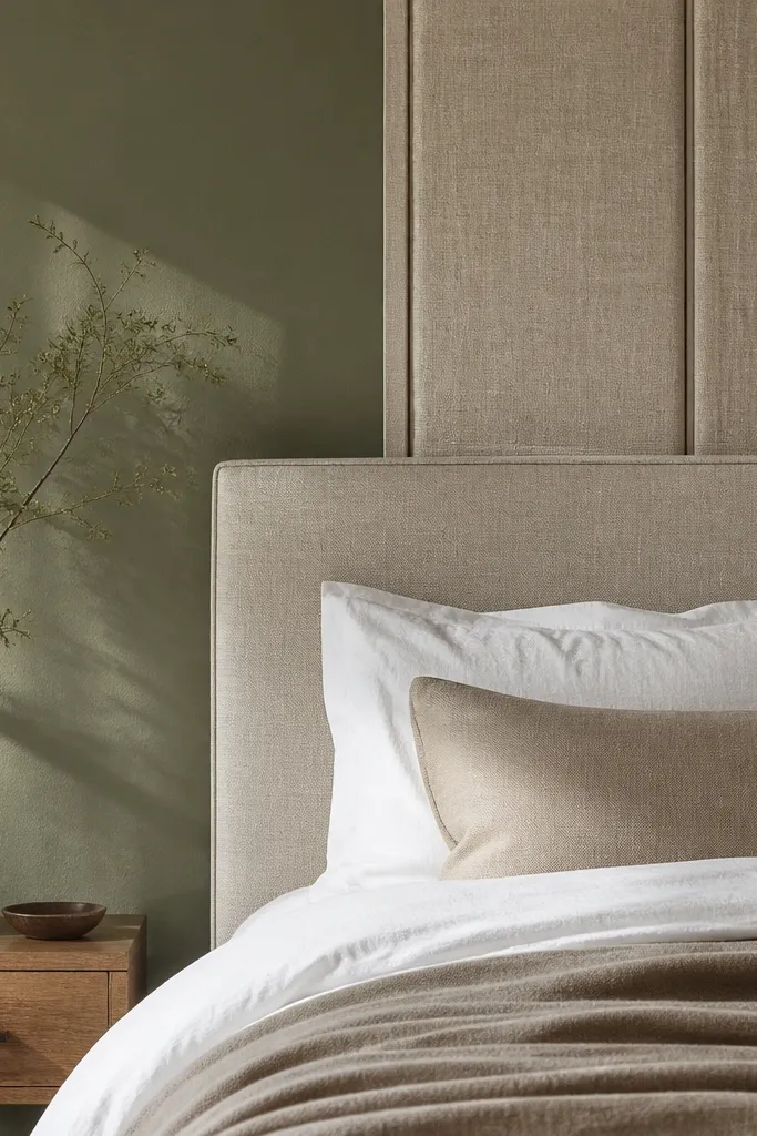
This combo makes the room feel cozy because it mixes color with softness. Paint the wall a muted green like sage or soft moss, then add simple linen wall panels or a fabric-covered headboard to bring texture close to the bed. The fabric absorbs light and makes the green look warmer, so the room feels calm even after dark. Keep the rest of the palette neutral: cream bedding, tan rug, and a warm lamp. This is a smart choice if your bedroom has a lot of hard surfaces and you want it to feel softer without adding more patterns.
Choose wall panel sizes that match your bed — panels 24 to 30 inches wide each look right beside a typical queen headboard. Paint the wall first and let it cure fully, then mount panels using a stud finder and the manufacturer’s mounting method. If you’re adding a fabric headboard, align it so it covers the same visual area as the panels. Finish with one or two throw pillows in linen or cotton in cream and a muted green tone that matches the wall.
Pro tipMatch the fabric undertone to the paint — both should lean warm or both should lean gray, or they’ll look mismatched.
Watch outDon’t use stiff, shiny fabric panels; they reflect light and make the green feel colder.