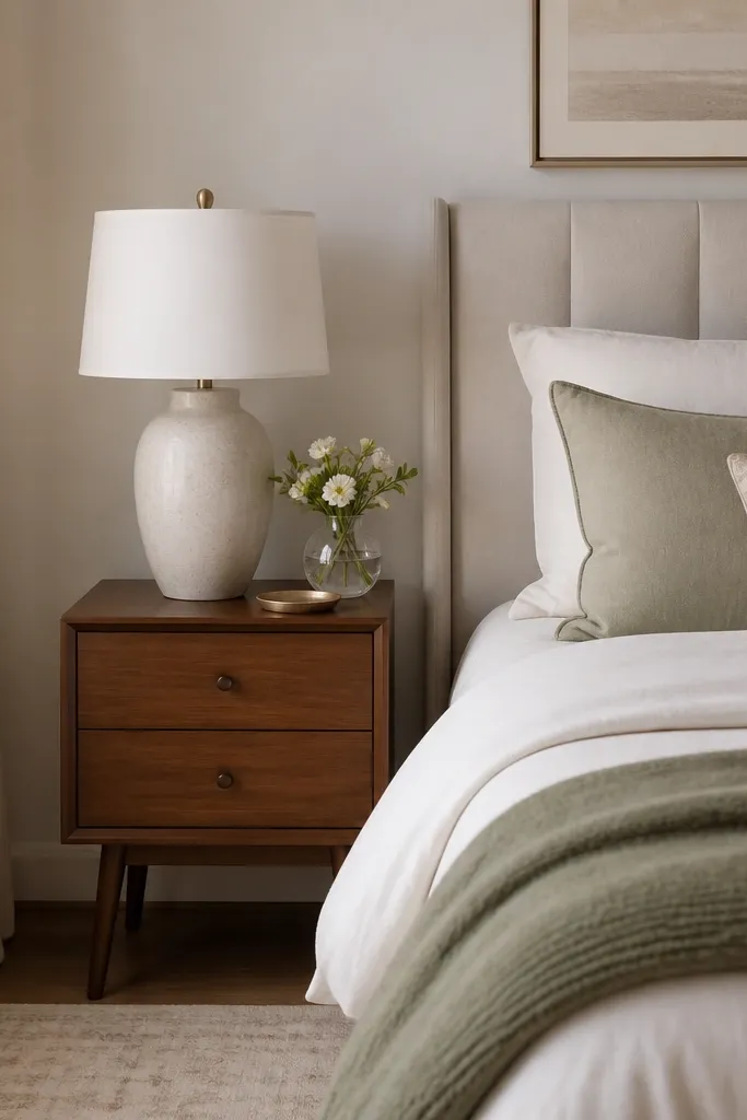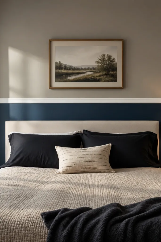
1. Plaster-look microcement in warm greige
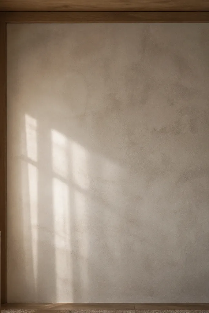
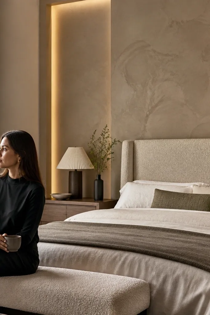
Go for a plaster-look microcement finish in warm greige when your room feels too clean or too flat. This look reads high-end because it has subtle movement — not a flat paint wall — and it catches light without turning shiny. Choose a greige with a hint of beige rather than a cool grey so the accent wall warms up your bedding and wood furniture. It’s especially good for bedrooms with simple, modern lines because the texture adds depth without adding visual clutter. If you have imperfect wall drywall, microcement-style finishes hide small flaws better than slick paint, which keeps the wall looking expensive.
1) Prep matters: sand the wall to a smooth, uniform surface, then prime with a bonding primer made for cementitious coatings. 2) Apply in thin passes using a finishing trowel; aim for a consistent skim thickness so the texture reads even across the wall. 3) Seal with a matte or low-sheen clear coat; keep it breathable so the wall doesn’t look plastic. Plan on about 2-3 days for dry/cure time depending on product and humidity, and expect a mid-range cost if you hire a finisher.
Pro tipPick greige that matches your duvet base color within one shade family — the wall should blend, then reward you with texture when you move.
Watch outSkip high-gloss sealers; they reflect overhead light and make the wall look like a coating, not plaster.
2. Walnut slat wall with shadow-gap framing
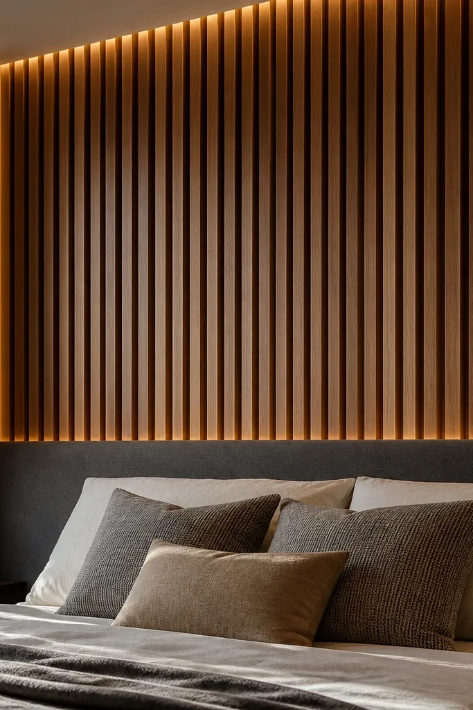
A walnut slat wall with a shadow-gap border is one of the cleanest ways to get “hotel suite” energy in a bedroom. Vertical slats elongate the wall and make ceilings feel taller, which is a big win in typical apartments. Use medium walnut with a satin finish so the wood grain looks warm under both daylight and lamps. The shadow gap is what makes it feel custom — you see depth, not flat boards. This works best when you have a solid bed frame or a simple headboard because the slats become the hero without competing with patterns.
1) Mark your layout: start with the bed width, then center the slat pattern so the edges align with nightstands. Use 2-3 in. Wide slats with 1/2 in. Gaps for a luxe rhythm, and keep the slats perfectly level with a laser or long level. 2) Build a perimeter frame first using 1x2 or similar straight stock, then fasten slats onto the frame with finish screws. 3) Stain and seal after installation, or stain slats beforehand if you’re confident about matching tones; finish with a satin topcoat.
Pro tipRun the shadow-gap border about 2 in. Thick around the accent zone — it frames the bed and makes the whole wall look intentional.
Watch outDon’t use glossy walnut oil; it can look wet and cheap under warm bulbs.
3. Oversized fabric wall panels in oat bouclé
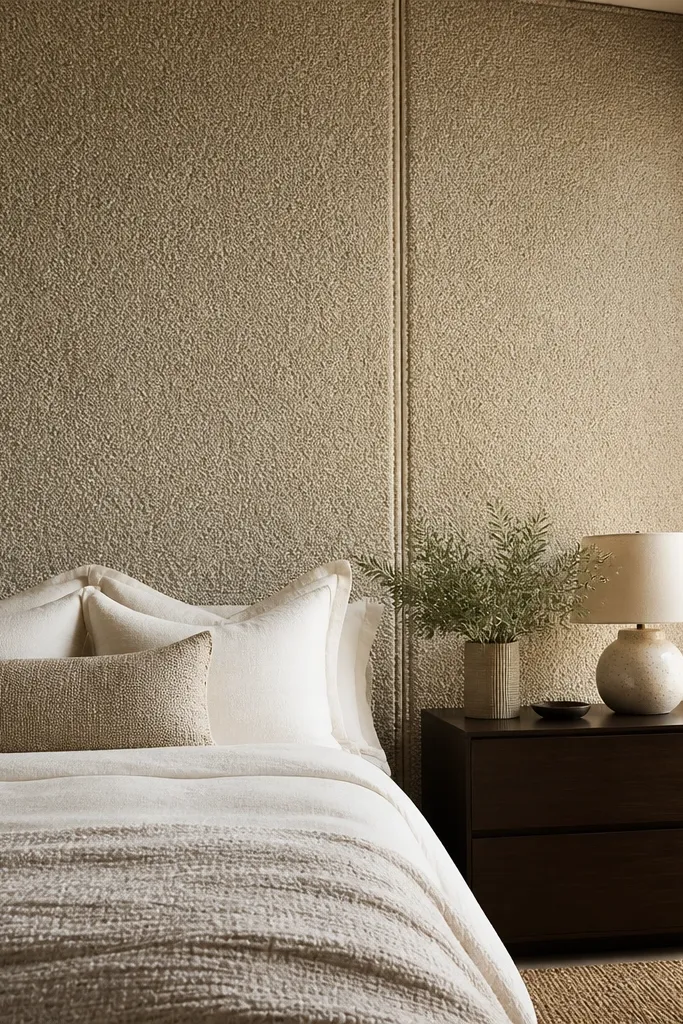
If you want a bedroom accent wall that looks expensive the second you walk in, go with oversized fabric panels in oat bouclé. Bouclé catches light in a soft, cloud-like way and adds warmth to rooms that feel stark. The key is scale: panels should be large enough to read as a single design field, not a patchwork. Use oat or warm cream rather than bright white so the wall looks inviting and doesn’t turn grey in low light. This is perfect for bedrooms with upholstered beds or soft bedding, because the texture language matches.
1) Plan panel sizes: for a typical queen bed wall, use two to four large panels across the accent zone, like 24-36 in. Wide each, so seams stay minimal. 2) Install a flat backing layer (thin plywood or hardboard) on studs, then stretch and staple the fabric tightly, keeping the nap direction consistent. 3) Add trim over edges (simple fabric-wrapped welt or thin molding) and finish with a clean, matte lining so the wall doesn’t look baggy.
Pro tipChoose fabric with a tight, even loop texture; loose bouclé can look fuzzy and messy from across the room.
Watch outSkip tiny panels with lots of seams; that reads craft-store, not luxury.
4. Deep green matte paint with a picture-frame trim border

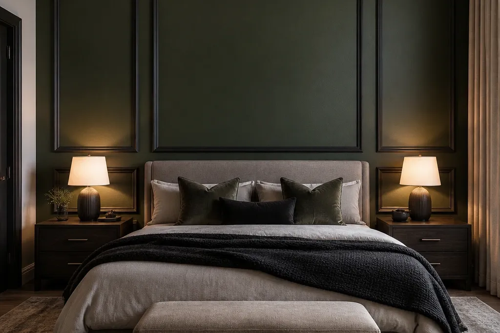
Deep green matte paint plus a picture-frame trim border is a classic luxury move that doesn’t require special materials. The matte finish looks expensive because it absorbs light instead of reflecting it, and deep green makes bedding and wood look richer. The trim border creates structure and makes the wall feel architected, especially when your headboard sits centered. Pick a green that leans slightly warm (forest-leaning, not blue-leaning) so it doesn’t turn harsh in the evening. This works well in bedrooms with neutral linens and brass or gold accents.
1) Paint first: prime, then apply two coats of matte deep green, keeping edges crisp with painter’s tape. Let it cure fully before adding trim. 2) Install 1x2 or similar trim to create a rectangle around the bed area; keep inside dimensions aligned with your headboard width plus 6-10 in. On each side. 3) Caulk edges and paint trim in a matching sheen (matte or eggshell) so it looks built-in, not stuck on.
Pro tipUse a light source test: look at the wall at night with lamps on before you commit to the green shade next to your bedding.
Watch outDon’t skip caulking at trim edges; tiny gaps show instantly and kill the upscale look.
5. Herringbone linen wallpaper in warm stone

Herringbone linen wallpaper in warm stone gives you pattern with restraint, and it looks upscale because it adds texture without going loud. The angled weave catches light differently across the day, so the wall looks dimensional even when everything else is calm. Choose a warm stone base that sits between beige and greige so it doesn’t compete with wood floors. This is best in bedrooms where you want visual interest but you don’t want dark paint or heavy wood. It also photographs well because the pattern creates depth without needing extra lighting.
1) Measure and plan: find the centerline of the bed wall, then dry-lay a strip to confirm how the pattern aligns at the edges. 2) Use a paste/adhesive that matches the wallpaper type, and keep seams tight; use a seam roller if the paper calls for it. 3) Trim carefully around outlet covers and keep the pattern alignment consistent across the accent zone, aiming for a continuous herringbone “flow.”
Pro tipBuy one extra roll and label it by batch; small dye shifts show up on patterned walls.
Watch outSkip wallpaper with a shiny finish; it looks cheap under overhead fixtures.
6. Blackened oak paneling with vertical boards
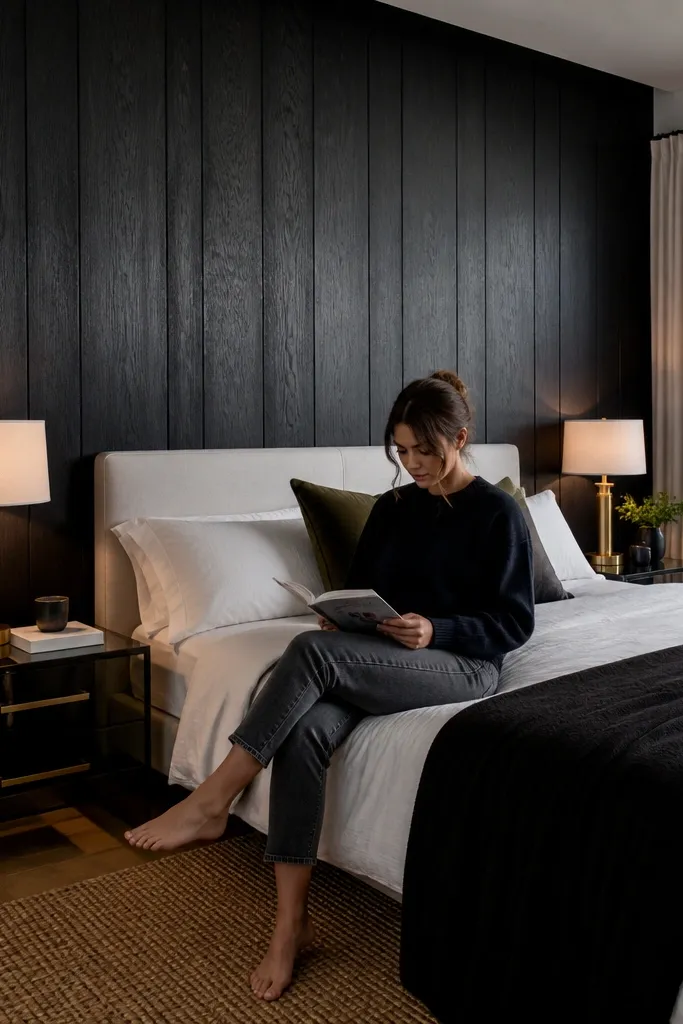
Blackened oak paneling is for bedrooms that want drama without looking messy. The deep tone makes the headboard and nightstands look sharper, and the vertical board layout adds height. Choose a blackened finish that still shows grain; that texture is what makes it look high-end instead of flat black. This style works beautifully with warm metals like brushed brass or aged bronze and with creamy bedding. It’s also a great fix if your room has lots of light-colored walls and you want a confident focal point.
1) Decide your panel width: use 3-4 in. Boards with consistent spacing (like 1/4-1/2 in. Gaps) for a modern upscale rhythm. 2) Install a level ledger strip first, then attach boards to studs or solid backing using finish screws, keeping all boards plumb. 3) Seal with a matte or satin clear coat to reduce glare and protect the finish; touch up screw holes with matching stain before sealing.
Pro tipKeep the accent zone height tight: cover from about 8-10 in. Above the headboard top to the ceiling only if ceilings are tall; otherwise stop around 90-96 in. For a clean frame.
Watch outDon’t choose a flat, paint-like black finish with no grain — it reads like a budget makeover.
7. Porcelain-look wall tiles in warm ivory with a matte grout
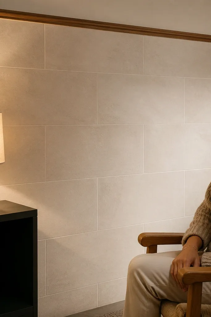
Tile is the most reliable way to make a bedroom accent wall look “built-in,” and porcelain-look tiles in warm ivory keep it soft. The luxury effect comes from the surface finish and the grout choice: matte grout makes the wall look architectural, not glossy and cheap. Pick tiles with subtle variation (not big dramatic veining) so the wall stays calm and works with linen, wood, and metal. This is a strong option for primary bedrooms where you want durability and easy cleaning near a headboard. It also hides wall imperfections better than paint.
1) Plan your layout: dry-fit the first row so you don’t end up with thin slivers at the edges; start with a level guide strip. Use 12x24 in. Or similar plank-format for a more upscale, less busy look. 2) Apply thinset with the correct trowel notch, set tiles, then use spacers for consistent joints. 3) Grout with a matte, sanded grout in a warm ivory tone; after curing, seal if the product recommends it.
Pro tipUse a grout color slightly warmer than the tile — it makes the tile read deeper and cleaner in photos.
Watch outSkip glossy grout or shiny tile; reflections make the wall look colder and less luxe.
8. 3D plaster panels in off-white for a hotel-texture effect
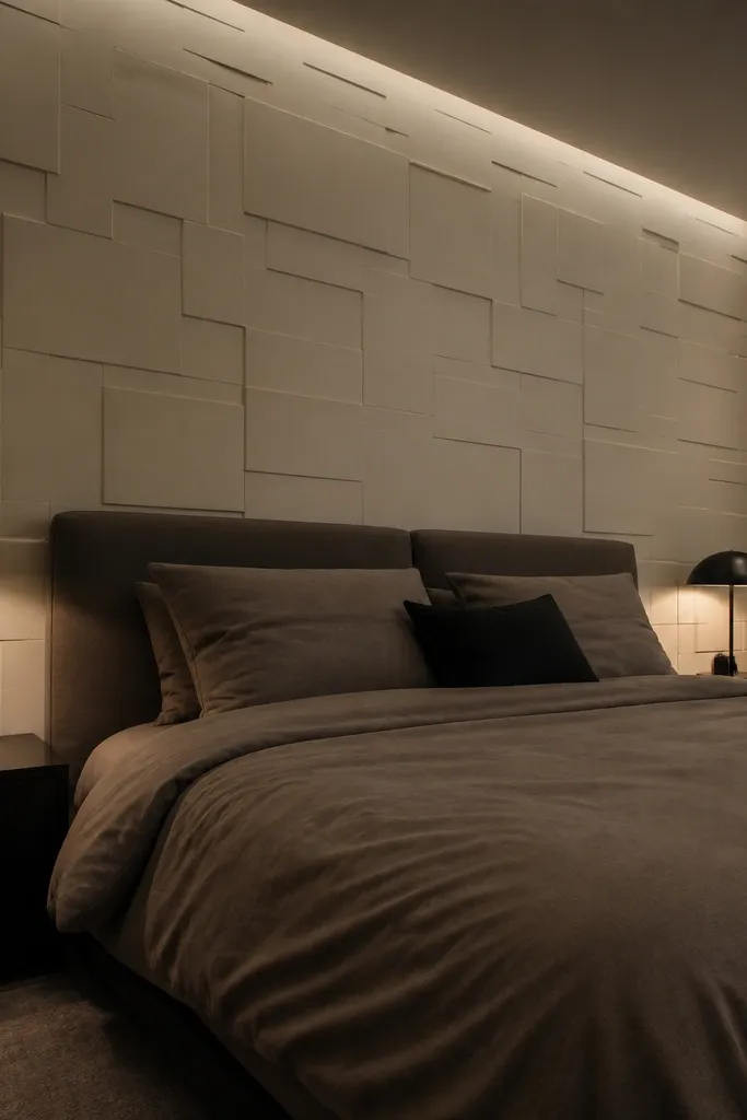
3D plaster panels in off-white give you depth that reads from across the room, even with low lighting. The luxury comes from the relief pattern and the finish: an off-white that’s slightly warm makes the shadows soft, not harsh. Choose a panel design with gentle geometry like shallow waves or rectangles; it looks upscale and doesn’t feel trendy. This works in bedrooms with simple furniture because the wall becomes the texture focal point. It’s also ideal if you want something that looks custom but don’t want to deal with full wood paneling.
1) Mark your accent zone and find the centerline, then dry-fit a row to see how the relief pattern lands around your headboard. 2) Install panels with construction adhesive rated for the panel material; press firmly and use spacers or guide strips if the system provides them. 3) Fill seams with joint compound or the included filler, sand smooth, then paint with a matte off-white. Two thin coats look cleaner than one heavy coat that fills in shadows.
Paint after installation, not before; it makes the shadows consistent across all panels.
Don’t overfill seams so the relief disappears — keep texture edges crisp.
9. Stone veneer in light travertine tone with a clean cap
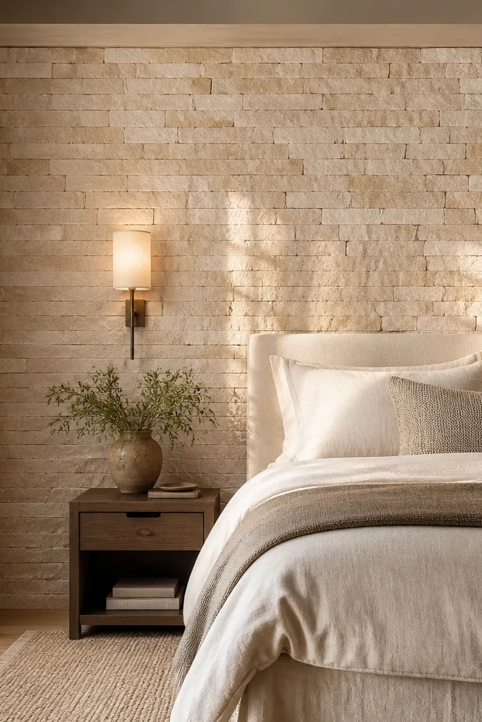
Light travertine-toned stone veneer brings real weight and luxury texture to a bedroom without going full rock wall. The key is choosing a tone with warm whites and soft beige striations, not grey. Stone looks best when it’s framed neatly, so keep the top edge capped with a straight trim and the sides clean. This is ideal for bedrooms with earthy bedding, tan leather accents, or warm wood furniture. It also solves the “my wall looks blank” problem because stone reads as material, not decoration.
1) Build a level starting line and install a backer board or cement board where required; follow the veneer system instructions. 2) Set stone with thinset in small batches, mixing pieces from different cartons so the tone stays natural. 3) Use a minimal grout approach if your veneer system recommends it, then seal with a matte sealer so the surface doesn’t look wet.
Pro tipPick one stone cap trim piece and commit to it; random edge cuts make stone look DIY.
Watch outSkip high-gloss sealers; they create shine that makes the wall feel like a showroom sample.
10. Matte lacquer wallpaper in smoky taupe with vertical striations
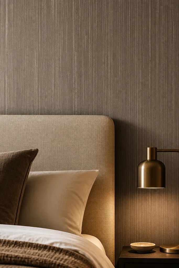
Smoky taupe wallpaper with vertical striations gives you a luxury look that’s almost architectural. The vertical lines create height, and the “matte lacquer” finish reads smooth but not shiny. This is a great option when you want something more upscale than paint, but you don’t want to commit to wood or stone. Choose taupe with a hint of grey-brown so it pairs with both silver and brass lighting. It’s especially good for bedrooms with patterned bedding because it adds texture without loud color.
1) Choose an installable pattern: confirm the repeat and that the striations align without complex matching at seams. Mark your centerline and apply paste/adhesive per instructions, keeping the first strip perfectly plumb. 2) Smooth seams with a seam tool and wipe excess paste immediately so the finish stays clean. 3) Trim around outlets and finish with a slim molding or clean tape line on the edges of the accent zone.
Pro tipIf your room has dark bedding, go one shade lighter than you think; taupe can look heavy in low light.
Watch outDon’t choose a wallpaper with visible micro-shine; subtle sheen is fine, mirror shine is not.
11. Large-scale botanical mural in muted sage with matte backing
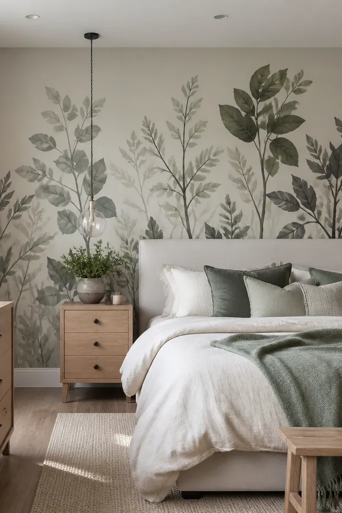
A large-scale botanical mural in muted sage is upscale because it adds art without turning the room into a theme. The trick is scale and color restraint: keep the palette to sage, oat, and soft charcoal so it stays calm. Use a matte mural backing or a mural finish that doesn’t glare under ceiling lights. This works best for bedrooms with neutral furniture and a simple headboard, where the mural can take the spotlight. It also solves the problem of “my accent wall needs personality” without the chaos of bright florals.
1) Center the mural to the bed: find the headboard center and align the main stem or focal cluster to that line. Measure the wall width and choose a mural size that lands cleanly at edges without awkward cropping. 2) Prep the wall smooth and paint the base color close to the mural background so seams don’t show through. 3) Install carefully by panels, keeping each panel aligned; seal with a matte topcoat only if the product calls for it.
Pro tipAdd one matching element in bedding — a sage throw or pillow — so the mural looks integrated, not pasted on.
Watch outSkip glossy murals; reflections make botanical art look cheap and distract from the details.
12. Oversized framed linen panels with wide matte frames
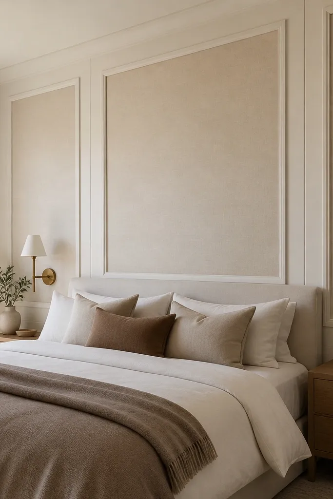
Oversized framed linen panels with wide matte frames feel custom because they look like built furniture, not a wallpaper trick. The luxury comes from the negative space: wide frames create rhythm and make the wall feel designed. Choose linen in cream or sand, and paint frames in matte white, bone, or a muted taupe that matches trim elsewhere. This option is forgiving if your wall isn’t perfectly straight because the frame edges visually correct small unevenness. It suits bedrooms with classic or transitional furniture and works beautifully with brass sconces.
1) Build a grid: measure your accent zone and plan two or three large panels so the wall doesn’t get too busy. Use 1x3 or 1x4 frame boards for wide borders, then attach a backing layer for stapling the linen. 2) Stretch linen tightly and staple on the back, then mount the frame over the edges. 3) Paint frames before installation for clean coverage, then caulk the frame perimeter to keep the edges crisp.
Keep all frame widths identical and align them to the bed centerline — that’s what makes it look expensive.
Don’t use thin picture frames; narrow borders read decorative instead of architectural.
13. Luxe wallpaper with a metallic-free damask in warm ivory
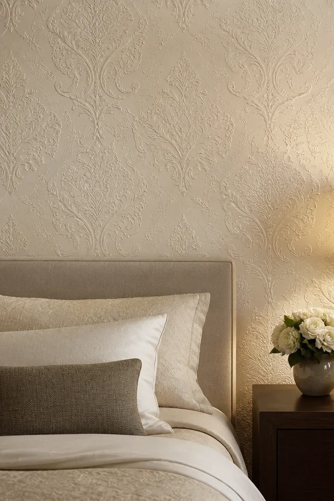
For an upscale look that still feels calm, pick a metallic-free damask in warm ivory. Damask adds pattern depth, but without shiny metallic inks it stays soft and bedroom-appropriate. The warm ivory base keeps it from looking stark, and the raised or textured damask makes the wall read dimensional even with minimal decor. This works when you have classic furniture lines, a tufted headboard, or traditional molding around the room. It’s also a smart choice if you tried bold colors and found them too loud for your sleep space.
1) Choose the right damask scale: large damask works best behind a headboard; small damask can look busy when viewed from bed. 2) Install with careful seam alignment and keep the first strip plumb; damask patterns are unforgiving if the wall isn’t straight. 3) Finish with matching trim or a slim molding border so the accent zone feels framed, not wallpapered randomly.
Pair it with matte hardware and avoid glossy mirrors; it keeps the damask feeling soft, not flashy.
Skip metallic damask; it reflects light in a way that can look dated and overly decorative.
14. Monochrome terrazzo-look paint with subtle speckle
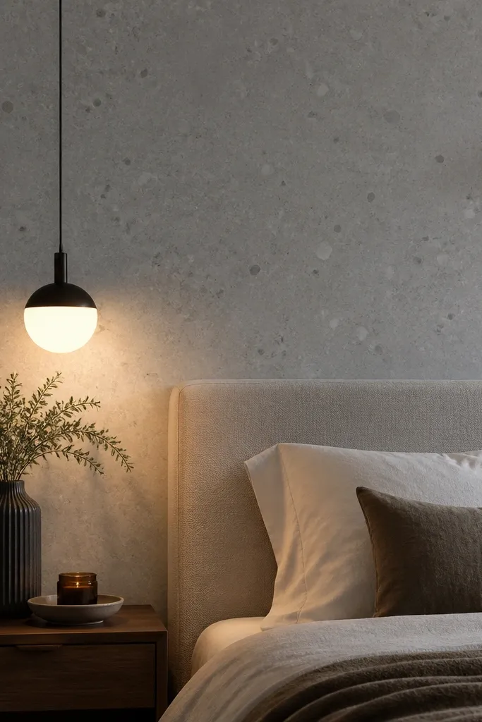
A terrazzo-look accent wall in monochrome gives you luxury texture without heavy installation. The speckle reads expensive because it’s irregular in a controlled way, and it hides tiny wall imperfections that paint shows. Choose charcoal, deep slate, or soft cement grey so it stays modern and pairs with both light bedding and dark wood. This is ideal for bedrooms that need warmth and character but don’t want a strong color shift. It also looks great with black metal bed frames and warm lights because the speckle catches a little glow without looking shiny.
1) Use a terrazzo-effect paint system or a textured base with speckle additives; follow the mixing ratios carefully so the speckle density stays consistent. 2) Tape off the accent zone and apply a base coat, then add the speckle in controlled passes using the recommended brush or sprayer. 3) Finish with a matte clear coat if the system calls for it; keep it matte so the wall doesn’t reflect overhead glare.
Pro tipTest on a spare board or the back of a closet door first; the speckle density changes how luxe it feels.
Watch outDon’t go too bright on the speckle; high-contrast specks can look like cheap faux finish.