1. Buttercream walls with clean white trim
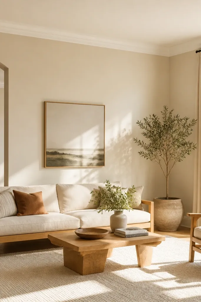
Ask for a buttercream with a subtle warm undertone, not a high-yellow pigment. Keep trim and ceiling in the same family: crisp white for trim and a slightly lighter version for ceiling. If your furniture is cool-toned (gray), add a warm element like a camel throw or tan leather accent chair to balance it.
Buttercream is warm but not yellow-mustard. On large walls it creates that “sunny all day” feeling without the boldness of a true yellow. I pair it with crisp white trim so the room looks finished and the walls stay the star. This works especially well with light wood, woven textures, and white or cream upholstery.
Watch outAvoid pairing buttercream with icy blue whites on trim — it makes the walls look dirty.
Pro tipPaint test squares on the wall where your sofa back sits, then view them after the living room lights turn on — buttercream can read more golden at night.
2. Warm greige with a soft white ceiling
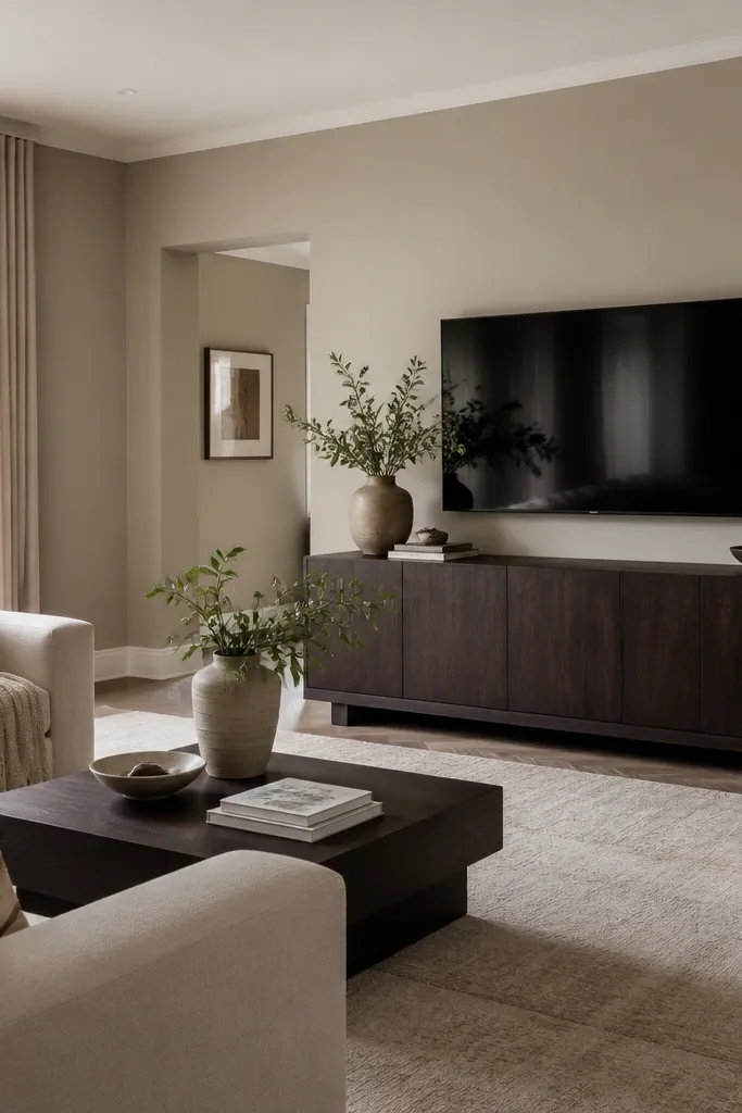
Warm greige is the easiest large-room paint color choice when you’re not sure what undertone your space needs. It bridges beige and gray, so it flatters both wood and metal. The soft white ceiling keeps the room from feeling heavy, even with deeper furniture. This is the color direction I reach for when the room has mixed finishes: oak floors plus black frames plus a stone coffee table.
Choose a greige described as warm or beige-leaning, then keep the ceiling 1-2 shades lighter. If you have a fireplace, paint the mantle wall the same greige and let the hearth details create contrast. For textiles, go with oatmeal, greige, and camel to keep everything cohesive.
Bring home two greige samples and place them side-by-side on the same wall; the one that looks more beige than gray wins for large spaces.
Avoid picking a greige that looks purple in the sample pot — it will show up under warm lamps.
3. Sage green walls with natural linen curtains
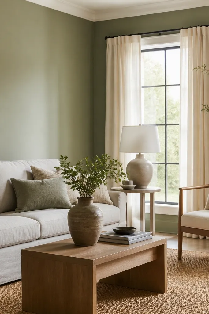
Sage green makes a large living room feel calm without going flat like many grays. The trick is choosing a muted sage that leans gray, not mint — it reads softer at scale. Linen curtains and jute rugs keep the room grounded and stop the green from feeling too “paint store trendy.” If you have plants, sage makes them look richer.
Use an eggshell or matte finish for walls; sage shows less glare and looks smoother. Pair with warm whites (ivory or cream) instead of pure blue-white. Keep hardware and frames either brushed brass or dark bronze so they don’t fight the green undertone.
Test sage in two spots: one near a window and one across the room from the window; the undertone shift is real in large spaces.
Avoid bright mint or high-chroma green — it can make big walls feel loud and slightly harsh.
4. Cool light gray with warm wood accents
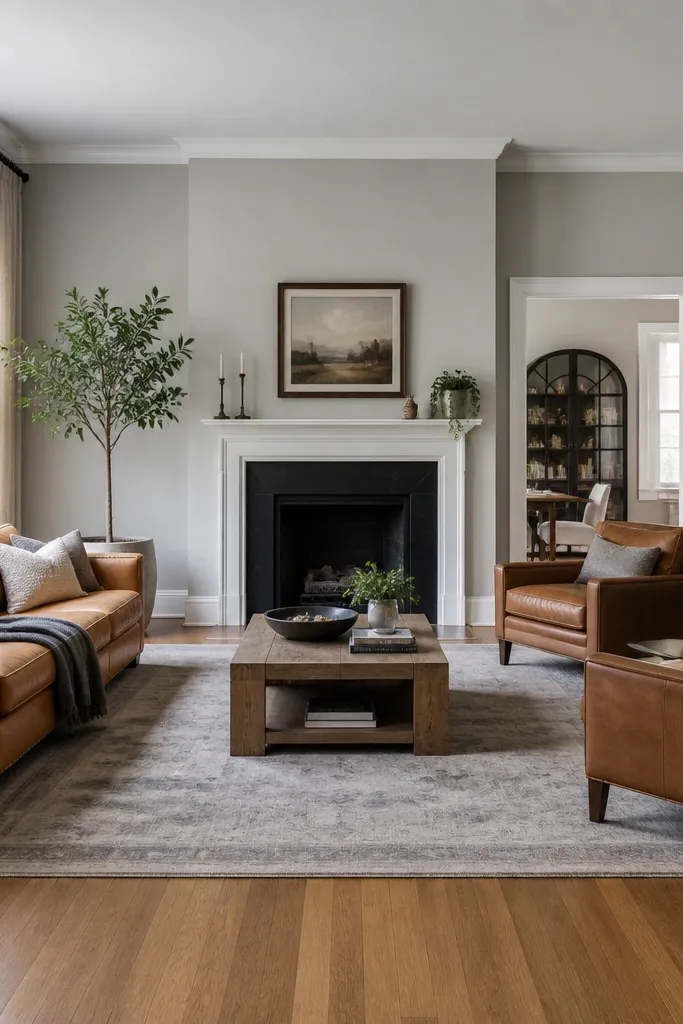
A cool light gray can work beautifully in a spacious room if you balance it with warm materials. I’ve seen too many people pick gray then wonder why their wood looks dull — the wall is pulling warmth out of it. With warm wood accents (oak, walnut, or honey-toned wicker) the gray feels crisp and clean. This color direction also makes black picture frames and metal lamps look intentional.
Pick a light gray that doesn’t go blue-heavy. Keep trim crisp white and ceiling a shade lighter than walls to avoid a “boxy” feel. Add at least one warm textile — caramel leather, cognac leather, or a warm beige rug — so the room stays inviting.
If you have warm lighting bulbs (2700K), test the gray under them; cool grays can turn slightly steel at night.
Avoid pairing cool gray walls with cool gray floors or icy-white decor — everything can look washed out.
5. Soft taupe with a charcoal media wall
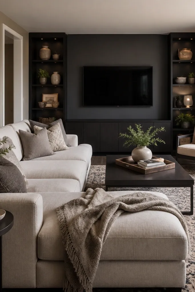
Paint three walls taupe and reserve charcoal for the wall behind the sofa or TV. Keep the charcoal finish matte to reduce glare from screen time. Use warm metals (brass or bronze) in decor so charcoal doesn’t feel too cold.
Soft taupe keeps the room open and comfortable, while a charcoal media wall gives you the anchor big rooms need. Taupe is forgiving with artwork and it hides minor wall imperfections better than crisp whites. Charcoal behind the TV makes the screen area look grounded and visually “finished.” This is the setup I use when the living room is long and open — it prevents the far wall from feeling unreachable.
Watch outAvoid making every wall charcoal — large spaces need contrast, not darkness.
Pro tipTape off the media wall carefully and use a 2-3 inch cut-in line around outlets and trim so the charcoal edge looks sharp.
6. Creamy off-white with warm undertones
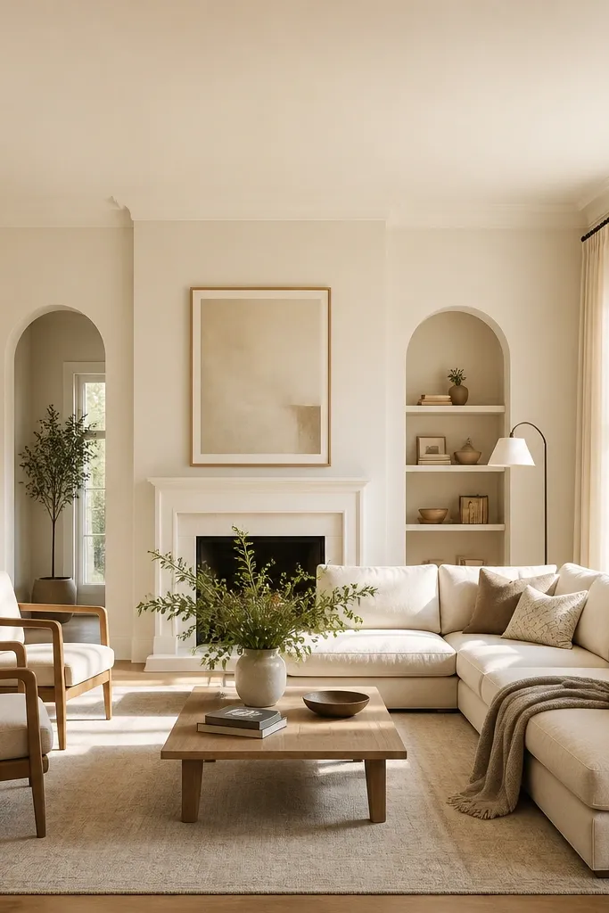
Choose a creamy white with a beige undertone and test it against your trim. Keep ceiling in the same family but slightly lighter if you want that airy lift. For floors, pair with oak, walnut, or travertine tones; for accents, use camel, chocolate, and olive.
Creamy off-white is the safest big-room choice when you want the room to feel bigger and calmer. The difference between off-white that looks good and off-white that looks sickly is undertone: you want it to lean warm, not pink. At scale, creamy walls make upholstery look richer and artwork color pop feels natural. This works well if you have lots of natural light and you’re trying to highlight furniture, not compete with it.
Watch outAvoid pure white on walls if your trim is creamy — the mismatch can look accidental.
Pro tipHold a piece of your existing upholstery fabric against the sample — if the fabric looks yellow, the paint is too warm for your setup.
7. Terracotta blush on an accent wall
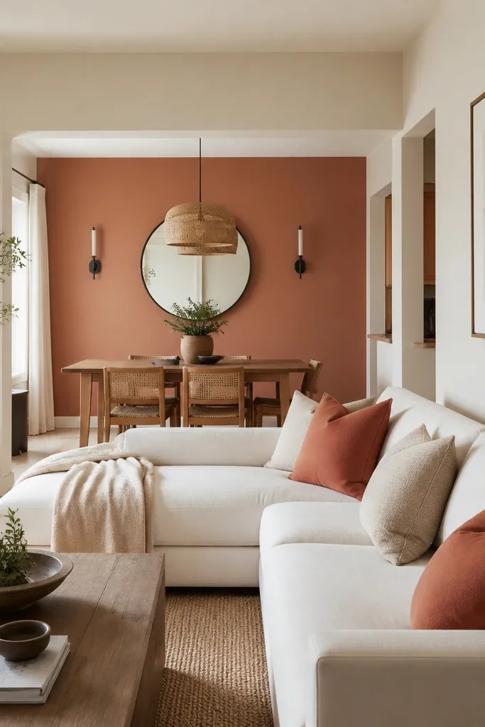
Keep the other walls in a soft warm white or very light greige so the terracotta doesn’t feel heavy. Use matte or soft eggshell because terracotta looks better without shine. Add matching accessories: a rust ceramic lamp, woven baskets in natural color, or a rug with terracotta threads.
Terracotta blush adds warmth and movement without turning the whole space into a themed room. I like it as an accent because it gives you that lived-in, sunbaked look while keeping the rest of the living room light. It also pairs well with cream, white oak, and black metal details. In big rooms, the accent wall acts like a visual “frame” for the seating zone.
Watch outAvoid terracotta in a room with cool, bluish flooring — it can make the floor look gray.
Pro tipPaint the accent wall last and live with the neutral walls for a week — you’ll see exactly where the room needs warmth.
8. Deep navy on the fireplace wall
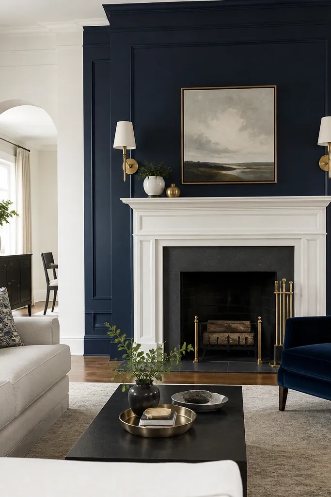
Deep navy is dramatic, but it’s also practical when you use it in the right place. On a fireplace wall, it makes the mantel and art feel crisp and intentional. Navy hides scuffs better than light colors and it makes gold and brass look richer. In large living rooms, a single dark wall prevents the room from feeling like an empty hallway.
Paint the fireplace wall navy and keep the surrounding walls warm off-white or warm greige. Use satin or soft eggshell on trim and matte on the navy wall. If you have a lot of natural light, navy still looks luxe — just avoid pairing it with cool gray floors.
Test navy with a sample board next to your brass fixtures; if the brass turns dull, the navy is too green-leaning.
Avoid navy on all four walls — it shrinks the room fast.
9. Charcoal gray with tonal furniture
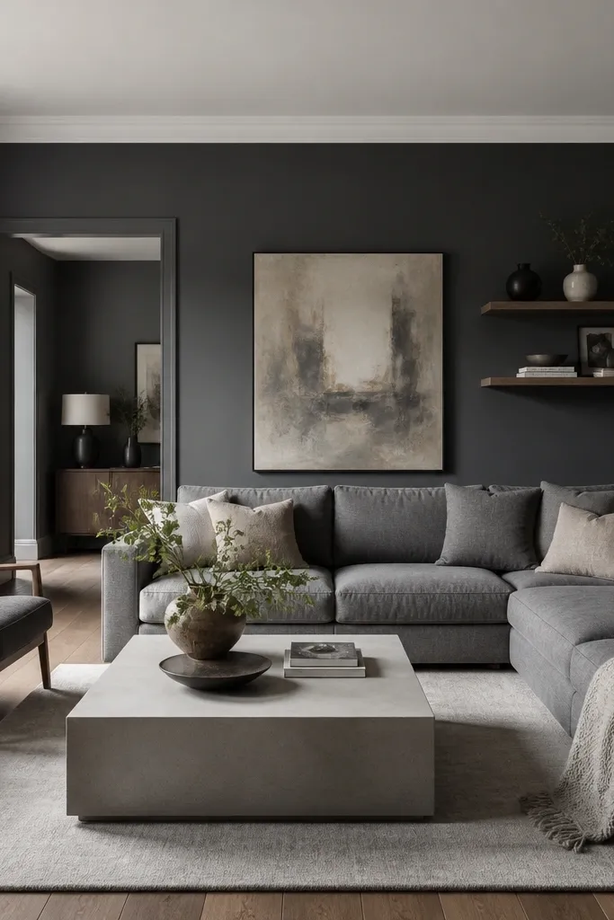
Charcoal gray can work in large living rooms if you keep the ceiling and trim much lighter. I like charcoal when the furniture is already mid-to-dark and you want a clean, modern base. It also makes patterned rugs look more grounded instead of floating. The key is tonal pairing — charcoal walls plus furniture in slightly different grays so the room doesn’t look flat.
Choose a charcoal that isn’t bluish; look for one that reads neutral. Keep ceiling bright white, and trim crisp white. Add one light reflective element like a glass lamp or a metal-framed mirror to keep it from feeling heavy.
Use a roller with a smooth nap (about 3/8 inch) to avoid texture showing up in charcoal paint.
Avoid high-sheen on charcoal walls — glare shows every roller mark.
10. Warm white with oatmeal undertones
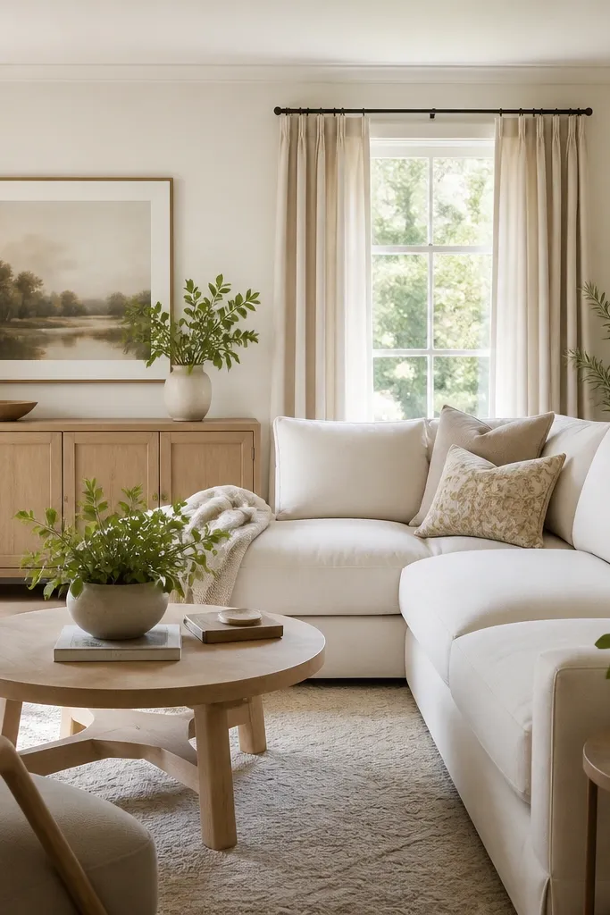
This is the warm-white version of greige. It’s not creamy yellow and it’s not gray-washed. On large walls, it makes the room feel calm and it flatters oatmeal, tan, and natural fibers. If you’re tired of gray trends but you don’t want the commitment of beige, oatmeal-warm white is a strong middle path.
Pick a warm white described as oatmeal or beige-leaning, then match trim to it with a slightly brighter version. Keep your ceiling the same color family but lighter so the room stays airy. Add contrast with dark wood or matte black accents.
Paint a small swatch next to a white pillow you already own; if the wall looks darker than the pillow, you picked the right undertone.
Avoid warm whites that look peachy in the pot — they show up too orange on big walls.
11. Olive green with brass and leather
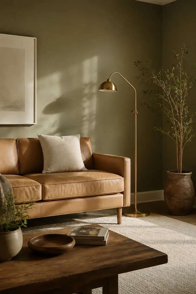
Use matte walls to keep olive from turning shiny and “painty.” Keep trim in a warm white. If you have dark floors, add a lighter rug so the olive doesn’t pull everything down.
Olive makes large living rooms feel grounded, like the walls belong to the furniture instead of competing with it. The best olive shades have gray in them, so they read mature and not neon. Pair olive with tan leather, brass, and off-white textiles for a warm, lived-in look. I’ve used this in rooms that get lots of light and it still stays calm.
Watch outAvoid yellow-leaning olive — it can look muddy next to brass.
Pro tipOlive is sensitive to daylight; test near your brightest window and near a darker corner.
12. Light sand beige with black accents
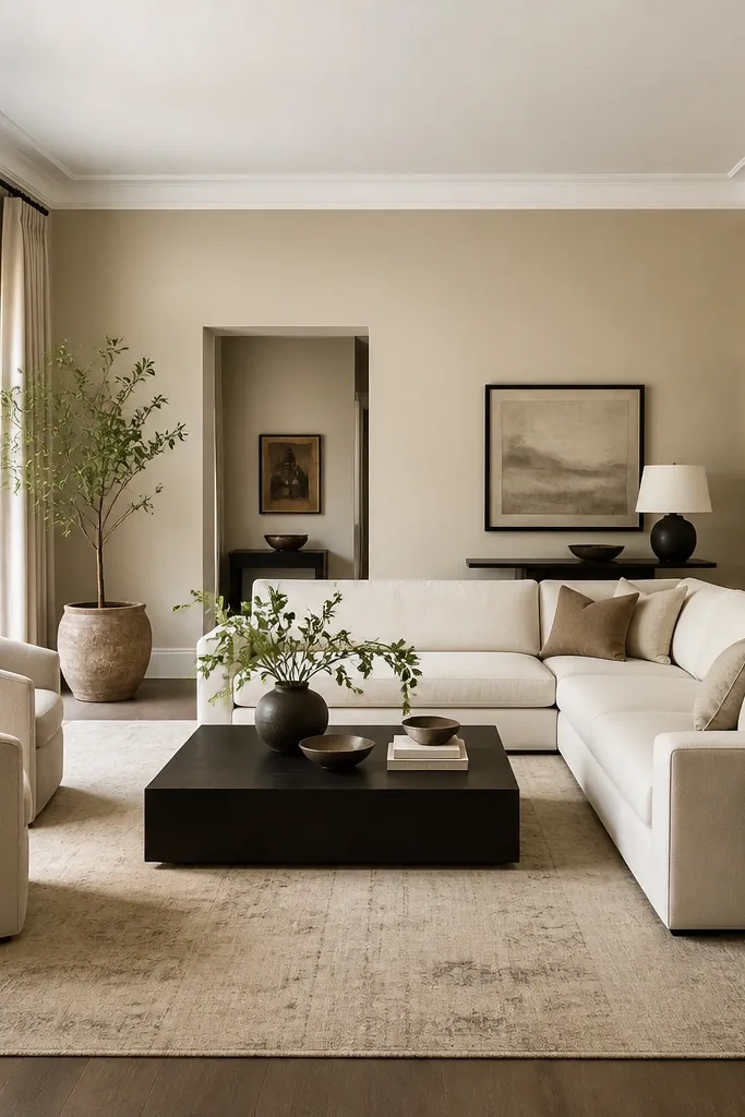
Choose a sand beige that reads light enough to bounce light across the room. Keep trim bright white to create a clean edge. Add a black metal lamp or frames and one wood element like ash or oak to keep it balanced.
Light sand beige gives you warmth without the heaviness of deeper browns. It’s also great if you want black accents to pop without the room feeling stark. On large walls, sand beige makes furniture look crisp and it keeps the space from feeling washed out. This color direction works well when your decor is mostly white, cream, and black.
Watch outAvoid sand beige with heavy pink undertones — it clashes with black and can look dusty.
Pro tipIf your rug is patterned, paint the walls to match the rug’s lightest background — it stops the room from looking busy.