1. Warm Cream with Honey Undertones
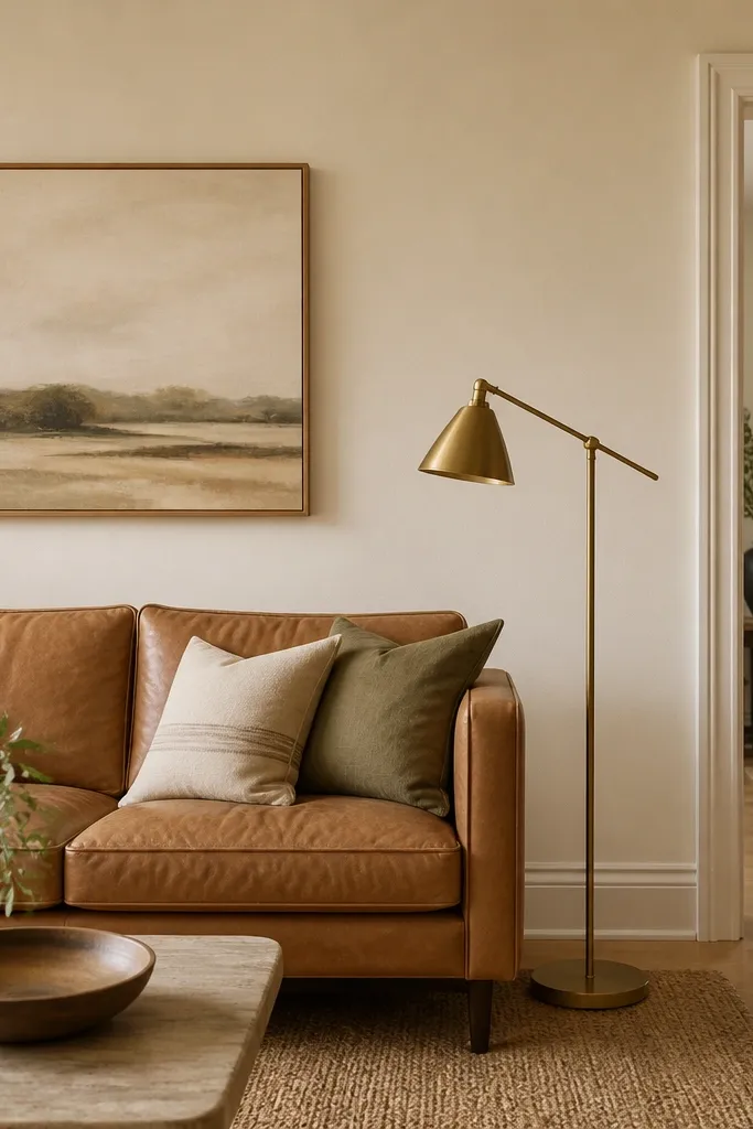
Warm cream smooths out the intensity of brown furniture without making it look flat. The honey undertone helps medium browns (cognac, caramel) look richer instead of dull. It also makes wood trim look intentional when you have mixed materials like oak and walnut. Under morning light it reads soft; under lamps it stays cozy.
Choose a paint labeled warm or creamy with a light reflectance around the mid range (not a stark bright white). Pair it with a brass or aged gold lamp and a rug that has cream + tan stripes or a natural jute base. Keep curtains off-white, not gray — gray curtains pull the cream toward beige-brown.
Paint a 2-foot sample on the wall beside the sofa arm and check it at 11am and 6pm. If it turns pinkish, switch to a cream with more yellow than red.
Avoid gray-leaning “cream” shades — they make tan furniture look tired.
2. Soft Greige That Leans Toward Beige
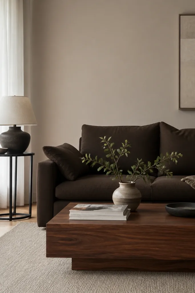
Greige works when it stays beige-forward. This shade keeps brown furniture from looking too heavy while still giving you a modern neutral backdrop. With walnut and dark chocolate, a beige-leaning greige prevents the “dirty gray” effect. It also plays well with black accents because the wall isn’t competing for attention.
Look for greige with a warm undertone — when you compare it to a true beige and a true gray, it should sit closer to beige. Use an eggshell finish so the wall reflects light gently. Style with a white or cream curtain panel and add one black metal piece for contrast.
Pro tipUse a white pillow cover and a black throw in the room while you test. The greige should make both look cleaner, not grayish.
Watch outSkip cool greige — it makes brown look muddy and can highlight wall texture.
3. Buttermilk Yellow for Caramel Brown
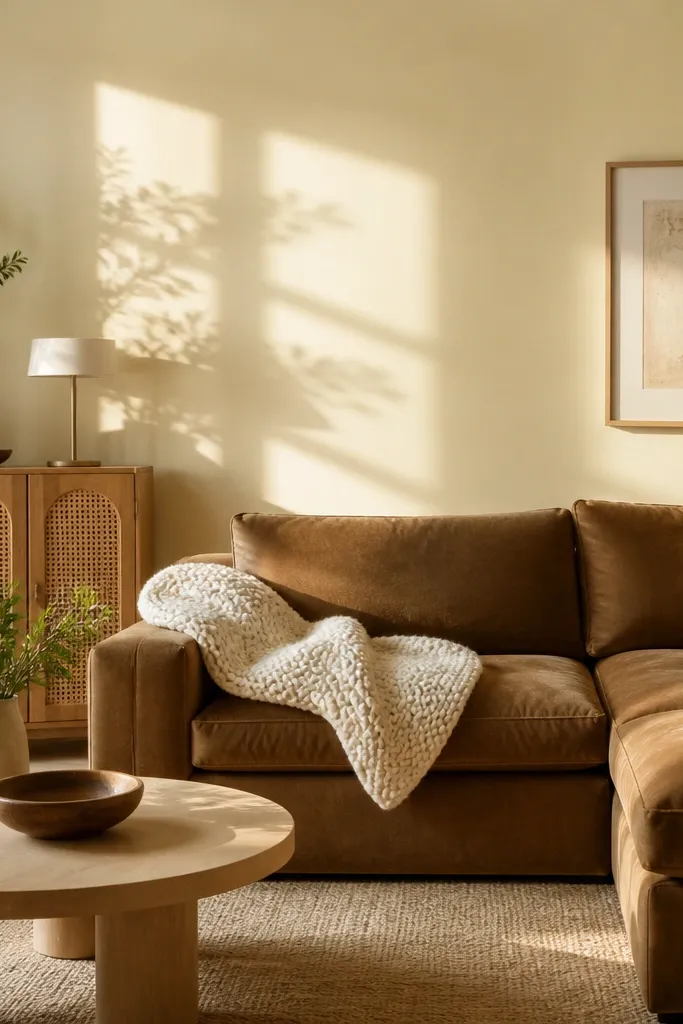
Buttermilk yellow is one of the best living room paint color ideas with brown furniture when your brown is caramel, chestnut, or light leather. It adds warmth without going full “mustard.” The yellow undertone makes wood grain look alive. In daylight it feels bright; in the evening it turns the room into a warm cocoon.
Pick a pale yellow with a creamy base, not a lemony yellow. Pair with textiles in oatmeal, cream, and light gray-taupe. Add natural woven pieces like cane or rattan so the color story feels cohesive.
Pro tipTest it on a wall that gets direct sun. If it turns too strong, choose a yellow that’s closer to cream than yellow.
Watch outAvoid bright school-bus yellow — it clashes with most brown finishes.
4. Dusty Rose-Backed Tan
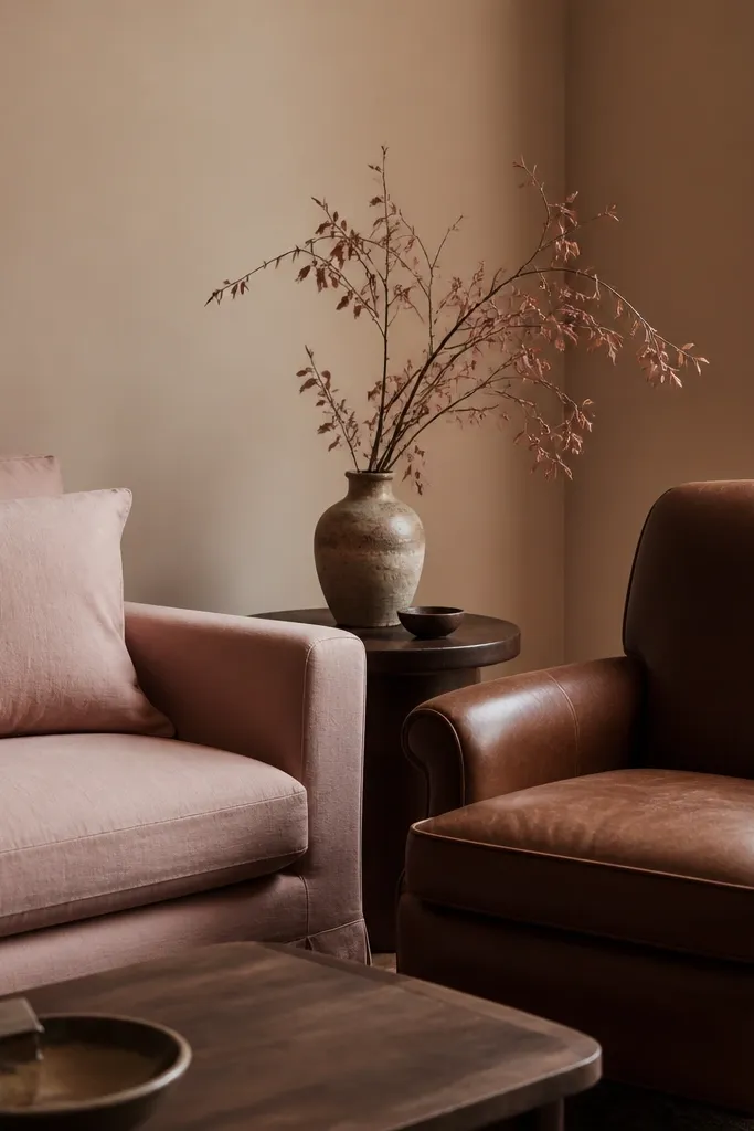
This is a sneaky good option when you want warmth but you also want the room to feel soft. The dusty rose undertone keeps brown from reading flat and adds a gentle contrast to darker woods. It looks especially good with medium to dark brown leather because the blush note doesn’t fight the warmth — it rounds it out. You get a “lived-in” look that still feels clean.
Choose a tan paint that has a pinkish cast when compared to beige. Keep your accents in linen, cream cotton, and warm metals. If you have patterned rugs, pick ones with small amounts of rose or blush to tie everything together.
Hold a blush fabric swatch next to the sample board. If the wall makes the fabric look gray, the undertone is wrong.
Avoid pink that’s too saturated — it turns the brown into a heavy, dated combo.
5. Chalky White with Warm Depth
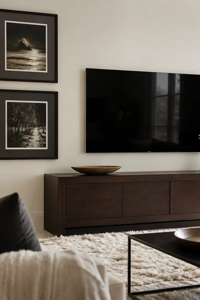
Chalky white gives you contrast without looking sterile. With brown furniture, a warm-depth white helps the furniture pop while keeping the room airy. It also hides minor wall imperfections better than bright enamel whites. The brown stays grounded, and your decor looks sharper.
Use a warm white that isn’t pure — it should have a whisper of cream. Keep trim the same family or just one step brighter so you don’t create harsh lines. Pair with black frames, matte ceramics, and off-white rugs.
If you have dark brown leather, go slightly warmer than you think. Pure cool whites make the leather look gray.
Avoid stark bright white — it can make brown furniture feel heavier.
6. Light Sage for Warm Brown Woods
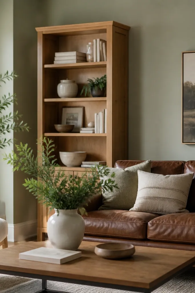
Light sage adds a green note that flatters warm brown woods. It doesn’t read “farmhouse” when you keep it pale and slightly gray. This pairing makes wood grain look richer and gives the room a calm backdrop. It’s also forgiving with mixed metals because sage sits between warm and cool.
Pick a muted sage with gray in it, not a fresh green. Use it on walls, then keep trim in warm white or creamy off-white. Style with natural greenery and white ceramics to keep it crisp.
Pro tipTest near a sunny window. If it goes too green, shift toward a sage that’s more gray than green.
Watch outAvoid neon or overly saturated greens — they fight brown and make everything look busy.
7. Muted Olive with Black Accents
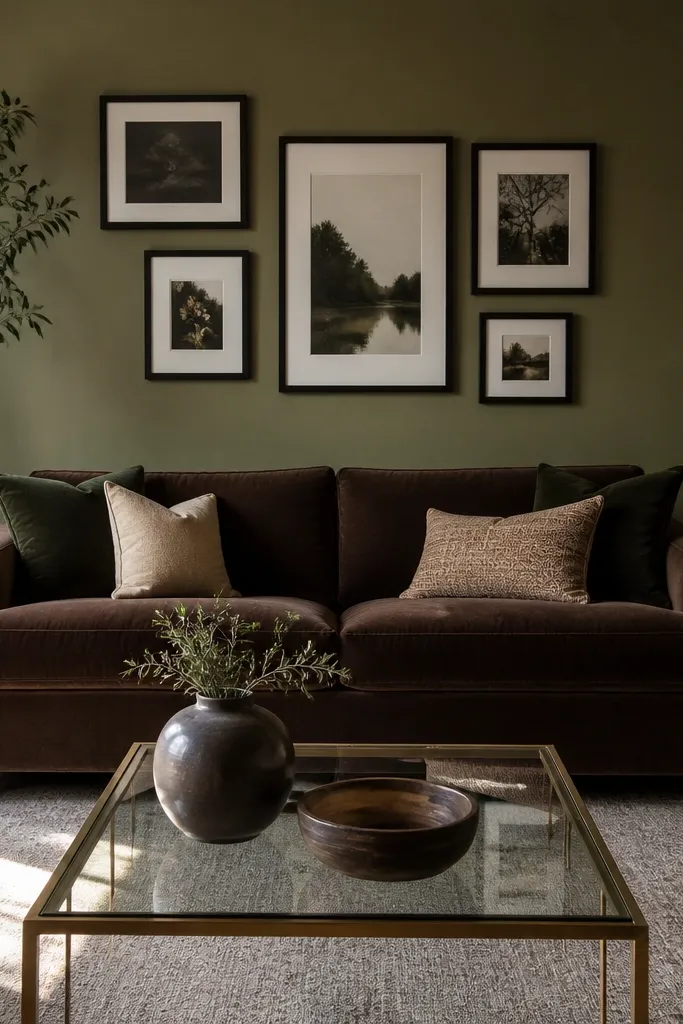
Muted olive is a dramatic but workable option when you want the room to feel grounded. It pairs well with dark brown furniture because the green-gray undertone adds complexity without turning the room cold. Black accents look intentional against olive. The overall effect is cozy, not heavy, when you keep lighting warm.
Use a paint that looks olive-gray in shade. Keep curtains light (cream or warm ivory) so the dark wall doesn’t swallow the window. Add brass touches and a couple of light-toned pillows to prevent the room from feeling one-note.
Pro tipChoose bulbs around 2700K and check the color at night. Olive can look dull under cooler bulbs.
Watch outSkip cool blue-gray lighting — olive will look muddy.
8. Smoky Taupe That Matches Espresso
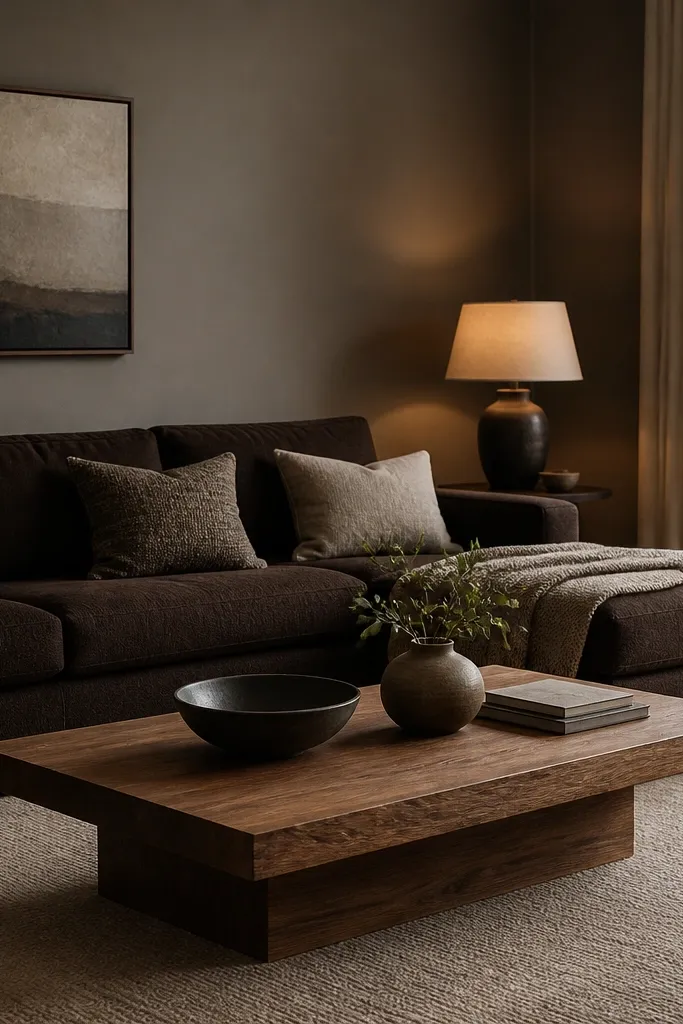
Smoky taupe works when your brown furniture is espresso or very dark. It creates a monochrome feel without going flat because the taupe has gray depth. The room feels modern and calm, and your lighter decor pieces stand out more. This is also a good choice if you have a lot of dark wood trim and want it all to feel connected.
Pick a taupe that isn’t gray-silver. You should see warmth when you hold it next to a true gray swatch. Use eggshell paint and keep rugs slightly lighter than the wall. Add a woven or boucle texture so the monochrome doesn’t feel flat.
If the room feels dark, lighten the ceiling trim one shade warmer, not whiter. It keeps the space from shrinking.
Avoid taupe that’s too close to your furniture color — you lose contrast.
9. Warm Greige + Off-White Ceiling Combo
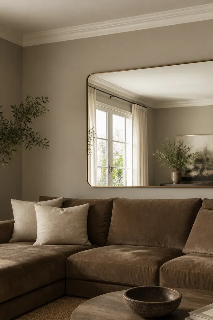
When you have brown furniture and you want the room to feel bigger, the ceiling matters. Warm greige on walls with a slightly brighter off-white ceiling creates a subtle lift. It keeps the brown from dominating because the eye travels upward. The mirror helps too, but the wall/ceiling contrast is what makes it feel open.
Paint walls in a warm greige and ceiling in a creamy white with the same undertone family. Don’t jump to a cool white — it will make the ceiling look like an afterthought. Add a large mirror opposite a window to bounce light.
Use painter’s tape to protect the ceiling edge and keep the line razor straight. A sloppy edge makes greige look messy.
Avoid painting ceiling and walls the same exact color.
10. Mocha Brown-Gray for Modern Rooms
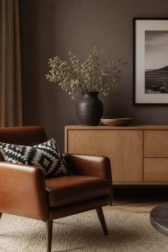
Mocha brown-gray is for when you want color warmth but you also want a modern edge. It pairs with brown furniture because it sits close in tone, but it still has enough gray to prevent it from looking like a heavy tan. This works best with lighter wood pieces so the room has a “light and dark” rhythm. The black-and-white accessories pop cleanly.
Pick a mocha that reads brown in daylight and gray in shade. Use matte or low-sheen to keep it soft, but test first because darker colors can show patchiness. Keep at least one light wood element in the room — light oak, birch, or pale ash.
Add one reflective surface like glass or polished metal. Mocha looks richer next to shine.
Avoid pairing mocha with all-dark furniture and no light wood — it feels closed in.
11. Soft Blue-Gray for Cool Espresso Leather
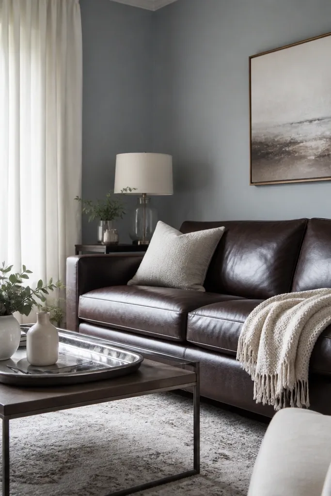
If your brown furniture leans cool (espresso with gray undertones), soft blue-gray walls make it look intentional. The blue note keeps the room from turning flat and adds a crisp contrast to brown leather. I’ve used this combo in rooms with big north-facing windows where warmer beiges look dull. You get a calm, modern look without turning the brown gray.
Choose a blue-gray that’s very light, almost smoky. Pair with crisp whites and light grays. Add silver or nickel accents, plus a rug that has cream base so the blue-gray doesn’t dominate.
Pro tipHold a piece of white paper next to the sofa. If the sofa looks cooler than the paper, go blue-gray.
Watch outAvoid warm camel paint with cool espresso — it can look mismatched.
12. Powder Blue Tint with Warm Wood
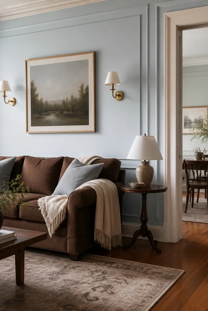
Powder blue tint looks airy next to warm brown furniture. The key is that it should be a tint, not a saturated blue. Warm wood floors help the brown feel cohesive, and the powder blue keeps the room from feeling too serious. This is a great option for living rooms that get a lot of daylight.
Use a very pale blue with a creamy base so it reads gentle, not icy. Keep trim in warm white and add brass sconces or a brass picture frame. Use natural textures like linen, cotton, and jute so the color feels soft.
Test on a wall that gets direct sun. If it turns too bright, go one step closer to gray-blue.
Avoid deep blue with warm brown — it can make the room feel heavy.