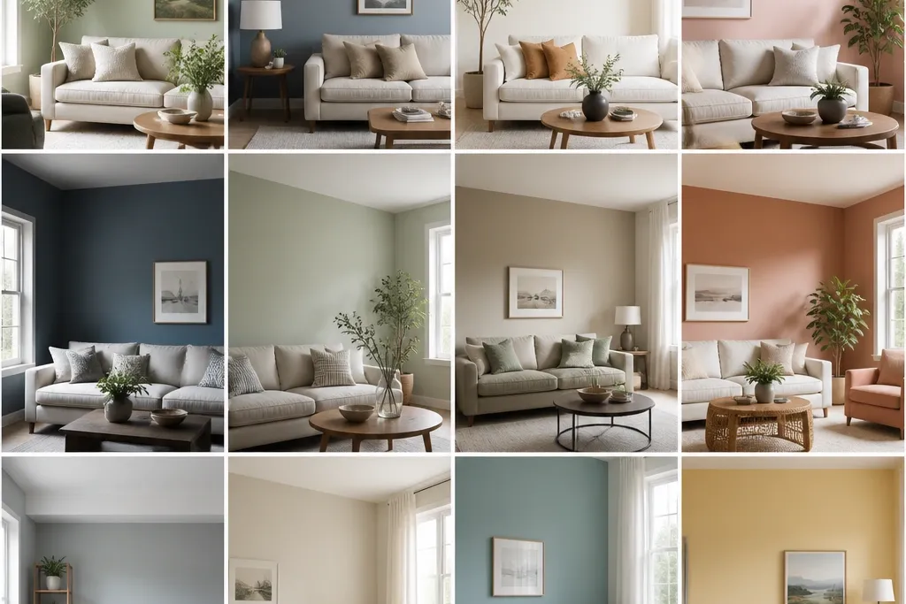
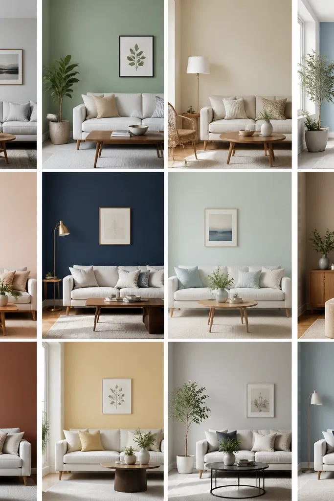
1. Creamy Linen Walls with Clean White Trim
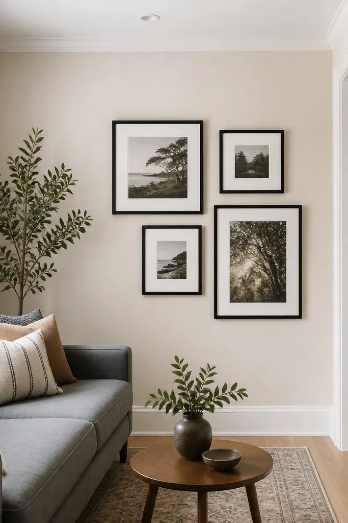
Creamy linen is my go-to when people say they want “bright but not sterile.” It keeps warmth in the room so it doesn’t feel washed out, especially if you have beige or tan textiles. The clean white trim creates a sharp edge that makes the ceiling look taller, even when the ceiling is only 8 feet. I’ve used this combo in apartments where the living room only got direct light for 45 minutes.
Paint the walls in a creamy off-white with a warm undertone. Keep ceiling and trim in a true white or cool-white that reads crisp against the cream. Work with flat/matte on walls and semi-gloss or satin on trim; the sheen difference is what makes the lines look intentional.
Buy two samples: one creamy linen and one “true white.” Paint both on the same wall, then compare the difference from the couch at night.
Avoid using the same paint color on ceiling and walls — the room can feel boxy fast.
2. Pale Greige with a Taupe Accent Wall
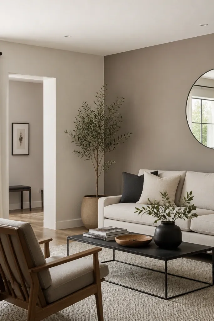
Greige is where budget color ideas start feeling “designer” because it plays nicely with both warm wood and gray fabrics. The trick is pairing a light greige for most walls with a slightly deeper taupe on the wall you look at first. That small contrast gives depth without making the room feel darker. I like taupe because it doesn’t go blue like some grays.
Use the pale greige on three walls and the taupe on one wall. Keep trim and ceiling bright white to maintain the upward visual line. Add a rug with a mix of taupe and light gray so the accent wall doesn’t feel like a separate room.
Place your accent wall behind the sofa or TV, not behind a doorway — you want the contrast to land where your eyes rest.
Skip a medium gray accent in a small room; it often reads gloomy even if the color looks “nice” in daylight.
3. Soft Sage Walls with Whitewashed Wood Tones
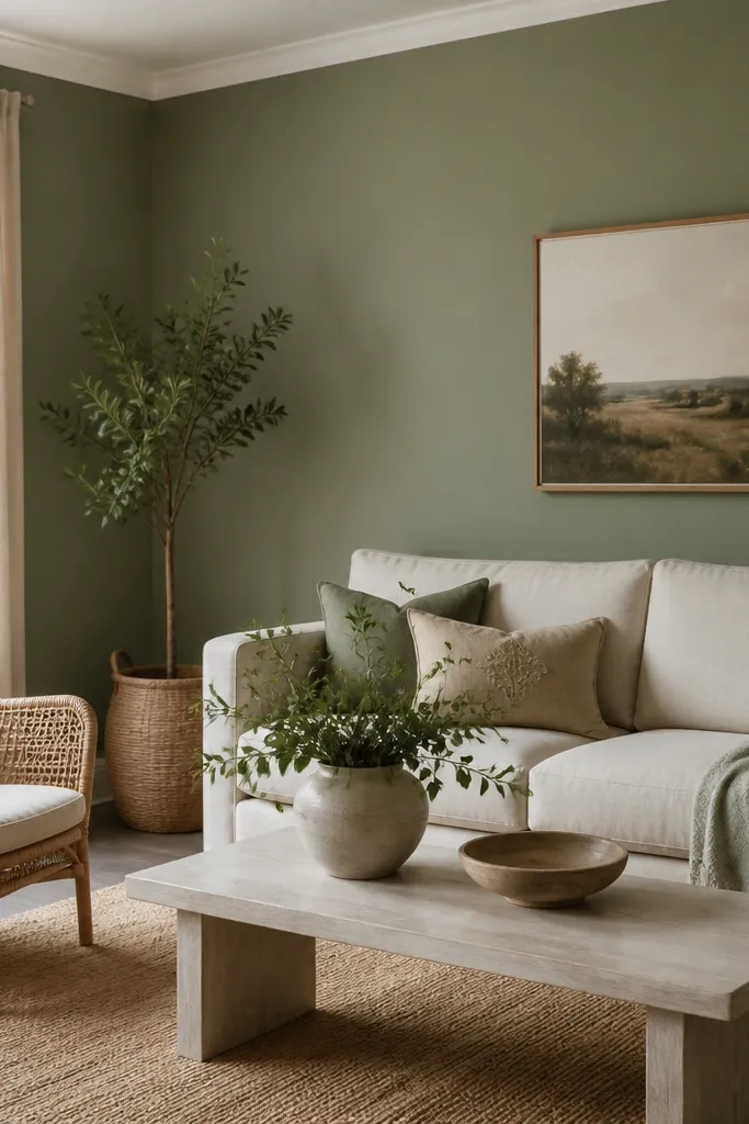
Muted sage is one of the few greens that expands a small room instead of shrinking it. It gives you color without the high-contrast drama of a saturated green. When paired with whitewashed wood or light rattan, it reads airy and calm. This is the look I use when someone wants “color” but has a small space and a limited budget.
Choose a sage that leans gray (not yellow). Paint walls in matte for softness, then keep trim crisp white. If you have any brass lamps, keep them — sage + brass looks warm without feeling loud.
Pro tipAdd one patterned throw pillow in off-white with tiny sage lines to blend the room instead of fighting the paint.
Watch outDon’t pick a bright spring green; it will look neon under indoor bulbs.
4. Warm Sand Beige with Black Metal Accents
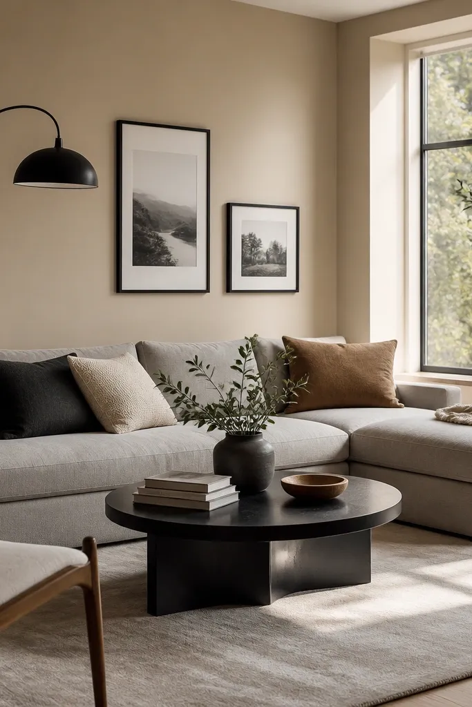
Warm sand beige is the “small room friend” when your furniture is dark or your rug is patterned. Beige absorbs some harsh light and makes the space feel grounded. Black metal details give you crisp lines that don’t require dark paint across multiple walls. I’ve done this in a narrow living room where the ceiling felt low — the warm beige helped it feel less tight.
Pick a beige that reads sandy, not pink. Paint walls in matte, then use white semi-gloss trim. Repeat the black in two places: a lamp and a frame, so the color story feels intentional.
Pro tipIf your rug has gray and cream, match the beige to the rug’s cream undertone, not the darkest stripe.
Watch outAvoid pink-beige; it can clash with warm wood and make the room look dated.
5. Light Greige with a Charcoal Doorway Frame
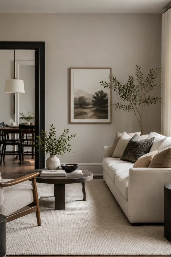
This is a sneaky way to add contrast without painting the whole room dark. Light greige gives you the spacious base, and the charcoal doorway trim creates a strong visual frame. Your eye follows the frame and perceives more structure, which makes the room feel organized. I’ve had great results in rentals where you can’t change furniture but you can paint trim.
Paint walls light greige, ceiling bright white, and trim mostly white. Only paint the doorway frame or one trim section charcoal so it reads like a design detail. Use satin on the charcoal trim so it catches light without glare.
Mask carefully around door hardware and caulk the edges; clean lines are what make this look intentional.
Don’t paint all trim charcoal — it can make the room feel heavy.
6. Soft Blue-Gray Walls with Linen White Textiles
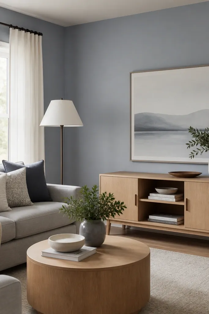
Blue-gray can make a small living room feel larger when it’s pale and slightly gray, not icy. It adds a cool calm that looks great with linen textures and light wood. The key is keeping the undertone muted so it doesn’t turn green in fluorescent lighting. I’ve used this in a room that faced west and got intense late-afternoon sun — the blue-gray kept it from going too warm.
Choose a blue-gray that looks like “smoke” in the sample card, not a sky color. Paint walls matte, trim and ceiling linen white or bright white satin. Keep fabrics in linen white, oatmeal, or pale gray so the paint stays the star.
Add a small amount of warm color in one spot — like a caramel throw or camel pillow — to keep the cool tone from feeling chilly.
Avoid navy-adjacent grays; they eat light in small rooms.
7. Oat Milk Walls with a Light Wood and Brass Mix
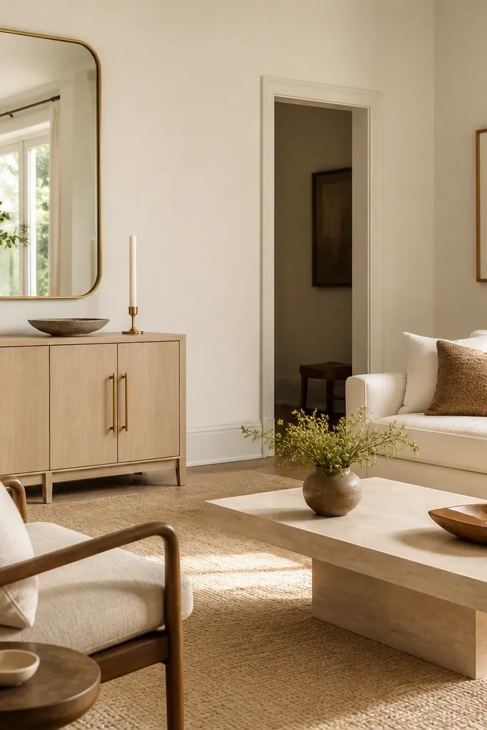
Oat milk is warmer than most off-whites, so it flatters skin tones in photos and makes the room feel cozy without going dark. It also works with brass because the warmth in the paint makes metal look intentional instead of harsh. In small spaces, that warmth helps the room feel lived-in, not staged. I used oat milk in a 10x12 living room and the walls looked brighter by evening, not dimmer.
Use matte on walls and satin on trim. Keep your ceiling slightly lighter than the walls — an off-white ceiling looks better than pure white if your lightbulbs run warm. If your rug has cream and light tan, oat milk ties it together.
When you test samples, also test under your actual bulb temperature (2700K vs 3000K changes warmth).
Skip stark white walls if your flooring is warm-toned; you’ll get a faint “cold” mismatch.
8. Soft White with a Single Light Gray Feature Wall
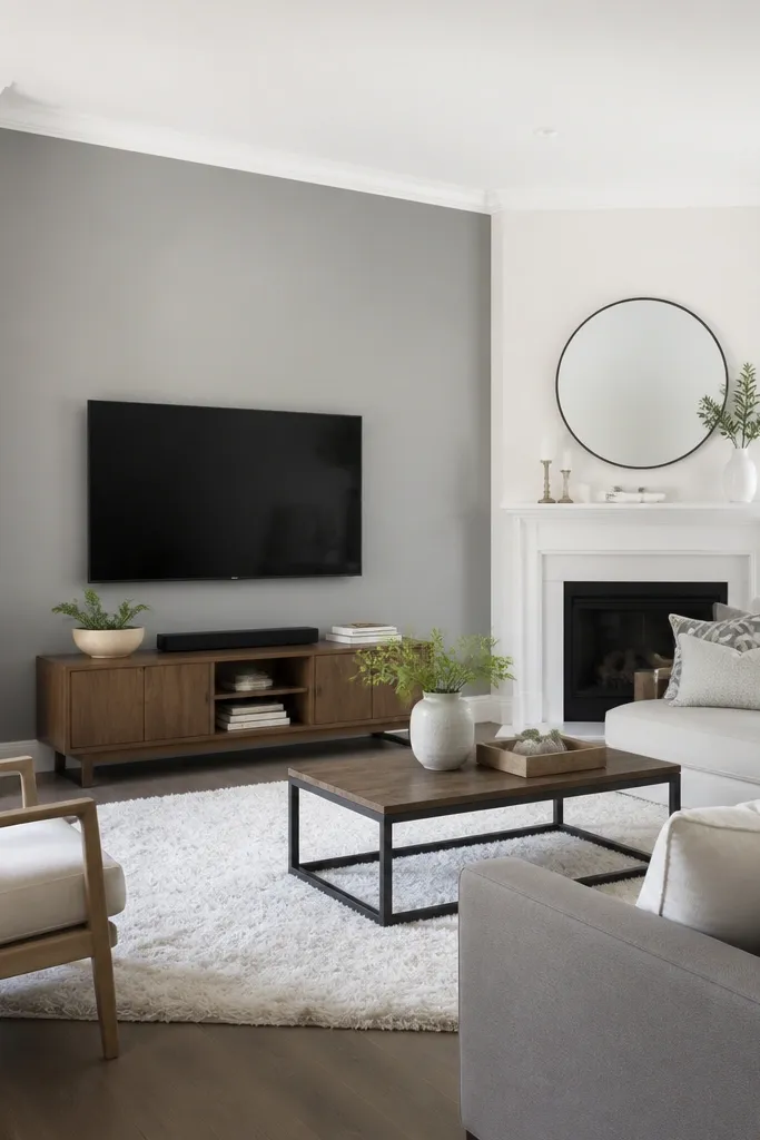
If you want airy without committing to beige, this is the easiest plan. Soft white on most walls keeps the room open, while a light gray feature wall adds dimension behind the TV or sofa. The gray needs to be light enough to reflect light, not a dusty medium. This arrangement is what I recommend when you have a lot of white furniture or a white sectional.
Paint three walls soft white and one wall a light gray that has a hint of warmth. Keep trim bright white. Add one textured element — boucle pillow or knit throw — so the gray doesn’t look flat.
Put your TV on the feature wall so your eyes have a “rest point” with contrast.
Don’t pick a gray that’s darker than your ceiling; that makes the room feel top-heavy.
9. Warm White with Subtle Mushroom Undertones
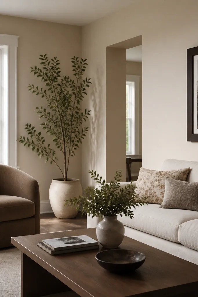
Mushroom-leaning warm whites look expensive because they hide imperfections in plaster and older drywall seams. They don’t go yellow like some “antique white” paints, and they don’t go gray like cold whites. In small living rooms, this gives you a calm backdrop that makes art and furniture edges look sharp. I’ve used it on textured walls because it smooths the visual noise.
Choose a warm white described as mushroom or taupe-leaning on the paint chip. Paint walls matte and keep trim semi-gloss white. If your furniture is espresso or dark brown, add a light rug with cream and taupe so the undertone matches.
If your wall has patchwork, use a stain-blocker primer first; the right white only looks good on an even base.
Avoid bright cool white if you have any warm wood — the mismatch will show every time the sun hits.
10. Pale Rose-Beige for a Soft, Airy Feel
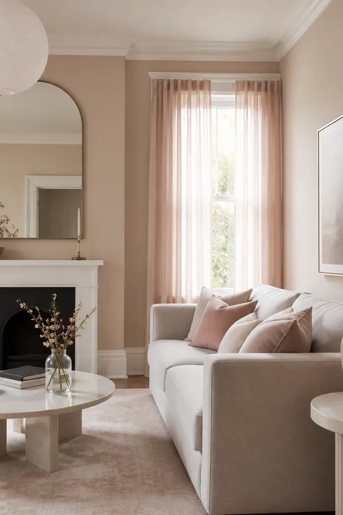
A pale rose-beige is the color idea budget shoppers love once they see it in their own lighting. It adds warmth without turning into peach. The room feels softer, especially with gray or cool-toned furniture. I’m careful with this one: it only works when the rose is muted and the rest of the palette stays light.
Pick a light paint that reads like “dusty cream,” not pink. Keep trim bright white and keep your rug and curtains in off-white to avoid competing pink saturation. Use rose only as a small repeat in textiles or decor, not as a second paint color.
Pro tipHang one swatch next to your sofa fabric before painting; if the undertones clash, switch to oatmeal or sand beige.
Watch outDon’t go for blush walls if your room has lots of orange lighting; it can turn the whole space peachy.
11. Light Mushroom with a Black Window Trim Look
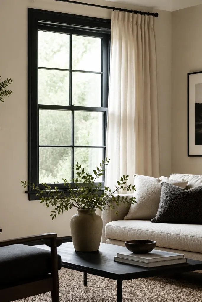
This look uses paint to fake architectural detail. Light mushroom walls keep the room from feeling small, while black trim around the window adds crisp contrast that draws the eye outward. It also makes your window feel like a focal point even in a tiny room. I’ve done it in condos where the window trim was boring white and the room needed structure.
Paint walls light mushroom matte. Use a durable trim paint on window trim in semi-gloss black. Keep the ceiling white so the black doesn’t visually lower the space.
Pro tipUse painter’s tape on a clean surface and remove it while paint is still slightly tacky to avoid a jagged edge.
Watch outAvoid flat black on trim; it fingerprints and looks chalky up close.
12. French Gray on an Accent Wall Only
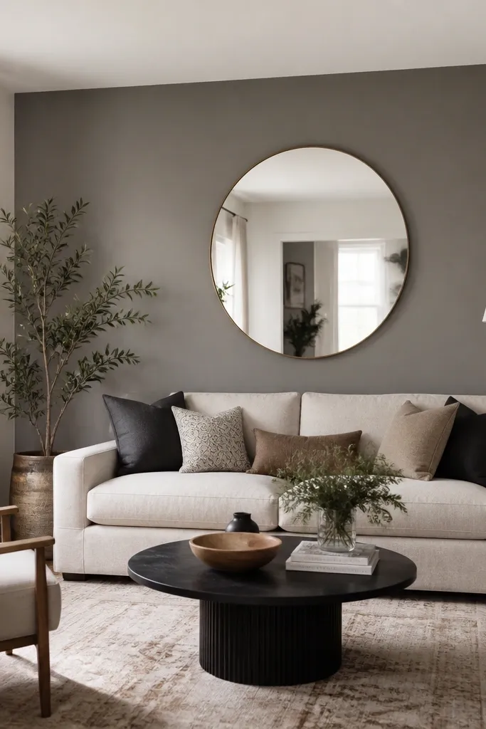
French gray is a classic for small rooms when you use it like seasoning. One accent wall adds depth and makes the room feel more layered. Choose a French gray that isn’t too blue — it should look like soft smoke. I like this when you have a dark sofa or a patterned rug that needs a calmer background.
Paint three walls off-white and one wall French gray. Add mirror or art centered on the accent wall so the gray reflects light. Use the same off-white on ceiling and trim to keep the contrast controlled.
If the accent wall feels too strong in the morning, you can lighten it with a glaze topcoat, but test first on a scrap.