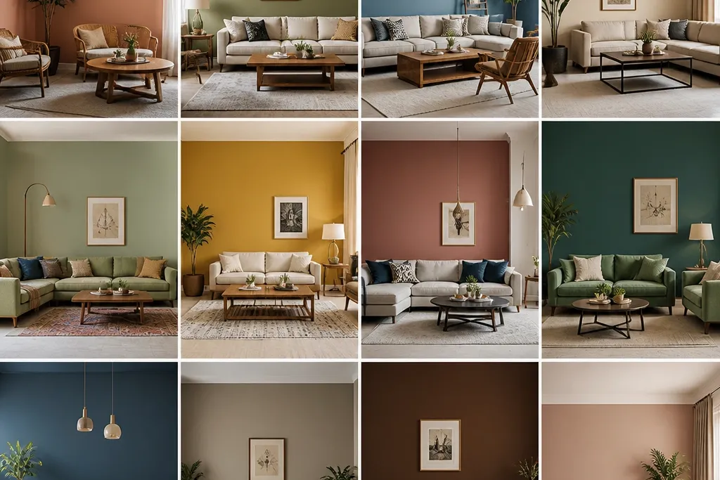
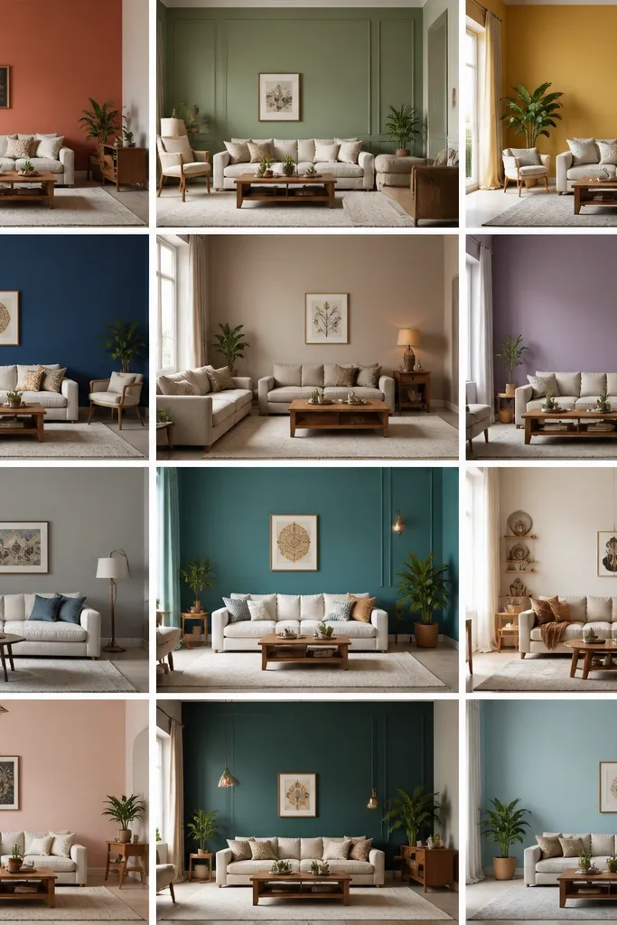
1. Creamy Kundan White with Brass Warmth
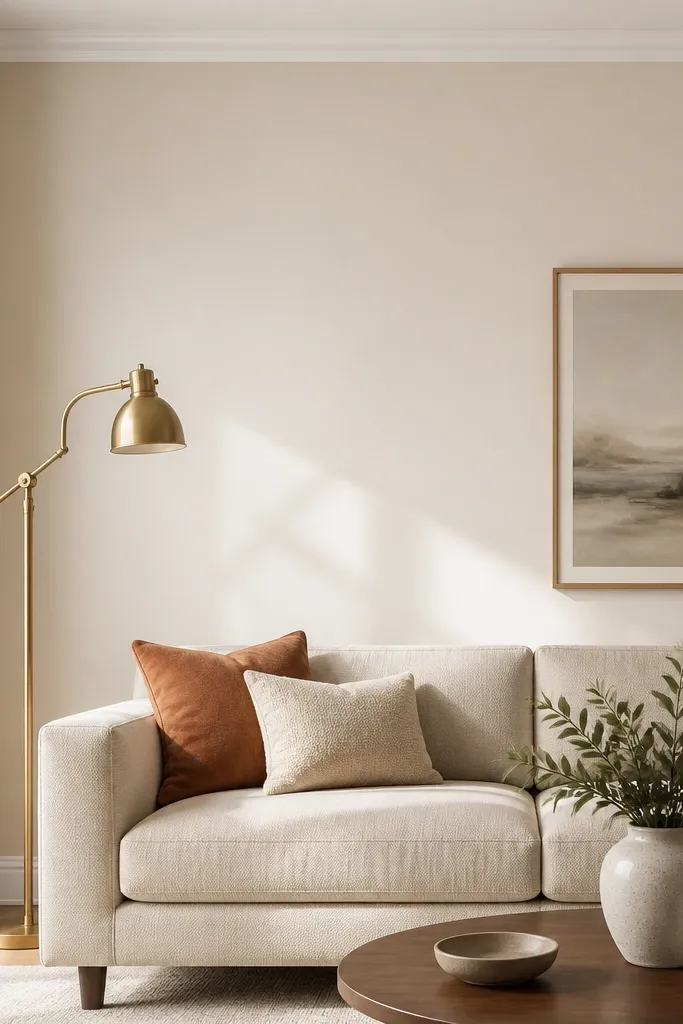
This is the off-white I reach for when the room feels “empty” but you don’t want beige to go dull. The creamy undertone keeps wood and upholstery looking warmer, especially camel, caramel, and oat fabrics. It also makes brass decor read golden instead of yellow-green. Pair it with matte plaster-style walls and keep trim slightly brighter so the room looks finished.
Paint the main walls in the creamy white and keep ceiling trim one shade lighter. Use a brass floor lamp or wall sconce to bring out the warmth. Add one textured element like a jute rug or boucle throw so the wall doesn’t feel flat.
Pro tipDo a test patch behind the sofa — the wall behind furniture often shows undertone shifts more than the wall facing the window.
Watch outAvoid pure white walls if your sofa or curtains lean warm; they will make your room look washed.
2. Sandstone Beige for Teak and Warm Floors
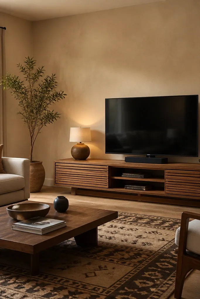
Sandstone beige is a grounded color that makes teak and rosewood look richer without turning the room orange. It sits between beige and taupe, so it doesn’t go too yellow. This shade works when your room already has warm flooring or wooden furniture and you want calm, not contrast. With a matte finish, it hides minor wall unevenness well.
Use a matte finish on walls and paint the skirting slightly darker — just one step down in shade — for definition. Match curtains in oatmeal, sand, or light greige. Add dark brown cushions to keep the palette from looking too light.
Pro tipIf your rug has both warm and cool tones, choose beige with a brown undertone, not a pink one.
Watch outAvoid beige that looks almost yellow in the daylight; it will date your room fast.
3. Cool Greige for Grey Sofas and Marble Tiles
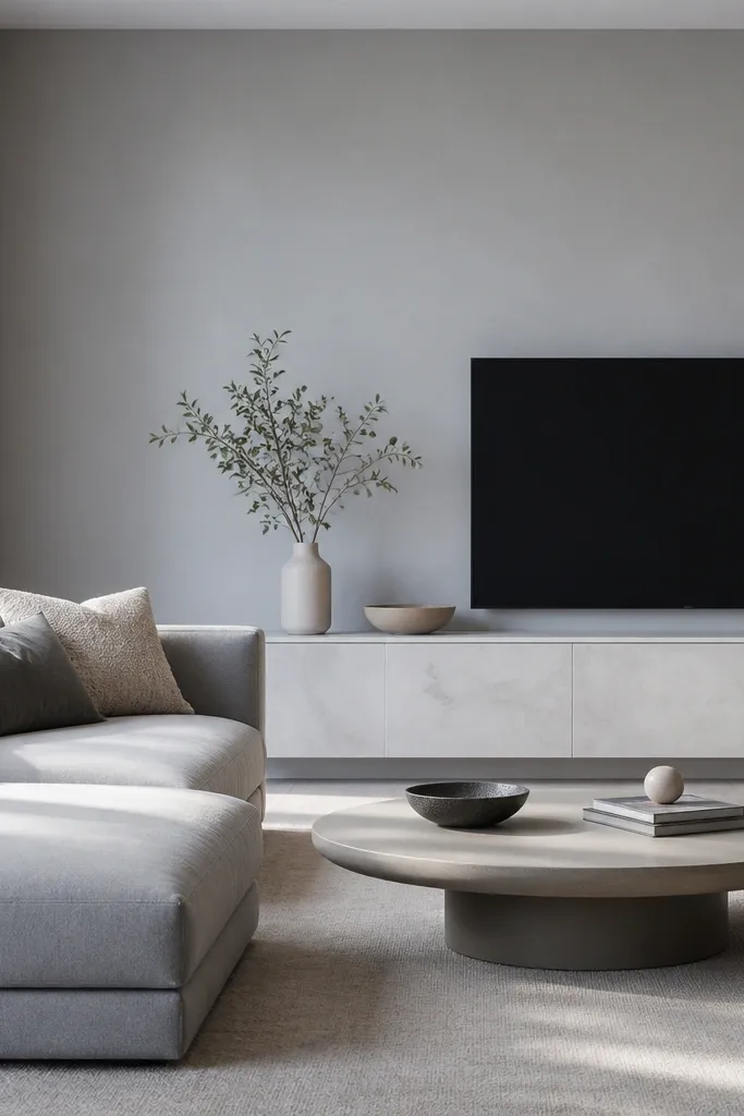
Greige is your friend when your living room has marble-look tiles or a grey sofa. The trick is picking a greige that is cool enough to harmonize with grey, but not so blue it feels sterile. This color makes white trim look crisp and keeps metal decor from looking harsh. I like it because it lets patterned rugs stand out without screaming.
Paint walls in greige and keep trim clean white. If your sofa is light grey, choose cushion covers with a slight warmth — like mushroom or stone. Add a warm lamp with a 2700K bulb so the room doesn’t go icy at night.
Before committing, tape a 1-foot test rectangle and watch it after lights turn on; cool undertones show up fast in evening lighting.
Avoid greige that leans lavender; it can fight with grey fabrics and look off.
4. Sage Green with Cream Accents
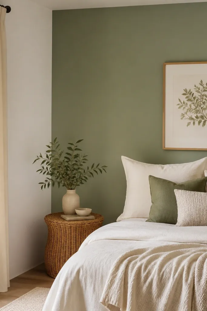
Sage green makes Indian living rooms feel fresh without going “kitchen green.” It’s muted enough to work with neutral rugs and still gives you a color moment. Sage also plays nicely with natural fibers like rattan, cane, and jute. When you pair it with cream and warm wood, it looks lived-in, not trendy.
Do sage as an accent wall behind the sofa or TV. Keep the other walls in creamy off-white to prevent the room from feeling small. Use matte paint for walls and add a textured rug so the green doesn’t look flat.
Pro tipPick sage that has a gray base; bright mint can feel too playful for a formal living room.
Watch outSkip high-sheen paint for sage — it shows wall imperfections and makes the color look cheap.
5. Terracotta Clay for a Warm, Earthy Lounge
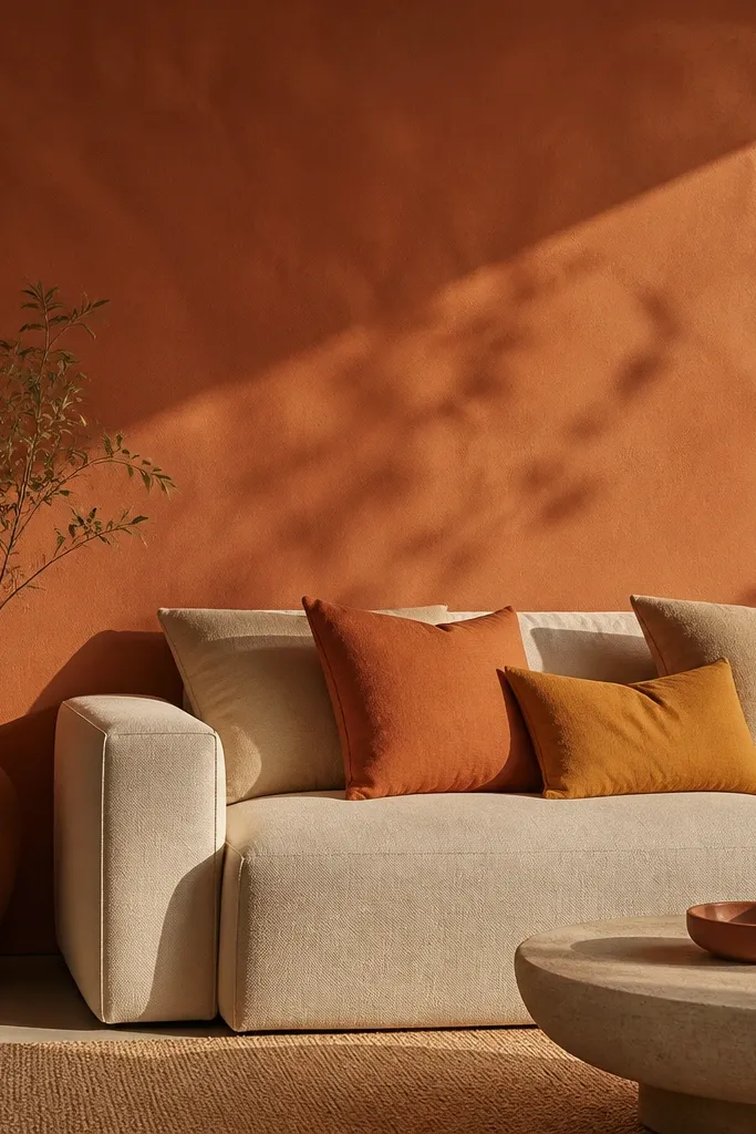
Terracotta clay brings instant warmth and makes brass, copper, and warm wood look intentional. It’s bold, but it works because it’s earthy rather than bright. In Indian homes, it pairs beautifully with handwoven rugs and traditional prints. Keep the rest of the walls light so the terracotta stays the star.
Use terracotta on one wall — the one your eye hits when you enter. Keep the other walls in off-white or very light cream. Choose cushions in ochre, rust, and off-white; avoid cool blues with terracotta unless you’re going for a specific modern contrast.
Pro tipTest terracotta in the corner; that’s where it can look darker and heavier than you expect.
Watch outAvoid painting all four walls terracotta in small rooms; it will close the space.
6. Deep Olive for a Library-Like Feel
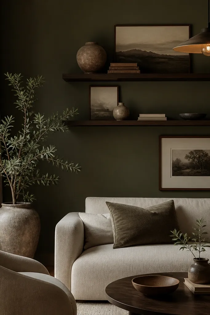
Deep olive gives you that grounded, “grown-up” look without turning the room into a cave. It reads classy with dark wood and it also makes gold frames look richer. Because it’s green, it doesn’t feel as harsh as deep charcoal. Olive also helps patterned curtains look more cohesive.
Paint only one feature wall and keep the other walls in warm off-white. Pair with dark wood, black metal accents, and cream textiles. If you have a TV unit in walnut tone, olive will match it better than you think.
Pro tipUse a satin or eggshell finish for the olive wall if it’s near a TV area that gets cleaned often.
Watch outDon’t choose olive with a strong yellow cast; it can look like old paint on camera.
7. Dusty Rose for Soft Modern Homes
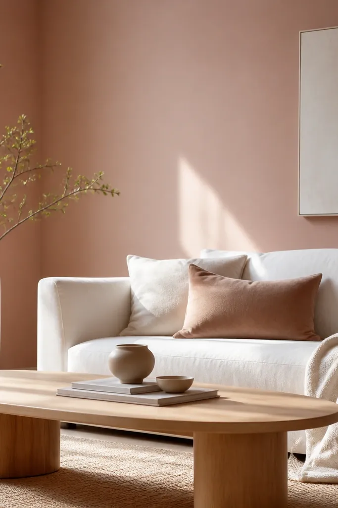
Dusty rose is the pink that doesn’t scream. It gives warmth and softness, and it works surprisingly well with white sofas and light wood. The key is choosing a muted rose with a gray undertone so it stays sophisticated. In living rooms, it also makes skin-toned decor and warm fabrics look better under mixed lighting.
Use dusty rose on one wall or as a full-room color if your room is bright. Pair with white or ivory trim and cushions in cream, taupe, and soft blush. Add a neutral rug with a subtle pattern so the pink doesn’t look flat.
If your curtains are beige with a pink tint, match the wall to that tint instead of picking rose from a random fan card.
Avoid bright fuchsia or salmon pink; they will look dated and harsh with Indian indoor lighting.
8. Blue-Gray for a Calm, Clean Look
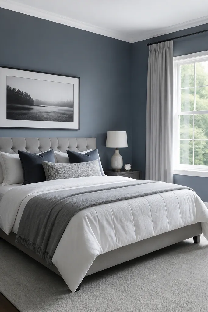
Blue-gray walls calm down a busy living room because they sit quietly between blue and gray. This shade works well with white marble-look tiles and dark frames. It also makes your lighting feel more even — the room doesn’t look yellow at night like it can with warmer paint. Pair it with crisp whites and black accents for a modern feel.
Keep the trim and ceiling in clean white, not cream. Use light-to-medium gray upholstery and a rug with some texture like flatweave or wool. If your TV unit is glossy, choose a matte paint so reflections don’t fight.
Pro tipTest a blue-gray sample on the wall opposite your window; that’s where the color usually shifts most.
Watch outAvoid blue-gray that turns greenish in evening light; it will look muddy.
9. Marigold-Butter Accent for Festive Energy
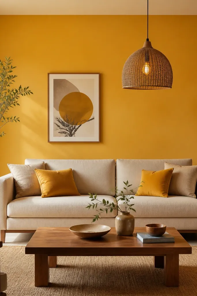
Marigold-butter yellow is not the loud schoolroom yellow. It’s warm, but softened — and it makes Indian decor look festive without needing a full overhaul. I use it when a living room has mostly neutrals and you want a single pop that still feels classy. In photos, it makes skin tones look warmer too.
Paint only one wall as an accent, ideally behind the sofa or the seating corner. Keep the other walls in warm off-white to balance the yellow. Add mustard and cream cushions, and use a rug with brown or black lines to ground the brightness.
Pro tipUse eggshell or satin on the accent wall if it will get touched often; matte can look scuffed near switches and frames.
Watch outAvoid lemon yellow; it can look harsh and makes the room feel smaller.
10. Chocolate Brown with Cream Trim
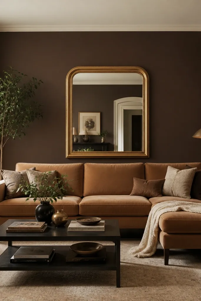
Chocolate brown adds depth and makes a living room feel cozy even with modern furniture. The trick is keeping trim in a lighter cream so walls don’t blend into the ceiling. This color also helps patterned rugs look richer, especially if they have beige and rust tones. With warm lighting, it looks like a boutique hotel.
Use chocolate brown on all walls only if your room has decent natural light. If not, do it on one feature wall and keep the rest in cream. Match with leather, boucle, or textured cotton in beige, caramel, and cream.
Paint a test patch near a window and watch it in late afternoon; dark browns shift fast as the light drops.
Avoid glossy brown paint; it shows uneven texture and can look plastic.
11. Charcoal Feature Wall for Modern Contrast
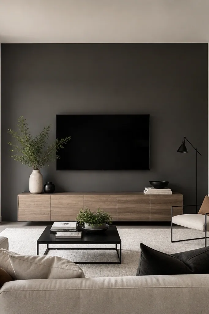
Charcoal gray gives you crisp contrast without the harshness of black. It makes a TV zone look intentional and it pairs cleanly with white walls and black frames. If your living room has light wood floors and a white modular unit, charcoal will make the whole setup look sharper. It also hides minor scuffs better than light colors.
Tape a straight line and paint only the wall behind the TV or the main seating focal point. Keep other walls in warm off-white or soft greige. Use matte finish for a premium look and reduce glare from the TV.
Pro tipPlan for lighting: add a warm wall sconce or floor lamp so the charcoal doesn’t swallow the room at night.
Watch outSkip charcoal if your room has almost no natural light; it will feel heavy.
12. Off-White with a Soft Yellow Undertone
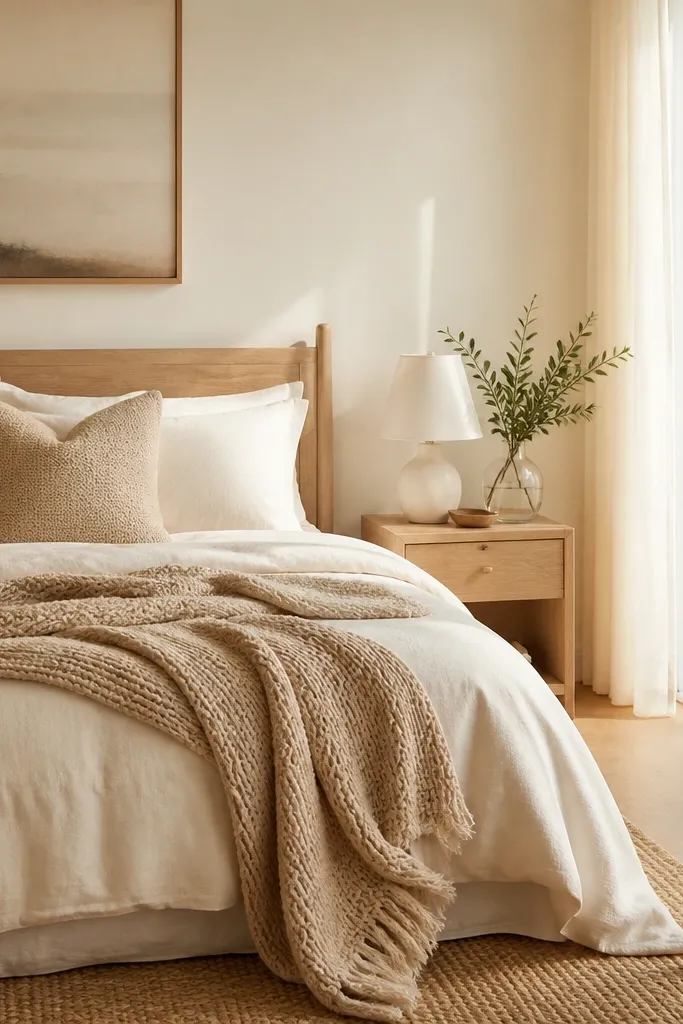
This is the off-white that looks like “warm daylight” on walls. It’s different from cream because it’s lighter and reads airy, but it still fights the gray cast you get in winter. In Indian homes, it works well with both traditional wood tones and modern white furniture. The result is a living room that feels bright even without a lot of decor.
Use it on all walls and keep trim slightly brighter for a clean boundary. Pair with ivory, oatmeal, and light tan textiles. If you have a patterned rug, this off-white helps the pattern look balanced instead of loud.
Pro tipTry it if your current white looks too blue; warm undertones fix that fast.
Watch outAvoid choosing this when your room already feels too yellow; it can push the whole space toward dull orange.