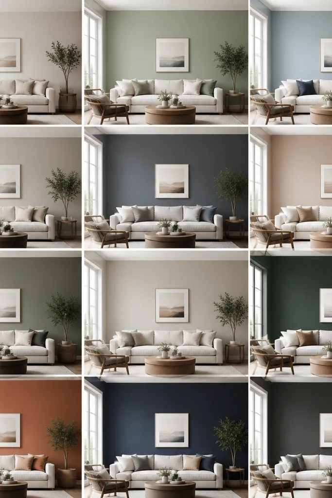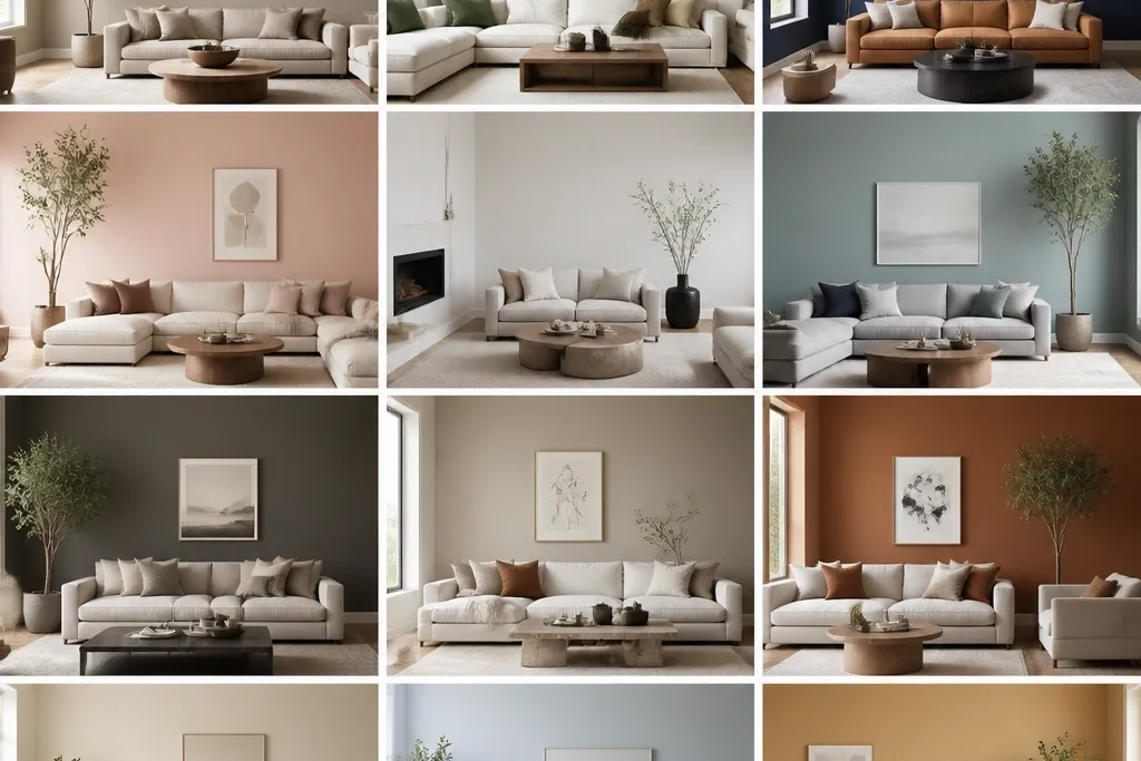
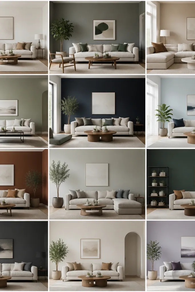
1. Oyster Beige + Warm White Trim
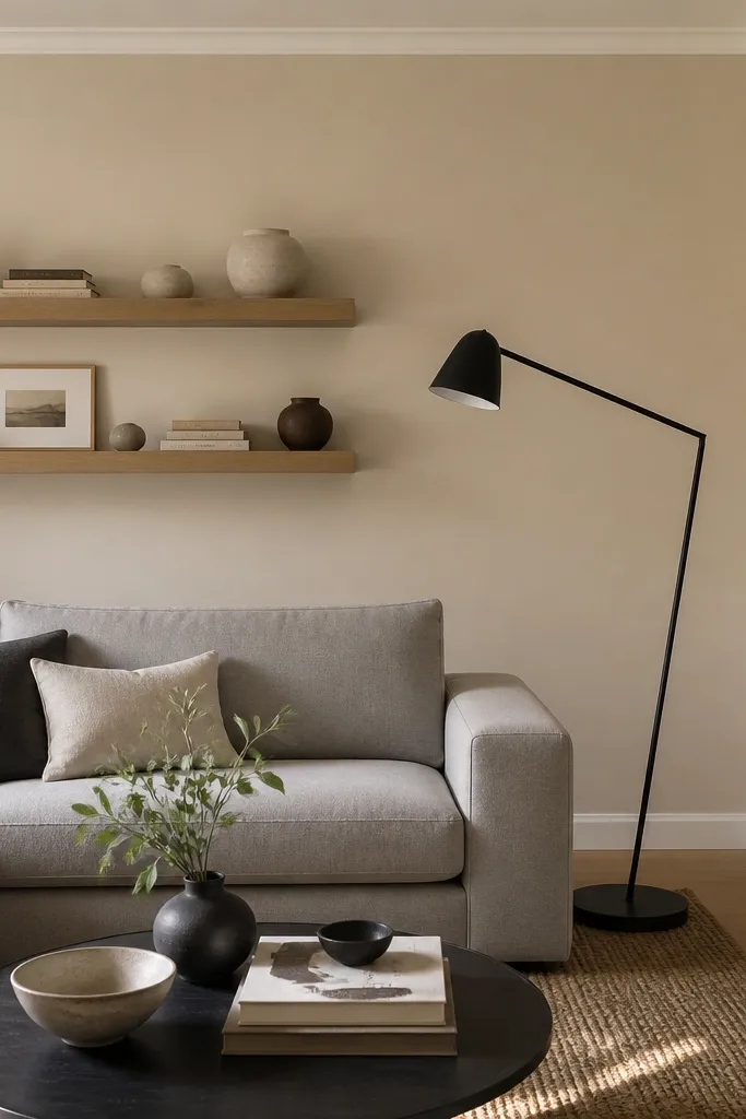
Paint three walls in the oyster tone and use it as the main color throughout. Keep trim and ceiling in the warm white at 85% white strength (the common “warm white” look), and choose a baseboard that’s at least 3.5 inches tall for a clean frame. This works best with light oak or blonde wood floors and rugs with beige-and-gray stripes.
Oyster beige reads modern because it has enough warmth to stay flattering but enough gray content to avoid turning yellow. Pair it with warm white trim so the room doesn’t feel high-contrast or harsh. This palette makes light-colored fabrics look expensive — linen, boucle, and cotton blends — without needing bold decor.
Watch outDon’t pick a beige that’s too yellow or your room will look dated under evening lighting.
Pro tipBring home two swatches: one labeled “oyster” and one labeled “greige.” Put them next to your sofa fabric; pick the one that doesn’t pull orange.
2. Greige That Isn't Beige
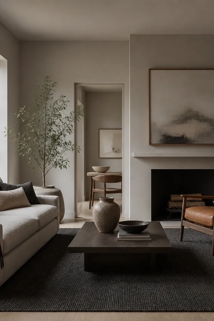
Use a greige with a LRV in the mid range so it still reflects light — think roughly 45-60. Paint all walls in one coat-light base, then add a darker accent through a gallery wall mat color or a single charcoal wall behind the TV. Finish with eggshell on walls and semi-gloss on trim so the undertone stays consistent.
The modern greige trick is choosing one that leans gray enough to read current, but not so gray it makes the room feel cold. I like greige when there’s a mix of metals in the room — brushed nickel plus black — because the walls calm everything down. It also makes art look sharper, especially pieces with off-white mats.
Watch outSkipping a daylight test is how you end up with a greige that turns greenish in the afternoon.
Pro tipHold the swatch next to a white pillow cover. If it looks dingy, it’s too gray — choose one with a softer gray base.
3. Soft Sage for a Relaxed Modern Room
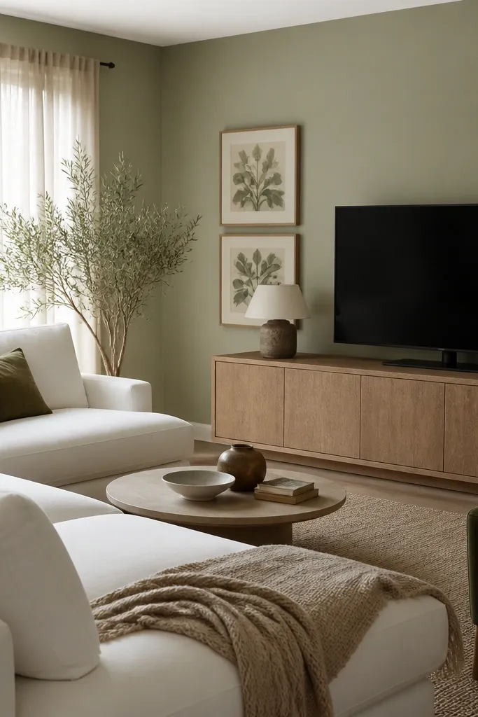
Soft sage looks modern because it’s muted and slightly gray-green, not a loud “farmhouse” green. It pairs beautifully with natural wood and off-white textiles, and it makes metals like brass look warmer instead of brassy. If your room feels sterile with gray walls, sage adds a calm warmth without going yellow.
Paint the whole room sage, then keep trim in a creamy white rather than bright white. Use light wood (oak, ash, or birch) and choose fabric with a linen or cotton weave so the wall color stays the star. This works especially well with north-facing rooms that need a little color warmth.
Pick sage with a gray cast. If your swatch looks neon next to the rug, it’s too saturated.
Avoid sage that’s too saturated — it reads trendy for a minute, then feels loud every day.
4. Dusty Blue with Linen Neutrals
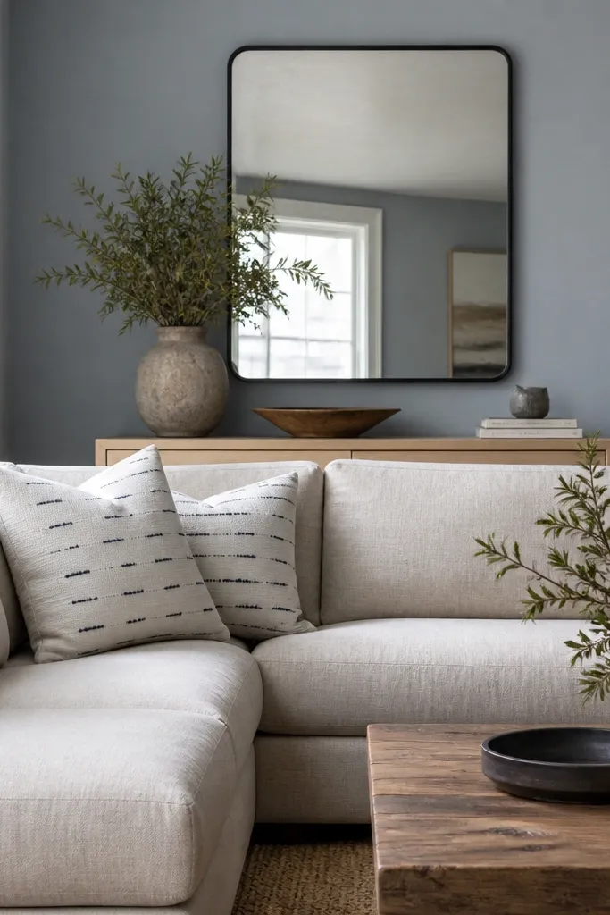
Use the dusty blue on all walls if your room gets decent daylight; if not, do it on the main wall only and keep the other three in a warm off-white. Match trim to the off-white, and choose art with navy, charcoal, or warm gray accents. Finish with eggshell so the wall doesn’t look shiny under lamps.
Dusty blue-gray gives modern depth while still feeling airy. It works because it sits between gray and color, so it doesn’t fight your neutrals. In my experience, it makes white decor look cleaner and helps dark furniture feel grounded instead of heavy.
Watch outDon’t choose a blue that’s too saturated; it will look like a bedroom color in a living room.
Pro tipTest it near a lamp that runs warm (2700K). If the blue turns purple, the undertone is off.
5. Charcoal TV Wall with Light Base
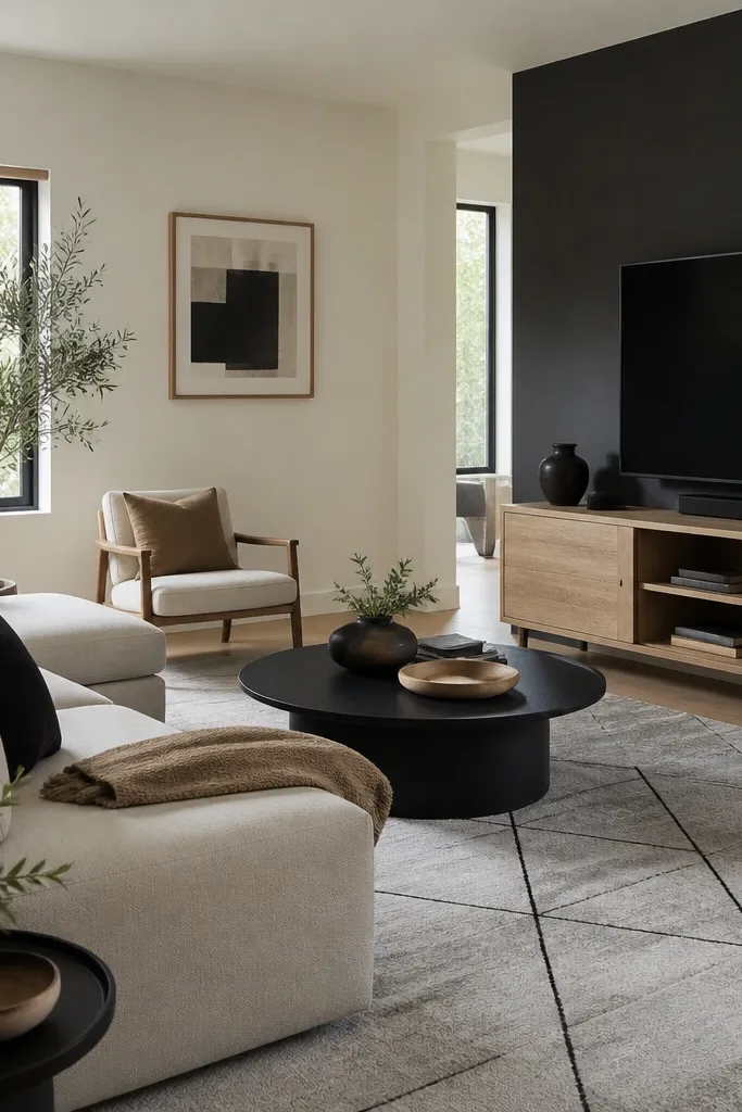
A charcoal back wall creates a modern frame around your TV or fireplace. The reason it works is contrast: the dark wall makes the lighter furniture look crisp, and it reduces the “blank wall” effect. I’ve done this in rooms with neutral sofas where the space felt unfinished; charcoal made it look styled instantly.
Paint the accent wall charcoal and keep the other walls in a warm off-white. Use semi-gloss or satin on the trim so the edges pop. If you have a low ceiling, keep the charcoal wall aligned to the top of the mantle or centered behind the TV to avoid making the room feel boxed in.
Mask carefully and use painter’s tape with a firm press along the edge. Charcoal shows bleed faster than light colors.
Don’t paint charcoal on all walls unless your room has big windows and strong natural light.
6. Warm White with a Chalky Finish Look
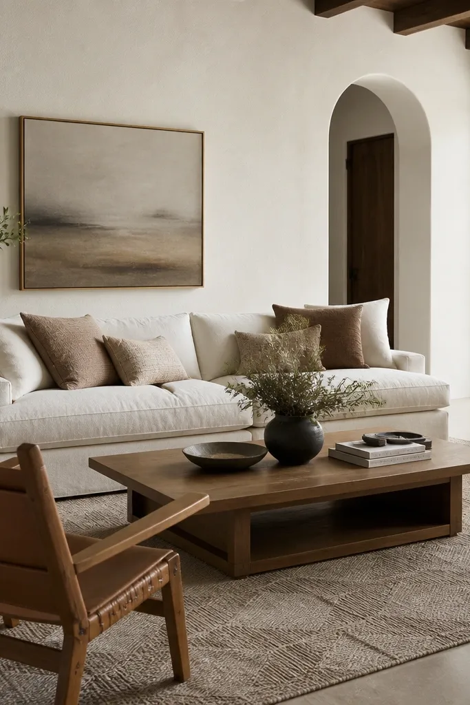
Not every modern living room needs color. A warm white with a soft, matte feel can look modern because it hides imperfections and makes the room feel bright. I use this when the room already has a lot of pattern — curtains, rugs, or layered art - and the walls need to calm everything down.
Choose a warm white with a hint of beige, then ask for a matte or flat look rated for walls (not “washable flat,” which can be tricky). For durability, I still prefer eggshell if you’re worried about scuffs, but I aim for a low-sheen look. Pair with natural materials: jute, oak, and linen to keep it from feeling sterile.
If your warm white looks creamy-yellow in photos, switch to one that reads “warm neutral” rather than “cream.”
Avoid bright optical white on walls if you have warm wood; it will look too sharp and clinical.
7. Light Cool Gray with Black Accents
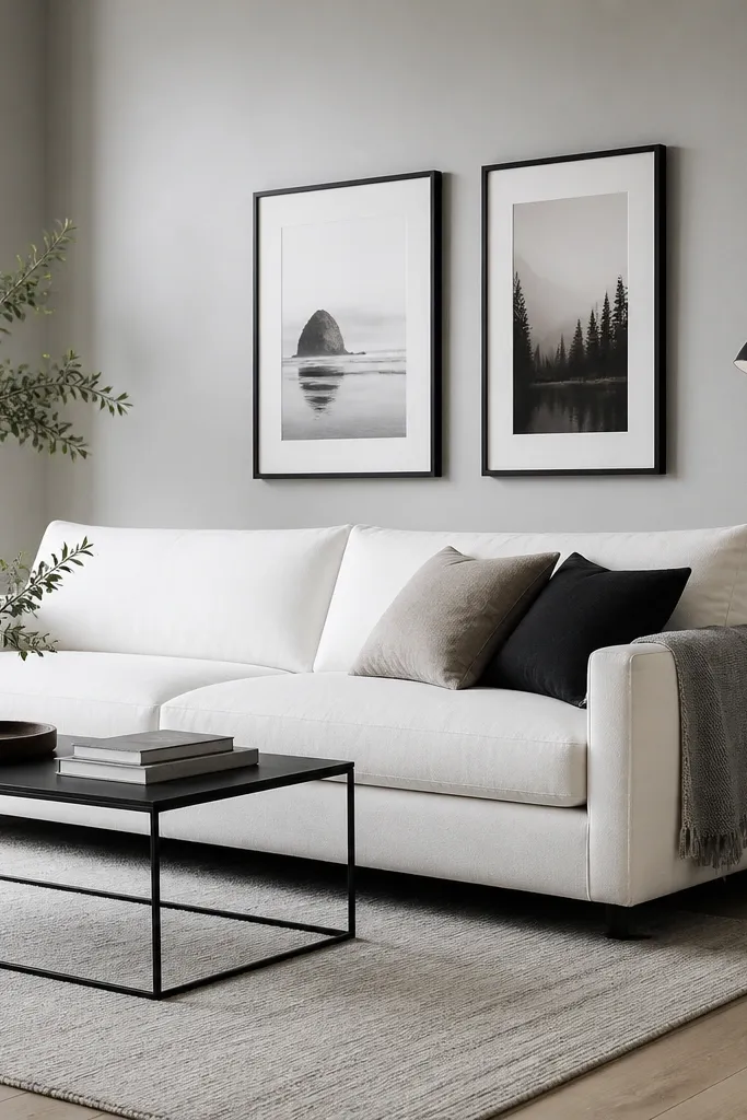
Pick a cool gray around a light-to-mid range so it doesn’t feel gloomy. Keep trim white (slightly cool) and choose rugs with warm undertones or beige threads to balance. Use black in small quantities: frames, lamp base, and a coffee table leg.
This is the modern “clean and crisp” look. Light cool gray makes the room feel organized, and black accents add edge without needing loud color. It works best when you have at least one warm element too — like wood or a tan leather chair — so the gray doesn’t feel like an office.
Watch outDon’t pair cool gray walls with only cool finishes; the room will feel flat and lifeless.
Pro tipHold a swatch next to your black furniture. If the gray looks too blue, choose a gray that reads more neutral.
8. Muted Terracotta + Soft Cream
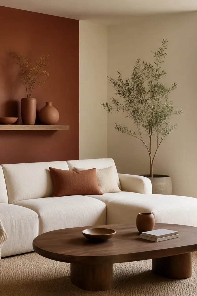
Use terracotta as an accent wall, not the whole room, if your space is small or has limited daylight. Keep the rest of the walls in soft cream and use walnut or medium wood tones in coffee tables and shelving. Finish with eggshell on walls so the color looks smooth, not shiny.
Muted terracotta modernizes a living room because it reads like clay, not like “orange paint.” It adds warmth and texture to neutrals, especially when your furniture is cream, ivory, or light gray. I’ve seen terracotta make plain white art mats look warmer and more grounded.
Watch outAvoid bright tangerine terracotta; it reads temporary and cheap fast.
Pro tipChoose terracotta with a brown-red undertone, not pink-red. Pink undertones turn funky under warm bulbs.
9. Olive Green with Natural Wood
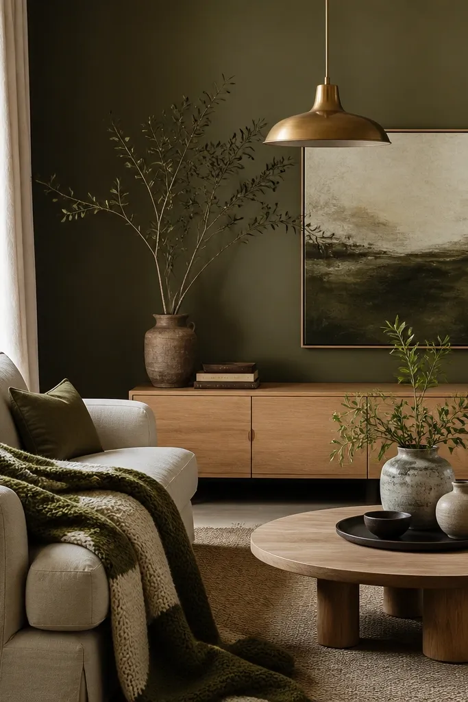
Olive green looks modern when it’s muted and slightly dusty. It’s a color that plays well with natural wood and stone, and it makes brass look intentional instead of random. If you want “earthy modern” without going full boho, olive is the middle ground I reach for.
Paint the main wall olive and keep the remaining walls in a warm off-white. Use natural textures: linen curtains, woven baskets, and a rug with a low-contrast pattern. Keep metals mixed but controlled: brass pendant plus black frames, not five different metal shades.
Test olive against your rug. If the rug starts to look pink or muddy, the olive undertone is fighting it.
Don’t choose a bright green. It will look like a kids' room in a living room.
10. Deep Navy Accent with Brass Lighting
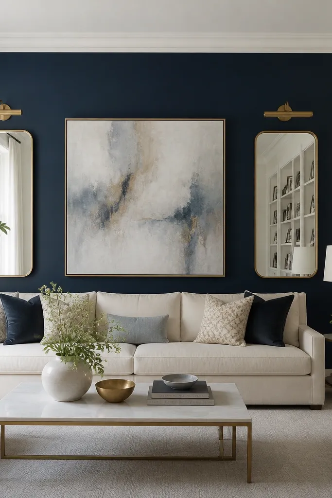
Do navy on one wall — fireplace or TV — and keep all other walls off-white. Paint trim in a clean off-white that isn’t too warm, so the navy doesn’t look brown. Pair with brass, ivory, and a small amount of black for structure.
Deep navy gives you the modern contrast people chase with charcoal, but it feels richer. It makes warm metals look golden and makes light textiles pop. In rooms with white trim and light floors, navy can look tailored rather than dramatic.
Watch outSkipping a primer on darker accents is how you get patchy spots after the first coat.
Pro tipUse a navy that dries flat or satin (not glossy). Gloss navy shows uneven wall texture more than you want.
11. Blackened White for a Soft Modern Contrast
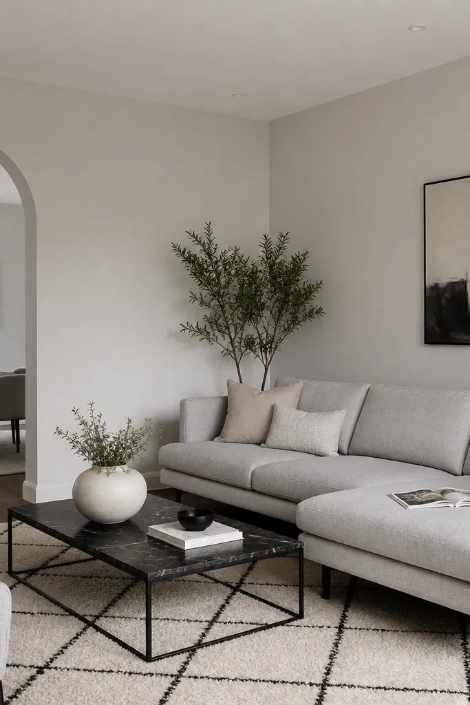
Blackened white sounds weird, but it’s the secret to modern “white” that doesn’t look flat. It has enough gray to hold contrast with dark furniture, yet it stays light enough to keep the room open. I use this when homeowners want white walls but hate how stark bright white looks at night.
Paint all walls in the blackened white, then keep trim and ceiling lighter by one shade. Choose furniture with clear lines — track arms, straight legs, low profile — so the color reads intentional. This palette works with both warm and cool floors, as long as you use a consistent white tone on trim.
Compare the swatch to your ceiling color. If the ceiling is brighter, the room will feel uneven.
Don’t pick a “gray white” that looks dirty next to your curtains; it will age the room.
12. Warm Gray with Textured Plaster Look
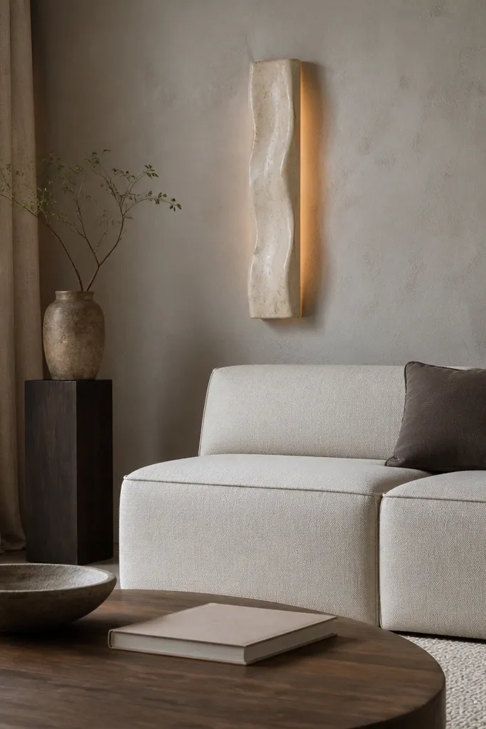
Use a wall primer and then apply a textured finish product with a flat trowel. Keep the texture consistent — don’t chase peaks and valleys. Pair with matte fabrics and avoid high-gloss decor; otherwise the wall texture fights reflections.
A warm gray with texture reads modern because the wall has depth even with neutral decor. Plaster-style finishes hide minor bumps and make light look soft instead of harsh. When you add textured paint, the color looks richer without getting darker.
Watch outDon’t overwork the texture. It makes patchy sheen that shows up in photos.
Pro tipPractice the trowel pattern on a spare board. The direction of your strokes shows under angled light.