1. Warm Putty Walls with Crisp White Trim
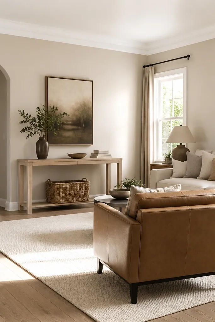
Paint the walls in a warm putty (think beige-gray with a hint of sand). Keep trim and ceilings in a clean white that doesn’t look creamy in daylight. Use a light oak or bleached wood accent so the warmth feels intentional, not sticky.
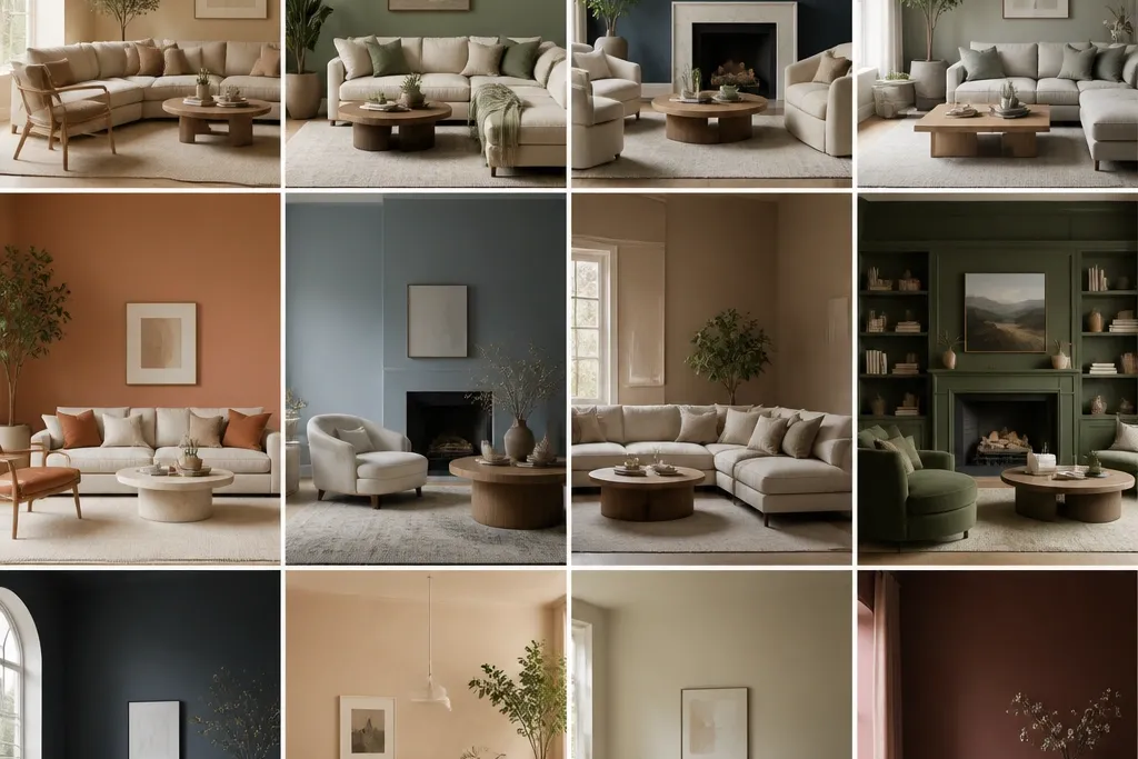
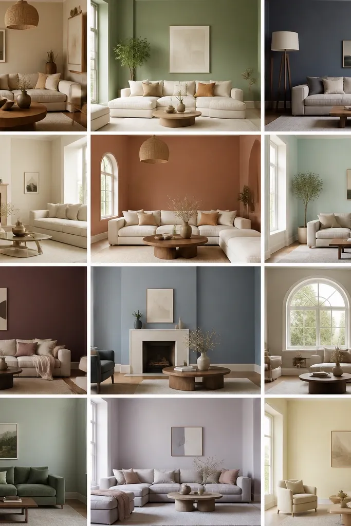
Warm putty is my go-to when a room has warm wood floors and you want “soft” without going yellow. The putty base keeps shadows from looking dirty, and the crisp white trim adds contrast that makes furniture edges look sharper. I like pairing this with natural textures like jute, linen, and light leather because the color stays calm even when the room gets busy.
Watch outAvoid choosing a white trim that’s too warm; it can make everything look yellowed together.
Pro tipTape a 24-inch horizontal test strip at chair height so you see how it looks against upholstery in the same light.
2. Sage Smoke for a Cozy, Not-Chalky Green
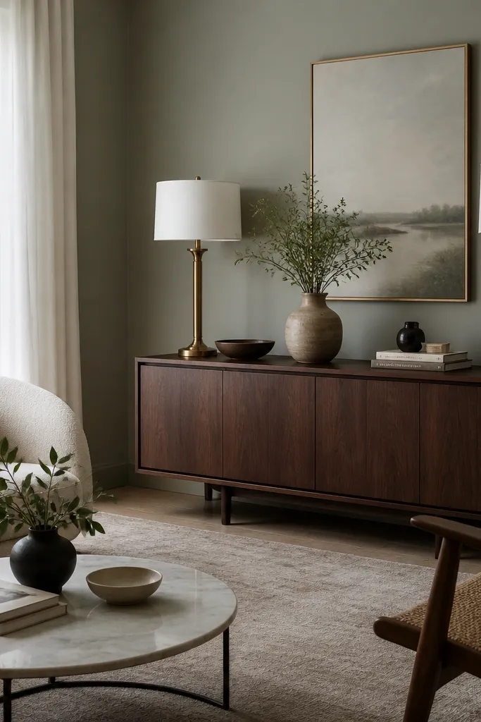
Pick a sage that leans gray more than yellow. Pair it with cream or ivory textiles, plus one darker element like walnut or black iron. If you have brass fixtures, this color makes them look softer instead of brassy.
Sage smoke looks like it has depth even in plain lighting. It’s muted enough to play nicely with beige rugs and warm woods, but it still reads green, so the room feels fresh instead of generic. I’ve used it in rooms with cream upholstery and it keeps the fabric from looking too warm or too stark.
Watch outAvoid bright mint greens; they look harsh once the sun shifts.
Pro tipUse a satin or eggshell finish on walls and keep sheen even across the whole room to avoid patchy “spotty” depth.
3. Earth Clay with Linen Layers
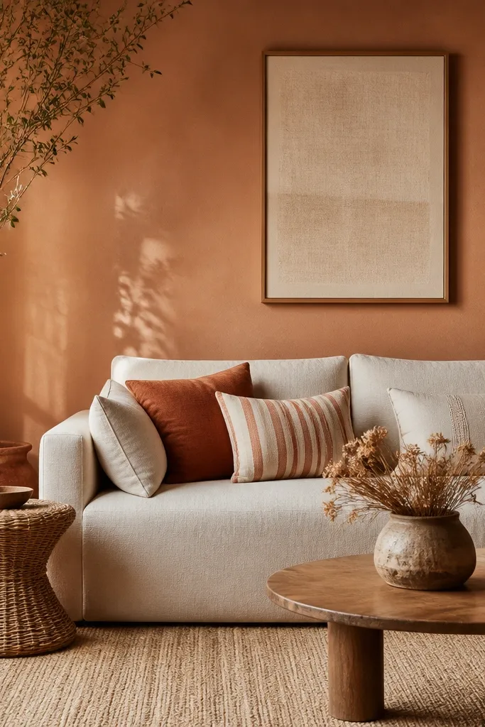
Earth clay is the color you choose when you want warmth without orange overload. It sits between beige and terracotta, so it flatters warm metals and natural fibers. The room feels grounded, and linen textures look expensive because the wall color doesn’t compete.
Use a clay that reads “dusty” rather than “painted pumpkin.” Keep your whites off pure bright and go for ivory or oatmeal. Add one rust accent pillow or terracotta vase to echo the wall undertone.
When you buy sample cards, swipe two shades lighter than you think you need; clay darkens as it dries.
Avoid pairing clay with icy grays; the clash shows up fast in photos.
4. Moody Charcoal Accent Behind the TV
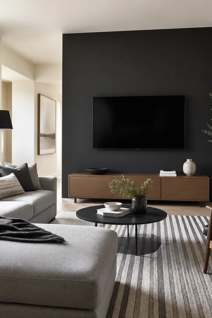
Paint only the wall behind the TV and any built-in shelving on that plane. Keep surrounding walls in a warm off-white, not stark white. Use matte or eggshell on walls so the charcoal looks soft instead of glossy.
Charcoal behind the TV makes the whole zone feel designed because it frames the focal point. It also hides smudges better than lighter grays if you choose a washable paint. The rest of the room stays light, so you don’t get that closed-in feeling.
Watch outAvoid painting the entire room charcoal; it will shrink the space and show dust.
Pro tipHold your rug up to the wall color in daylight. If the rug’s gray looks too blue, swap charcoal for a charcoal with warmer undertones.
5. Blue-Gray for a Clean, Modern Calm
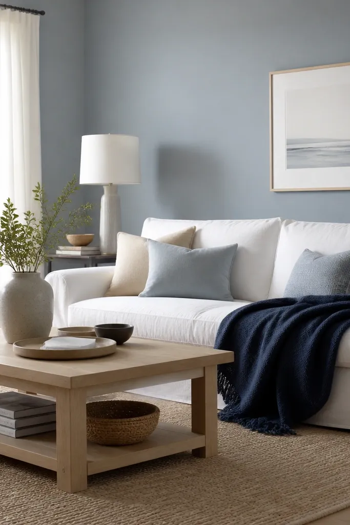
Pick a blue-gray that looks slightly cooler in the shade but not icy. Pair with clean white trim and natural wood. Add navy or denim textiles as your second color to keep the palette tight.
Blue-gray gives you calm without the heaviness of straight gray. The trick is choosing a blue-gray that doesn’t go lavender. When it’s right, it makes white upholstery look crisp and it balances warm wood tones without turning the room orange.
Watch outAvoid gray-blues with purple undertones; they make beige rugs look pink.
Pro tipTest next to a white outlet cover or baseboard in your room. That comparison tells you if the blue-gray is too purple.
6. Creamy White with a Hint of Taupe
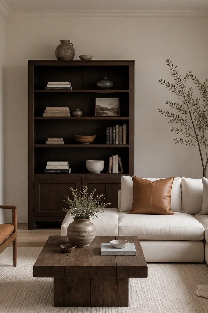
A creamy white with taupe undertone is the easiest way to make a living room feel updated without repainting every year. It’s forgiving with flooring and blends with both warm and neutral decor. I like it when the room has mixed finishes like brushed nickel and wood because it doesn’t pick a fight with either.
Choose a white that has gray-brown undertones, not a buttery yellow. Keep ceilings in the same color family but slightly lighter if you’re picky about contrast. Use eggshell on walls and satin on trim so it cleans without glare.
If your room has lots of natural light, test the color on two opposite walls. One side can show undertone shifts.
Avoid pure bright white if your furniture is creamy; it will look stark and cheap fast.
7. Warm Mushroom Neutrals for Mixed Wood Floors
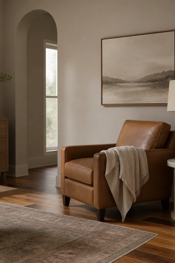
Pick a mushroom that’s more gray-brown than yellow. Pair with camel, cream, and one deeper accent like olive or espresso. If you have patterned rugs, this wall color prevents the pattern from fighting the floor.
Mushroom neutral is what you reach for when you have mixed woods and you want them to look intentional. The color sits in the gray-beige middle, so it doesn’t force everything to match one undertone. It also keeps the room from going too beige-beige, which can feel flat.
Watch outAvoid cool greige if your wood leans warm; it will look smoky and dull.
Pro tipUse a matte or eggshell finish and keep your lighting consistent when evaluating samples — different bulbs will exaggerate undertones.
8. Olive Drift for a Modern Traditional Look
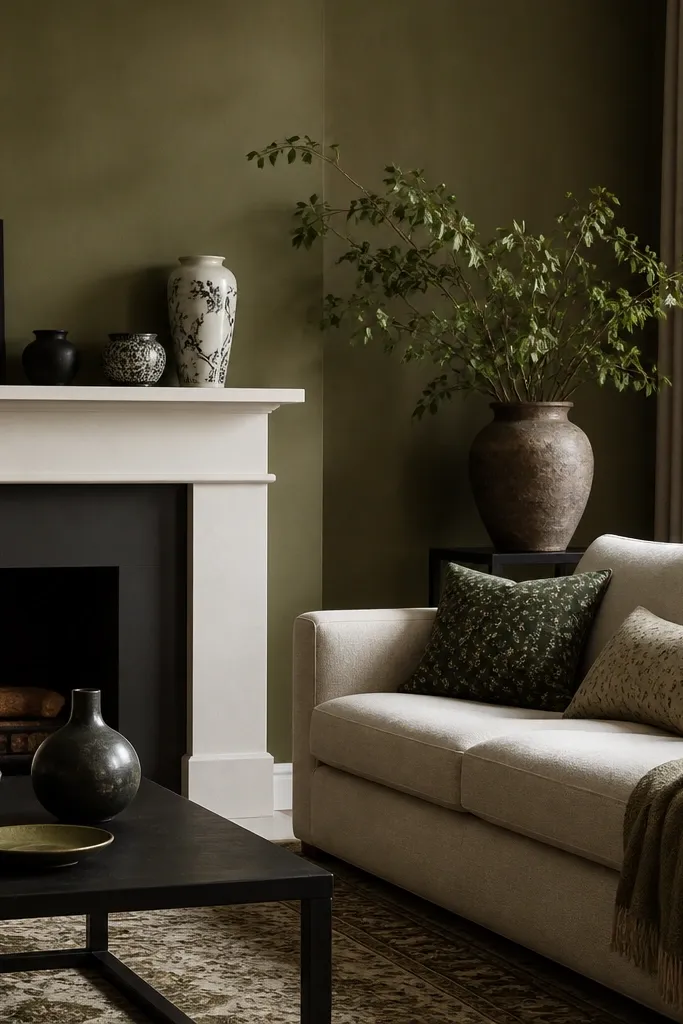
Choose an olive that looks muted, almost olive-brown. Pair with oatmeal or cream textiles, plus black or bronze hardware. If your room has a fireplace, this color makes the mantel look crisp and intentional.
Olive drift reads sophisticated because it’s not a bright green. It has enough gray in it to feel calm, but it stays clearly green in daylight. I’ve seen it work in living rooms that have both traditional molding and modern furniture because it bridges warm and cool elements.
Watch outAvoid yellow-leaning olives; they look dated and turn the room into a “mustard cousin.”
Pro tipPaint a small section around one outlet. If the green looks too dark near white outlets, go one shade lighter.
9. Terracotta Rose for Soft Color Without Loudness
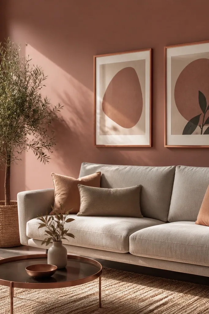
Pick a terracotta rose that reads dusty, not brick-red. Pair with light grays, cream rugs, and warm metals like copper. Add one darker accent in chocolate brown so the palette doesn’t feel too light.
Terracotta rose is warm, but the rose tone keeps it from turning purely orange. It makes gray furniture feel warmer and it flatters copper and bronze without looking like a theme. This one is great for living rooms that want color but don’t want to commit to deep jewel tones.
Watch outAvoid pairing with cool blue walls; the undertones clash and everything looks off in photos.
Pro tipIf you’re unsure, start with a lighter sample and test beside a gray cushion. The color match tells you fast.
10. Deep Forest Green with Matte Finish
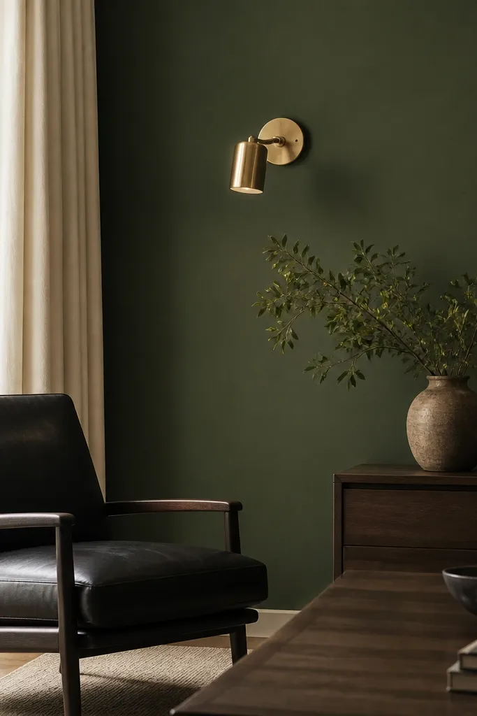
Use matte or flat on the feature wall only if you’re okay with slightly harder cleaning. Keep other walls in a warm neutral for balance. Add cream curtains and one glossy element like a brass frame for contrast.
Deep forest green makes a living room feel cinematic without needing wallpaper. Matte finish keeps it from looking shiny and cheap, and it hides wall texture better than glossy paints. Pair it with brass and cream so the greens don’t swallow the room.
Watch outAvoid forest green in rooms with very weak daylight; it can feel heavy.
Pro tipPlan your lighting before you paint. Forest green looks best with layered lamps, not just overhead light.
11. Warm Gray with a Beige Base
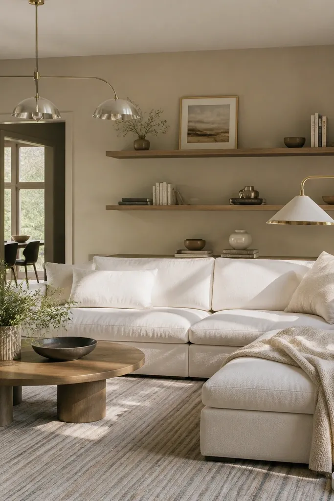
Choose a warm gray that has brown undertones — it should look slightly creamy next to white. Pair with beige rugs, light wood, and a darker accent like espresso. Use eggshell on walls for wipeability.
Warm gray with a beige base is the gray that doesn’t feel cold at night. It works when you want a neutral but your room’s fabrics lean warm. I like it for families because it hides dirt better than light whites and it still looks clean.
Watch outAvoid blue-gray if your lighting is warm; it will look dingy.
Pro tipCheck your paint sample against your sofa fabric. If the gray makes the fabric look pink, swap to a slightly browner gray.
12. Powder Blue for a Light, Airy Sitting Room
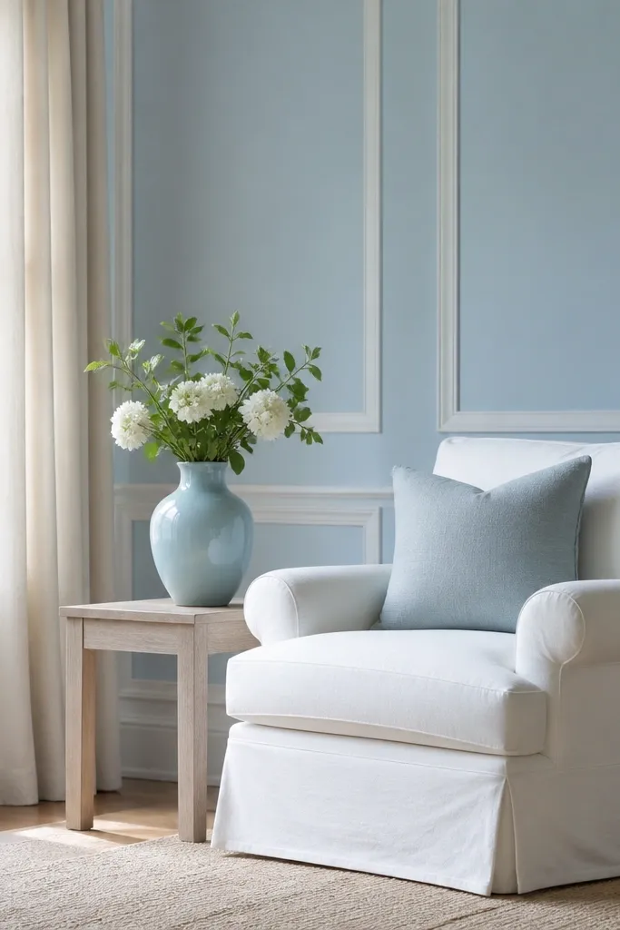
Powder blue brightens a living room without going bold. It looks airy because it’s light and soft, and it pairs cleanly with white trim and light woods. I use it when I want the room to feel fresh, especially if the space has a lot of beige furniture that can otherwise feel heavy.
Use a powder blue that dries evenly and doesn’t show chalkiness. Keep trim crisp white, and add one grounding element like natural jute or light tan leather. If you have patterned rugs, keep the blue tone consistent so it doesn’t compete.
If you have south-facing light, test two times of day. Powder blues can shift toward green by late afternoon.
Avoid dusty gray-blue if you want airy; it reads dull instead of light.