1. Warm Greige Paint with a Subtle Color-Block Border
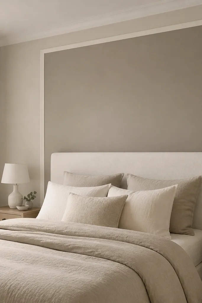
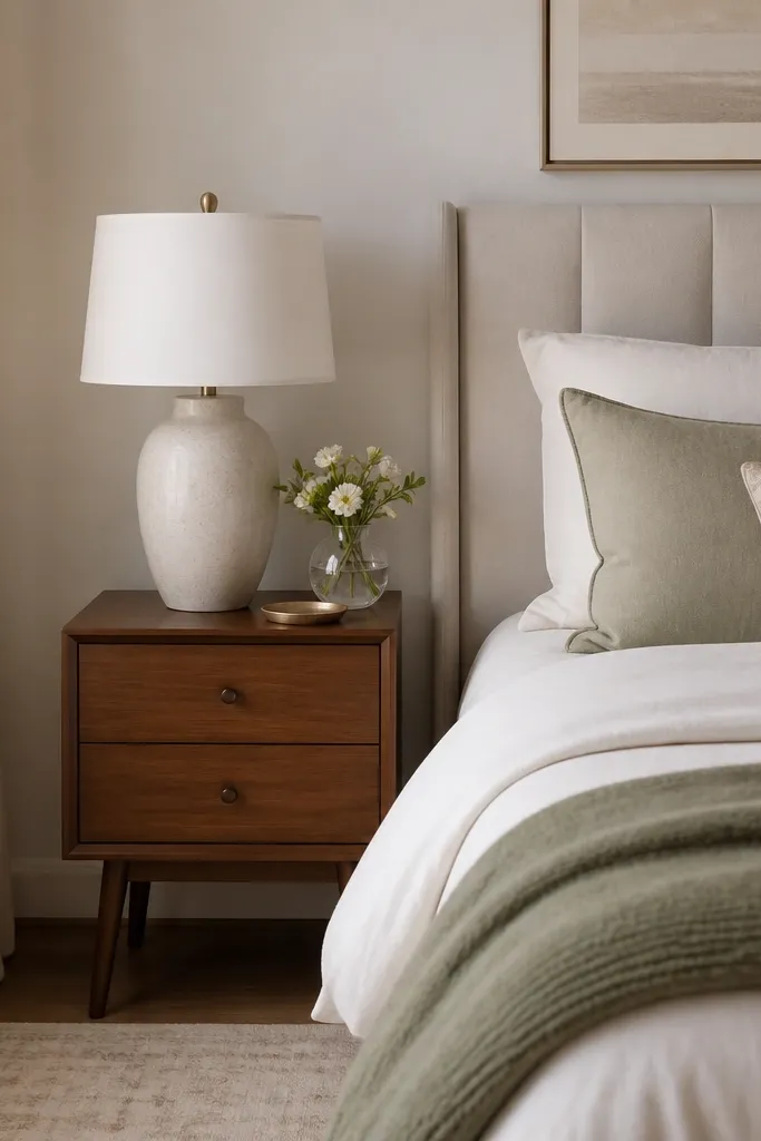
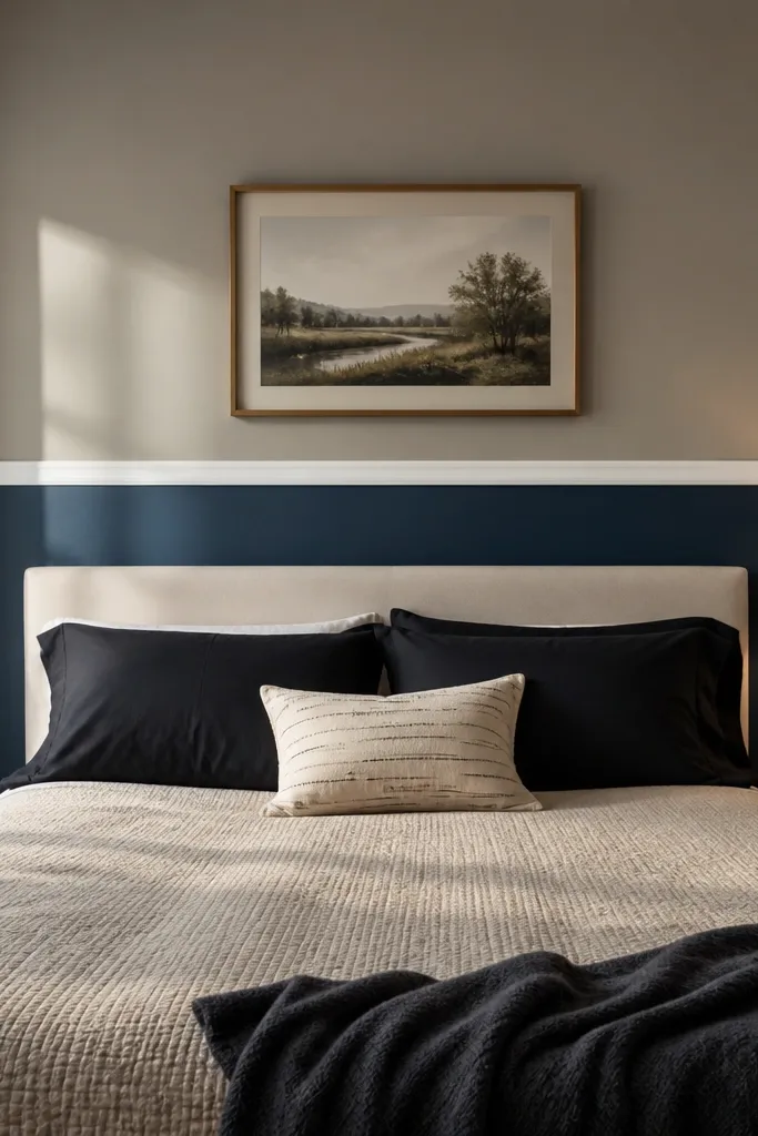
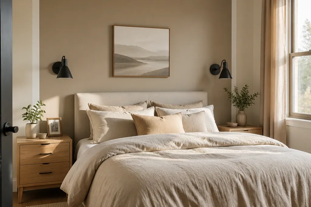
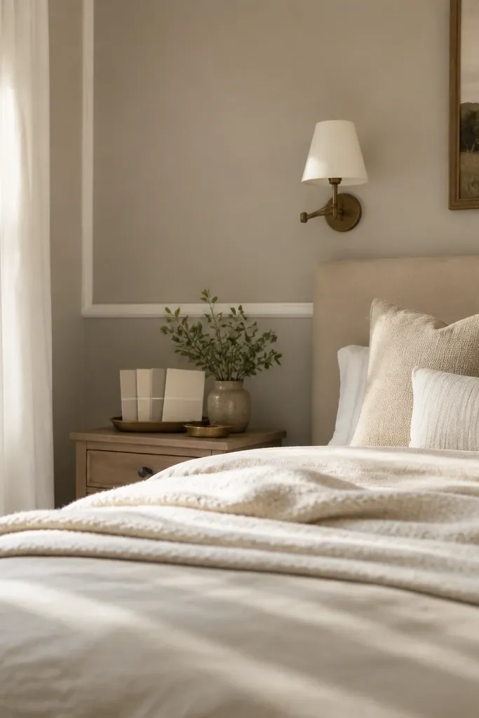
This look is soft, timeless, and still interesting because the border gives your eyes a shape to land on. Choose a warm greige paint (think beige-greige, not gray-greige) and pair it with crisp white trim or painter’s tape lines. Keep the accent area behind the headboard and add a 3 to 4 inch border so it looks styled, not accidental. The matte finish keeps everything calm and bedroom-friendly, while the trim adds contrast without going bold. It solves the “plain wall” problem by creating a framed focal point that photographs cleanly.
1) Paint your main walls first, then tape a rectangle behind the headboard. Target a height that lands 6 to 12 inches above the headboard top and about 10 to 16 inches wider than the headboard on each side. 2) Use a warm greige matte or eggshell paint on the taped rectangle, then remove tape while paint is still slightly tacky for sharper edges. 3) Add the border with white semi-gloss or satin trim paint using a small angled brush; let it cure before styling.
Pro tipIf your bedding is creamy or oatmeal, match the greige undertone to your duvet — warm greige should look slightly beige next to it.
Watch outSkipping a border or using the same undertone as your main walls makes it read flat.
2. Textured Linen-Effect Peel-and-Stick Wallpaper Behind the Bed
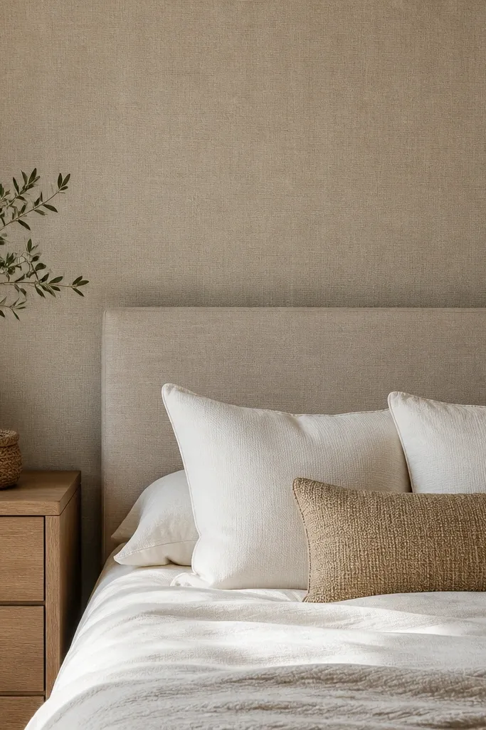
Linen-effect wallpaper makes neutral walls feel expensive because the texture catches light gently. Go for an oatmeal, sand, or taupe-linen look with a subtle weave — not a printed pattern. This is perfect for bedrooms where you want softness and don’t want to deal with brush marks or patchy drywall showing through paint. The textured surface hides minor imperfections and adds depth even when the room lighting is dim. It also reads timeless because it looks like a material, not a trend.
1) Clean the wall, then measure the width of the bed wall and cut wallpaper strips with 1 inch extra at the top and bottom. 2) Start at the centerline behind the headboard and smooth outward with a plastic smoother, working slowly to avoid bubbles. 3) Trim edges with a sharp utility knife and a straightedge; use a caulkable edge trim if your wall has chunky baseboards.
Pro tipUse a matte curtain fabric nearby (linen, cotton voile, or slub weave) so the wall texture and textiles look like one set.
Watch outChoosing a glossy wallpaper finish — it can look shiny and less “soft” in a bedroom.
3. Half-Wall Wainscoting in Taupe with White Upper Paint
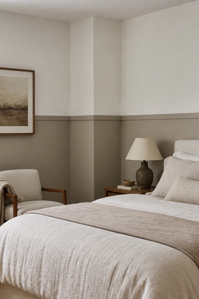
Half-wall wainscoting gives you the most “traditional meets modern” look without going full renovation. The key is contrast: white upper paint keeps the room airy, while taupe lower paneling adds warmth and depth. Aim for a taupe that looks slightly warm (greige-taupe) so it doesn’t turn cold. This solves the problem of a wall that feels too tall or too bare — the paneling creates structure and frames the bedding. It’s also very photogenic because the shadows in the grooves show up even in low light.
1) Mark a level line for the wainscoting — typically 36 to 42 inches from the floor, adjusted to where your headboard sits. 2) Install peel-and-stick or lightweight MDF panel sheets, then caulk seams and paint the panels taupe eggshell. 3) Paint the upper wall white matte; finish with simple chair-rail trim and a base cap if you want a cleaner edge.
Pro tipIf your bedding is dark, keep the taupe slightly lighter than the duvet to prevent heavy contrast.
Watch outMaking the taupe too close to your main wall color — you need a clear split line.
4. Board-and-Batten Accent Wall with a Greige Wash
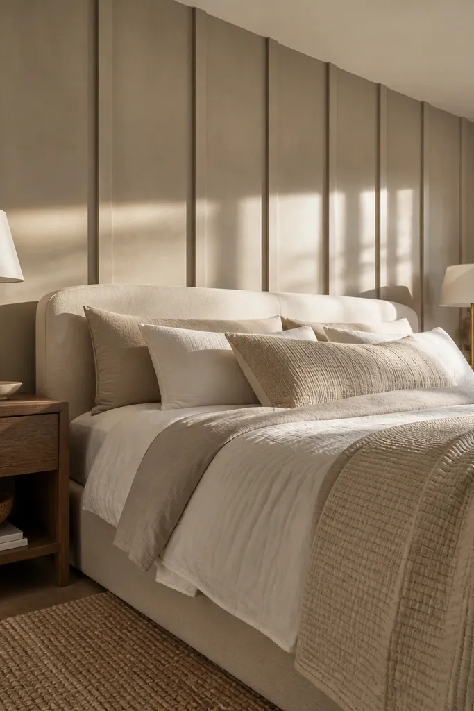
Board-and-batten adds dimension fast because the vertical lines create shadow depth. Use a greige wash (a diluted taupe-beige finish) on medium-tone boards so the wall looks soft, not stark. This is one of the best neutral accent wall bedroom ideas when you want “tailored” without loud color. It also hides wall flaws because shadows do the work. The result feels timeless because the pattern is classic, but the wash keeps it from looking like heavy farmhouse.
1) Measure the wall and plan batten spacing around 12 to 16 inches center-to-center for a balanced look behind a queen or king bed. 2) Install thin MDF or primed pine battens with construction adhesive and a few brad nails; patch nail holes and sand. 3) Apply a greige paint wash: base coat in a light greige, then wipe a slightly deeper taupe wash into the grooves, finishing with a matte topcoat.
Pro tipPaint the battens the same color as the wall behind them, just slightly deeper — the shadows show without looking striped.
Watch outUsing wide battens with a dark stain — it can make the room feel heavy.
5. Mushroom Taupe Paint with a Textured Roller Finish
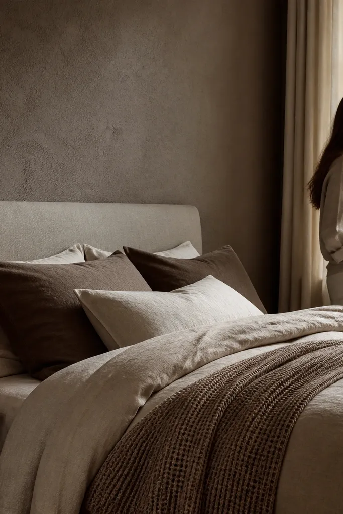
A textured roller finish makes neutral paint look layered, not flat. Choose mushroom taupe — a soft brown-beige that warms up the room without going yellow. The micro texture catches light and gives you that cozy, editorial look even with plain bedding. This solves the “my paint looks boring” issue by adding dimension that doesn’t require wallpaper. It’s especially good if your room has overhead lighting that makes smooth walls look flat and slightly dull.
1) Prime any patched areas, then paint a base coat in a light taupe-mushroom shade. 2) After it dries, use a textured roller (knockdown or subtle stipple) with a slightly darker taupe to create gentle variation; work in 2 to 3 foot sections. 3) Keep a wet edge as you roll and blend lightly so you don’t get harsh bands.
Test on a 2-foot section first; mushroom taupe can read more brown or more beige depending on your wall undertone.
Going too dark — deep taupe plus texture can feel heavy in small bedrooms.
6. Creamy Off-White Wallpaper with Faint Damask in the Bed Zone
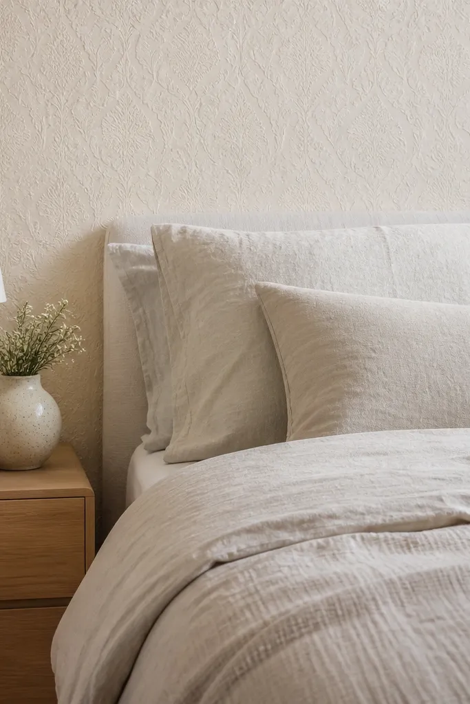
Faint damask in creamy off-white gives you pattern without looking busy. The trick is choosing a pattern that is barely there — it should read as texture at a glance, not as a bold motif. This is ideal for neutral bedrooms where you want softness and a hint of formality. It photographs well because the raised or slightly darker pattern catches light and creates gentle contrast. It also solves the “I want something special but I don’t want color” problem.
1) Select wallpaper with a subtle relief or low-contrast damask; measure and cut so the pattern centers behind the headboard. 2) Apply carefully at the top and smooth down in vertical strokes to keep pattern alignment clean. 3) Add a simple frame: paint or trim around the wallpaper edge with white matte so it looks intentional rather than pasted.
Pro tipIf your bed has a tufted headboard, keep the damask contrast low so the textures don’t compete.
Watch outChoosing a high-contrast damask — it turns the room into a statement wall that can feel busy.
7. Sand-Colored Microcement Look with a Single Accent Stripe
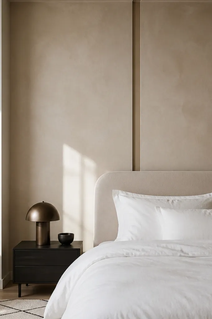
Microcement-style paint or a microcement-look finish adds that modern spa feel while staying neutral. Keep the main wall sand-colored, then add one thin stripe in a slightly deeper sand-beige to guide the eye toward the headboard. This works when you want a clean, architectural look that still feels soft. The microcement texture makes the wall interesting under different light temperatures. It solves the problem of modern bedrooms feeling too sterile by adding tactile variation without color drama.
1) Paint the wall sand base in matte or eggshell, then apply microcement-look coating using a wide trowel in thin passes. Keep the texture subtle — you want “skin” not “stone.” 2) Once cured, tape a single horizontal stripe behind the headboard and paint it with the deeper sand-beige. 3) Seal if the product requires it, then touch up edges with a small brush.
Use one stripe only. Two stripes start to look like a hallway treatment fast.
Making the texture too rough — it will look patchy instead of intentional.
8. Neutral Ombre Paint from the Floor Up Behind the Headboard
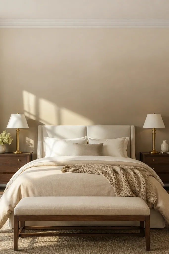
An ombre effect gives you movement while staying neutral and timeless. Go for a mushroom-to-cream ombre that gets lighter toward the top, so your ceiling feels higher and the bed looks framed. The soft gradient reads calm and expensive, especially with oatmeal bedding and warm metals. It solves the “accent wall is too flat” problem by adding dimension without pattern clutter. It’s also great for bedrooms with lots of windows because the gradient shifts nicely with daylight.
1) Paint a base coat in the lightest top color across the entire wall area, then tape a rough boundary around the headboard zone. 2) Mix a slightly darker shade, then blend downward with a large dry brush or sponge in small sections, feathering edges. 3) Step back every 2 feet to keep the gradient smooth; finish by sealing with matte topcoat if needed.
Pro tipPull the ombre line slightly above the headboard top so the gradient feels like it’s supporting the bed, not ending at it.
Watch outUsing a sharp line between colors — ombre should fade, not stripe.
9. Light Oak Slat Accent Wall with White Backing
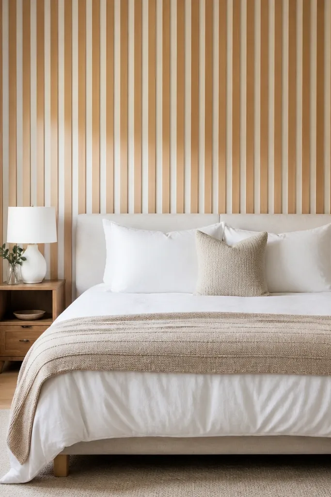
Wood slats bring warmth to neutral bedrooms without turning the room brown and heavy. Use light oak slats over a white backing so the slats read bright and airy, not dark. Keep the slat spacing consistent (about 1 to 2 inches between slats) for a clean, modern rhythm. This accent wall looks great with crisp white bedding, cream throws, and black or brushed brass hardware. It solves the issue of “neutral walls feel too cold” by adding a natural texture that still reads soft.
1) Install slats or slat panels by marking level lines and using adhesive plus a few screws into studs if needed. Start centered behind the headboard and work outward to keep symmetry. 2) Use a light oak finish (clear satin or whitewashed) and paint the backing white before installing slats if you’re using pre-assembled panels. 3) Finish with a thin caulk line at edges and touch up any gaps with matching filler.
Pair slats with simple bedding — solid duvet, minimal pattern — so the wall texture stays the star.
Going too dark with the slats — it can make a small bedroom feel smaller.
10. Neutral Geometric Peel-and-Stick in the Bed Center Only
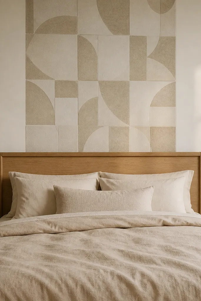
This is a clever trick when you want an accent wall look but your room layout makes full-wall treatments annoying. Use neutral geometric peel-and-stick panels (think beige-on-cream, sand-on-ivory) and place them only behind the headboard center. The geometry adds structure and keeps the room from feeling flat, while the limited area keeps it soft and wearable. It’s also easier to install and remove if you rent. The result feels intentional because the pattern is concentrated where your eyes focus.
1) Measure the headboard width and plan a panel area that is about 8 to 12 inches wider on each side than the headboard. 2) Apply panels in straight rows, starting at the centerline and smoothing firmly to lock seams. 3) Frame the edges with a thin white trim strip or paintable edge tape so the geometry looks like it was designed, not stuck on.
Choose a geometric pattern with low contrast so it reads as texture from across the room.
Covering too much wall — full geometric walls in neutrals start to feel busy.