1. Warm greige satin paint with a ceiling-hugging top band
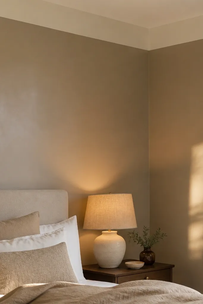
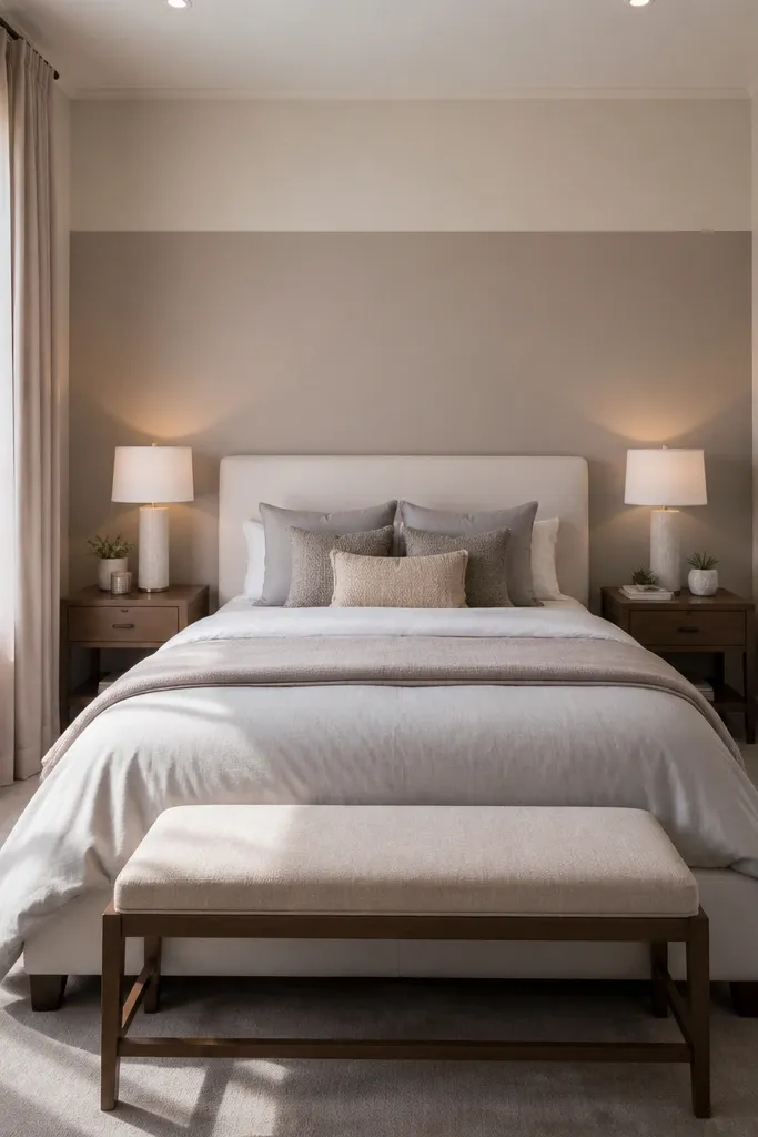
Start by painting the accent area behind the bed in your warm greige satin, extending to the trim lines you want to keep crisp. Tape a 2 to 3 inch ceiling band in a lighter cream (the same family as your trim) and paint it after the greige flashes dry. Finally, remove tape while paint is still slightly tacky for cleaner edges. For supplies, use a 2-inch angled sash brush plus a 9-inch roller, and plan for two coats on the greige.
A warm greige satin accent wall makes small bedrooms feel bigger because it reflects light without looking shiny. The real win is the thin top band — a lighter cream stripe just under the ceiling line that gives the eye a visual “lift.” Choose a greige that leans warm (think mushroom, not gray) so it doesn’t go cold at night. This works especially well if your room has white trim and beige or walnut furniture. The satin finish also hides minor wall imperfections better than flat paint, which matters when you’re working with older plaster or patchy drywall.
Watch outSkip flat paint — it makes the wall look chalky and shrinks the room’s light.
Pro tipUse warm 2700K bulbs and add a small wall sconce or plug-in picture light aimed upward so the satin catches light in the evening.
2. Vertical wood slats for height, stained to match your furniture

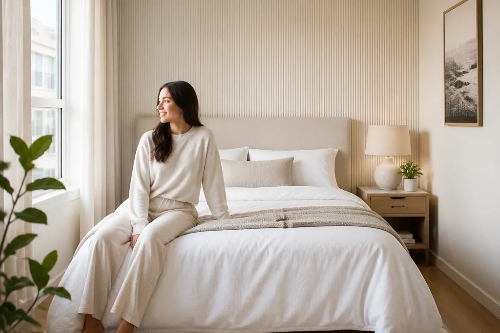
Measure the wall behind the headboard and decide on slat width — 2.5 to 3 inches looks clean, with 1/2 inch spacing for a modern rhythm. Install a level ledger or mounting strips first, then attach slats so the top edges line up with the ceiling trim. Pre-stain the slats before installation if you want even color, or stain after if you want a slightly more natural variation. Plan on 1 weekend for prep and layout, plus a second day for stain and dry time.
Vertical wood slats are one of the best small-room accent wall moves because they pull the eye up. The look feels warm and layered, and it hides minor wall bumps because you’re mounting slats over a base or directly onto studs/hat channels. Stain matters: match the slat tone to your nightstands or bed frame so the wall looks like part of the furniture, not a separate “project.” Go for medium-light oak or warm ash if your room is small and you want it airy. If your room already has dark wood, use a slightly lighter stain than the furniture so the slats don’t turn the wall into a heavy block.
Watch outDon’t use very dark stain in a room with limited daylight — it can make the bed area feel boxed in.
Pro tipPaint the gap shadows the same warm off-white as your ceiling trim; it makes the slats look crisp and intentional.
3. Bold striped wallpaper with a single color palette
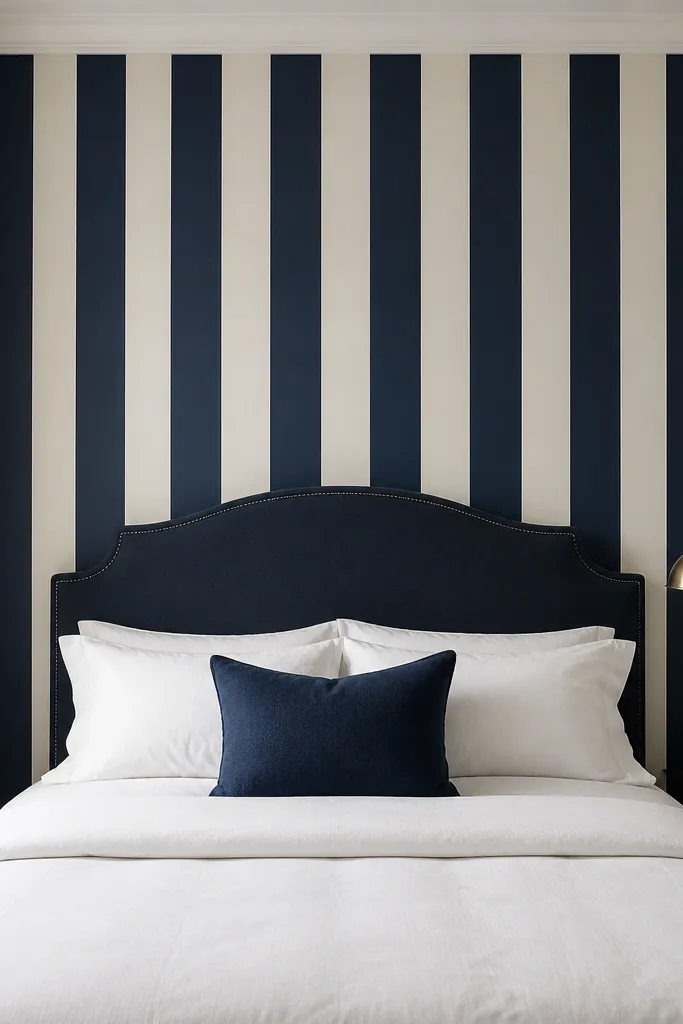
Measure the wall height from just above the headboard to near the ceiling and calculate how many full drops you need. Dry-fit one strip first to confirm the pattern repeat, then cut each drop with a little extra at top and bottom. Apply paste (or use peel-and-stick if the wall is smooth) and use a smoothing tool to push bubbles out from the center. After hanging, trim edges with a sharp utility knife and finish seams with a seam roller for clean lines.
Stripes create structure fast, and vertical stripes are the easiest way to make a small bedroom feel taller. Choose wallpaper with only two main colors so it stays photogenic and doesn’t clash with bedding. Navy-and-cream reads classic and looks sharp even in dim mornings. Keep the stripes aligned with the bed centerline so the room feels “designed,” not patchy. This works best when your furniture is neutral (white, beige, tan, light wood) because the wall does the talking and the rest stays calm.
Watch outSkip multi-color stripe patterns if your bedding already has prints; it turns the room into visual noise.
Pro tipHang wallpaper so the stripes sit centered behind the bed, even if the mattress is slightly off-center — the visual center matters more than the physical one.
4. Oversized fabric panel in front of the bed wall
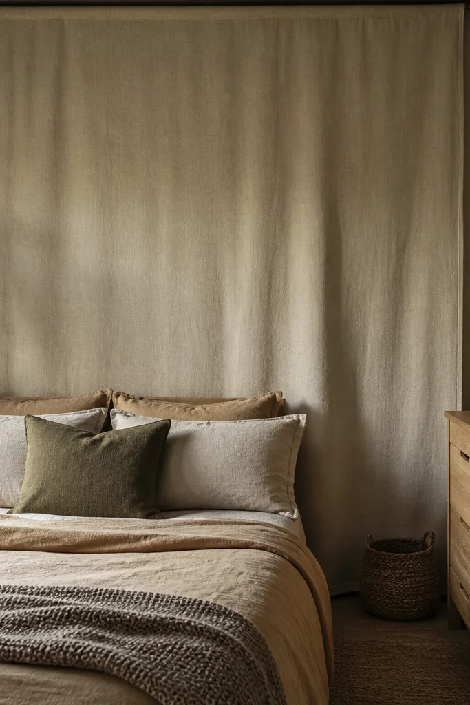
Choose a mounting method that fits your wall — a tension-rod frame, a simple wood picture rail, or a nailed-and-stapled stretched fabric onto a lightweight backing. Measure the bed width and aim for a panel that’s 10 to 16 inches wider than the mattress on each side. Mount it so the bottom sits about 6 to 10 inches above the top of your headboard or pillows, then staple or attach fabric taught but not overly stretched. Use a staple gun or fabric glue, and keep corners squared.
A single oversized fabric panel adds soft texture without the clutter of multiple pieces. It’s also forgiving: minor wall dents or paint patchiness disappear behind the panel. Linen or cotton canvas in oatmeal, sand, or warm taupe keeps the room bright, while a deeper color like olive adds mood if you have warm lighting. This is a great choice when you rent or don’t want to paint the whole wall. The look reads intentional because it’s one big shape behind the bed, not a collage.
Watch outDon’t use a thin, shiny fabric — it shows wrinkles and reads cheap fast.
Pro tipAdd a thin piping trim around the panel edges. It makes the fabric look tailored and more “architectural” in photos.
5. 3D plaster-look panels in a smooth wave pattern
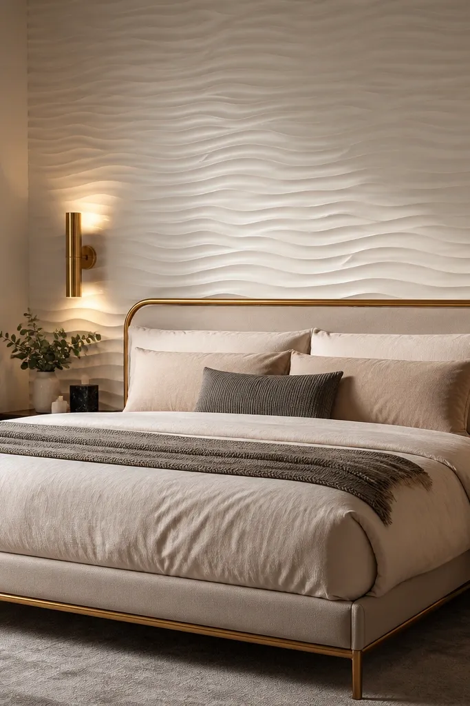
Select panels with a shallow relief so they don’t feel bulky — look for about 1/8 to 1/4 inch depth. Dry-fit one section first to see how the waves align behind your headboard, then mark a level starting line. Glue panels with a construction adhesive rated for wall panels, press firmly, and use painter’s tape to hold seams while it sets. Fill any gaps with lightweight filler, sand once dry, then paint the entire wall with a warm white satin for a uniform finish.
3D plaster-look panels add depth without changing your room’s color scheme. The smooth wave pattern catches side lighting and creates shadows that make the wall feel dimensional even when you’re not using bold paint. Choose warm white or pale ivory so the texture looks clean, not dingy. This works well if your bed frame and nightstands are already styled and you don’t want another color layer. The best part for small spaces: the texture gives interest while staying neutral, so you can keep bedding and curtains simple.
Watch outSkip high-gloss paint over the texture — it makes the shadows harsh instead of soft.
Pro tipUse a small angle of light — a wall sconce or a lamp with a shade that points upward — so the shadows show the wave pattern.
6. Painted rectangle grid with a darker inner frame
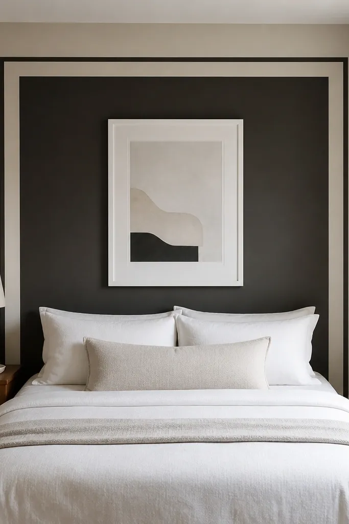
A painted rectangle grid gives you a “headboard architecture” look even if you don’t have an upholstered headboard. The trick is to use one darker inner rectangle and a lighter outer field so the bed wall looks framed. Use a deep color like charcoal, espresso brown, or forest green, then surround it with a warm off-white. This adds structure and makes the bed area feel grounded, which helps in small bedrooms where everything else feels close. It also works with both modern and classic furniture because the design is clean and linear.
Pick your inner rectangle size first — for most small bedrooms, keep the inner frame about 70-80% of the bed width. Tape the outer field, then paint the inner rectangle, and finally paint the outer field in your lighter off-white. After the paint dries, remove tape carefully and use a fine brush to touch up any bleed. If you want a sharper look, add a thin 1/2 inch border line inside the rectangle at the edges for a gallery-frame effect.
Use painter’s tape with a burnishing tool (or a credit card edge) so the border lines stay crisp.
Don’t go too big with the inner rectangle — if it takes over the whole wall, it visually shrinks the room.
7. Color-blocked accent wall with a horizontal band at eye level
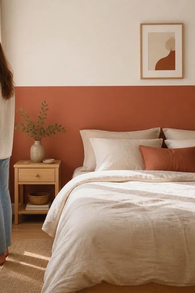
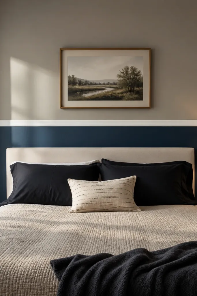
Start by painting the base color across the entire wall. Measure up from the floor to find your band height, then tape a straight line and paint the band color with a foam roller for smooth coverage. Let it dry fully before removing tape to avoid tearing the top edge. Keep the band width consistent — about 12 to 18 inches tall usually looks right behind a bed.
Color-blocking is a small-room cheat code because you control where the visual weight sits. A horizontal band at eye level (roughly 48-60 inches from the floor) makes the wall look styled while keeping the upper and lower areas from feeling heavy. Pair a calm base color like warm white or light greige with a muted terracotta, dusty rose, or sage band. This is perfect when your ceiling is low or you want to avoid vertical patterns that can feel busy. The band also gives you a natural place to hang a mirror or framed art without competing with the wall.
Watch outSkip neon or super-saturated paint — it overwhelms small bedrooms fast.
Pro tipHang art slightly above the band, not centered on it, so the composition feels balanced from the doorway.
8. Gallery-style panel molding in a warm white tone
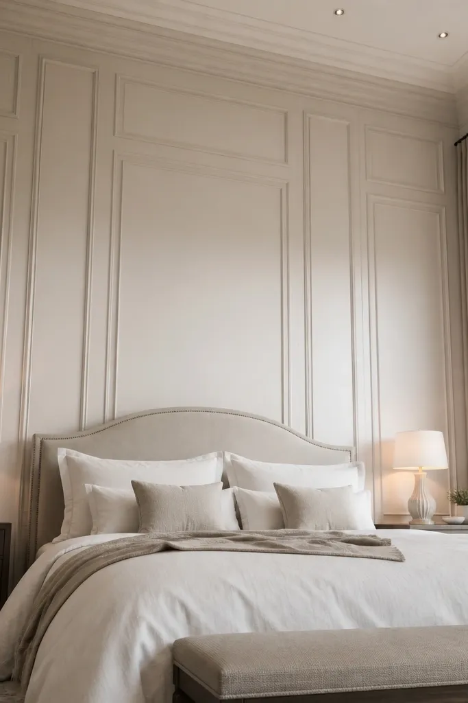
Molding is the most “expensive-looking” accent wall for small bedrooms when you keep it monochrome. A warm white panel molding grid adds depth through shadow lines, not color, so it doesn’t fight your bedding. This works best if you already have white trim or can match it with a warm off-white paint. The grid makes the bed wall feel like a built-in headboard niche, which is exactly what a small space needs. You’re adding shape without adding visual clutter.
Decide on panel size based on wall width — for small bedrooms, panels around 14-18 inches wide look right. Mark your grid lightly with a pencil, then install pre-primed MDF chair rail style trim or flat molding strips with adhesive and finishing nails. Prime the molding, then paint the entire wall and trim in the same warm white satin so the shadows are the only contrast. Finish by caulking seams and touching up nail holes for a smooth photo-ready surface.
Use a light touch with caulk lines — over-filling shows bumps under side lighting.
Don’t pick glossy paint for the molding — it highlights flaws and looks harsh in small rooms.
9. Limestone-look peel-and-stick tile for a spa vibe
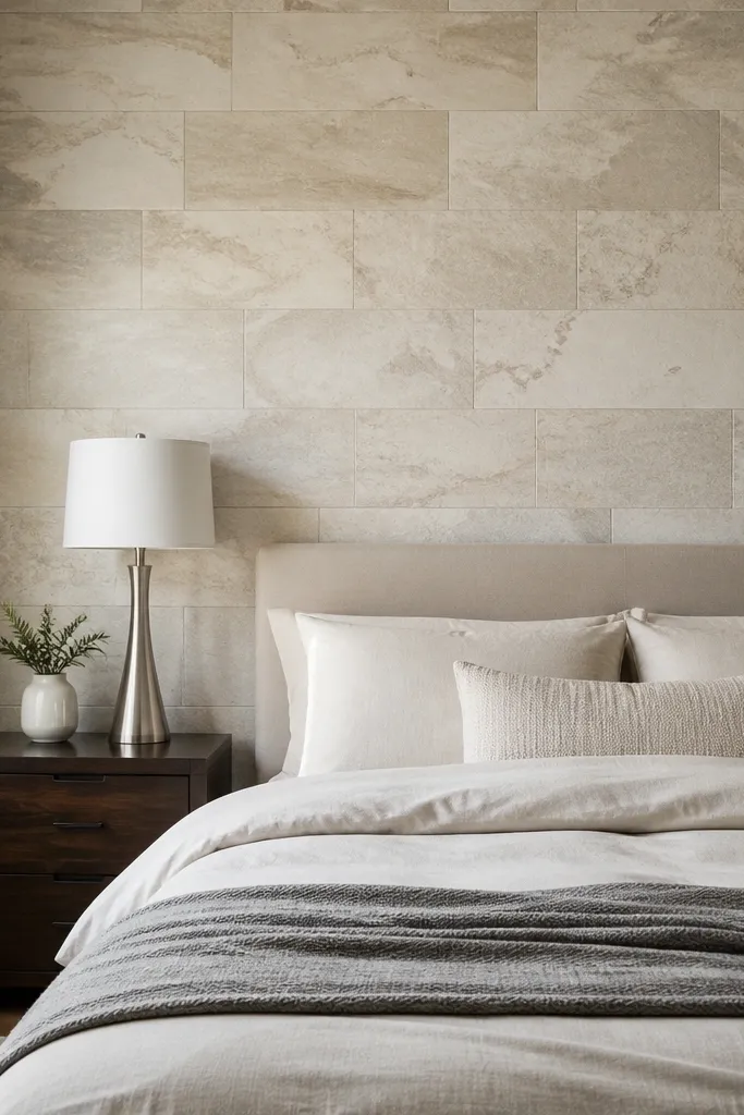
Limestone-look peel-and-stick tile makes the accent wall feel like a boutique hotel without the mess of real stone. Choose a soft cream or warm beige with subtle gray veining so it reads natural, not busy. This works when you want a strong texture that still stays neutral, and it’s especially good in rooms with light wood floors. Because tile is visually dense, keep your bedding simple — a solid duvet and minimal patterns. The wall behind the bed becomes the focal point instantly, even if your room’s layout is awkward.
Measure the wall area behind the headboard and plan a cut layout so you don’t end up with a skinny tile near the center. Dry-fit a row first, then peel and stick starting at a level line you mark with a chalk line. Press each tile firmly with a roller or your palm, working from the center outward to prevent bubbles. Seal seams only if the product recommends it; otherwise, keep grout lines as printed for the clean look.
Use a matte or eggshell paint on the surrounding wall so the tile’s texture stands out without glare.
Don’t tile over glossy paint — adhesion fails and seams lift.
10. Moody dark wall with a lighter headboard zone
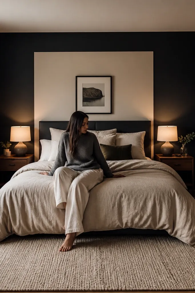
Paint the entire accent wall in your dark color first, using a roller cover made for smooth walls. Tape a lighter rectangle behind the headboard area, roughly 6-8 inches wider than the headboard on each side, then paint it with warm off-white. Remove tape carefully after the lighter paint sets, then add a thin trim line if you want extra polish. Expect two coats for the dark and one to two coats for the light, since contrast can show through.
A moody dark accent wall can look stunning in a small bedroom when you counterbalance it with a lighter zone behind the bed. The dark color adds drama and makes the room feel cozy, while the lighter rectangle keeps the bed from sinking into the wall. Use deep charcoal, espresso, or near-black blue with a matte or eggshell finish. Keep the headboard area about 10-12 inches taller than your pillows so it frames your sleeping setup. This is ideal if your bedroom is already neutral and you want a high-impact look that still feels clean.
Watch outSkip dark paint if your room gets almost no daylight — it can turn into a cave.
Pro tipAdd one warm wall sconce on the accent side — dark walls need light to look intentional, not heavy.