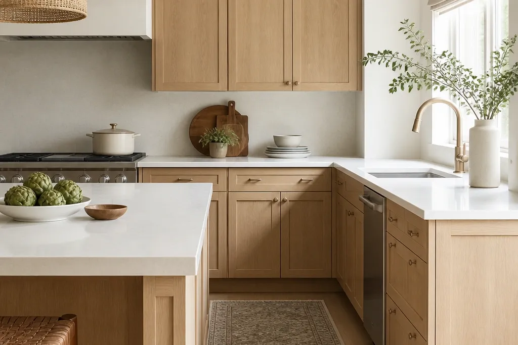
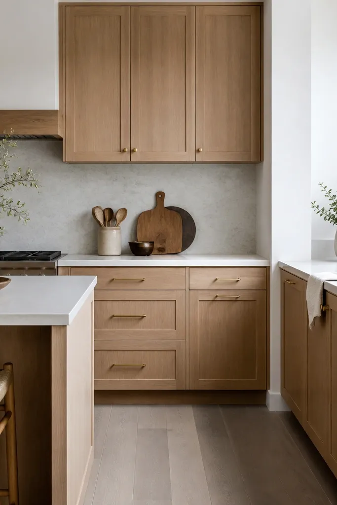
1. Warm White Oak Shaker + Dove Gray Walls
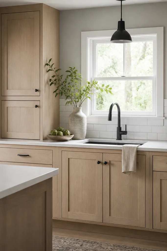
This combo works because the oak warmth gets a neutral landing instead of a competing undertone. Dove gray keeps the kitchen from looking yellow, but it doesn’t introduce the bluish cast that can make oak look tired. Matte black hardware gives crisp edges against the soft wood grain. The result reads clean and “grown-up” without needing expensive stone.
Use shaker doors with a consistent door reveal (about 1/8 inch) so the face looks tight. Keep the hardware finish matte black and use the same on drawers and uppers. For the backsplash, stick to full-height white subway tiles or a simple 3x12 brick pattern so the cabinets stay the focus.
Bring a sample of your quartz to the paint store and compare it under morning light and night light before you commit to dove gray.
Don’t pair warm oak with a blue-gray paint — it makes the wood look muddy.
2. White Oak Slab Doors + Crisp White Countertops
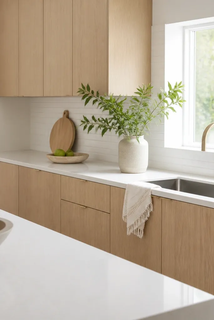
Slab doors look expensive when the finish is even and the grain doesn’t look blotchy. Crisp white counters brighten the whole room and give the oak a clean stage. Keep the hardware minimal so the door face stays the star. This style also hides minor imperfections better than ornate raised panels.
Choose slab doors with consistent sheen — I prefer satin to avoid glare from overhead lights. Use long bar pulls on drawers (roughly 5-6 inches) and shorter pulls on doors (around 3-4 inches). Keep backsplash grout light gray or near-white to avoid harsh lines.
If you’re using slab doors, use a level during installation and check reveal gaps twice — wavy lines show immediately.
Avoid mixing slab uppers with shaker lowers unless you want a deliberate two-style look.
3. White Oak Cabinets + Matte Black Frame Backsplash
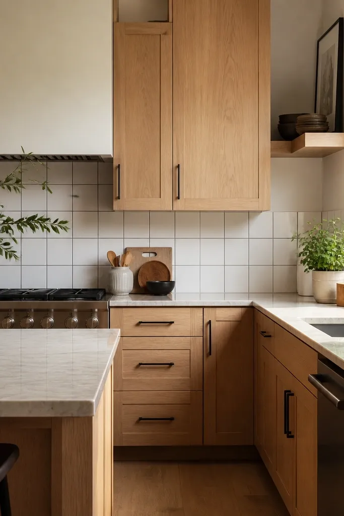
The black trim is the trick: it creates structure and makes the kitchen look designed, not assembled. White oak stays warm, while the matte black ties together fixtures and appliances. This is one of the easiest ways to add contrast without repainting everything. It also makes the backsplash look thicker and more expensive than it is.
Use a white tile base like 3x6 or 4x12 and add matte black metal trim pieces in straight lines. Keep the trim width consistent (thin, like 1/8 to 1/16 inch) so it doesn’t look chunky. Match your faucet finish to the black trim and keep lighting in a similar finish.
Dry-fit the trim before you set tile so the grid lands centered on the window or stove hood.
Don’t use glossy black trim — it reflects light and can look cheap near matte cabinets.
4. White Oak + Warm Taupe Backsplash and Brass Accents
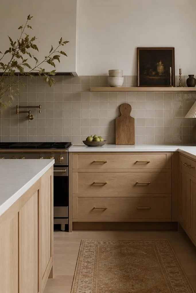
Warm taupe makes white oak look like a natural extension of the floor, especially if your floors are honey or light oak. Brass accents add warmth without turning the space orange like too-dark gold can. This combo feels inviting and works great in kitchens that get less direct daylight. It also photographs well because the tones stay within the same temperature family.
Pick a taupe backsplash with a creamy base, not pinkish taupe. Use satin or brushed brass pulls — I like 5-inch pulls on drawers and smaller 3-inch pulls on doors. Keep the countertop light (white with warm undertones) so the brass doesn’t fight the stone.
Use painter’s tape to mark pull placement before drilling — brass shows every tiny misalignment.
Avoid pairing warm taupe with cool stainless steel — it clashes hard.
5. Two-Tone Run: White Oak Base + White Uppers
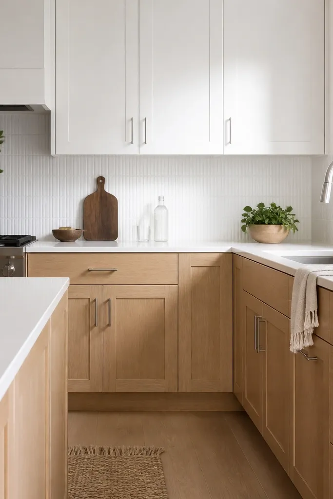
Two-tone kitchens look custom because the eye gets a break at counter height. White oak on the base grounds the kitchen, and white uppers keep it light. This style also helps if you’re trying to stretch budget — you can put your money into the base cabinets where you see them most. The brushed nickel hardware keeps everything cohesive without leaning too warm or too cold.
Choose matching door styles so the frames and proportions stay consistent between zones. Keep the oak finish close to the tone in your floor, then make the uppers a true clean white. Use the same hardware size across all drawers so the kitchen feels planned.
Pro tipIf your room has low ceilings, keep the upper cabinets simple and skip crown molding — it avoids visual clutter.
Watch outDon’t choose a white for uppers that’s too creamy — it can look like mismatched paint.
6. White Oak Cabinets + Cement-Gray Concrete Look Tile
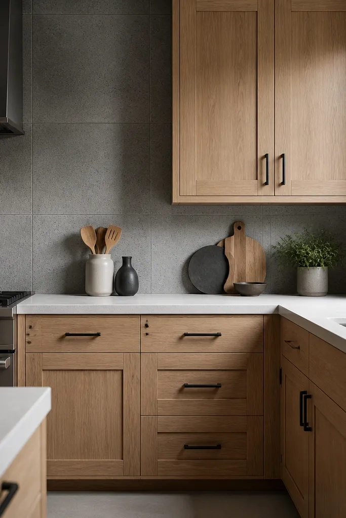
Concrete-look tile adds a grounded, modern texture while keeping the palette neutral. The oak warmth stops the gray from feeling cold. This is a great option if you have a modern floor pattern or a black-and-gray appliance set. It also makes the hardware look intentional because the black is already present in the backsplash.
Use a concrete-look tile with light-to-mid gray speckling so it doesn’t darken the whole backsplash. Keep grout light gray or warm gray, not charcoal. For cabinets, stick to a warm white oak finish with visible grain — flat, grain-less stains look off against concrete texture.
Order two extra boxes of tile — concrete patterns vary and you’ll want matching pieces for the most visible sections.
Avoid using charcoal grout — it makes the tile look dirty fast.
7. White Oak Cabinets + Off-White Herringbone Backsplash
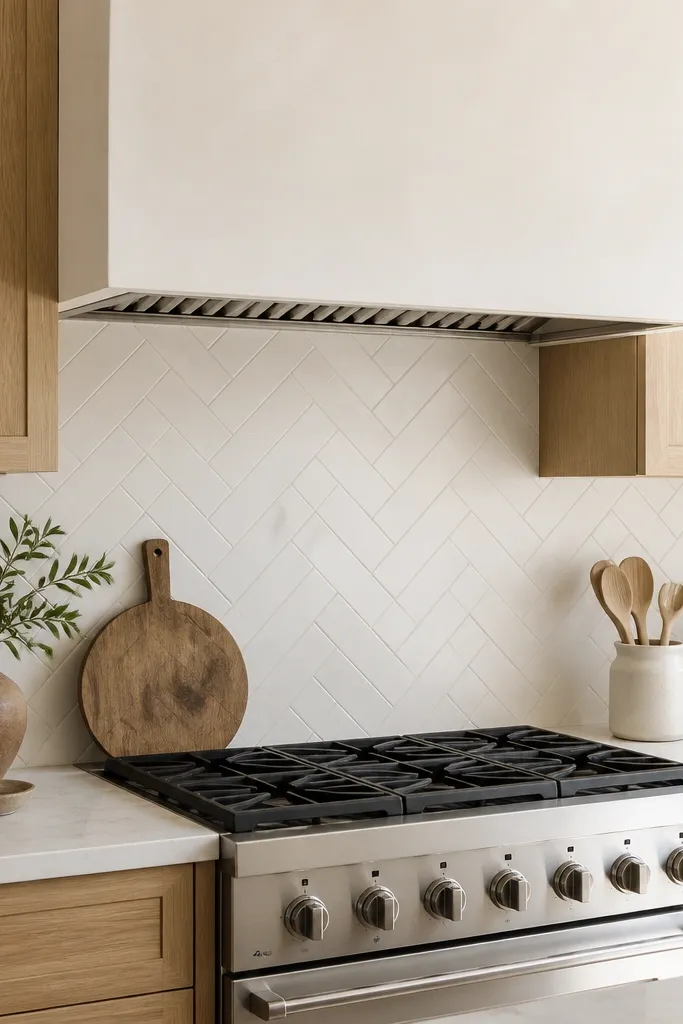
Herringbone adds movement without going loud. Off-white keeps the cabinets warm and prevents the gray “construction” look that some herringbone tiles create. The angled tile pattern makes the backsplash look thicker and more detailed than subway tile. It’s one of the easiest ways to make a budget kitchen feel styled.
Choose a small tile size like 2x6 or 3x6 so the pattern stays tight. Use a light grout (near-white) to keep lines clean. Keep hardware simple — small black knobs or bar pulls — so nothing competes with the backsplash pattern.
Pro tipDry-lay a section on the counter and check the grout line width before the installer starts.
Watch outDon’t choose a herringbone with big dark specks — it turns the backsplash into a busy spot.
8. White Oak Cabinets + Dark Walnut Accent Shelf
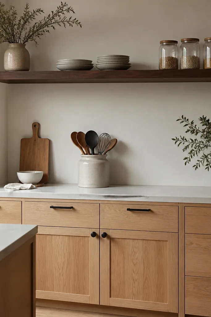
Adding one darker wood tone makes white oak look richer instead of washed out. Walnut shelf wood gives contrast without switching the whole kitchen to a different cabinet finish. It also gives you a place to style without committing to expensive upper cabinets. The shelf makes the kitchen feel lived-in but still tidy.
Use a floating shelf in walnut with a matte clear finish. Keep the shelf width about the same length as the sink wall or a key section of counter. Match your hardware finish to the shelf hardware if you add brackets — matte black brackets look best here.
Style with three heights: one tall item, two medium items, and one flat tray at the bottom edge.
Avoid overcrowding — the shelf should look intentional, not like storage.
9. White Oak Cabinets + Charcoal Countertop + White Backsplash
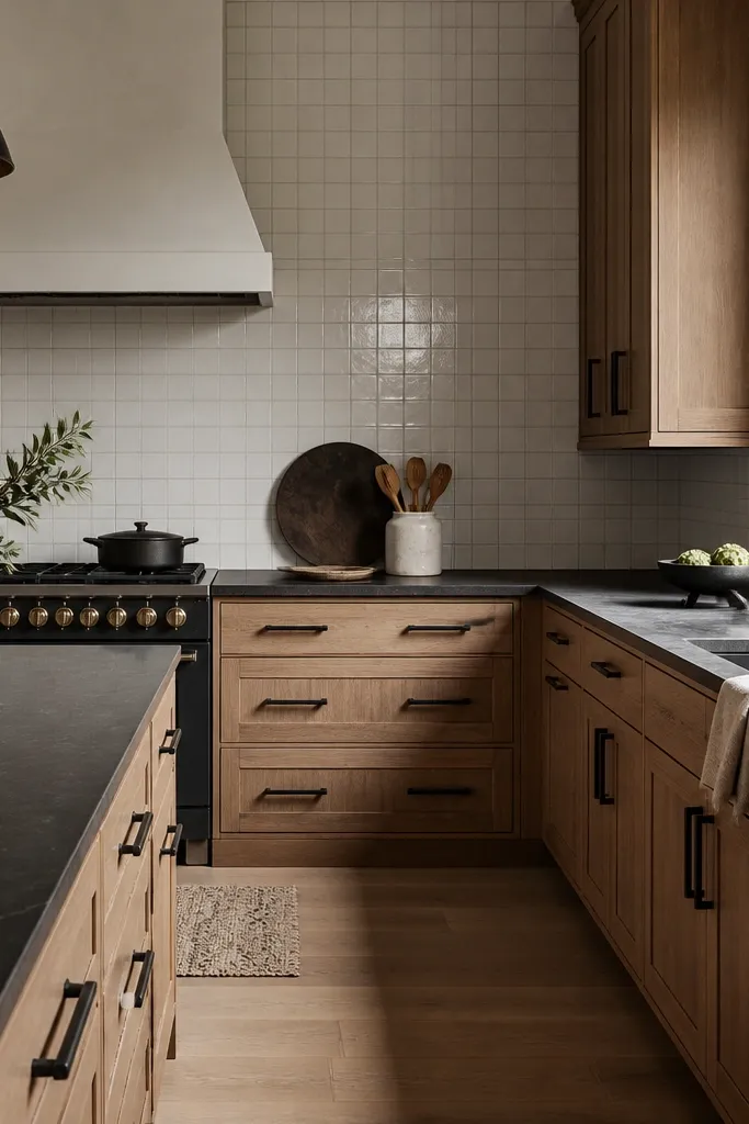
Charcoal counters create a strong contrast that makes oak look cleaner and more expensive. When the backsplash stays white, the drama stays focused and doesn’t spread across the whole wall. This combo works especially well in kitchens with lots of daylight. It also hides minor scuffs and marks better than bright white counters.
Pick a charcoal quartz or laminate with subtle movement so it doesn’t look flat. Keep backsplash simple — white subway or small square tile. Use consistent matte black hardware and match the faucet to it for a tight look.
Pro tipIf you have pets or kids, choose a darker countertop and keep the backsplash grout light so cleaning stays manageable.
Watch outDon’t use black backsplash with charcoal counters — it turns into a dark cave.
10. Shaker White Oak Cabinets + White Quartz Waterfall Island
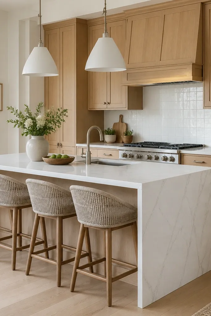
A waterfall island makes the kitchen feel high-end even when the rest of the finishes stay budget-friendly. White quartz keeps the oak from looking heavy, and the waterfall edge gives a smooth, continuous line. Brushed nickel is a good middle ground if you don’t want matte black. This look is very “current” without getting trendy in a way you’ll regret.
Match the island countertop to the main counter so undertones stay consistent. Keep cabinet hardware brushed nickel and use the same finish on the faucet. For backsplash, use a simple tile and let the island take the visual spotlight.
Make sure the waterfall edge thickness matches the counter thickness — mismatched proportions look off fast.
Avoid tiny islands with waterfall edges — the proportions need enough mass to look intentional.
11. White Oak Cabinets + Black Farmhouse Sink + White Tile
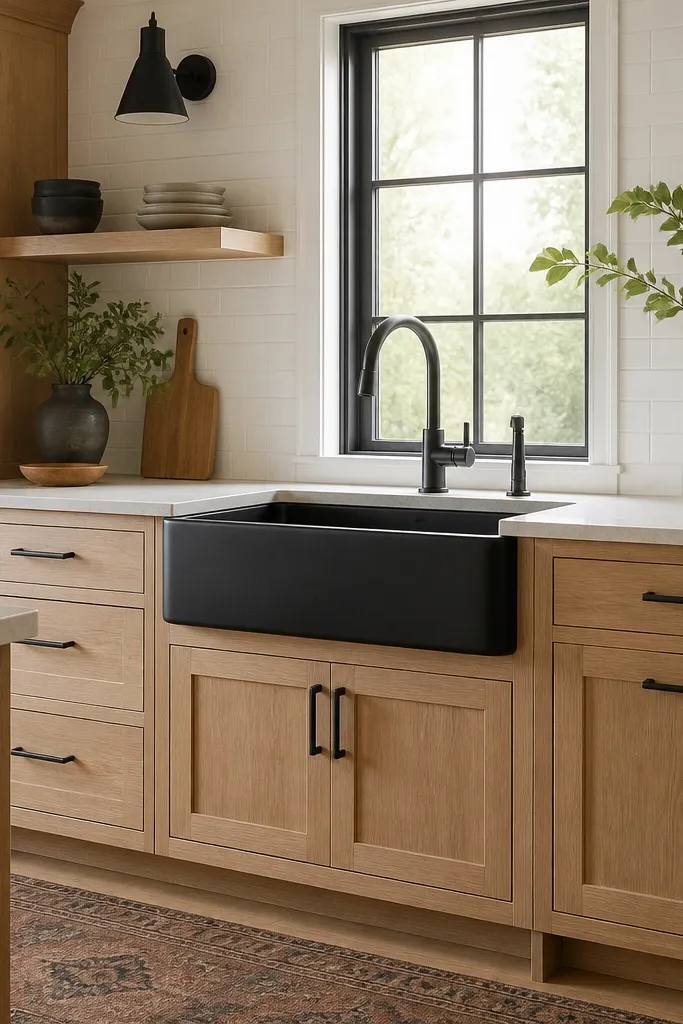
The black sink is a styling shortcut: it adds contrast at the exact spot your eye lands first. With white tile behind it, the sink reads crisp instead of heavy. This is also practical — black hides water spots better than stainless in my experience. Oak warmth keeps the sink from feeling too industrial.
Choose a matte black farmhouse sink and pair it with a black or matte black faucet. Keep backsplash white with minimal pattern so the sink color stays the focal point. Use shaker cabinets and black hardware for a consistent theme.
Use a sink drain cover that matches the sink finish so the area doesn’t look mismatched day-to-day.
Avoid chrome faucets with matte black sinks — the shine looks random.
12. White Oak Cabinets + Light Oak Floating Vanity Style (Entry to Bathroom)
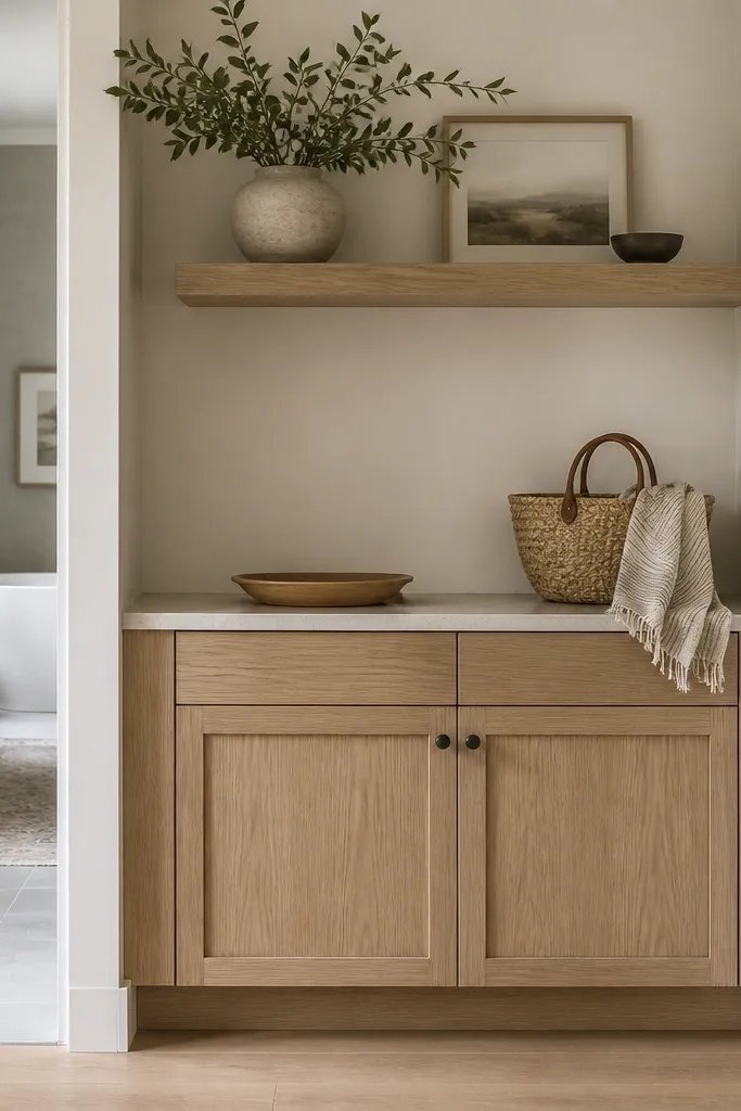
Using the same white oak cabinet look in an entry or bathroom-adjacent space makes the whole home feel cohesive. It also gives you a place to repeat the hardware finish and door style, which makes the kitchen feel less “standalone.” This is a smart move if you’re doing a kitchen refresh and want the rest to catch up later. The palette stays calm and consistent.
Repeat the same door profile and wood finish as your kitchen cabinets. If your kitchen has black hardware, keep it black here too. Use one accent material like a white stone top or a simple quartz to tie both rooms together.
Measure your hardware spacing from the kitchen and copy it exactly so drawers line up visually across rooms.
Don’t change the door style between rooms — the mismatch reads like different projects.