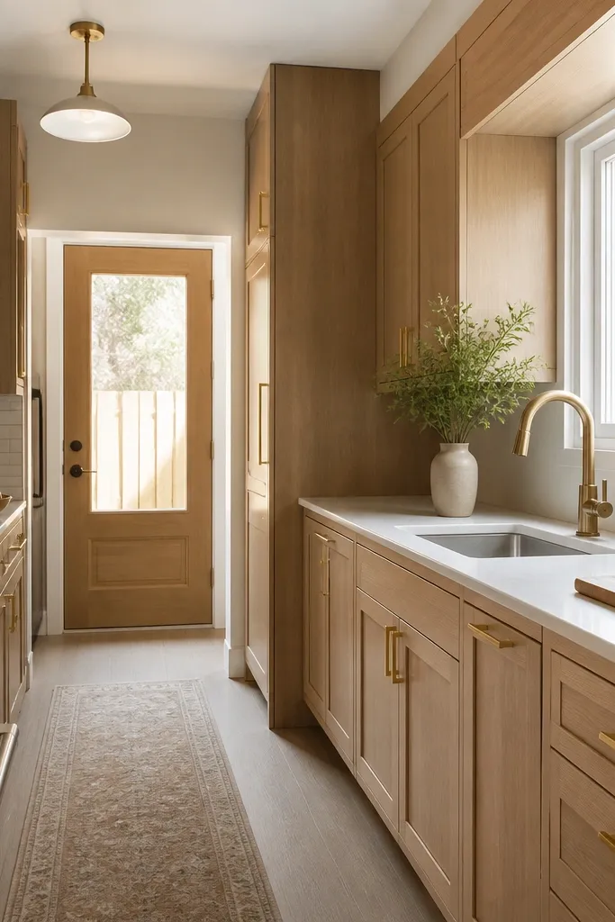
1. Creamy white oak shaker doors with 3-inch brushed gold pulls
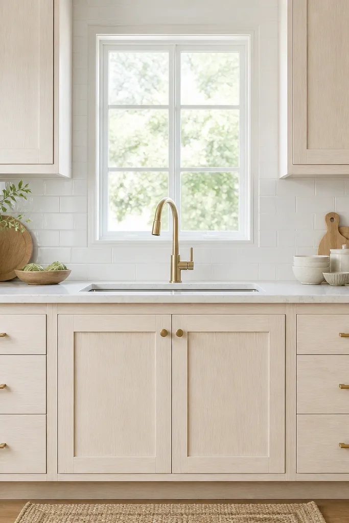
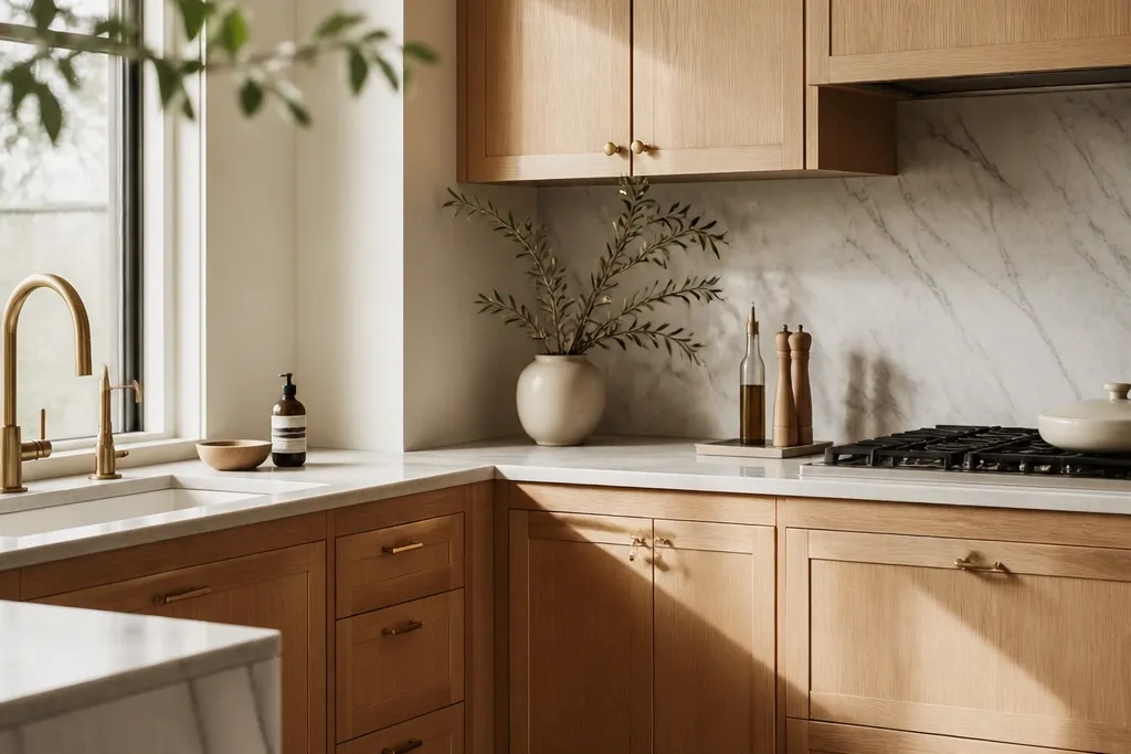
Use 3-inch centers on drawers that are roughly 18-24 inches wide and 1-1/4 inch knobs on narrower doors. Mount pulls with the same height across every drawer stack, so the cabinet fronts form a visual grid. Pair with a bright white quartz or solid surface counter and a thin grout line (1/16 inch) on the backsplash.
Shaker doors keep the lines calm, which matters in small layouts. Creamy white oak adds warmth without turning the kitchen yellow, and brushed gold keeps the hardware from looking too shiny next to light counters. The gold pulls sit at a scale that matches most compact drawer faces, so the front elevation looks clean instead of busy. Bright white backsplash tile gives the oak grain contrast so it shows up clearly in daylight.
Watch outAvoid mixing brushed gold hardware with a polished gold faucet — it reads mismatched in small kitchens.
Pro tipIf your cabinets are close to the fridge, align the pull height on the fridge-side cabinets too. That one alignment makes the whole run look designed.
2. Tall pantry-style uppers in white oak with vertical gold bar pulls
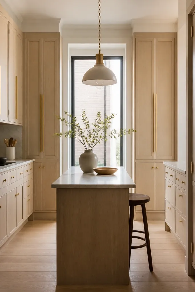
Choose vertical bar pulls that are about 6-7 inches long for door faces between 24-30 inches tall. Keep the pull centered and keep the same mounting orientation on every tall door. Pair with a matte white backsplash and warm off-white walls so the vertical lines don’t fight busy paint tones.
Vertical hardware emphasizes height, which helps a narrow kitchen feel less cramped. When you use tall uppers in white oak, the vertical gold bars echo that geometry and draw the eye up. Keeping the lowers simpler (knobs) prevents the front of the room from looking too busy. The result feels luxe but still orderly, even in tight spaces.
Watch outDon’t use vertical pulls on tiny doors under 18 inches tall — it looks like the hardware is too big for the panel.
Pro tipMeasure your tallest door and pick pull length so the ends sit about 3/4 inch away from the top and bottom rails.
3. Flat-panel modern cabinets with sleek gold cup pulls
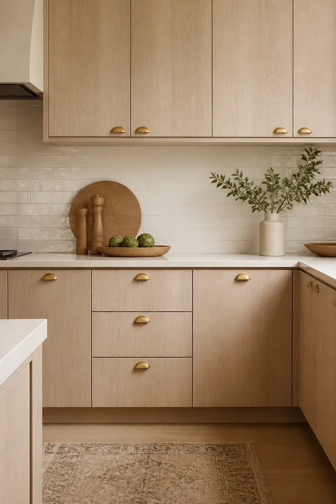
Use cup pulls sized for drawer faces about 12-20 inches wide, with two hands' worth of clearance between pulls on stacked drawers. Keep all doors using the same pull type and keep the orientation consistent. Pair with a light warm stone countertop (cream/ivory undertones) so the oak stays creamy.
Flat-panel fronts already feel crisp, so you can go minimal with hardware and still get the luxe look. Cup pulls add a soft curve that catches light without the bold shine of long bar pulls. The gold finish contrasts with the light oak, and because the hardware is compact, it doesn’t visually shrink your drawers. Glossy subway tile adds a subtle reflection that makes the gold look intentional.
Watch outAvoid oversized cup pulls on narrow drawers — the face starts to look crowded.
Pro tipDry-fit one pull on scrap wood and hold it under your cabinet lighting. If it throws glare, switch to brushed or satin gold.
4. Two-tone look using white oak uppers and warm white lowers with gold knobs
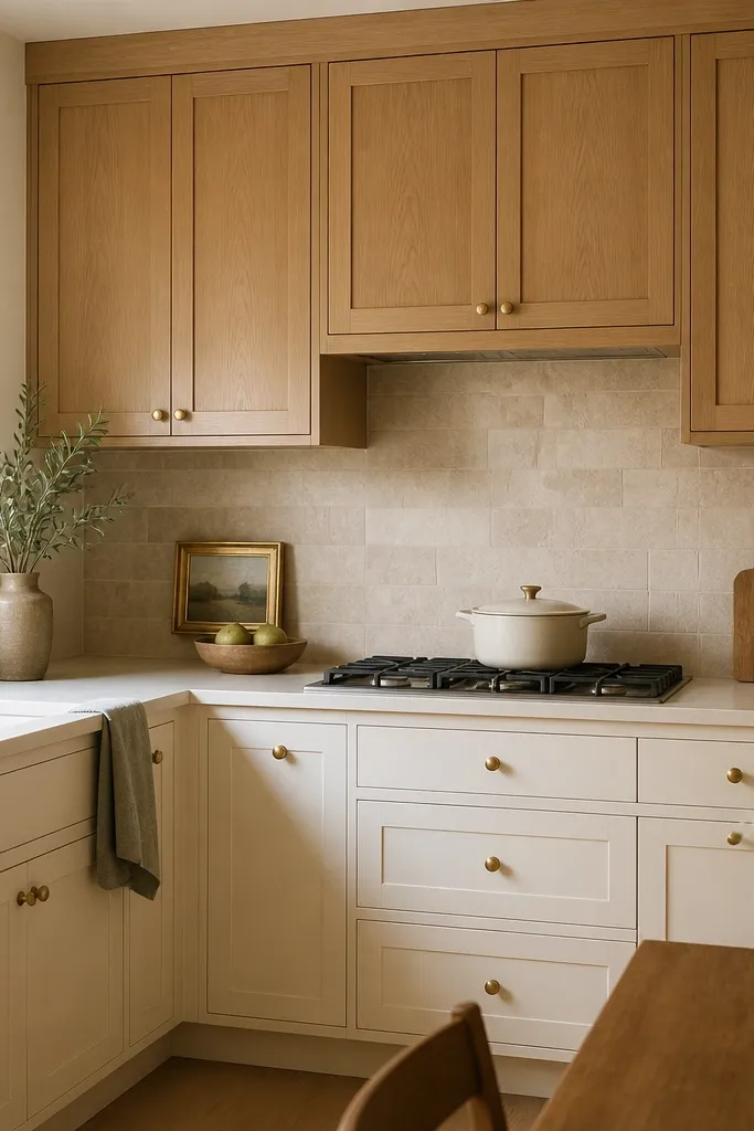
Two-tone helps small_space kitchens feel layered instead of one big block of wood. White oak uppers keep the upper half warm and textured, while warm white lowers brighten the lower sight line. Gold knobs unify both zones so the look feels designed, not patched together. The warm neutral backsplash softens the contrast so the gold doesn’t look harsh.
Keep gold knobs consistent in diameter (around 1-1/4 inch) and use the same finish on both zones. Place knobs on doors at the center of the rails and on drawers at the center of the drawer face. Choose a warm white lower paint that reads creamy, not blue-based.
If your room gets yellow afternoon light, pick a slightly cooler warm white for the lowers to keep the contrast clean.
Don’t choose a stark refrigerator-white lower — it makes the oak look darker and more yellow.
5. White oak cabinets with gold pulls only on drawers and knobs on doors
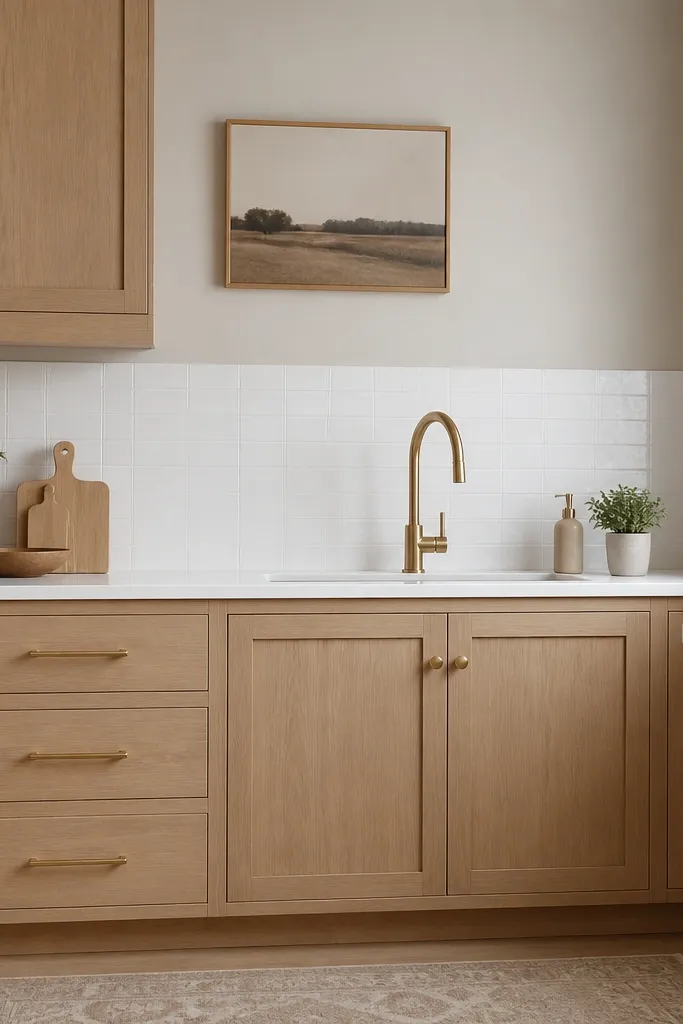
This is the cleanest way I’ve found to add luxe without turning every panel into a hardware grid. Drawer pulls give you a strong horizontal visual line, while knobs keep the door fronts quiet. Gold ties the whole system together, and because doors don’t compete with pulls, the small_space layout feels calmer. It also works when your cabinet doors have different widths — knobs stay proportionate.
Use pulls on drawers only, sized so the bar doesn’t look long compared to the drawer face. For knobs, keep the diameter around 3/4 to 1 inch depending on door size. Maintain a consistent mounting height for drawers and a centered mounting position for knobs.
Stand back 6 feet and check the rhythm. If you see a “stair-step” where drawer pulls don’t line up, fix it now before installation is done.
Don’t put pulls on doors that are less than 12 inches wide — it looks like the hardware is oversized.
6. Gold hardware on a corner run with symmetry across the filler gap
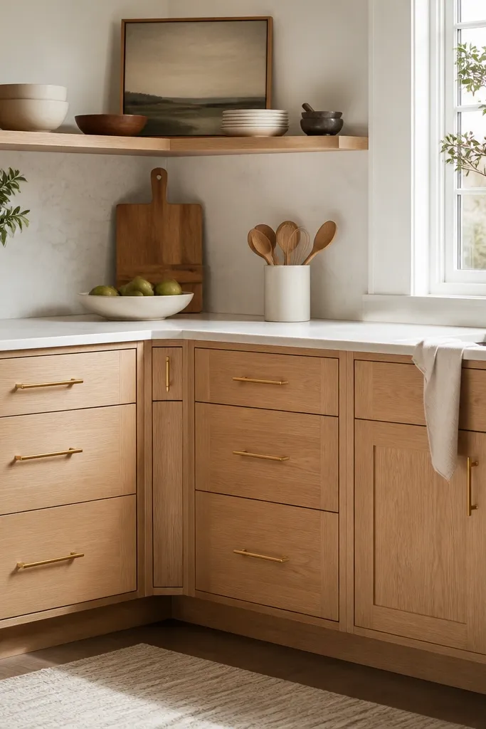
Corners are where small kitchens look messy fast. When you add gold hardware, you create another alignment reference, so you have to treat the corner like a design feature, not an afterthought. Symmetry across the filler gap makes the corner look intentional. The luxe look comes from the neatness, not from bigger hardware.
Pick a single reference line for mounting height across the entire corner run. If you have a filler, keep the hardware centerline aligned with the adjacent cabinet hardware centerline. Use a level and a cabinet hardware jig so both sides land at the same height.
Mark the center of one pull first, then measure from that to the adjacent pull centers on both sides. Don’t eyeball corners.
Avoid placing hardware on the filler at a different height. It reads like a mistake in small kitchens.
7. White oak cabinets with brass-gold accents and a warm backsplash (no busy patterns)
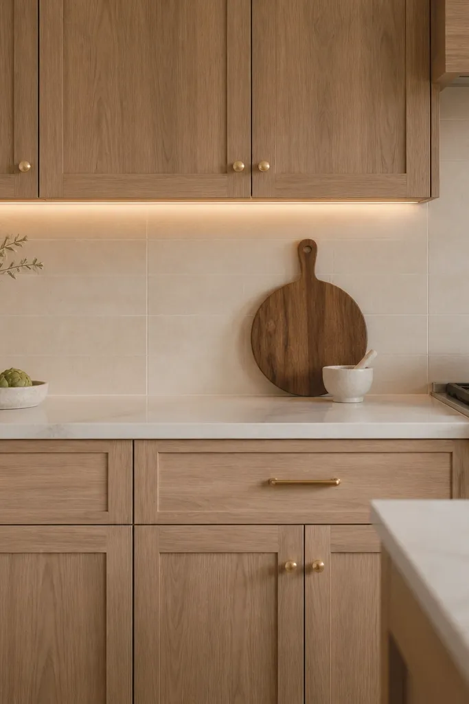
Use satin gold hardware (not mirror polished) and keep the backsplash color in the cream family. Install under-cabinet lighting with a warm color temperature around 2700K-3000K so the oak reads white-washed rather than honey. Choose grout that matches the tile so the wall looks clean.
If you want luxe in a small_space kitchen, reduce visual noise. White oak already has grain, so you don’t need a loud backsplash. Satin gold hardware looks expensive next to matte warm tile because it doesn’t scream under bright reflections. Under-cabinet warm LEDs make the oak look creamy and bring out the grain without turning it orange.
Watch outAvoid high-contrast black-and-white backsplashes with white oak. The hardware will look out of place.
Pro tipBring one hardware piece to the tile store. Put it next to samples under the store lights — satin gold should look gold, not greenish.
8. Gold hardware + white oak with a waterfall island apron in the same finish
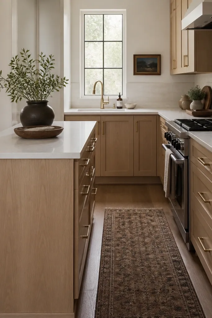
Use the same white oak finish on the island apron and keep the grain direction consistent if possible. Mount the island drawer pulls at the same height as the cabinet drawer pulls so the line reads continuous. Pick a countertop with light movement (soft veining) and avoid chunky dark slabs.
Luxe looks happen when the wood finish repeats. Matching the island apron in white oak ties the hardware and cabinet face into one continuous front. Gold hardware on both cabinetry and island drawers keeps the rhythm consistent. In small spaces, repeating materials makes the room feel bigger because your eye has fewer “breaks” to interpret.
Watch outDon’t mix oak tones between cabinets and island — even a small difference turns the gold into the only “matching” element.
Pro tipIf the island is narrow, go with shorter pulls (3 inches) so they don’t look like they’re hanging off the drawer face.
9. Glass-front upper cabinets in white oak with gold pulls and interior trim
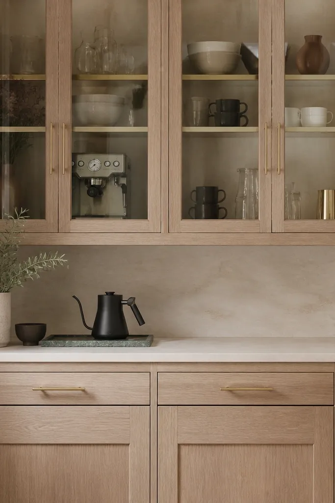
Choose clear or lightly tinted glass so the oak doesn’t look washed out. Use gold pulls sized to the door width — don’t scale up for glass doors. Style the interior with matching containers in two colors max to keep the glass clean.
Glass-front uppers make small kitchens feel lighter, and white oak frames keep it warm. Gold pulls add the luxe note right where your eye lands when you look up at the cabinets. Interior trim in a warm metallic tone gives the glass a finished look without turning it into a showpiece. The effect is practical too — you can spot mugs and staples without opening doors.
Watch outAvoid frosted glass if your backsplash is already busy. It kills the warm contrast with white oak.
Pro tipUse 2-3 identical canisters and stack them low. Tall items make glass look cluttered fast in small kitchens.
10. Gold hardware with a light oak edge detail and off-white cabinet walls
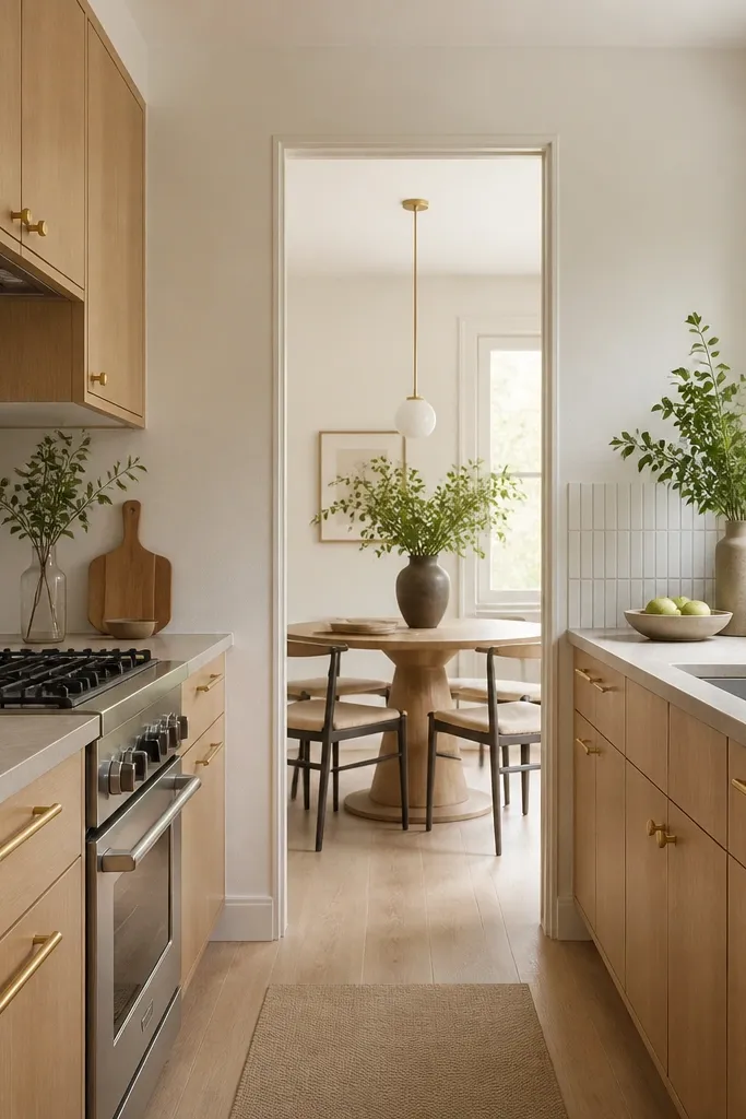
Edge detail matters more than people think. When your white oak cabinets have crisp edges and consistent finish, they look custom even in a small kitchen. Gold hardware gives you the bright focal point, and the off-white wall color keeps the whole room from feeling boxed in. Thin-line backsplash tile keeps the visual field calm, so the gold doesn’t compete with grout lines.
Keep wall paint in the creamy category, not stark white. Install backsplash so grout lines stay straight and thin. Use gold bars on drawers and matching knobs on doors, with consistent spacing across both cabinet runs in a galley.
If you’re hanging art or a mirror near the cabinets, match the frame tone to your hardware. It makes the gold feel intentional.
Don’t paint the walls too gray. Gray pulls the oak toward beige and makes gold look dull.