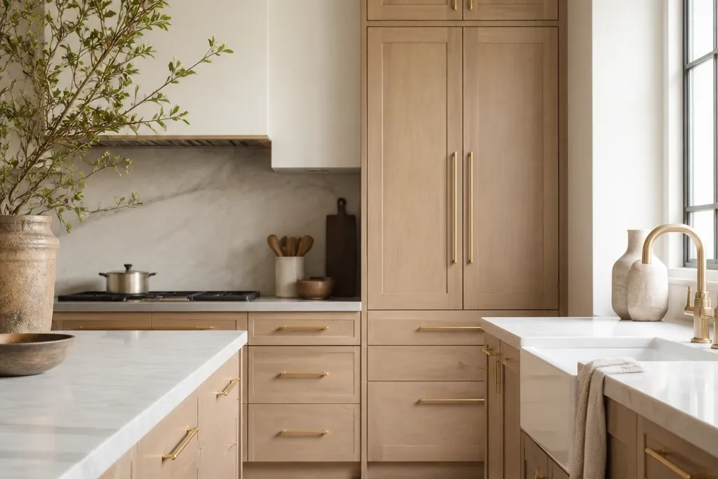
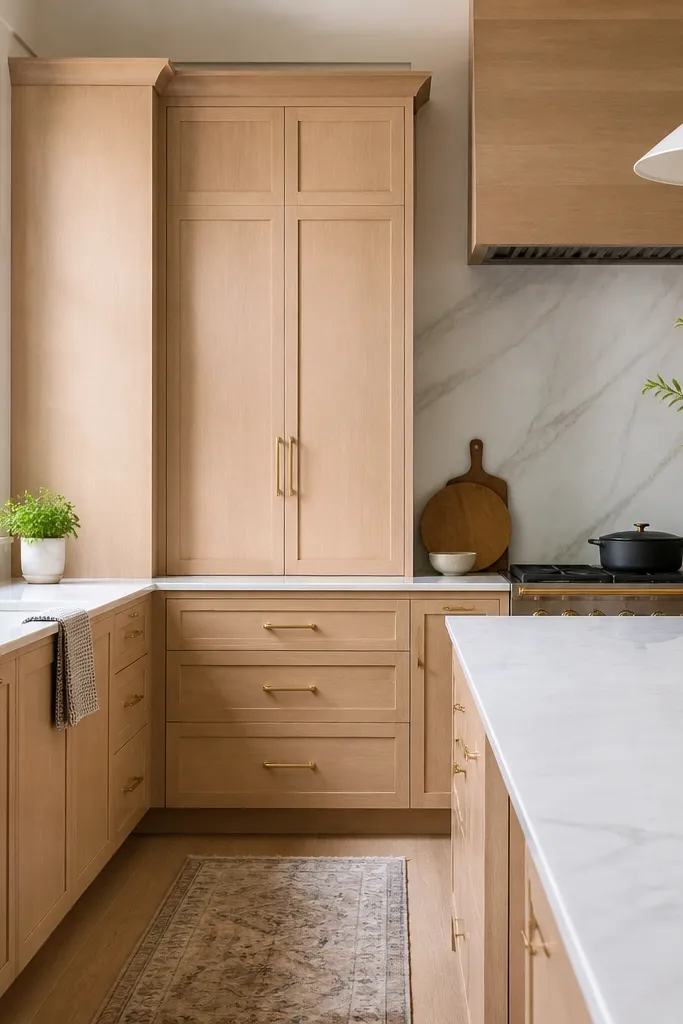
1. Warm Greige Oak with Champagne Gold Rail Pulls
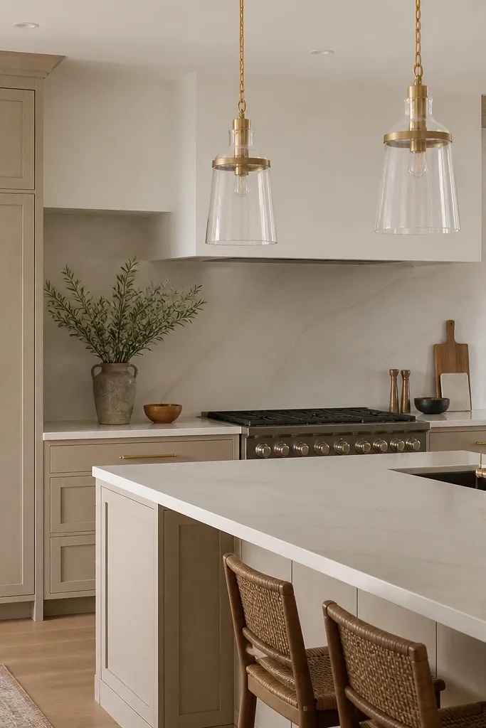
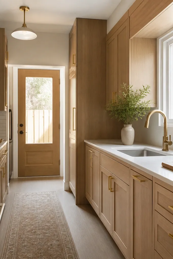
This look works because the cabinet color sits between beige and soft gray, so the gold reads smooth and expensive instead of bright-yellow. The rail pulls keep the lines calm and modern, and the horizontal placement makes the island feel longer. I like this with cream countertops because the gold hardware gets a warm glow rather than a harsh reflection. The overall effect is “hotel kitchen” without going glossy.
Use shaker doors with a consistent stile width (about 2.25 to 3 inches) so the panel edge has a crisp shadow. Choose champagne gold pulls with a satin or brushed finish, not mirror polish. Keep the countertop light but not white — look for a cream base with subtle movement.
Place pulls 2.75 to 3 inches down from the top of drawers so the hardware aligns across the run. I’ve found it makes the whole kitchen feel laid-out by a designer, not a homeowner.
Avoid bright yellow “antique gold” if your lighting is cool white — it makes the oak look dusty.
2. Two-Tone Upper White Oak with Lower Matte Black Panels
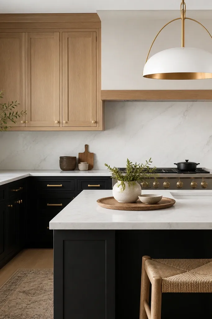
The contrast is the point here. White oak uppers bring warmth and soften the room, while matte black lowers make the gold hardware look sharper and more intentional. The gold stays consistent across both zones so your eye reads one cohesive hardware family. This is the fastest way I know to make a kitchen feel high-end even if the room is small.
Keep the uppers shaker and the lowers panel-style or flat with a slight inset so the black doesn’t look like cheap laminate. Use gold pulls on drawers and gold knobs on doors for a clean rhythm. Choose a countertop with some gray movement so the black doesn’t feel too heavy.
Run the same reveal gap (the thin space between door and frame) across both colors. When reveals match, the two-tone reads custom.
Skip glossy black with shiny hardware — the reflections fight each other and look bargain-y.
3. Tall Pantry Columns with Center-Mounted Gold Knobs
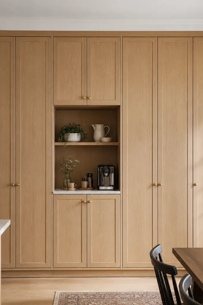
Center-mounted knobs make tall doors look engineered. The knob placement tells your brain the door is properly framed, even from across the kitchen. White oak grain direction adds movement, and the gold knob keeps it from looking too rustic. I love this in open-plan spaces because the pantry reads as a designed wall, not a storage block.
For a tall door, center the knob vertically about 60 inches from the floor for standard 84-inch doors. Use a consistent knob size across the wall (about 1 to 1.25 inches diameter). Add a simple crown or a shallow toe-kick to give the columns a finished base.
If you have pets or kids, choose knobs with rounded edges and a satin finish; they snag less than sharp pulls.
Don’t place knobs too high on pantry doors — they look like utility hardware.
4. Shaker Perimeter with Gold Cups on Island Base
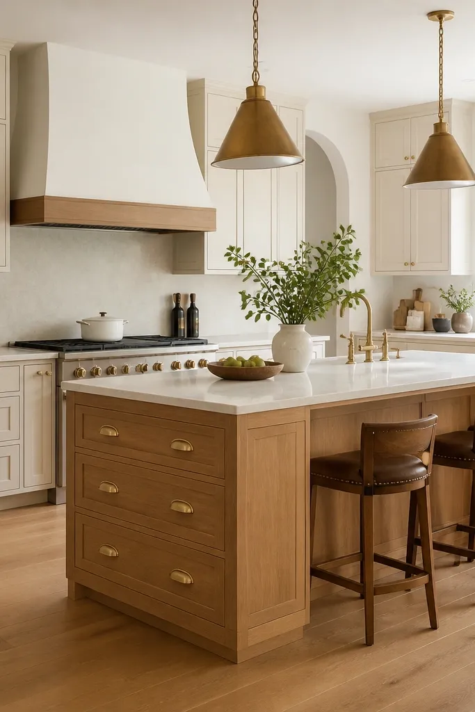
Cup pulls add weight and a “tailored” feel, especially on an island where you see the hardware up close. Keeping the perimeter simpler with knobs makes the island hardware feel like a focal point instead of clutter. The warm gold tone matches wood flooring and pendant lighting, so nothing looks out of place. This is one of my favorite ways to make a builder-grade kitchen feel custom.
Use cup pulls sized to drawer width — for 24-inch drawer spans, I like 3 to 3.5 inch cup pulls. Keep the top drawer hardware aligned with the drawer below so the island reads symmetrical. If your island has a waterfall end, keep the hardware centered in each drawer face.
Pro tipDry-fit the cup pull location by holding it against the drawer from the front. If it feels too low, move it up 1 inch — the difference is huge.
Watch outAvoid mixing cup pulls on the perimeter and knobs on the island — it looks like you shopped hardware separately.
5. Inset-Style Oak with Long Gold Pulls and Shadow Gaps
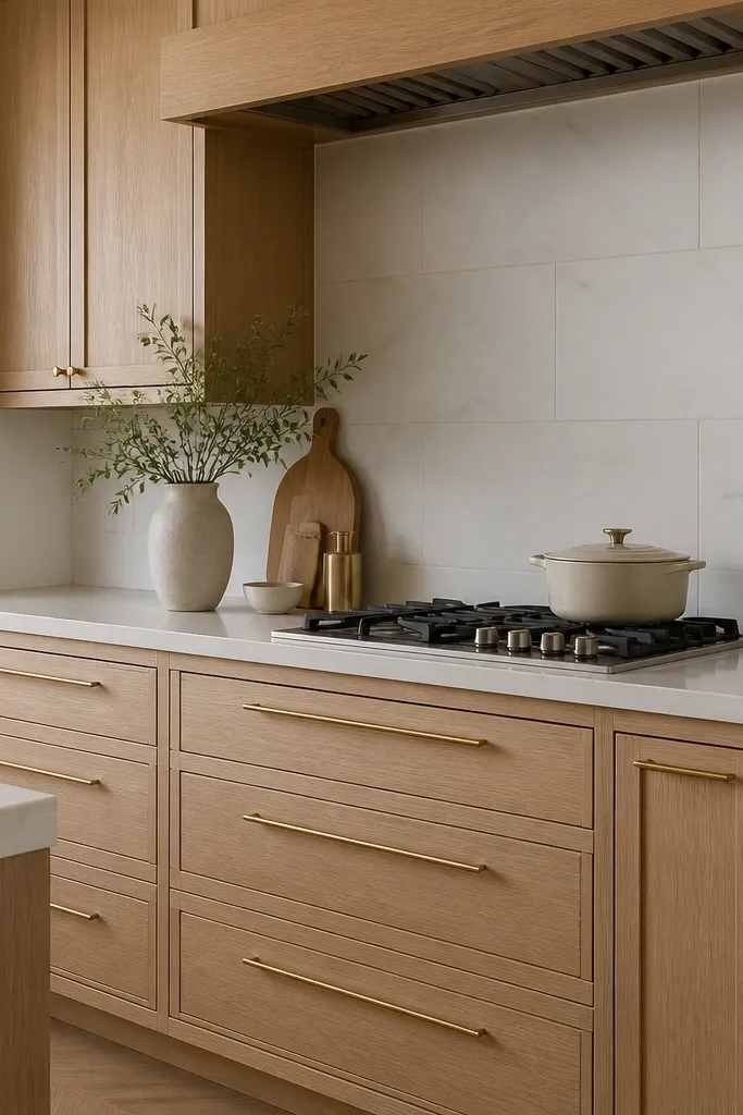
Inset-style doors look expensive because the eye reads the reveal gap as precision. The shadow gap creates a line of depth that makes the oak look richer, even before you add countertops. Long pulls keep the drawer faces clean and modern. Gold hardware then becomes the finishing touch rather than the main design element.
Ask for a true inset door style or a near-inset look with consistent gaps. Keep drawer pulls centered horizontally and align them across the kitchen. Choose a satin gold pull with a flat back plate so it sits flush on the inset face.
Measure and mark pull centers before installing doors. I’ve seen tiny off-center pulls ruin the “custom” vibe.
Skip thick, chunky pull plates on inset doors — they crowd the reveal gap.
6. Two-Panel Shaker with Blackened Bronze Gold Mix
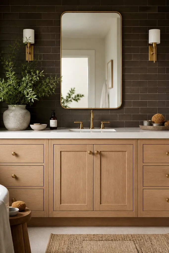
The trick is using gold as the primary metal while adding a second dark metal in small doses. The blackened bronze accents make the oak look more grounded, and the gold stays the star on cabinet hardware. This reads upscale because the dark tile and dark metal create contrast behind the lighter wood. It also hides fingerprints better than bright metals in real kitchens.
Use gold knobs on doors and gold pulls on drawers; keep the bronze for non-hardware items like faucet accessories or a grab bar. Choose a backsplash tile with a slightly matte glaze so it doesn’t reflect the gold harshly. Keep the countertop light and warm so the dark tile doesn’t swallow the room.
Pro tipIf you have dark tile, pick gold hardware with a brushed finish. Mirror gold shows every angle and makes the backsplash glare.
Watch outAvoid using two dark metals everywhere. It looks like a mismatch, not a designed palette.
7. White Oak Cabinets with Brushed Gold Bar Pulls and Brass Vents
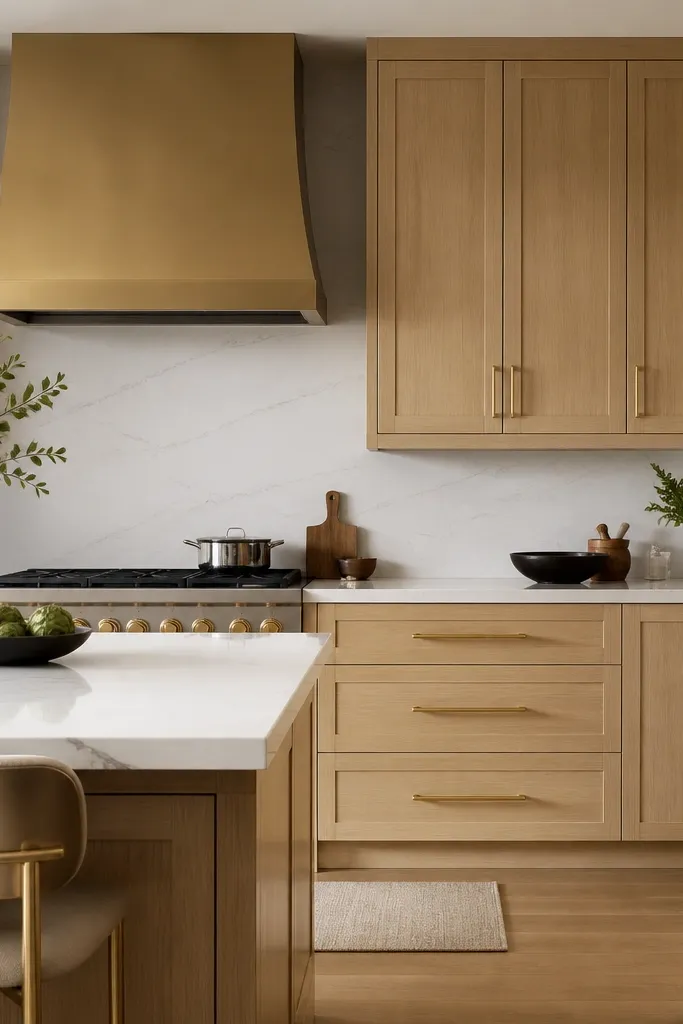
When gold hardware echoes another brass element, the kitchen looks intentional instead of random. The bar pulls keep everything linear, and the brushed hood finish makes the gold look part of the same material family. White oak stays warm, and the quartz adds brightness without making the hardware pop too hard. This is a “clean luxury” look that works in both modern and transitional homes.
Match the hood finish to the hardware finish — both should be brushed. Use the same pull length across drawers and keep consistent spacing. For tall cabinets, use vertical pulls or knobs depending on door width so the metal lines up with the hood.
Pro tipTake a small sample of your faucet or hood finish to the cabinet hardware store. The undertone matters more than the word “gold.”
Watch outSkip mixing polished hood hardware with satin pulls — the shine mismatch reads cheap.
8. Gold Knobs Only on Doors, Pulls Only on Drawers
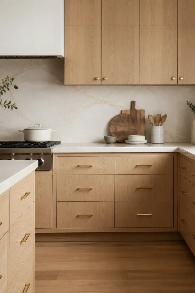
This rule makes the hardware look like it was planned from the start. Knobs on doors are visually tidy, and pulls on drawers match the way you reach and grip. The result is calm and high-end, especially when the cabinet doors have a raised panel or clean shaker face. White oak warmth plus a consistent gold scheme reads expensive without needing fancy moldings.
Choose knob size around 1 inch and pull size around 5 to 6 inches for standard drawers. Keep door knobs centered vertically on each door panel. Use the same gold finish across all pieces so the metal tone doesn’t drift.
Mark a level line across the kitchen and use it to keep knob height consistent. I’ve used painter’s tape and a laser level for this.
Don’t mix knob styles on different door heights — it breaks the rhythm.
9. Long Pulls Paired with a Thin-Walled Gold Edge Cabinet Trim
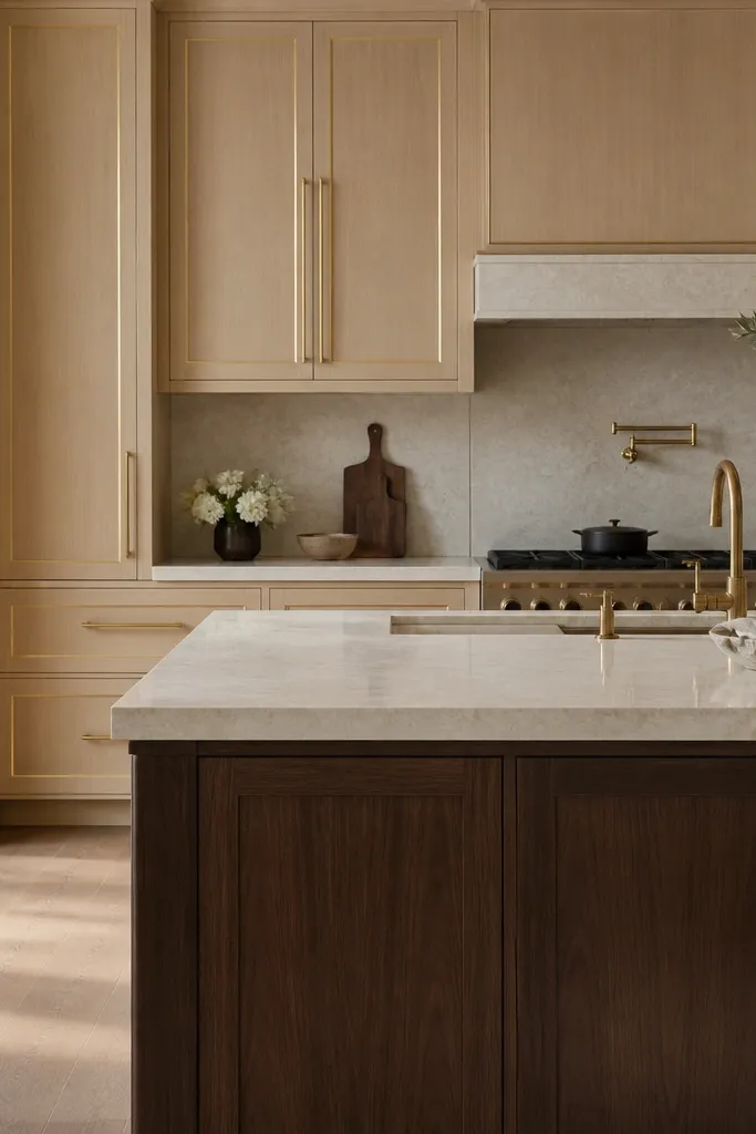
A thin gold trim line turns plain cabinet faces into a framed look. It’s the kind of detail that reads high-end because it looks like custom millwork. Long pulls then reinforce the horizontal structure. The oak warmth stays the background, while the gold framing gives it that “designed” finish.
Use a very narrow edge trim (think slim metal tape or a thin profile) only along the door frame edges, not the whole cabinet box. Keep pulls centered and aligned to the same horizontal line across drawers. Pair with a darker wood or stone base on the island for contrast.
Apply trim after you test door alignment. If doors aren’t square, the trim will show it immediately.
Skip thick gold trim — it overwhelms the oak grain and looks like costume hardware.
10. Open Shelving in White Oak with Gold Pin Pulls
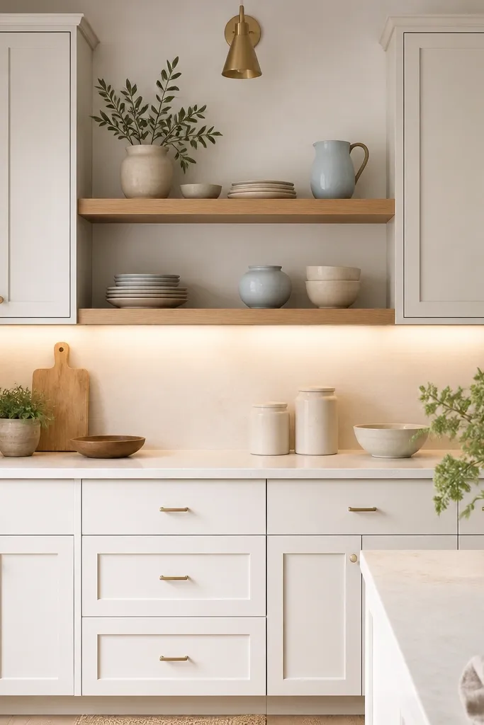
Open shelving makes white oak feel intentional because you get to see the wood finish in more than one plane. Gold pin pulls add a slim, tailored accent that doesn’t overpower the shelves. The best part is how the hardware matches the shelf styling — both read light and neat. This is a great choice when your kitchen needs visual breathing room.
Keep open shelves to two levels maximum so it doesn’t look like clutter. Use matching white oak shelves with the same finish as the cabinet doors. Install pin pulls on drawers only, and keep knobs small on doors to keep the look airy.
Style shelves with a color limit: cream, oatmeal, and one soft blue. When everything is the same family, the gold hardware feels cohesive.
Don’t put mismatched shelf brackets. Dark brackets against gold pulls look messy.
11. Full Height Oak with Gold Hardware and a White Linen Hood Wrap
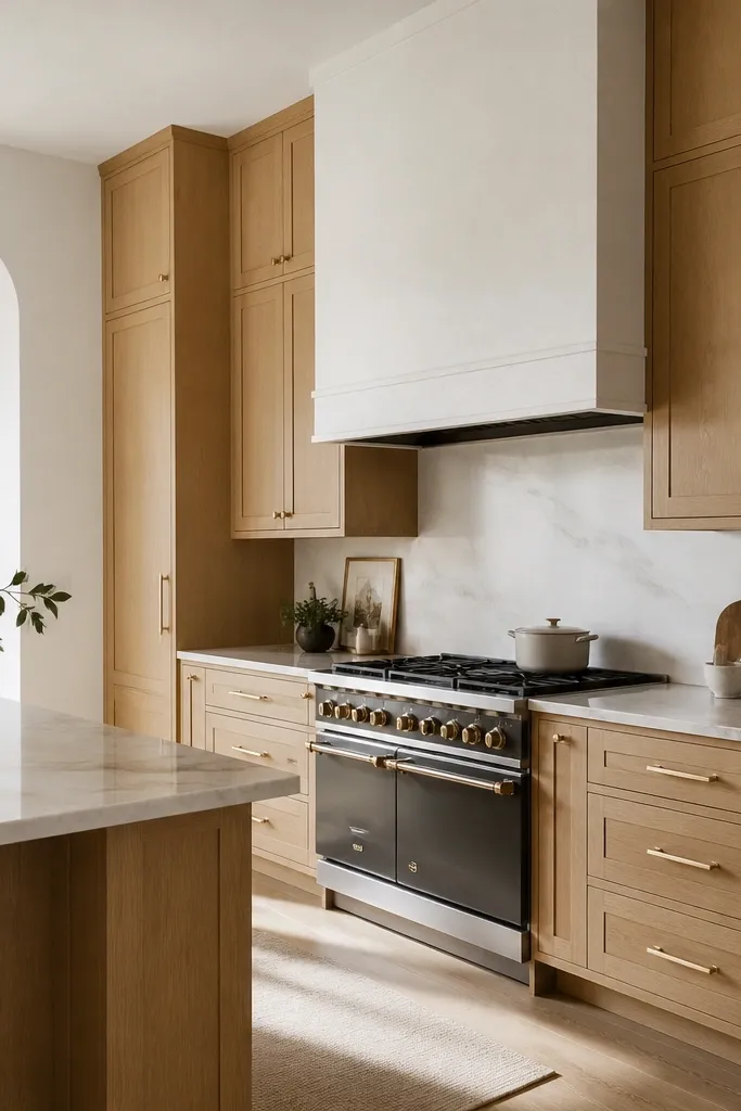
Full-height cabinetry makes the kitchen feel custom because it removes the “unfinished top” zone. The gold hardware then looks like it belongs to a built-in furniture piece, not a standard cabinet run. The white hood wrap softens the oak and prevents the gold from feeling too heavy. This look feels calm and expensive.
Use ceiling-height cabinets with a consistent crown profile. Keep the hardware scale larger on tall drawers so it doesn’t look tiny from across the room. Choose a linen-look hood wrap in a warm white so it doesn’t go icy.
Plan the hardware height around your backsplash outlet positions. I’ve seen people drill pulls without checking outlets, and it forces awkward placement.
Avoid full-height oak with tiny knobs everywhere. It reads under-designed at a glance.
12. White Oak Cabinets with Gold Corner Cup Pulls and Dark Countertops
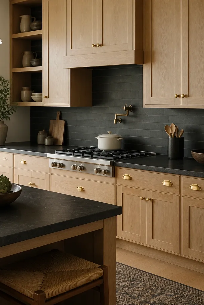
Dark countertops push the oak warmth forward and make the gold feel brighter without looking flashy. Corner cup pulls add a slightly old-world grip and make drawers feel substantial. The mix of centered knobs and corner pulls creates a visual structure: stable doors, confident drawers. It’s a hands-on look that feels lived-in but still luxe.
When you place corner pulls, keep the distance from drawer edges consistent across the kitchen — measure from the same side each time. Use dark quartz with a matte or low-sheen finish to reduce glare. Keep backsplash grout lines clean so the dark background looks intentional.
Test drawer pull reach before final install. If your hands hit the drawer edge, move pulls toward center by an inch.
Don’t put corner pulls on very narrow drawers. They crowd the face and look cramped.