1. Deep Ink Navy + Cream Linen Bed Stack
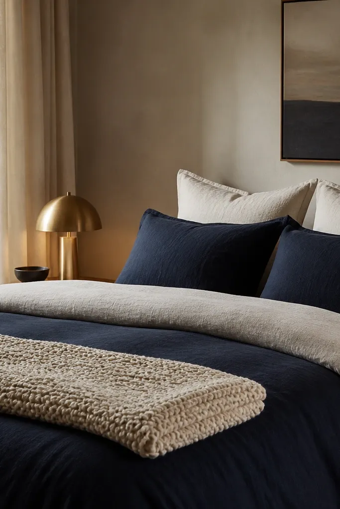
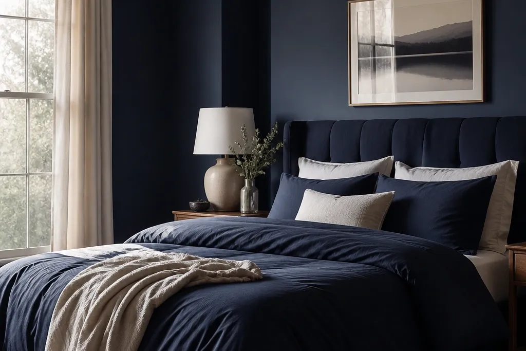
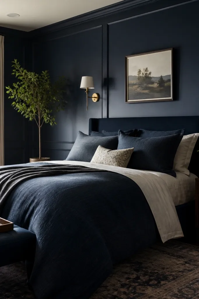
This look works because deep ink navy reads rich without needing extra colors, and cream linen keeps it breathable. The duvet cover gives you the big navy hit, while the cream layer softens the contrast so the room feels calm. Linen also catches light differently than smooth cotton — it looks textured even in daylight. Brass and warm lamp light prevent navy from feeling cold.
Use a navy duvet cover in a matte fabric (linen blend or cotton-linen). Layer a cream duvet or top sheet on top, then add two cream euro shams (26x26) behind standard pillows (20x26). Choose a throw in cream waffle weave or a chunky knit and keep it at the foot so it frames the bed. The lamp shade should be off-white, not bright white, and the metal finish should be warm brass.
If your navy looks too black, swap the lamp bulb to 2700K and add one cream textured layer — it warms the entire palette instantly.
Avoid glossy satin bedding with deep navy — it reflects light in a way that makes the room look shiny and cheap.
2. Navy Velvet Headboard + Warm Wood Nightstands

A navy velvet headboard gives you the main “statement” without needing wall art. Velvet absorbs light, so it looks plush and expensive even with simple bedding. Warm oak tones pull navy into a cozier temperature, and the off-white wall keeps the scene from shrinking.
Choose a headboard height that reaches at least 4-6 inches above your pillow line. Keep bedding mostly cream or white with navy accents so the headboard stays the focal point. Pair with nightstands in oak, walnut, or a warm stained finish — avoid cool gray wood. Add one brass element per side: lamp base, drawer pulls, or a small mirror frame.
Hang curtains so they start 2-3 inches above the top of the headboard — it creates a clean vertical line that makes the bed look taller.
Don’t mix navy velvet with black metal everywhere; it can turn the room goth instead of dreamy.
3. Removable Navy Wallpaper Panel Behind the Bed
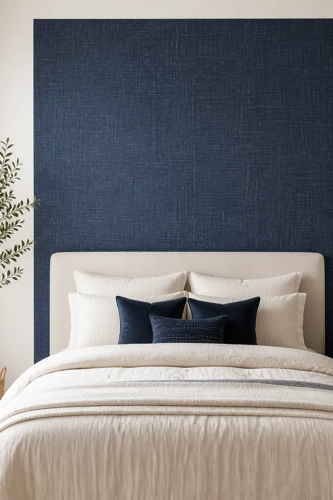
Measure the wall behind your bed and cover only the area that sits above the mattress and to the sides of the headboard. I like a panel that leaves 6-10 inches of wall border around the bed so it frames instead of swallowing. Use a matte wallpaper finish and press edges firmly with a plastic smoothing tool. If you rent, pick peel-and-stick with strong adhesion and plan your alignment before you peel the first corner.
A wallpaper panel gives you the navy wall effect without committing to repainting. Panels also solve the “blank wall behind bed” problem — the eye has a place to land. Choose a navy wallpaper with a subtle texture or tiny pattern so it doesn’t look flat or overly busy. Keep everything else simple: cream sheets, one patterned pillow max, and warm lighting.
Watch outAvoid wallpaper that’s too glossy; navy reflections make the panel look cheap and uneven.
Pro tipIf your wallpaper has a repeating pattern, dry-fit the seams on the floor first so the lines match when you mount it.
4. Navy and Brass Gallery Wall with Cream Frames

Gallery walls make a navy bedroom feel styled instead of heavy. Cream frames keep the navy from overpowering, and brass hardware ties into your lamp and mirrors. I like navy art with warm neutrals because it reads cohesive even when the prints vary. The result looks intentional and personal, not like generic wall decor.
Use frames in a consistent finish (all cream or all brass) and vary only the print sizes. Keep the center of the gallery about 57-60 inches from the floor for most beds. Hang with a grid or vertical column — I prefer a 2x2 cluster plus one taller piece in the middle. Use matting in cream to soften the contrast with navy.
Print one “anchor” piece in a larger size and build around it — it stops the wall from looking like random decor.
Skip mismatched frame colors; it makes navy look messy and the whole wall feels off.
5. Navy Striped Curtains with a Cream Sheer Layer
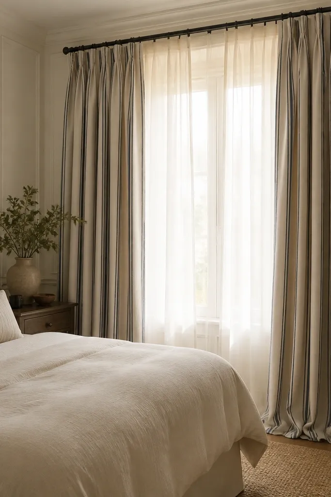
Choose a curtain fabric with a medium weight so it drapes, not floats. Hang the rod 4-6 inches above the window trim and extend the panels 3-6 inches past the sides of the window. For the sheer, pick an off-white that matches your bedding cream tone. Use curtain rings or a rod pocket that lets the heavier panel glide smoothly.
Curtains do two jobs here: they frame the bed and add movement. Navy stripes add rhythm without adding extra colors, and the cream sheer layer keeps daylight soft. Pairing a heavier navy curtain with a light sheer makes the room look layered and expensive. The key is keeping the navy curtain matte, not shiny.
Watch outAvoid short curtains that stop at the sill; navy accent fabric needs height to look right.
Pro tipSteam the curtains and let them settle for 24 hours — stripes look crooked before the fabric relaxes.
6. Wool Low-Pile Navy Rug with Cream Border

Pick a size where the rug extends at least 18-24 inches past the sides of the bed. If you have a queen, a 6x9 often works — it covers more visual floor. Choose a low-pile rug with a flat weave or tight wool so it doesn’t snag on furniture feet. Keep the border color close to your cream bedding tone, not bright white.
A navy rug grounds the room and makes the bed feel anchored. Wool low-pile looks cozy underfoot and doesn’t show footprints the way high-pile rugs do. A cream border gives you a clean frame, so the navy doesn’t spread into the whole floor area. This combo also helps rooms with pale walls look more layered.
Watch outAvoid a high-contrast rug pattern with navy — it competes with bedding and makes the room feel busy.
Pro tipUse a thin rug pad so the pile stays flat and your bed doesn’t wobble.
7. Navy Bedding with Dusty Rose Accent Pillow Pair

Dusty rose makes navy look softer. I use it when the room feels too severe — navy + rose adds warmth without turning the palette pink. Velvet or corduroy rose pillows look best because the texture reads luxurious next to matte navy bedding. Keep the rose to two pillows and maybe one throw, so the navy stays the main character.
Choose a rose fabric with a noticeable texture (velvet, corduroy, or a slub knit). Pair it with cream pillows so the rose doesn’t look too loud. Stick to a simple navy pattern or solid navy duvet; if the duvet already has pattern, skip patterned rose. Place rose pillows slightly forward in the stack so they catch light.
If the rose looks too bright, soften it with a cream throw in waffle weave — it calms the color fast.
Avoid using bright fuchsia with navy; it screams party room instead of bedroom.
8. Olive and Navy Mix with a Textured Knit Throw

Olive is the secret neutral that keeps navy from feeling too cold. It’s muted enough to stay calm, but it brings an earthy warmth that reads cozy. A chunky knit throw adds the tactile layer that makes the bed look lived-in and inviting. Olive also looks great with warm wood and brass.
Pick olive items that are not too green — think sage-leaning olive, not neon. Use the olive only in the throw and one or two pillows so it doesn’t turn into an outdoor theme. The knit throw should have visible loops or thick ribbing, not a smooth acrylic blanket. Keep the rest of the palette cream and navy with one brass accent.
Fold the olive throw once, then drape it so one corner hangs down about 6-8 inches past the bed edge.
Avoid matching olive paint on the wall unless you’re committing; it can clash with navy undertones.
9. Navy Nightstands with Off-White Bedside Styling

If you can’t repaint, use furniture color. Navy nightstands create the navy presence at eye level, so the room feels cohesive even with neutral walls. Off-white styling on the nightstands stops the navy from looking heavy. Brass trays and lamp bases keep everything warm and reflective — small shine is enough.
Choose nightstands in a matte navy finish or a satin that doesn’t look glossy. Keep the lamp shade off-white and slightly textured so it doesn’t look flat. Add one tray per side and style with one object: a ceramic vase or a candle jar. If you have a mirror, pick a simple frame in brass or warm wood.
Match the nightstand navy to your duvet navy by holding them together in daylight — phone photos lie.
Avoid mixing two different navies in furniture and bedding; it looks like the room is trying to pick a direction.
10. Navy Bedroom Lighting Plan with 2700K Bulbs
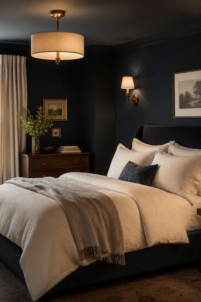
Navy looks best under warm light. I’ve changed one bulb from 3000K to 2700K and the entire navy palette shifted from “cold” to “cozy” without adding new decor. Table lamps and wall sconces also add depth by lighting the wall texture and curtains. Use dimmers if you can — navy gets flattering when the room is slightly darker.
Use 2700K bulbs in every bedside lamp and sconce. Choose shades in off-white linen or a light fabric — the warmth shows through. If you have only overhead lighting, swap to a fixture with a warm shade or add a floor lamp with an angled head. Keep the brightness balanced so your bed looks soft at night and crisp in daylight.
Test your bulbs in the bedroom at night before you commit to new decor — the color temperature decides everything with navy.
Avoid cool blue bulbs; they make navy look gray and the room feels sterile.