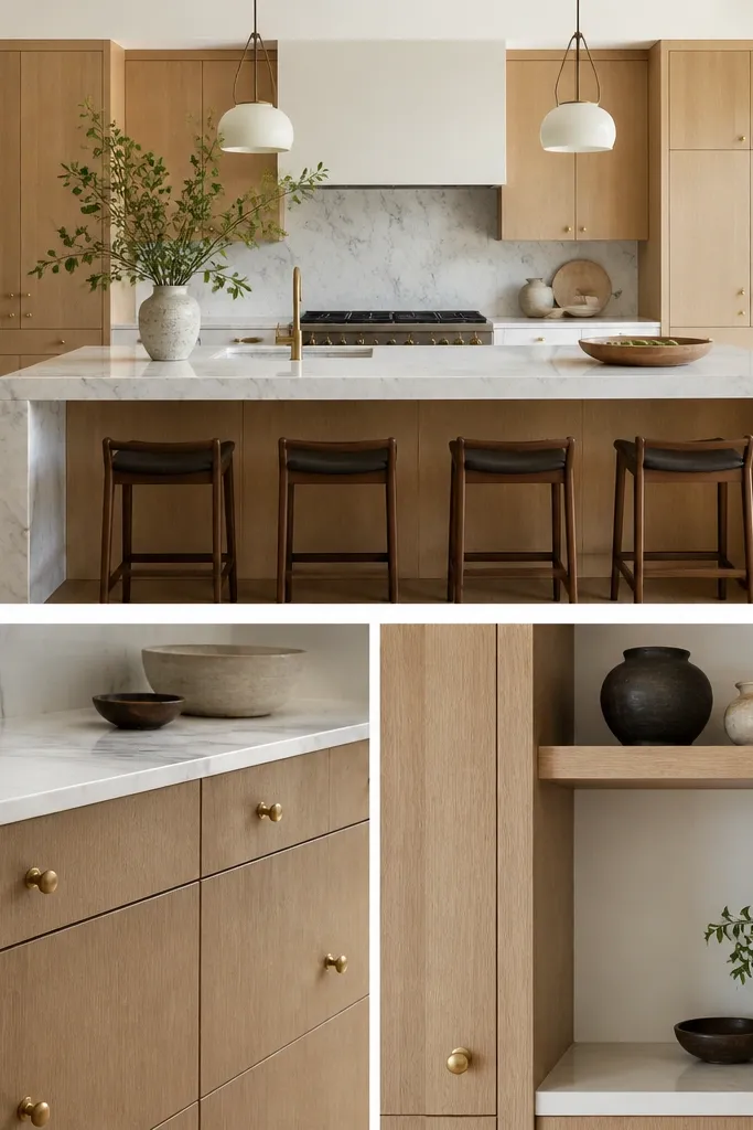
1. Warm White Walls + Brushed Nickel Pulls
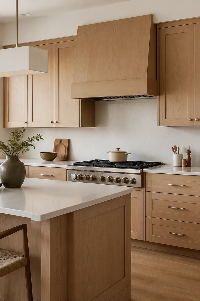
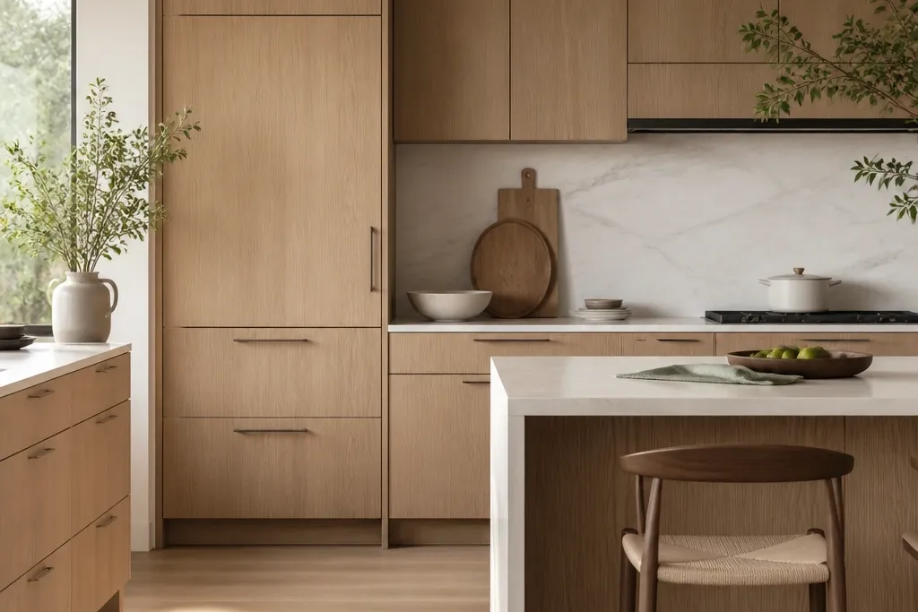
This combo keeps the oak airy instead of golden. Warm white paint adds softness, and brushed nickel brings a gentle cool note without turning the whole kitchen silver. Rift grain stays visually clean because the hardware finish is satin, not shiny. The result reads bright, calm, and premium even with busy cooking patterns.
Choose a warm white with a hint of cream, not a blue-white. Keep the nickel pulls slim and straight — about 5-6 inches for drawers and 1-2 inches for knobs. Pair with light quartz in a soft white base, not a stark white that looks like copy paper.
Before buying the final pulls, tape a nickel pull to a cabinet door and view it under the kitchen’s real lighting at night. If it looks too icy, switch to satin bronze.
Don’t use high-gloss nickel and a bright white wall together — it makes the oak look dull and the metal look harsh.
2. Oil-Rubbed Bronze Hardware + Linen Shades
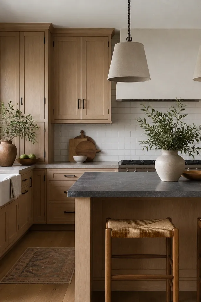
Bronze warms the metal tone and makes rift oak feel like it belongs in a lived-in home, not a showroom. Linen shades add diffusion, so the oak grain catches light gradually instead of flashing under bright bulbs. The dark stone adds contrast without adding more pattern. Everything looks cohesive because bronze and oak share that warm undertone.
Pick bronze pulls with a satin oil-rubbed look, not glossy. Use a backsplash with small format tile and grout that matches the stone — a light warm gray works well. Linen shades should hang 30-34 inches above the floor and be wide enough to cover the bulb area.
Pro tipAdd a thin bronze towel bar or a bronze faucet accent if your sink area has space — repeating bronze in one more spot makes the kitchen feel finished.
Watch outSkip black hardware with warm oak if you don’t have dark counters. Black alone can make the grain look “separated” from the rest of the kitchen.
3. Blackened Steel Modern Lighting + White Quartz Countertops
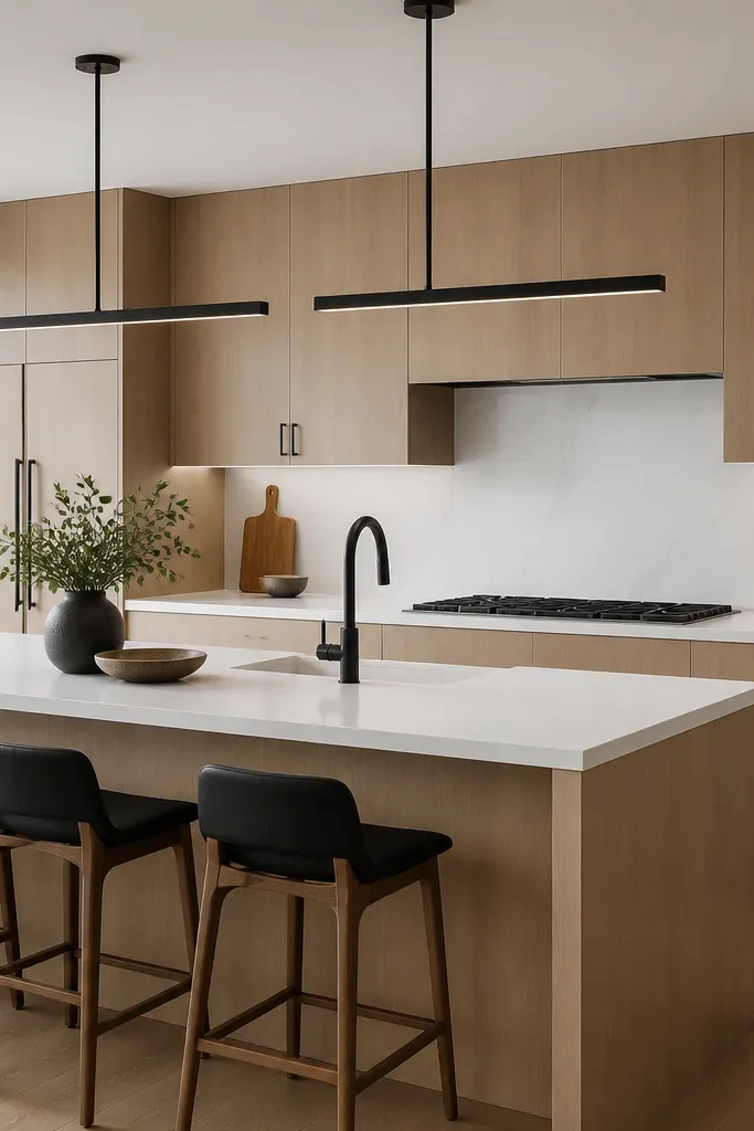
Blackened steel gives you clean lines and high contrast, which makes rift oak look intentional instead of rustic. White quartz keeps the brightness, and the subtle veining adds movement without stealing attention from the grain. I like this when the cabinet doors are simple and the kitchen has straight architectural lines. The pairing reads modern, but the oak keeps it warm.
Choose black hardware that looks slightly textured, like brushed and aged, not flat painted black. Keep the countertop veining delicate. If your backsplash is tile, choose a large format or a simple slab look so the black lines don’t compete with pattern.
Set pendant bulbs to 2700K. Under cooler light, blackened steel can look too blue and the oak can read gray.
Don’t use glossy black hardware with a glossy backsplash — it turns the whole kitchen into reflections instead of design.
4. Matte Sage Walls + Brass Accents
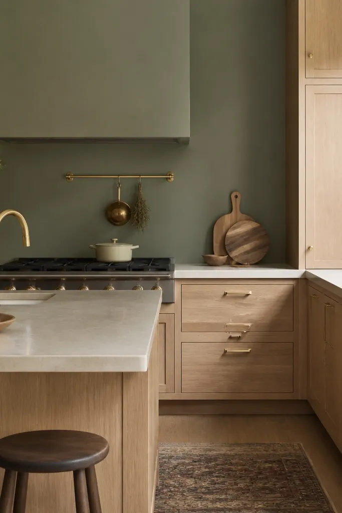
Sage is one of the few greens that plays nicely with oak without making it look orange. Brass adds a soft gold warmth that matches the oak’s undertone, but you keep it premium by using matte finishes and fewer pieces. Rift grain stays the focus because sage paint is flat and quiet. This is a “slow luxury” look that doesn’t require complicated decor.
Use a matte or eggshell sage paint, not satin. Hardware should be warm brass with a brushed finish. Keep the backsplash simple — small-scale cream tile or thin grout lines look best with brass because they don’t fight the cabinet grain.
Pro tipHold a brass pull next to your cabinet door under daylight. If it looks too yellow, switch to brushed champagne nickel or oil-rubbed bronze.
Watch outAvoid bright emerald walls — they push the oak toward orange and make the brass feel louder than the cabinets.
5. Two-Tone Upper Cabinets in Soft White
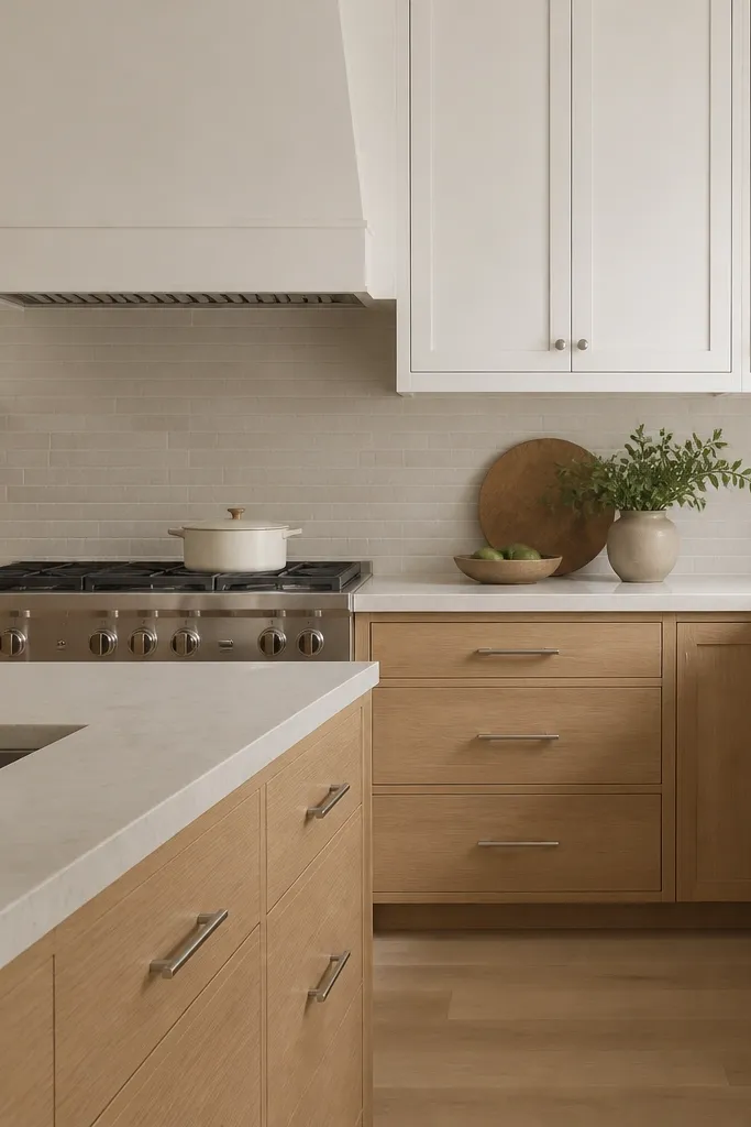
Two-tone is how you make rift oak feel designed, not “just wood.” Keeping the uppers soft white reduces visual weight and makes the oak lowers feel grounded. Rift grain still shows clearly on the bottom, while the painted uppers provide a clean frame. The brushed nickel ties both materials so it doesn’t look like two separate kitchens.
Use the same hardware finish on uppers and lowers so the eye doesn’t hunt. Keep the painted upper white slightly warm and match your wall temperature. If you add glass-front uppers, use clear or lightly tinted glass so the oak doesn’t get washed out.
Pro tipChoose a countertop with warmth, like a creamy white quartz. Stark white counters can make the oak look pale and the uppers look dirty.
Watch outDon’t choose an ultra-cool gray for the painted uppers — it makes the oak look yellow and the whole kitchen feel off-balance.
6. Rift Oak + Travertine-Style Backsplash and Floor
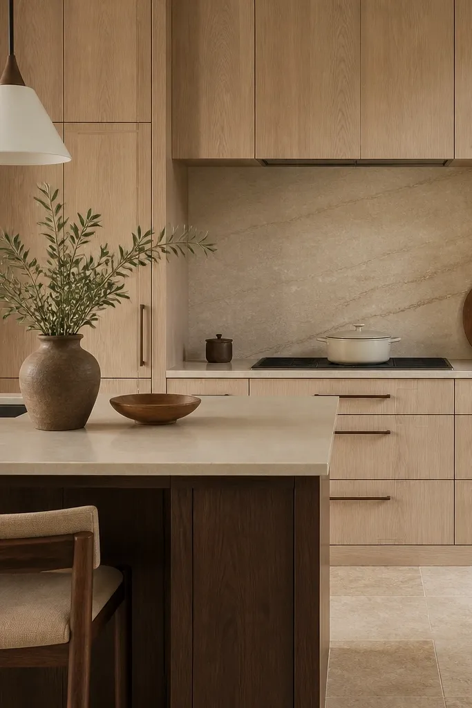
Travertine-style surfaces bring texture without loud color, which complements rift grain. The warm beige echoes oak, but the stone veining is irregular enough to add depth while staying natural. This combo works when you want the kitchen to feel like it has history, even if it’s brand new. Rift oak stays crisp because the stone texture provides the “interest” elsewhere.
Pick travertine look tiles with light pores and a matte finish. Use a warm gray or beige grout so lines don’t create a grid that competes with the cabinet grain. Match hardware to the stone undertone — matte bronze is the easiest win.
Bring a sample of your backsplash tile home next to the cabinet door. If the tile pulls more orange than the oak, switch to a cooler beige stone.
Don’t use glossy stone tile. It reflects light sharply and makes rift oak grain look less clean.
7. Large Format Slab Backsplash in Off-White
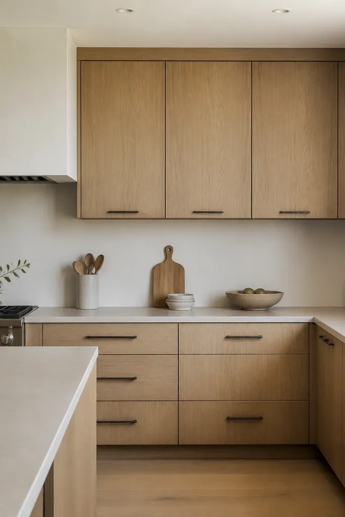
A slab backsplash makes rift oak look even cleaner because you remove visual interruptions behind the doors. Off-white keeps warmth without adding pattern. Blackened steel hardware gives crisp edges, and the slab prevents the black from feeling harsh. This is one of the best ways to get a premium look in a smaller kitchen.
Choose an off-white with subtle gray or beige movement, not pure white. Set slab edges straight and keep the caulk line thin and consistent. If you have a window above the counter, align the backsplash seam to the window center for a calmer look.
Pro tipUse a slightly warmer bulb temperature and aim recessed lights to wash the backsplash. Slab surfaces show shadows — good lighting makes it look expensive.
Watch outAvoid a busy tile mosaic behind rift oak. The grain already has movement, and too much pattern makes the kitchen feel crowded.
8. Charcoal Island Base with Rift Oak Faces
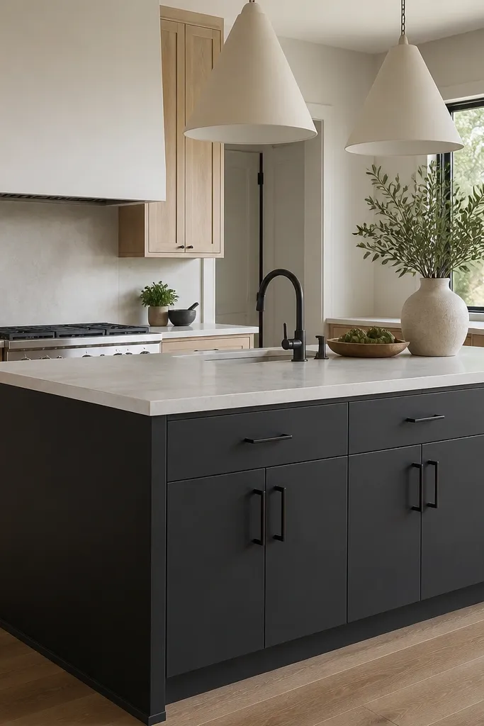
This is how you add drama without changing the whole cabinet finish. The charcoal island anchors the room and makes the rift oak feel brighter. Matte paint keeps it modern and hides minor wall imperfections. Bronze hardware links the charcoal and oak so the contrast feels intentional, not random.
Use a matte charcoal paint with a deep base, not a dusty gray. Keep the island countertop light so the island doesn’t feel heavy. If you have seating, choose upholstery in oatmeal or black leather with a matte finish.
Repeat charcoal once more — maybe in a framed mirror or a stove hood color — but keep it to two spots max.
Don’t paint the entire kitchen charcoal. The oak needs breathing room to look premium.
9. Rift Oak + Patterned Runner and Simple Counter Styling
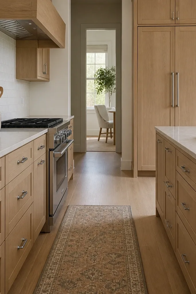
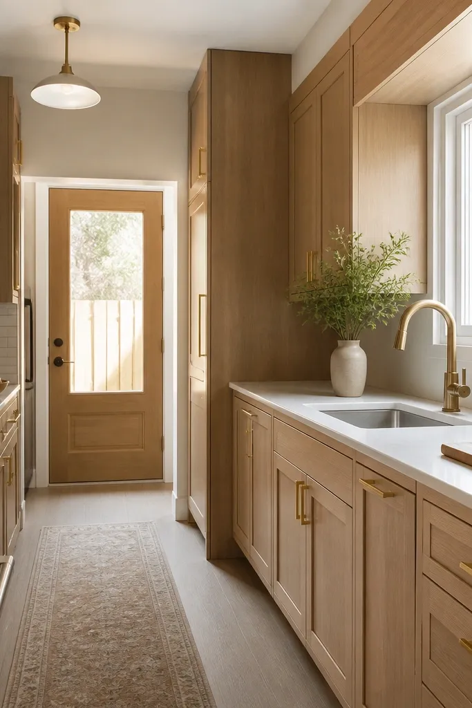
This is the “styled but lived” trick I use in real kitchens. The patterned runner adds softness underfoot, and it also gives the room a focal layer that doesn’t fight the cabinet grain. Keeping countertops simple keeps the oak from looking overwhelmed. It reads premium because the styling has restraint, not because you added more stuff.
Choose a runner with a low-contrast pattern in neutral tones, like oatmeal, warm gray, and a touch of black. Keep the countertop styling to one tray and two items max. Use ceramic that matches your hardware undertone — brushed nickel pairs well with white stoneware.
Pro tipIf your cabinets have a lot of visible grain, keep the runner pattern smaller. Large bold patterns can make the grain look busy.
Watch outAvoid stacking multiple countertop textures — cutting boards, woven baskets, and patterned canisters all at once makes the kitchen feel cluttered.
10. Glass-Front Upper Cabinets with Clear Shelves
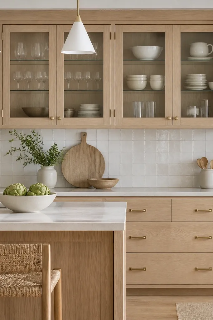
Glass-front uppers let you control what the room sees, and rift oak makes the interior look tidy. Clear shelves and clean dish colors create a calm display that doesn’t compete with the cabinet grain. Satin brass warms the glass reflections without looking shiny. This is the best move when you want personality but you don’t want the kitchen to feel cluttered.
Use clear glass with minimal tint so the oak tone stays true. Arrange dishes by color — white and cream only, or white plus soft blue. Add a fabric back panel in a warm neutral if you need to hide clutter behind the glass.
Keep glass shelves level and wipe fingerprints often. Glass fronts show smudges faster than you think.
Don’t overfill glass cabinets. Two-thirds full looks intentional; packed shelves look messy.