1. Brass tray anchor with cream linen base
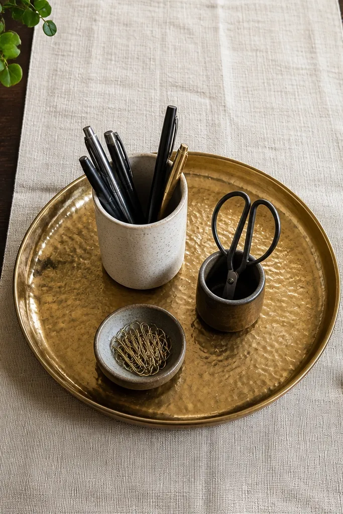
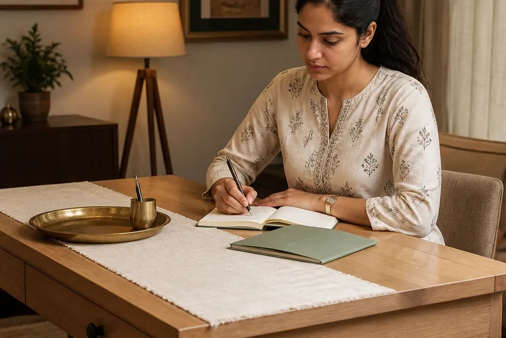
This setup looks expensive because it creates a clean “stage” for your daily items. Put a cream linen runner or folded cloth under a medium brass tray so the warm metal pops against a soft matte background. Inside the tray, keep only what you use daily: a pen cup, a small scissor holder, and one tiny dish for paperclips. The linen hides desk imperfections and gives a luxury texture contrast that reads upscale in photos.
Step 1: Cut or fold linen to the size of your tray footprint plus 1 inch on each side, then place it centered on the table. Step 2: Use a brass tray about 10-14 inches wide (depending on your desk) and arrange items with at least 1 inch gaps between holders. Step 3: Add one small ceramic catch-all for loose cables or a single sticky note pad corner; keep everything inside the tray so the surface stays tidy.
Pro tipWipe brass with a dry microfiber cloth so it stays warm and not dull; dull metal reads “used” instead of “styled”.
Watch outDon’t spread stationery across the table — keep it inside the tray or it will look cluttered.
2. Terracotta lamp + dark walnut book stack
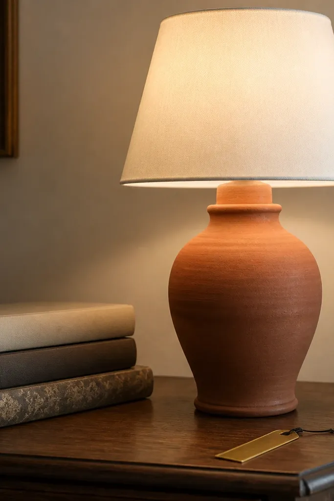
A warm terracotta lamp makes the table feel cozy and premium, especially next to darker wood tones. Choose a lamp with a fabric shade in off-white, beige, or light oatmeal so the light looks soft, not harsh. Stack 2-3 books with spines facing outward, using one neutral cover and one muted pattern so it looks curated. This works because the lamp gives height and the book stack adds substance without random clutter.
Step 1: Place the lamp on the side you don’t write from, leaving 6-8 inches of workspace in the center. Step 2: Stack 2-3 books so the tallest cover sits about level with the lamp shade base. Step 3: Add a thin bookmark ribbon or a small neutral frame behind the books (lean it), keeping the color palette to terracotta, cream, and one dark tone.
Pro tipUse warm bulb light around 2700K; cool white light makes terracotta look flat and cheap.
Watch outDon’t use a bright white lamp shade with terracotta — the contrast can look harsh and less expensive.
3. Ikat notebook cover + pen organizer in matte black
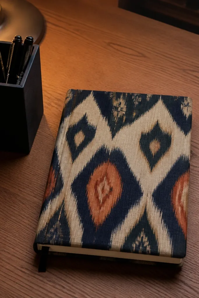
Patterns can look high-end when you keep them to one hero item. Use an ikat or block-printed notebook cover in muted tones (indigo, sand, rust) and pair it with matte black accessories. Matte black reads sleek and modern, and it balances Indian patterns without making the desk busy. This is a great choice for anyone who wants the aesthetic study table decor look expensive but still needs a practical writing setup.
Step 1: Place the notebook on a tray or directly on a small neutral mat so the patterned cover is the focal point. Step 2: Put a matte black pen organizer to the right (or left if you’re left-handed) and keep it at least 2 inches away from the notebook edge. Step 3: Add a single thin metal ruler or a bookmark clip in brushed steel so the palette stays controlled.
Choose one pattern only; if your notebook is patterned, keep the rest solid and matte.
Avoid mixing two loud patterns (like ikat plus floral) on the same tabletop.
4. Puja-inspired marble-look desk tray with gold edges
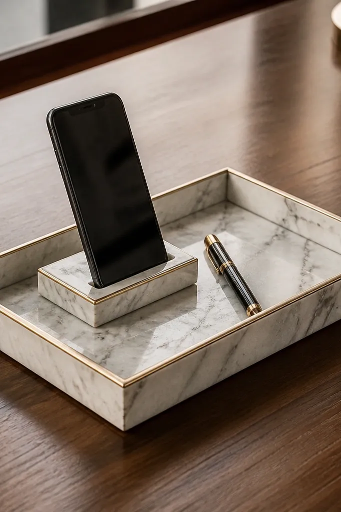
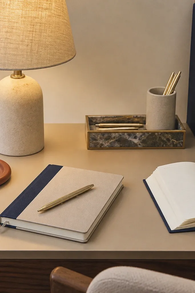
Marble-look trays instantly read “luxury” because they mimic stone veining and light reflection. Go for a tray with subtle white-gray veining and thin gold edges, then keep your items minimal. Add a small phone stand inside the tray so studying looks organized, not like you’re juggling devices. This setup works because it centralizes everything and gives a clean, expensive-looking surface even if your desk is basic.
Step 1: Use a tray sized about 12-16 inches wide and place it near the writing corner, not dead center. Step 2: Inside the tray, arrange a phone stand, a pen cup, and one small divider for sticky notes; keep empty space visible. Step 3: If your desk has scratches, put a thin neutral mat under the tray to stop the tray from sliding and to hide imperfections.
Keep the tray items aligned to the same edge so the desk looks designed, not random.
Don’t overfill the tray; empty marble-look space is what makes it look expensive.
5. Walnut wall shelf + mini frame leaning behind books
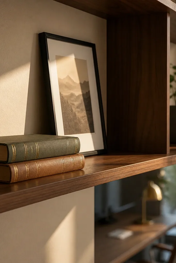
The expensive look isn’t only on the table. A simple frame behind the books adds depth and makes the whole corner look styled. Lean a small frame or print behind a 2-book stack so it creates a vertical layer. Use walnut-toned wood or a thin black frame to match the desk finish. This setup is ideal for small rooms because it uses wall space while keeping the table practical.
Step 1: Choose a frame or print in neutral art (black and cream line art works best) and place it behind the book stack, slightly angled. Step 2: Keep the book stack low enough that the frame doesn’t block your writing space; aim for 5-7 inches height above the tray line. Step 3: Add one small object on the table front (like a pen cup) so the frame looks intentional instead of decorative clutter.
Pro tipMake the frame the only “wall color” item; keep the table palette to two neutrals plus one accent.
Watch outDon’t hang a bulky frame and also clutter the table — the corner will feel crowded.
6. Sage green runner + brass cup for pens and pencils
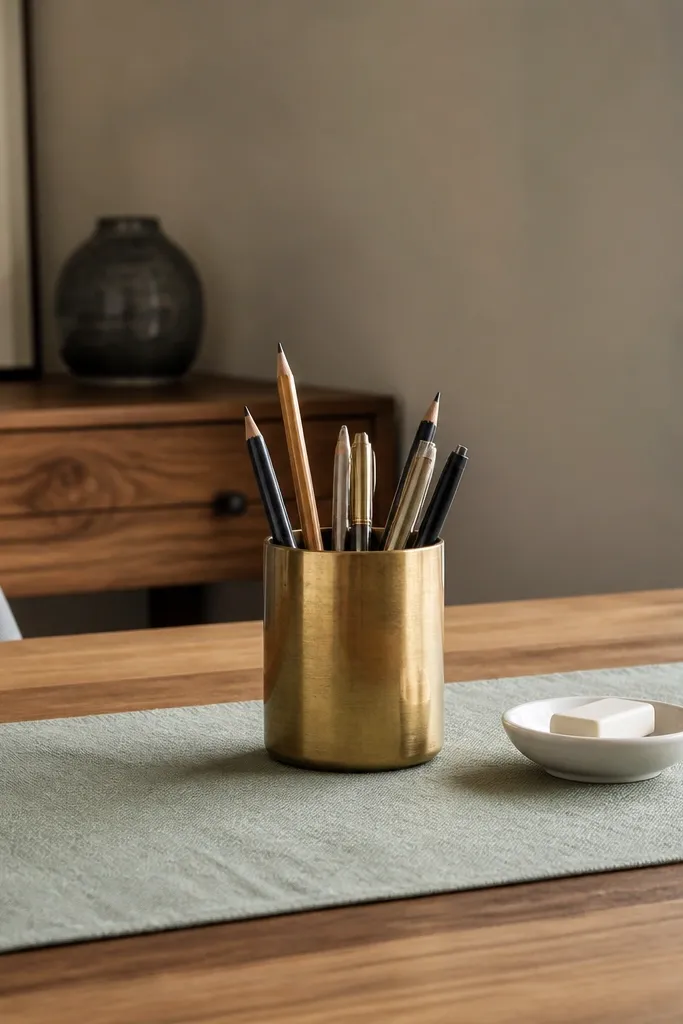
Sage green feels calm and premium, and it photographs beautifully against Indian interiors. Use a sage runner (cotton or linen) under your daily tools and pair it with a single brass cup. The brass gives a warm highlight that reads “expensive” even with simple stationery. Keep the rest minimal: one small tray for erasers and a neat stack of sticky notes. This is a cozy setup that doesn’t look childish or overly themed.
Step 1: Place the sage runner so it starts 3-4 inches before the writing edge and ends just past the organizer footprint. Step 2: Put the brass pen cup in the non-writing side corner and leave a 2-inch clear zone between it and the notebook. Step 3: Add one small ceramic dish for erasers and a single closed container for highlighters so loose items don’t spill.
Pro tipPick sage in a slightly muted tone; neon green makes everything look cheap.
Watch outAvoid mixing sage with too many bright colors; stick to cream, brass, and one muted accent.
7. Stone coaster set as a stationery base
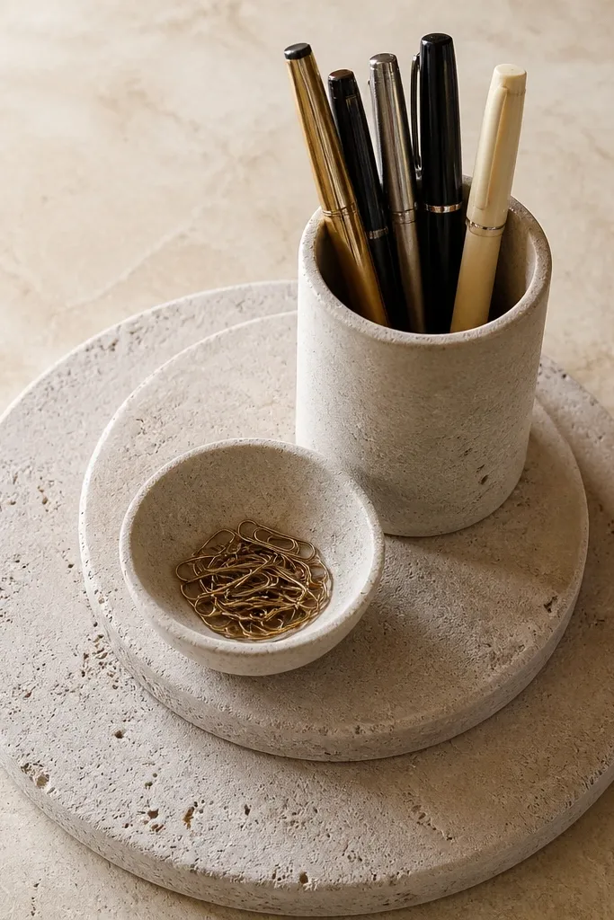
This one is underrated because it’s practical and looks styled at the same time. Use a set of stone or faux-stone coasters in a matching tone, then place your pen cup and small dishes on top. The textured stone surface adds weight and visual structure, like a mini gallery display. It also stops the “things sliding around” problem, so your desk stays clean between study sessions.
Step 1: Choose a coaster set in one tone (beige, taupe, or charcoal) and place them in a loose L-shape near your writing corner. Step 2: Put the pen cup on the largest coaster and place a small dish for clips and a mini tray on the remaining coasters. Step 3: Keep your notebook and laptop on a separate clean mat so the coasters look intentional, not random.
Match your laptop sleeve color to the coaster tone for a tighter, more expensive look.
Don’t place coasters under everything; the effect comes from a few “styled anchor spots”.
8. Monogram-style side organizer in light wood + neutral baskets
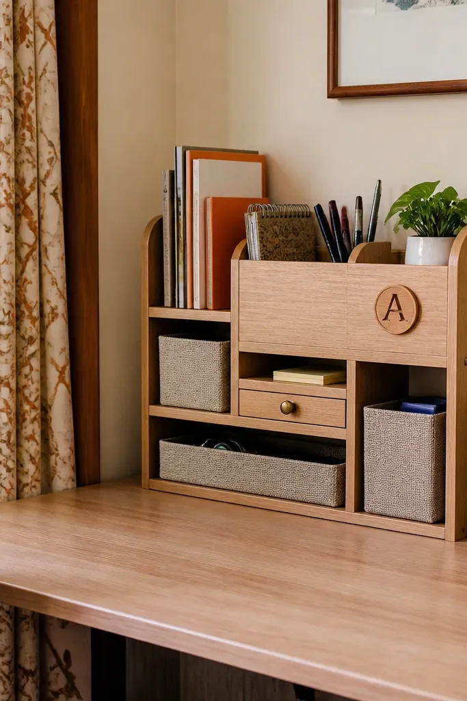
If your desk looks messy because supplies spill, this is the fix that still looks good. A light wood side organizer with compartments lets you hide chaos while keeping a warm, Indian home feel. Use neutral baskets or fabric bins for cables, chargers, and extra stationery. Add a small monogram letter or name plaque on the organizer front to make it feel personal without turning it into a theme.
Step 1: Position the organizer on the non-writing side so it doesn’t steal space from your workspace; keep at least 8 inches clear for your elbows. Step 2: Sort items by category and put them into bins: one for chargers, one for paper, one for refills. Step 3: Add a single framed print or small plaque on the organizer front; keep it small (under 8 inches wide).
Use fabric bins with a tight weave; loose, stringy fabric makes the setup look casual instead of premium.
Skip bright patterned baskets; when the bins are busy, the whole desk looks cluttered.
9. Ceramic incense stick holder repurposed as pen stand
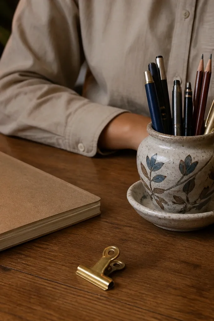
This is an Indian trick that reads intentional when you keep the palette tight. Use a ceramic incense stick holder or diya-style holder with a hand-painted neutral pattern, then fill it with pens and pencils. Ceramic adds weight and texture, so even a basic desk looks styled. Pair it with a plain notebook cover and a single neutral tray so the holder remains the hero. It’s practical because it’s deep enough to hold pens upright.
Step 1: Choose a ceramic holder with a stable base and a narrow opening; place it near the notebook corner where you grab pens most. Step 2: Keep the rest minimal: one tray for paperclips and a ruler laid flat to add structure. Step 3: If the holder is glossy, wipe it clean and avoid extra shine items; glossy ceramic plus glossy plastic looks cheap.
Match the ceramic accent color to one item only (like a highlighter cap or notebook spine), not five different colors.
Don’t use a loud, multicolor ceramic holder with patterned stationery at the same time.
10. Rattan document tray + leather-look bookmark strip
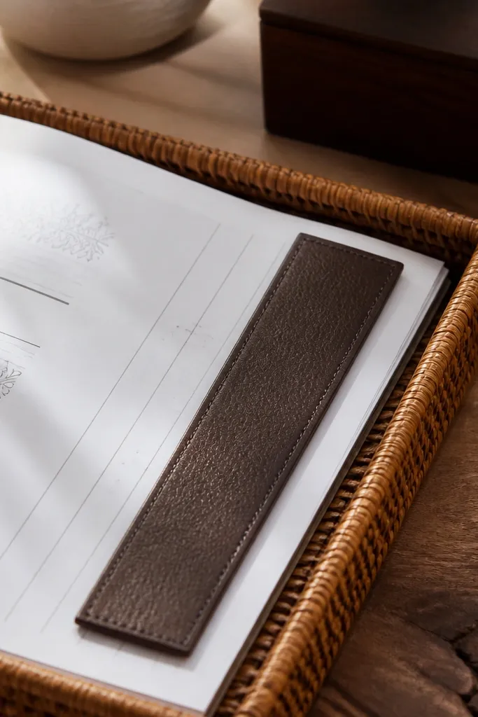
Rattan and cane read warm and expensive when they’re used as a single organized layer. Put a rattan document tray on the desk to hold loose papers, printed notes, or worksheet sheets. Add a leather-look bookmark strip or a slim faux-leather pad next to the notebook to bring in a darker, structured contrast. This combination solves the “papers everywhere” problem and looks cozy without looking like a storage area.
Step 1: Place the rattan tray on the side where papers land while studying, usually the left or right front corner. Step 2: Sort papers into 2 stacks: active (today’s) and pending (tomorrow’s), then keep them inside the tray so edges don’t spill. Step 3: Add the leather-look strip as a bookmark holder on the notebook so it looks like part of the desk styling, not an afterthought.
Pro tipKeep the rattan tray empty around the edges; visible space makes it look intentional.
Watch outAvoid mixing rattan with too many other natural textures like jute and wood slices everywhere.
11. Black-and-cream study grid mat with brass clips
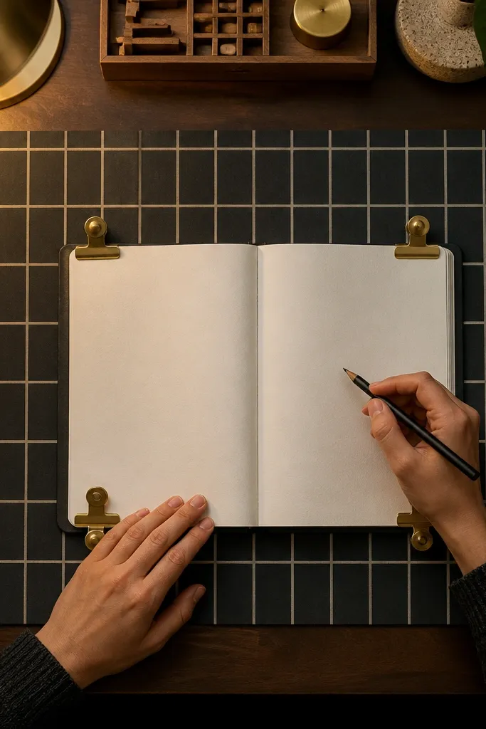
A study grid mat gives your desk a designer “layout” look. Use a black-and-cream grid mat under the notebook so the writing area looks structured and clean. Then add brass clips or brass mini clip holders to keep notes from flying around. This works because it controls chaos visually and makes the setup look like it has a system, which is what “expensive” desks do.
Step 1: Cut the grid mat to fit your writing area or choose a size that leaves 2-3 inches of table visible on at least one side. Step 2: Place the notebook centered on the mat and keep one side for a single pen cup only. Step 3: Use 3-5 brass clips to hold loose sheets; line them up in a row so they read as a design detail.
Pro tipKeep the grid mat the only graphic pattern on the desk; everything else should be solid and matte.
Watch outDon’t add multiple patterned organizers on top of the grid mat.
12. Oversized desk clock + fabric-wrapped cable channel
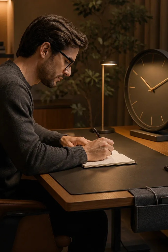
A good-looking clock and clean cables make a desk look finished. Pick an oversized clock with a muted finish (matte black, champagne gold, or walnut wood) and place it slightly behind your notebook so it frames the writing space. Add a fabric-wrapped cable channel so charging wires disappear along the table edge. This setup is practical because it reduces cable tangles, and it looks expensive because the visual mess is removed.
Step 1: Place the clock at the back center or back corner of the desk, about 6-10 inches behind the notebook. Step 2: Route cables along one desk edge using a fabric cable sleeve or channel; keep the sleeve color in the same family as your clock finish. Step 3: Add one small tray in front for chargers so the desk doesn’t look like it has “floating” electronics.
Pro tipHide the power strip under a tray or in a slim organizer; the worst look is visible cords spilling out.
Watch outDon’t let the cable sleeve hang loose in the middle of the desk.